I T A L Y · F L O P I C C O S T U D I O + R A I · 2 0 2 4
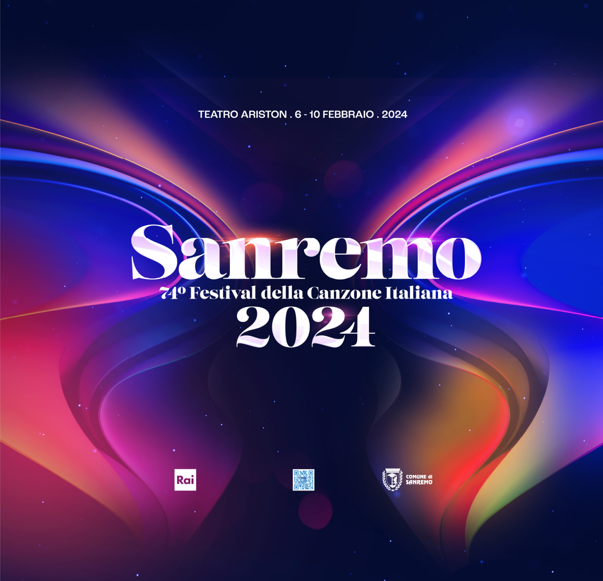
Festival di Sanremo 2024
EVENT BRANDING
The Client
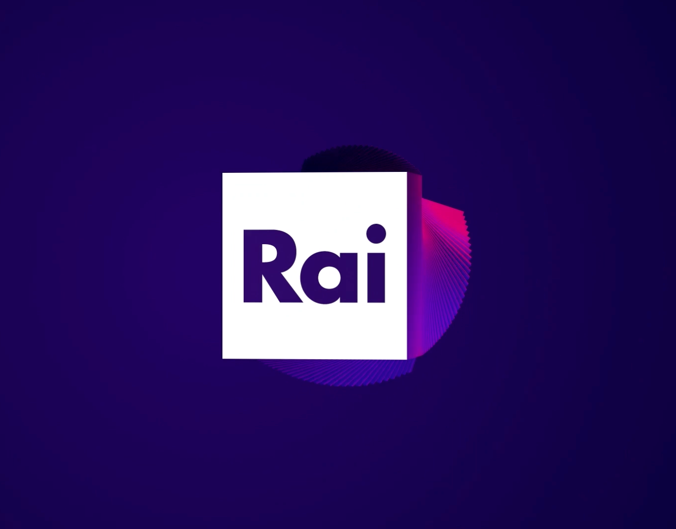
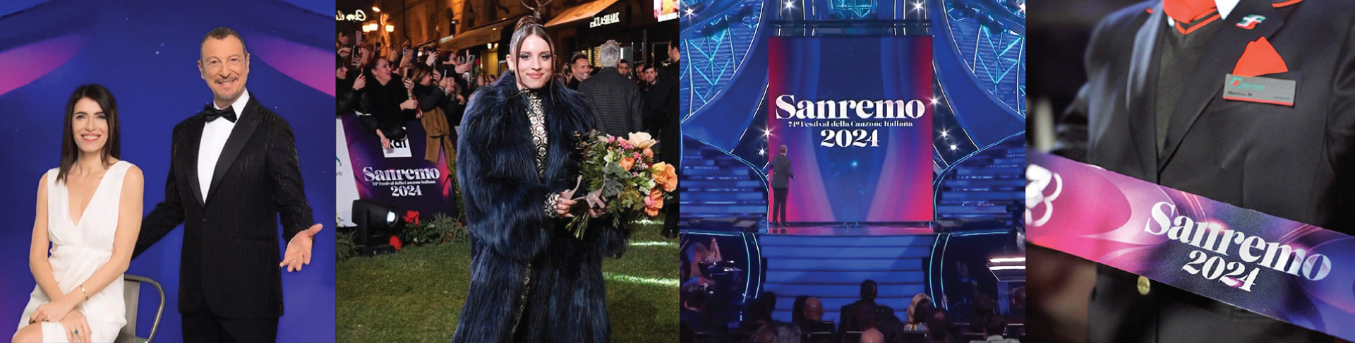
Radiotelevisione Italiana, the national broadcasting company of Italy, is also the official host of the Sanremo Music Festival, along the Comune of Sanremo. This Festival has often been used as a method for choosing the Italian entry for the Eurovision Song Contest. It has launched the careers of some of Italy's most successful musical acts, including Laura Pausini, Eros Ramazzotti, Andrea Bocelli, and Måneskin.
The Challenge
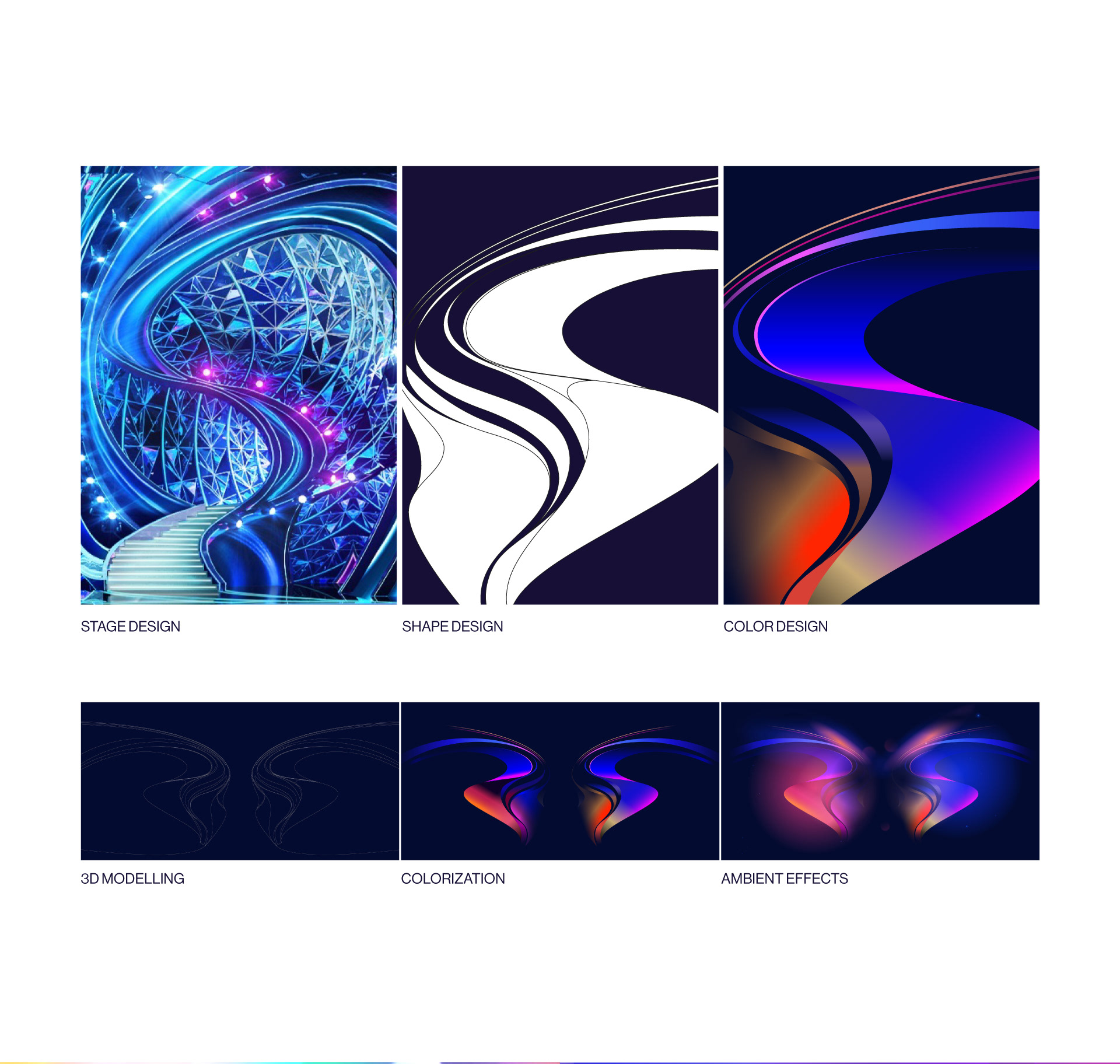
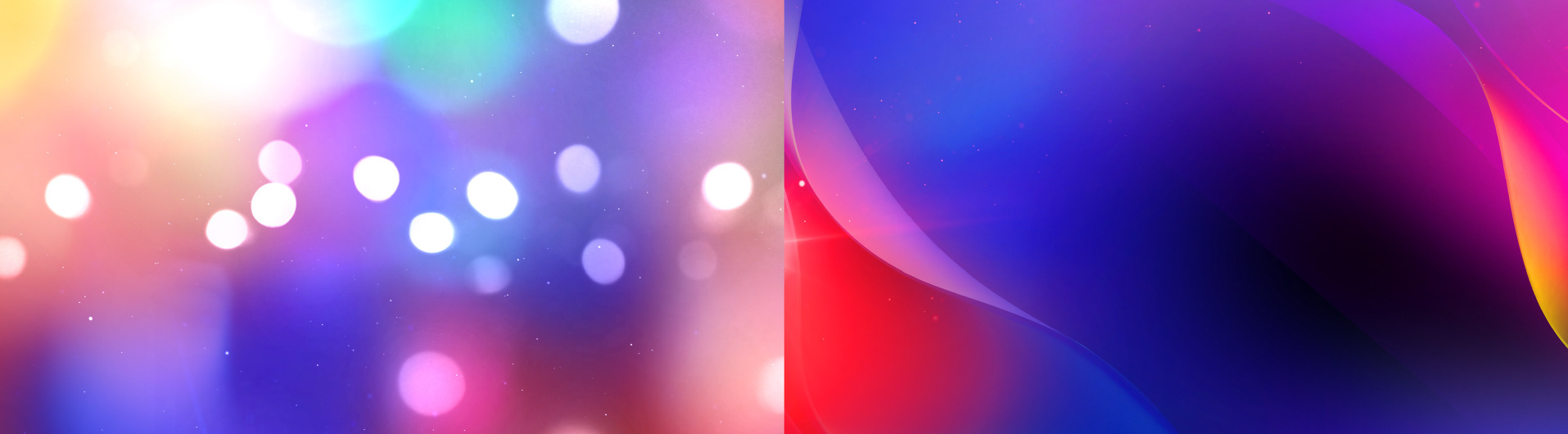
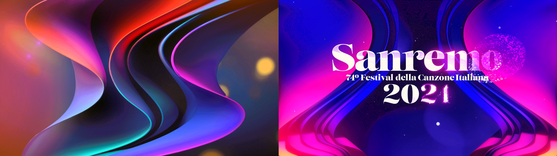
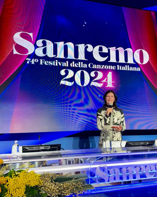
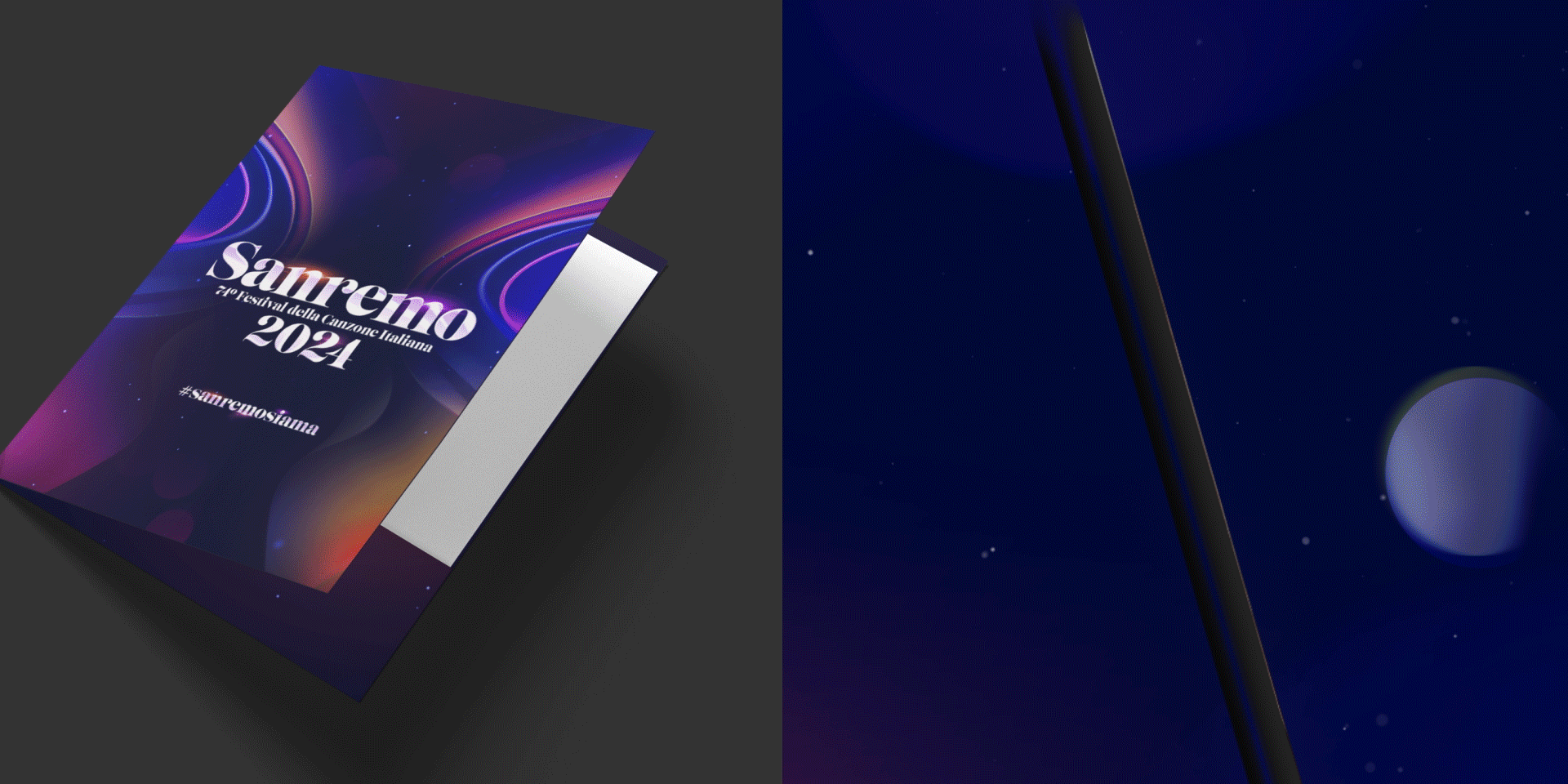
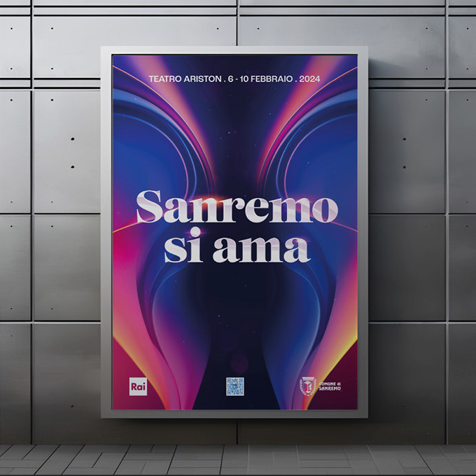
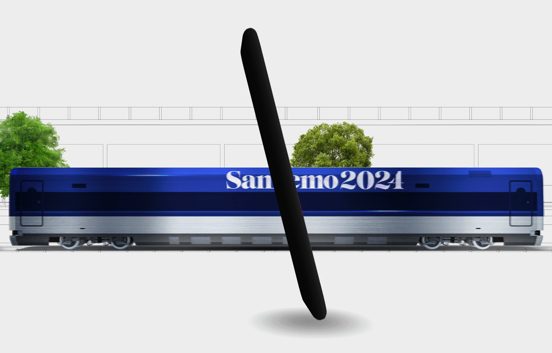
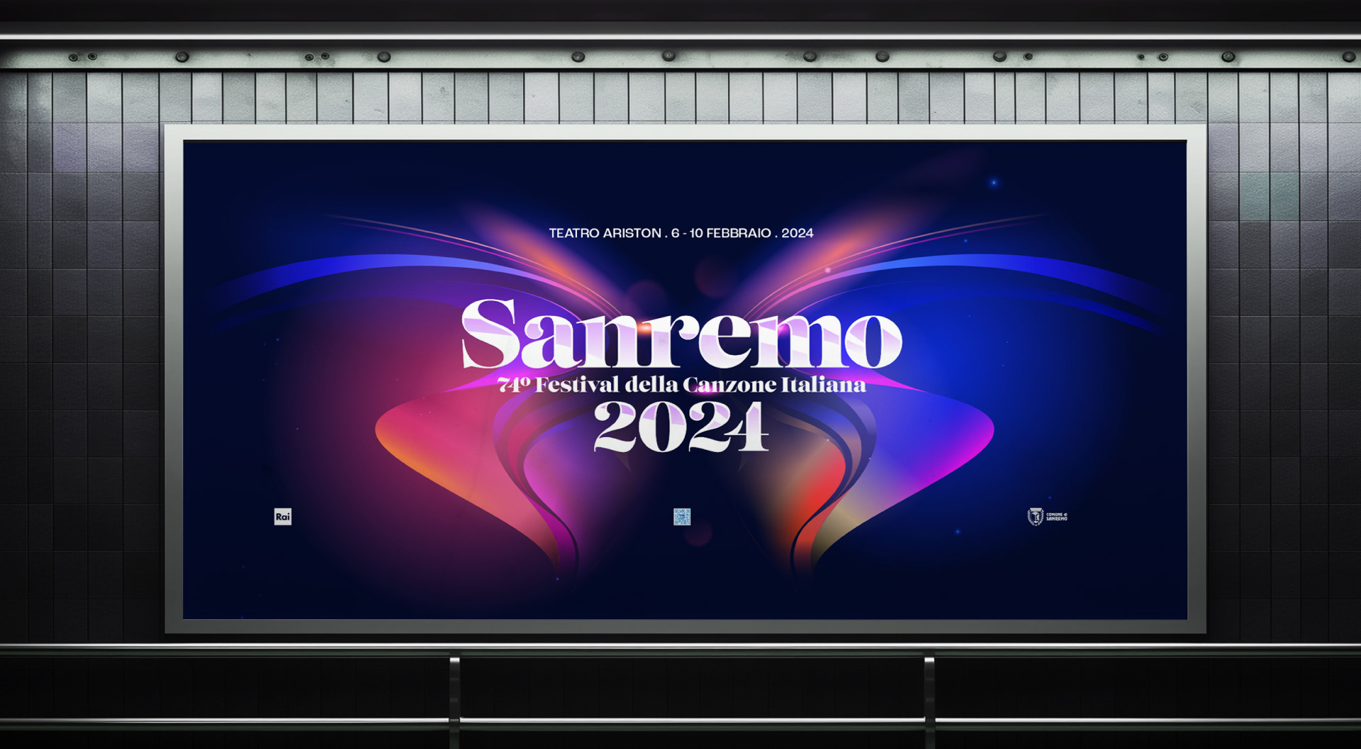
Building on the visual identities of past editions of the gala, this year Rai wanted to add more glitz, splendor and style to the image of Italy’s most transcendent music festival. As the festival’s experts, Flopicco Studio was commissioned to bring the festival’s visual identity to life, which included the design and animation of the logo and key arts that will be adapted by the Rai team and used in all official festival communications.
The Flopicco Studio Approach
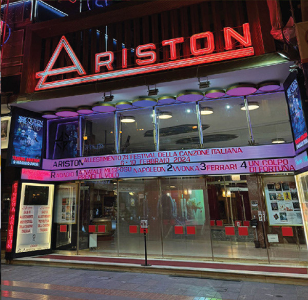
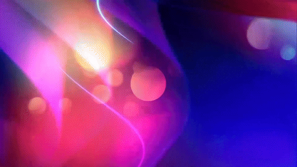
To make the image of Sanremo even more dazzling, this year we were inspired by the characteristic shape of the Ariston Theater’s Stage, the place where the magic happens. To our morphological approach, which also inspired the animation, we added a typeface created by Neil Summerour for the Foundry Positype, a balance of delicacy and indulgence.


El cliente
Radiotelevisione Italiana (Rai), la empresa de radiodifusión nacional de Italia, es también el anfitrión oficial del Festival de Música de Sanremo, a lo largo del municipio de Sanremo. Este festival se ha utilizado a menudo como método para elegir la entrada italiana para el Festival de la Canción de Eurovisión (cuya imagen de 2022 estuvo a cargo de Flopicco Studio). Ha lanzado las carreras de algunos de los actos musicales más exitosos de Italia, incluidos Laura Pausini, Eros Ramazzotti, Andrea Bocelli y Måneskin.
El reto
Basándose en las identidades visuales de ediciones anteriores de la gala, este año la Rai quería añadir más brillo, esplendor y estilo a la imagen del festival de música más trascendente de Italia. Como expertos del festival, Flopicco Studio estuvo a cargo de fue crear la identidad visual del festival, lo que incluyó el diseño y animación del logo y la creación de los key arts que serán adaptados por el equipo de la Rai y utilizados en todas las comunicaciones oficiales del festival.
El enfoque del estudio Flopicco
Para que la imagen de Sanremo fuera aún más deslumbrante, este año nos inspiramos en la forma característica del escenario y la escenografía del Teatro Ariston, el lugar donde sucede la magia. A nuestro enfoque morfológico, que también inspiró la animación, añadimos un tipo de letra creado por Neil Summerour para la Foundry Positype, un equilibrio de delicadeza e indulgencia.


CREDITS
CLIENT
Rai
CREATIVE DIRECTION, ART DIRECTION
AND GRAPHIC PRODUCTION
Flopicco Studio
Inhouse Team
Florencia Picco, Fernando Vallejos, Natalia Bellagio, Alejandro Guatelli,
Pablo Camino, Martín Polech & Ana Laya.
In collaboration with
NEO DG
🖤
[ Photos via Rai, RaiPlay & SanremoRai ]