U N I T E D  S T A T E S  ·  F L O P I C C O  S T U D I O  +  H B O - M A X  L A T A M  /  W A R N E R  M E D I A   ·  2 0 2 2


STICKER SET
DIGITAL KIT


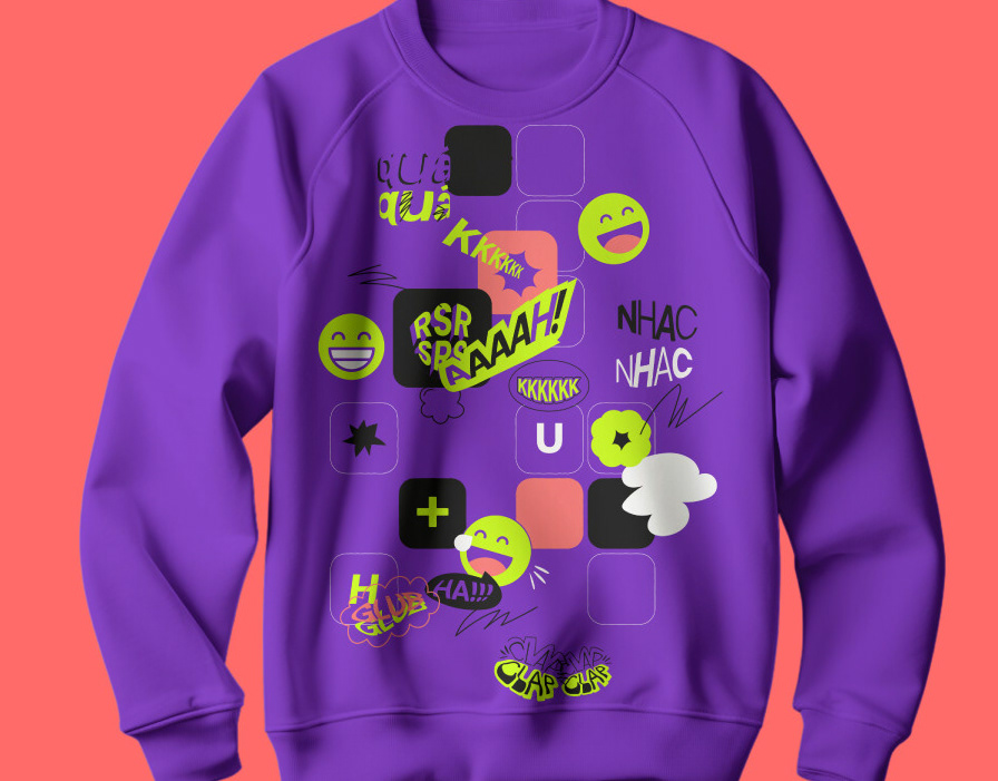
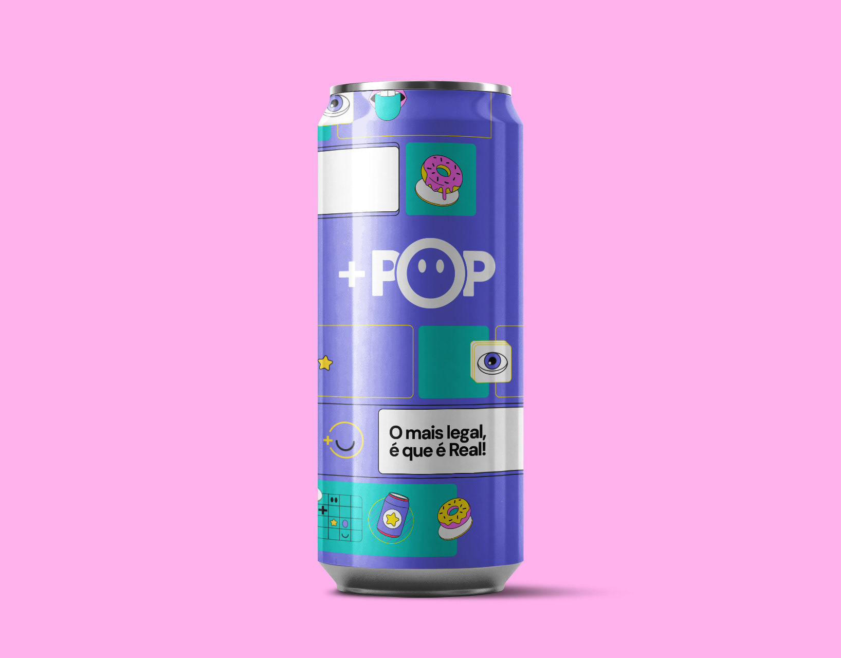
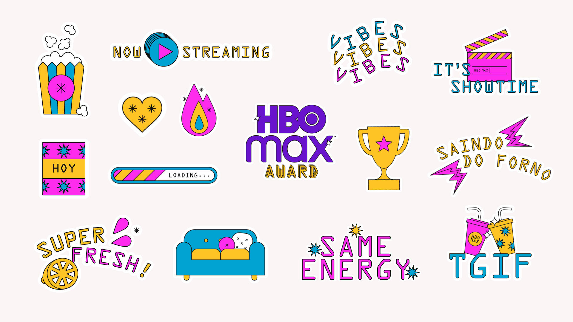
Flopicco Studio was commissioned a fun, distinctive and practical sticker set to enrich the digital communications of HBO-Max Latin America and Brazil that aims to position itself as a relevant technological/streaming platform in the region.

They requested stickers, both graphic and typographical (alerts, thematic, decorative, miscellaneous) in the three main languages used in Latin America: Spanish, Brazilian Portuguese and English.

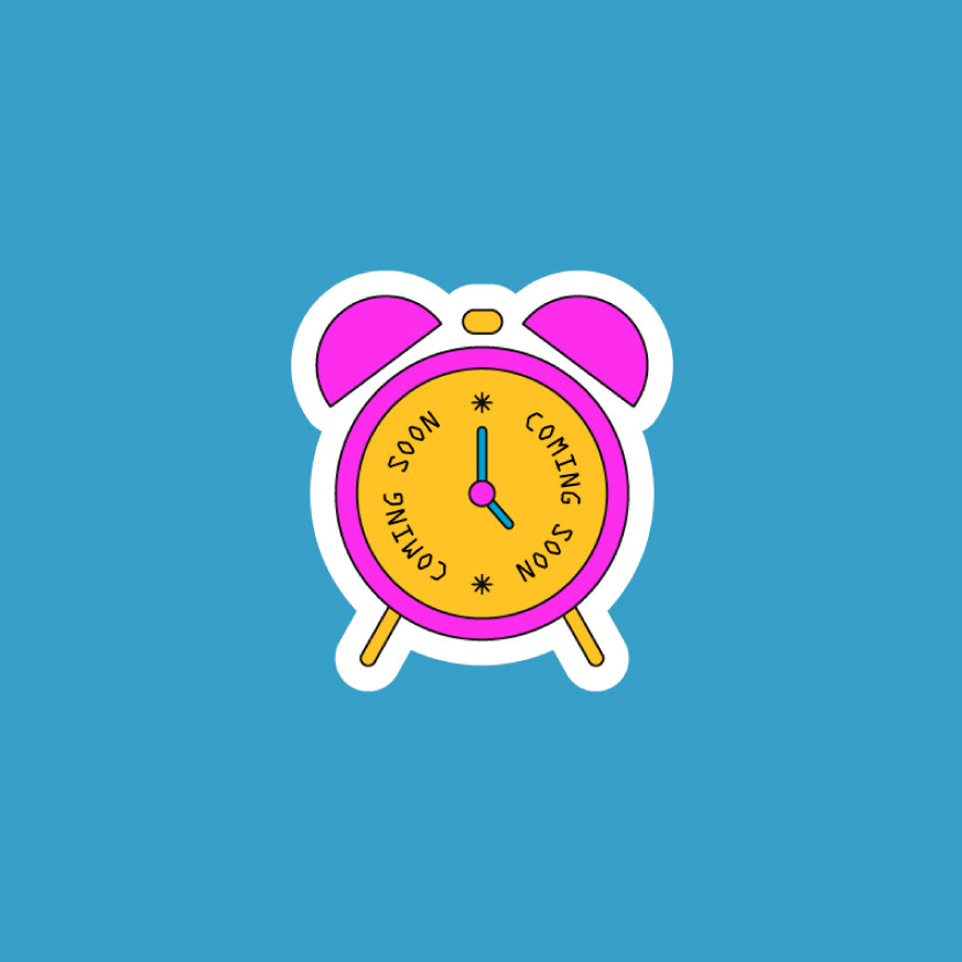
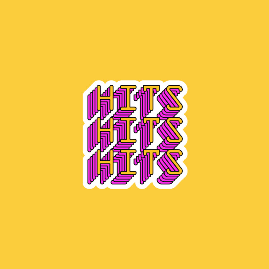
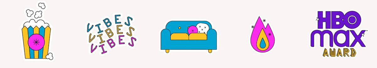
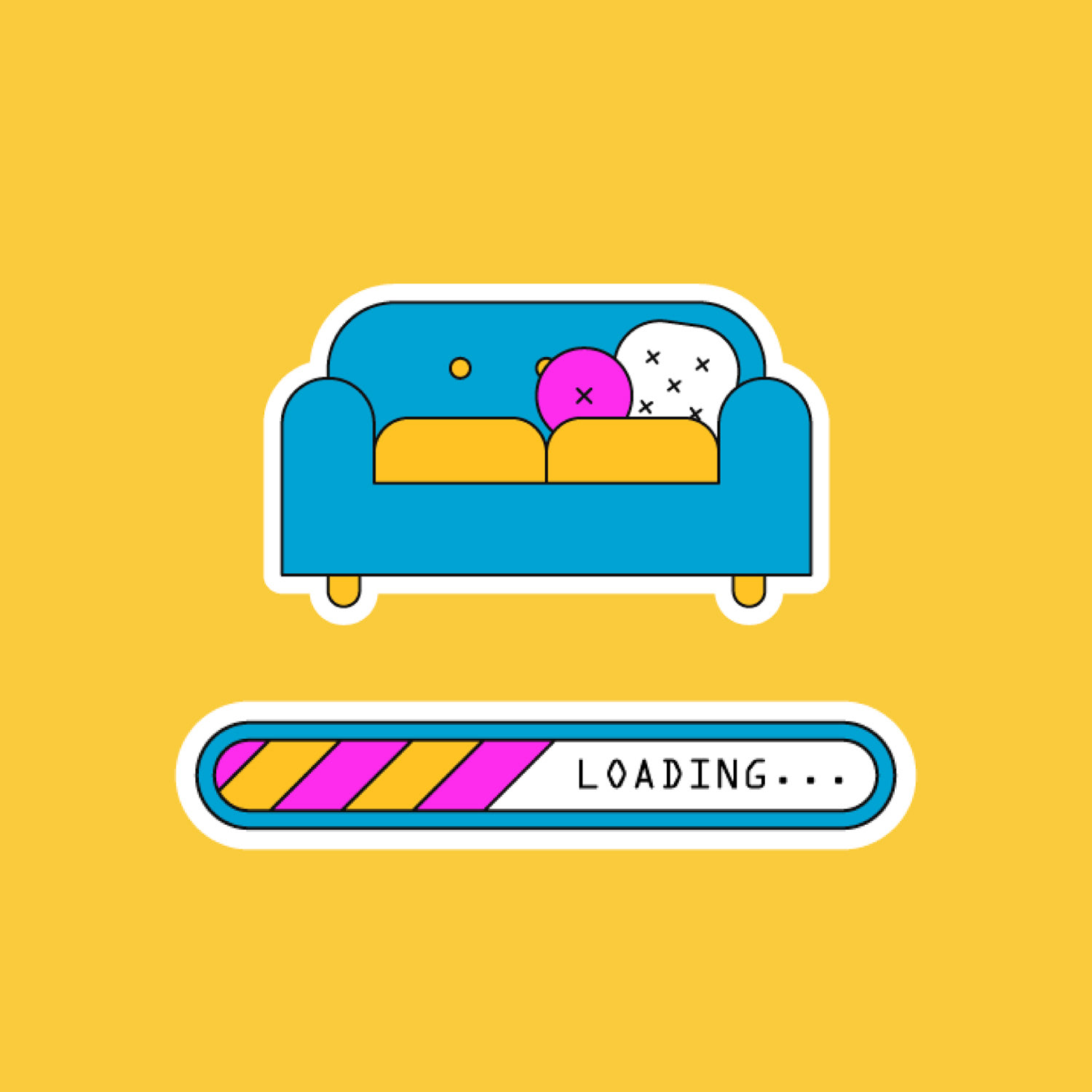
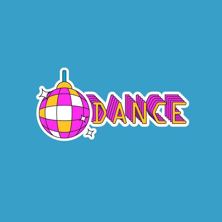
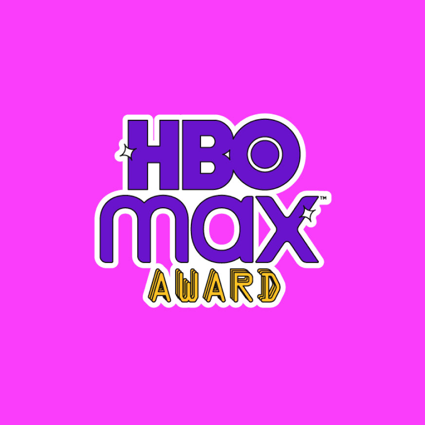
We created the messages, decided on a retro illustration style with geometric shapes and the Ocr A Std Font, with a vibrant and fresh palette of magenta, cyan, yellow, three colors that harmonically coexist and stand out from the HBO-Max institutional violet. Our palette is limited to generate a clear identity. 

All the stickers have a white border, emulating the physical ones and separating them from the image background on which they will be applied in HBO-Max's post, stories and reels. These are some of the 89 stickers that compose the set.


CREDITS

CLIENT
HBO-Max Latam / Warner Media International 


CREATIVE DIRECTION, ART DIRECTION
AND GRAPHIC PRODUCTION
Flopicco Studio

Inhouse Team
Florencia Picco, Fernando Vallejos, Natalia Bellagio, Pablo Camino,
Alejandro Guatelli, Martín Polech, Daniela Parasporo & Ana Laya

With the collaboration of
Esteban Ibarra & Macarena ​​​​​​​Lateülade


🖤
#GoWithTheFlopicco​​​​​​​​​​​​​​

You may also like

CASA PIANO PICCOLO BRANDING
The Piano Piccolo team relied on Flopicco Studio to turn an idea into a multi-purpose brand that reflects above all the value of contemplation as a source of inspiration for creation and the value of things made with care and attention.
Graphic Design, Branding, Packaging
STAR LIFE BRAND SYSTEM
Branding, Motion Graphics, Creative Direction
QUEI CATTIVI RAGAZZI
Visual identity and a basic motion toolkit for DMAX Italia new show Quei Cattivi Ragazzi, by Flopicco Studio.
Graphic Design, Branding, Motion Graphics
MAX: FROM CINEMAS TO MAX
Max is the brand that brings together several entertainment titans: HBO, Warner Bros., Discovery, DC and Wizarding World. Its logo, which has gradually replaced HBO-Max in the different markets where the streaming platform is present, combines the HBO bull's-eye and the Warner Bros. curves in a modern yet timeless design, according to its creators. In the case of Latin America, for the big launch in March 2024, they needed to adapt their popular premiere series "From Cinemax to HBO-Max" to the new design system. That was our challenge.
Branding, Motion Graphics
CINECANAL STAR WARS
Exciting brand domination exercise to celebrate the premiere of The Rise of Skywalker in Cinecanal.
Motion Graphics, Branding, Visual Effects
Eurovision 2022: The Sound of Beauty
"One of the most highly anticipated aspects of any Eurovision Song Contest is the visual identity and how that ties in with the Host City and the show they want to deliver"
Branding, Art Direction, Motion Graphics
HBO Go · A Universe of DC
Art Direction, Branding, Motion Graphics
DFL Supercup
"Every football story is a love story"
Branding, Photography, Graphic Design
Cine34 BRAND SYSTEM
Simple yet baroque, divine and mundane, essentially Italian, that's Cine34. Our studio was in charge of creating from scratch its brand system.
Graphic Design, Motion Graphics, Art Direction
DMAX Incredibile ma vero · ON AIR PACKAGE
Graphic Design, Motion Graphics, Branding
Back to Top