TIM LIVE EVENT
Video Graphics

Clonwerk · Italy · 2019


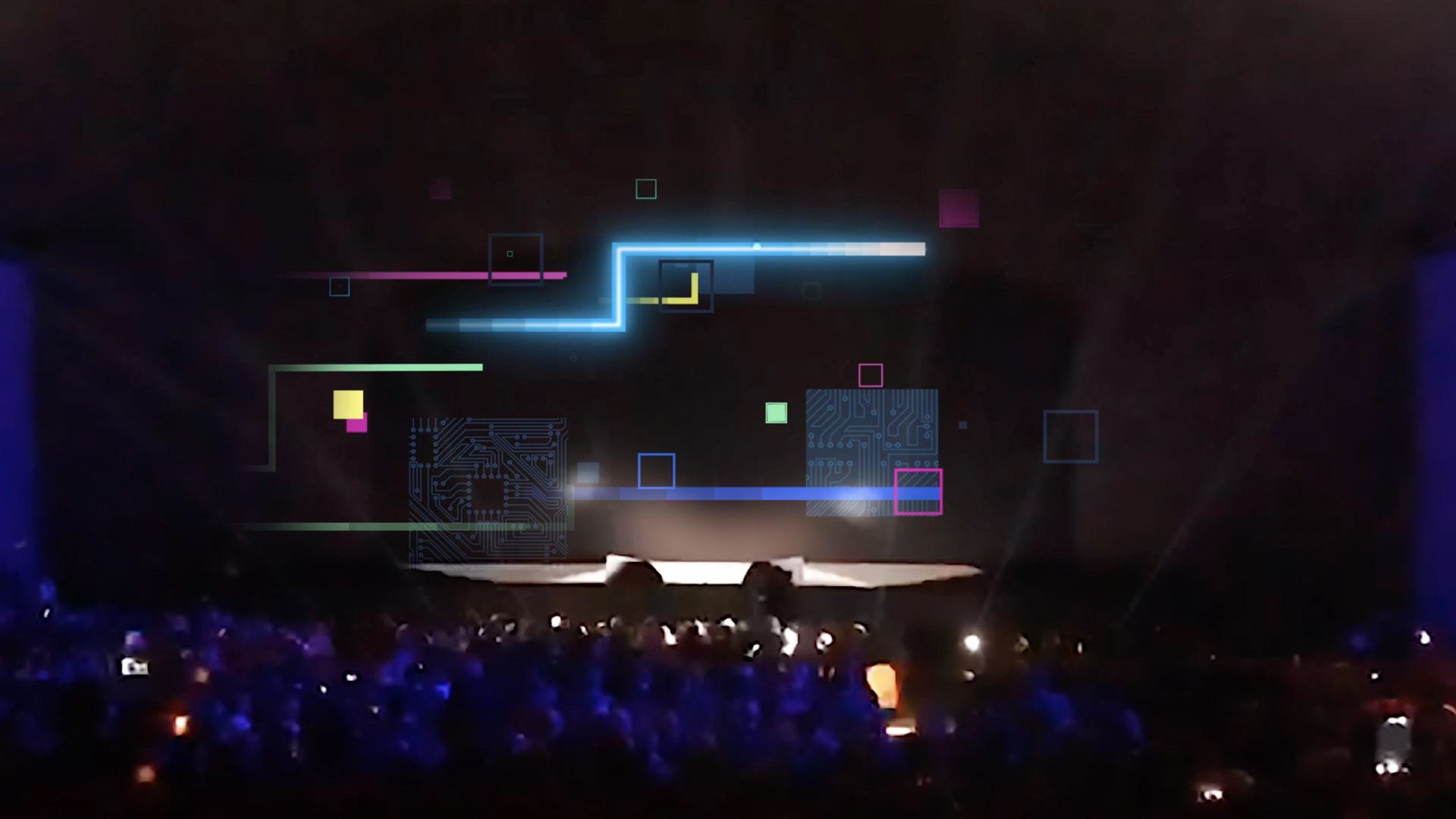
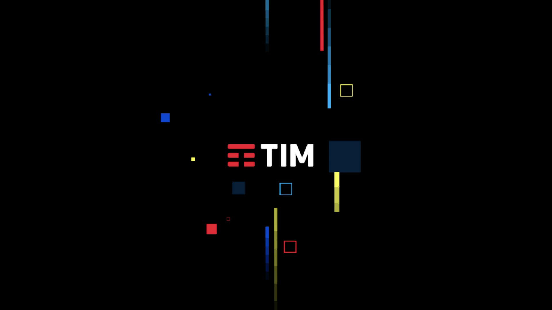
For this project we worked with Clonwerk, one of the leading companies in Italy in audiovisual contents and graphic videos production. This event was produced for a live event organised by TIM, the largest Italian telecommunications services provider in revenues and subscribers.

We really enjoy ideating and creating event motion graphics like this because it allow us to showcase our work in large non-conventional spaces and make it become an experience.


CREDITS

CLIENT
Clonwerk

CREATIVE DIRECTION & ART DIRECTION
Flopicco Studio

GRAPHIC PRODUCTION

Inhouse Team
Florencia Picco, Fernando Vallejos, Natalia Español, Pablo Camino,
Alejandro Guatelli, Martín Polech.


🖤

You may also like

HBO Go · A Universe of DC
Art Direction, Branding, Motion Graphics
National Geographic Latam · Branding Refresh
Branding, Motion Graphics, Graphic Design
RAI Rebranding
Art Direction, Graphic Design, Motion Graphics
Spotify Sanremo 2021-22 Brand Identity
Graphic Design, Advertising, Branding
Football As It's Mean To Be
Bundesliga promises to become the world's most popular football league as they are football as it's meant to be... and in this seasonal trailer we aimed to made it very clear.
Branding, Editing, Advertising
+SBT NOVELAS: BRAND SYSTEM
Inspired by the visual language of classic romance stories, we designed a playful set of icons that symbolize fragments of these stories, emotions, and convoluted plots. We worked with a palette of bold, contrasting colors: pink, blood orange, and dark green. These colors speak of passion and opposites attracting. The result is a brand system that celebrates the enduring love stories that keep audiences tuning in night after night.
Branding, Art Direction
QUEI CATTIVI RAGAZZI
Visual identity and a basic motion toolkit for DMAX Italia new show Quei Cattivi Ragazzi, by Flopicco Studio.
Graphic Design, Branding, Motion Graphics
DMAX I DEMONI DELLO SPORT
For Demoni dello Sport, Flopicco Studio created an identity that blends tabloid aesthetics with noir influences, highlighting the duality of fame and failure. To amplify the emotional weight of the series, a dramatic red was introduced into the black and white palette, creating a visual tension that reflects the complex reality of these fallen icons.
Graphic Design, Motion Graphics
+SBT SERIES BRAND SYSTEM
Branding
DFL 2024 UPFRONT
Graphic Design, Branding
Back to Top