I T A L Y · F L O P I C C O S T U D I O + N A T I O N A L G E O G R A P H I C · 2 0 2 1
Life and diversity in full color
BRAND SYSTEM
The Client
National Geographic is a channel for curious people, restless explorers and nature lovers. It airs non-fiction TV, mainly documentaries with factual content involving nature, science, culture and history all with and characteristic and unmissable entertainment element.
The Challenge
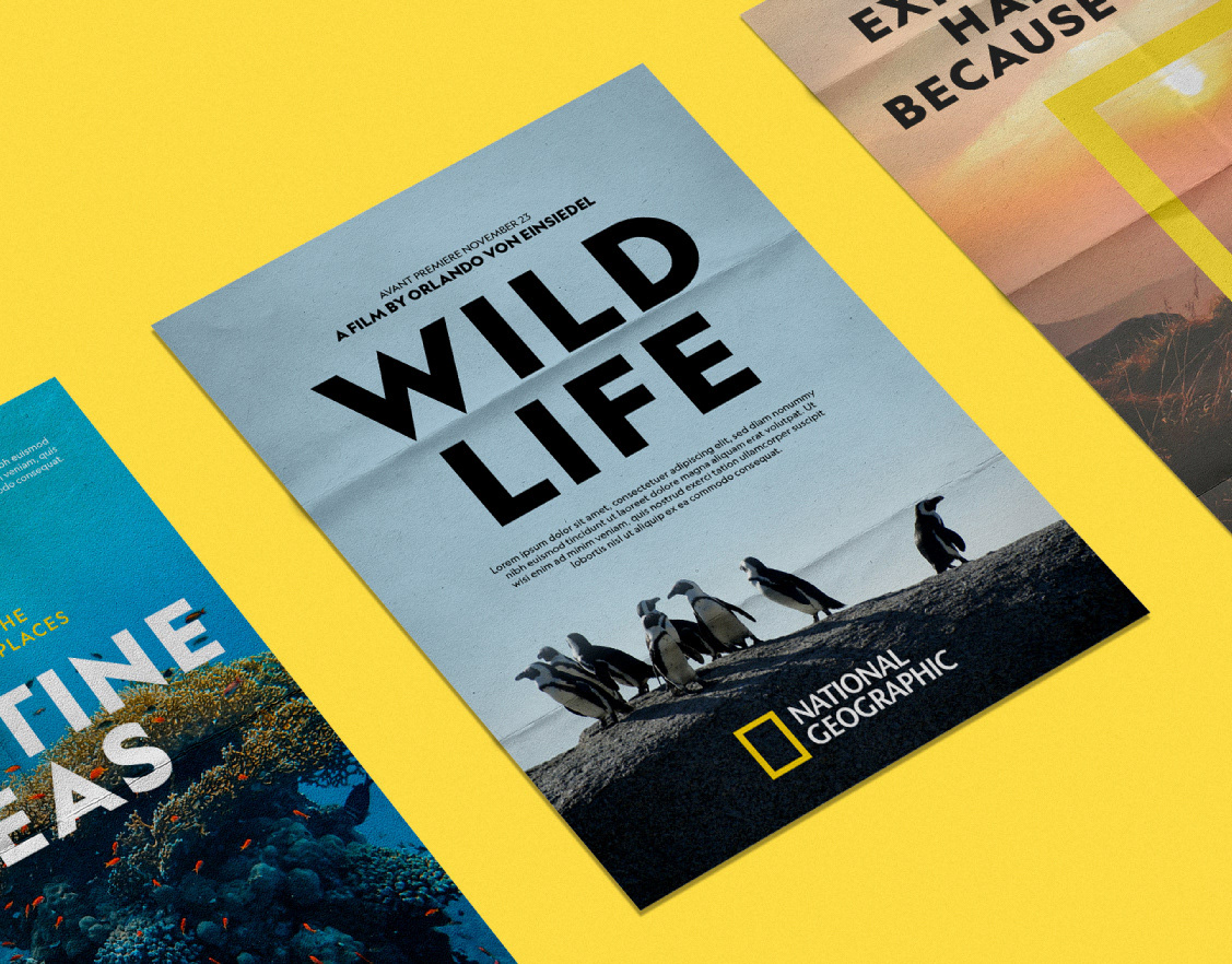
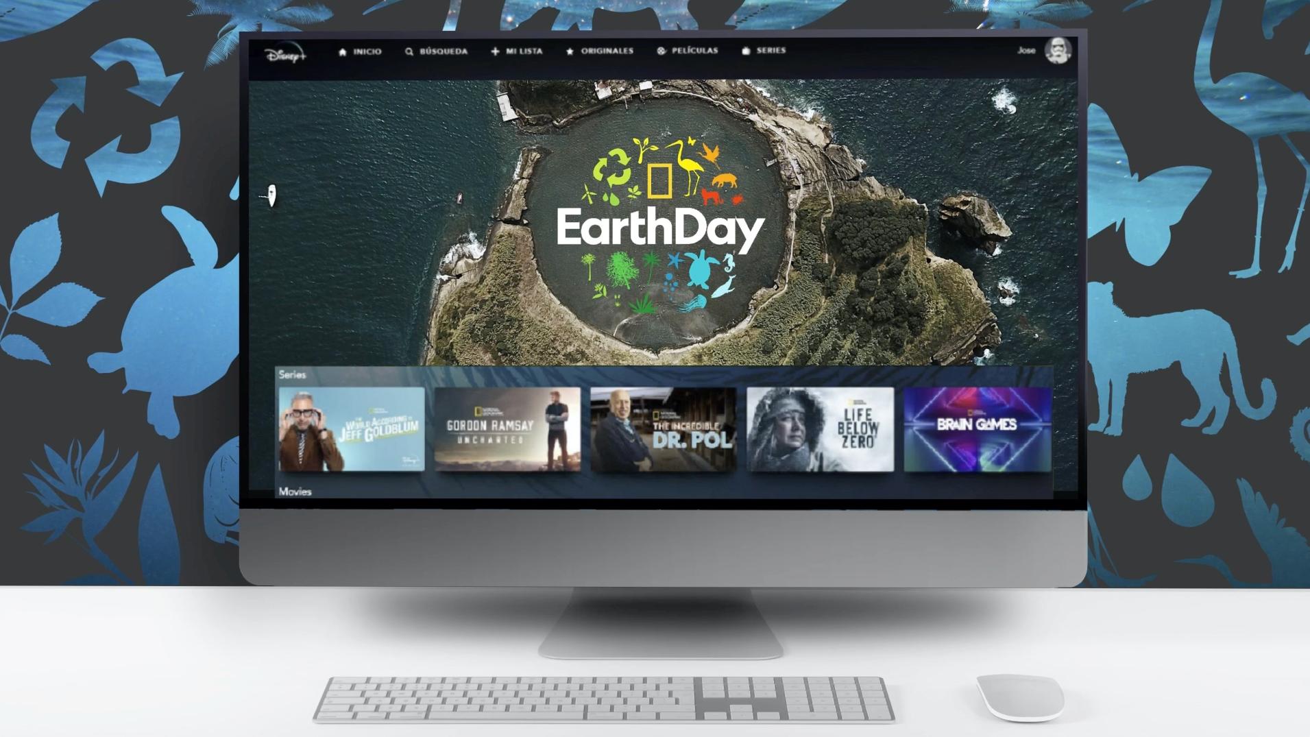
Each year, National Geographic Channel celebrates Earth Day (April 22nd) by programming a series of shows aimed to raise awareness, inspire positive action and especially, celebrating the beautiful diversity of our planet. The tone is uplifting. This time they commissioned us with strategising and creating a flexible system for this event.
The Flopicco Studio Approach
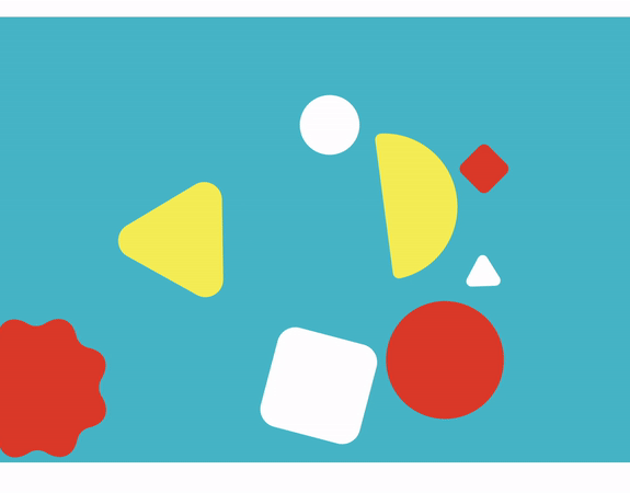
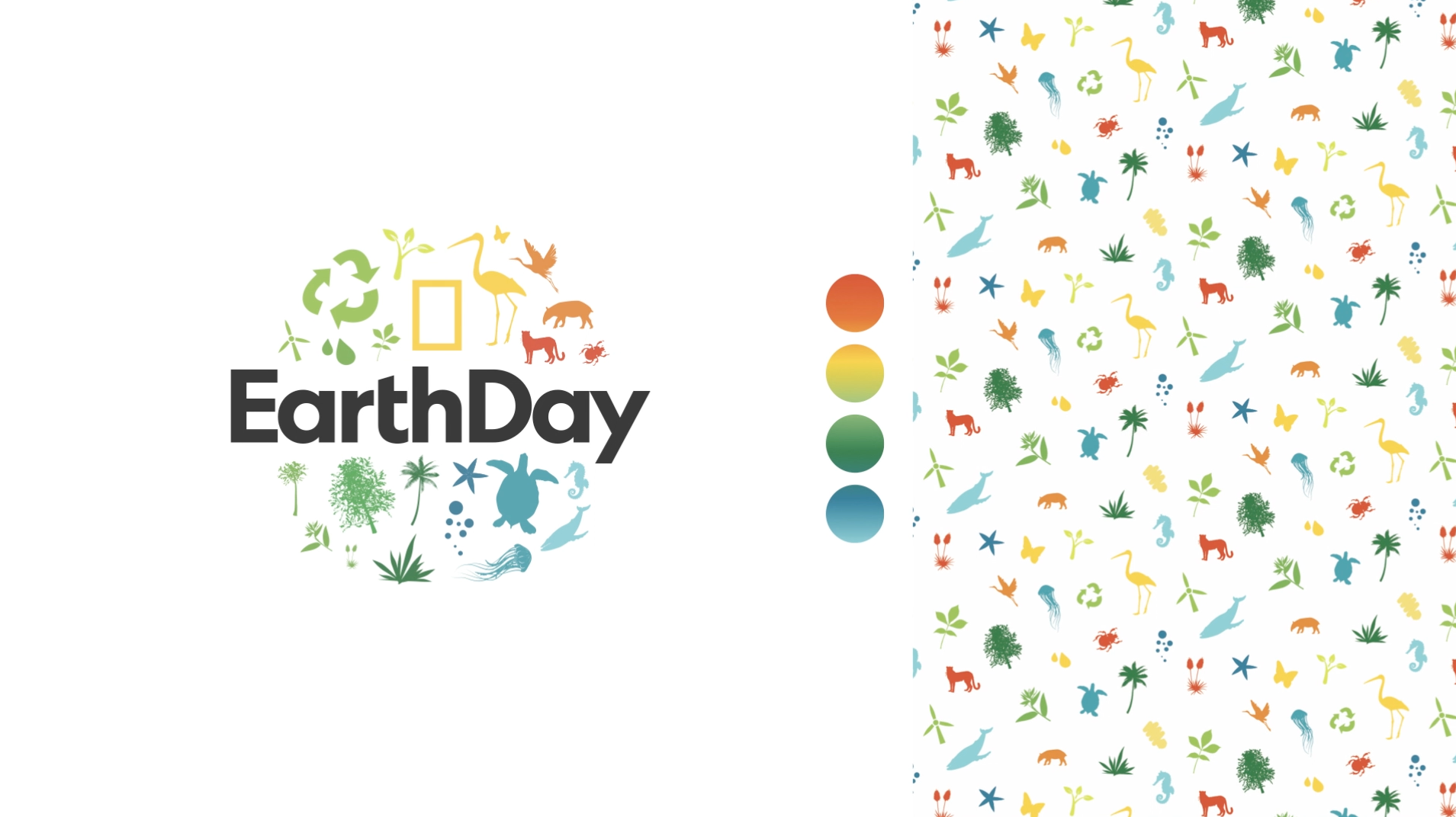
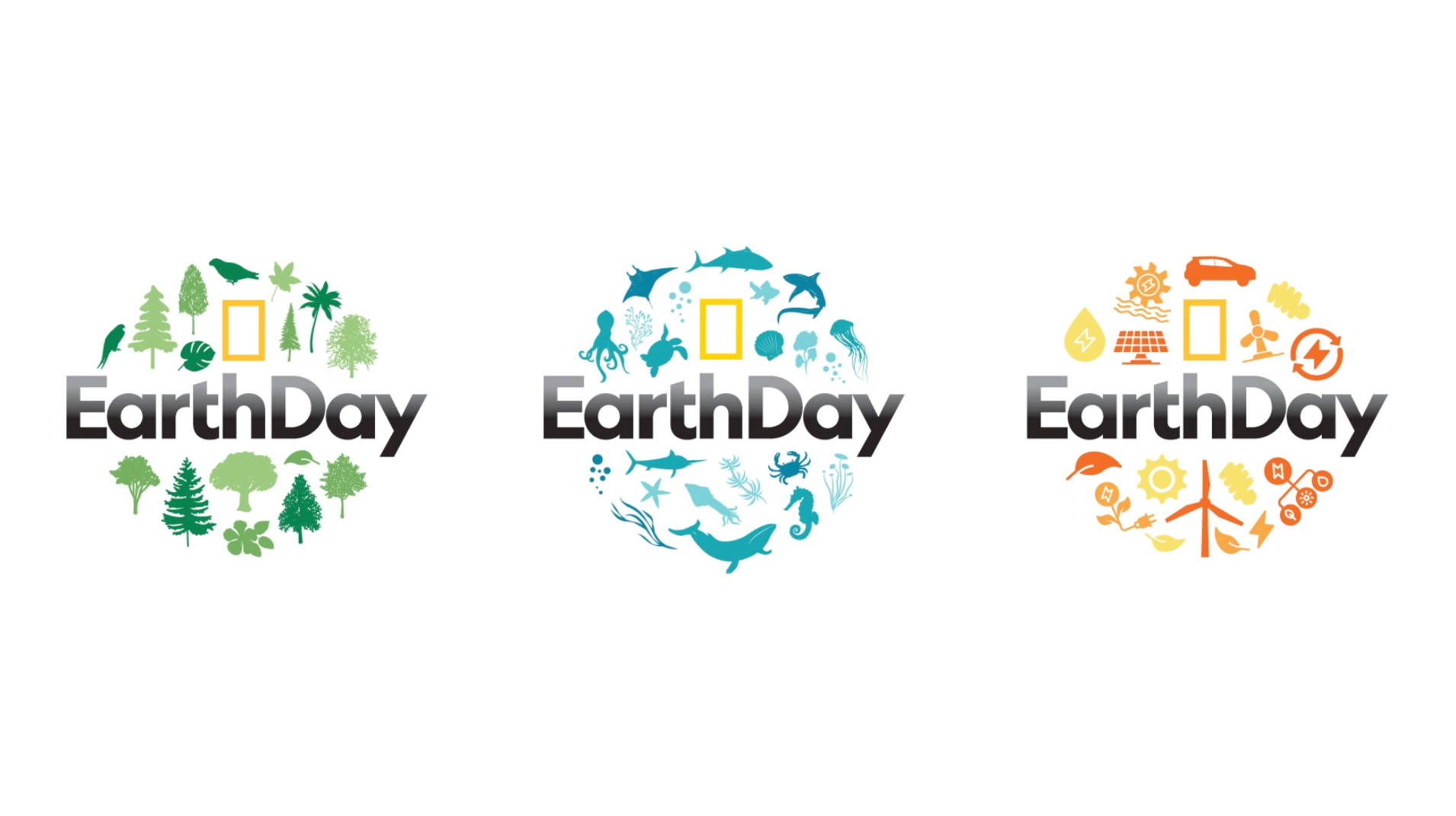
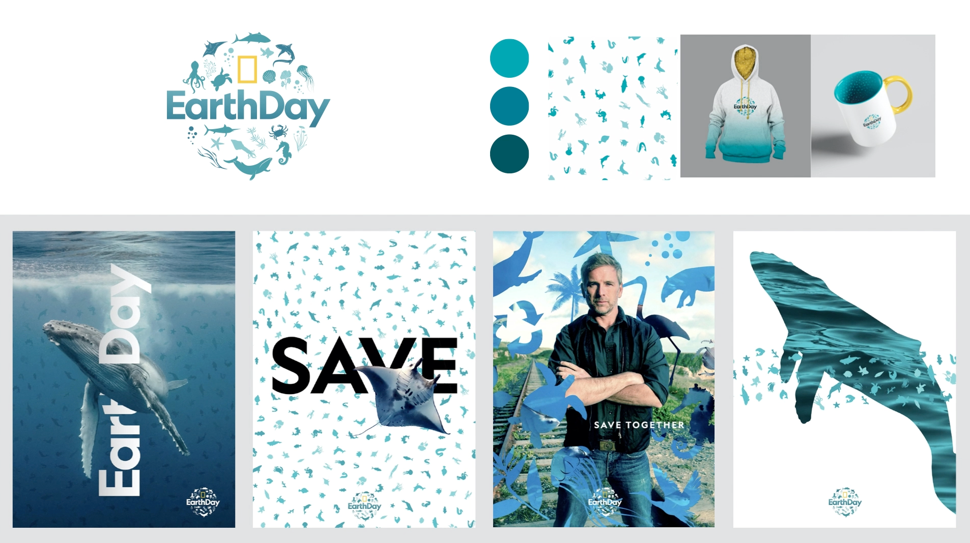
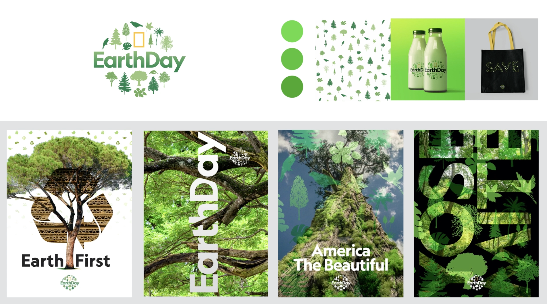
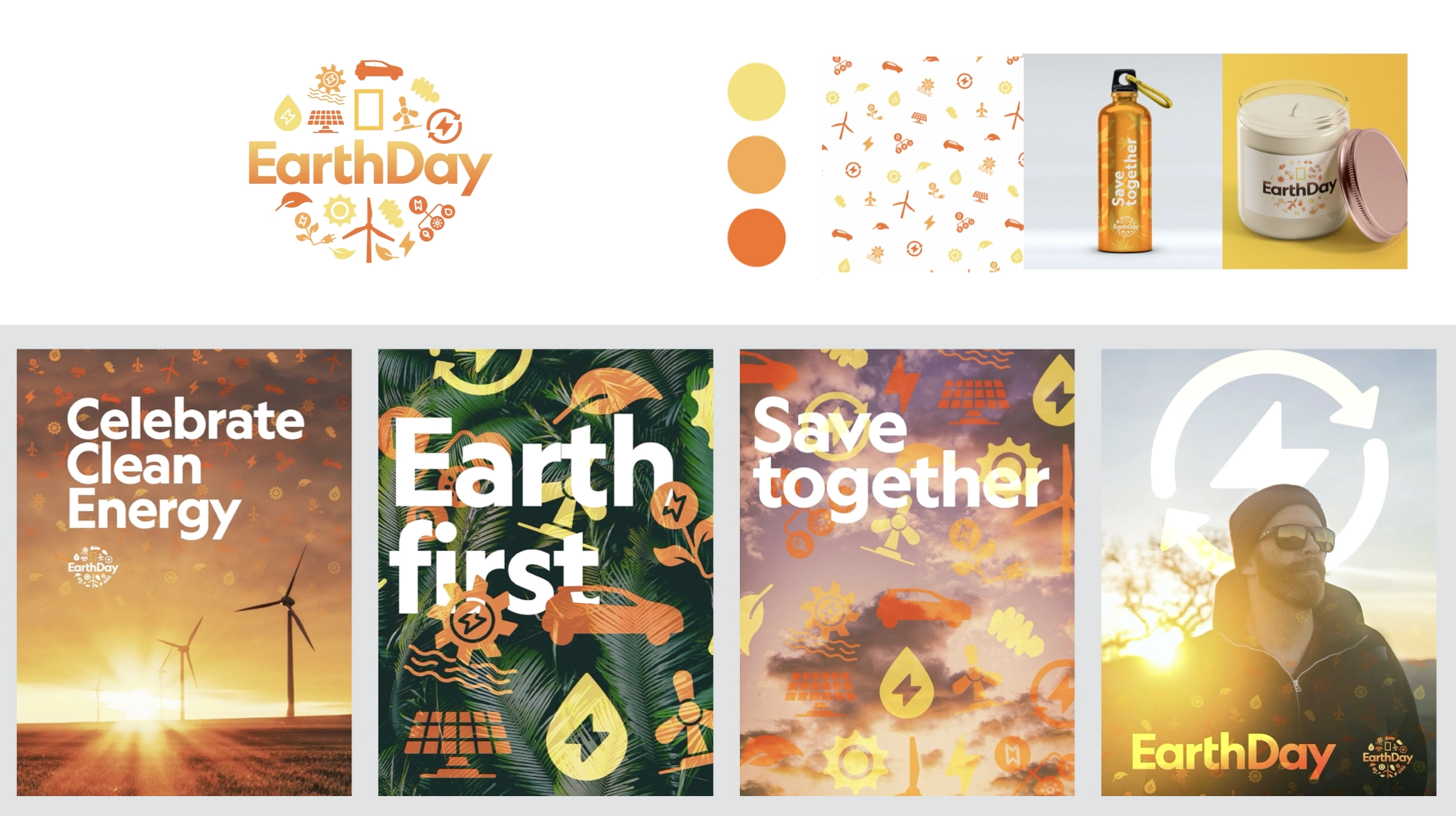
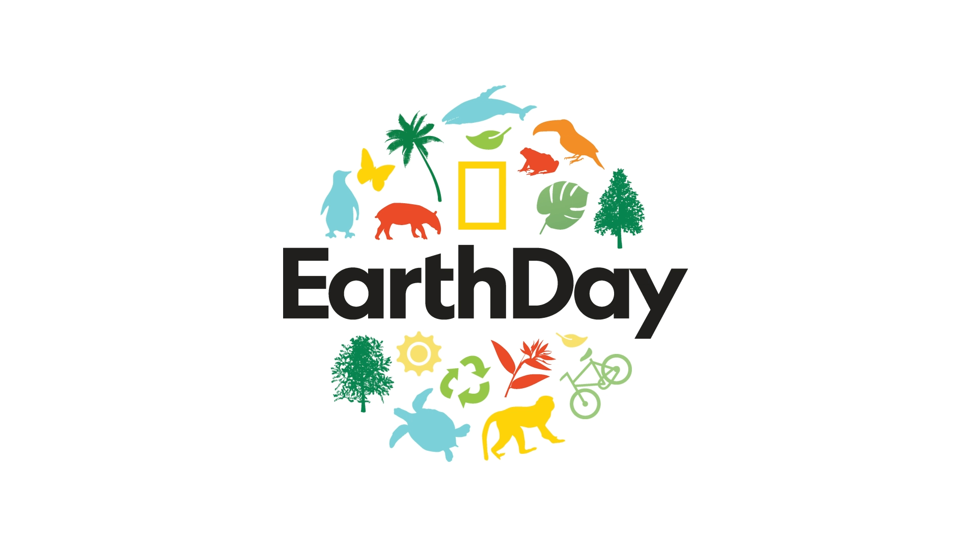
Based on the round world we created for Earth Day 2020, our objective was to create new thematic and colorful round worlds (oceans, flora, animals, the Amazon, energies, recycling), that worked individually and interlinked with each other. For each of them we emphasised different hues of the colourful generic palette. We explored the system's applications in motion, print and consumer products.
El cliente
National Geographic Channel es un canal para curiosos, exploradores inquietos y amantes de la naturaleza. Transmite televisión de no ficción, principalmente documentales con contenido fáctico que involucra la naturaleza, la ciencia, la cultura y la historia, todos con un elemento de entretenimiento característico e imperdible.
National Geographic Channel es un canal para curiosos, exploradores inquietos y amantes de la naturaleza. Transmite televisión de no ficción, principalmente documentales con contenido fáctico que involucra la naturaleza, la ciencia, la cultura y la historia, todos con un elemento de entretenimiento característico e imperdible.
El reto
Cada año, National Geographic Channel celebra el Día de la Tierra (22 de abril) programando una serie de programas destinados a crear conciencia, inspirar acciones positivas y, especialmente, celebrar la hermosa diversidad de nuestro planeta. El tono es edificante. Esta vez nos encargaron la estrategia y la creación de un sistema flexible para este evento.
Cada año, National Geographic Channel celebra el Día de la Tierra (22 de abril) programando una serie de programas destinados a crear conciencia, inspirar acciones positivas y, especialmente, celebrar la hermosa diversidad de nuestro planeta. El tono es edificante. Esta vez nos encargaron la estrategia y la creación de un sistema flexible para este evento.
La estrategia de Flopicco Studio
Basándonos en el mundo que creamos para Earth Day 2020, nuestro objetivo fue crear mundos circulares temáticos (océanos, flora, animales, Amazonas, energías, reciclaje) y coloridos, que funcionen individualmente y se relacionen entre sí. Para cada uno de ellos destacamos diferentes tonalidades de la colorida paleta genérica. Exploramos las aplicaciones de este sistema en motion, print y diferentes objetos.
Basándonos en el mundo que creamos para Earth Day 2020, nuestro objetivo fue crear mundos circulares temáticos (océanos, flora, animales, Amazonas, energías, reciclaje) y coloridos, que funcionen individualmente y se relacionen entre sí. Para cada uno de ellos destacamos diferentes tonalidades de la colorida paleta genérica. Exploramos las aplicaciones de este sistema en motion, print y diferentes objetos.


CREDITS
CLIENT
National Geographic
CREATIVE DIRECTION, ART DIRECTION
AND GRAPHIC PRODUCTION
Flopicco Studio
Inhouse Team
Florencia Picco, Fernando Vallejos, Natalia Bellagio,
Alejandro Guatelli, Pablo Camino, Martín Polech, Natalia Español,
Pia Rossi & Matías Pastorini.
🖤
#GoWithTheFlopicco