EUROVISION 2022 GLOBAL BRAND SYSTEM

RAI + EBU · ITALY · 2022


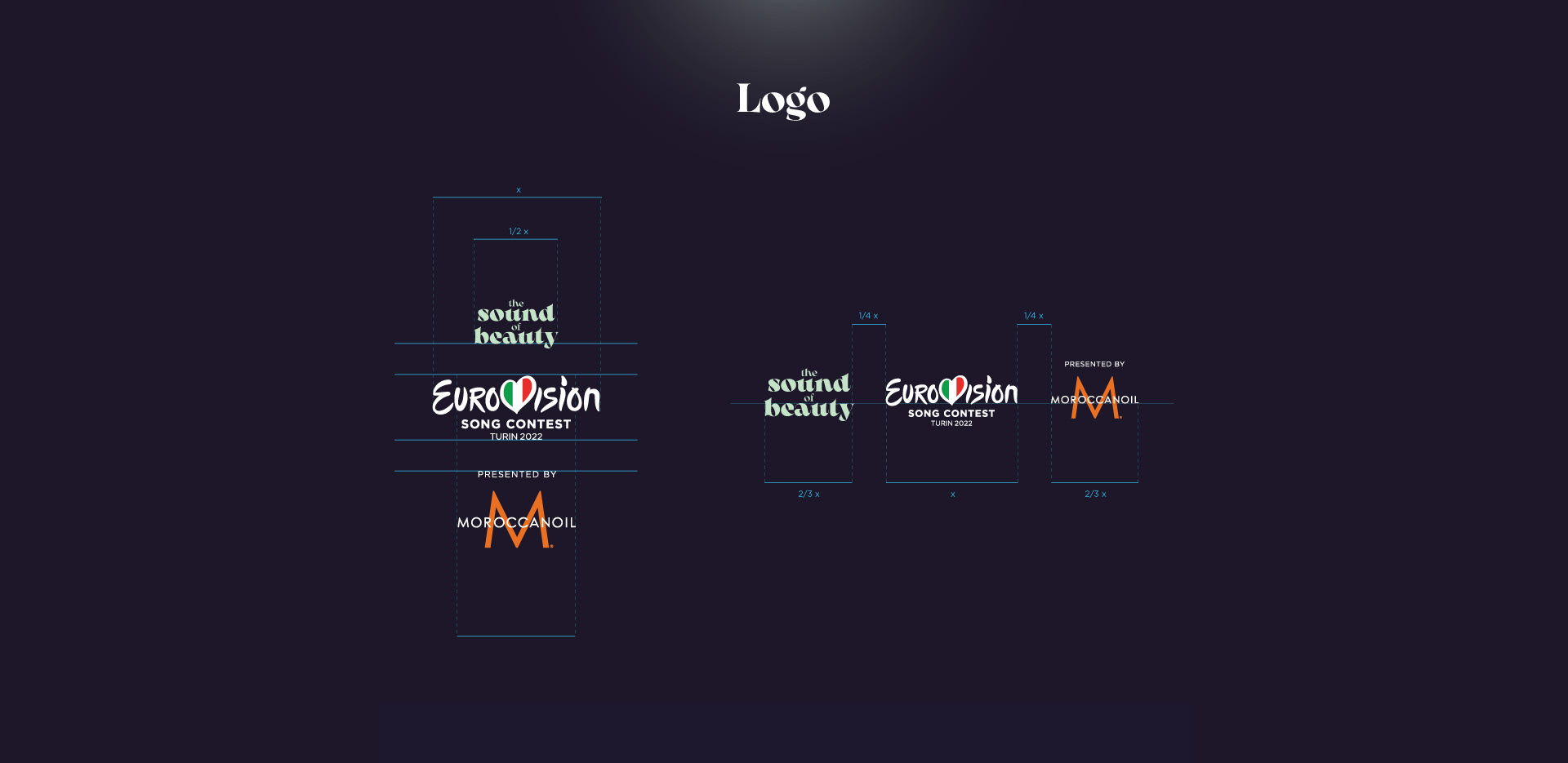
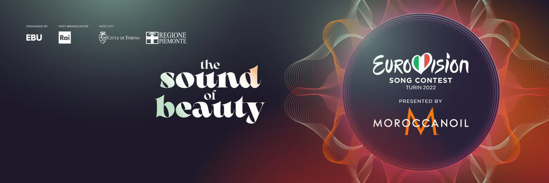
This year's Eurovision Contest's slogan is The Sound of Beauty. Our studio was in charge of bringing this concept to life. 

"One of the most highly anticipated aspects of any Eurovision Song Contest is the visual identity and how that ties in with the Host City and the show they want to deliver", Eurovision's official website explains.


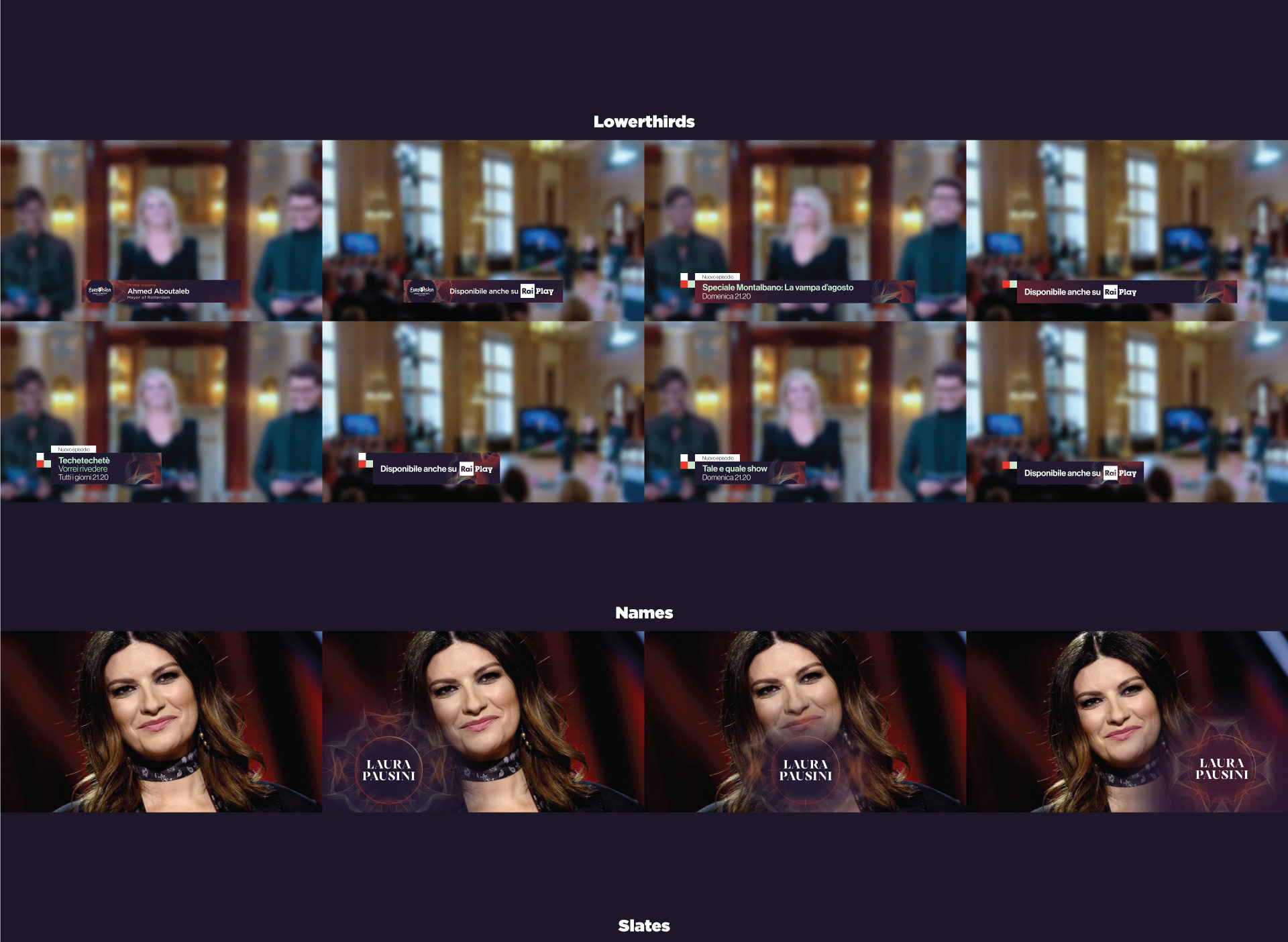
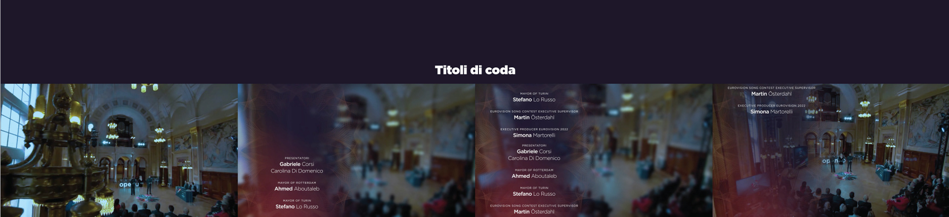
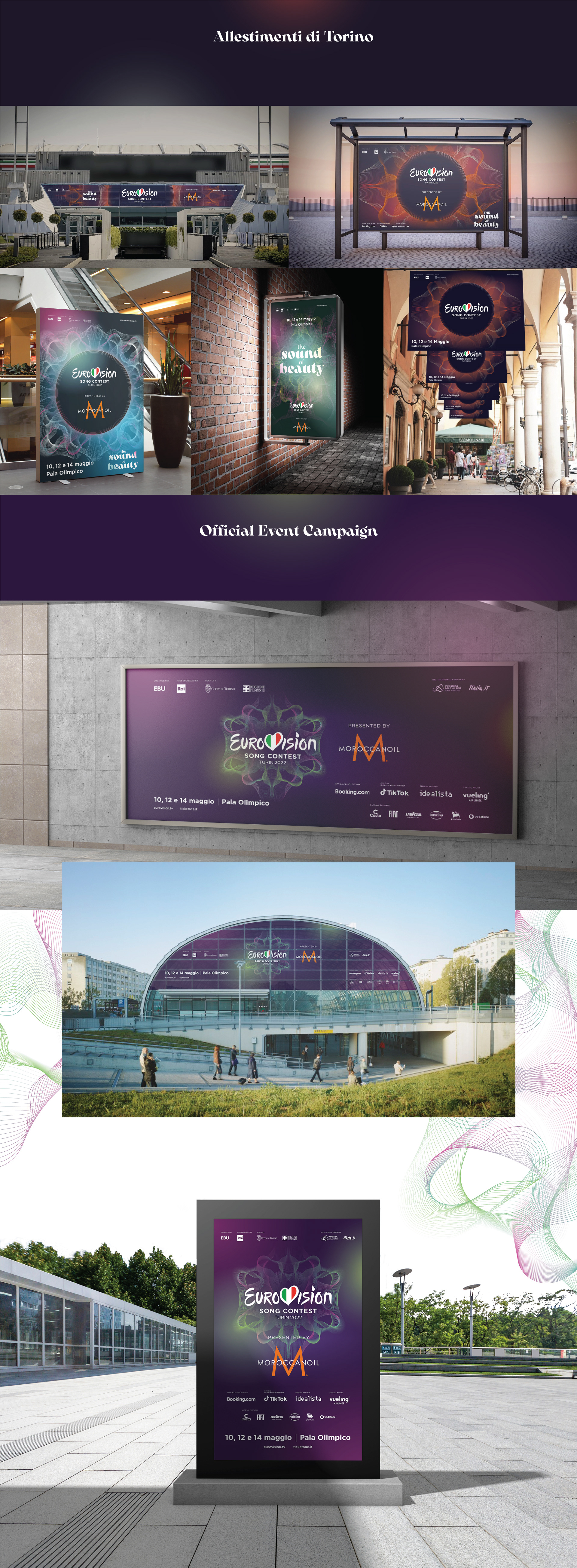
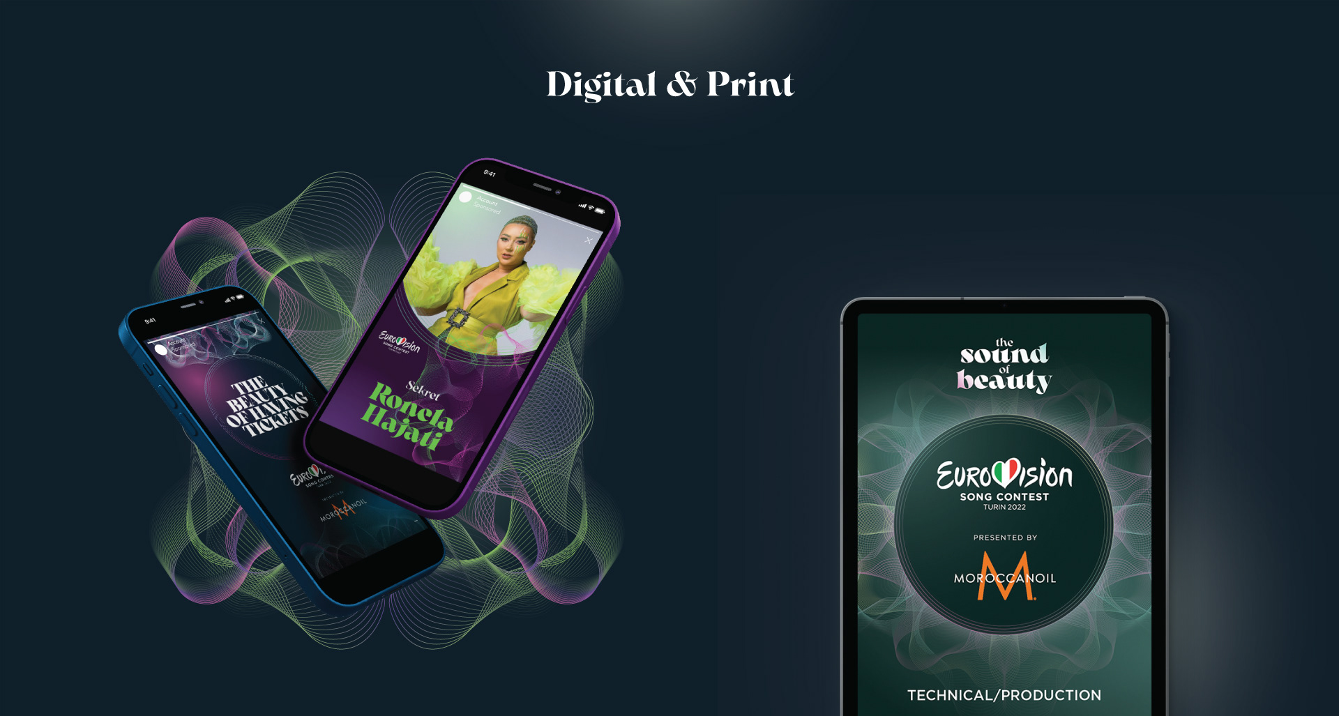
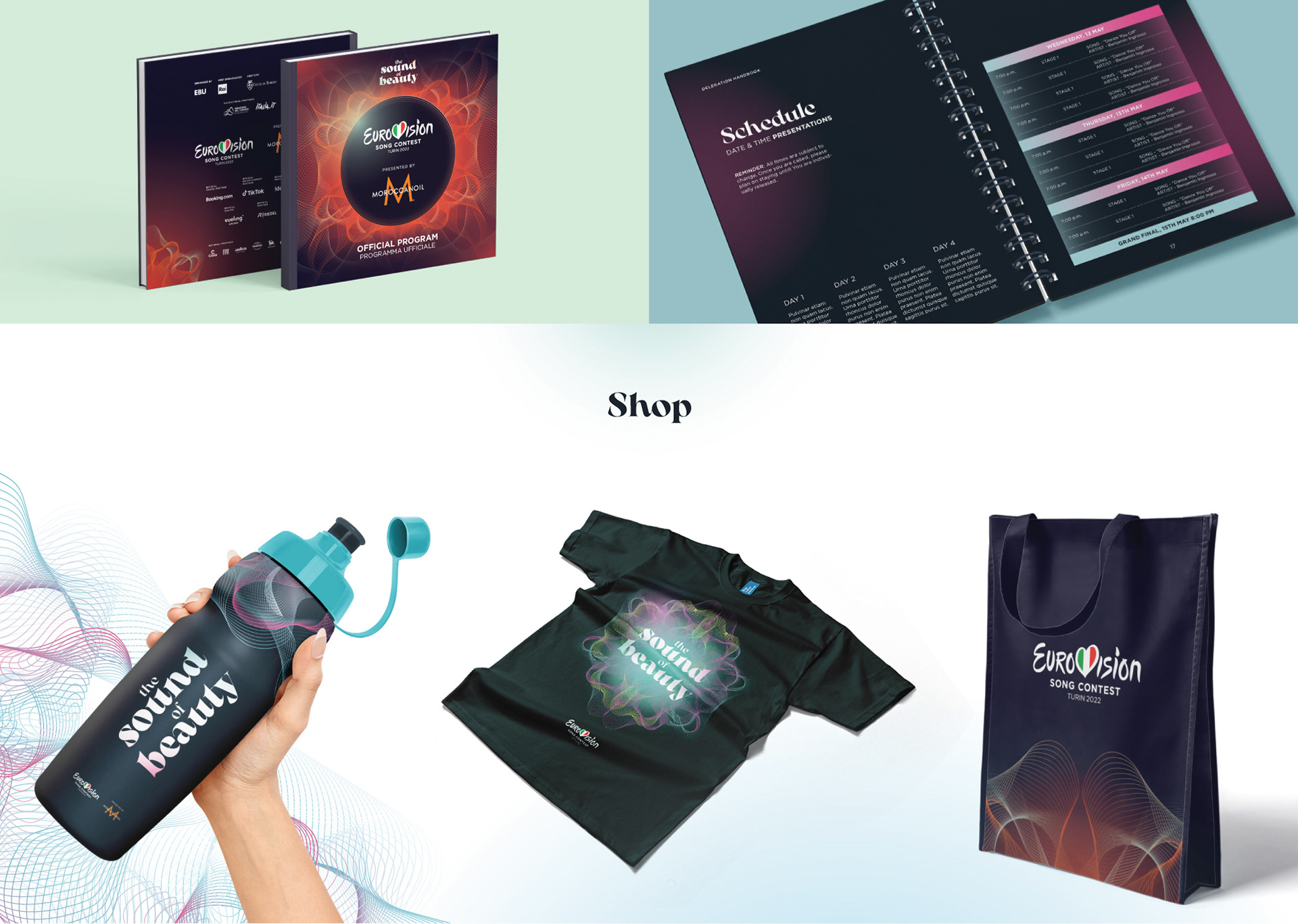
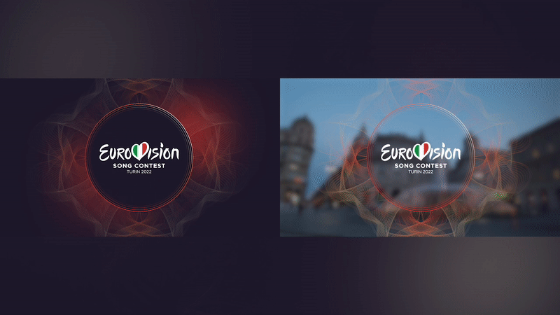
We created all the motion graphics, on-air, off-air, digital and social media pieces that you probably already have seen on your television set, your mobile... or it you're lucky, walking down the streets of Torino.​​​​​​​


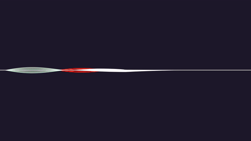
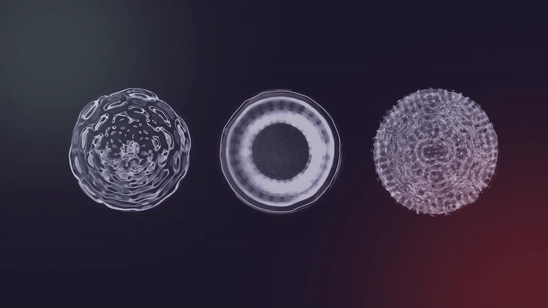
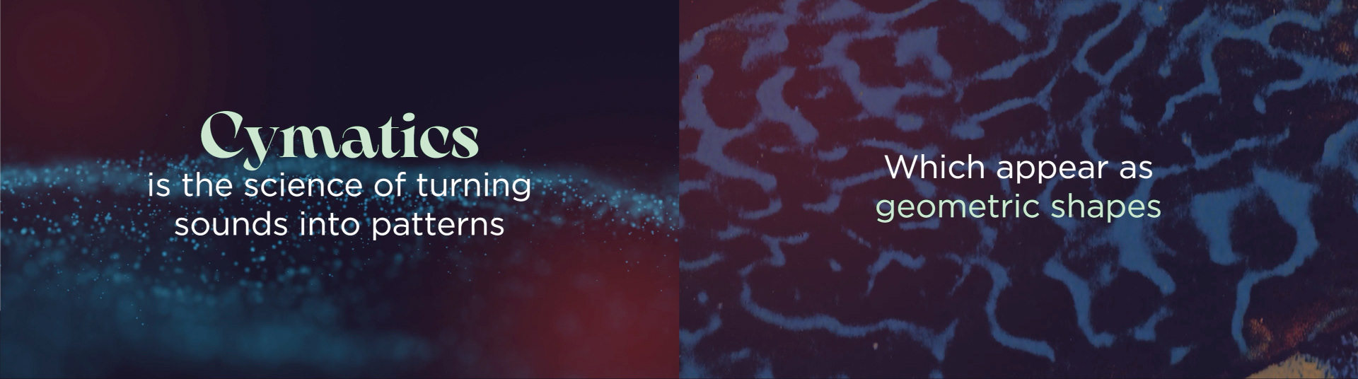
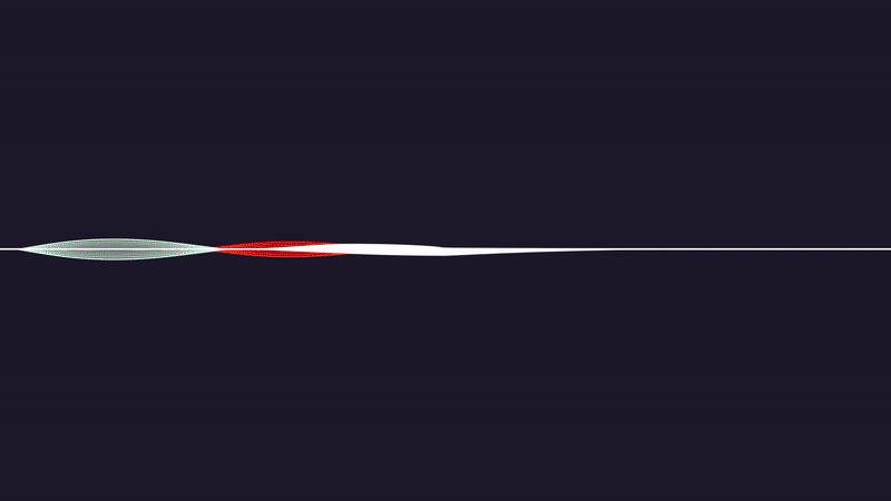
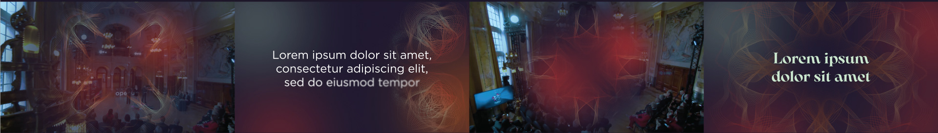
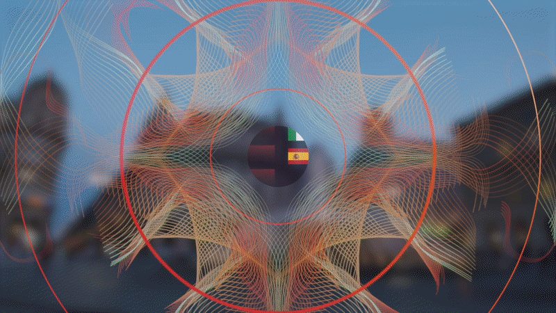
Our main inspiration to create the Sound of Beauty brand system were cymatics, that are the geometric shapes that visually represent sound.
​​​​​​​


The term was coined in the 1960s by Hans Jenny, a Swiss scientist and philosopher, derived from the ancient Greek word κῦμα (kyma), which means wave.

His experiments showed that if fine powders were placed on a sheet of metal and acoustic wave vibrations were applied to them, these particles were organised into specific patterns.


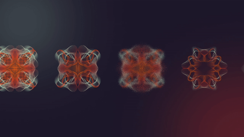
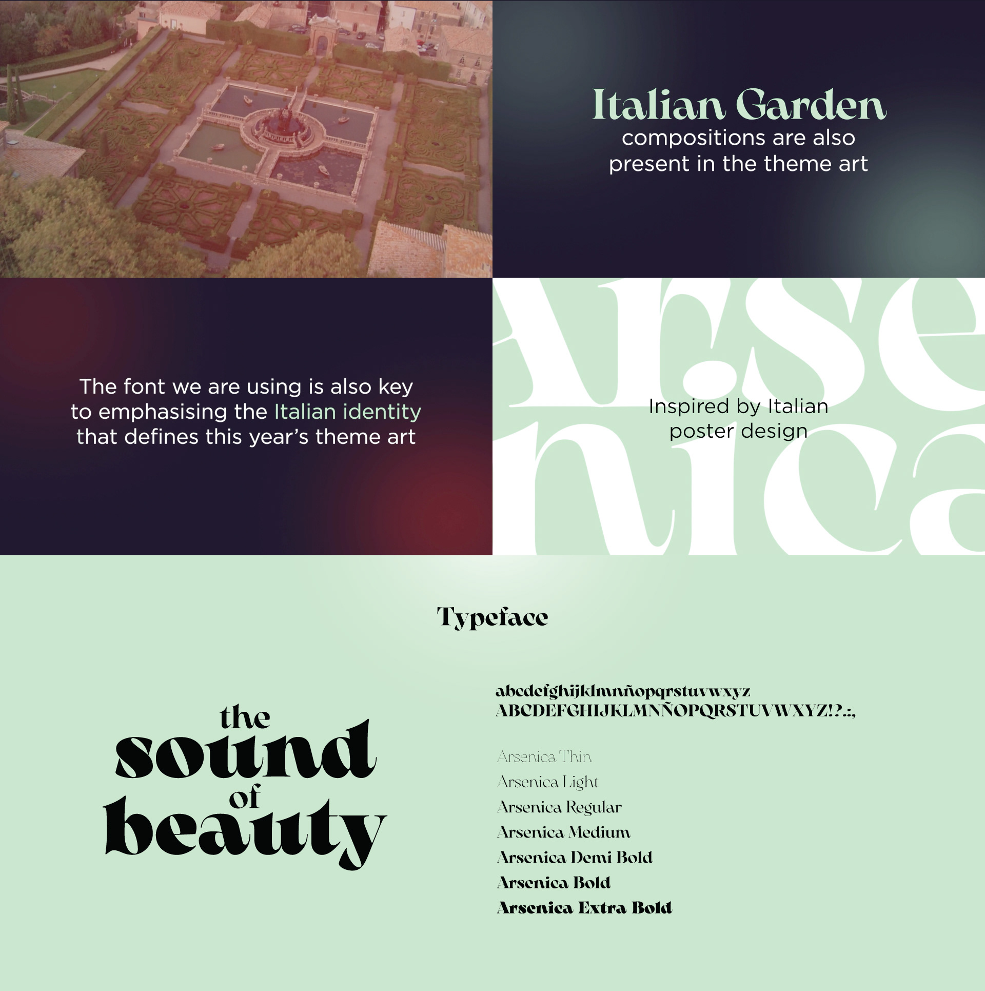
The very symmetrical Giardini all'Italiana, the Sun, always shinning over us, the Italian flag color palette (faded, of course), and the iconic Italian posters from the golden design era at the beginning of the 20th century were added to the mix to create a entirely new brand system, a delicate balance of complexity and simplicity, art and science, just like Eurovision, a brand identity so quintessentially Italian that it almost feels that it was the only one possible.


CREDITS

CLIENT
RAI Italia

CREATIVE DIRECTION, ART DIRECTION
AND GRAPHIC PRODUCTION
Flopicco Studio

Inhouse Team
Florencia Picco, Fernando Vallejos, Natalia Bellagio, Pablo Camino,
Alejandro Guatelli, Martín Polech & Ana Laya

In collaboration with

Emiliano Agnetti


TYPOGRAPHY DESIGN
Francesco Canovaro for Zetafonts
Developed by a design team including Mario De Libero, 
Andrea Tartarelli and Cosimo Lorenzo Pancini


🖤


You may also like

BORDER CONTROL ITALIA TOOLKIT
Illustration, Motion Graphics, Graphic Design
+SBT POP BRAND SYSTEM
+SBT POP is channel that is an ode to a "pop lifestyle", a casual approach to the simple pleasures we enjoy in our everyday lives: Eating, listening music and having fun watching our favourite shows with our besties.
Graphic Design, Illustration, Branding
National Geographic Latam · Branding Refresh
Branding, Motion Graphics, Graphic Design
DMAX Incredibile ma vero · ON AIR PACKAGE
Graphic Design, Motion Graphics, Branding
MILLION DOLLAR WHOOPER CONTEST PERKS
Earlier this year, Burger King began searching for a new and delicious recipe for its most popular product, the Whooper. The quest was called the Million Dollar Whooper, and contestants were asked to create their ideal Whooper using edible ingredients .... of all kinds! Flopicco Studio was responsible for the perks that were created to help launch this amazing nationwide campaign on the beaches of California.
Graphic Design, Branding, Product Design
DISNEY CHANNEL EMEA BACK TO SCHOOL
A revamp of the iconic identity elements of the Disney Channel image, with a school theme and a new palette of neon pastels.
Graphic Design, Motion Graphics, Logo Design
Versalis Brand System
Brand system for Eni's Biochemical brand Versalis.
Graphic Design, Branding, Logo Design
Il Boss del Paranormal 2024
Branding refresh for the new season of the DMAX show Il Boss del Paranormal.
Motion Graphics
BURGER KING FIERY PERKS
Flopicco Studio was tasked with creating custom perks that would not only entice Burger King fans, but also embody the fiery spirit of the new menu itself.
Graphic Design, Product Design, Advertising
DMAX OPERAZIONE N.A.S.
DMAX Italia's commissioned Flopicco Studio a visual identity and a basic motion toolkit for their new show Operazione N.A.S., an Italian TV program produced by Hangar for Discovery Italia, dedicated to the operations of the Carabinieri Corps' Anti-Sanitation and Health Unit.
Graphic Design, Branding, Art Direction
Back to Top