I T A L Y · F L O P I C C O S T U D I O + R A I · 2 0 2 2
Rai Channels
CORPORATE COMMUNICATIONS SYSTEM
The Client
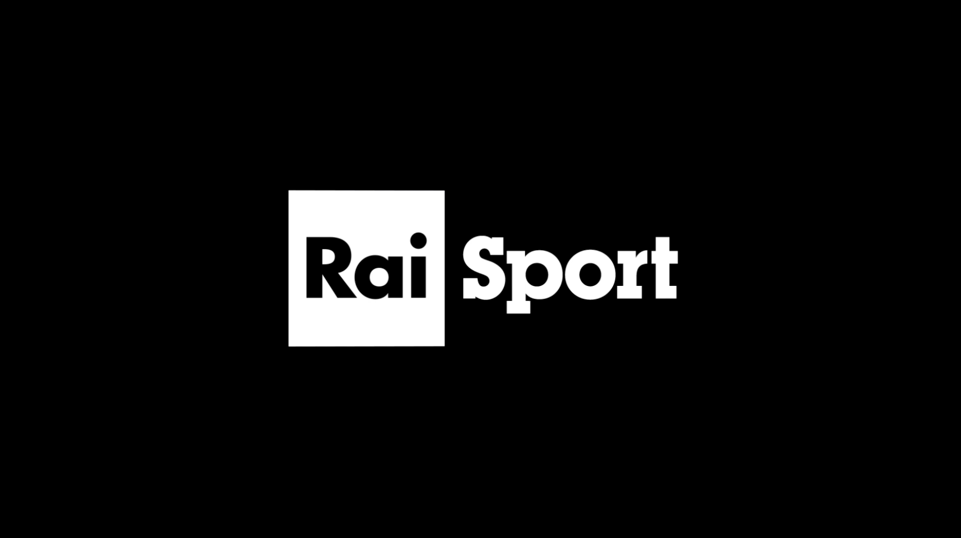
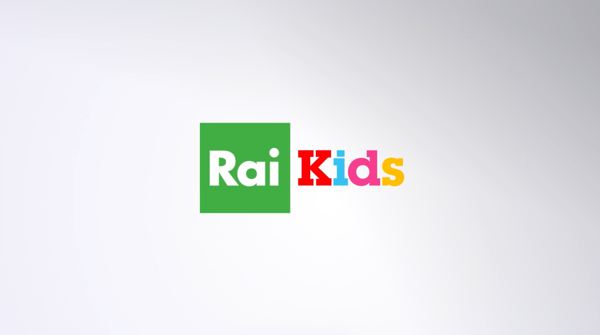
Radiotelevisione Italiana, the national broadcasting company of Italy, it operates many terrestrial and subscription television channels and radio stations (Rai 1, 2, 3, 4, Rai Culture, Rai Fiction, Rai Sport, Rai Kids, to name some). It is one of the biggest broadcasters in Italy.
The Challenge
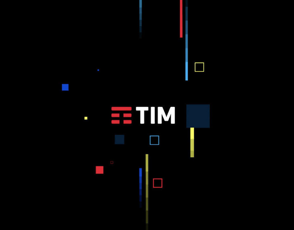
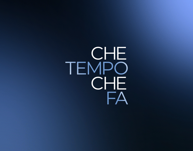
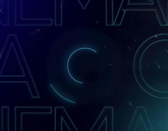
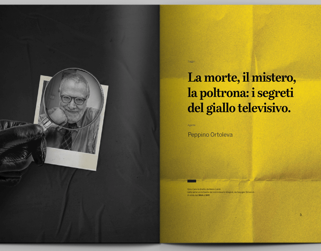
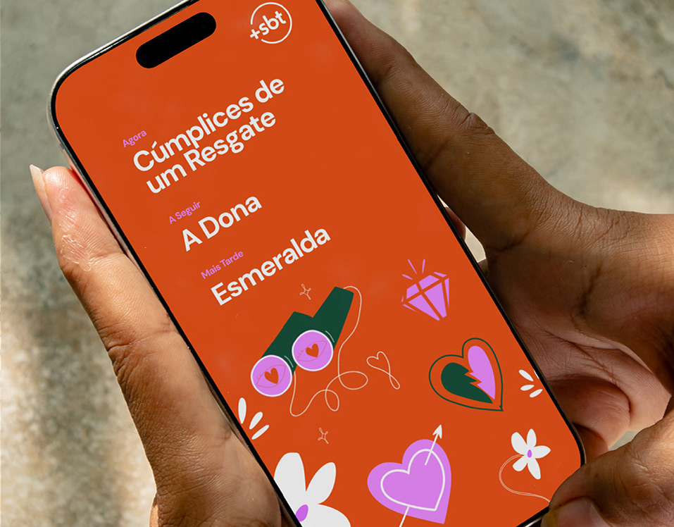
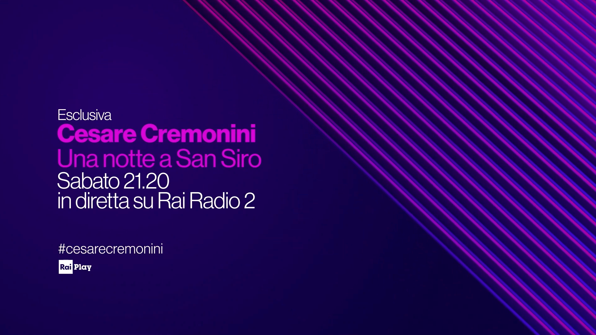
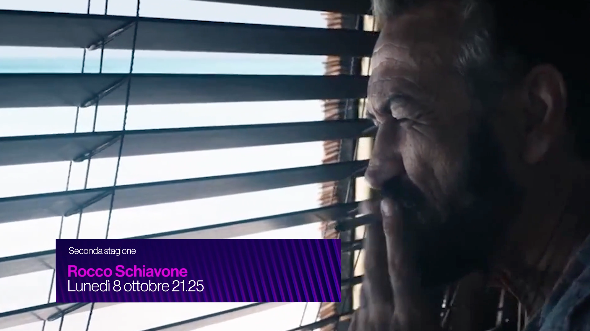
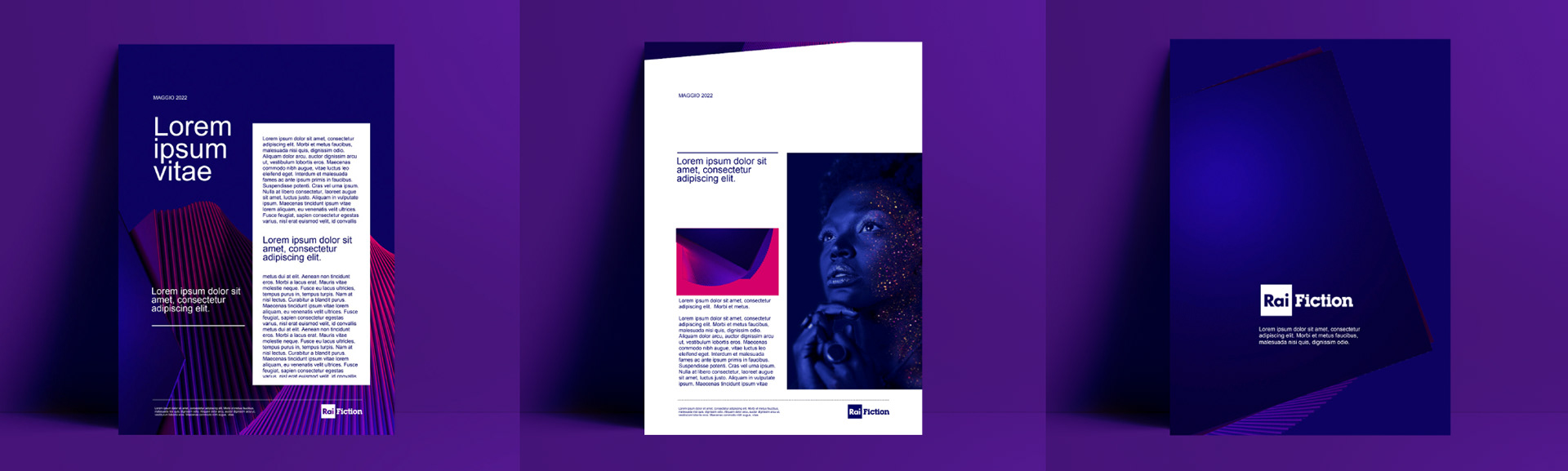
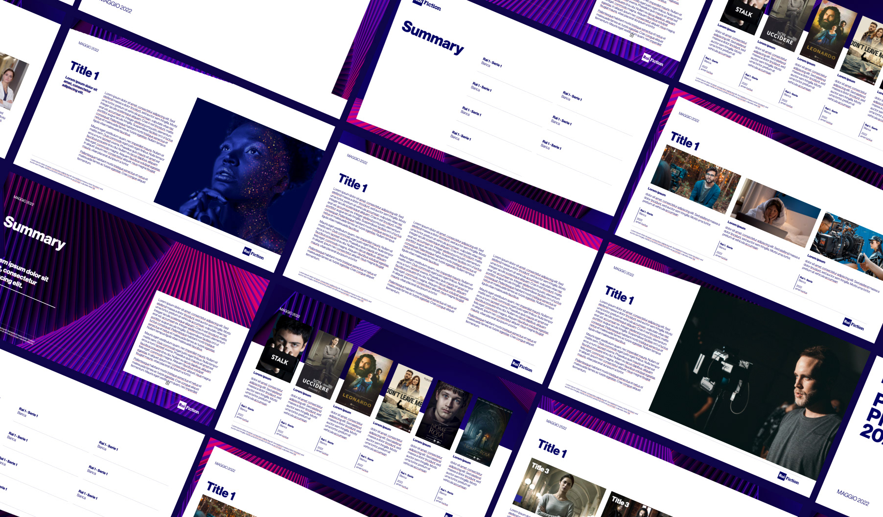
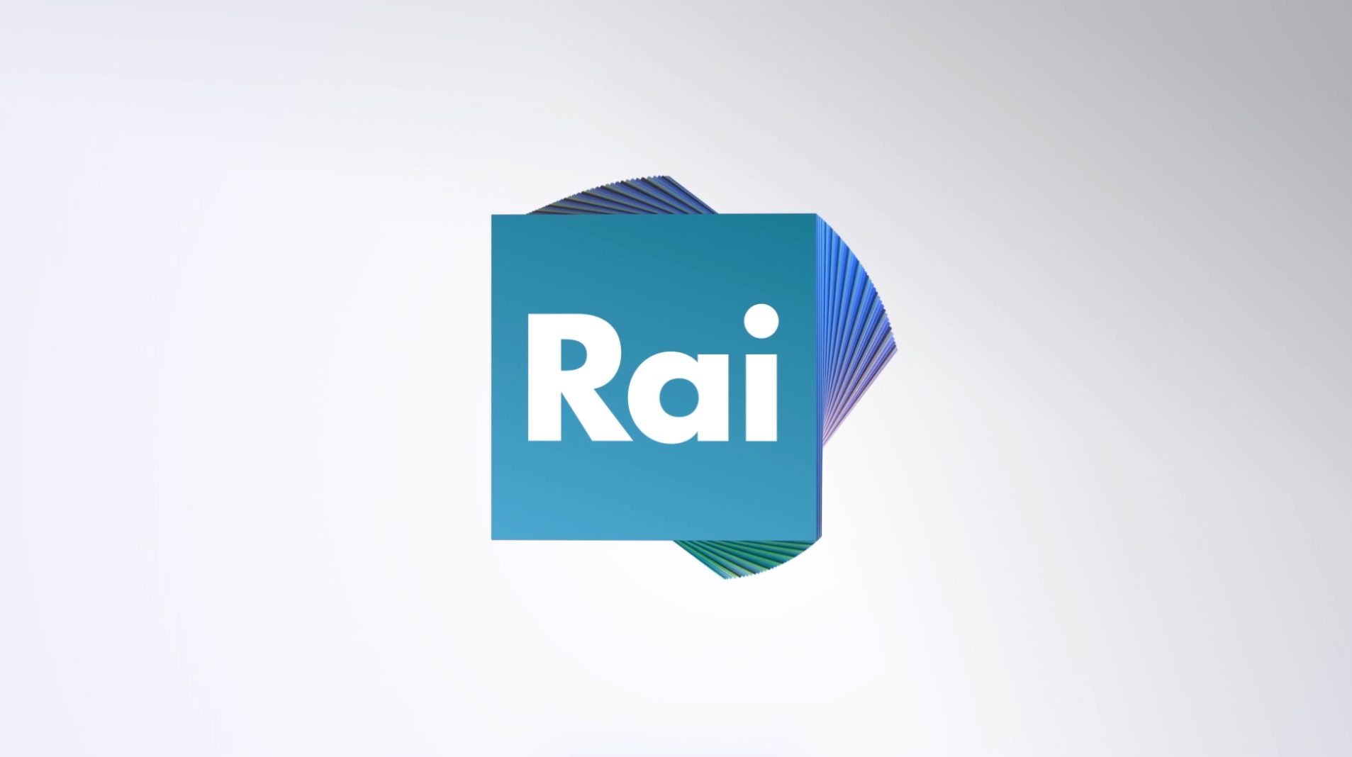
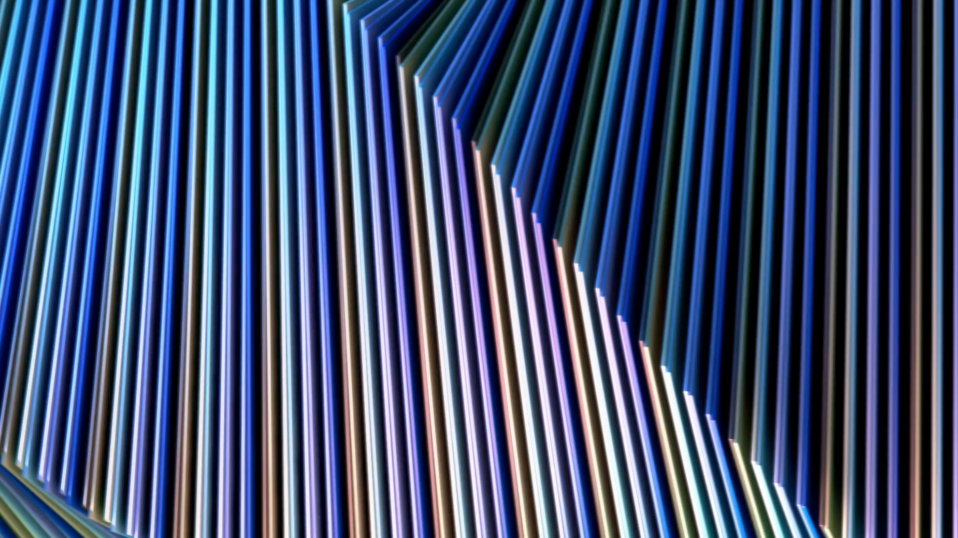
Flopicco Studio was commissioned the creation of a system of corporate elements (motion and print) for internal communications that worked as an expansion of the generic image being able to adopt each channel's distinct personality and palette whilst still reflecting the common language of Rai.
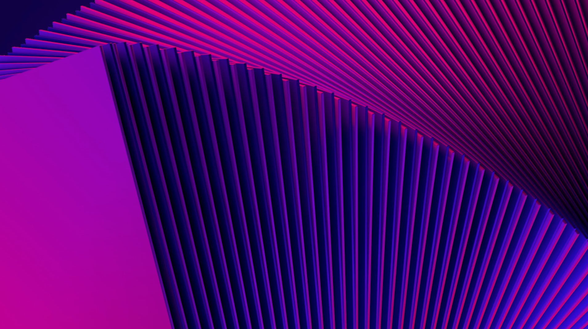
The Flopicco Studio Approach
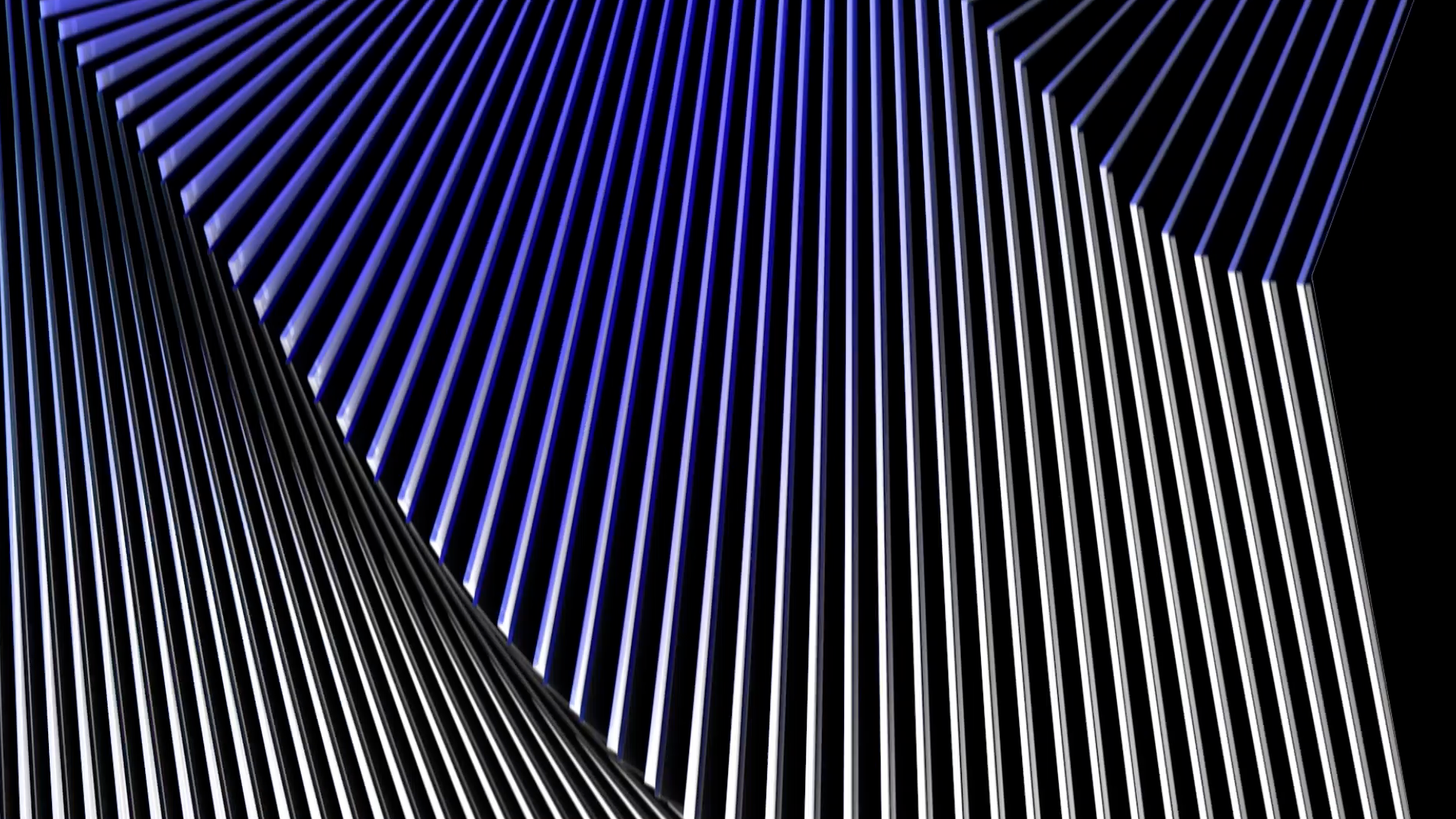
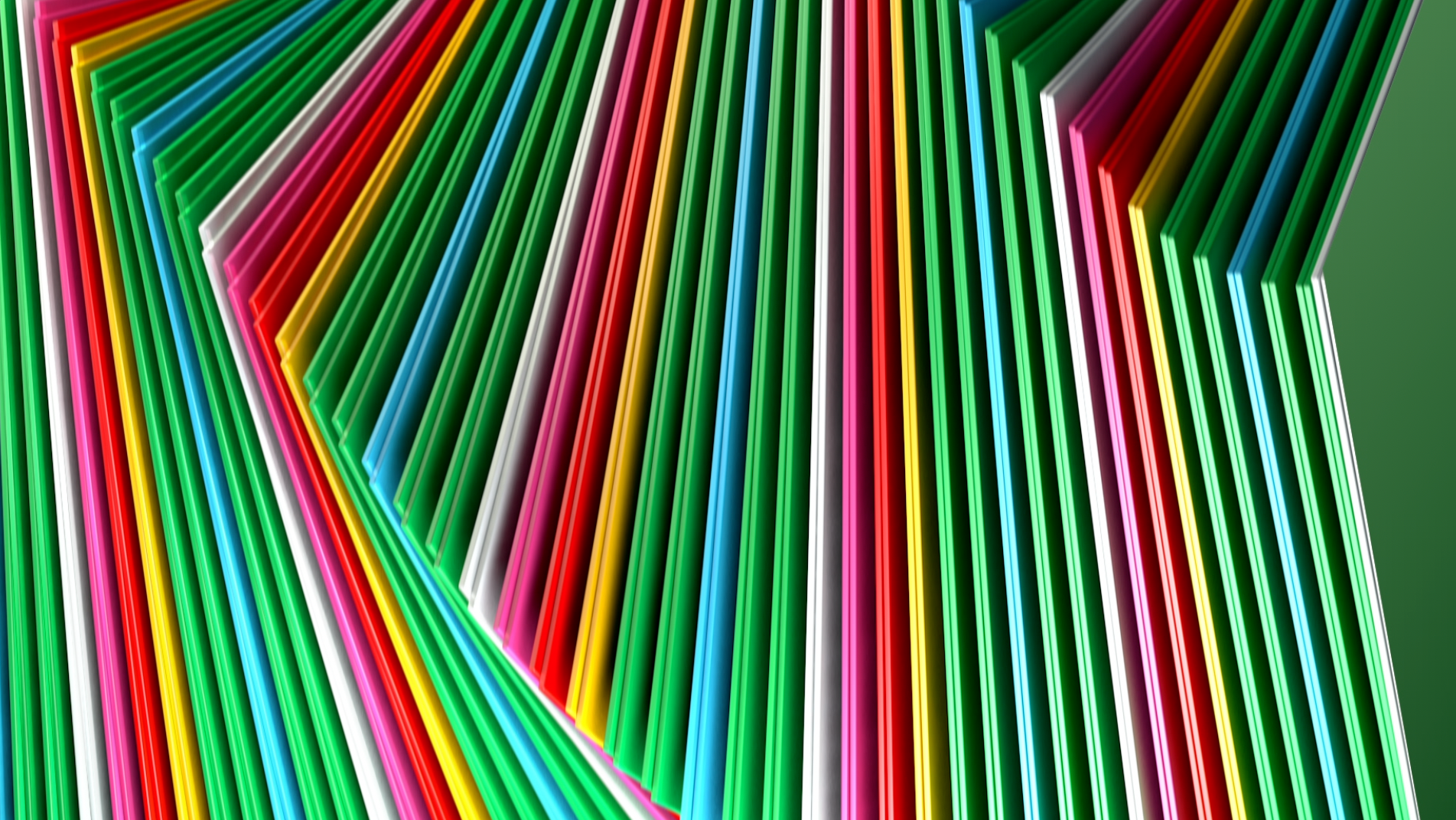
Our objective was to create a colourful 3D animation, playful, elegant and flexible enough to be easily customizable for each channel. The colour palette of each channel motion toolkit as well of its morphological logic were used to create the printed templates.
El cliente
Radiotelevisione Italiana, la empresa de radiodifusión nacional de Italia, opera muchos canales de televisión terrestres y de suscripción y estaciones de radio (Rai 1, 2, 3, 4, Rai Culture, Rai Fiction, Rai Sport, Rai Kids, por nombrar algunos). Es una de las mayores emisoras de Italia.
El reto
A Flopicco Studio se le encargó la creación de un sistema de elementos corporativos (motion y print) para comunicaciones internas que funcionara como una expansión de la imagen genérica pudiendo adoptar la personalidad y paleta distintas de cada canal sin dejar de reflejar el lenguaje común de Rai.
El enfoque de Flopicco Studio
Nuestro objetivo fue crear una animación 3D colorida, lúdica, elegante y lo suficientemente flexible como para ser personalizable para cada canal. Tanto la paleta de colores del toolkit de motion de cada canal como su lógica morfológica, se utilizaron para crear los templates de print.

CREDITS
CLIENT
Rai
CREATIVE DIRECTION, ART DIRECTION
AND GRAPHIC PRODUCTION
Flopicco Studio
Inhouse Team
Florencia Picco, Fernando Vallejos, Natalia Bellagio, Emiliano Agnetti,
Alejandro Guatelli, Pablo Camino, Martín Polech and Matías Pastorini.
In collaboration with
Luis París
Santiago Crescimone (Tercer Espacio)
🖤