U N I T E D S T A T E S · F L O P I C C O S T U D I O + T I M H O R T O N S · 2 0 2 5
NASHVILLE & KANSAS CITY GRAPHIC SETS
LICENCING & MERCHANDISING
The Client
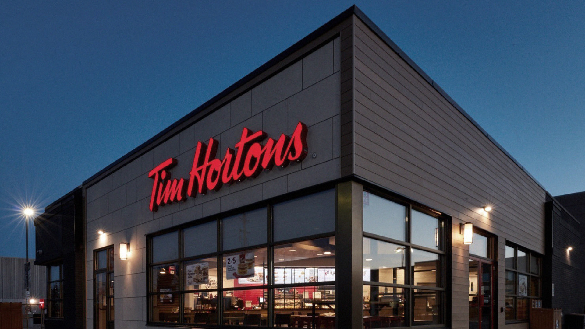
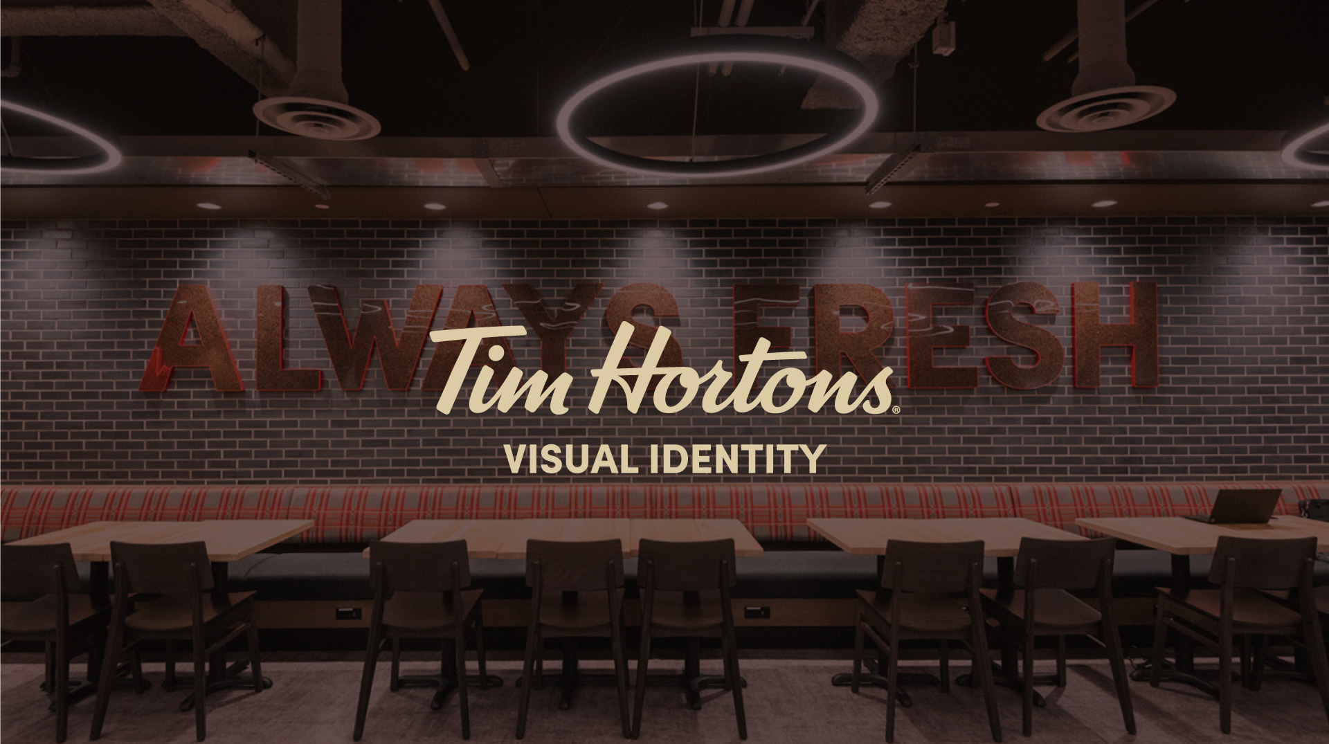
Tim Hortons is Canada's most iconic coffee and donut chains, beloved for its cozy, no-fuss vibe and strong community ties. As part of its U.S. expansion, the brand is investing in local activations to connect with new audiences in a warm and memorable way.
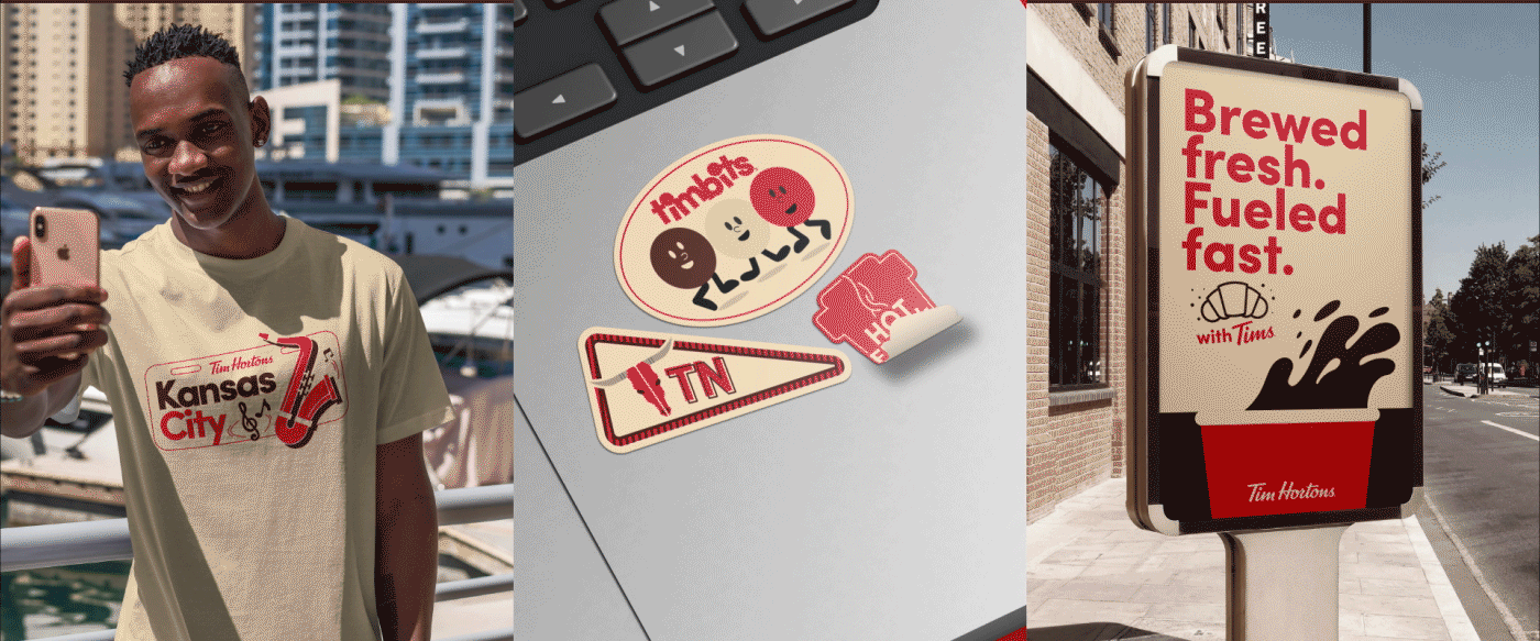
The Challenge
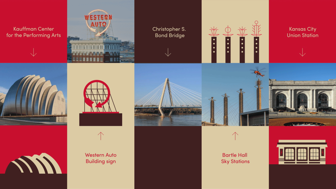
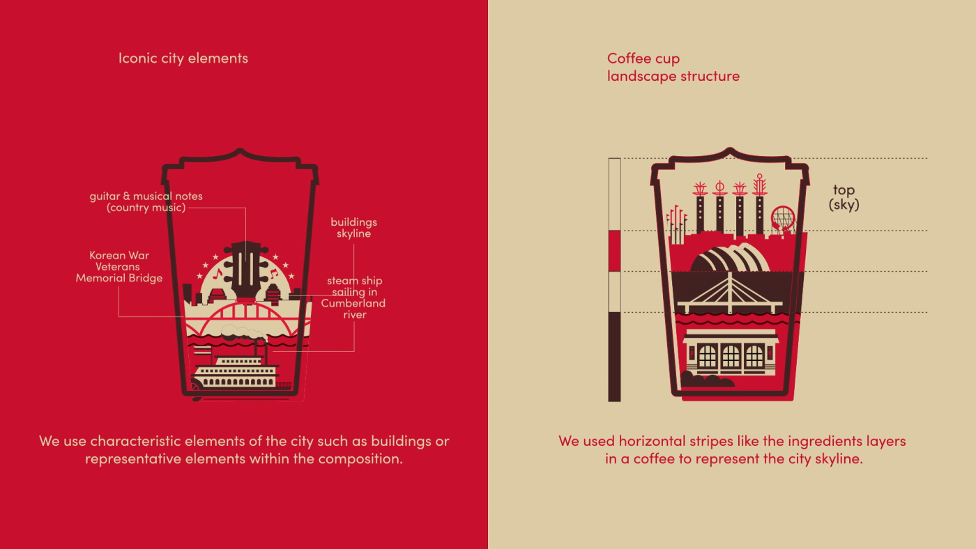
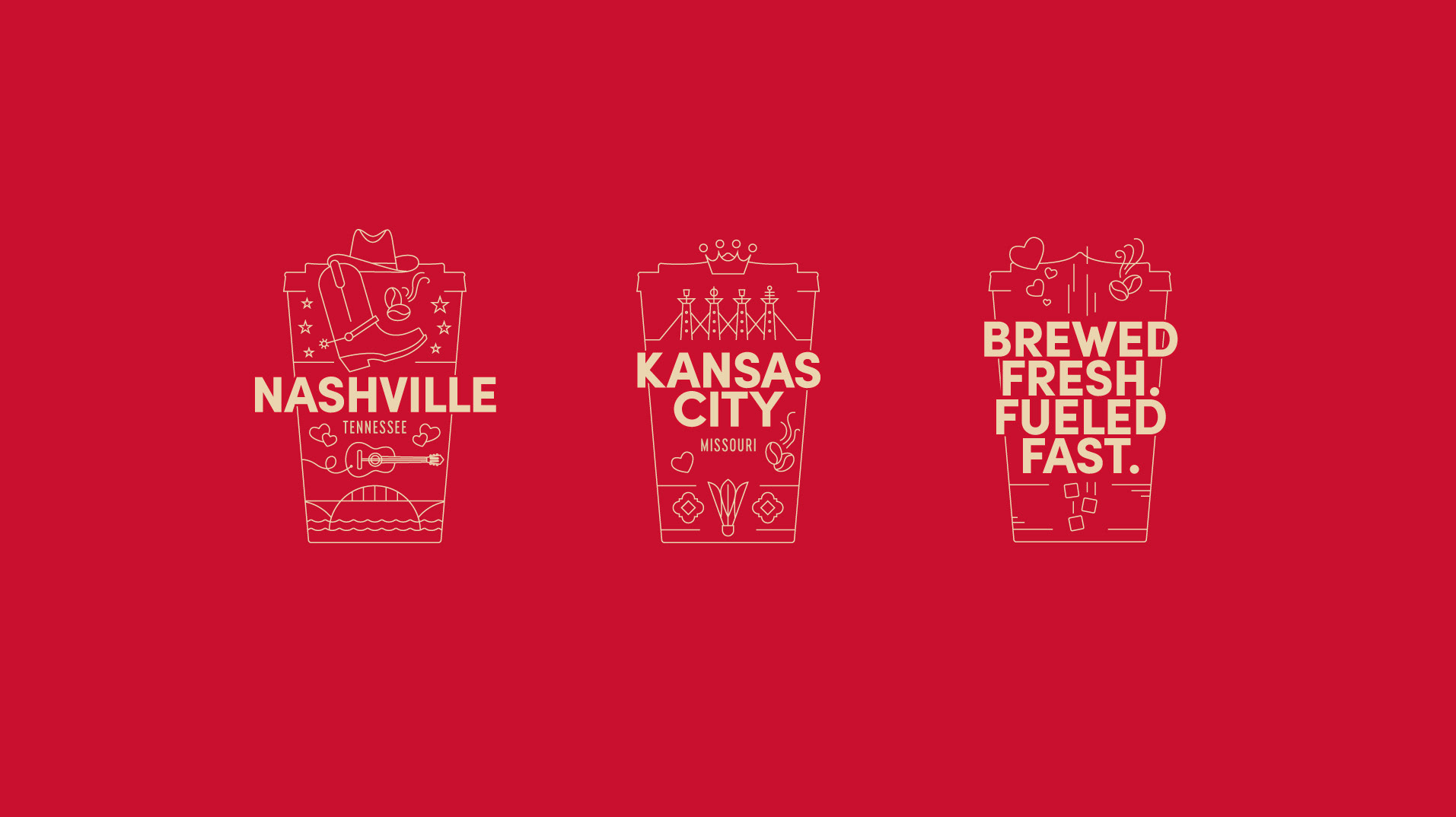
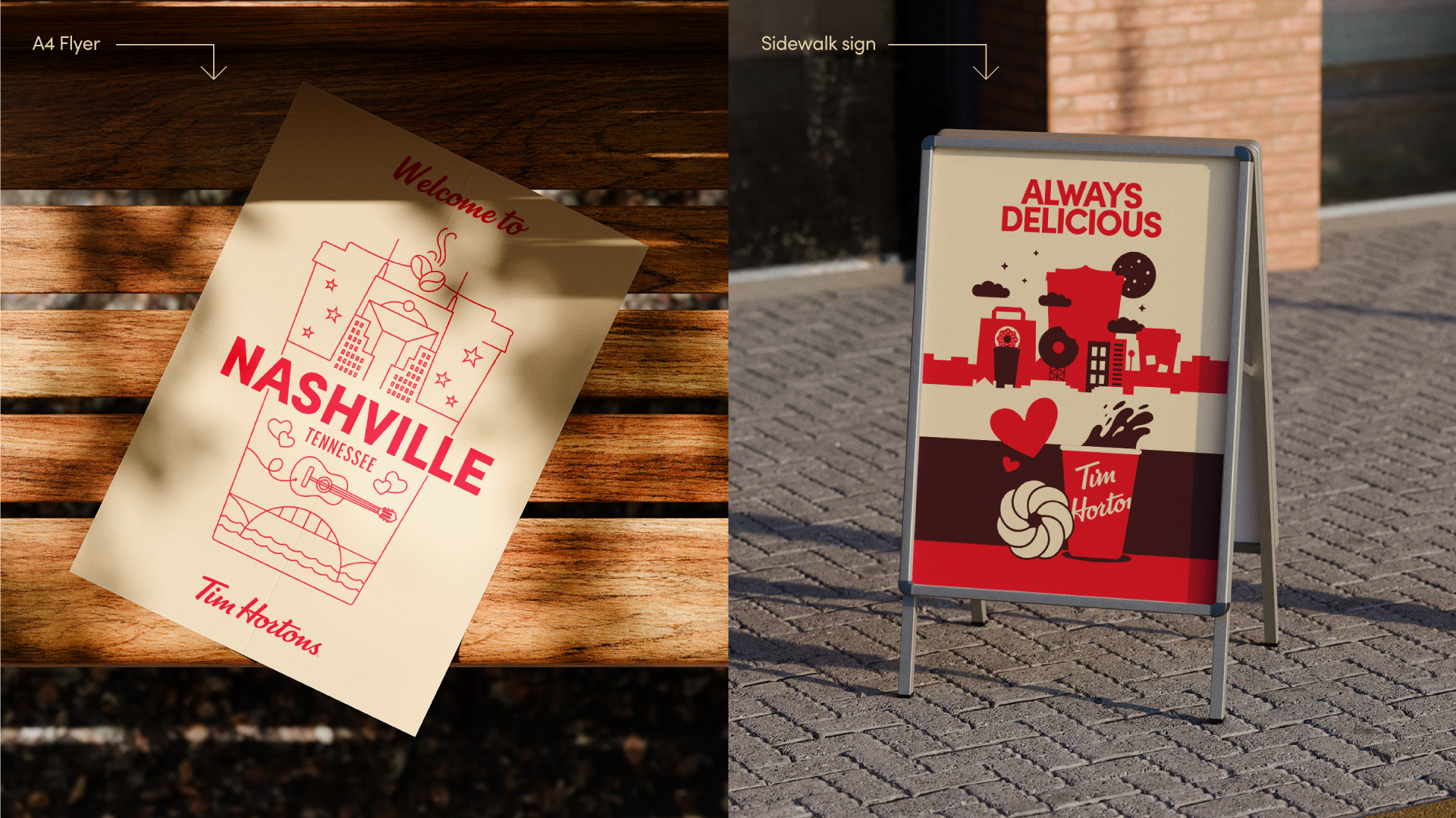
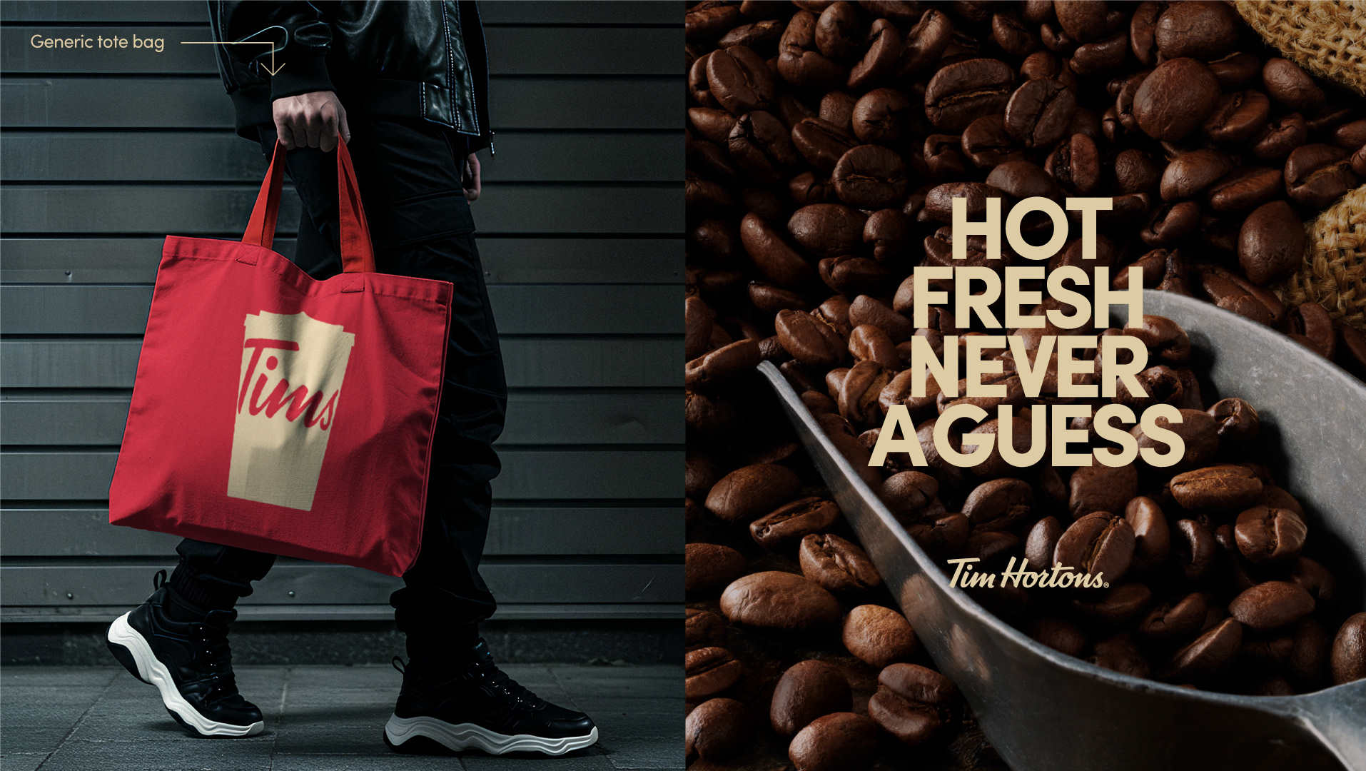
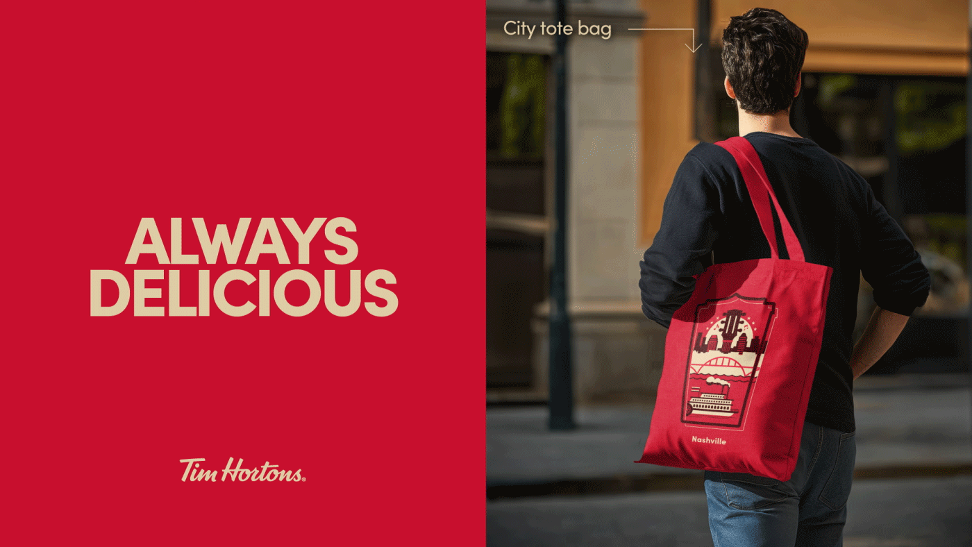
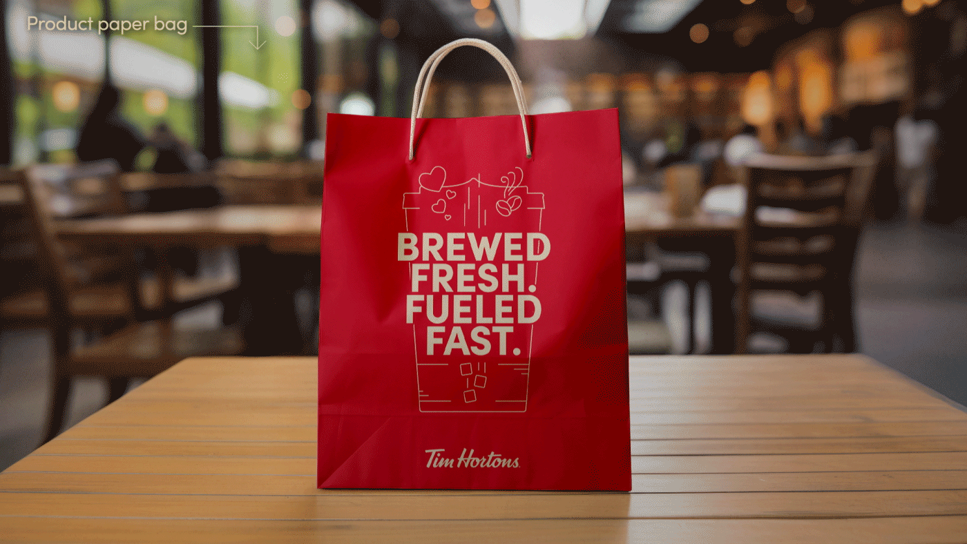
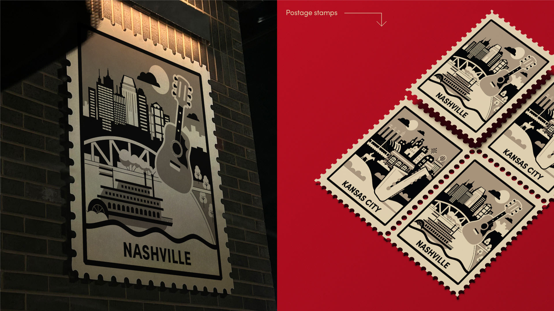
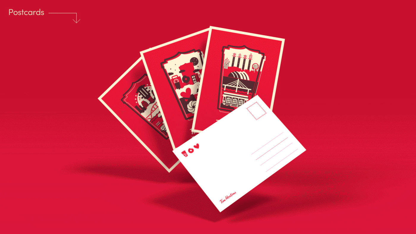
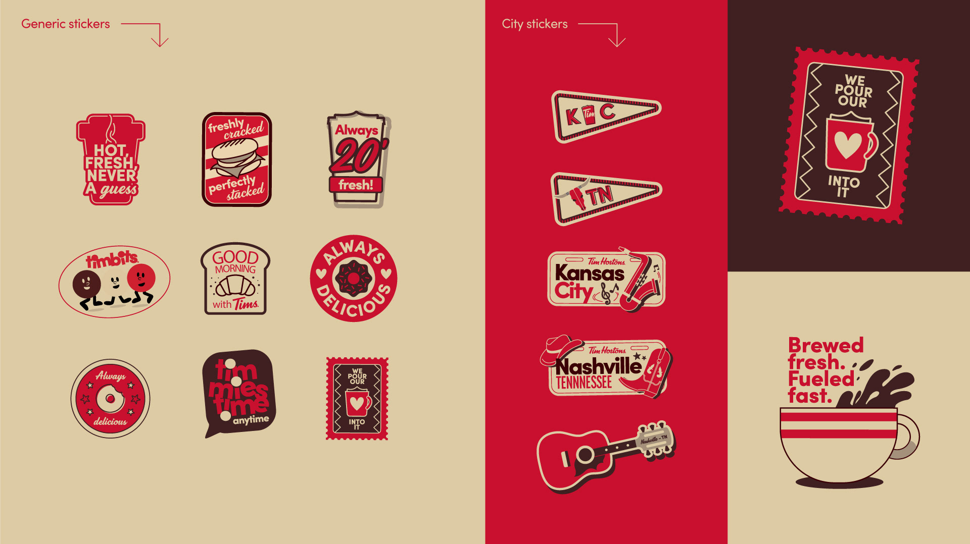
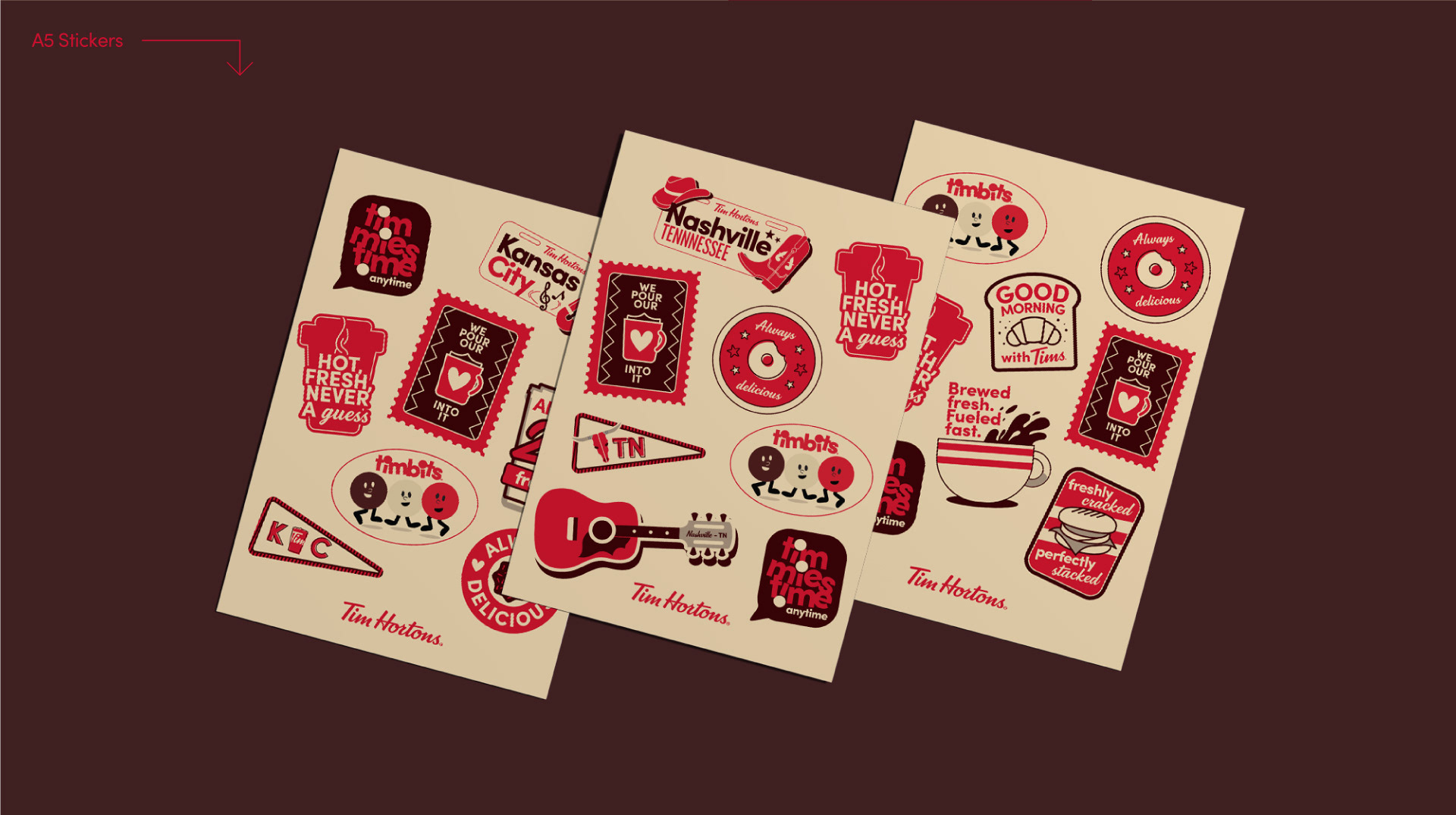
Tim Hortons approached Flopicco Studio to design city-inspired merchandise for its newest locations in Kansas City and Nashville, USA. The aim was to capture the essence of each city through playful illustrations that could be used on postcards, sticker sets and tote bags, turning each item into a unique collectable.
The Flopicco Studio Approach
We developed two custom graphic sets, one for each city, using simple shapes, a retro-inspired colour palette and charming, local references ranging from guitars and boots to skylines and city icons. The idea was to blend local pride with brand recognition, making every piece a keepsake and welcoming new fans into the Tim Hortons family one sticker at a time.


El cliente
Tim Hortons es una de las cadenas de cafeterías y donuts más emblemáticas de Canadá, muy apreciada por su ambiente acogedor y sin pretensiones y por sus fuertes lazos con la comunidad. Como parte de su expansión en Estados Unidos, la marca está invirtiendo en activaciones locales para conectar con nuevos públicos de una manera cálida y memorable.
Tim Hortons es una de las cadenas de cafeterías y donuts más emblemáticas de Canadá, muy apreciada por su ambiente acogedor y sin pretensiones y por sus fuertes lazos con la comunidad. Como parte de su expansión en Estados Unidos, la marca está invirtiendo en activaciones locales para conectar con nuevos públicos de una manera cálida y memorable.
El reto
Tim Hortons se puso en contacto con Flopicco Studio para diseñar productos inspirados en las ciudades para sus nuevos locales en Kansas City y Nashville, Estados Unidos. El objetivo era capturar la esencia de cada ciudad a través de ilustraciones divertidas que pudieran utilizarse en postales, sets de pegatinas y bolsos de tela, convirtiendo cada artículo en un objeto coleccionable único.
Tim Hortons se puso en contacto con Flopicco Studio para diseñar productos inspirados en las ciudades para sus nuevos locales en Kansas City y Nashville, Estados Unidos. El objetivo era capturar la esencia de cada ciudad a través de ilustraciones divertidas que pudieran utilizarse en postales, sets de pegatinas y bolsos de tela, convirtiendo cada artículo en un objeto coleccionable único.
El enfoque de Flopicco Studio
Desarrollamos dos set gráficos personalizados, uno para cada ciudad, utilizando formas sencillas, una paleta de colores de inspiración retro y referencias locales, que iban desde guitarras y botas hasta horizontes e iconos de la ciudad. La idea era combinar el orgullo local con la calidez reconocible de la marca, haciendo que cada pieza fuera un recuerdo y dando la bienvenida a nuevos fans a la familia Tim Hortons, pegatina a pegatina.
Desarrollamos dos set gráficos personalizados, uno para cada ciudad, utilizando formas sencillas, una paleta de colores de inspiración retro y referencias locales, que iban desde guitarras y botas hasta horizontes e iconos de la ciudad. La idea era combinar el orgullo local con la calidez reconocible de la marca, haciendo que cada pieza fuera un recuerdo y dando la bienvenida a nuevos fans a la familia Tim Hortons, pegatina a pegatina.


CREDITS
CLIENT
Tim Hortons
CREATIVE DIRECTION, ART DIRECTION
AND GRAPHIC PRODUCTION
Flopicco Studio
Inhouse Team
Florencia Picco, Fernando Vallejos, Natalia Bellagio, Alejandro Guatelli,
Pablo Camino, Martín Polech, Emiliano Agnetti and Ana Laya.
♥️
#GoWithTheFlopicco