I T A L Y · F L O P I C C O S T U D I O + R A I · 2 0 2 2
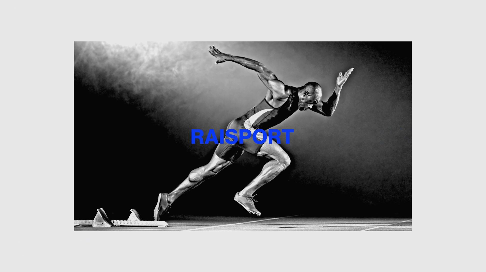
RAI SPORT
BRAND IDENTITY 2022
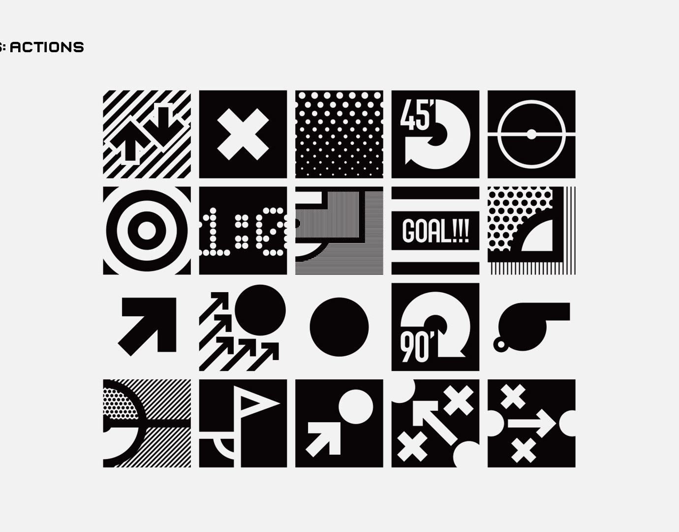
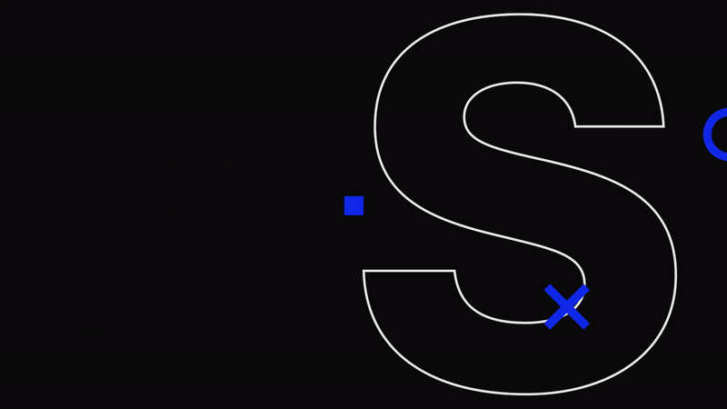
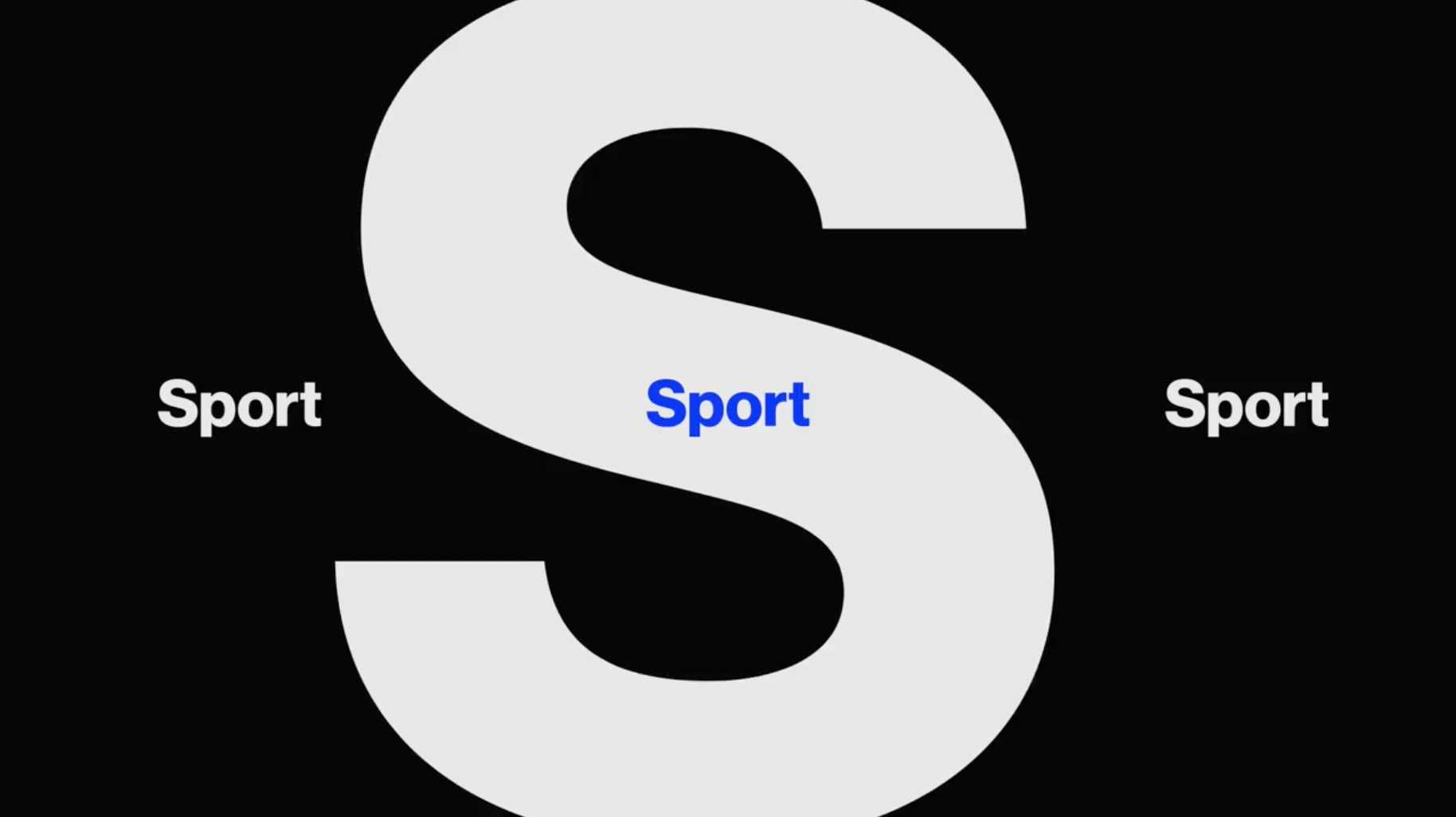
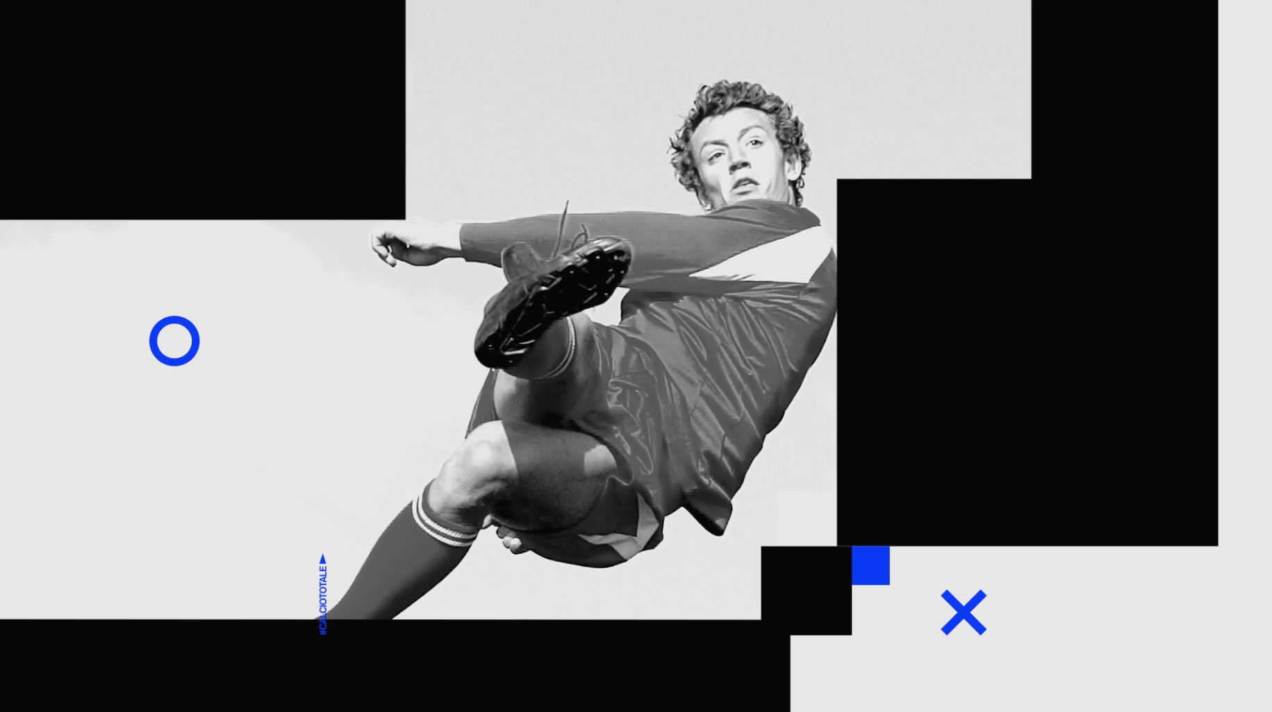
The rebranding project of Rai Sport —Rai's open TV sports channel— started with the quintessential and already iconic Rai's square, an element common to the whole Rai brand system. In this occasion, we were asked to make the channel more extreme and emotional by highlighting that in sports "things are pretty much black and white, you win or lose. There are no grays".
Yes, being a team player and playing fair are key, but with effort, stamina, excitement taken to the maximum, body and mind work towards one goal: Winning.

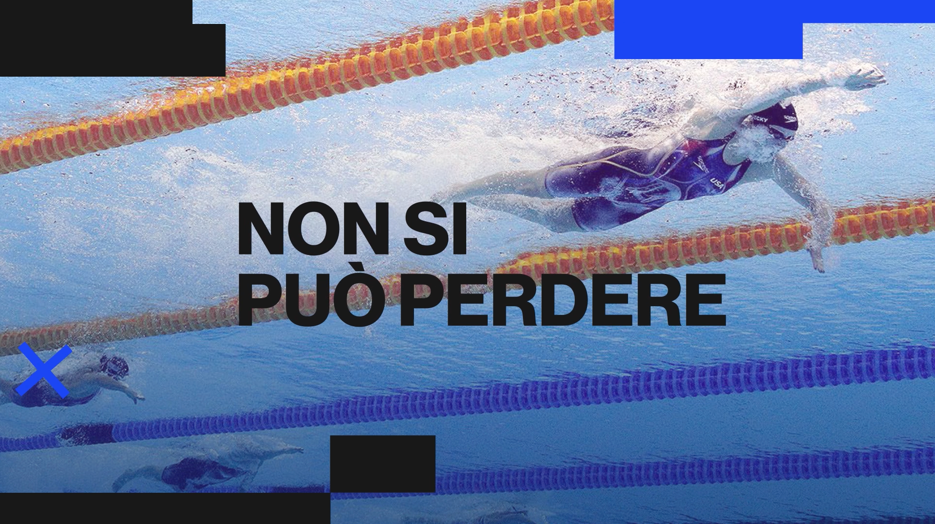
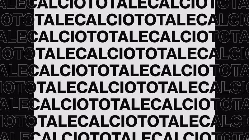
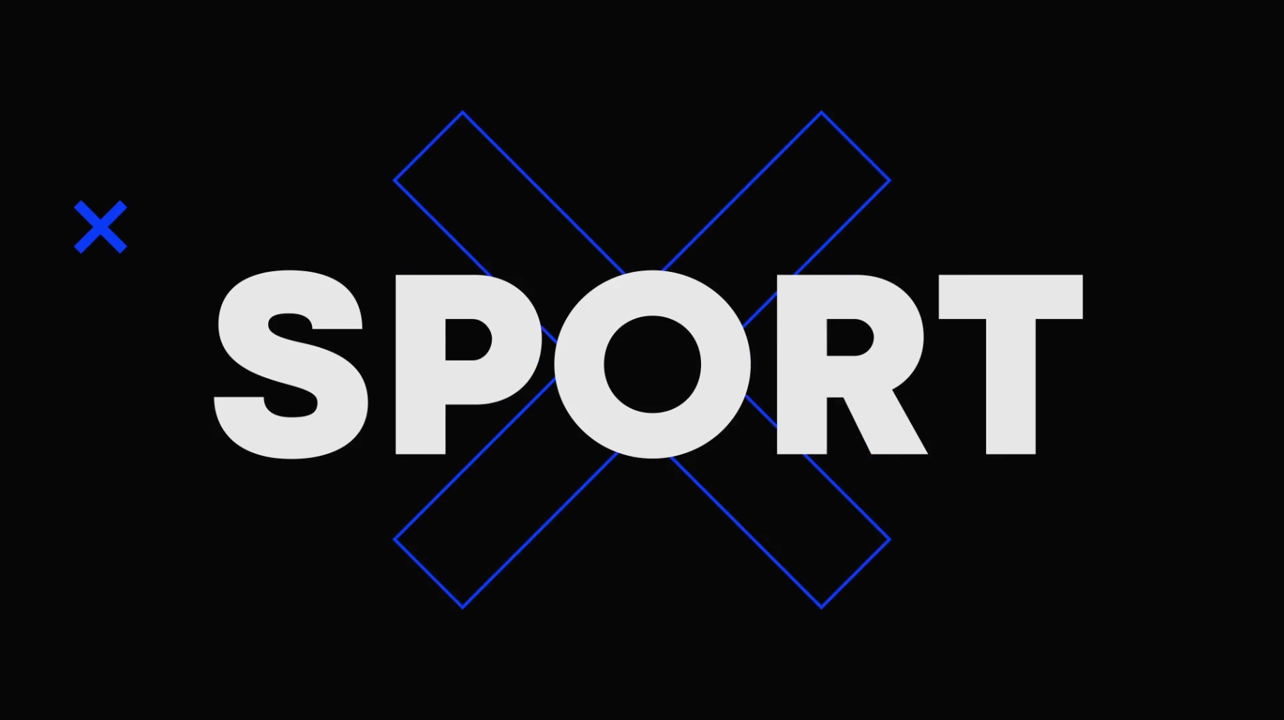
Our aim then, was to create an impactful yet simple image, able to include sports footage in a logical and clean and integrated way. The radical touch was added with dramatic framing, typographic textures, cut animation, contrast and the usage of resources of scale and repetition.

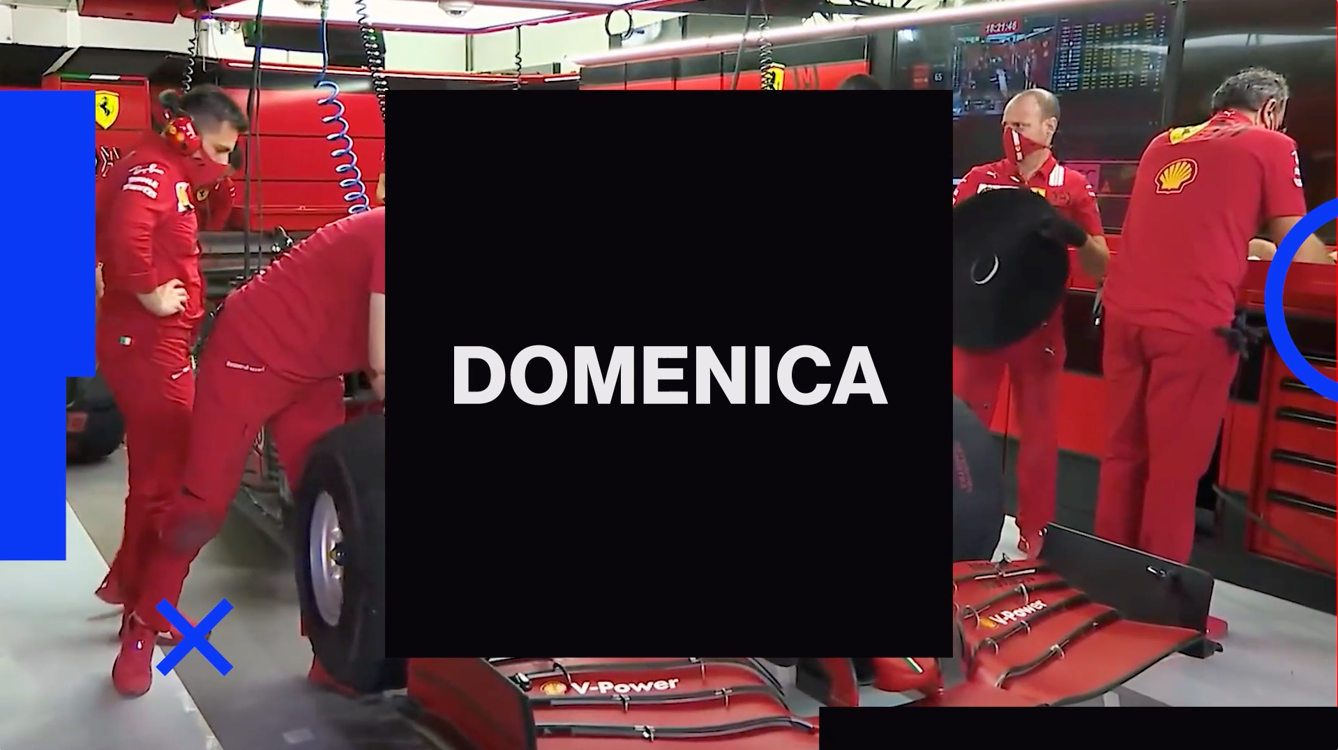
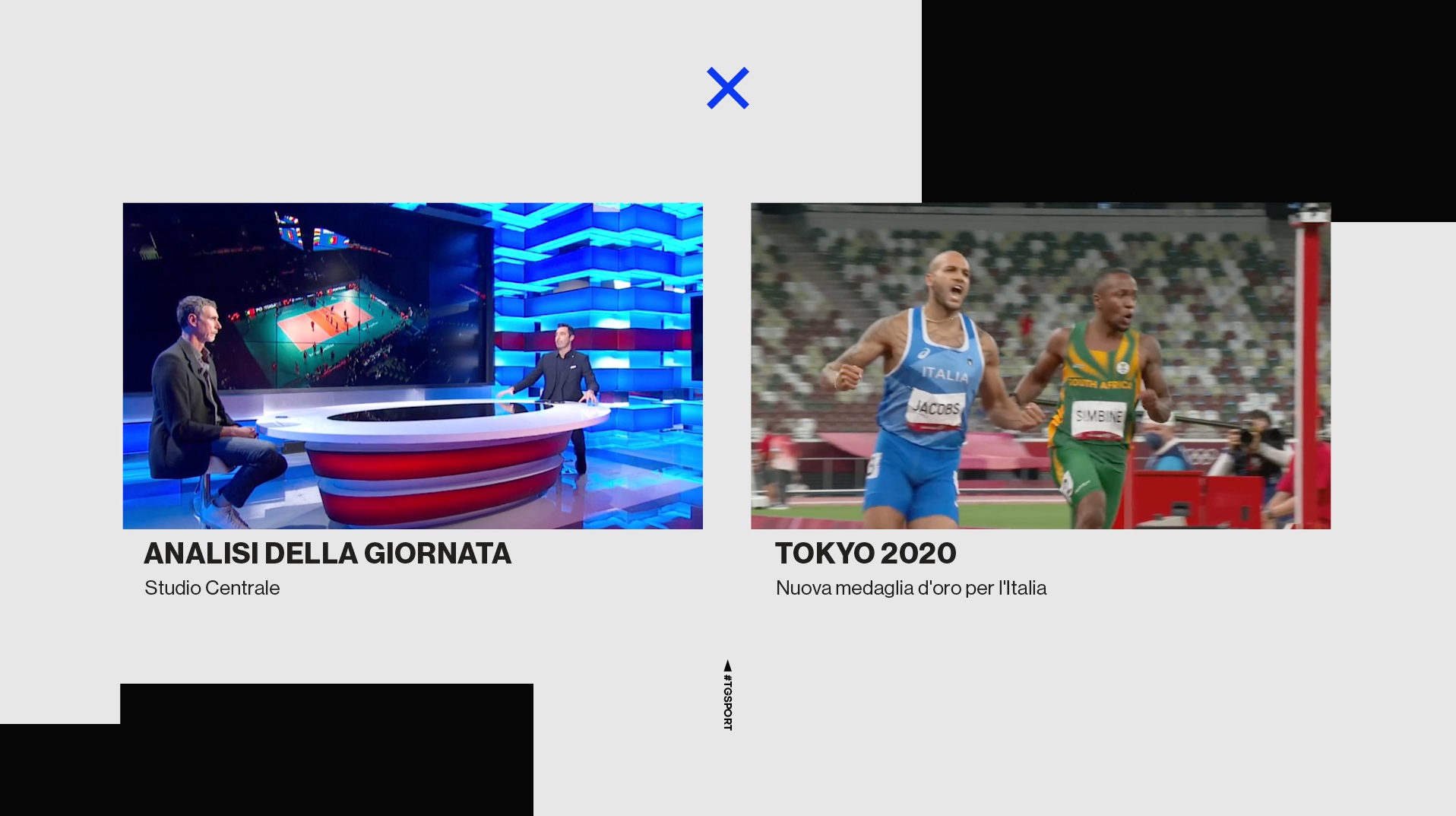
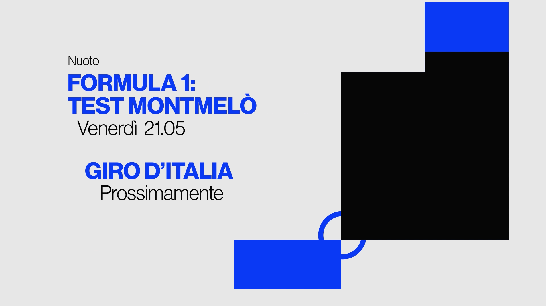

For this project we created the Complete Promo Toolkit, a series of Thematic Idents, and also the Openings, Bumpers, On-Screens, Idents and Credits of the channel's different shows.


CREDITS
CLIENT
Rai
CREATIVE DIRECTION, ART DIRECTION
AND GRAPHIC PRODUCTION
Flopicco Studio
Inhouse Team
Florencia Picco, Fernando Vallejos, Natalia Bellagio, Pablo Camino, Alejandro Guatelli, Martín Polech, Daniela Parasporo, Ana Laya, Pia Rossi, Soledad Basigalup, Matias Pastorini, Emiliano Agnetti, Beatrice Carosi, Agustín Tognola, Juan Manavella, Tato Herrero and Sebastián Brown.
With the collaboration of
Tercer Espacio
Andy Cambiasso
🖤