I T A L Y  ·  F L O P I C C O  S T U D I O  +  D M A X   ·  2 0 2 2


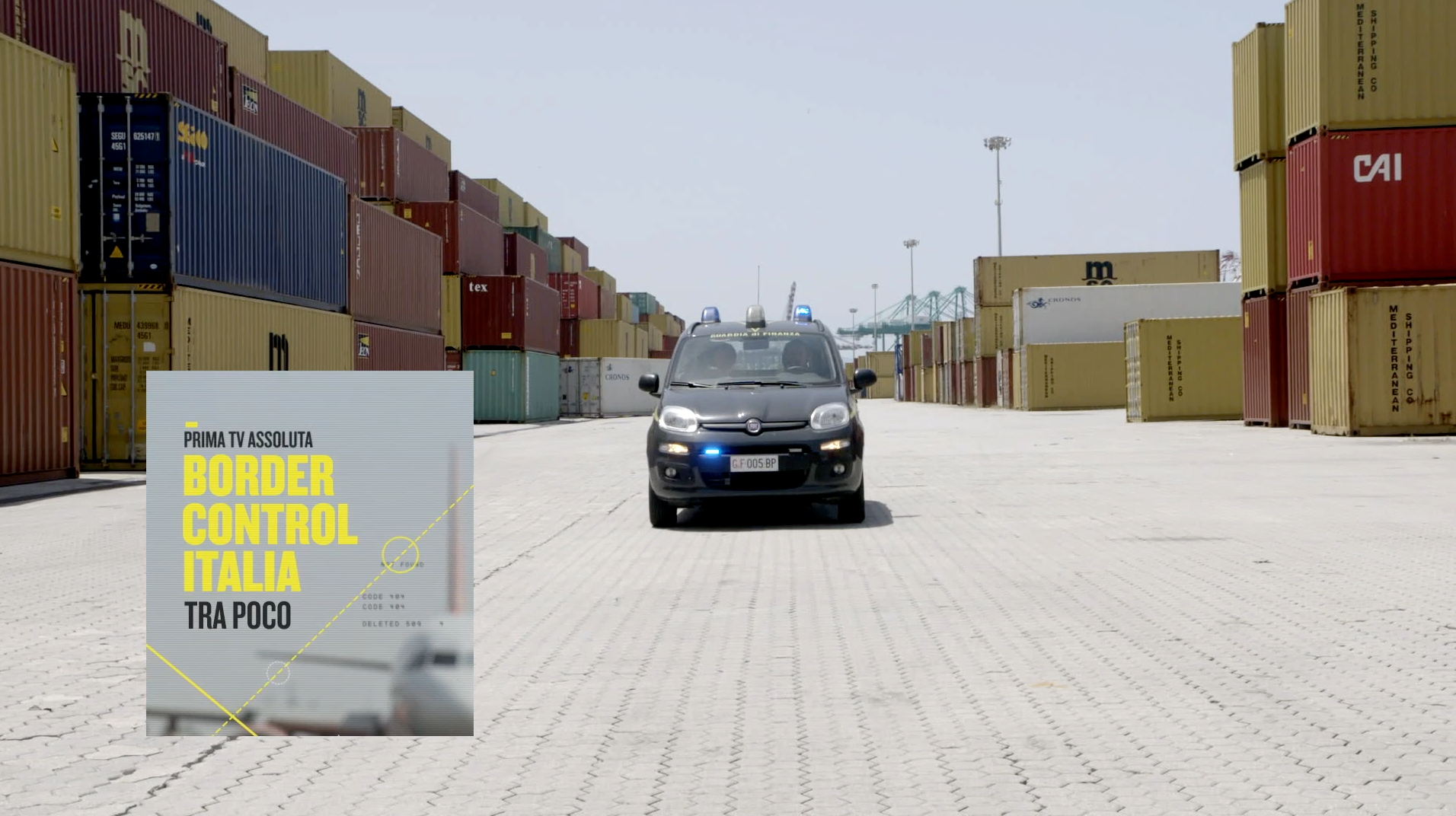
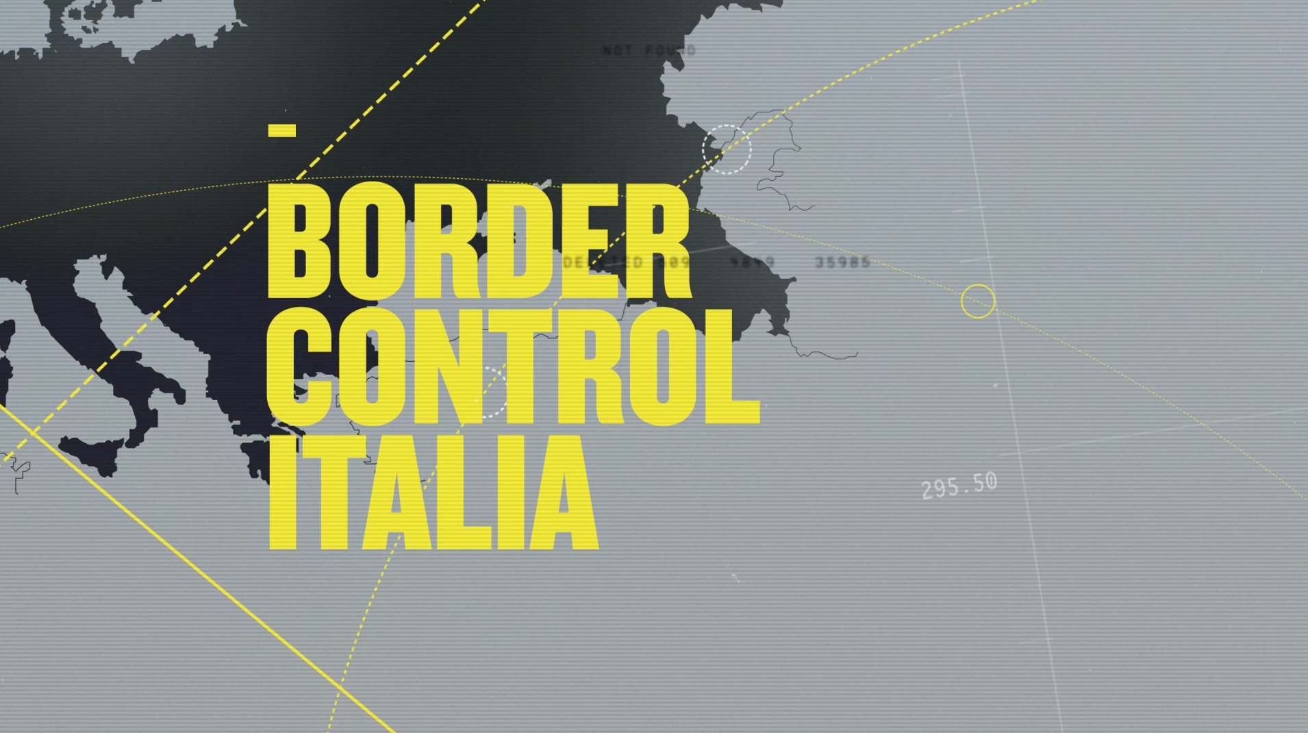
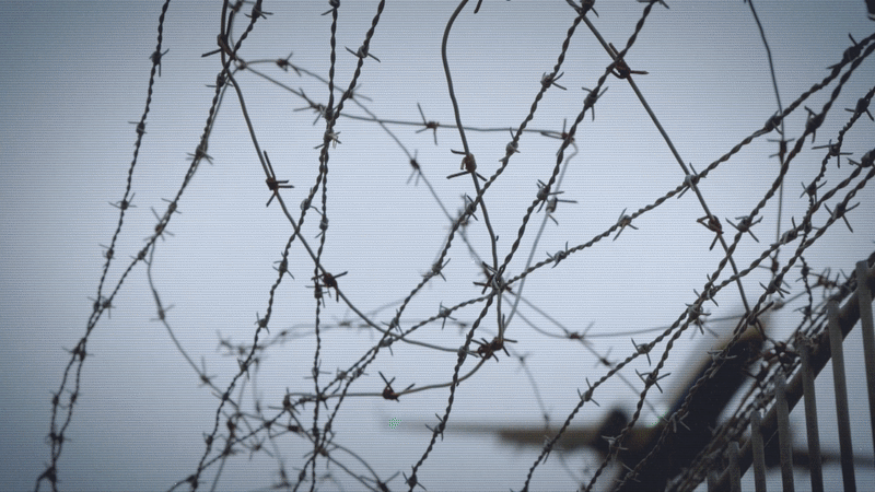
BORDER CONTROL ITALIA
ON AIR PROMO TOOLKIT


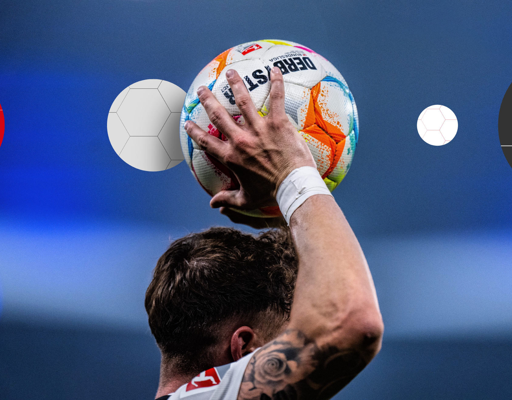
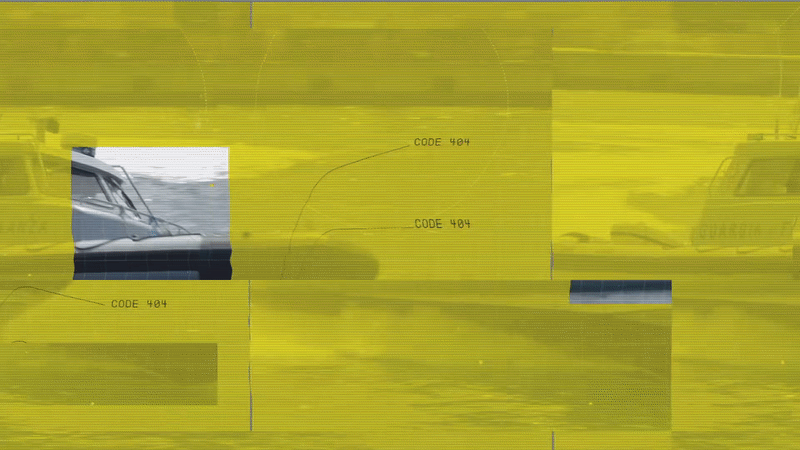
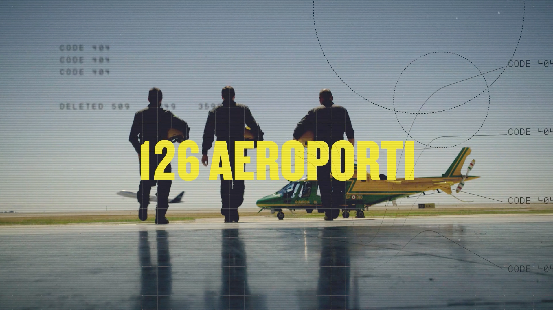
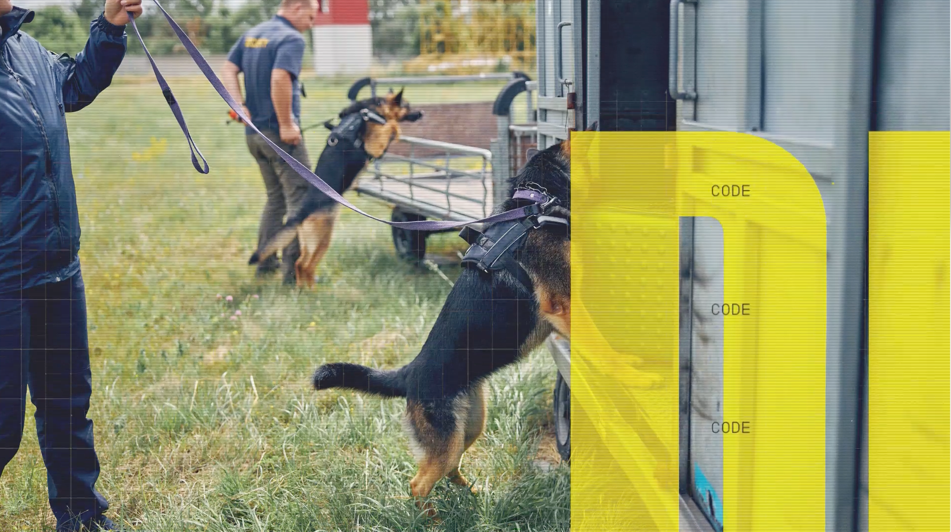
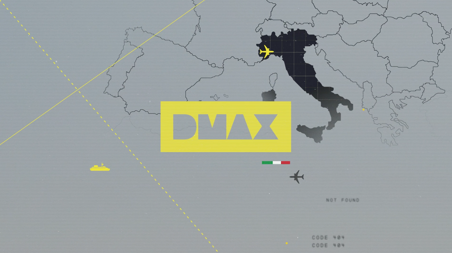
On Air Promo Toolkit for a the premiere of the show Border Control Italia, a peculiar TV show, in the intersection of a reality and a documentary that follows the work of the Guardia di Finanza on maritime, land and air borders, including Italy's main airports, of course, but also the ports of Naples and Gioia Tauro, one of the most important container hubs in the Mediterranean where goods from China and South America transit. ​​​​​​​​​​​​​​


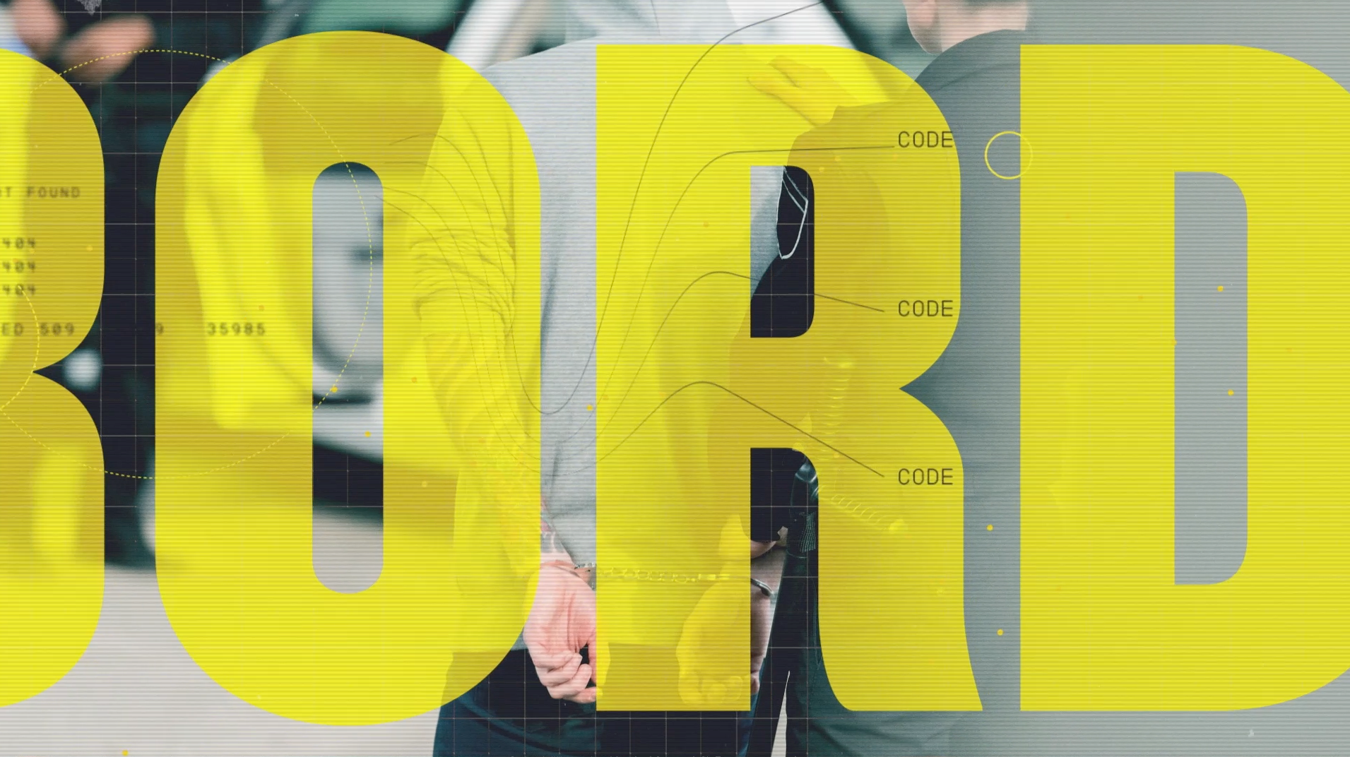
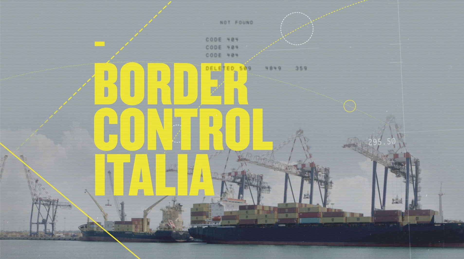
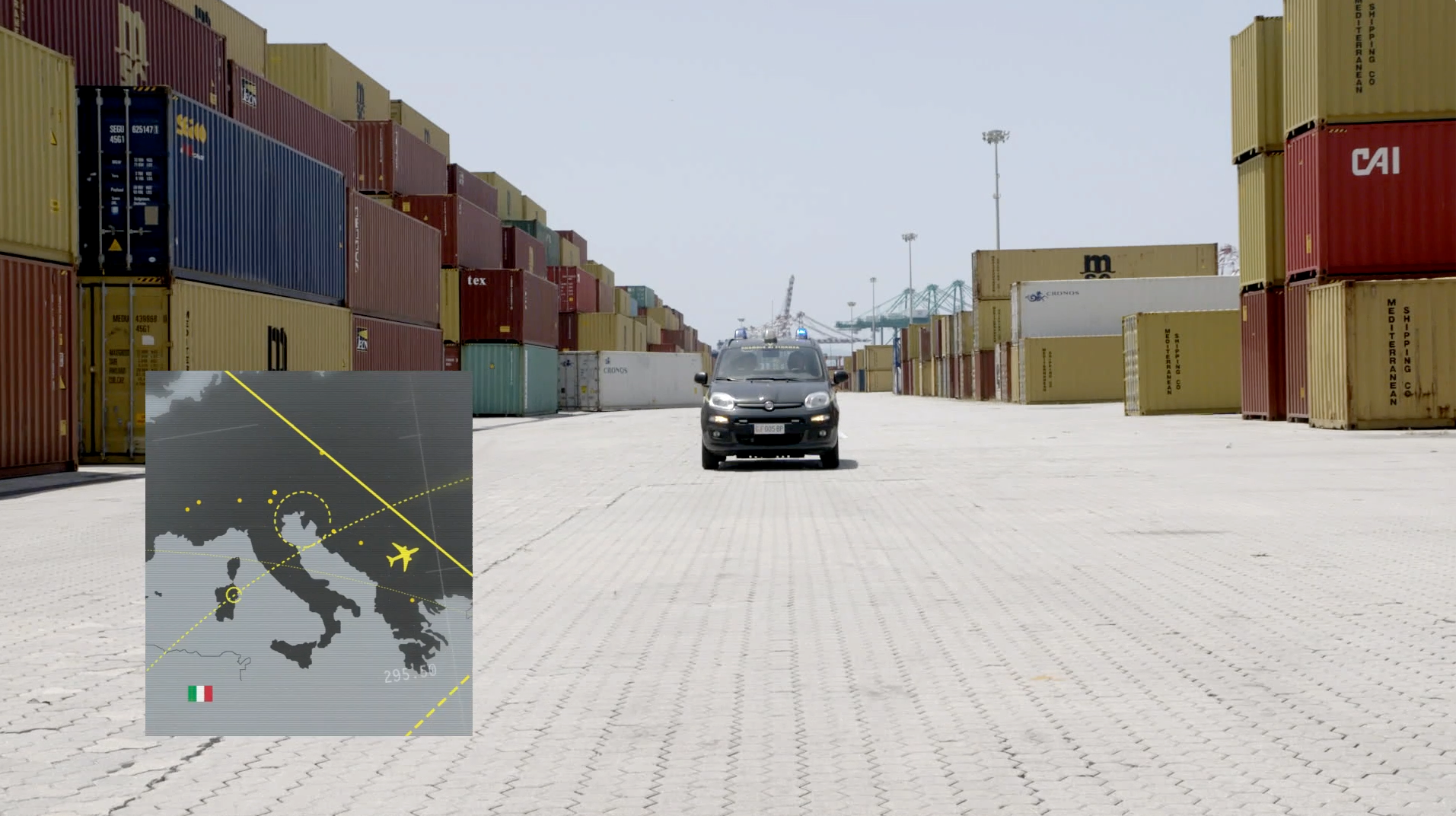
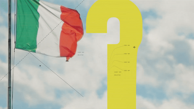
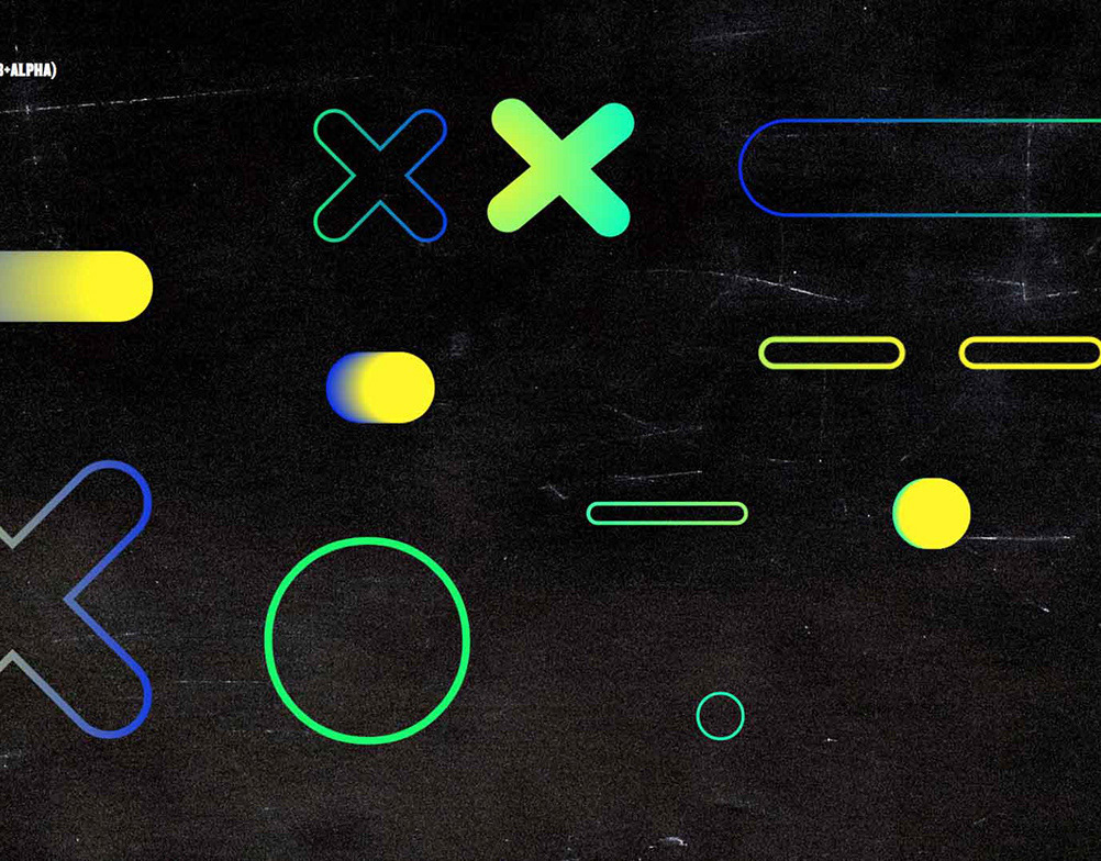
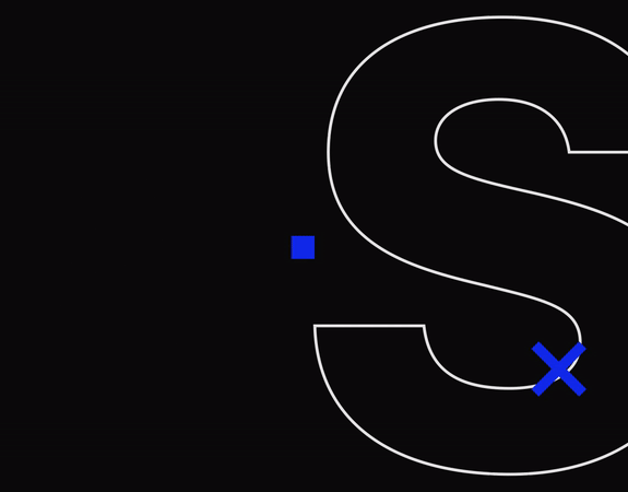
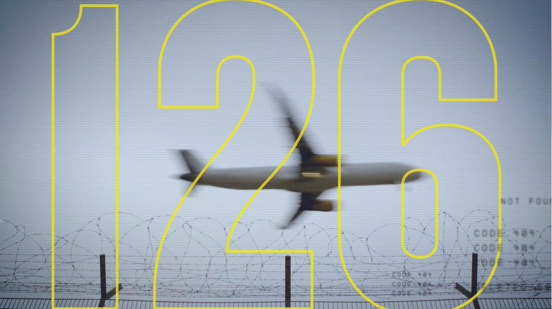
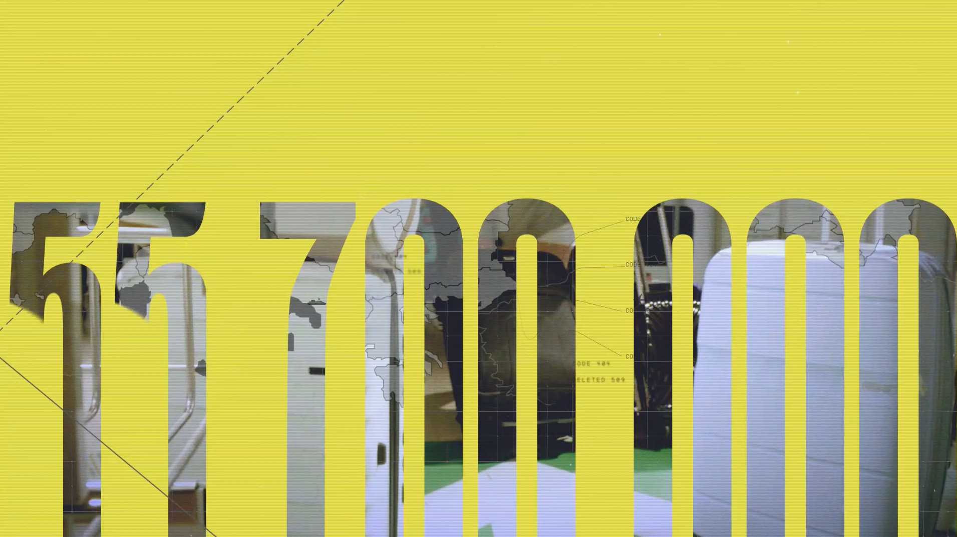
Since it depicts reality (from simple interventions to extreme situations), this hybrid and dynamic show it can also be very intense, and that's exactly how we wanted its visual identity to be: an energetic mix of formats, textures, contrasts, with a sober (real) palette with one bright yellow colour that represents the alert sign the officers and the audience is looking for... minus the cliches. 


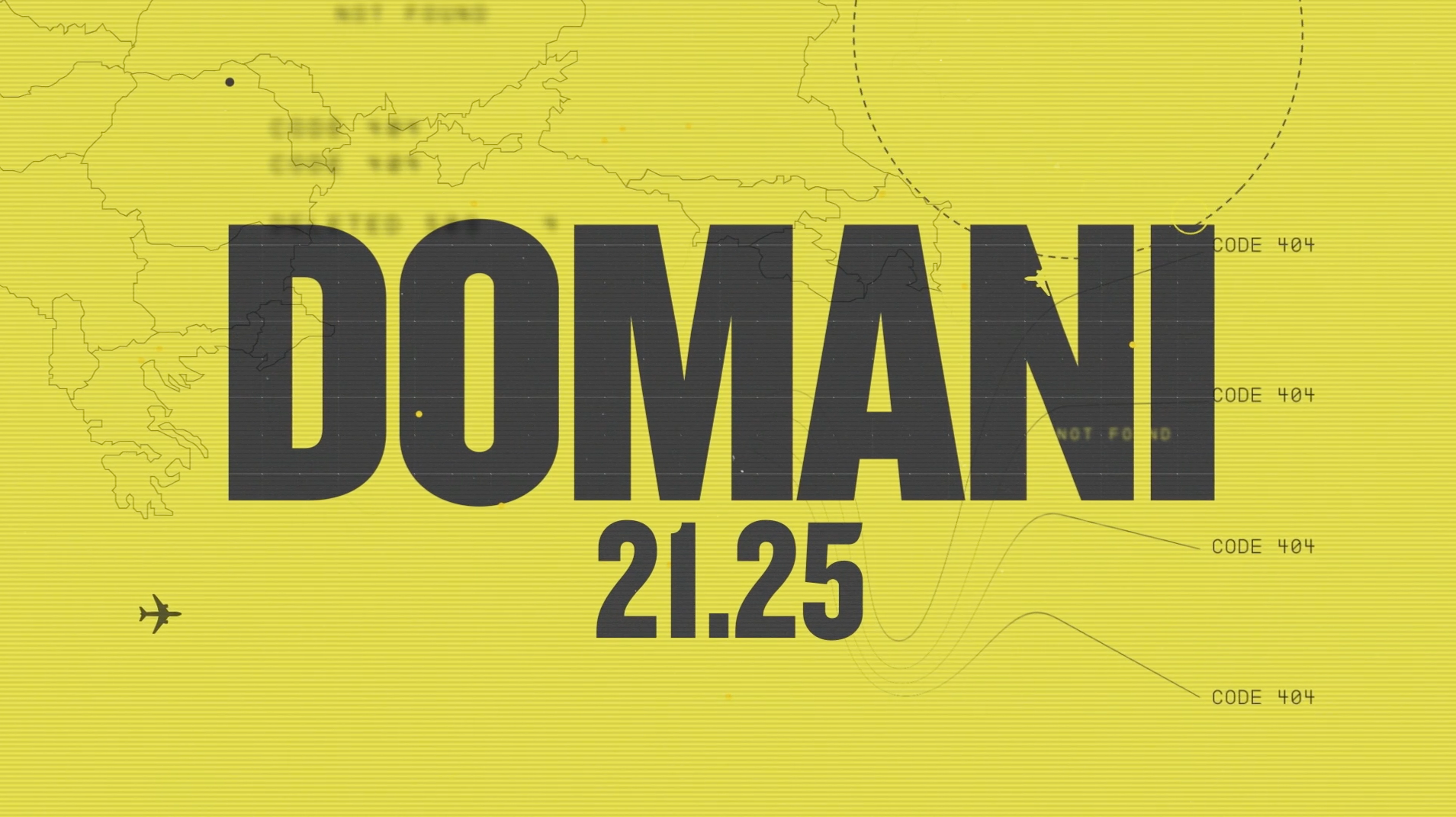
This on-air toolkit included: Bumpers, countdown pieces, elevator, endpage and one teaser. 


CREDITS

CLIENT
DMAX

CREATIVE DIRECTION, ART DIRECTION
AND GRAPHIC PRODUCTION
Flopicco Studio

Inhouse Team
Florencia Picco, Fernando Vallejos, Natalia Bellagio, Daniela Parasporo, Pablo Camino,
Alejandro Guatelli, Martín Polech, Leandro Nicolosi, Matías Pastorini & Soledad Basigalup & Ana Laya​​​​​​​


🖤
#GoWithTheFlopicco​​​​​​​​​​​​​​

You may also like

DFL 2024 UPFRONT
Graphic Design, Branding
DMAX ESPORTS
Promo package and toolkit created for DMAX Italia's e-Sports / Gaming section.
Branding, Graphic Design, Motion Graphics
CINECANAL BRAND SYSTEM
We have ideated, directed and produced the full visual identity of CineCanal, one of the most important Latin American subscription movie channel. On Air, Off Air, Print and everything in between.
Motion Graphics, Branding, Creative Direction
Rai Sport Brand Identity
Branding, Motion Graphics, Art Direction
LOL: Chi Ride È Fuori 
Advertising, Branding, 3D Motion
TIM HORTONS REFRESHERS MERCH
Our goal was to capture the essence of summer in our visual system while creating useful products for the season. We used a sunny color palette inspired directly by the drinks themselves, with juicy reds, yellows, and greens. We created a graphic language to tie the whole set together that is fresh and evocative. These products are a vacation you can wear.
Graphic Design, Branding
FESTIVAL DI SANREMO 2024
Event branding for Sanremo 2024, the most important music festival of Italy.
Graphic Design, Branding, Art Direction
LA BIENNALE DI VENEZIA 2021
Illustration, Motion Graphics, Animation
HBO Go · A Universe of DC
Art Direction, Branding, Motion Graphics
+SBT INFORMAÇAO
+SBT Informação, a Brazilian news outlet, needed a brand identity that could reflect the breadth of today's news landscape, covering everything from the economy and health to sports, travel, and fashion.
Branding, Graphic Design, Motion Graphics
Back to Top