I T A L Y · F L O P I C C O S T U D I O + D M A X · 2 0 2 2
THE SOCIAL ESSENCE OF
THE DMAX MAN
DIGITAL PACKAGING
The client
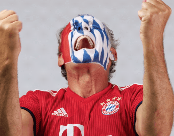
DMAX Italia is a thematic network television, owned by Warner Bros. It is the first factual entertainment channel dedicated to the Italian male audience. They promise their audience to experience a number of extremen adventures from their sofa.
The challenge
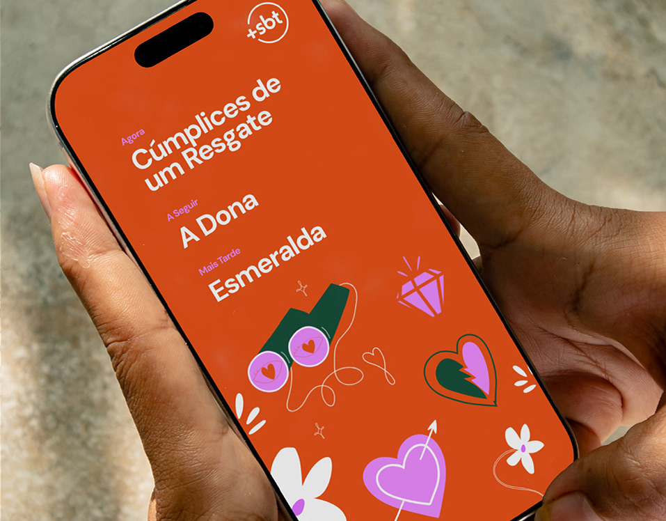
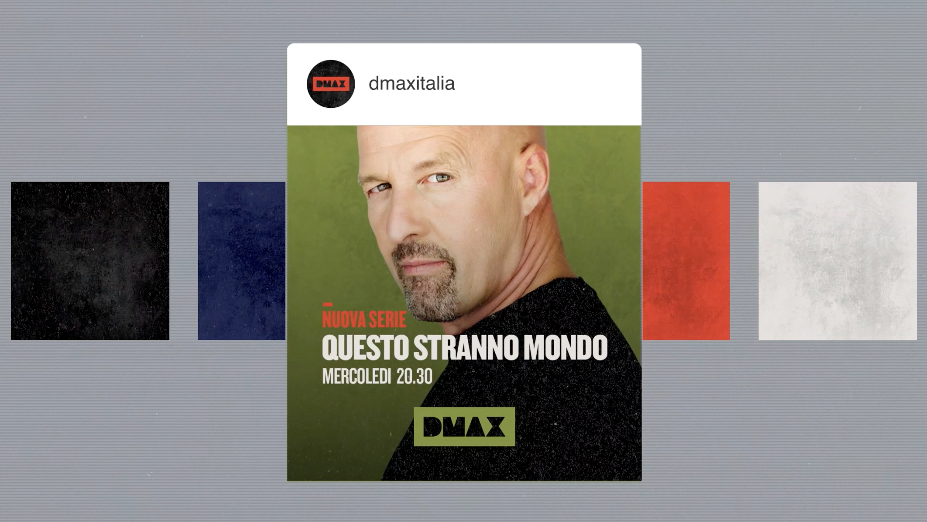
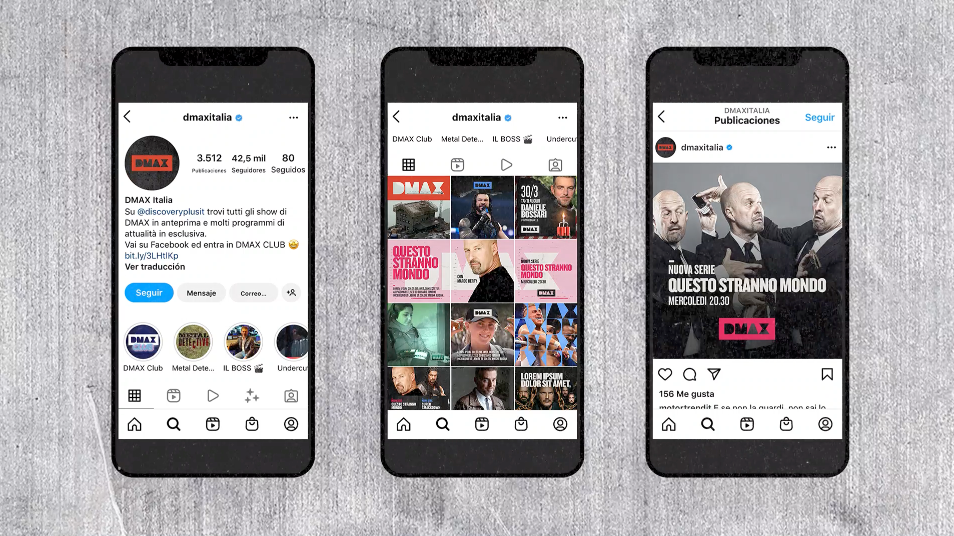
DMAX Italia's social media outlets heavily relied in the thematic branding of all their shows and even though all of these reflected the core values and identity signs of the channel's branding, the channel was missing a set of templates for generic contents and brand messages.
The Flopicco Studio Approach
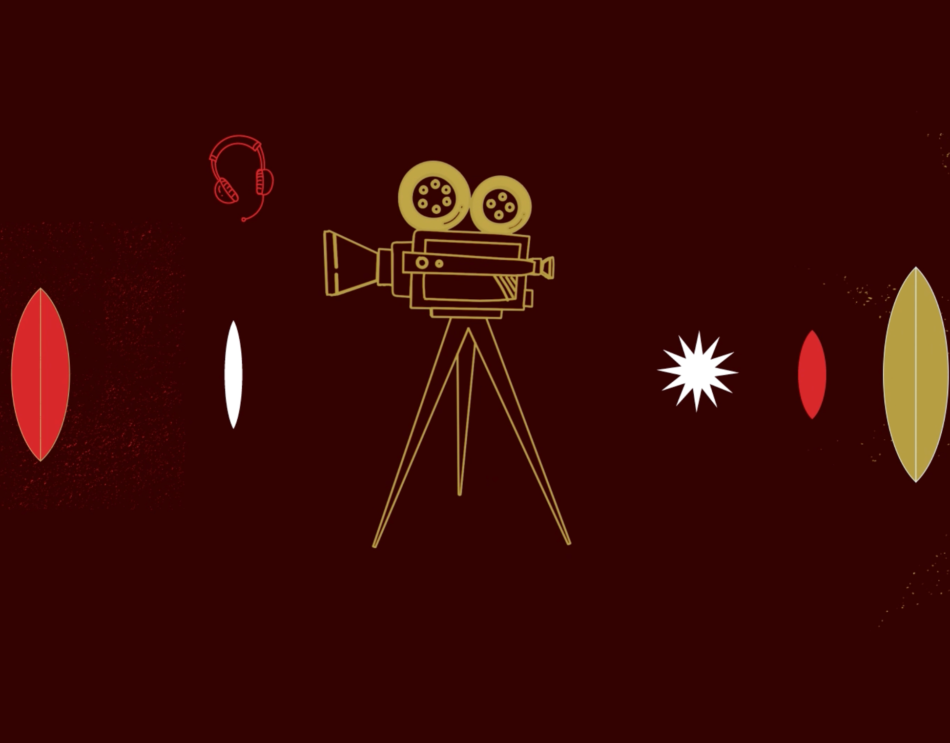
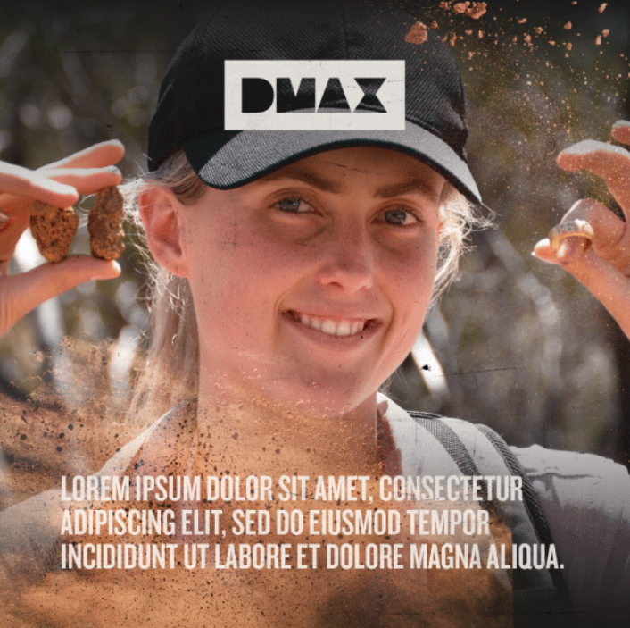
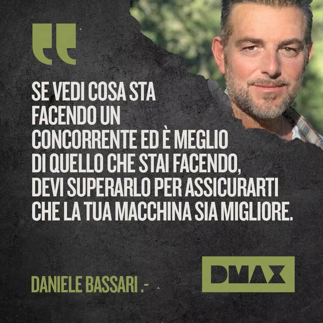
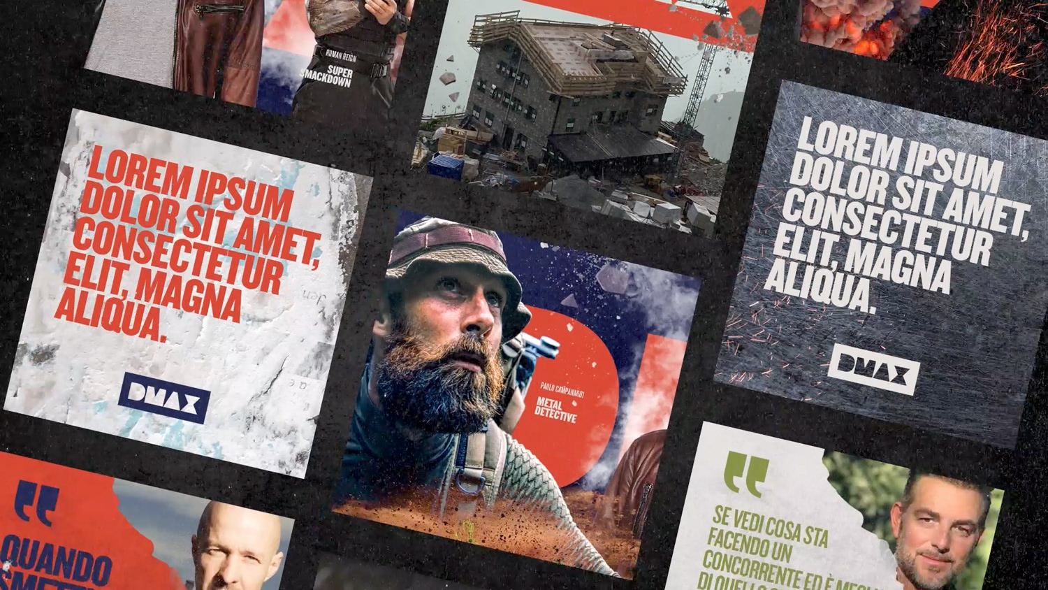
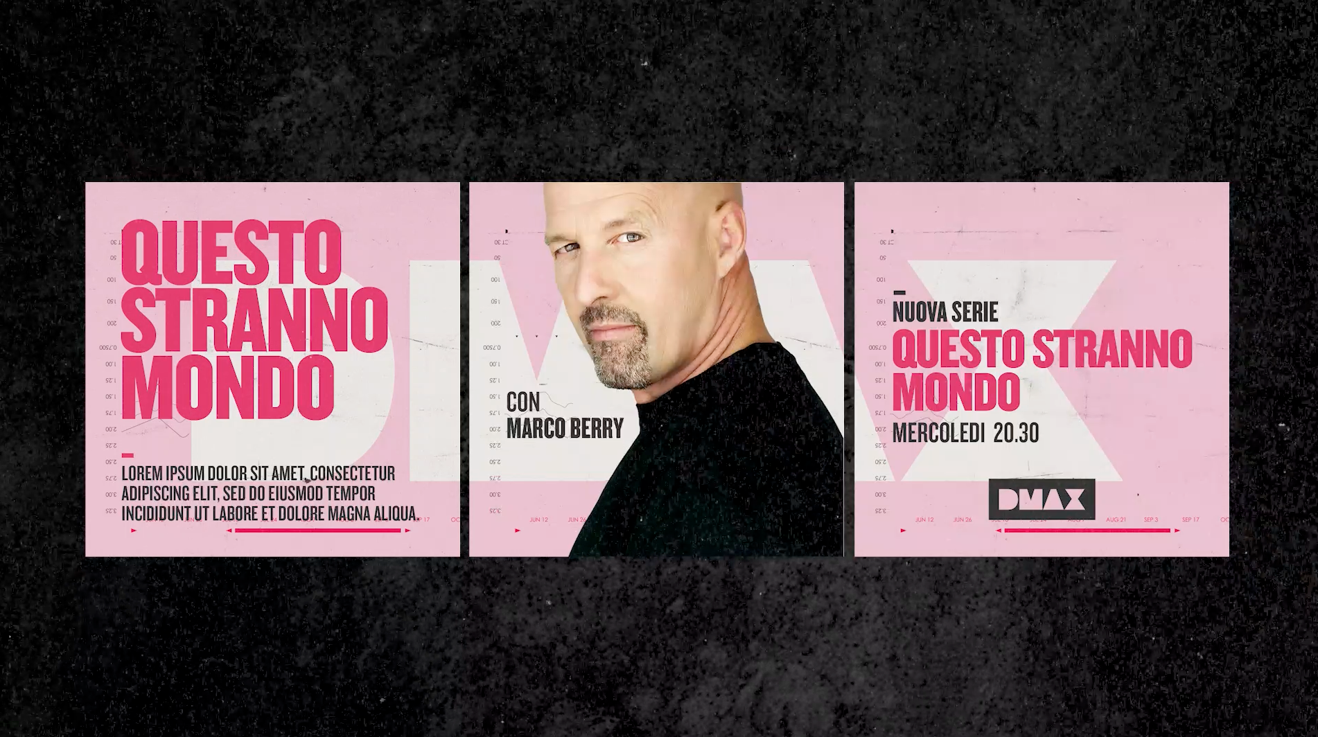
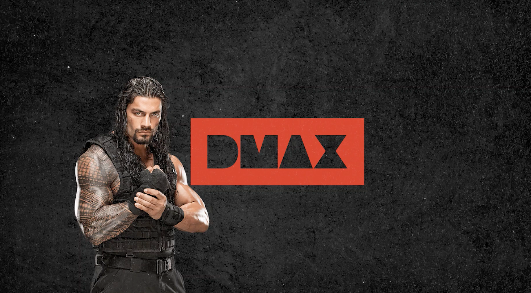
We went back to the DMAX's basics (textures, colors, composition) to create a toolkit that highlighted the core principles of the channel's personality: dynamism, experimentation, action and reaction. The DMAX man loves making and breaking things, and this is characterised with visual allusions to concrete (a very manly) actions: welding, building, painting, waxing on and off (!)
El cliente
DMAX Italia es una red de televisión propiedad de Warner Bros. Es el primer canal de entretenimiento dedicado a la audiencia masculina italiana. Prometen a su audiencia vivir una serie de aventuras extremas desde su sofá.
El reto
Los medios de comunicación social de DMAX Italia se basaron en gran medida en la marca temática de todos sus programas y, aunque todos estos reflejaban los valores fundamentales y los signos de identidad de la marca del canal, al canal le faltaba un conjunto de plantillas para contenidos genéricos y mensajes de marca.
La estrategia de Flopicco Studio
Volvimos a los conceptos básicos de DMAX para crear un conjunto de herramientas (texturas, colores, composición) que destacara los principios básicos de la personalidad del canal: dinamismo, experimentación, acción y reacción. Al hombre DMAX le encanta hacer (y romper cosas), y esto se caracteriza con alusiones visuales a una serie de acciones concretas y muy masculinas: soldar, construir, pintar, en incluso... pulir y encerar (!)


CREDITS
CLIENT
Chiara Cerutti · DMAX
CREATIVE DIRECTION, ART DIRECTION
AND GRAPHIC PRODUCTION
Flopicco Studio
Inhouse Team
Florencia Picco, Fernando Vallejos, Natalia Bellagio, Alejandro Guatelli, Daniela Parasporo, Pablo Camino, Martín Polech, Leandro Nicolosi, Matías Pastorini & Soledad Basigalup & Ana Laya
🖤