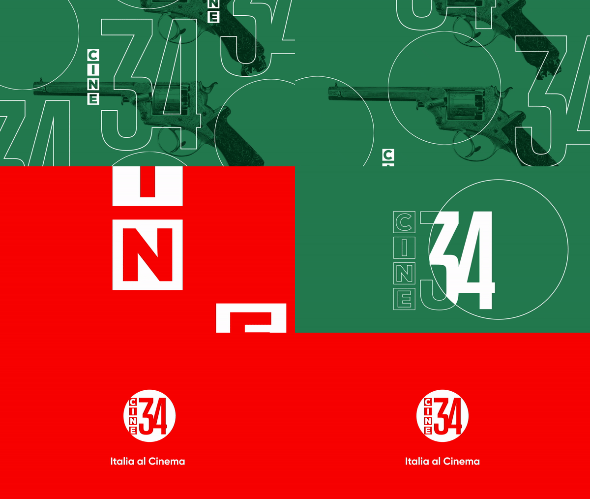
CINE34 BRAND SYSTEM
MEDIASET · ITALY · 2019
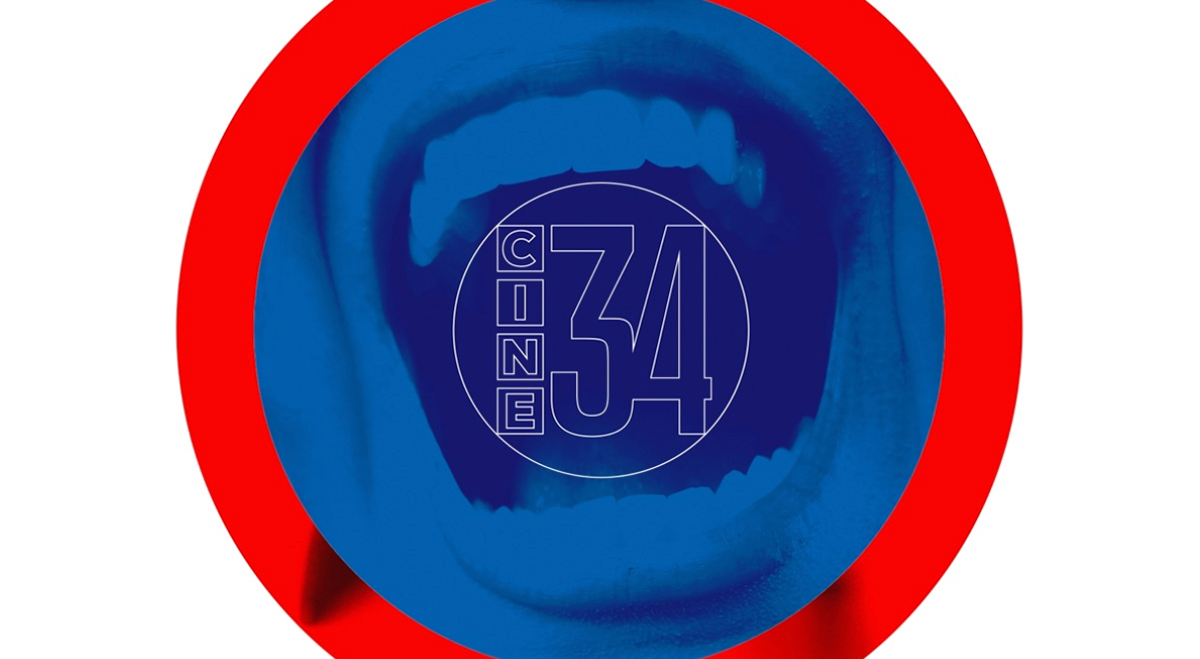
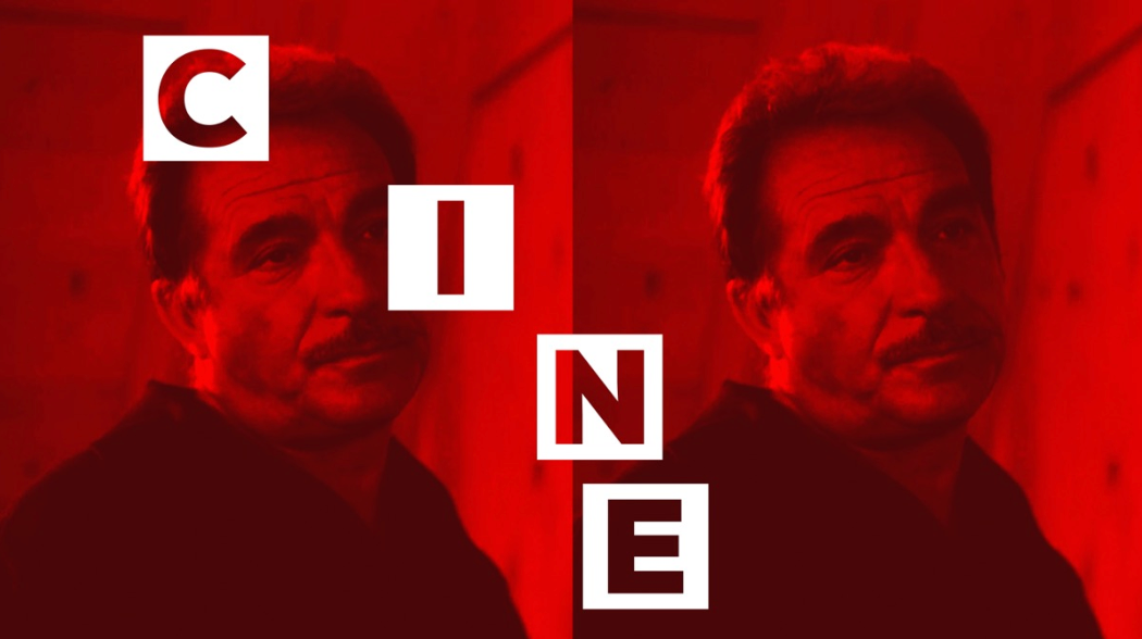
Absolutely over the moon for the opportunity to bring to life a project as fabulous as Cine34, a new free-to-air TV channel dedicated to home-grown Italian cinema. The channel was launched just on January 20, 2020. The date has been selected because it coincides with the centenary of Federico Fellini’s birth. Appropriately, the first day was entirely dedicated to Fellini’s films – including the eternal wonder La Dolce Vita.
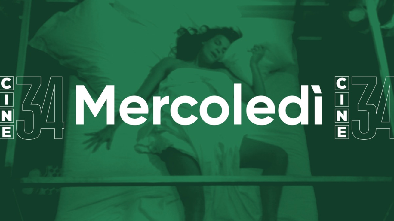
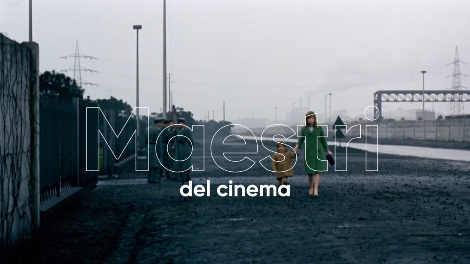
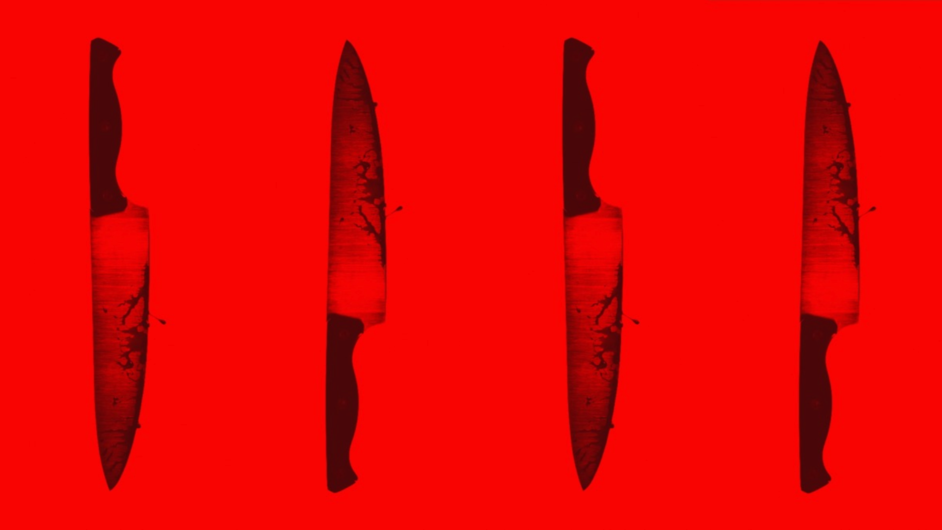
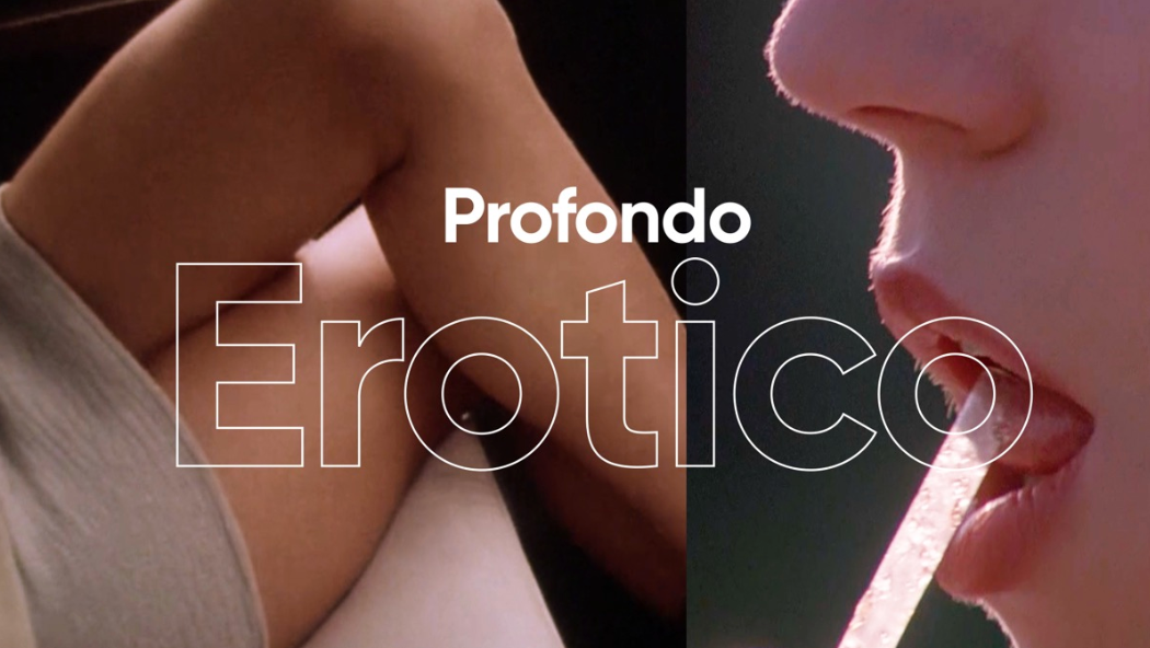
Every day of the week Cine34 will be dedicated to a different film genre. Monday will focus on the Masters of cinema, Tuesdays will be Bellissime (sexy comedies), Wednesdays will be for Detective Films, Thursdays for silly comedies (Non ci resta che ridere), on Fridays there will be Sfumature di giallo, aka Italian thrillers, and for the weekend a strange but complementary combo: Westerns & Cult movies.
Simple yet baroque, divine and mundane, essentially Italian.



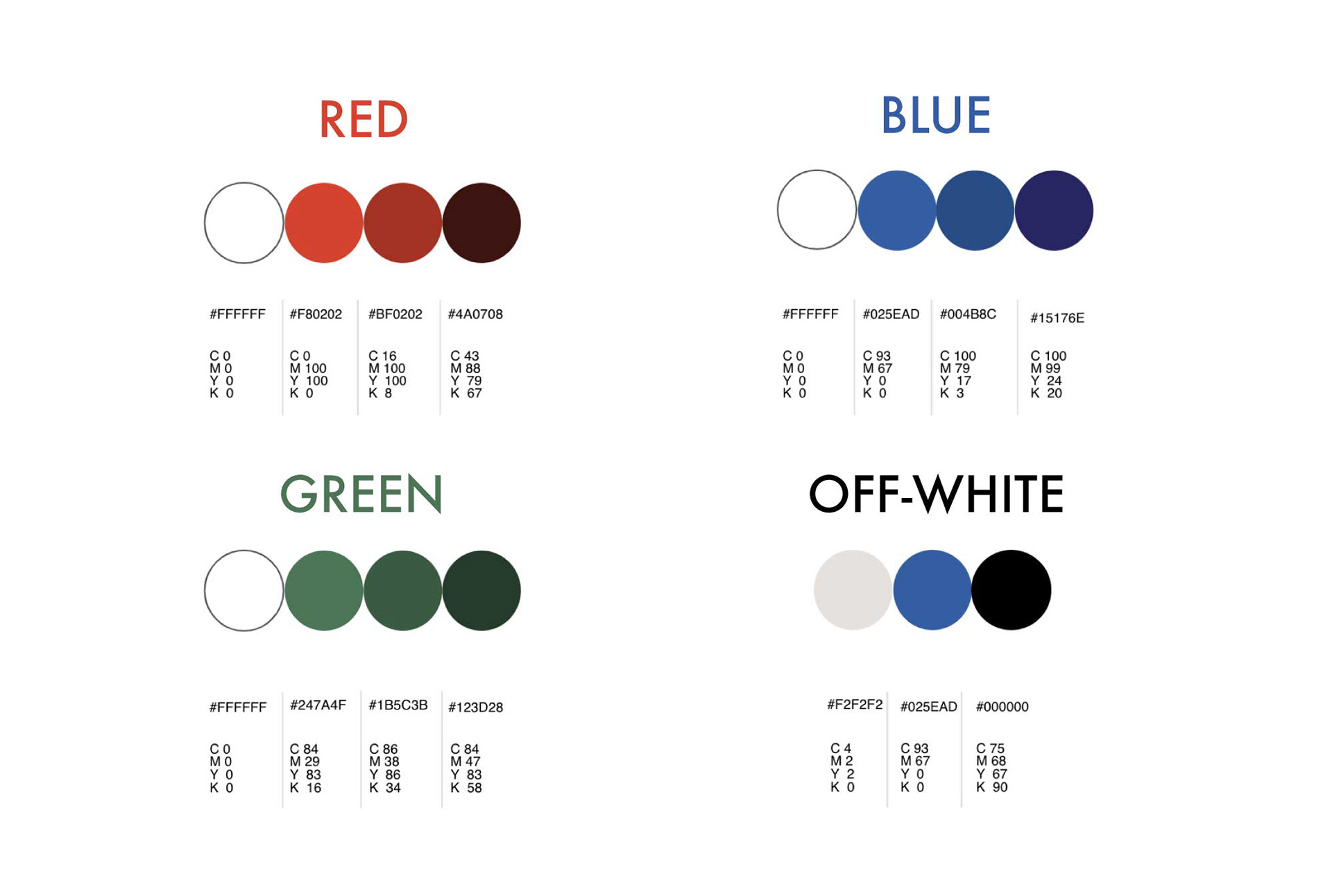
Colour palette
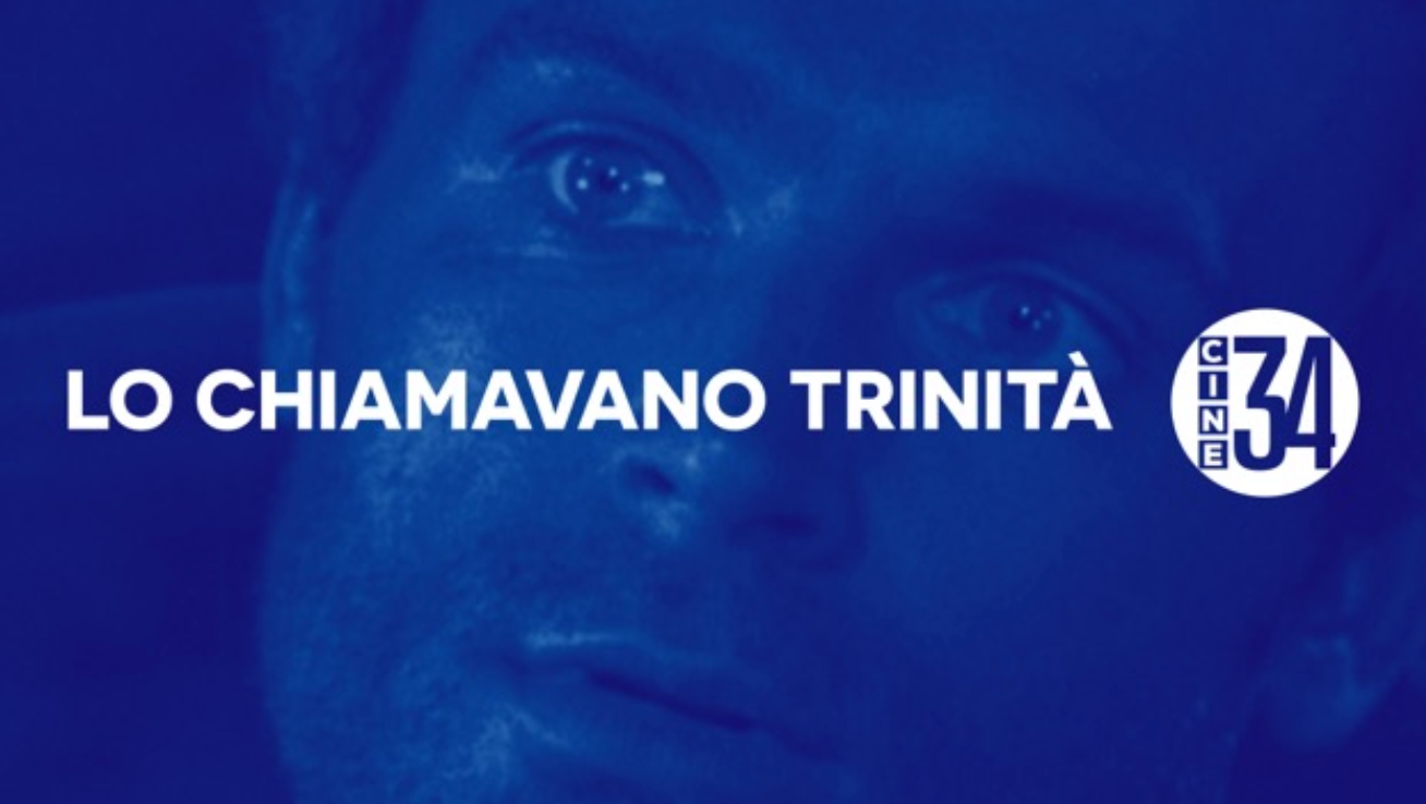
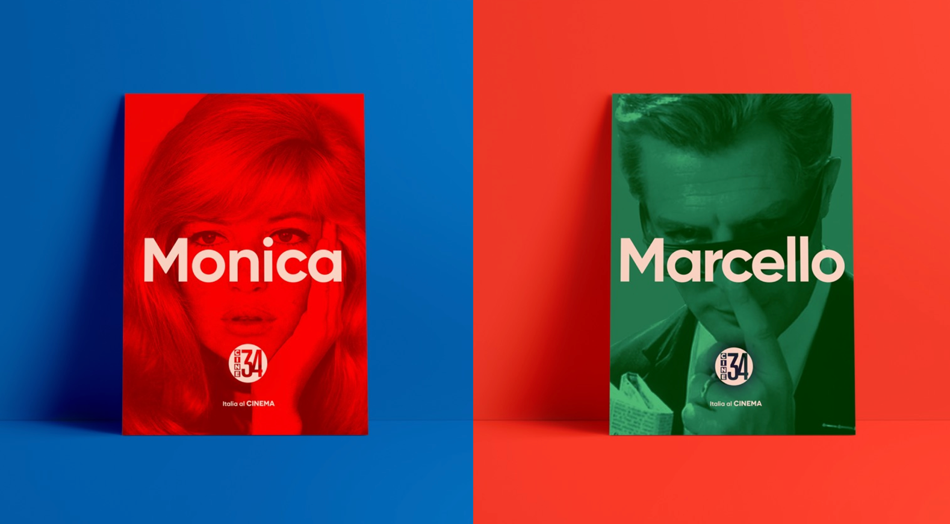
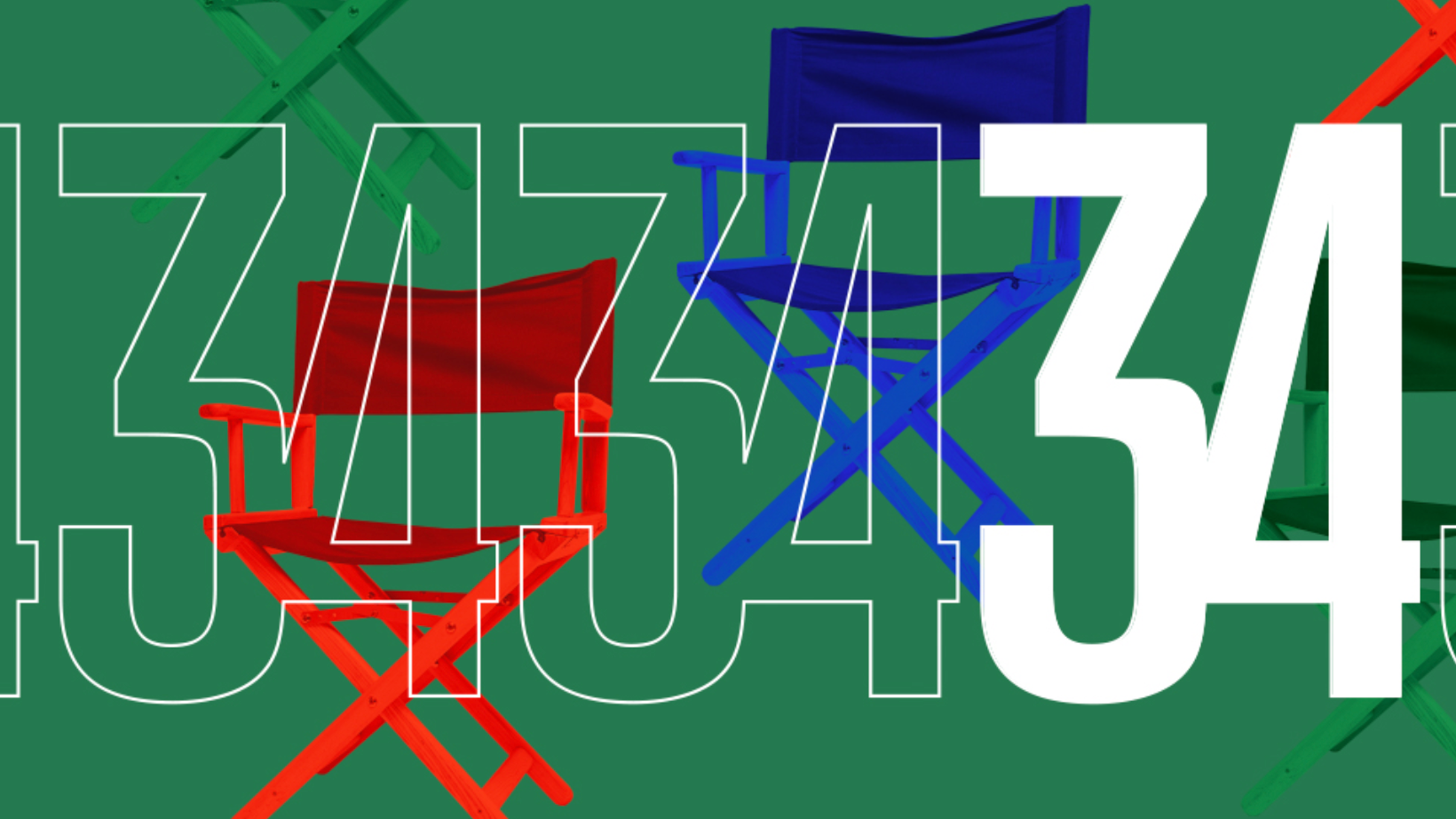
The colours we used were RGB and, as you probably already notice, they work very well on several levels. It is familiar, like a trattoria, bright like neon sign, four-colour like a pulp fiction fanzine.
Italy is bold, bright, unapologetically exaggerate. Elegant but decadent. And with this palette mixed and remixed with the rich footage of the channel we manage to send that message across.
Typography
We opt for a very easy to use couple of sans serif fonts: Novecento Wide Bold + Gilroy Bold. The combination reads nicely, creates hierarchies, and, again, respects the simplicity and mixability that we are aiming for.
Thematic Idents
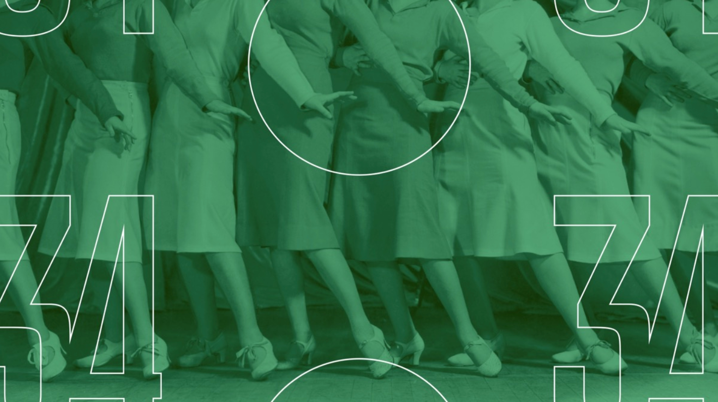
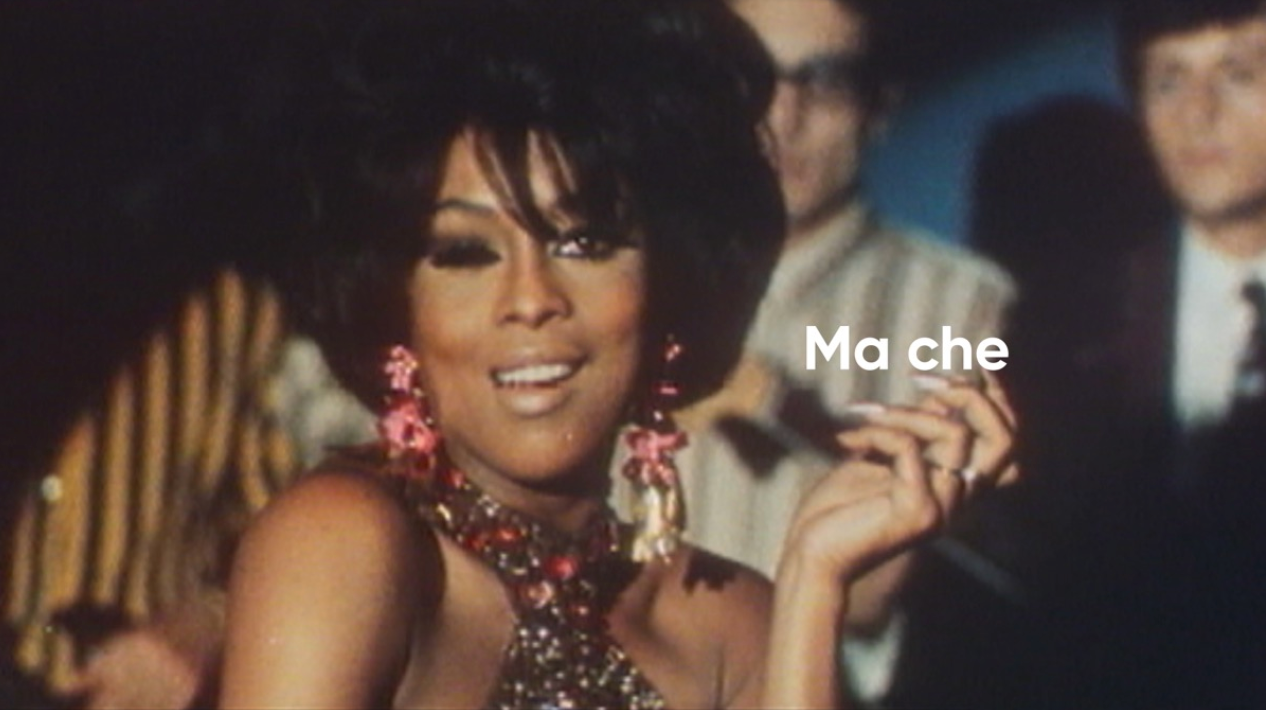
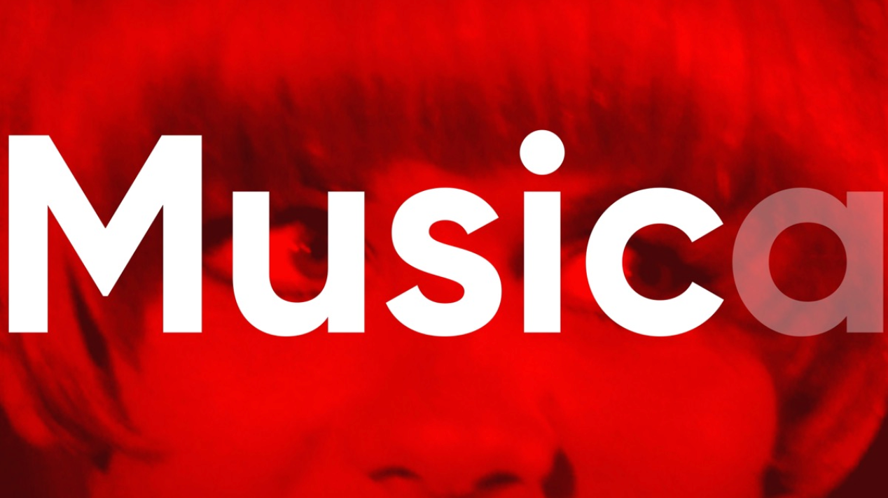
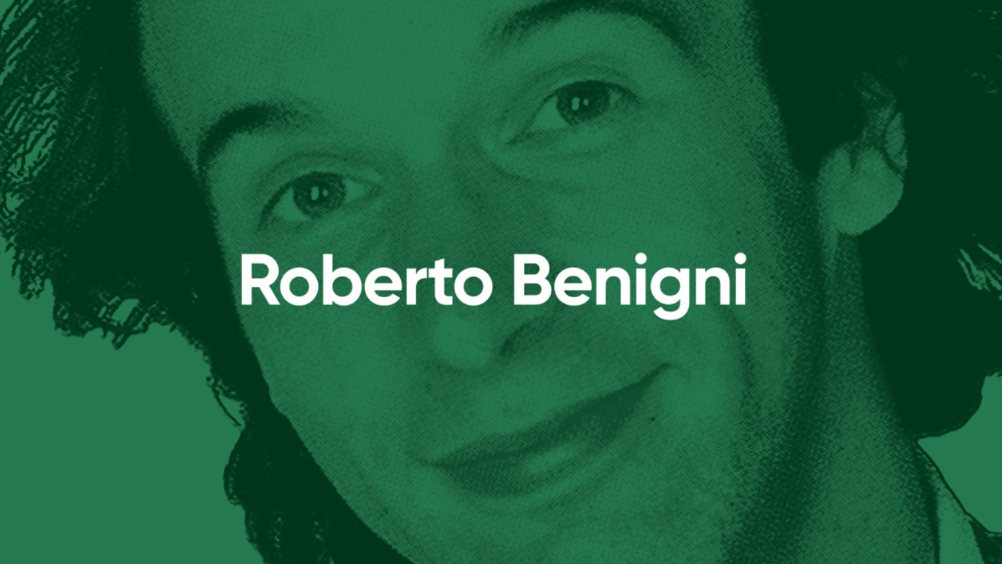
We created a series of IDs based both on the genres that determine the programming of the channel, but also based on the general look, feel and philosophy driving the channel: recognising and celebrating the best of the Italian cinema, from its groundbreaking narrative to its international icons, from Antonioni to Zeffirelli ;)


Off Air
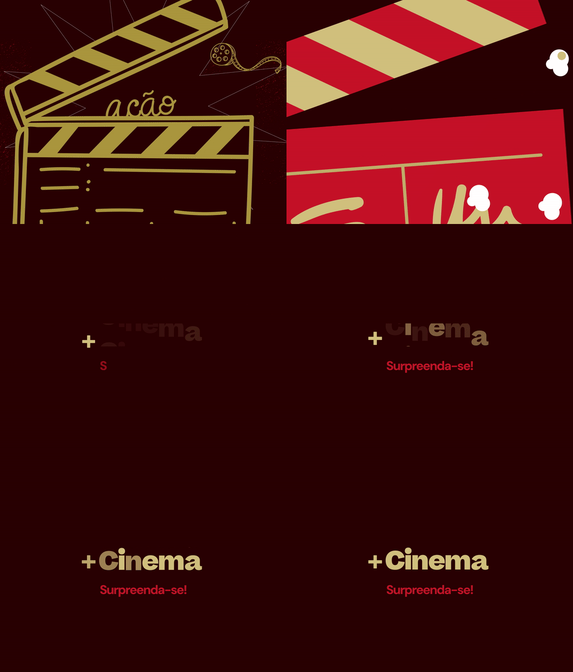
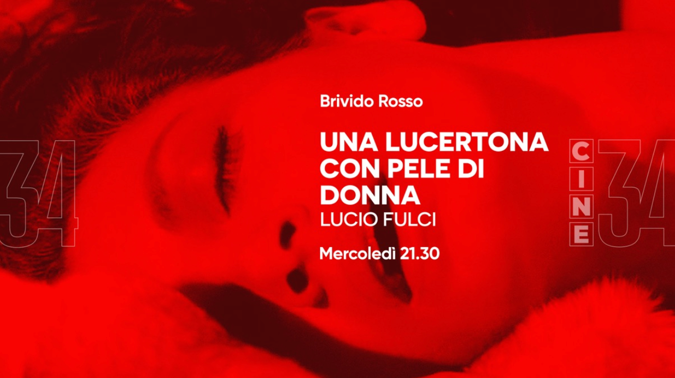
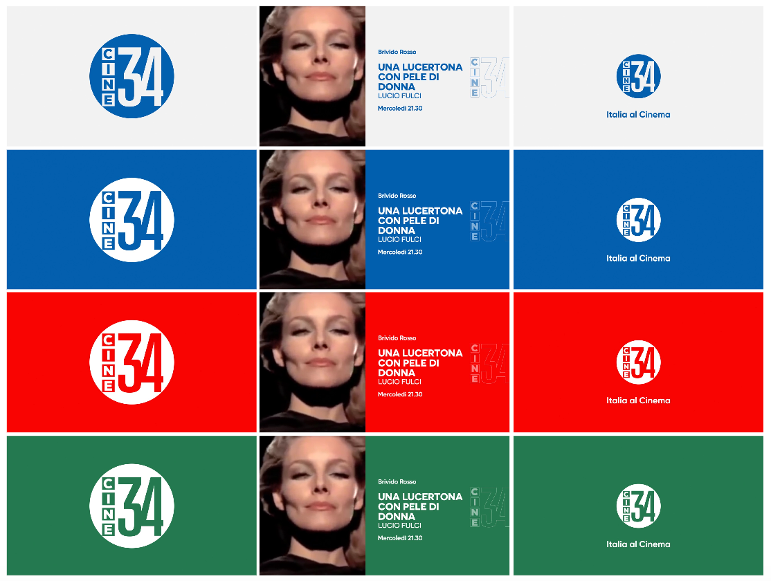
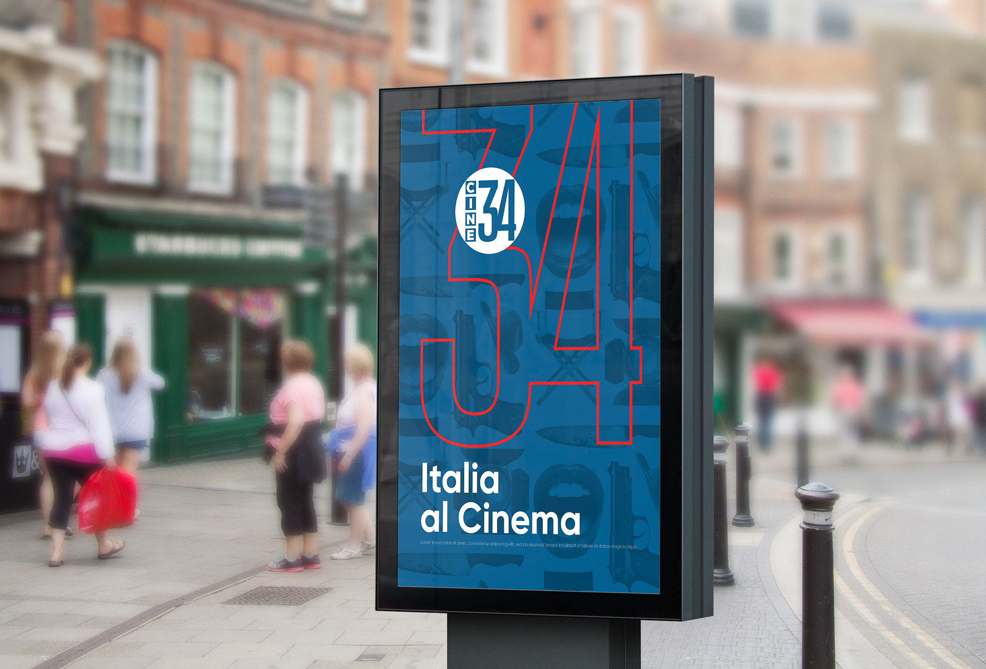
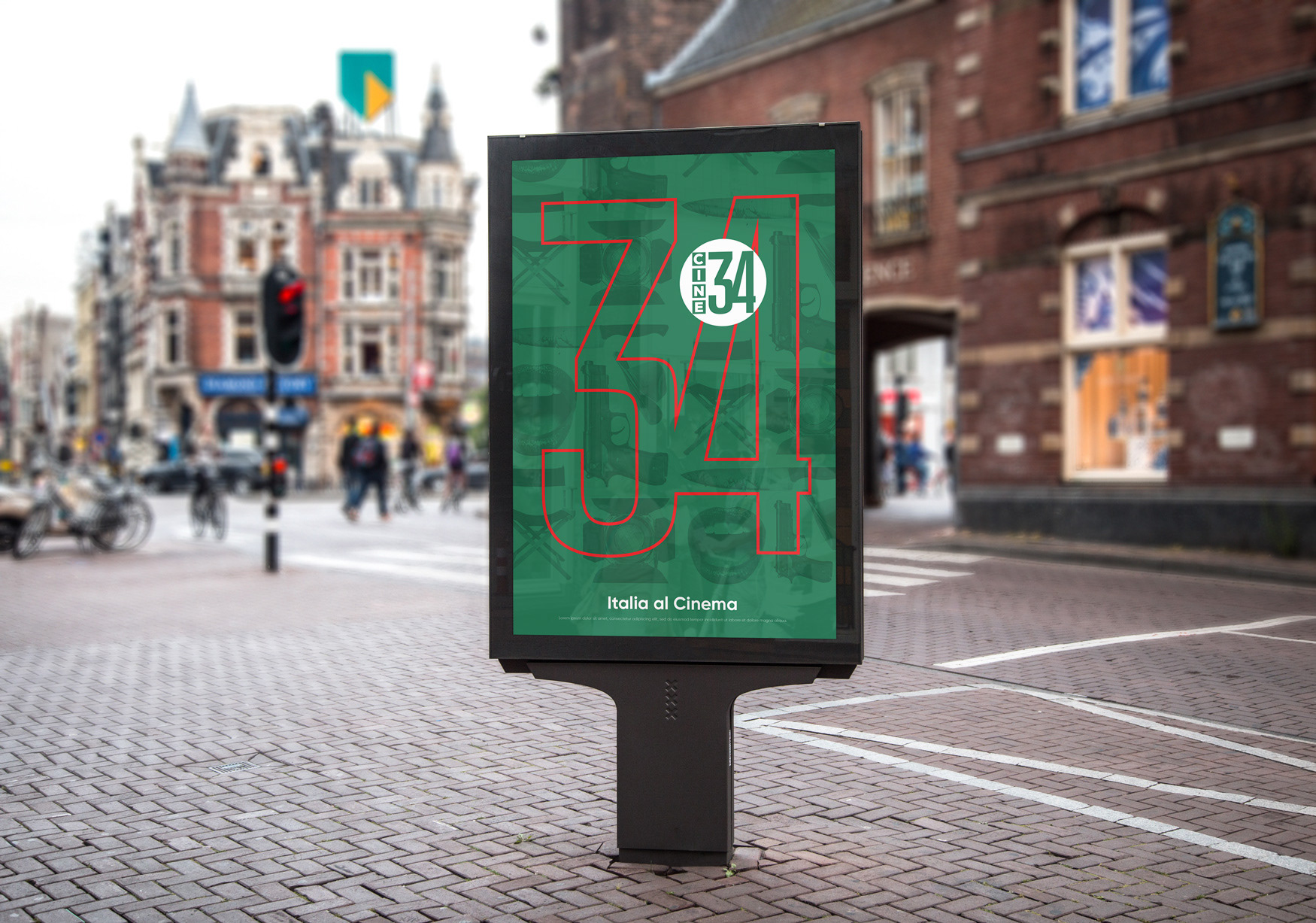
There are many elements to create beautiful Off Air pieces just with the basic graphic elements (palette, logo and typography) or including some of the footage of the most iconic movies.
Here's a small sample of the pieces we created for editorial uses and outdoors advertising.
- Italia al cinema all day, everyday?
- Yes, please!



CREDITS
CLIENT
Mediaset, Mirko Paje, Francesco Lo Torto, Letizia Mascolo
CREATIVE DIRECTION, ART DIRECTION
AND GRAPHIC PRODUCTION
Flopicco Studio
Inhouse Team
Florencia Picco, Fernando Vallejos, Natalia Español, Pablo Camino,
Alejandro Guatelli, Martín Polech
With the collaboration of
Neo Dg, Lionel Wainsztok, Marina de Pedro, Pablo Paz, Rino D'Anna
🖤
#GoWithTheFlopicco


