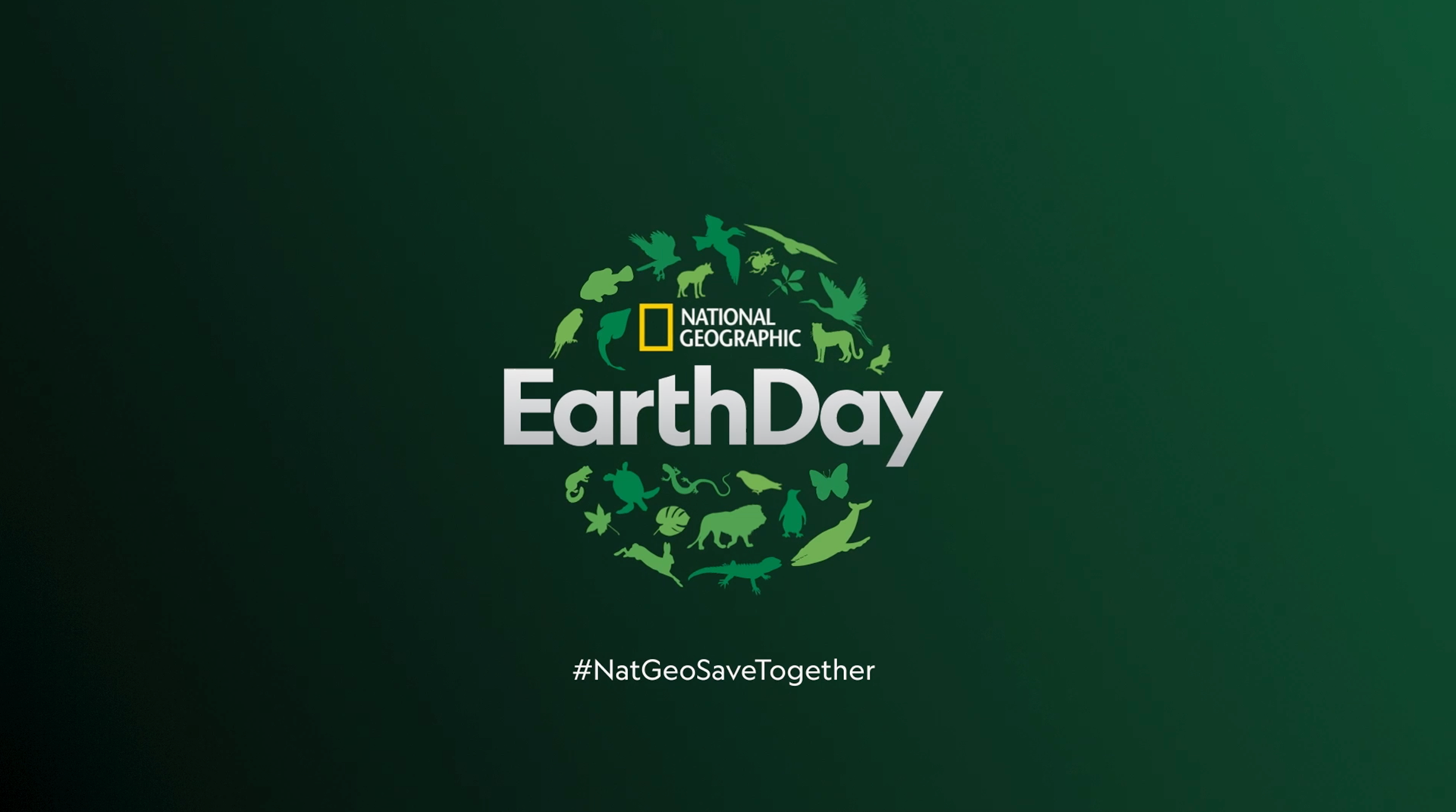
NAT GEO EARTH DAY 2020
National Geographic · Global · 2020
One of the most important projects we got the change to work lately is definitely Earth Day. Especially this year when we will be commemorating the 50th anniversary of the first Earth Day, a year where the significance of "Earth Day" is magnified and expanded to become a philosophical issue.
Nowadays it is easy to forget that we are in the middle of a climate emergency and that it is our hands to restart the world with another approach in our minds. A different notion of progress and growth that take into account that us humans are not the solely owners of the planet, but just one of the many wonderful species that inhabit it.
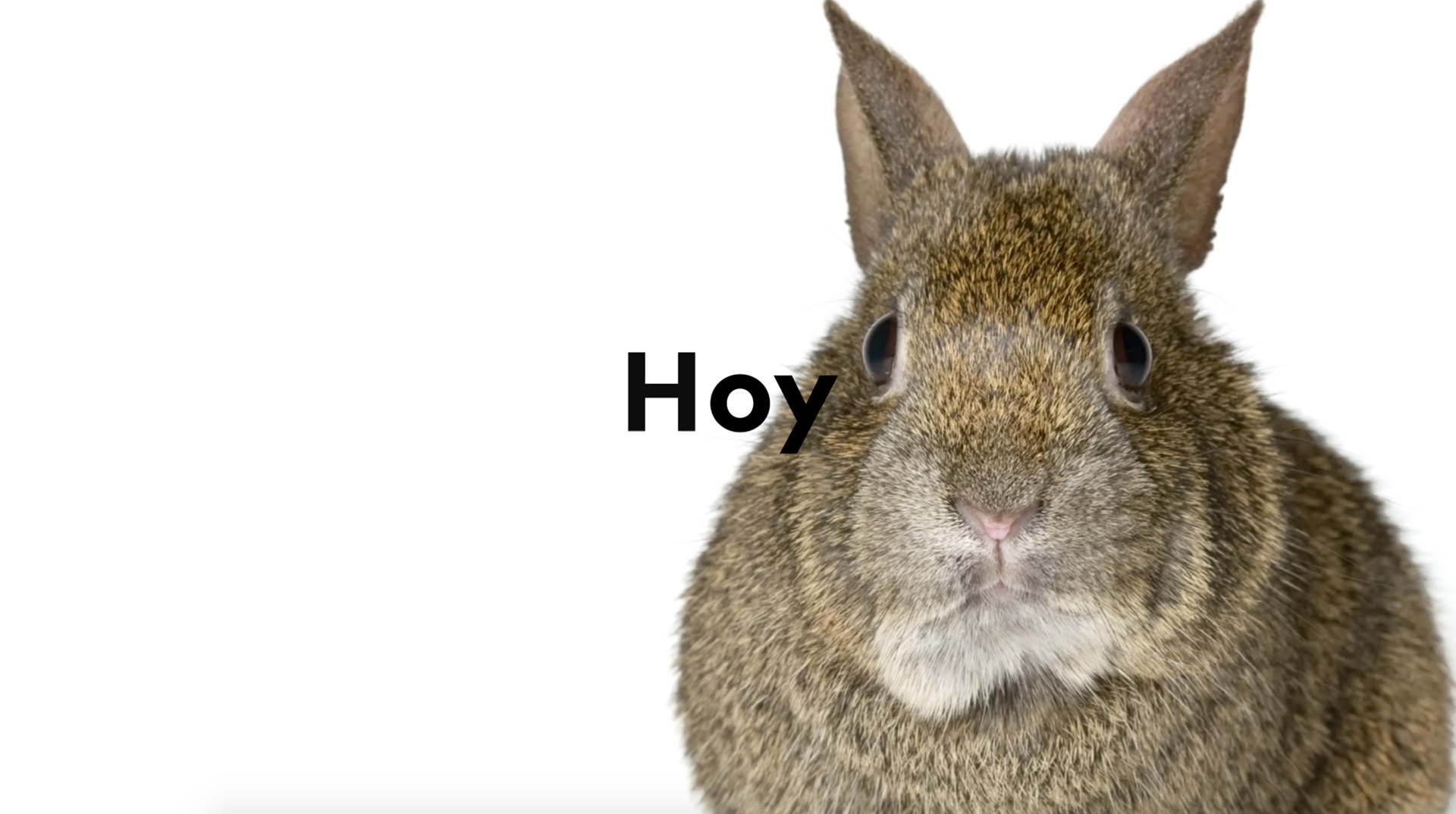
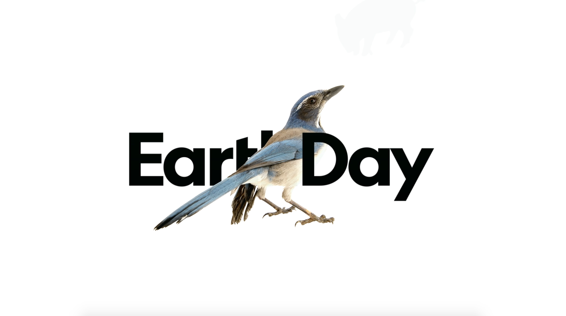
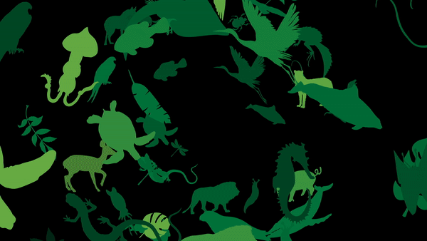
For this campaign we focused on highlighting the extraordinary -yet simple- beauty of all the living forms that surround us. A small tribute to the fellow travelers with whom we share our journey on Earth.

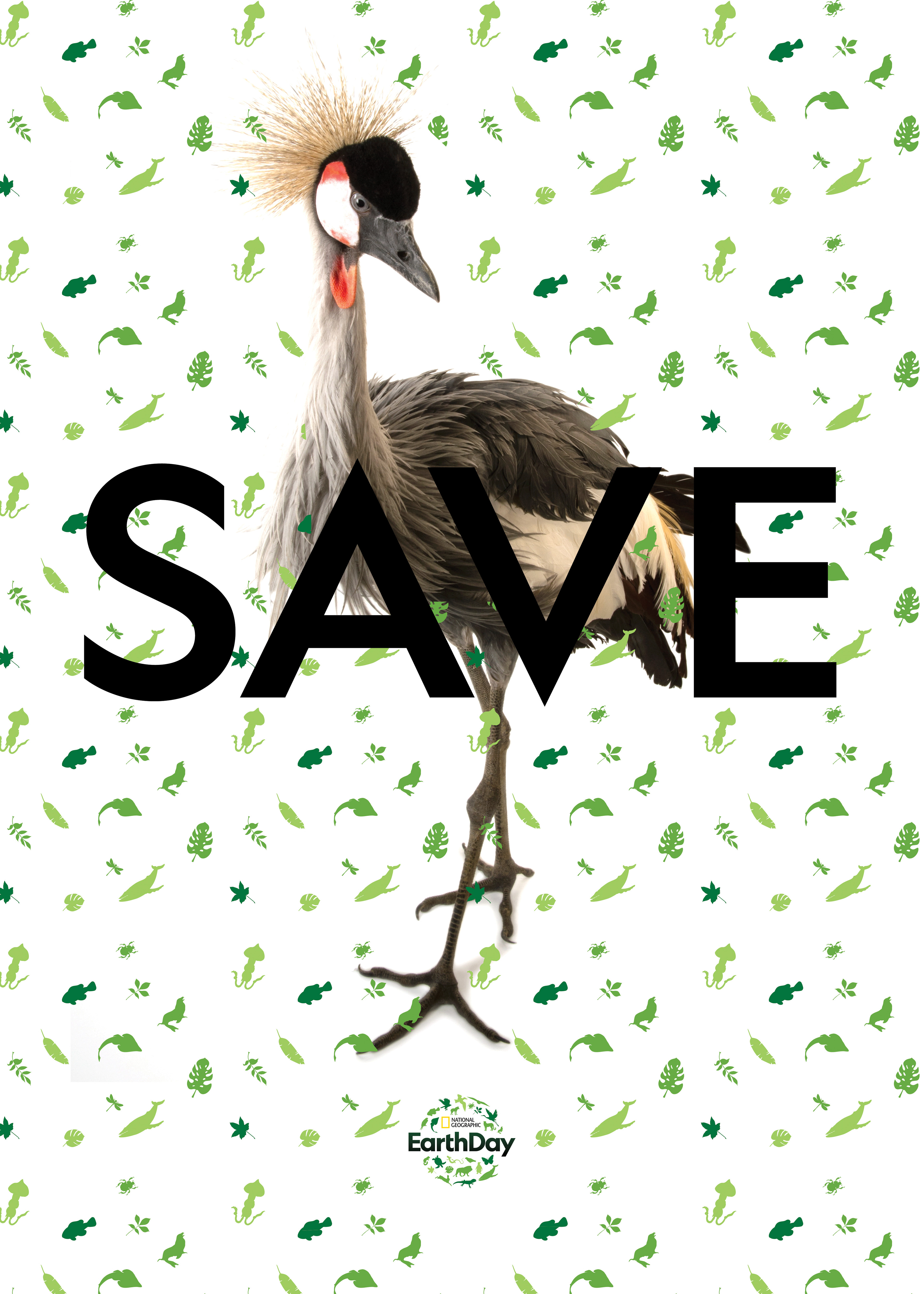


The core of the project is the natural beauty of all the animals and ecosystems on Earth but it also emphasises the power of photography to showcase beauty and to share knowledge, something that is inherent to the National Geographic project since the very beginning in 1888.
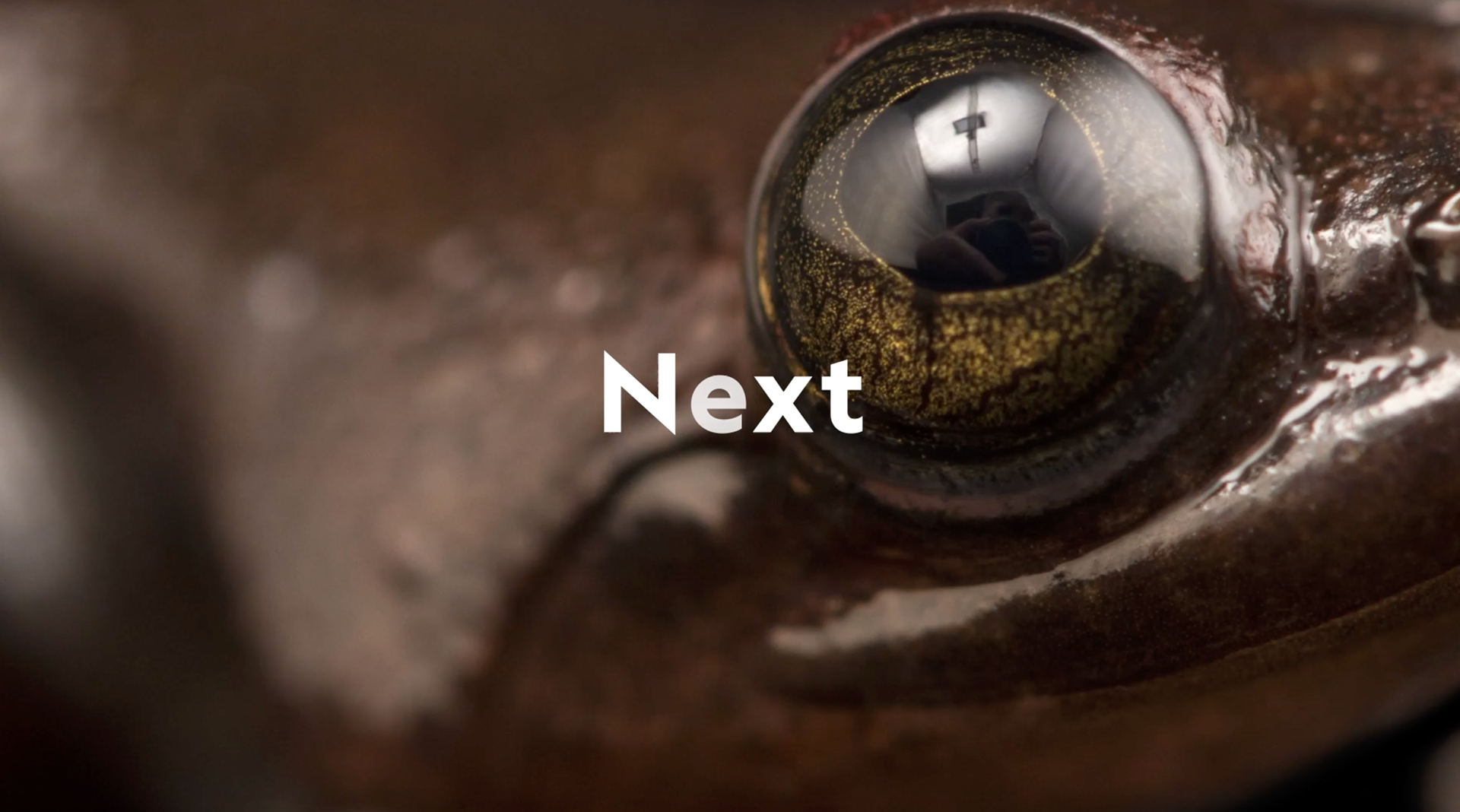
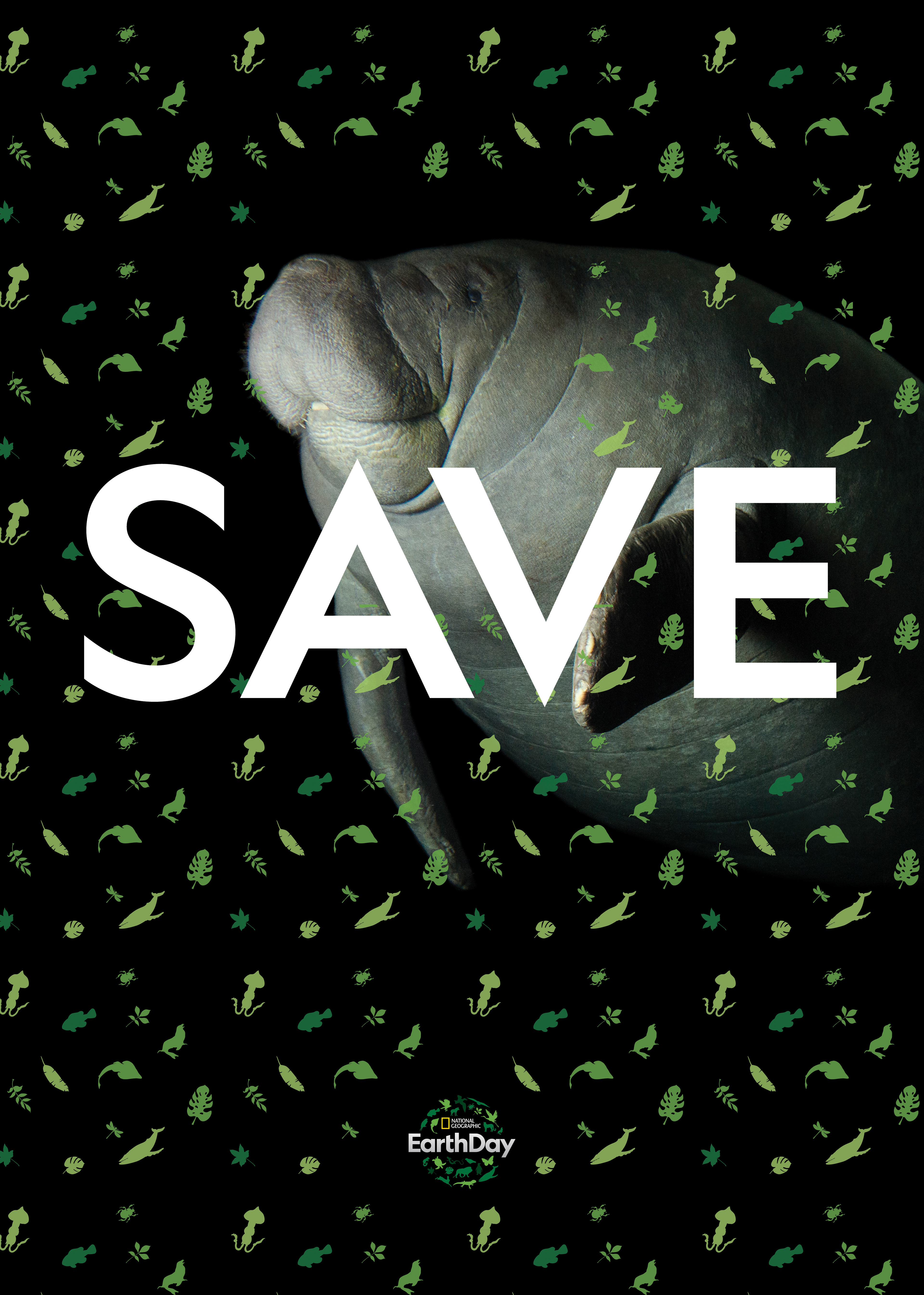
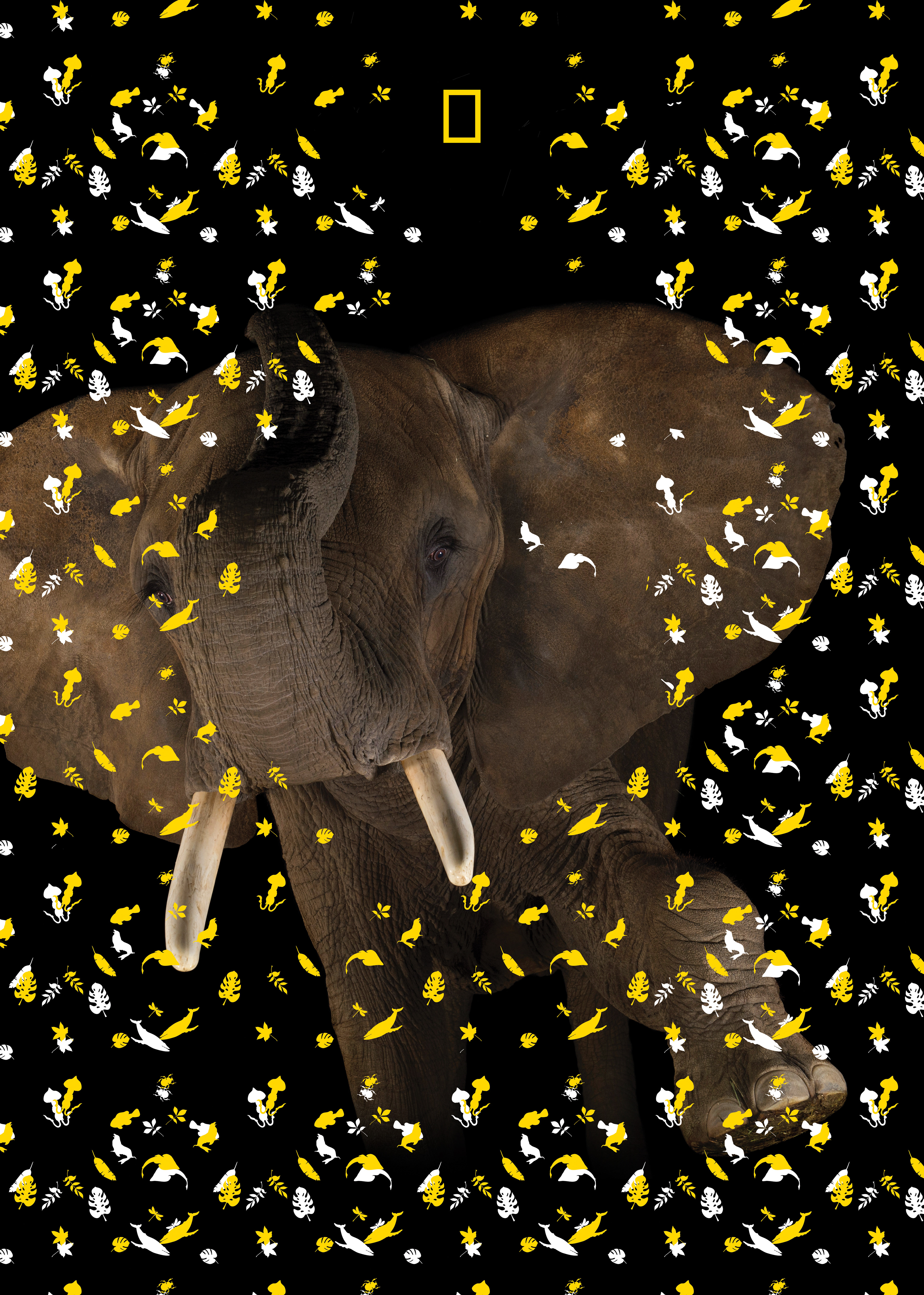
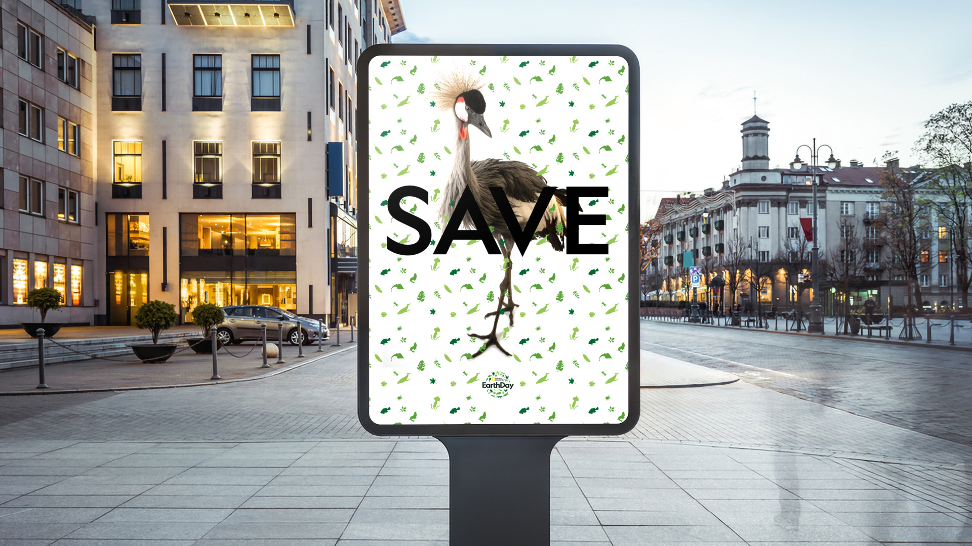
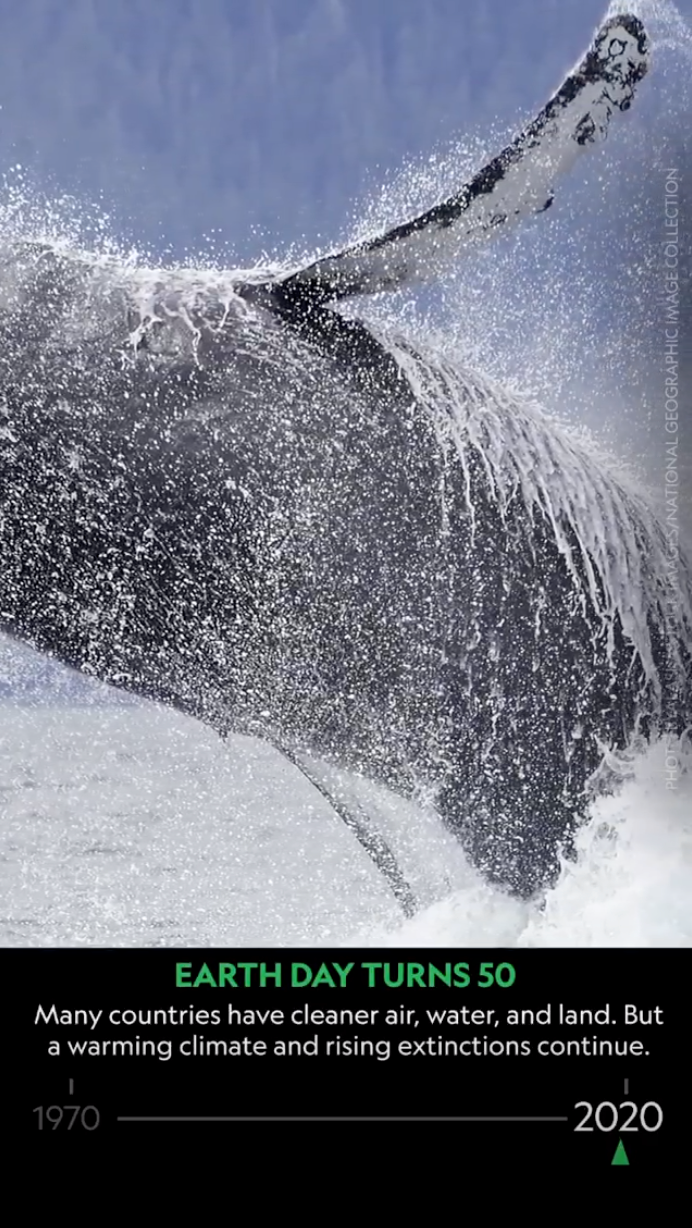
The photos used on this project belong to Photo Ark, an outstanding project founded by Joel Sartore who is making an enormous effort to document species before they disappear and, as he said "to get people to care while there's still time". A match made in heaven.
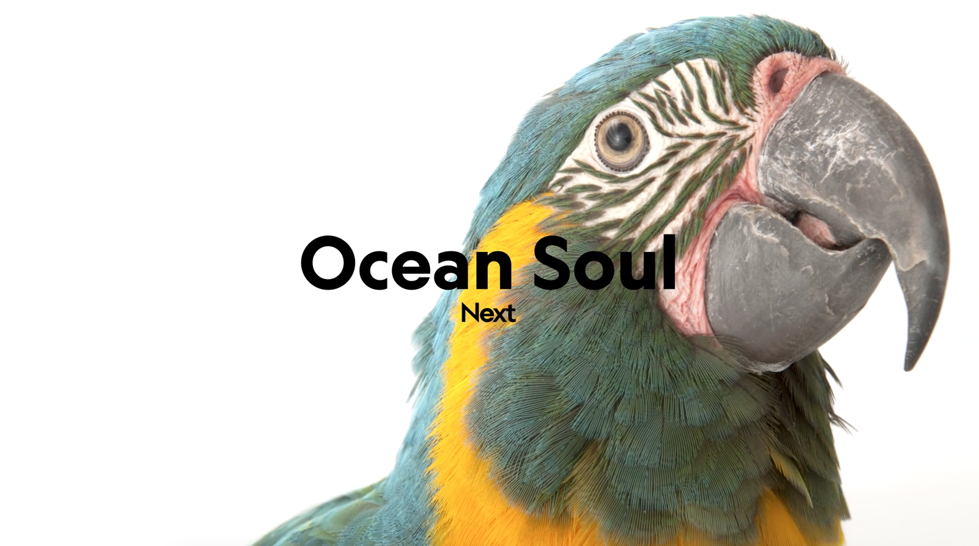
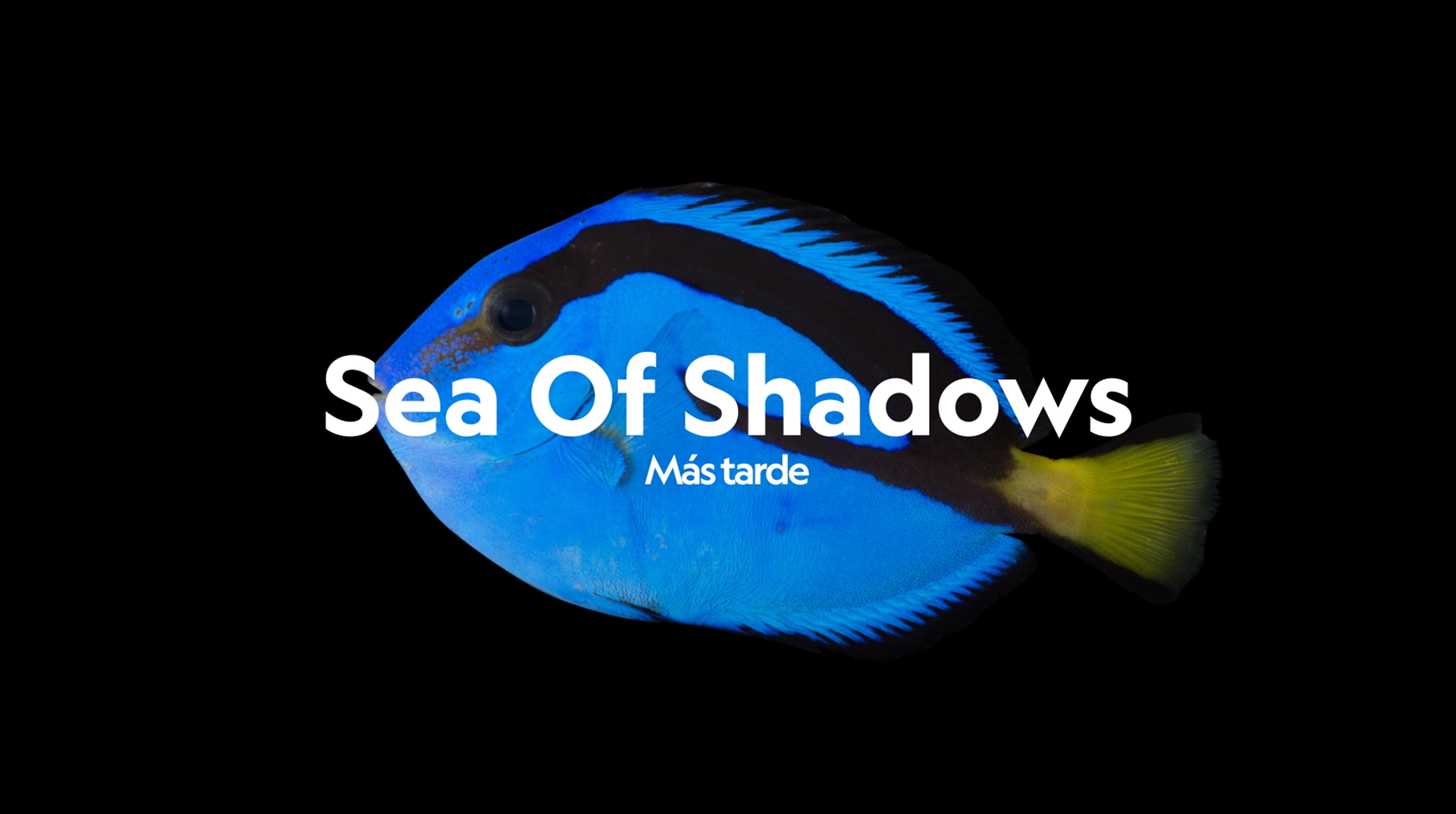
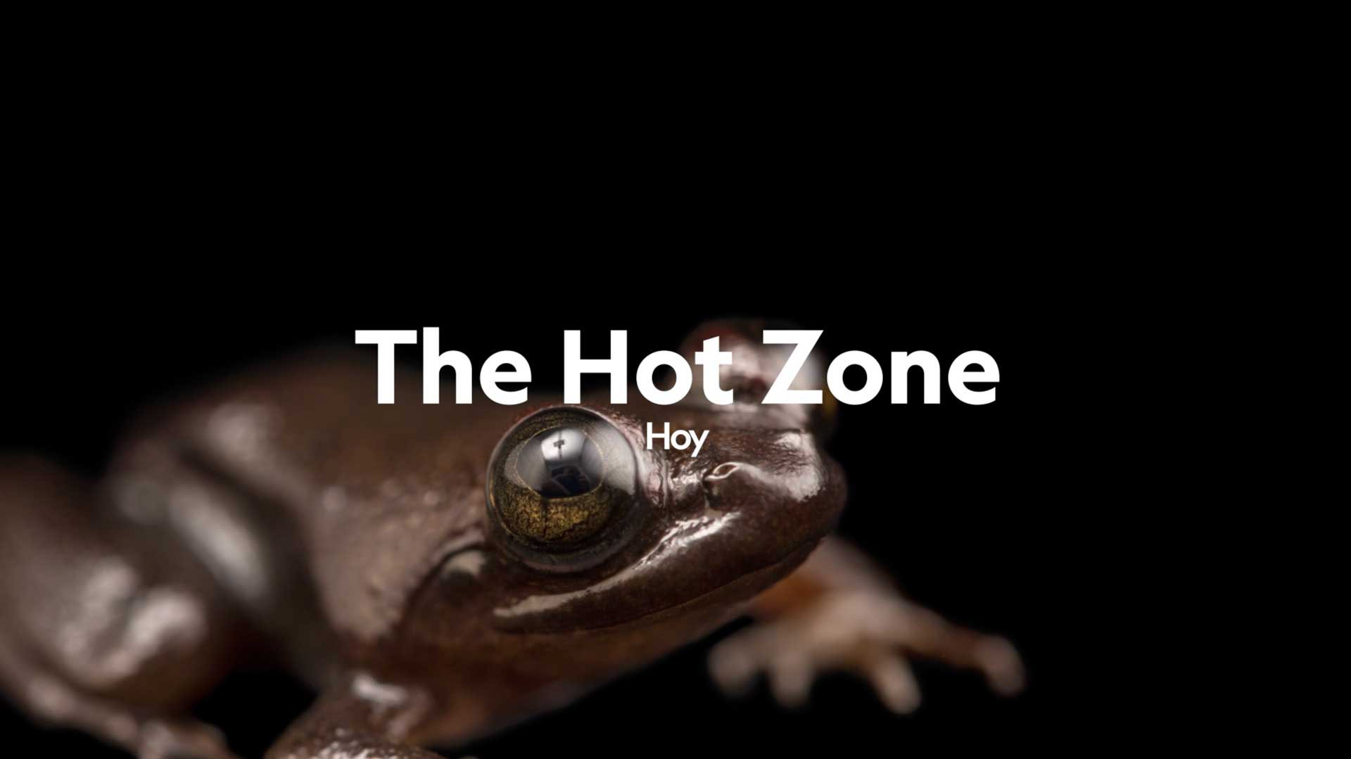
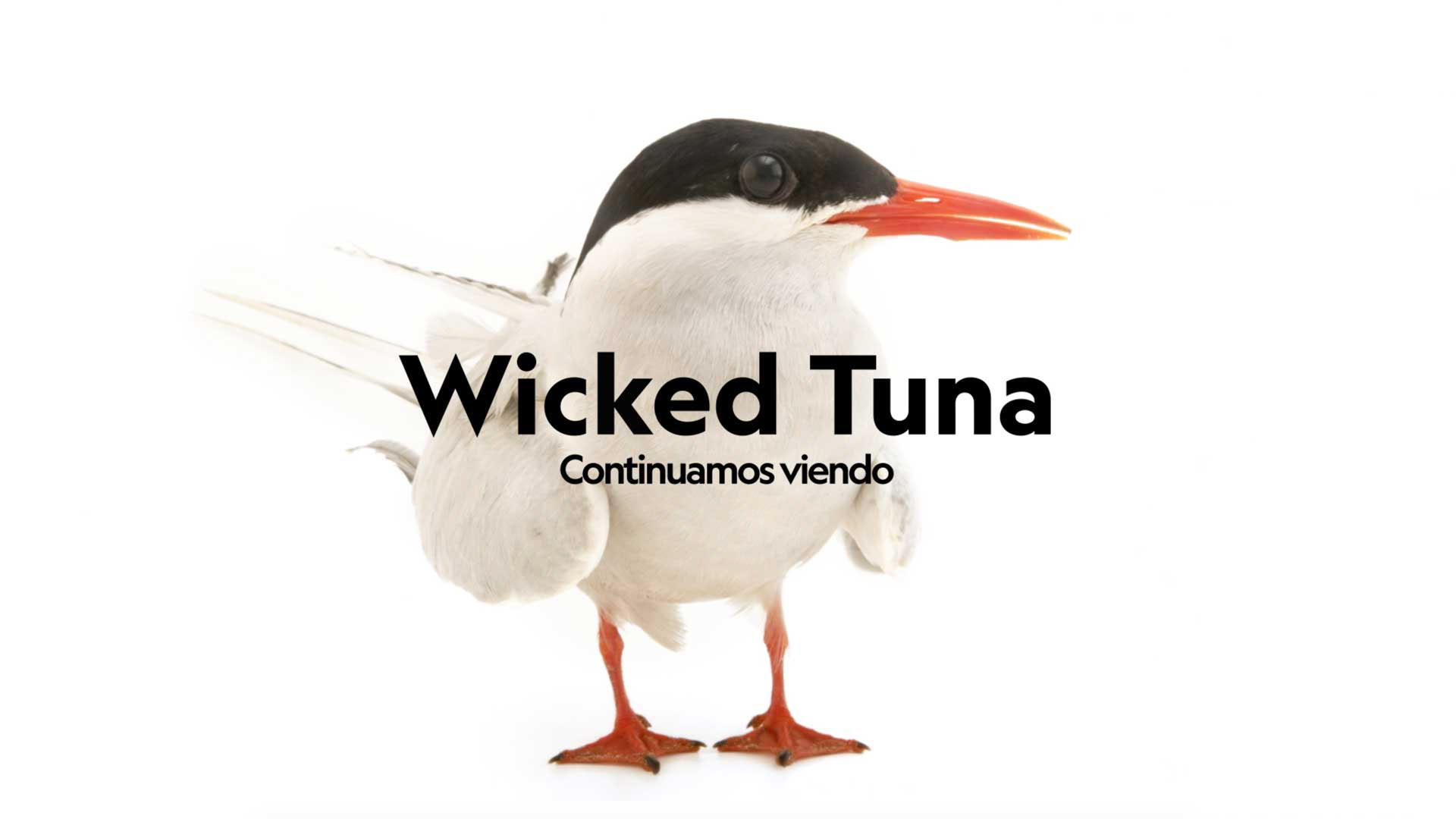

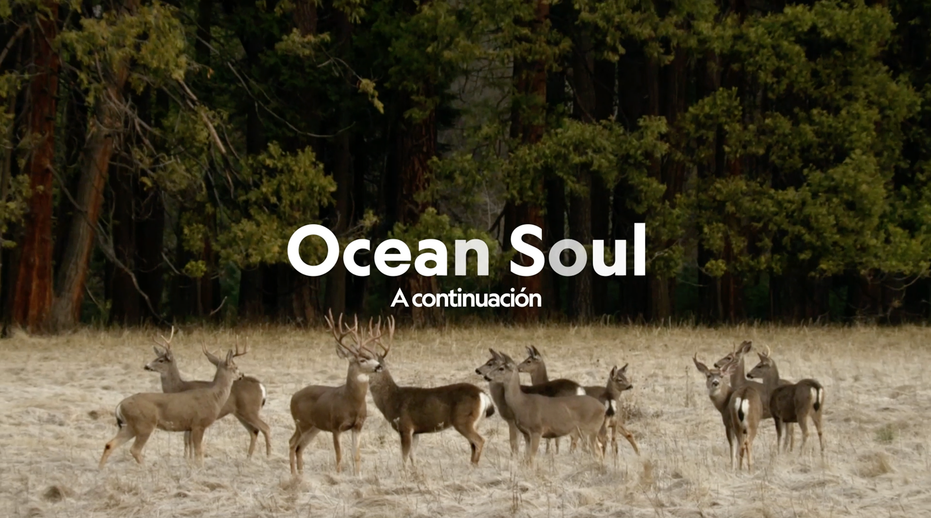

Having such eloquent photographies the challenge for us was to create a balanced system, as subtle enough not to interfere with the image, but also clear and powerful enough to create a strong identity.
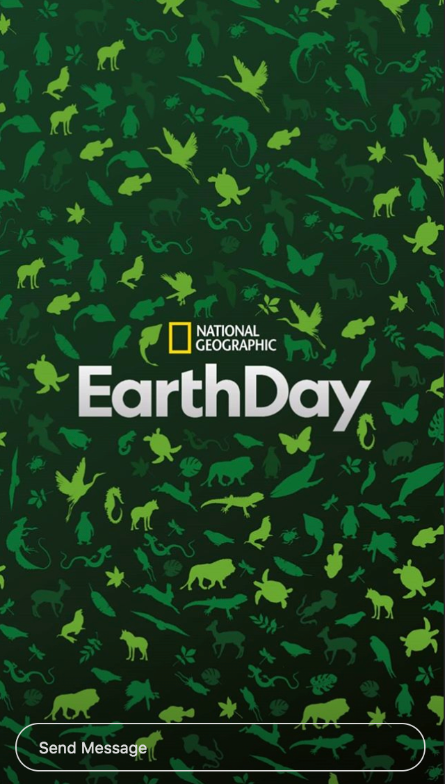
We decided to complement the greens palette of the logo with white, black and very delicate degrades, and we use the existing colours in each photograph to create a series of natural patterns.

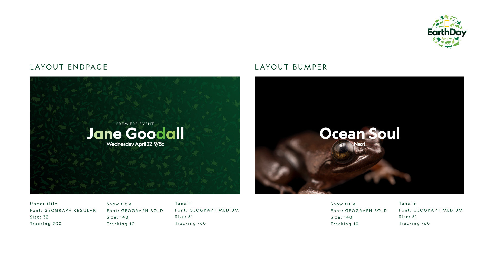


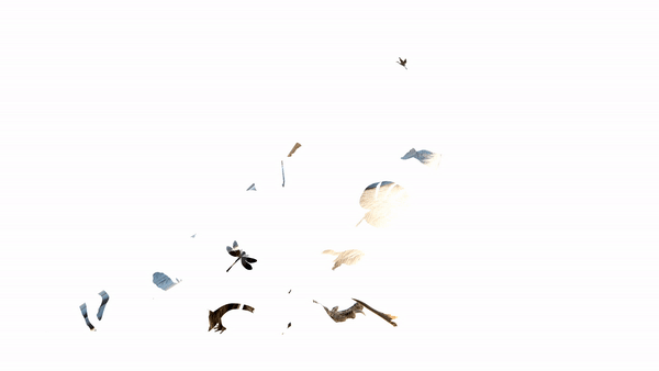

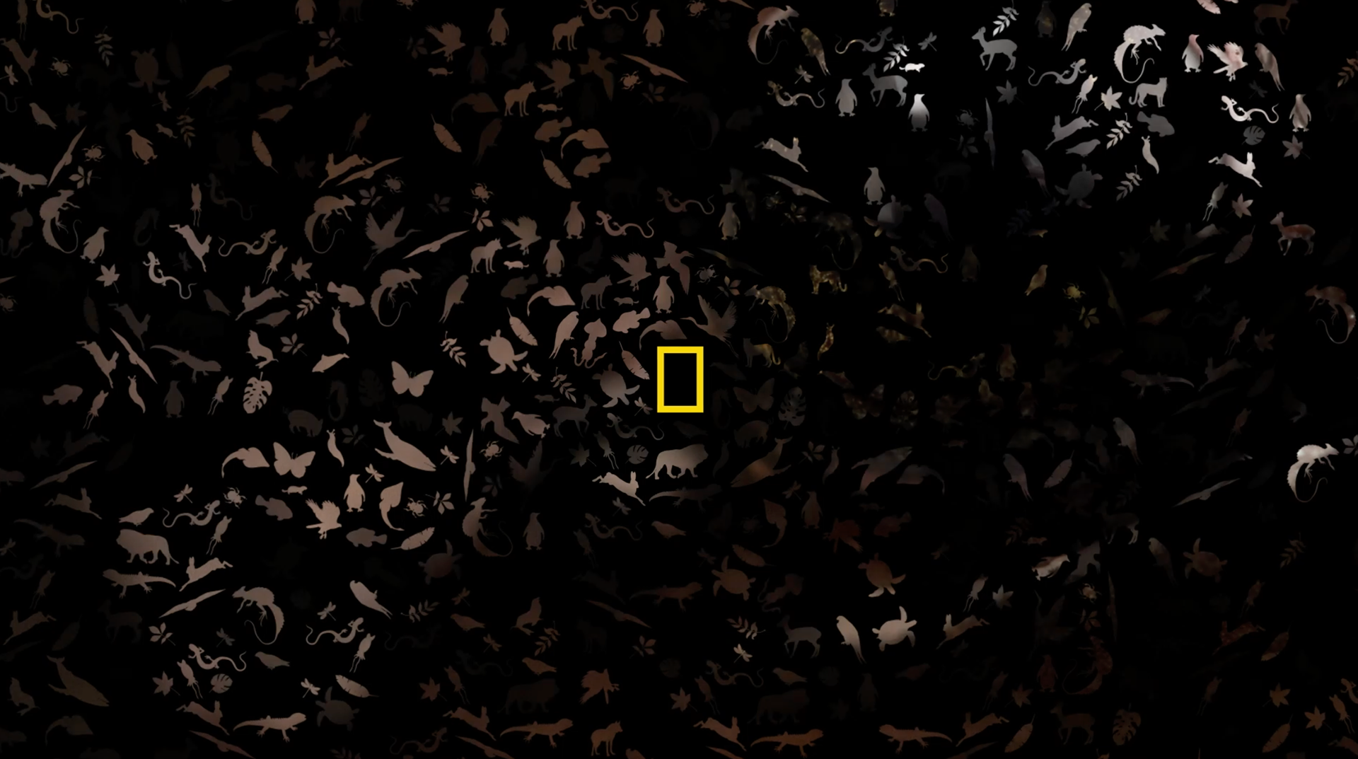
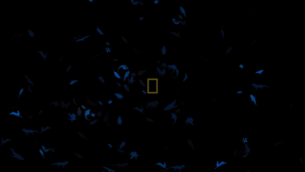
The patterns created resemble small colourful ecosystems that add the notion of a diversity, complementing the otherwise close-up approach.


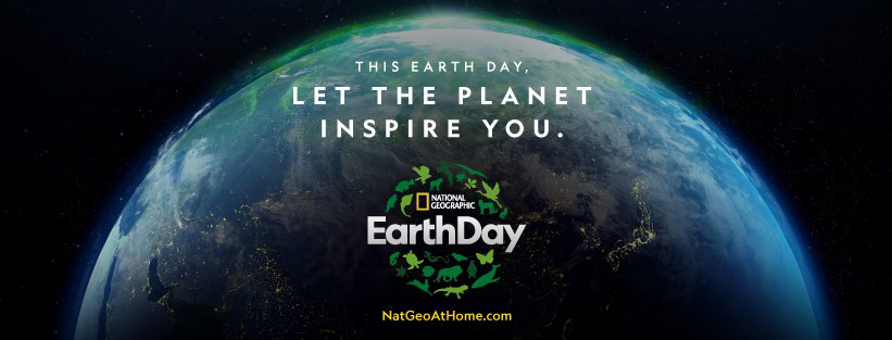
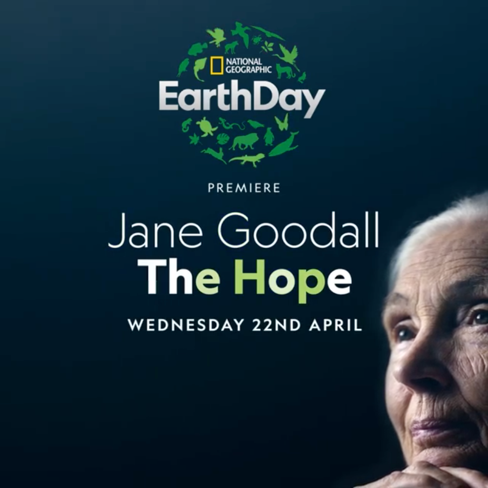
Given that 2020 marks the 50th anniversary of the first making Earth Day 2020 a historic moment all the Nat Geo channels around the globe prepared a very special programming for what the called Earth Week.
If you have the channel you can have a look at the elements we created for them in action during this whole week.


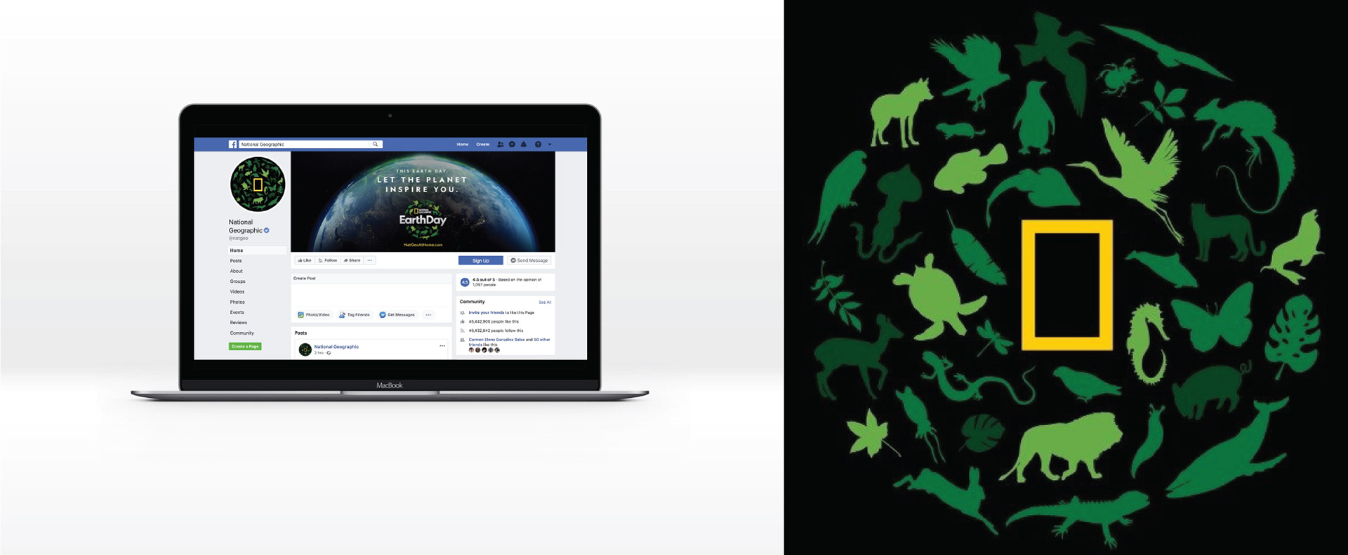
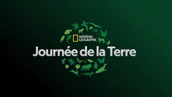
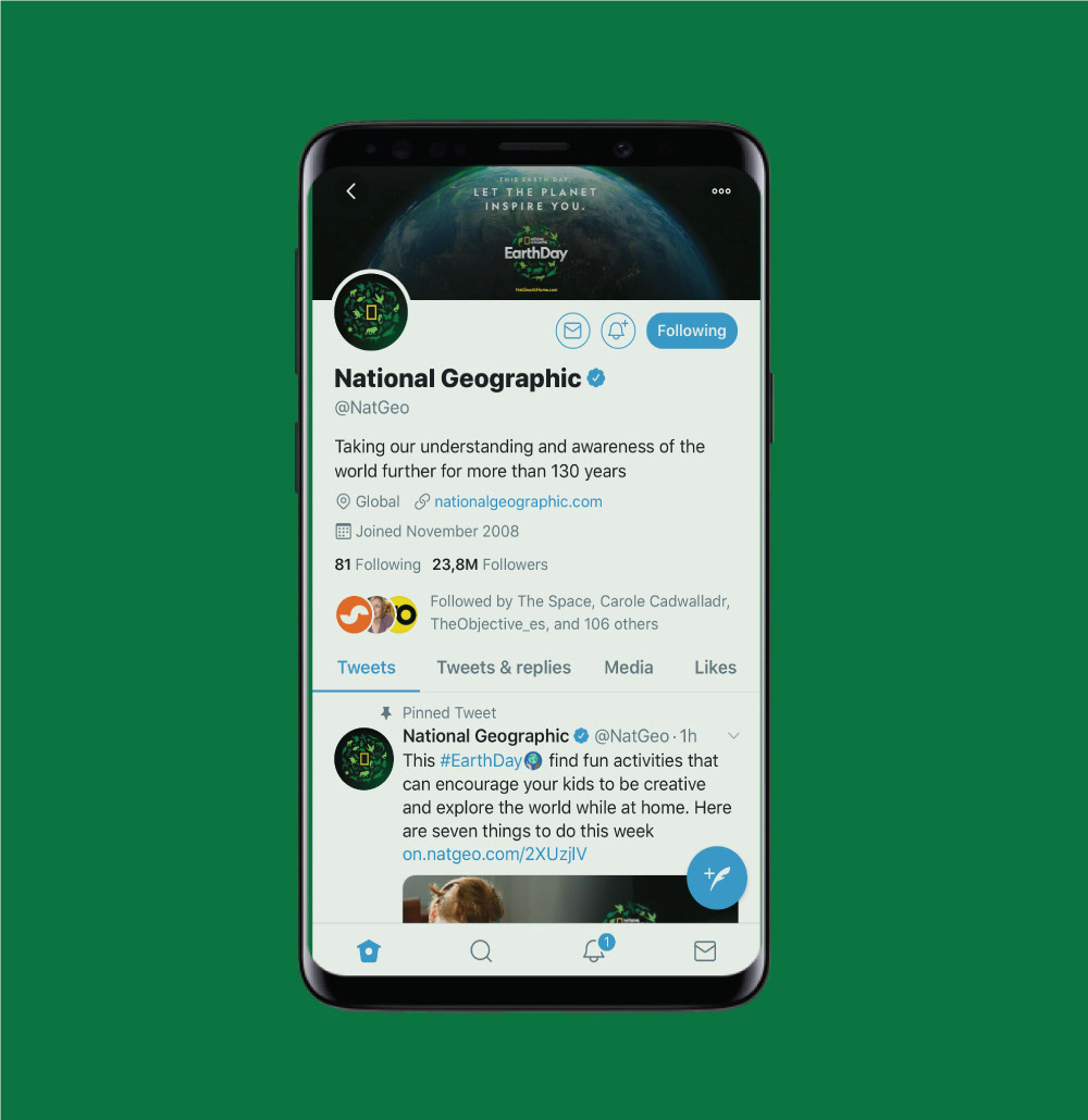
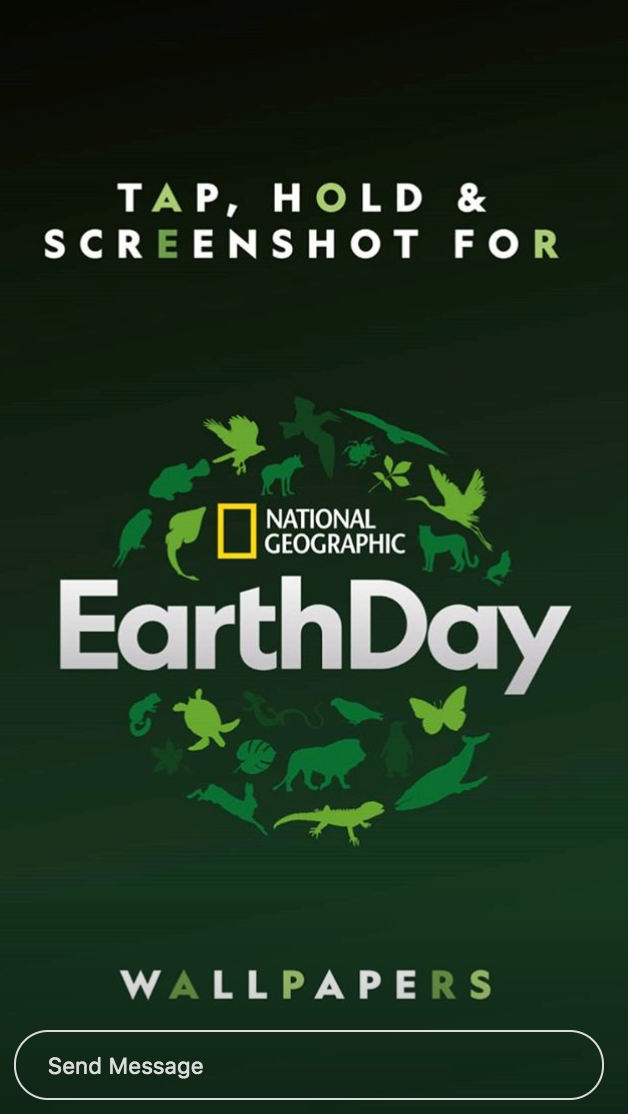
The toolkit we created was delivered to the different chapters of Nat Geo very functional and versatile and it has plenty of elements to be used in social media from avatars, cover photos to wallpapers for instagram stories.


This was truly a powerful and inspiring project and we hope it helps to inspire people to become part of the change. Together we can save our planet.
CREDITS
CLIENT
Nat Geo Partners
Mariano Barreiro VP Branding International
CREATIVE DIRECTION
Flopicco Studio
ART DIRECTION
Flopicco + Hup Studio
GRAPHIC PRODUCTION
Flopicco + Hup Studio
Inhouse Team
Florencia Picco, Fernando Vallejos, Natalia Español, Pablo Camino,
Alejandro Guatelli, Martín Polech
🖤