SANREMO
 BRAND IDENTITY 2021-22

SPOTIFY · ITALIA · 2021


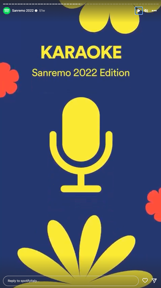
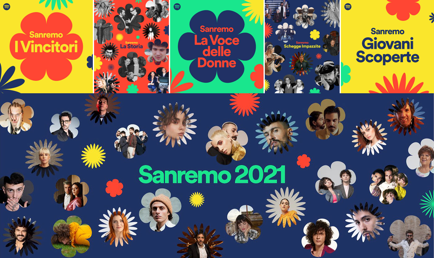
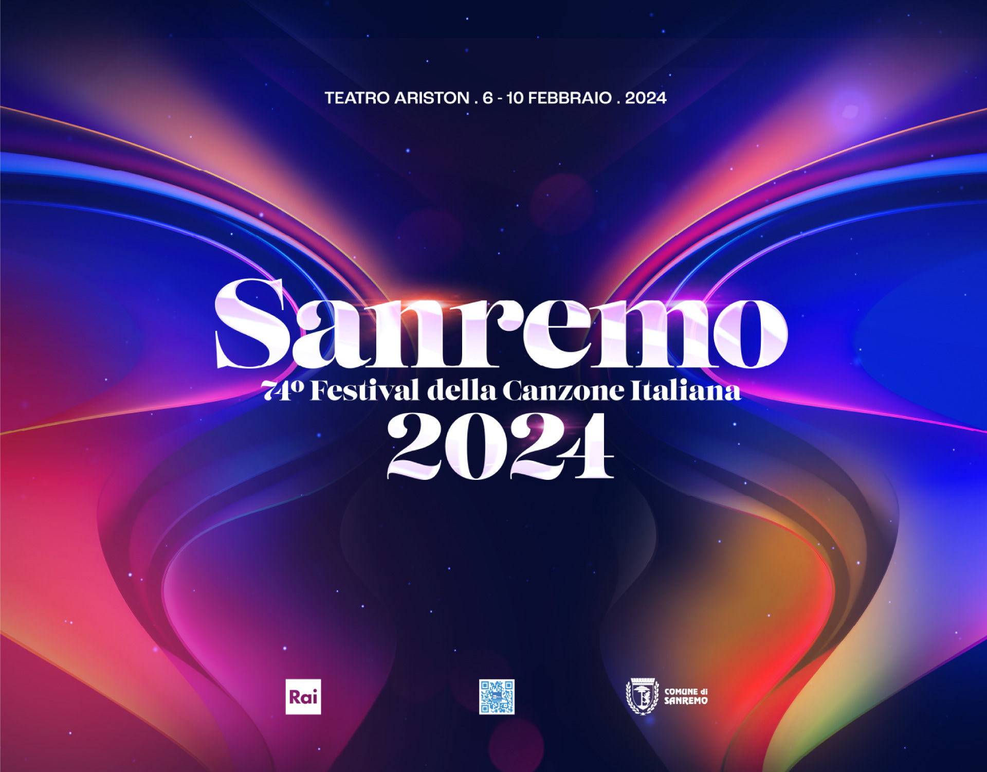
If there is an unmistakable symbol of spring in Italy, it has to be the Sanremo Music Festival. In 2021 the show marked not only the end of winter, but also of the first year of the pandemic. An anniversary that celebrated hope, resilience and community, and that marked the beginning of a new cycle filled with certainty that a positive change is possible. 

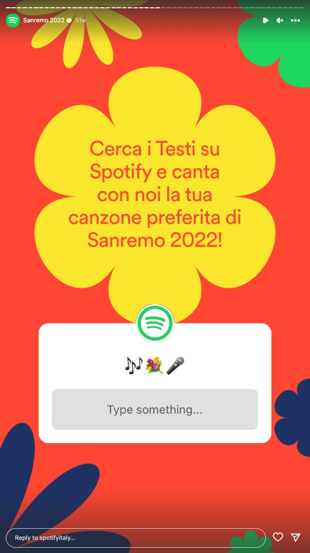
And it was will all these insights in mind that Spotify commissioned us a colourful, hopeful, shinny brand system for their Sanremo 2021 campaign, that has proven to be as resilient as all of us as the same graphic package was also used in 2022.
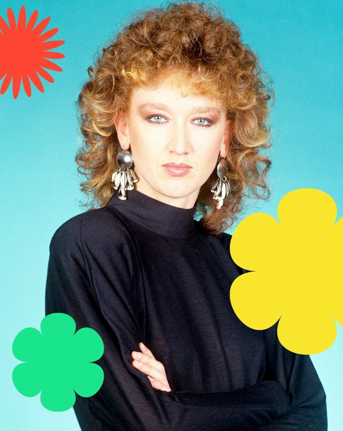
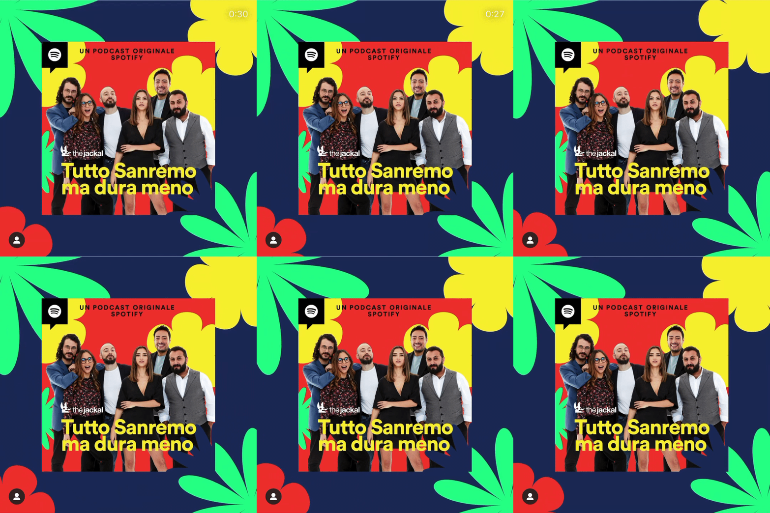
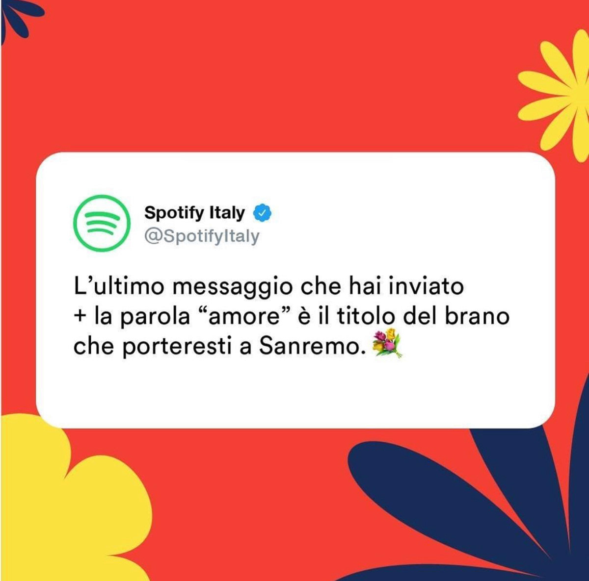
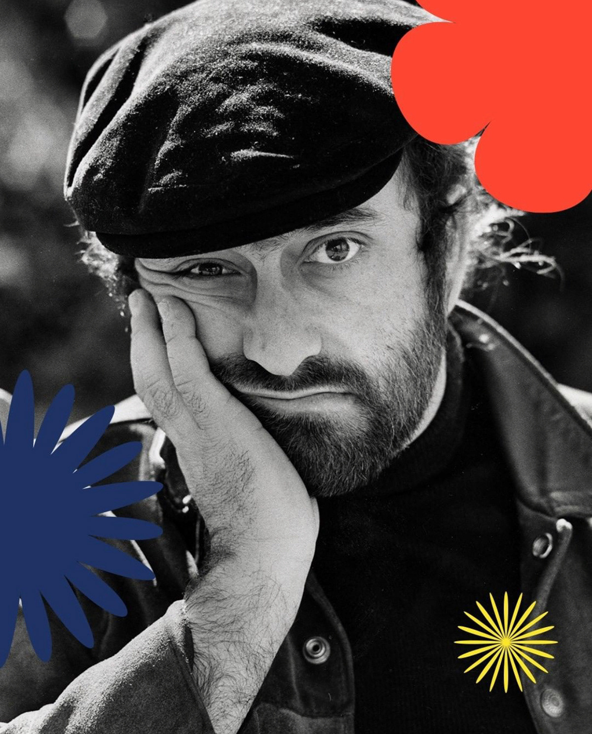
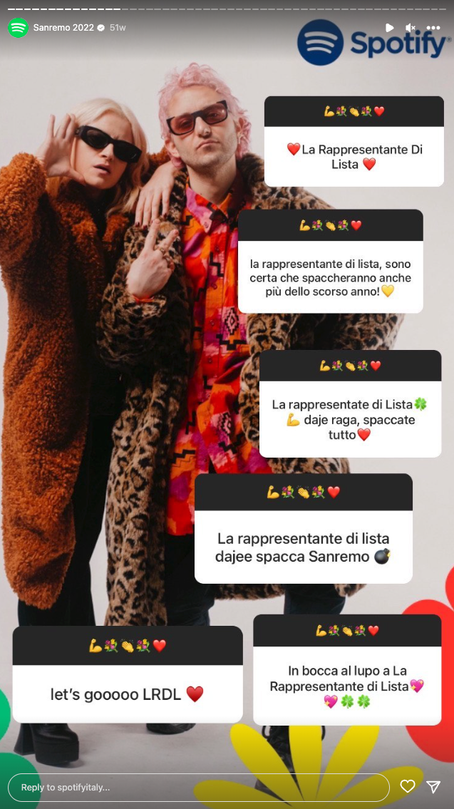
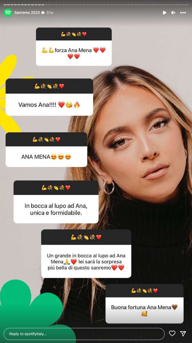
The brief was very specific about certain elements they wanted to include and the aesthetic era they aimed to evoque. The result is a powerful and versatile system, with a galore of elements that works together very well in all formats. They have used it for their original podcast and playlists, as well as for street posters, digital banners, and many different branded objects.​​​​​​​


CREDITS


CLIENT
Spotify Italia


CREATIVE DIRECTION, ART DIRECTION
AND GRAPHIC PRODUCTION
Flopicco Studio


Inhouse Team
Florencia Picco, Fernando Vallejos, Natalia Bellagio, Pablo Camino,
Alejandro Guatelli, Martín Polech & Natalia Español.


🖤​​​​​​​

You may also like

Rai Sport Rebranding 2024
Brand system of Rai Sport 2024.
Branding, Motion Graphics, Art Direction
DFL Supercup
"Every football story is a love story"
Branding, Photography, Graphic Design
DISNEY CHANNEL EMEA BACK TO SCHOOL
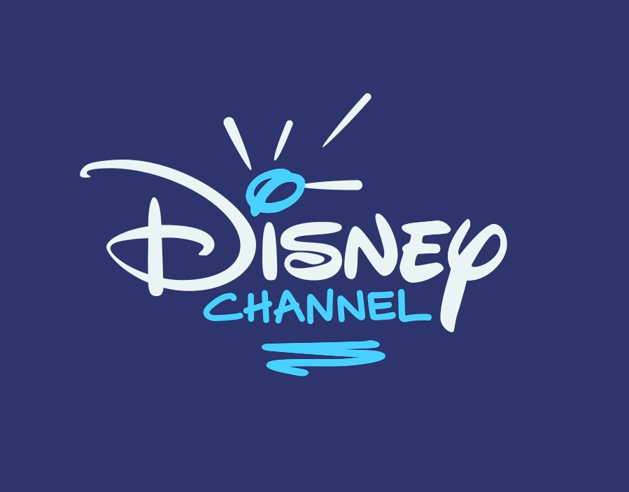
A revamp of the iconic identity elements of the Disney Channel image, with a school theme and a new palette of neon pastels.
Graphic Design, Motion Graphics, Logo Design
BORDER CONTROL ITALIA TOOLKIT
Illustration, Motion Graphics, Graphic Design
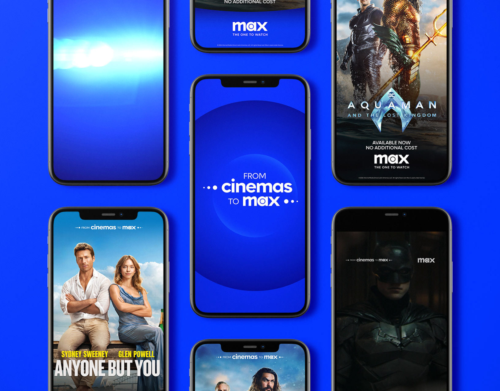
FROM THE CINEMAS TO YOUR HOME BARBIE EDITION
Branding, Motion Graphics
DMAX I DEMONI DELLO SPORT
For Demoni dello Sport, Flopicco Studio created an identity that blends tabloid aesthetics with noir influences, highlighting the duality of fame and failure. To amplify the emotional weight of the series, a dramatic red was introduced into the black and white palette, creating a visual tension that reflects the complex reality of these fallen icons.
Graphic Design, Motion Graphics
DMAX'S VIDEOGAME HUNTERS
Anchored in the basic elements of DMAX (composition, typography, animation signature), we searched for a visual language that would take us into the world of video games to reflect the retro/lively vibe of the show. Both the custom graphic elements and the fluorescent colour palette are inspired by classic console video games.
Graphic Design, Branding
QUESTO STRANO MONDO TOOLKIT
Illustration, Branding, Motion Graphics
+SBT SERIES BRAND SYSTEM
Branding
Nat Geo's Earth Day Brand System
Graphic Design, Art Direction, Branding
Back to Top