U S A  ·  F L O P I C C O  S T U D I O  +  N A T I O N A L  G E O G R A P H I C   ·  2 0 2 2


NAT GEO LOGO 
AND LABELS GUIDELINES
LICENSING & MERCHANDISING


The client
National Geographic is a Society founded with the purpose of furthering the knowledge and awareness of our world. They are the world’s leading multimedia destination for the best stories in science, exploration and adventure. Nowadays, National Geographic is owned by The Walt Disney Company.

The challenge
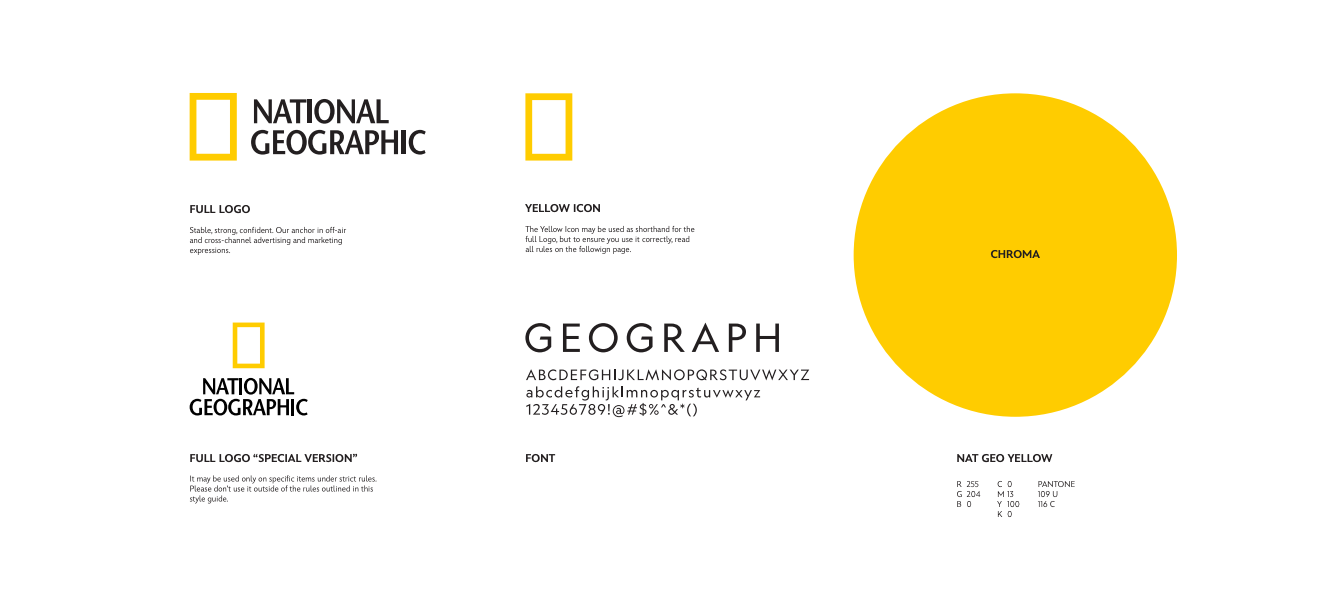
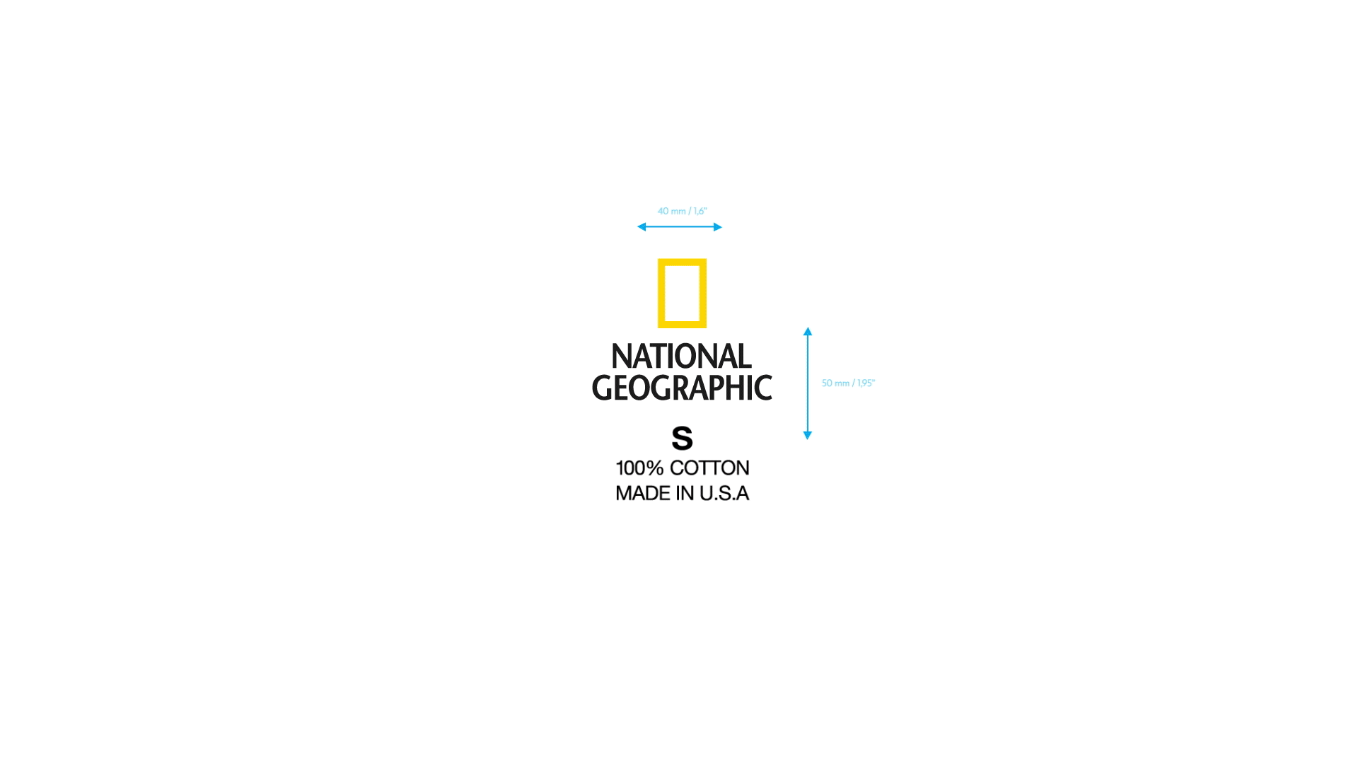
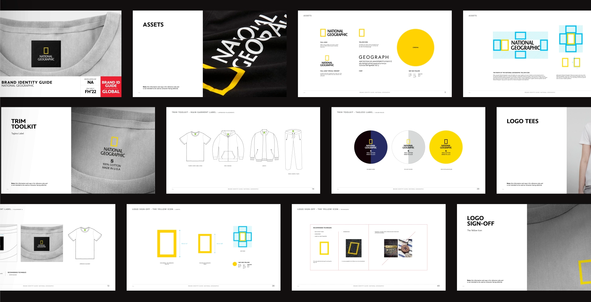
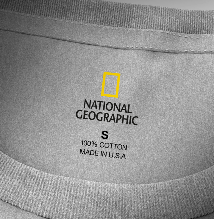
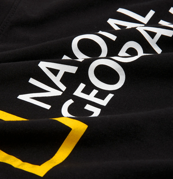
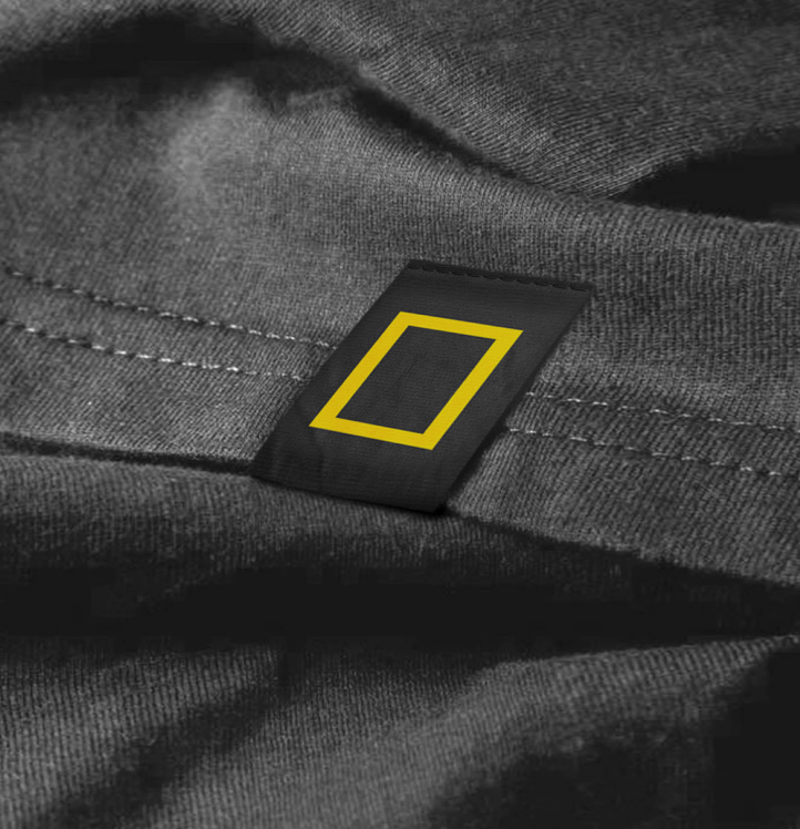
National Geographic approached Flopicco Studio as they needed to create a global set of guidelines for the authorised application of their brand logo (full logo, icon, font, color) in apparel items and their labels, to create a coherent system applicable to all sort of labels (main garment, tagless, icon sign-off, hem labels, etc).

The Flopicco Studio Approach
Flopicco Studio studied the identity usage of National Geographic's logo in all kinds of apparel items and their labels to then create a complete set of guidelines. This rules were compiled in a manual that anyone all over the world can consult to find out all the authorised uses of the National Geographic logo. ​​​​​​​​​​​​​​


El cliente
National Geographic es una Sociedad fundada con el propósito de promover el conocimiento y la conciencia de nuestro mundo. Son el destino multimedia líder en el mundo para las mejores historias de ciencia, exploración y aventura. Actualmente, National Geographic es propiedad de The Walt Disney Company.

El reto
National Geographic contactó a Flopicco Studio porque necesitaban crear un conjunto global de pautas para la aplicación autorizada del logo (full logo, icon, font, color) en indumentaria y sus respectivas etiquetas, para crear un sistema coherente, aplicable a todo tipo de etiquetas (impresas, principales, etiquetas sin tag, Icon sign-off, etc).

La estrategia de Flopicco Studio
Flopicco Studio estudió el uso identitario del logotipo de National Geographic en todo tipo de indumentaria y sus etiquetas para luego crear un conjunto completo de pautas. Estas reglas y guías se compilaron en un manual que cualquier persona alrededor del mundo puede consultar para conocer todos los usos autorizados del icono y logo de National Geographic.​​​​​​​


CREDITS

CLIENT
National Geographic · The Walt Disney Company


CREATIVE DIRECTION, ART DIRECTION
AND GRAPHIC PRODUCTION
Flopicco Studio

Inhouse Team
Florencia Picco, Fernando Vallejos, Natalia Bellagio, Alejandro Guatelli, 
Pablo Camino, Martín Polech y Martín Tibabuzo.


🖤
#GoWithTheFlopicco​​​​​​​​​​​​​​

You may also like

+SBT SERIES BRAND SYSTEM
Branding
DFL SUPERCUP 2020
Illustration, Branding, Animation
HBO-MAX: DEL CINE A TU CASA
Branding, Graphic Design, Advertising
QUEI CATTIVI RAGAZZI
Visual identity and a basic motion toolkit for DMAX Italia new show Quei Cattivi Ragazzi, by Flopicco Studio.
Graphic Design, Branding, Motion Graphics
BURGER KING's HOW TO TRAIN YOUR DRAGON
The goal was to harmoniously blend the film’s Viking-inspired imagery with Burger King’s bold, iconic aesthetic to create a functional, original and fun merchandise line.
Graphic Design, Illustration
LIKE A STAR
Like a Star is Nove's new talent show hosted by Amadeus, with Elio, Serena Brancale and Rosa Chemical acting as judges. Flopicco Studio was responsible for creating the show's visual identity and the motion toolkit for on-air use. The idea was to combine the look typically associated with talent shows with the glamour of Hollywood and stardom. Contestants will not only act like stars; they will be stars for one night. other and bring this concept to life.
Graphic Design, Branding, Motion Graphics
MILLION DOLLAR WHOOPER CONTEST PERKS
Earlier this year, Burger King began searching for a new and delicious recipe for its most popular product, the Whooper. The quest was called the Million Dollar Whooper, and contestants were asked to create their ideal Whooper using edible ingredients .... of all kinds! Flopicco Studio was responsible for the perks that were created to help launch this amazing nationwide campaign on the beaches of California.
Graphic Design, Branding, Product Design
DMAX OPERAZIONE N.A.S.
DMAX Italia's commissioned Flopicco Studio a visual identity and a basic motion toolkit for their new show Operazione N.A.S., an Italian TV program produced by Hangar for Discovery Italia, dedicated to the operations of the Carabinieri Corps' Anti-Sanitation and Health Unit.
Graphic Design, Branding, Art Direction
MOTOR TREND TOOLKIT
Motion Graphics, Animation, 3D Motion
+SBT NOVELAS: BRAND SYSTEM
Inspired by the visual language of classic romance stories, we designed a playful set of icons that symbolize fragments of these stories, emotions, and convoluted plots. We worked with a palette of bold, contrasting colors: pink, blood orange, and dark green. These colors speak of passion and opposites attracting. The result is a brand system that celebrates the enduring love stories that keep audiences tuning in night after night.
Branding, Art Direction
Back to Top