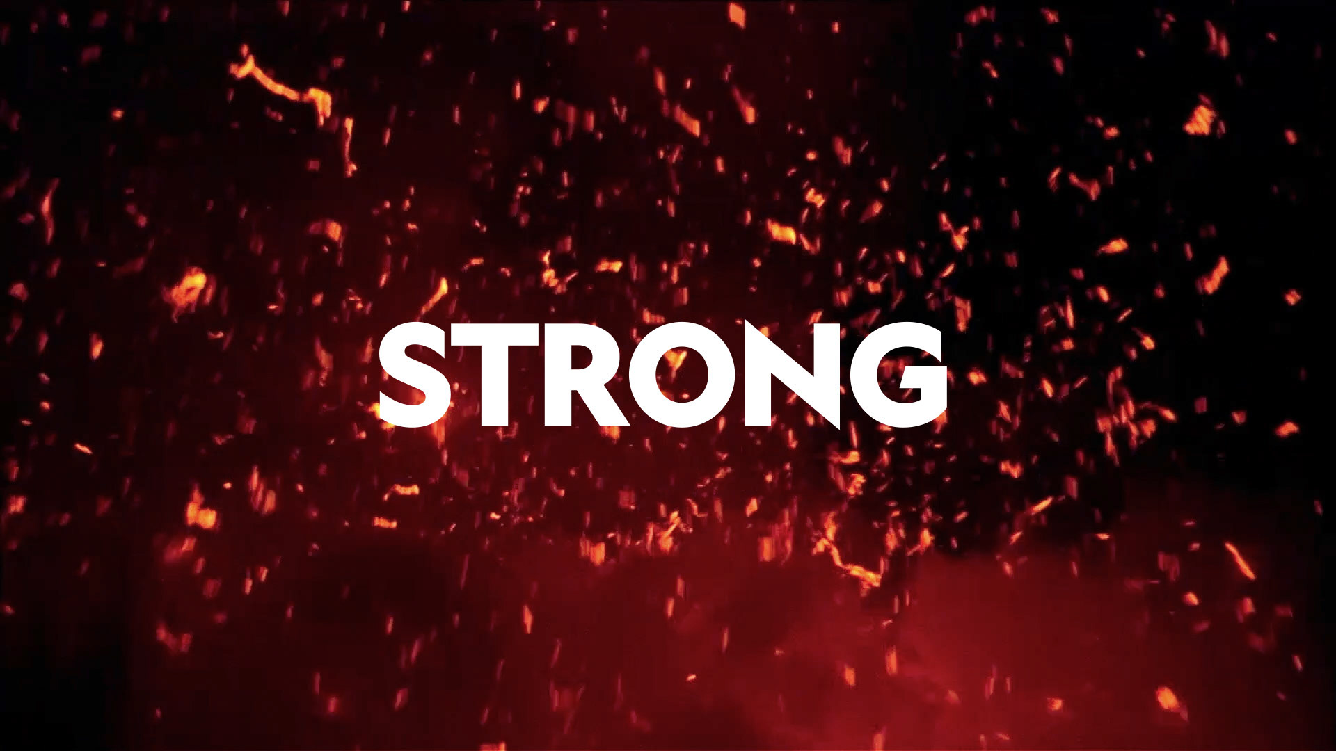
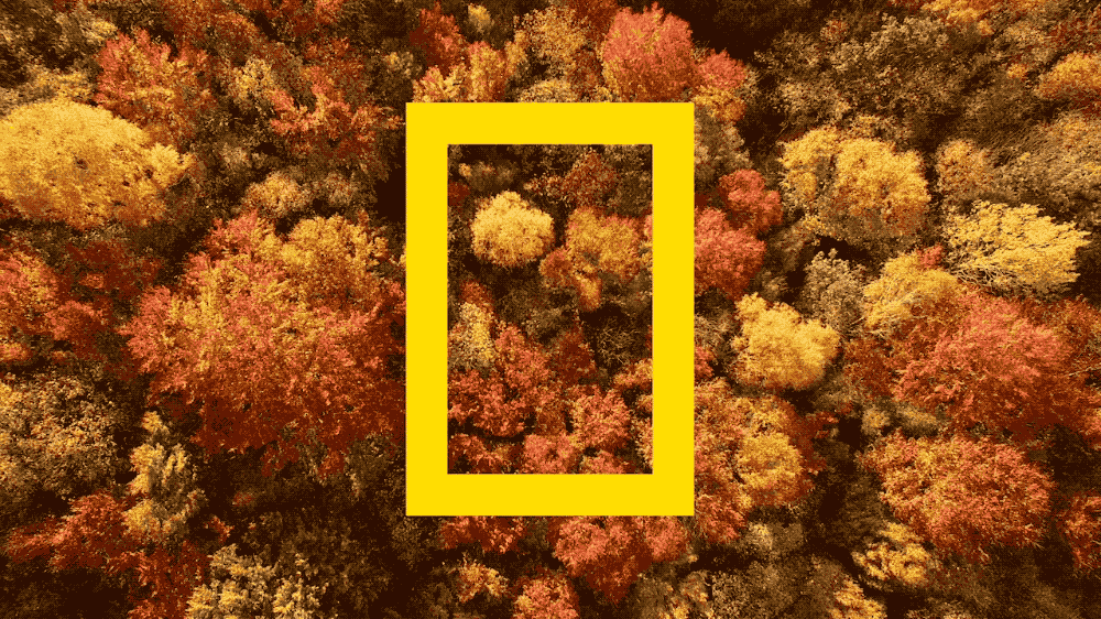
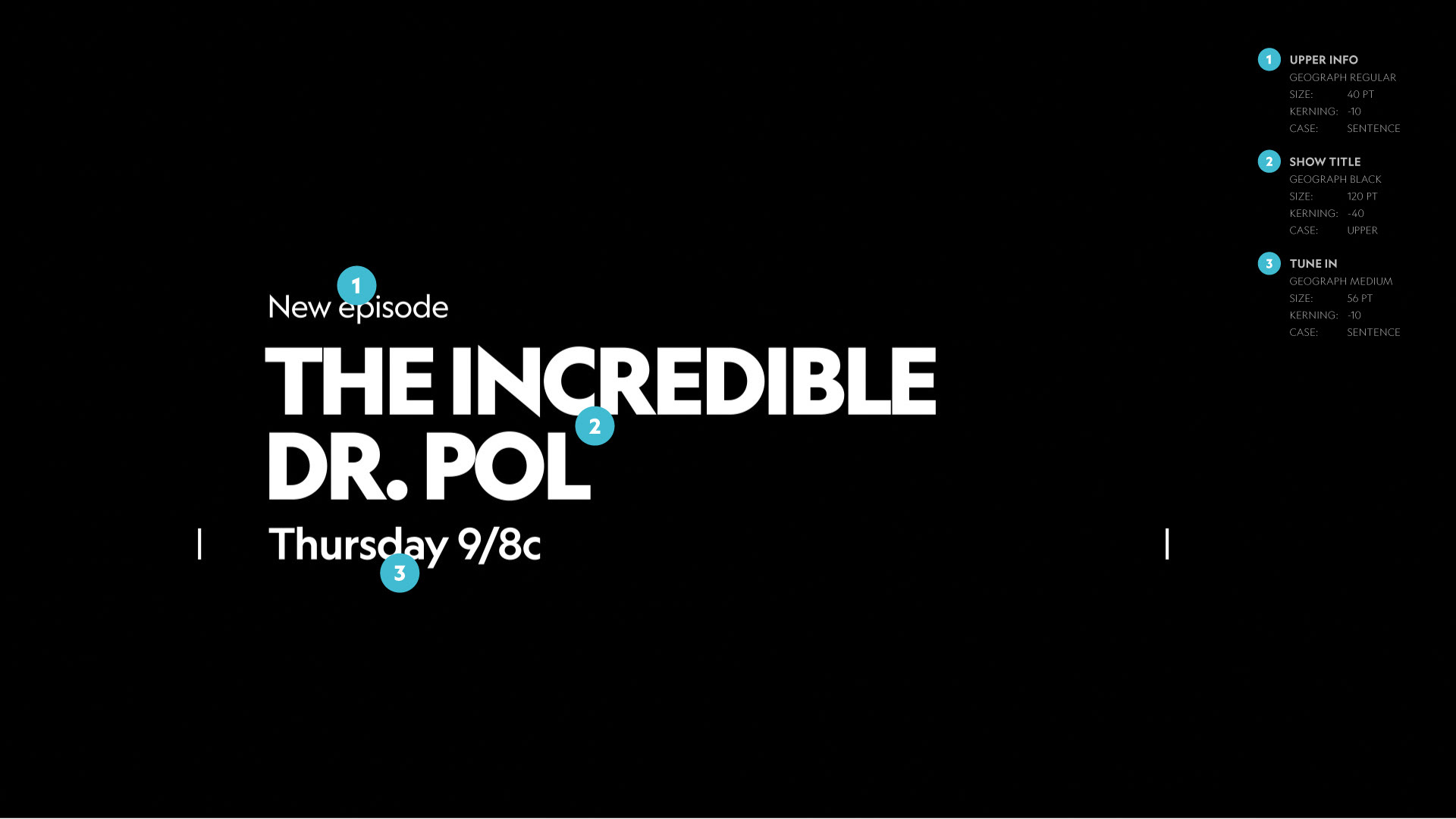
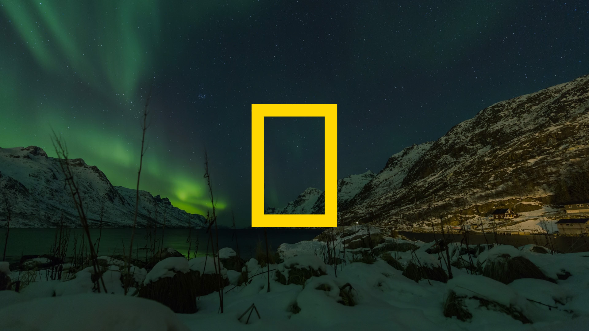
NAT GEO WILD GLOBAL BRAND SYSTEM
NATIONAL GEOGRAPHIC · USA · 2018
One of the greatest projects we worked on last year was the rebrand of the Nat Geo Wild brand globally.
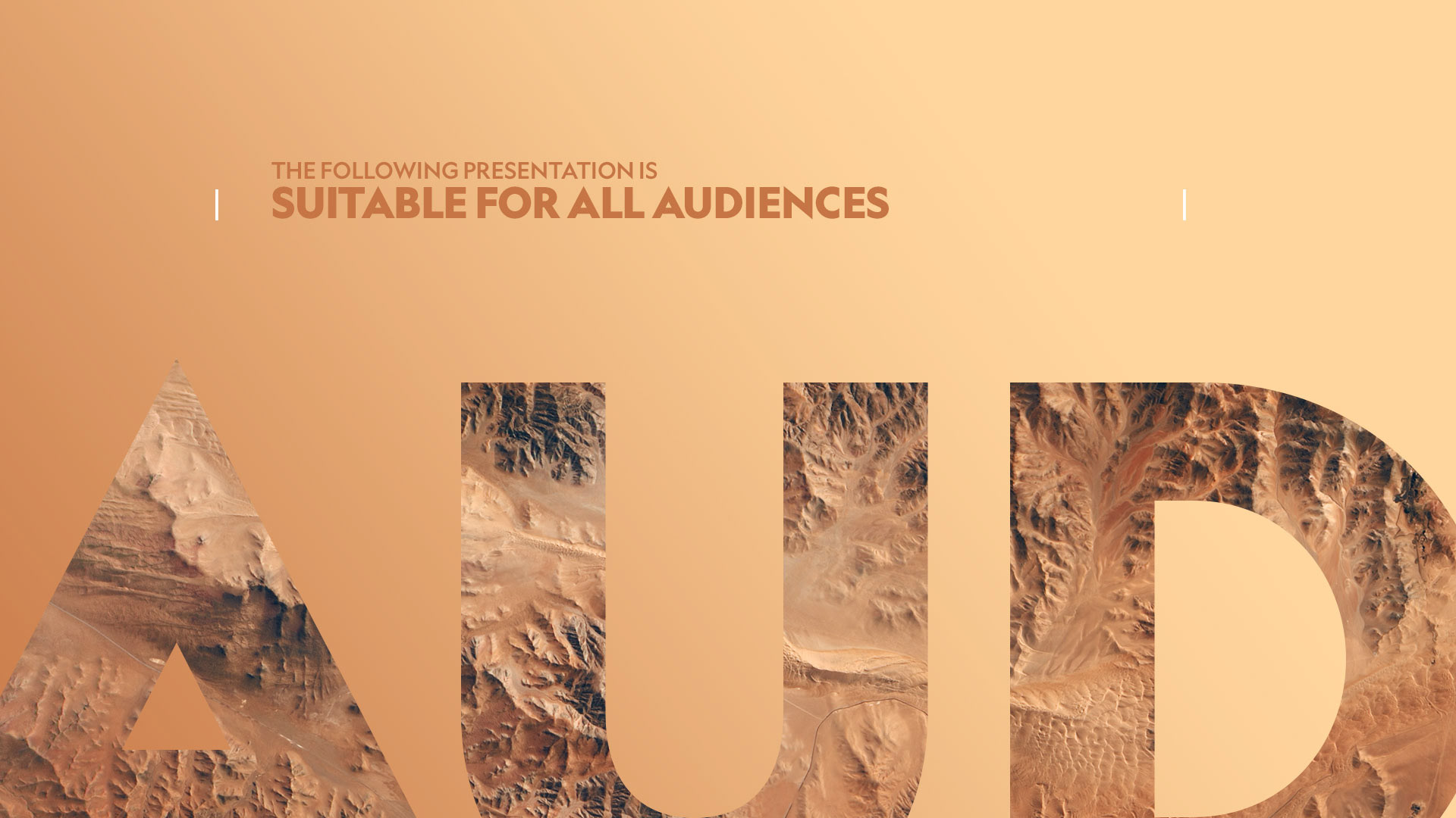
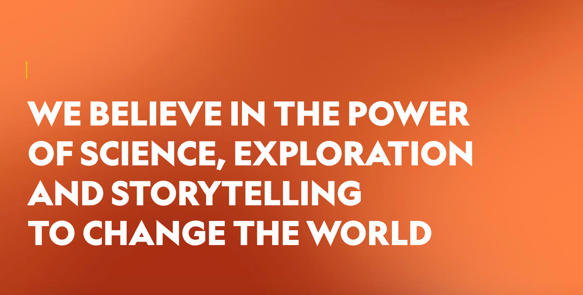
Nat Geo Wild is the only channel completely dedicated to premium wild life programming with espectacular cinematography and compelling storytelling that unveils the mysteries of nature while inspiring people to explore more, to understand better, and to get involved in the preservation of our planet.
The challenge was to refresh, perk up and refine the channel's image while keeping it close to the recently polished mother brand: Nat Geo.
We worked closely with National Geographic Partners VP Creative, Mariano Barreiro, and EVP Global Brand Strategy, Emanuele Madeddu.
With this lovely package we have just won a Silver Award for General Brand Design Package at Promax Europe.
Many thanks to all the people that was involved in bringing this beautiful work to life! It has been a really wild adventure!
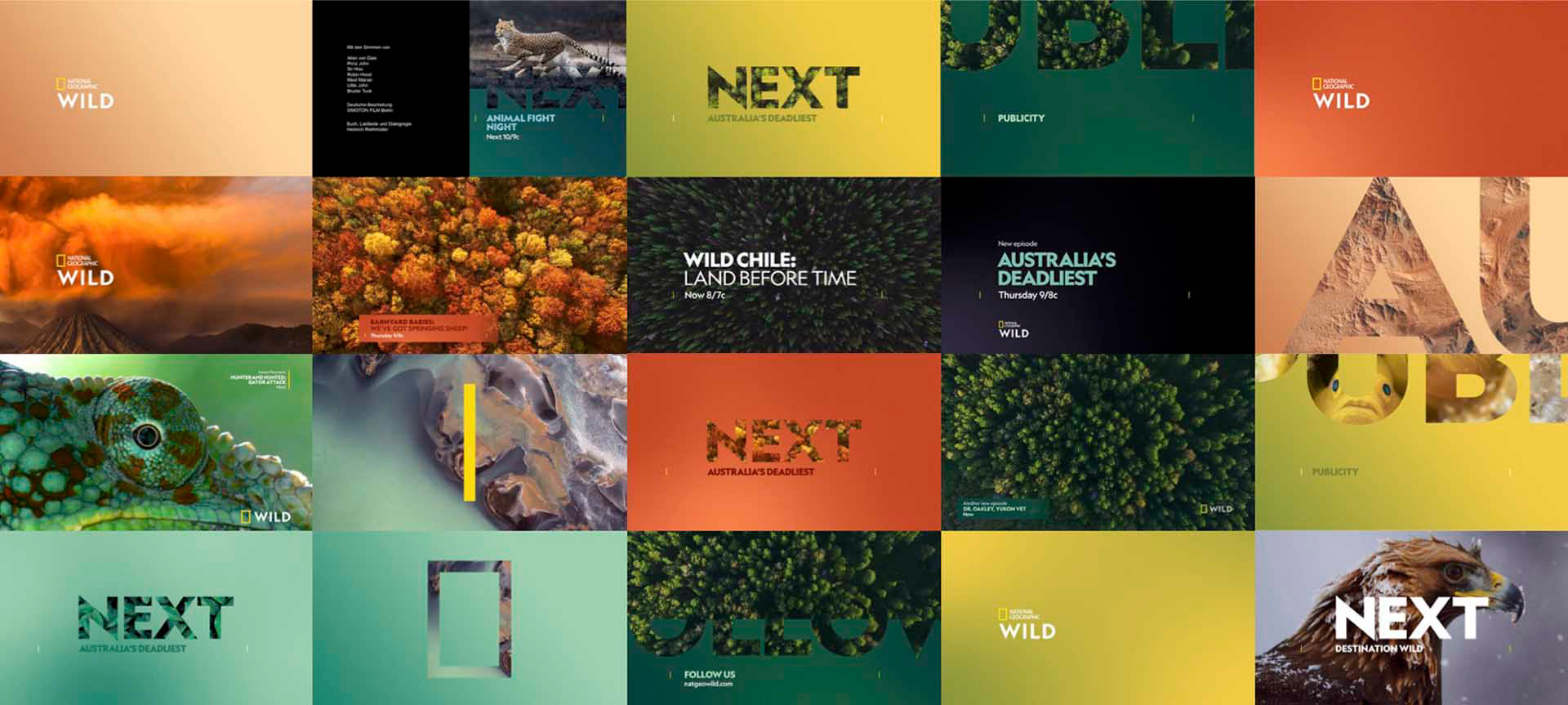

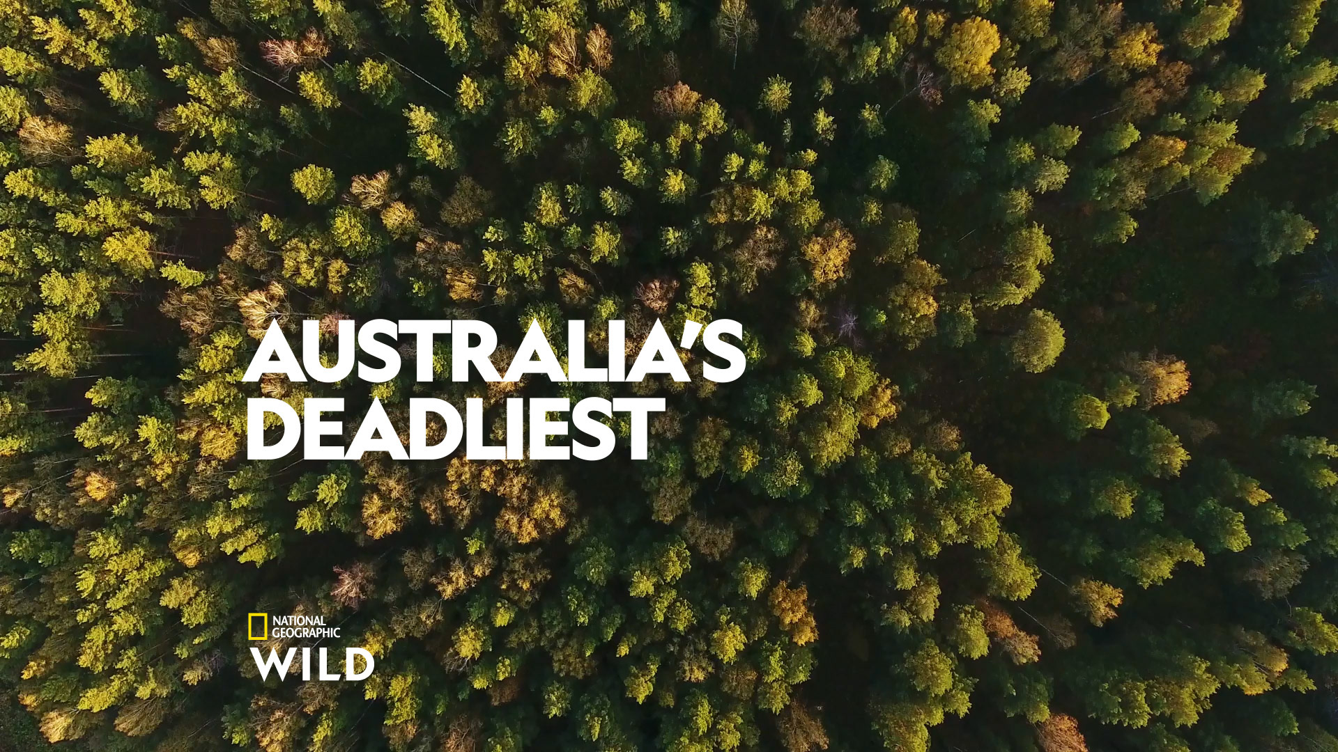
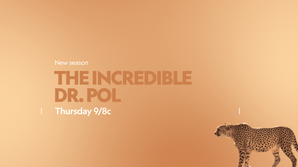
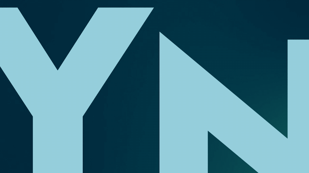
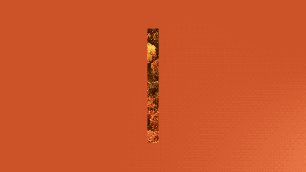
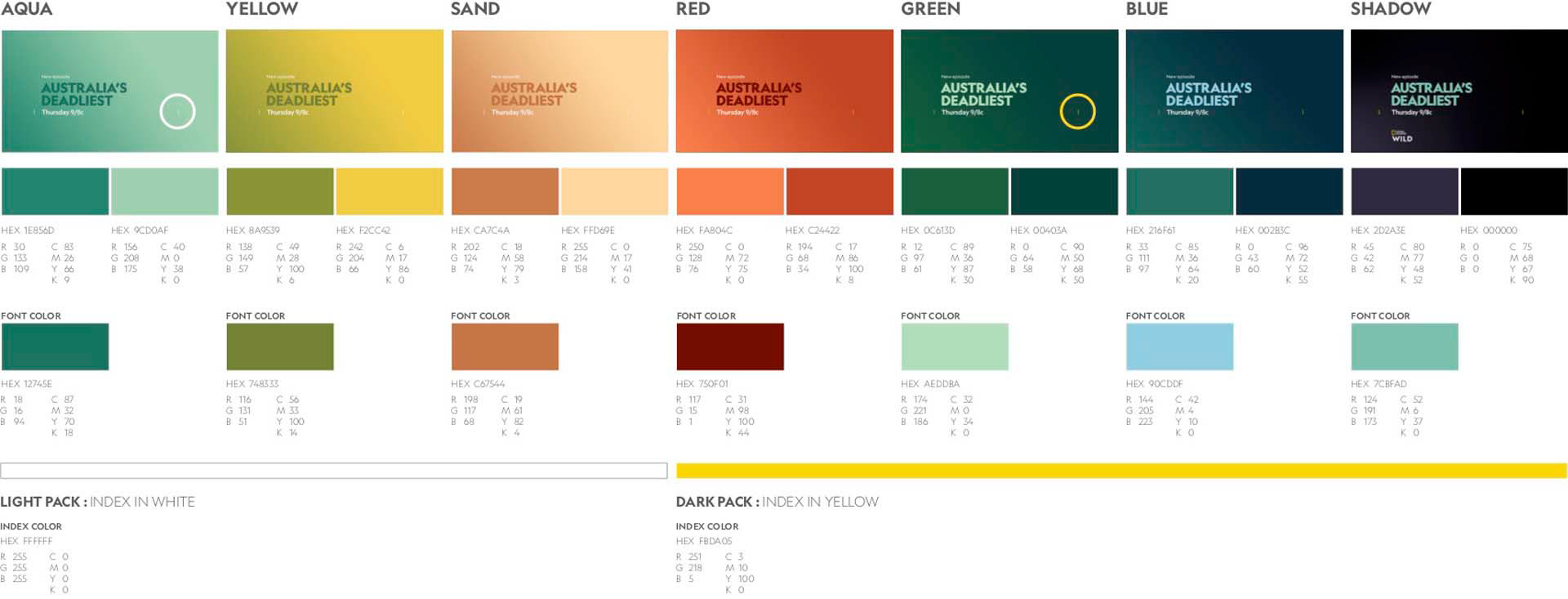
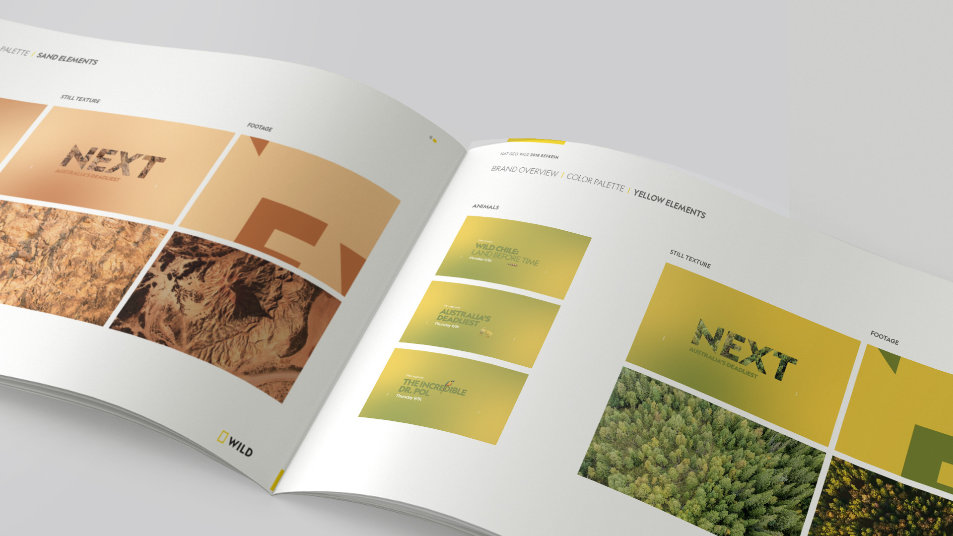
COLOR PALETTE
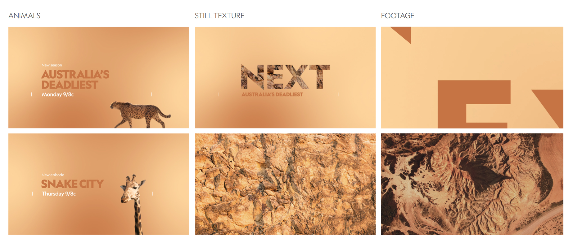
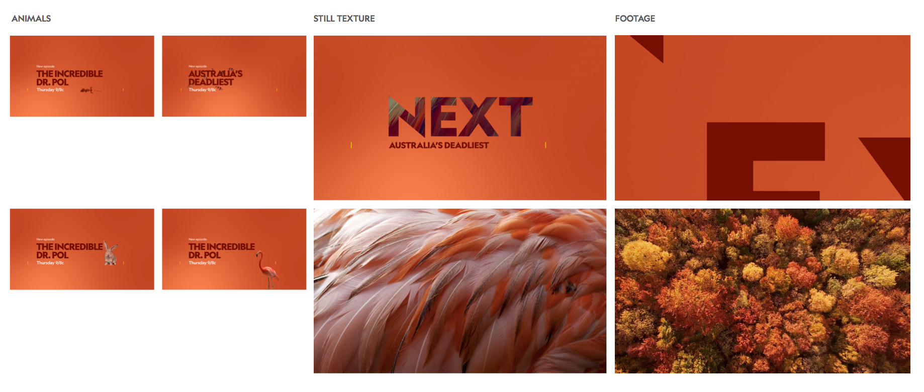
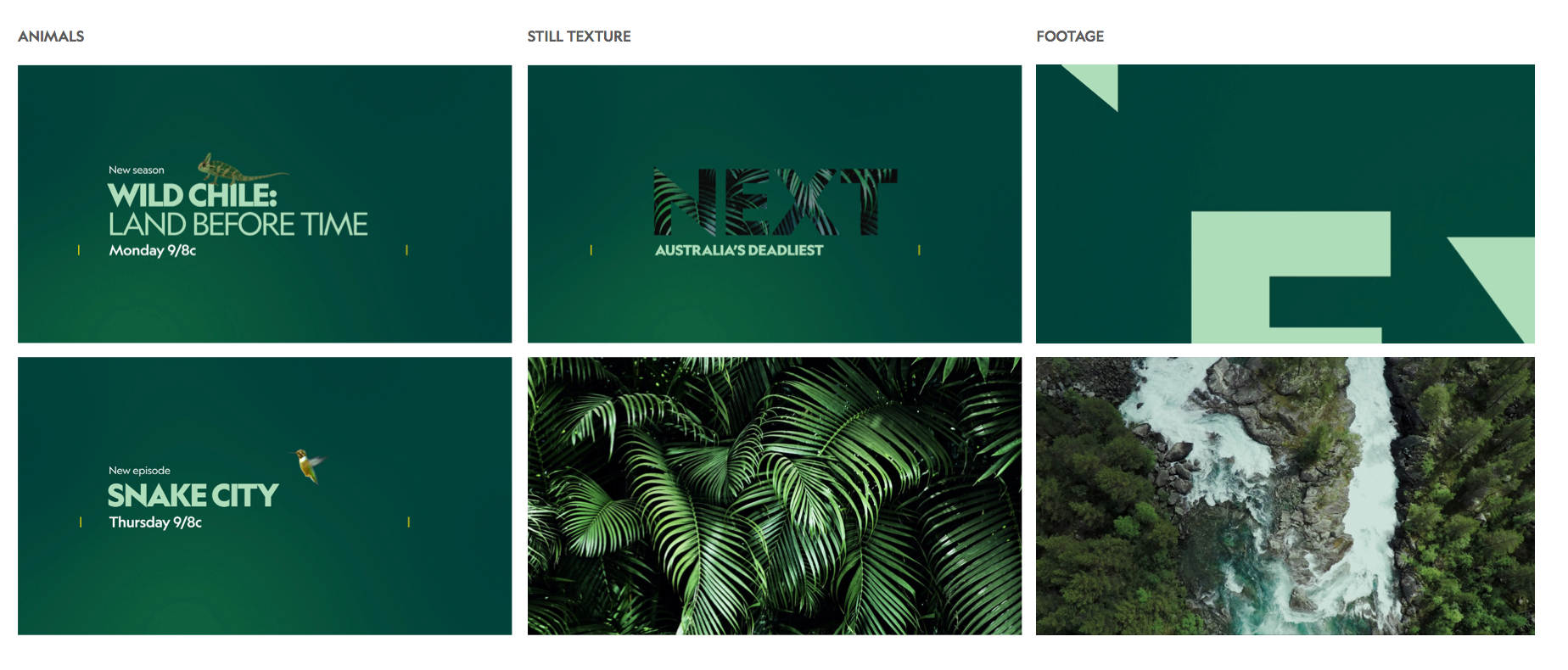
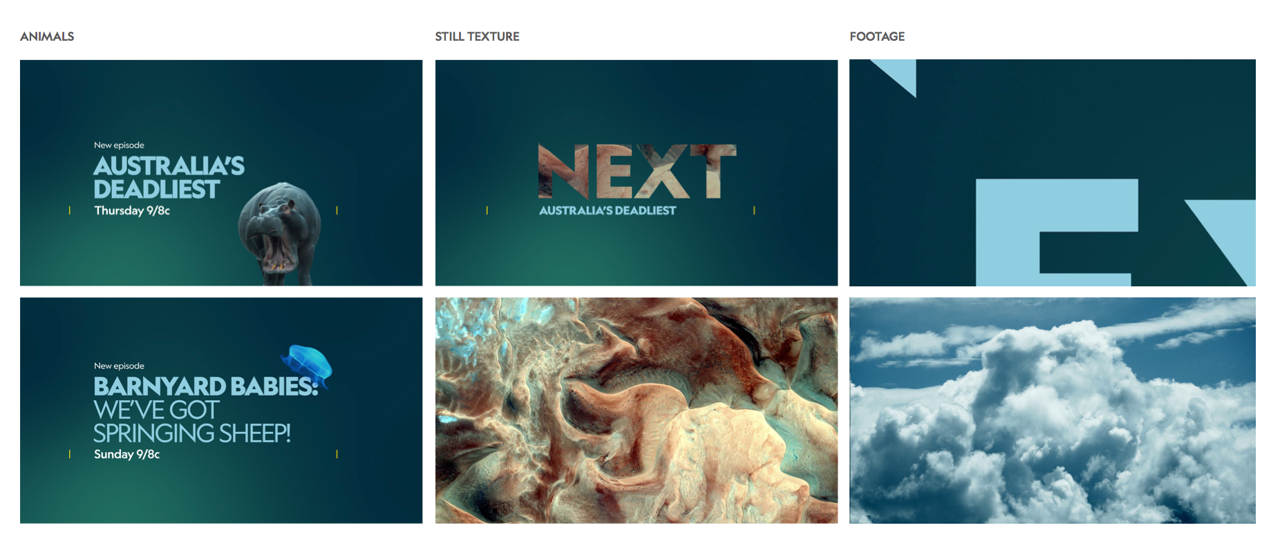
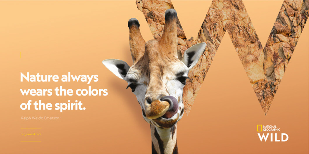
One of the hardest challenges of the rebrand was the creation of a color palette that was somehow linked to the mother brand while being distinctly Wild.
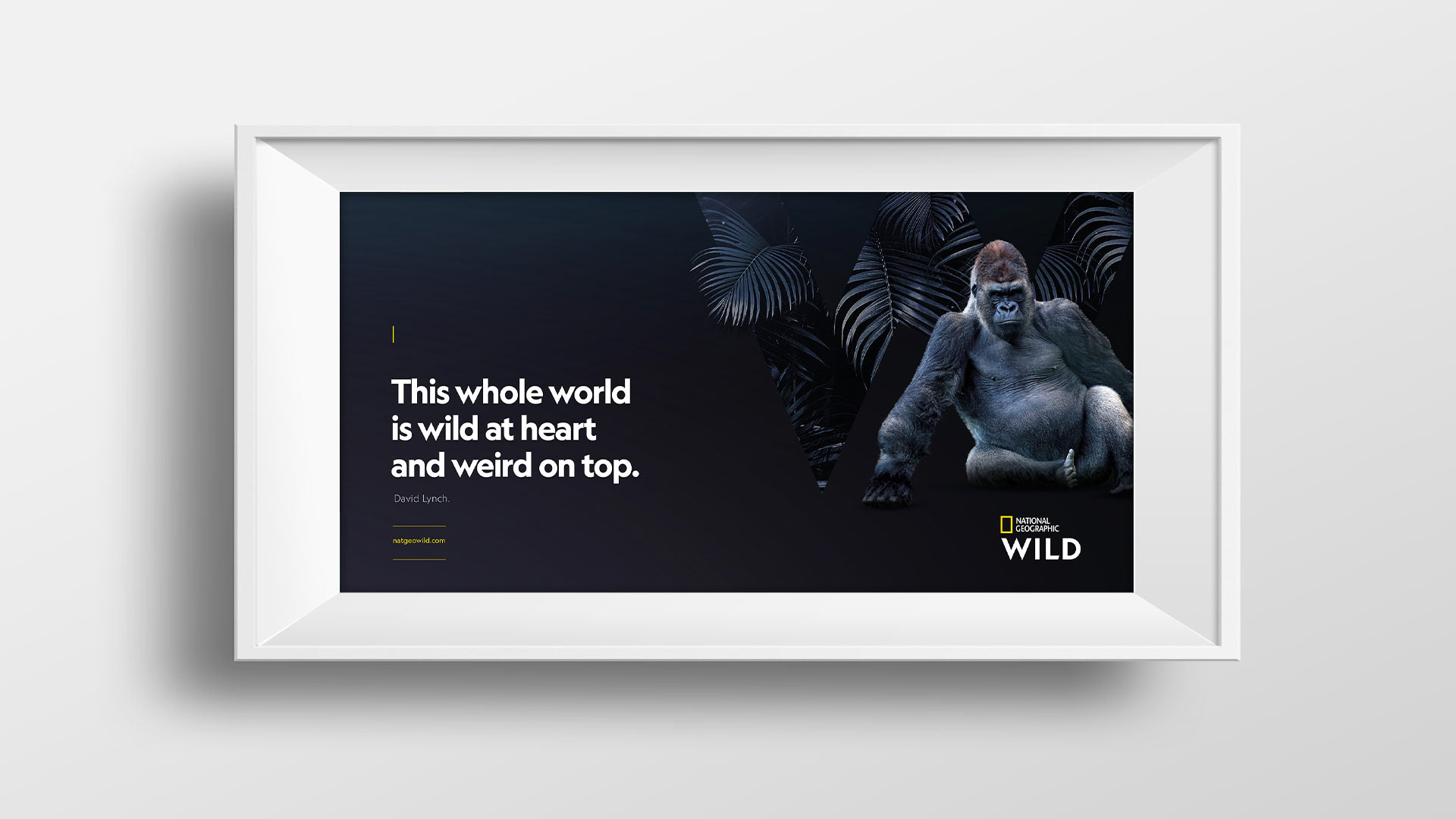
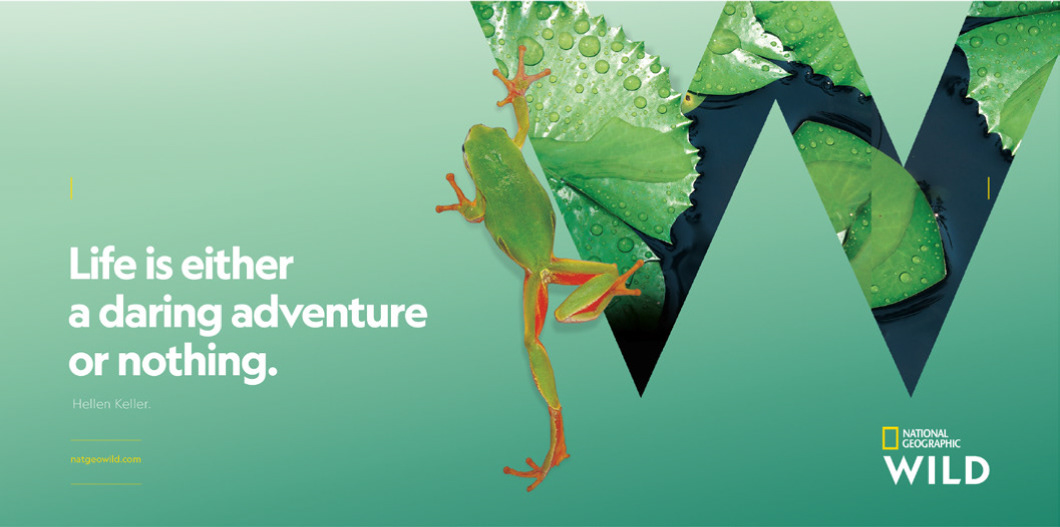
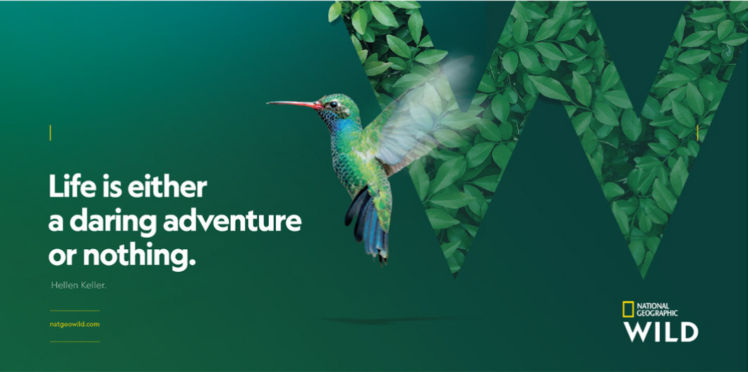
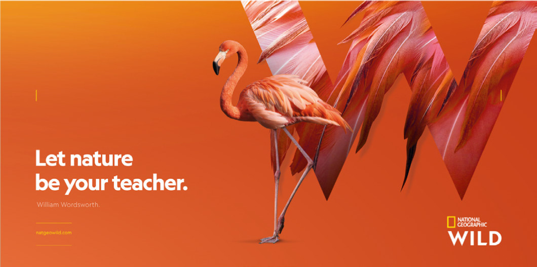
What did we do? We let nature be our guide. The seven color schemes come from seven different habitats of Earth, from espectacular sandy deserts to the hidden corners of the tropical jungle or the unexplored depths of the oceans.
The schemes are colourful, contemporary, they don't feel artificial, and most of all, they are flexible and modular as they work in two different levels: visually and content-wise.
Any of the contents of the Nat Geo Wild can be packed with a palette that is visually associated to the content of the show (blue oceans, red deserts, green jungles), or that psychologically reflects the mood of the show (from chilled puppy documentaries to exciting adventures involving very hungry lions).
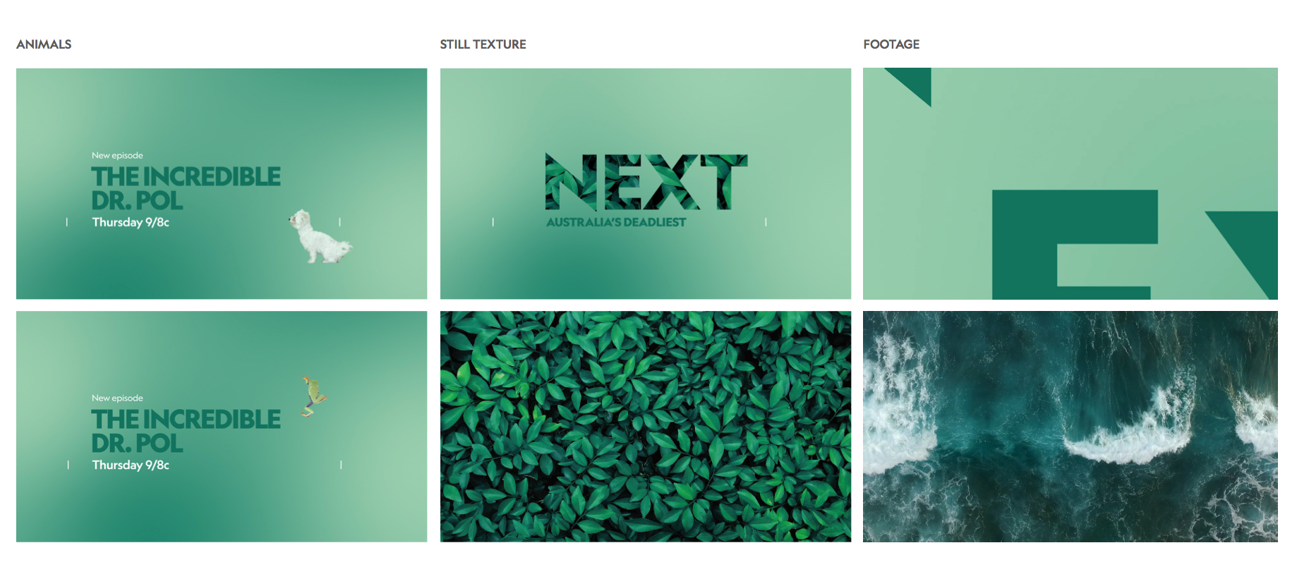


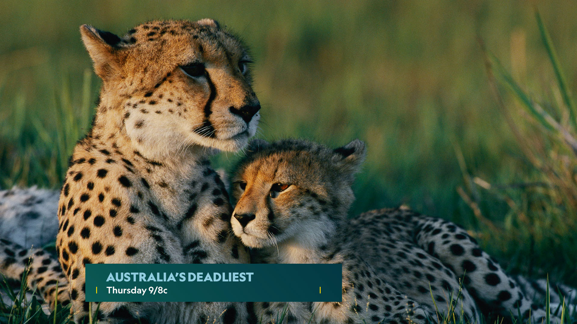
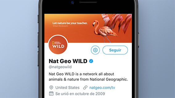
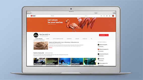
WEB APPLICATIONS
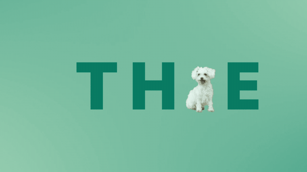
Different templates that mimic on-air composition but still are original and surprising were created to generate localized by-products for social media and print.
These turned out to be very, very successful amongst social media audiences... After all, who doesn't love a close-up photo of a sexy gorilla or a funny giraffe :)
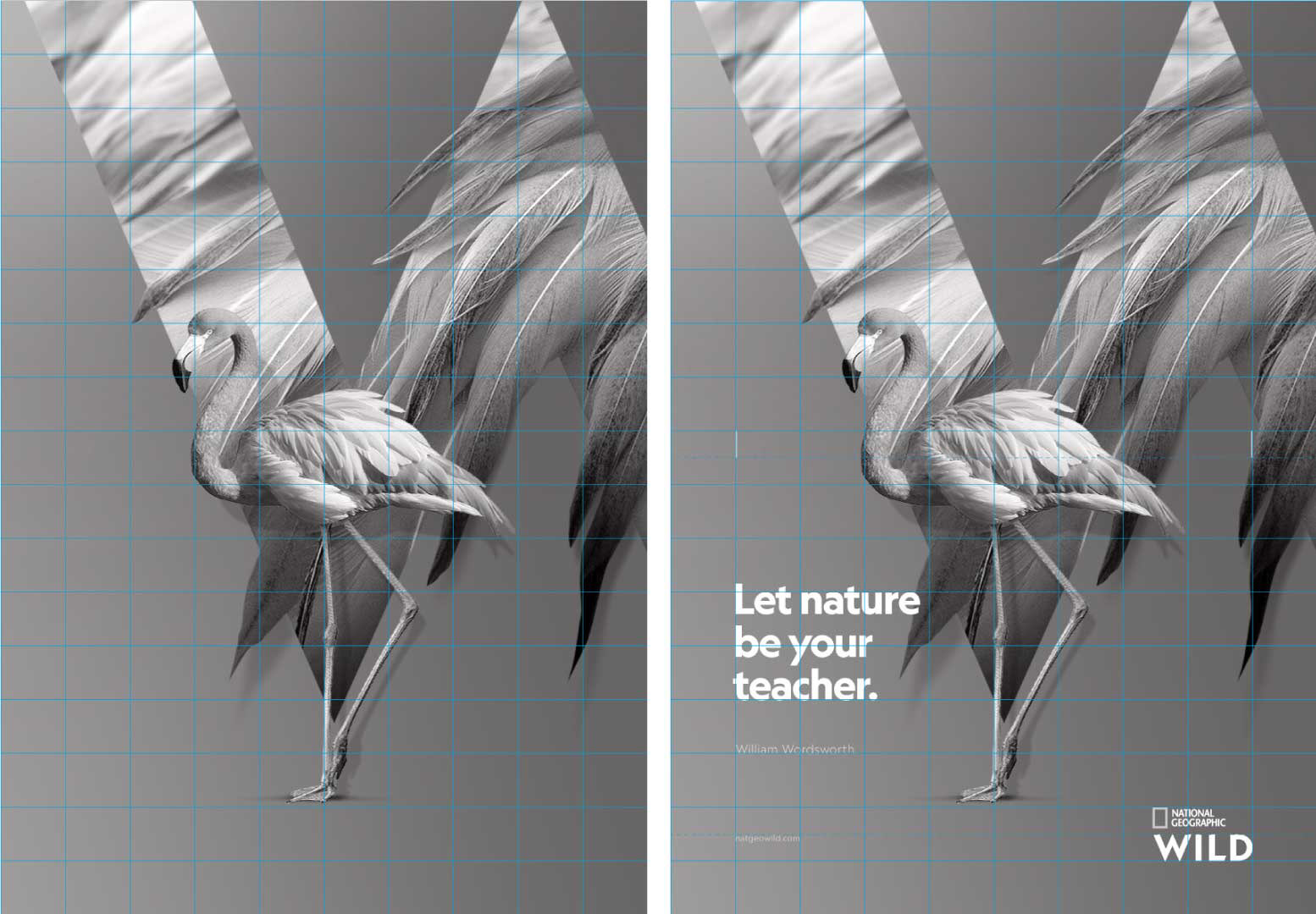
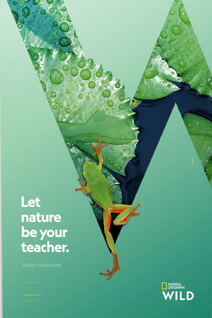

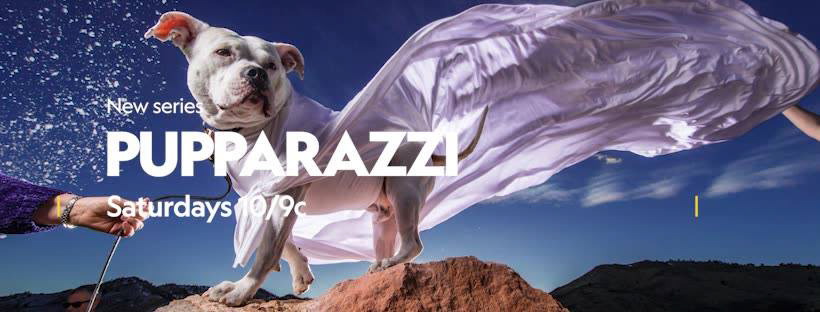
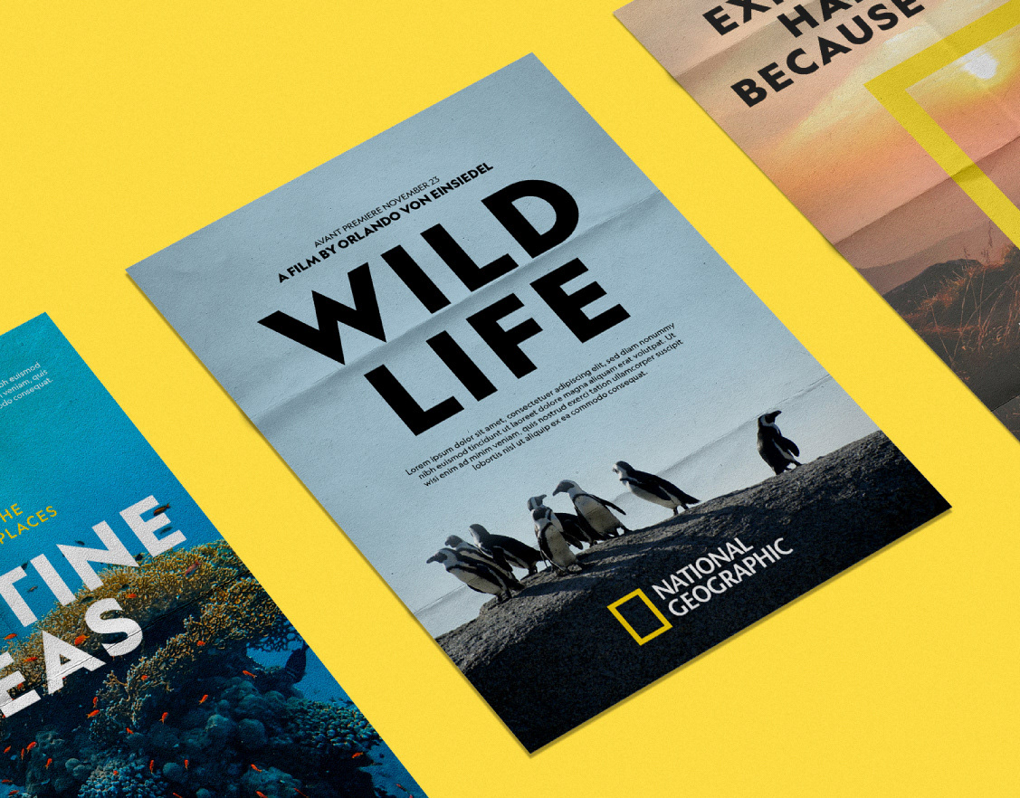
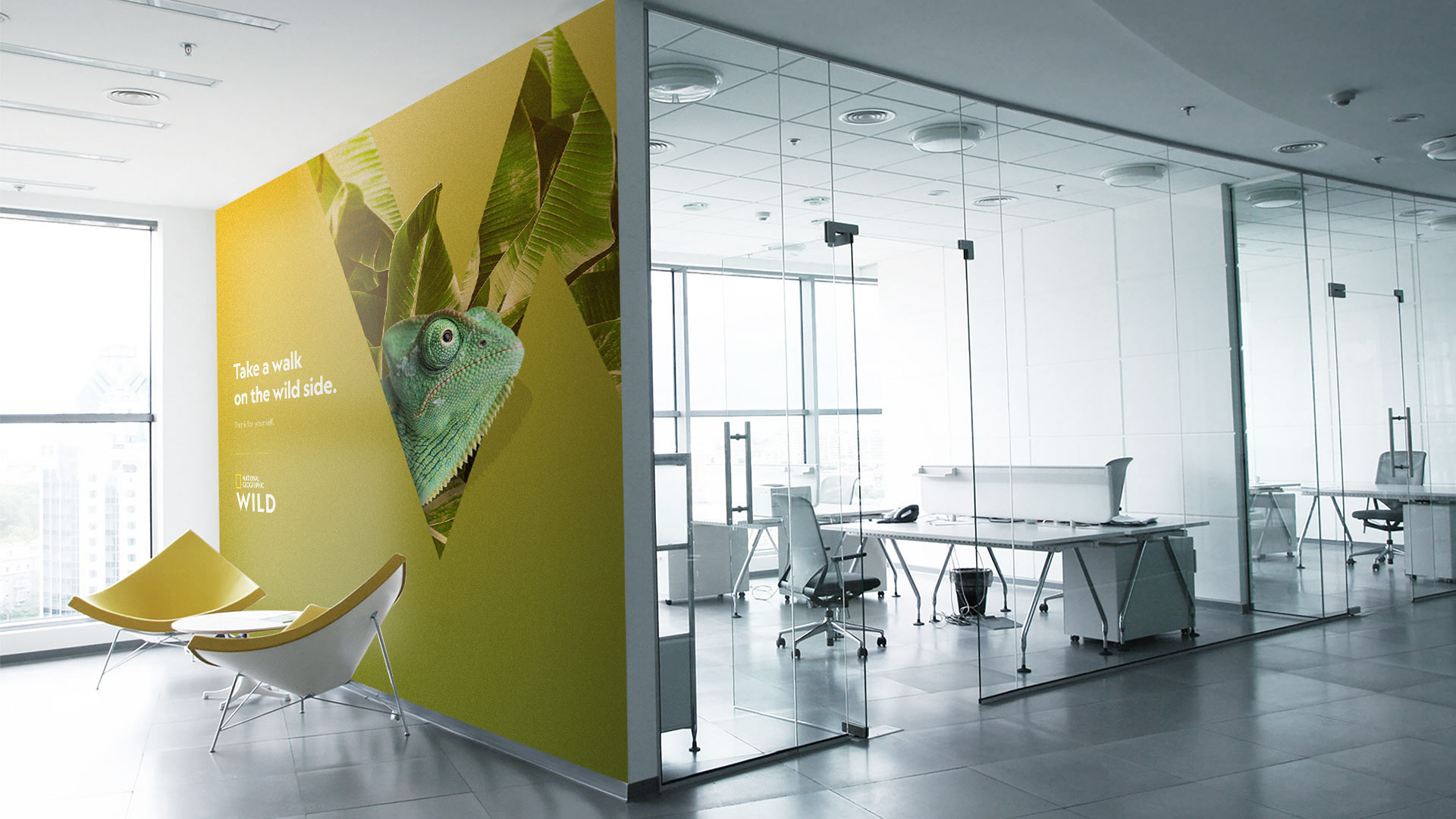
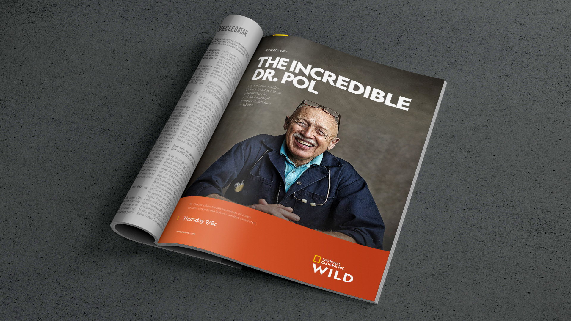
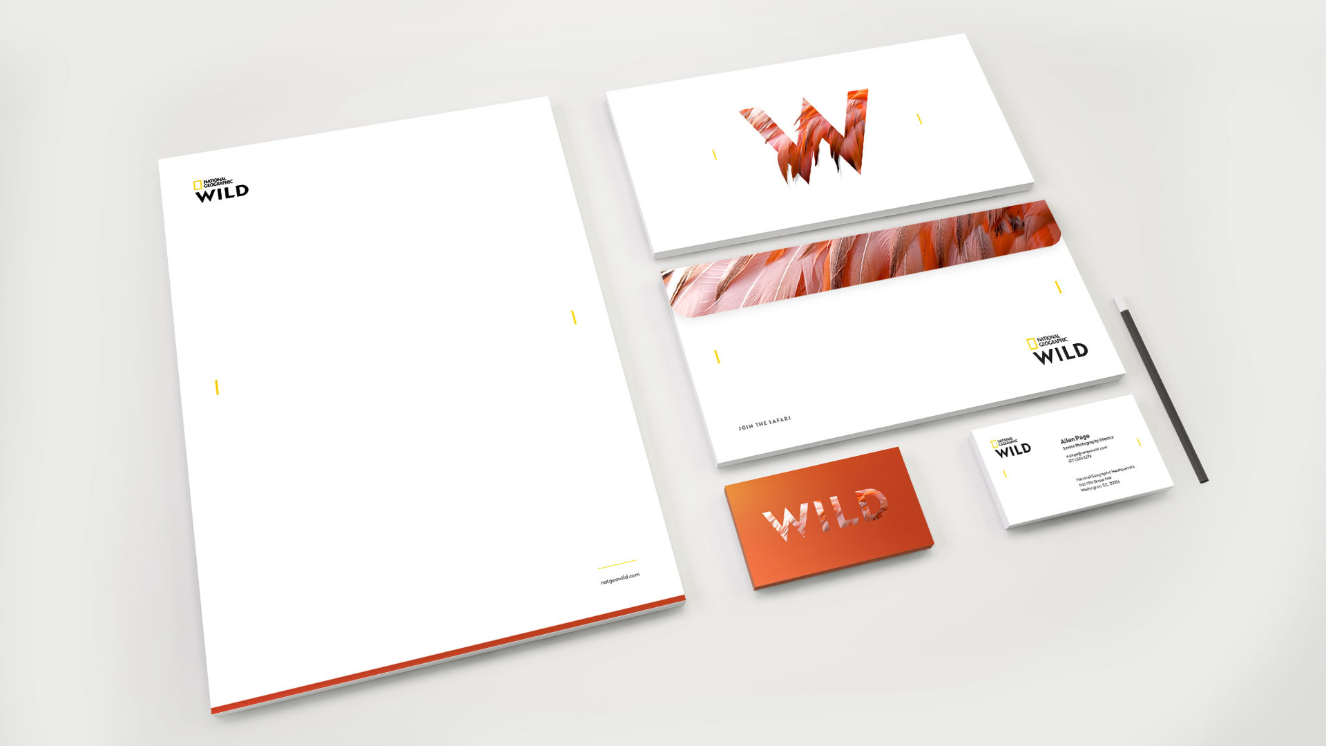
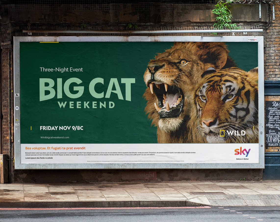
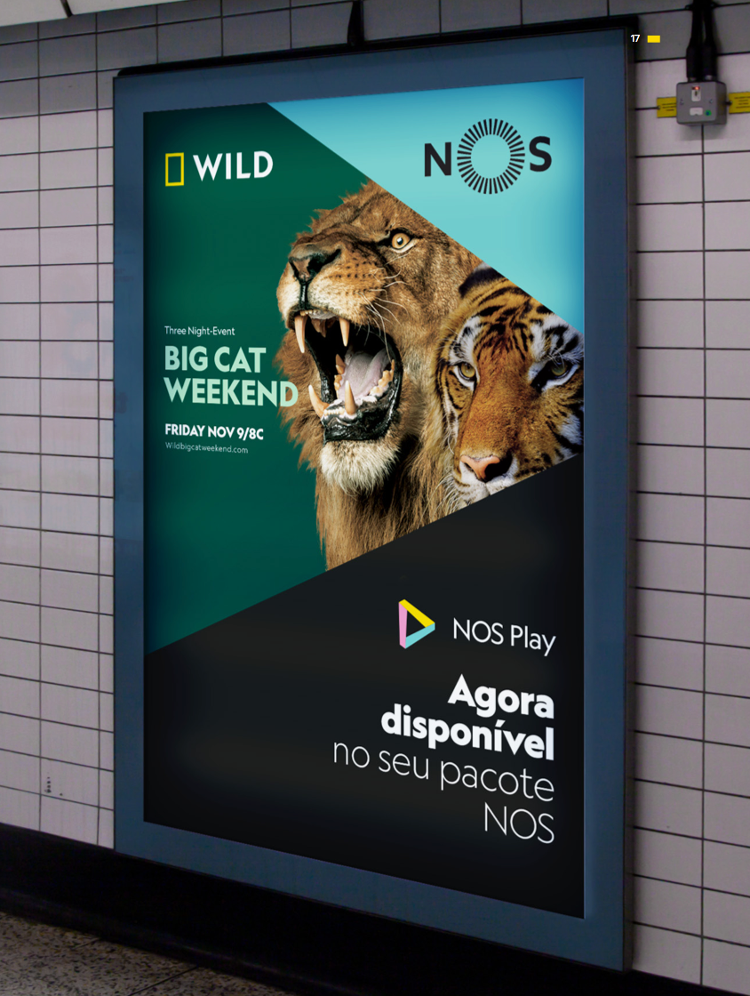
PRINT, OFF AIR & BRAND MANUAL
Here you can see some of the applications that have been created with the brand guidelines, from magazines to stationary and everything in between, but actually, you'll probably have seen them on your street... haven't you?


CREDITS
Client
Mariano Barreiro & Emanuele Madeddu
Mariano Barreiro & Emanuele Madeddu
National Geographic Partners
Creative Direction, Art Direction and Graphic Production
Flopicco Design Studio
Flopicco Design Studio
In-House Team
Florencia Picco, Fernando Vallejos, Pablo Camino, Alejandro Guatelli,
Florencia Picco, Fernando Vallejos, Pablo Camino, Alejandro Guatelli,
Romina Giarrizzo, Elia Iandolo and Marco Salemi.
🖤
Thanks for watching!