B R A Z I L · F L O P I C C O S T U D I O + S B T · 2 0 2 4
+SBT: A new streaming platform
BRAND SYSTEM
T H E C L I E N T
SBT, Sistema Brasileiro de Televisão (SBT, in Portuguese: Sistema Brasileiro de Televisão) is a Brazilian television network founded in 1981. It currently consists of ten thematic channels and is one of the three most watched channels in Brazil.
T H E C H A L L E N G E
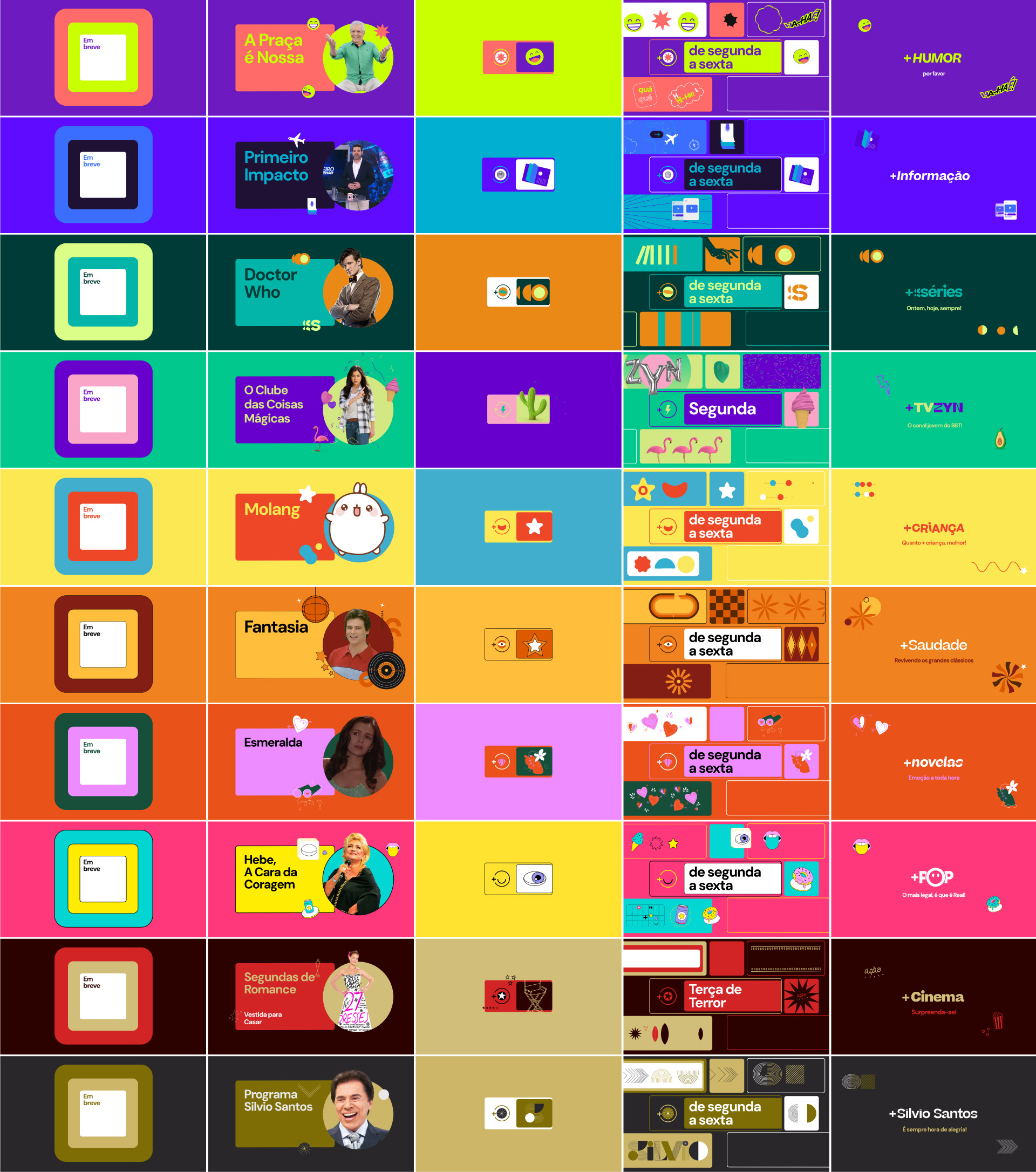
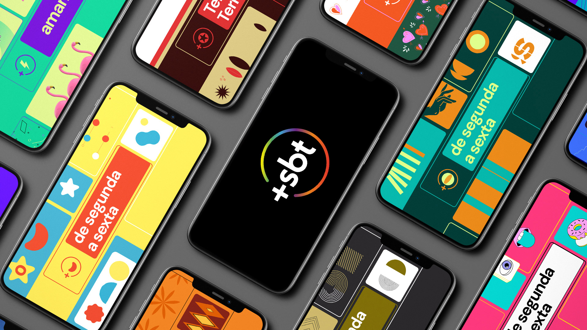
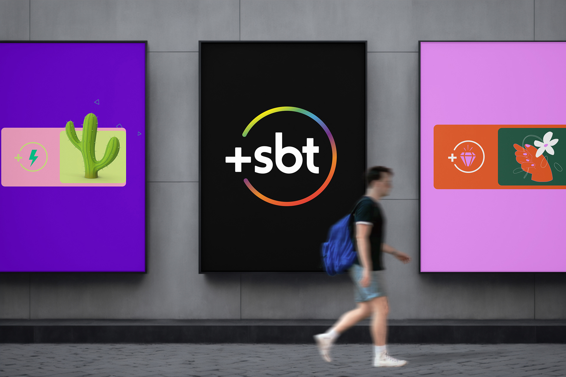
In 2024, SBT decided to innovate further by adding a free streaming platform to its TV offering: Mais SBT (+SBT). Our challenge was to develop a branding system for these 10 fast channels that was structurally harmonious to give a unique overall sense to the ten channels as a whole, but with a look & feel that reflected the identity of each channel.
T H E F L O P I C C O S T U D I O A P P R O A C H
Starting with the current SBT logo, we created a system consisting of three basic elements: a replicable modular base, a series of exclusive icons for each channel, and a single typeface family with enough versatility in variables to capture the spirit of each channel's theme. The result is ten perfectly defined identities, sufficiently differentiated in their brand language to be unique, yet similar enough to be understood as part of a set that encompasses them: Mais SBT.
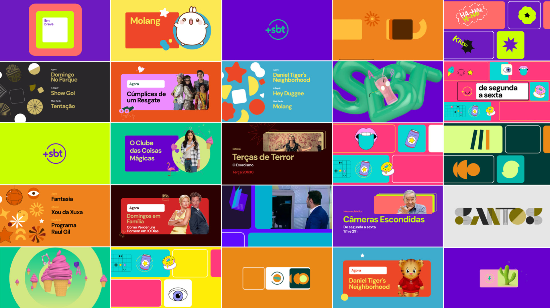

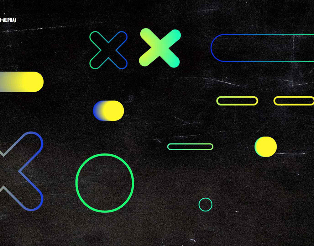
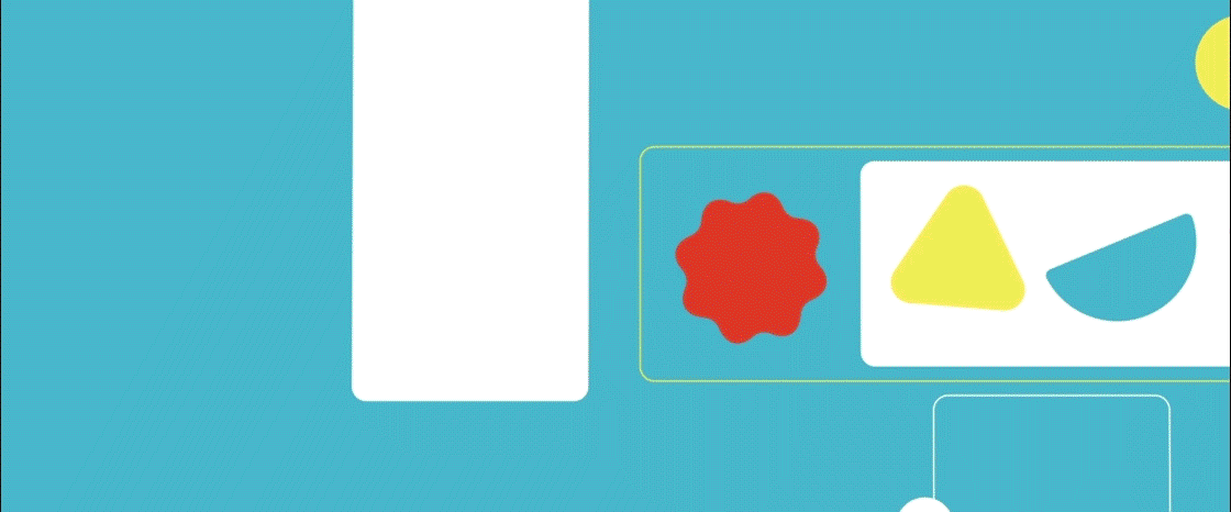
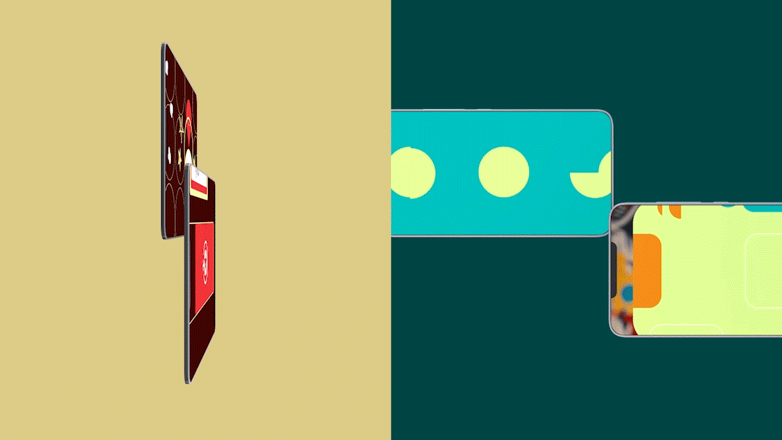
T H E M O D U L A R B A S E S Y S T E M
The design system began with a modular structure that could be adapted and applied consistently across all 10 channels. This replicable base ensured that each channel had a consistent framework that aligned them under the Mais SBT brand, while allowing room for individual expression.
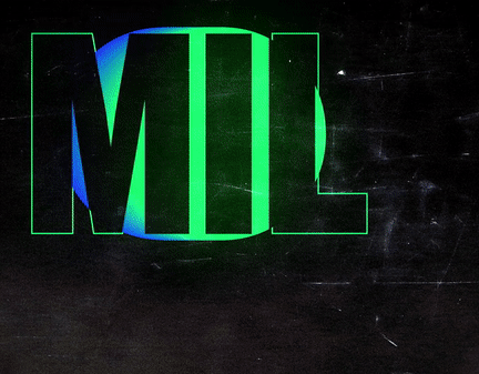
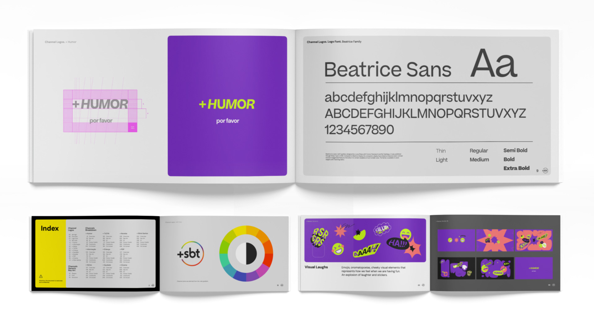
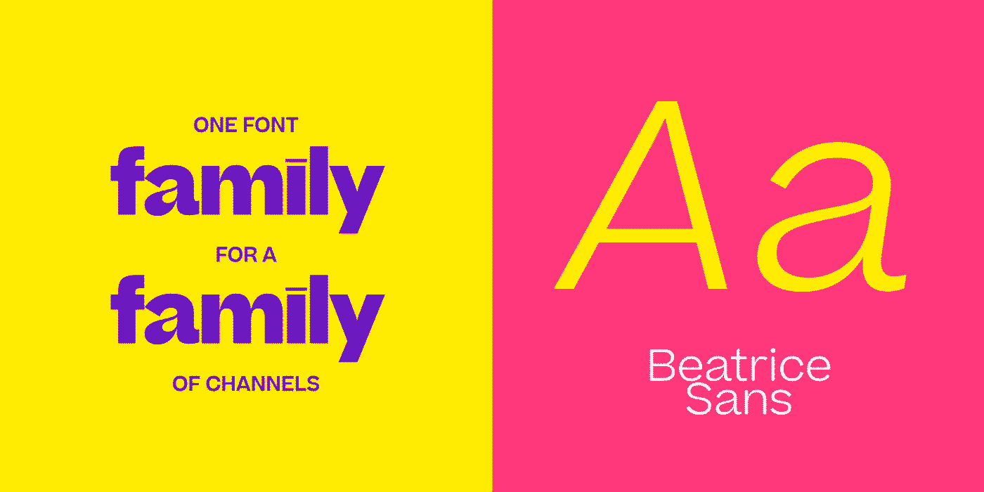
T H E T Y P E F A C E F A M I L Y
A main typeface family, Beatrice, was selected with enough flexibility in its variables - weight, style and proportion - to represent the diverse themes of the 10 channels. This ensured a consistent typographic presence across the brand system, but with the versatility to adapt to the specific needs of each channel's theme, whether playful, serious, or dynamic.
This typeface was developed by NYC’s Sharp Type and was designed by Lucas Sharp with Connor Davenport, Inga Plönnigs, & Kia Tasbihgou.
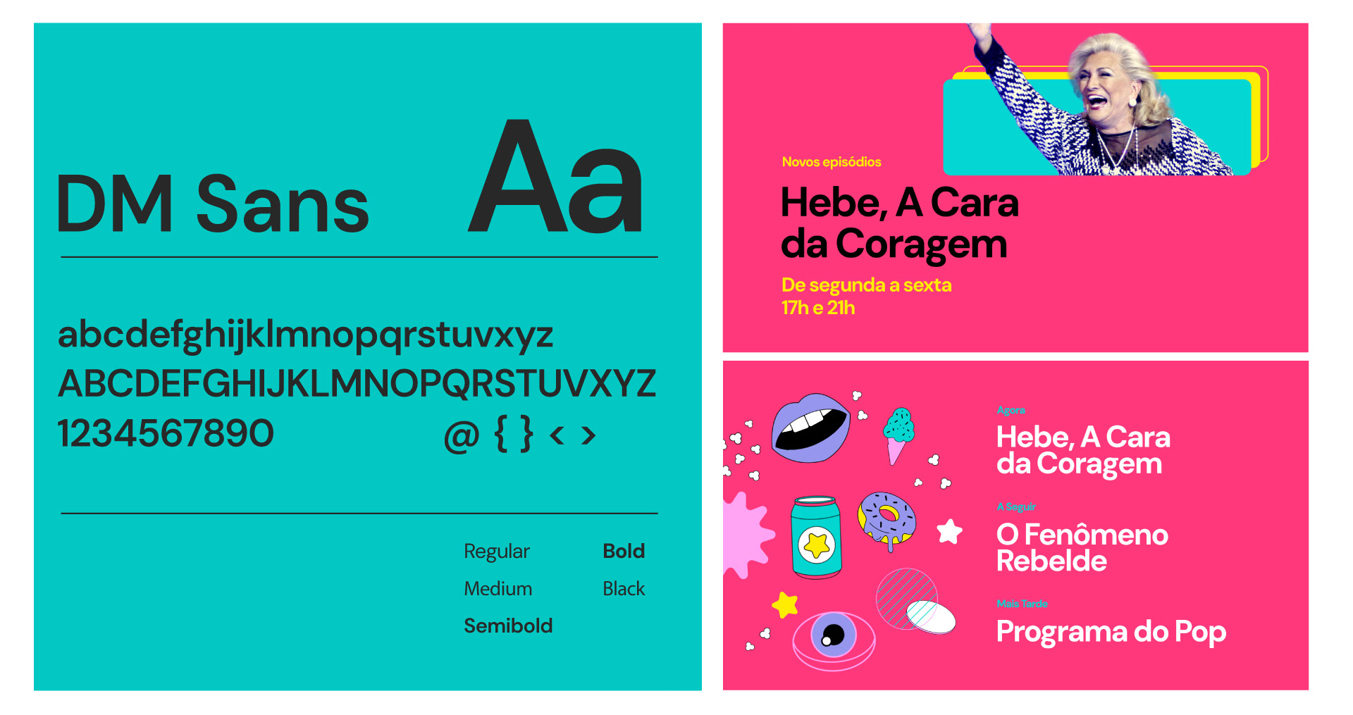
The secondary typeface was DM Sans, designed by Colophon Foundry (UK), a low-contrast geometric sans serif designed for use at smaller point sizes.

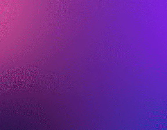
T H E C O L O R P A L E T T E
The main color of each channel is derived from the color gradient of the SBT logo, mixed, of course, with a few insights about the content, the target audience and the psychology of color.

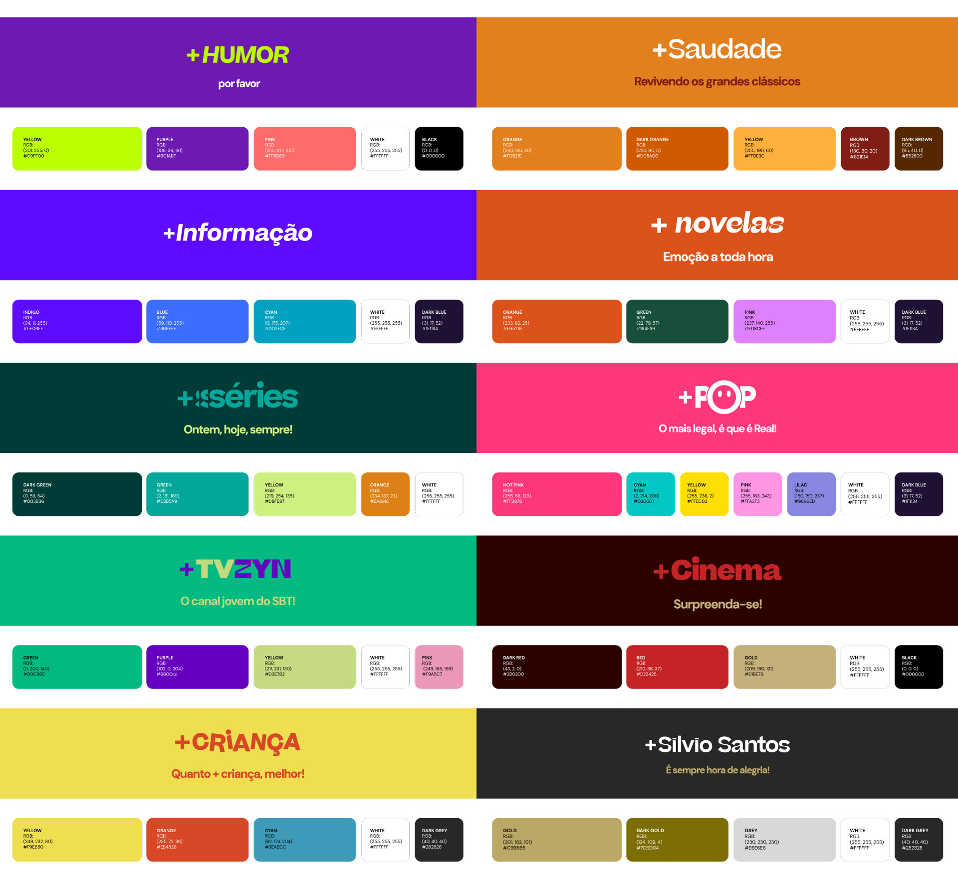
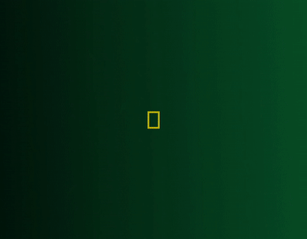
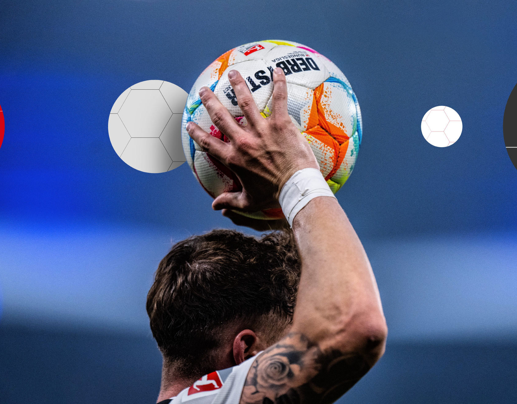
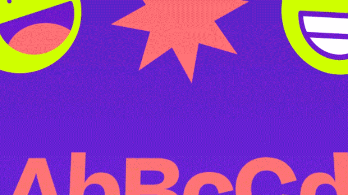
T H E T H E M A T I C I C O N S
To capture the distinct personality of each channel, we developed a series of exclusive icons. These icons were created to reflect the unique thematic essence of each channel, from entertainment and children's programming to sports and news. While distinct, the icons were designed with complementary shapes and styles to contribute to the unified look of the +SBT platform.


CLIENT
Sistema Brasileiro de Televisão (SBT)
CREATIVE DIRECTION, ART DIRECTION
AND GRAPHIC PRODUCTION
Flopicco Studio
Inhouse Team
Florencia Picco, Fernando Vallejos, Natalia Bellagio, Alejandro Guatelli,
Emiliano Agnetti, Martín Polech, Pablo Camino and Ana Laya.
With the collaboration of
Tercer Espacio
🖤