NAT GEO LATAM BRAND REFRESH
National Geographic · Latin America · 2020
Back in 2018, National Geographic went under a rebranding process brilliantly executed by Gretel. They make it their mission to rethink a legacy brand for the modern age, and, as they say, they built a platform around Nat Geo's purpose —to seek the unknown— and they've come out with a simple yet encompassing tagline that became the center of the proposal: Further.
Last year the Latin American chapter of National Geographic contacted us to come up with a new set of IDs, stings, bumpers and line ups that refresh the branding a bit and brought it closer to the Latin American audience, without losing the core idea, the feeling and the main elements of the global brand. And that's exactly what we did.
Let us take you through our process.
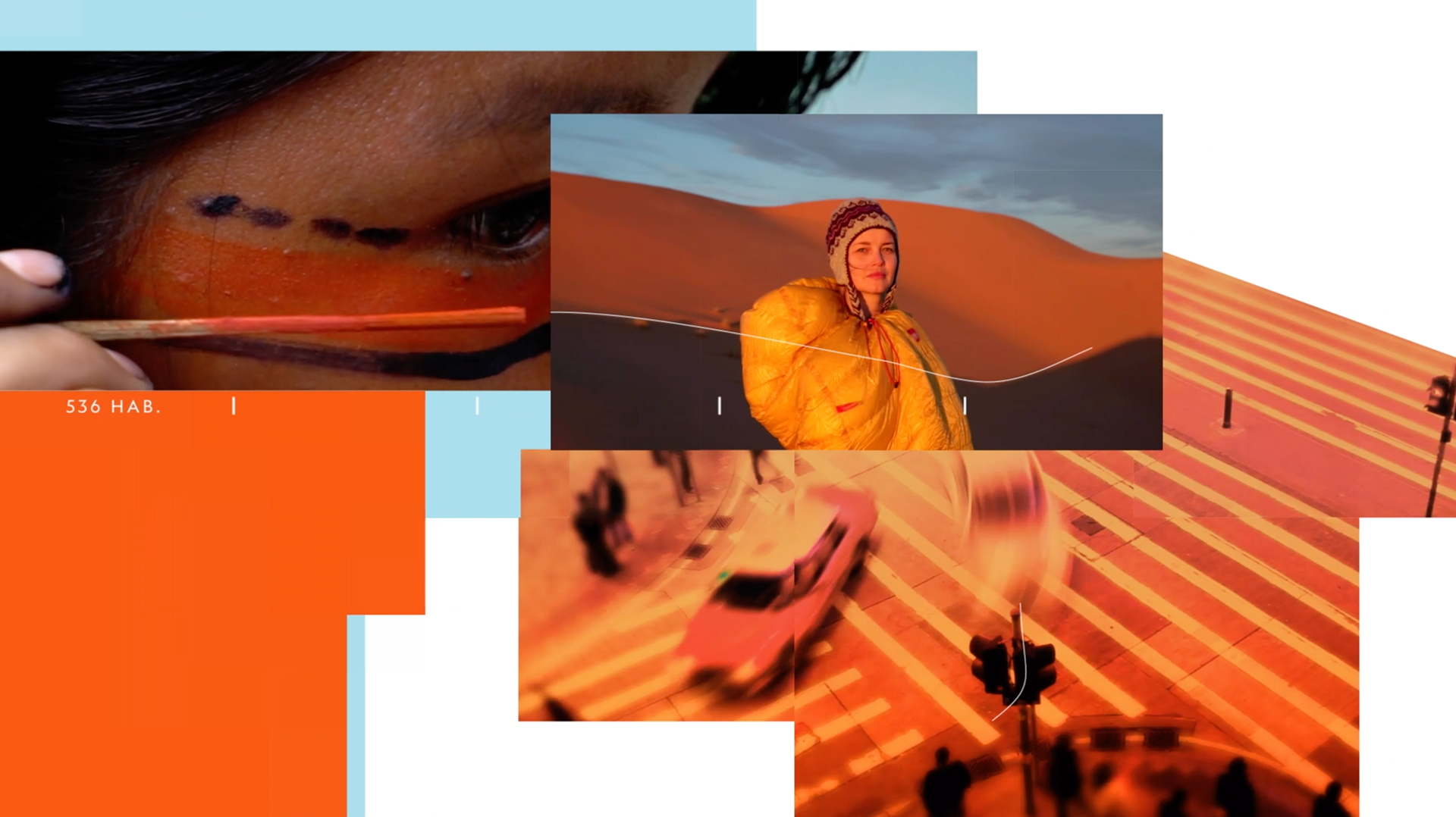
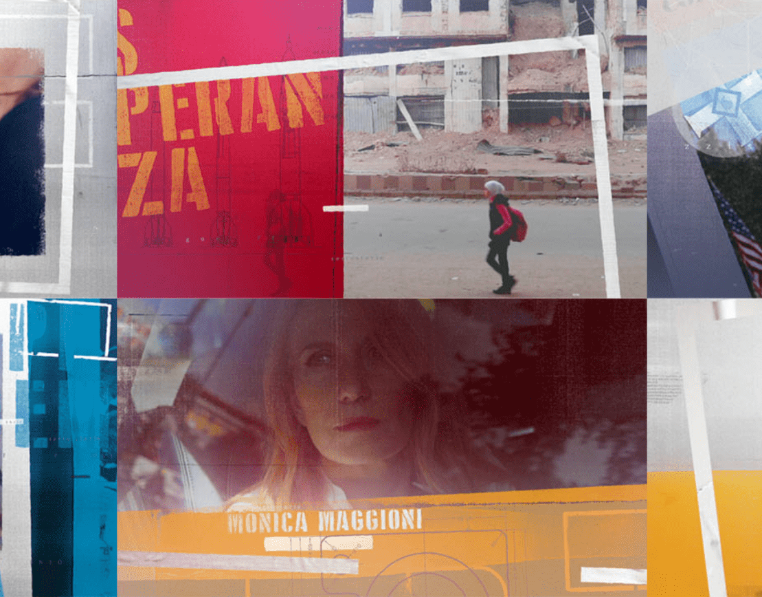
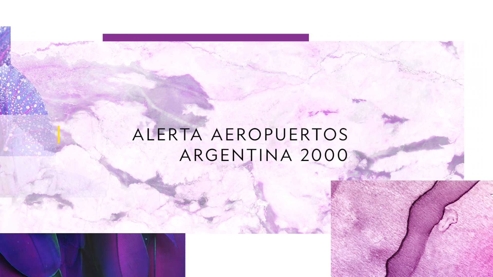
We thought that the Gretel branding showed in a very clean, perfect way the National Geographic ethos, we wanted to add a little more of warmth and colour into the mix.
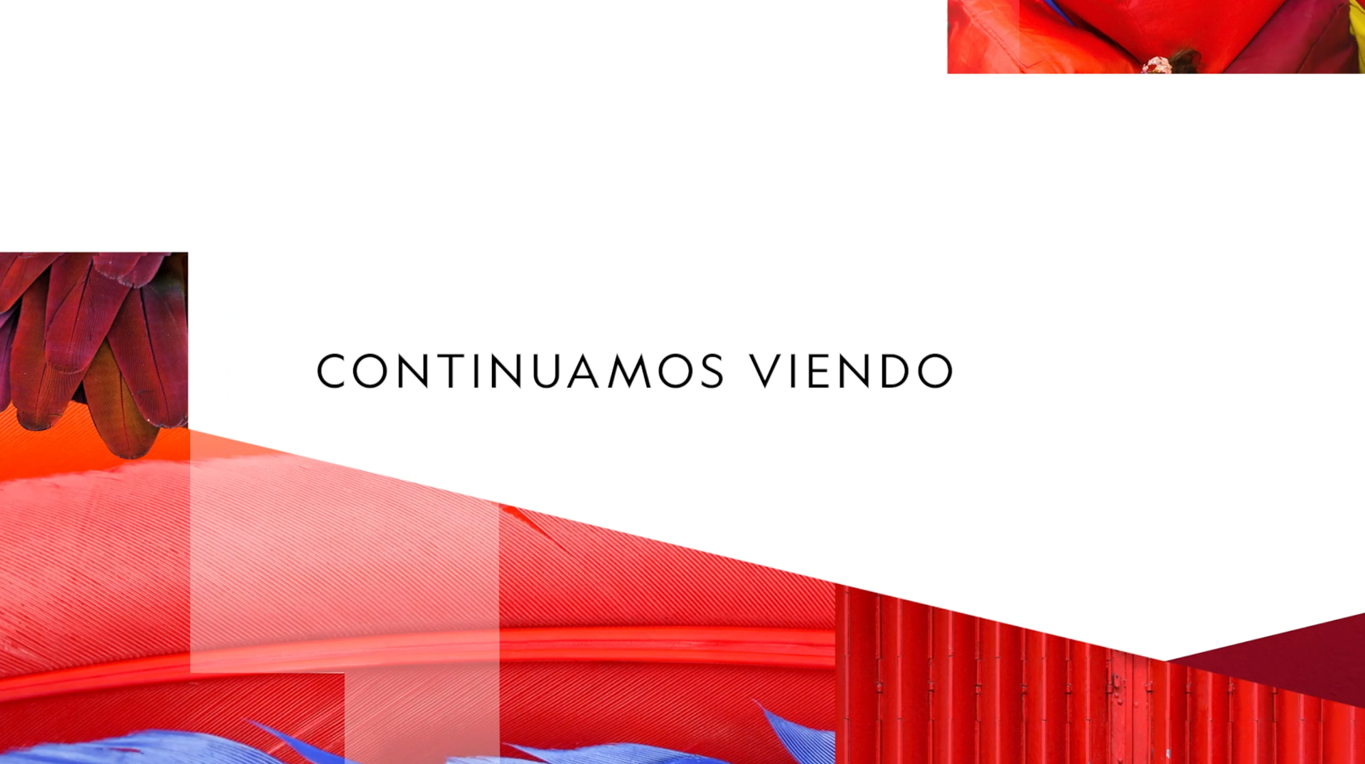
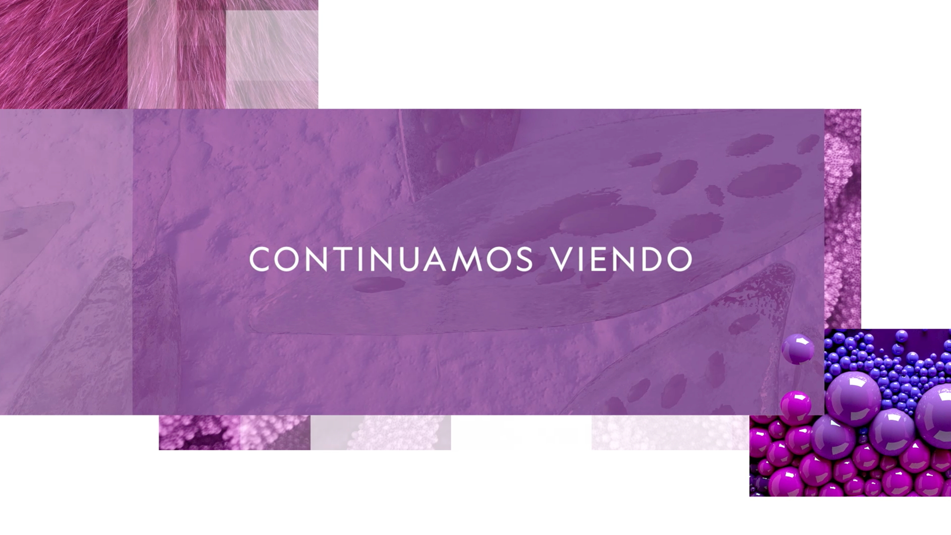
We started by studying colour through photographic textures that are a powerful way to tell stories and to awaken emotions, and a way to connect directly to the cornerstone of National Geographic brand since the very beginning: photography.
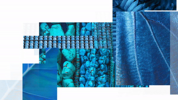
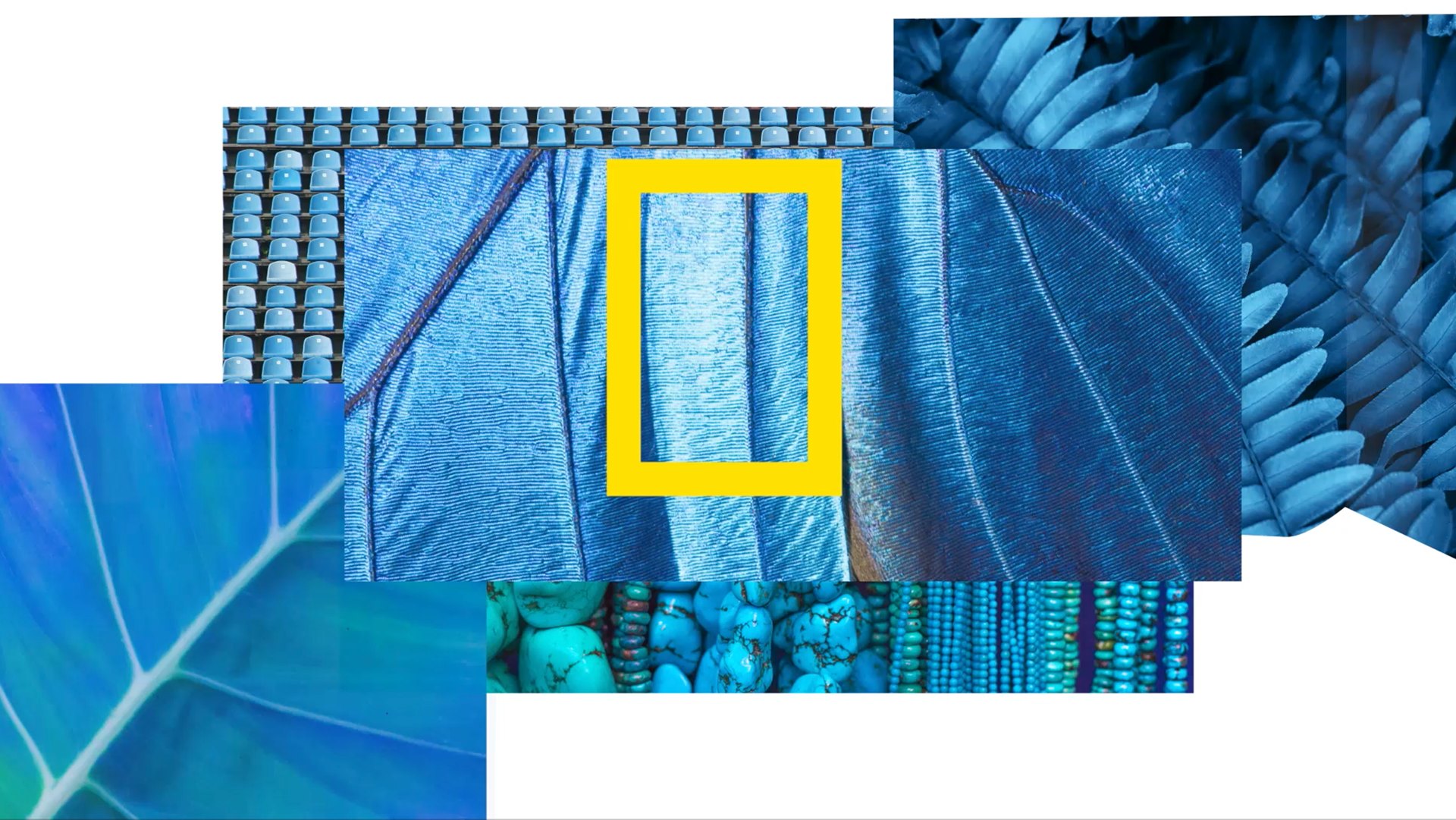
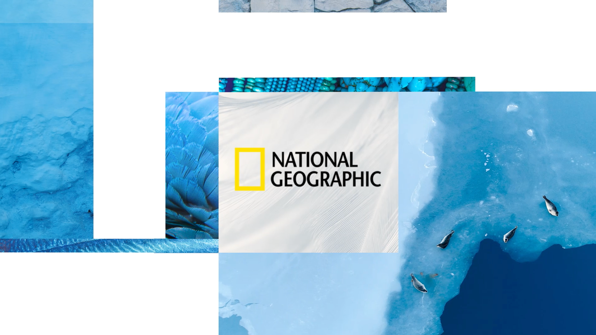

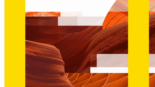
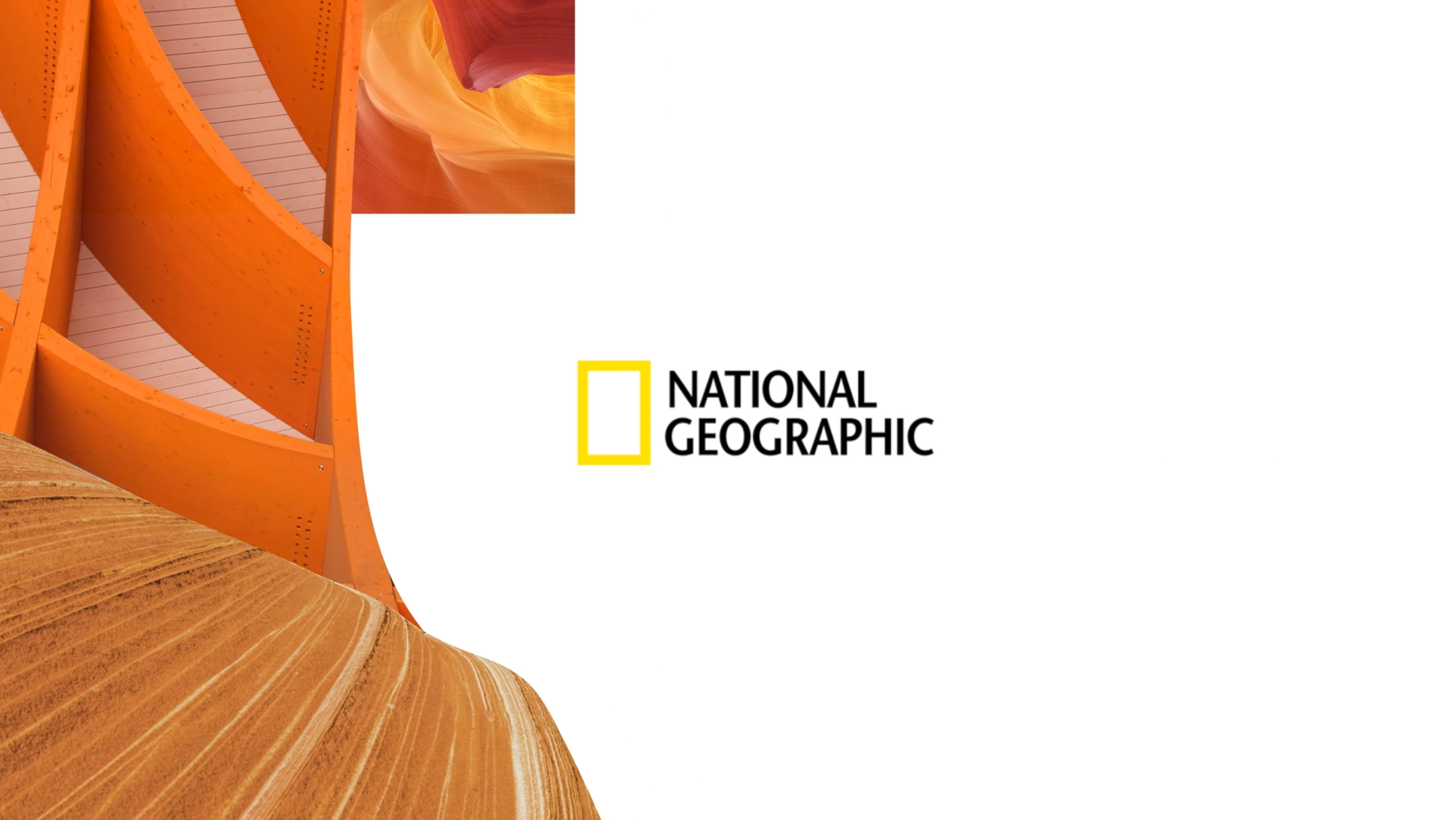
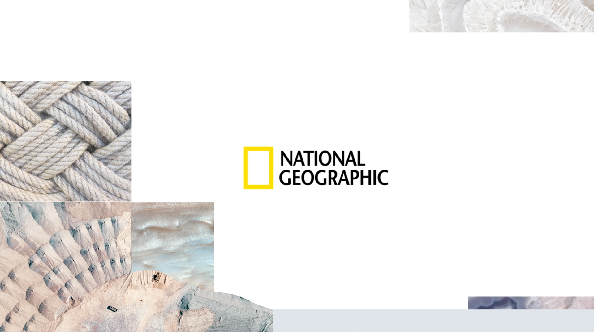
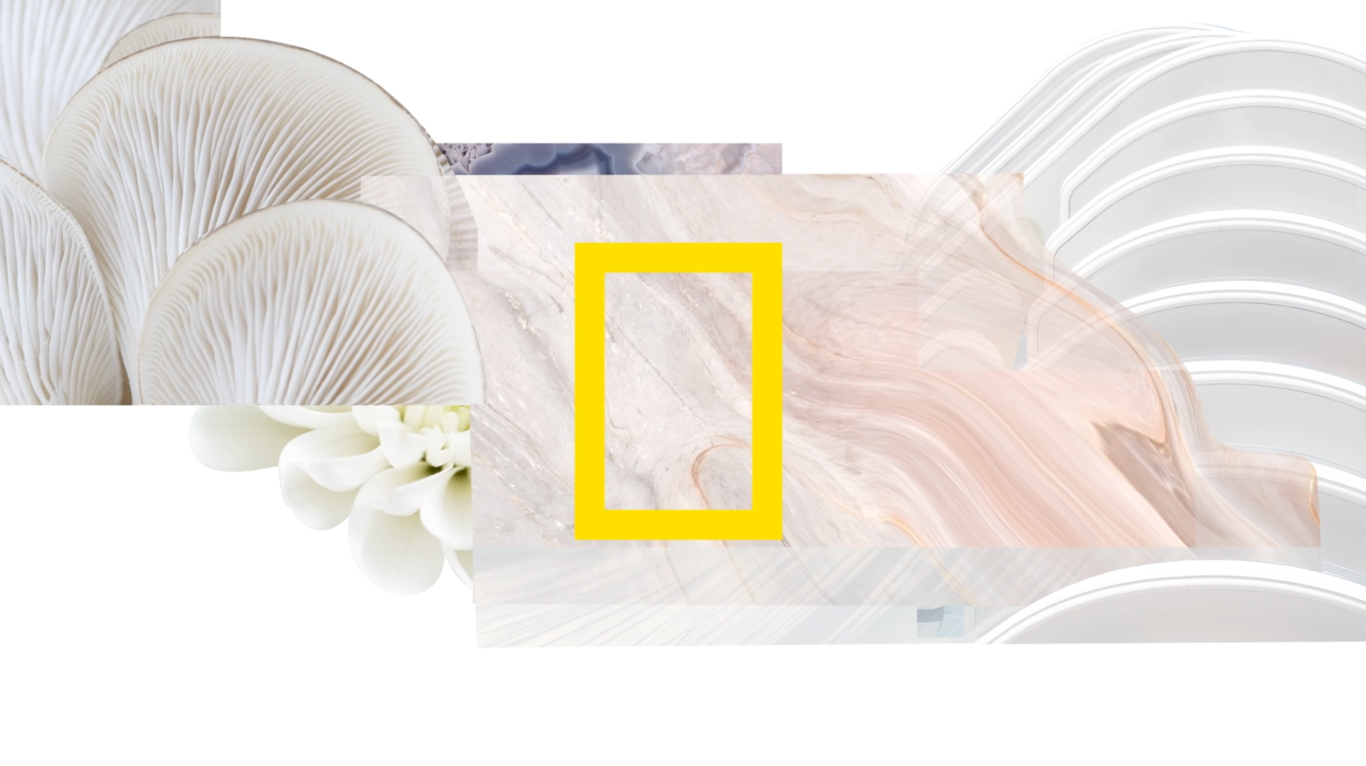

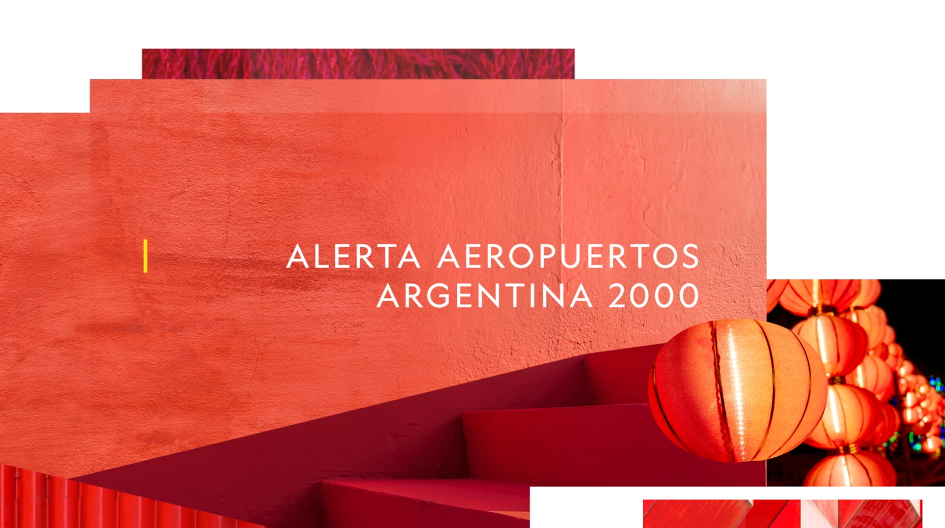
We included a wide variety of textures in each colour set, from the familiar to the unexpected. This way, all the pieces suit the great variety of thematics and the great visual storytelling capacity of National Geographic.
Our pieces are not related to a single part of the Earth, or to a distinct type of shows, they wanted to hold represent the variety of voices, approaches, points of view, which together create a great whole, a big picture.
When people watch National Geographic channel they can experience an extract of our wonderful, diverse, exciting world through a color flash.
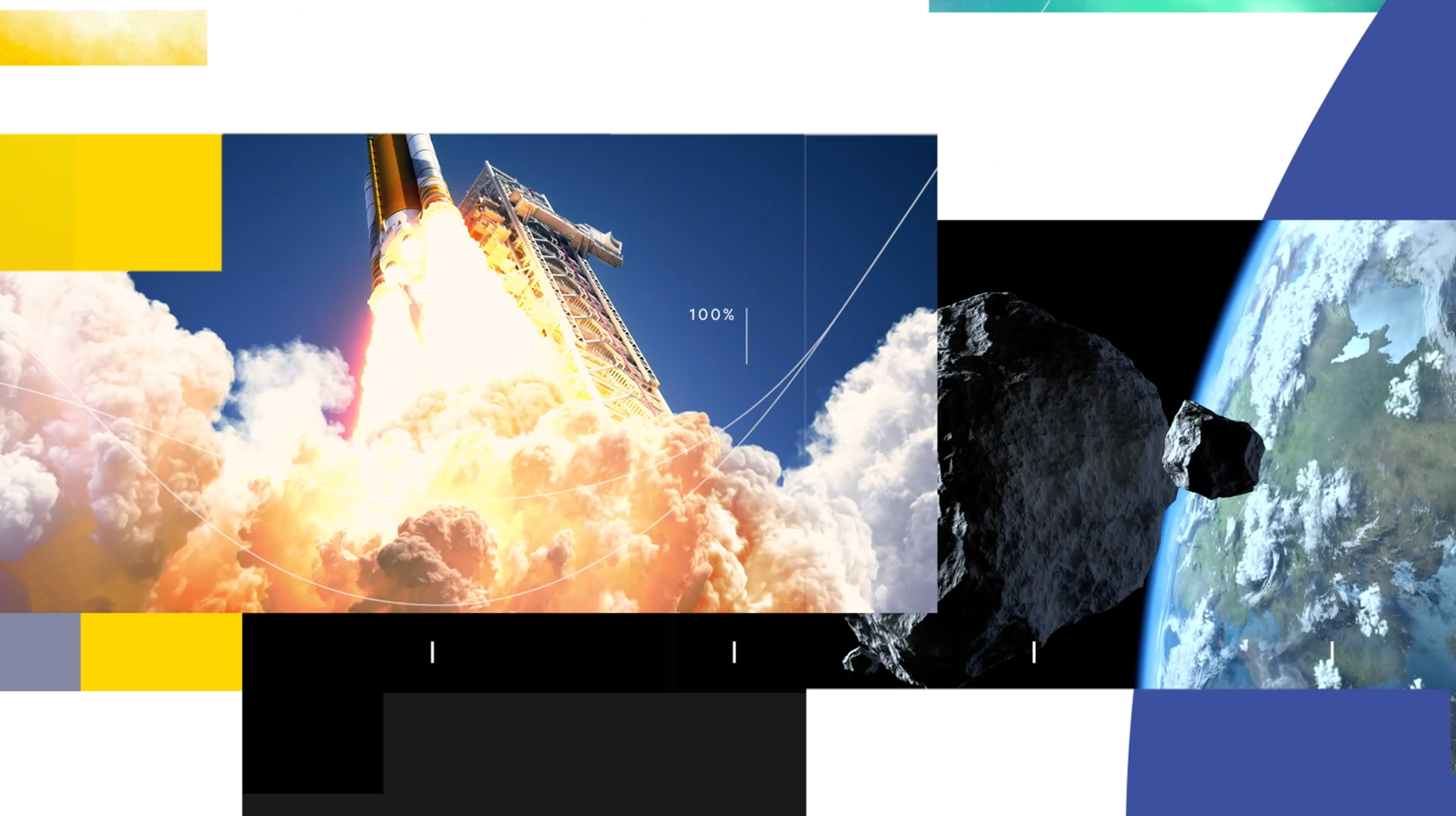
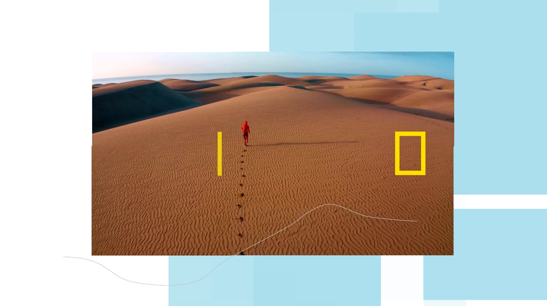
The motion language of National Geographic image created by Gretel is based in two basic elements all explorers should be familiar with: the index and mapping. Both playing an important part: to show the notion of a continuum and to illustrate the way bits of different data is combined in order to get a more complete picture.
These two elements are core to the brand and remain present in all the new pieces we created.

This was truly a powerful and inspiring project and we enjoyed a lot the opportunity of working with the amazing material of both National Geographic and Gretel.
Looking forward to reading your comments!


CREDITS
CLIENT
Nat Geo Latin America
CREATIVE DIRECTION
Flopicco Studio
ART DIRECTION
Flopicco Studio + Tercer Espacio
GRAPHIC PRODUCTION
Inhouse Team
Florencia Picco, Fernando Vallejos, Natalia Español, Pablo Camino,
Alejandro Guatelli, Martín Polech
🖤