I T A L Y · F L O P I C C O S T U D I O + F O N D A Z I O N E C A R I P A R M A · 2 0 2 5
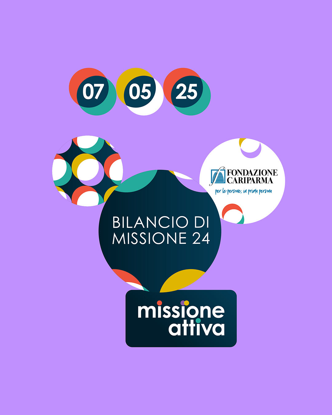
MISSIONE ATTIVA 2024
THEMATIC BRANDING
The Client
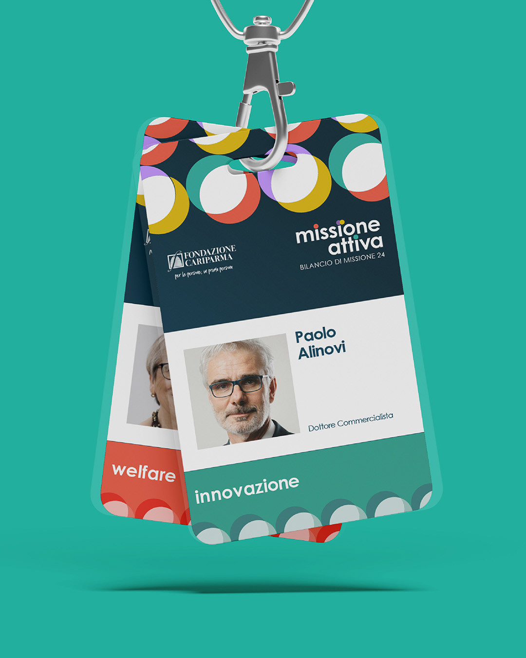
Fondazione Cariparma is a nonprofit foundation with banking origins that is committed to fostering positive transformation in its community. Its mission is rooted in three strategic goals: reducing inequality, strengthening people and institutions, and guiding the territory through its transformations. These priorities are brought to life through four action areas, ranging from social welfare to urban change and innovation, each of which is supported by tailored grant-making programs.
The Challenge
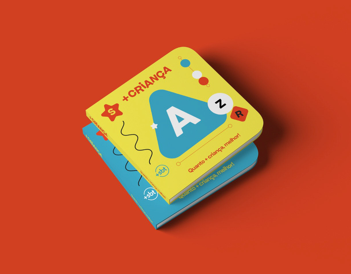
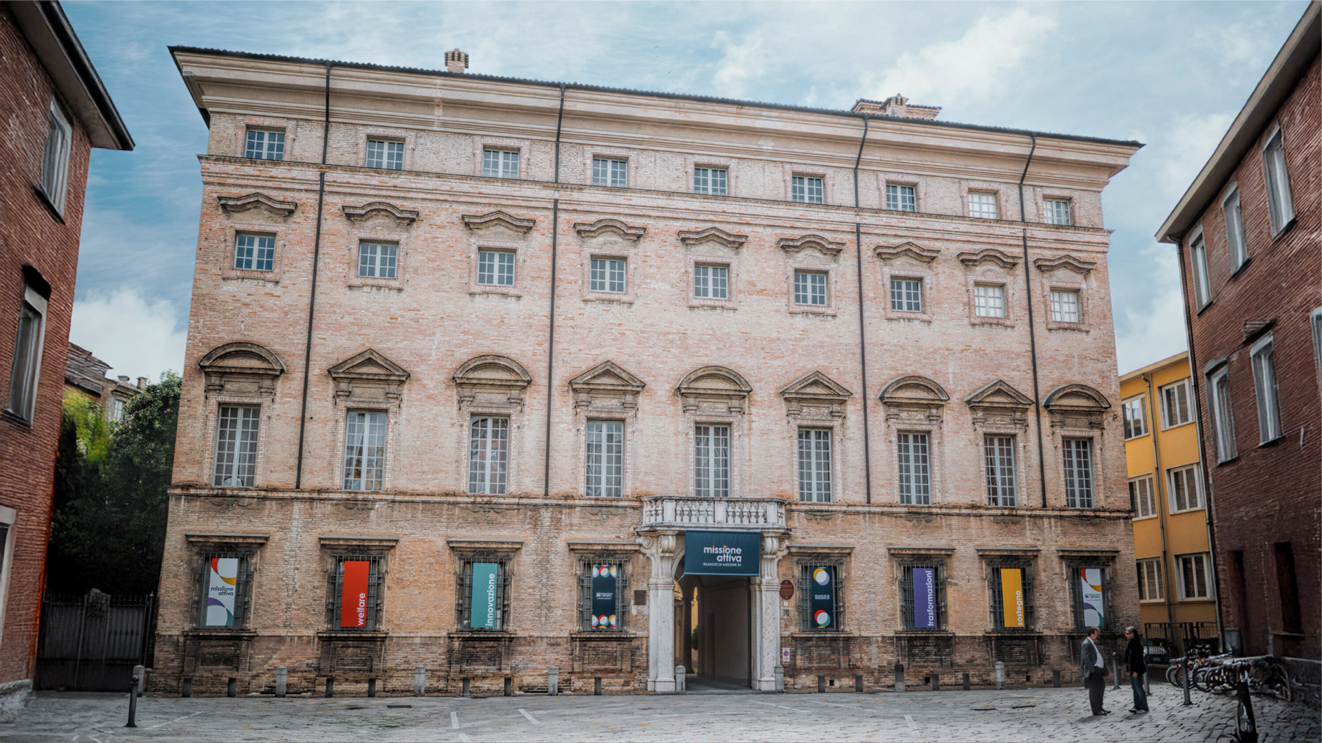
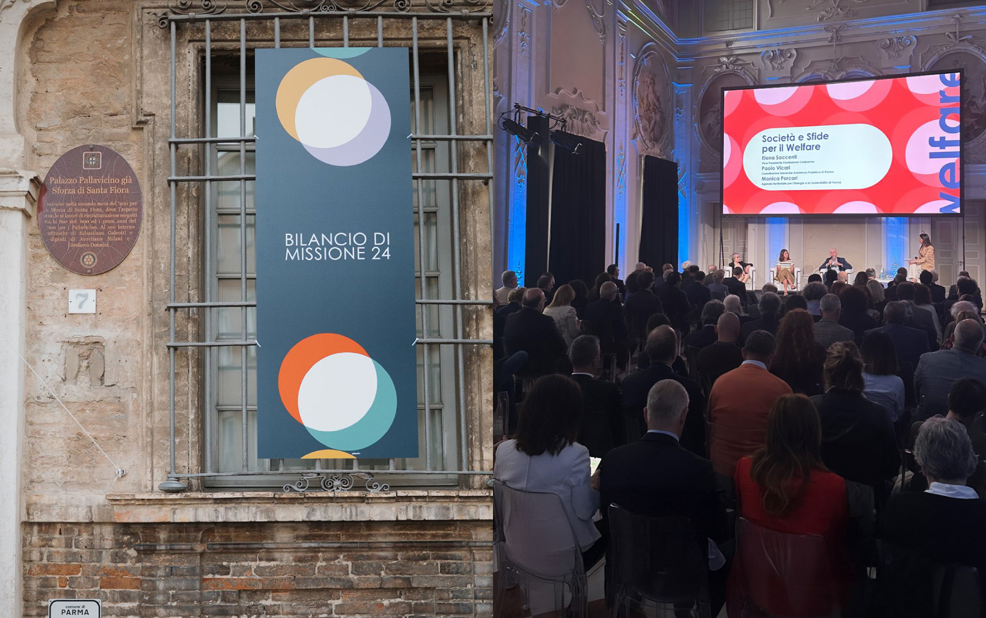
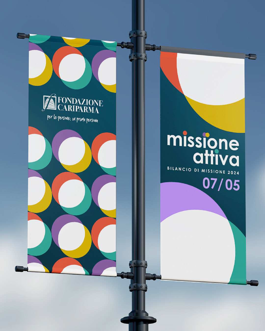
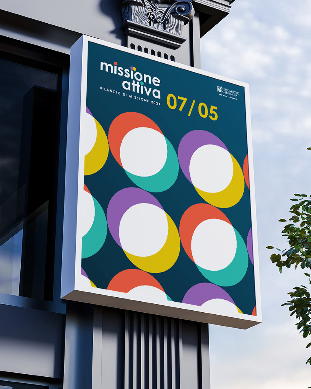
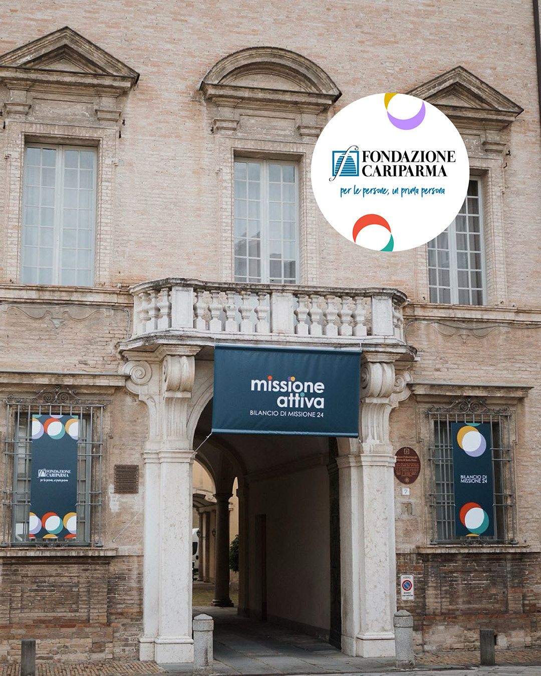
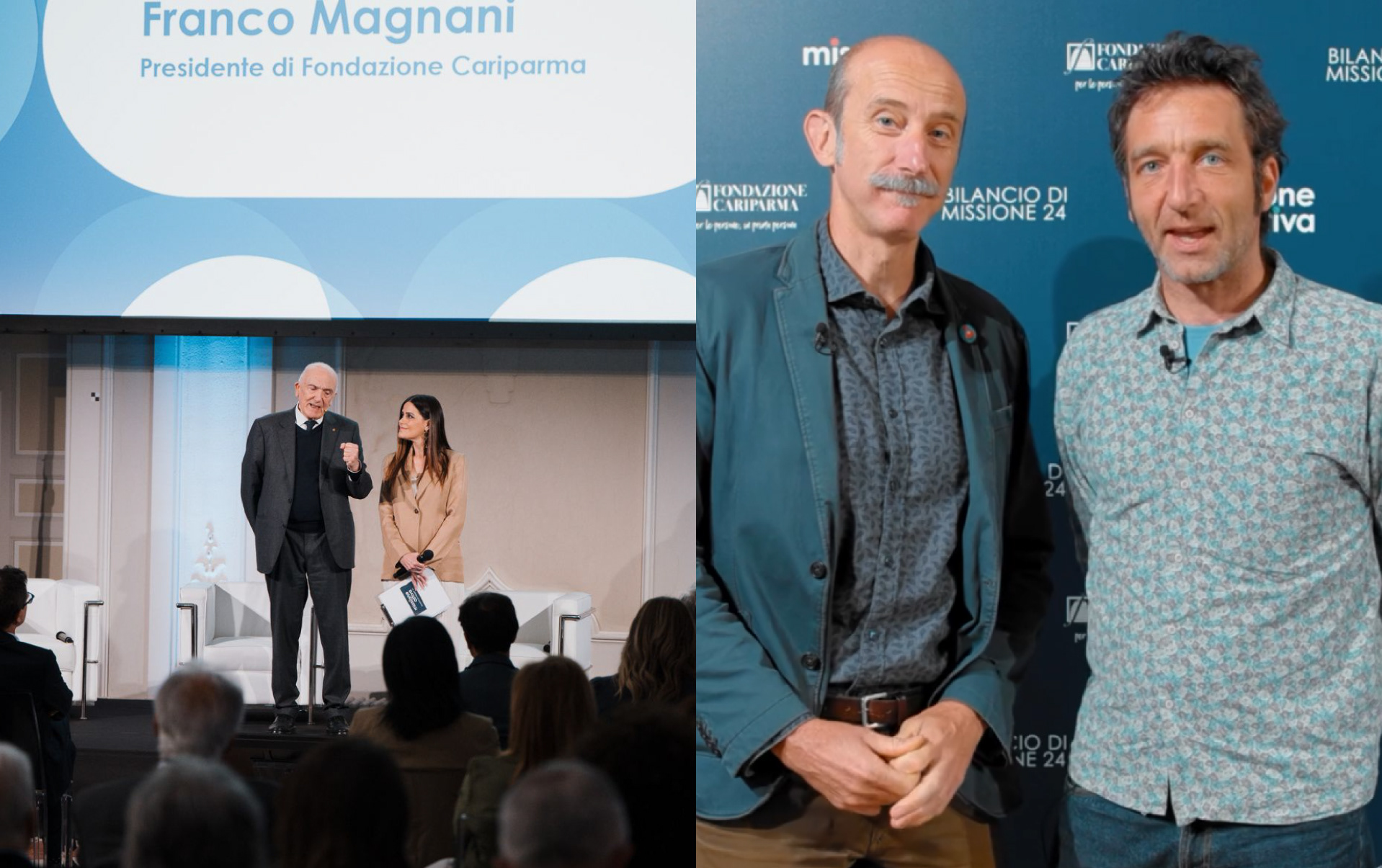
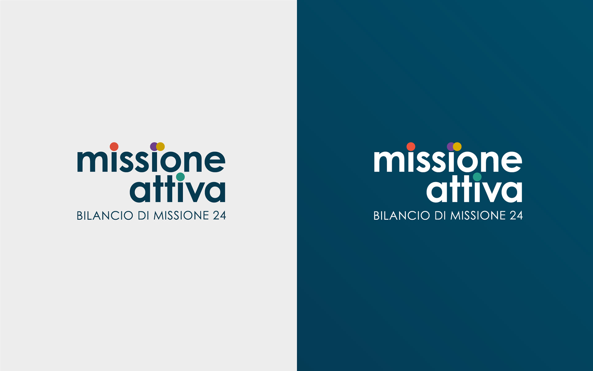
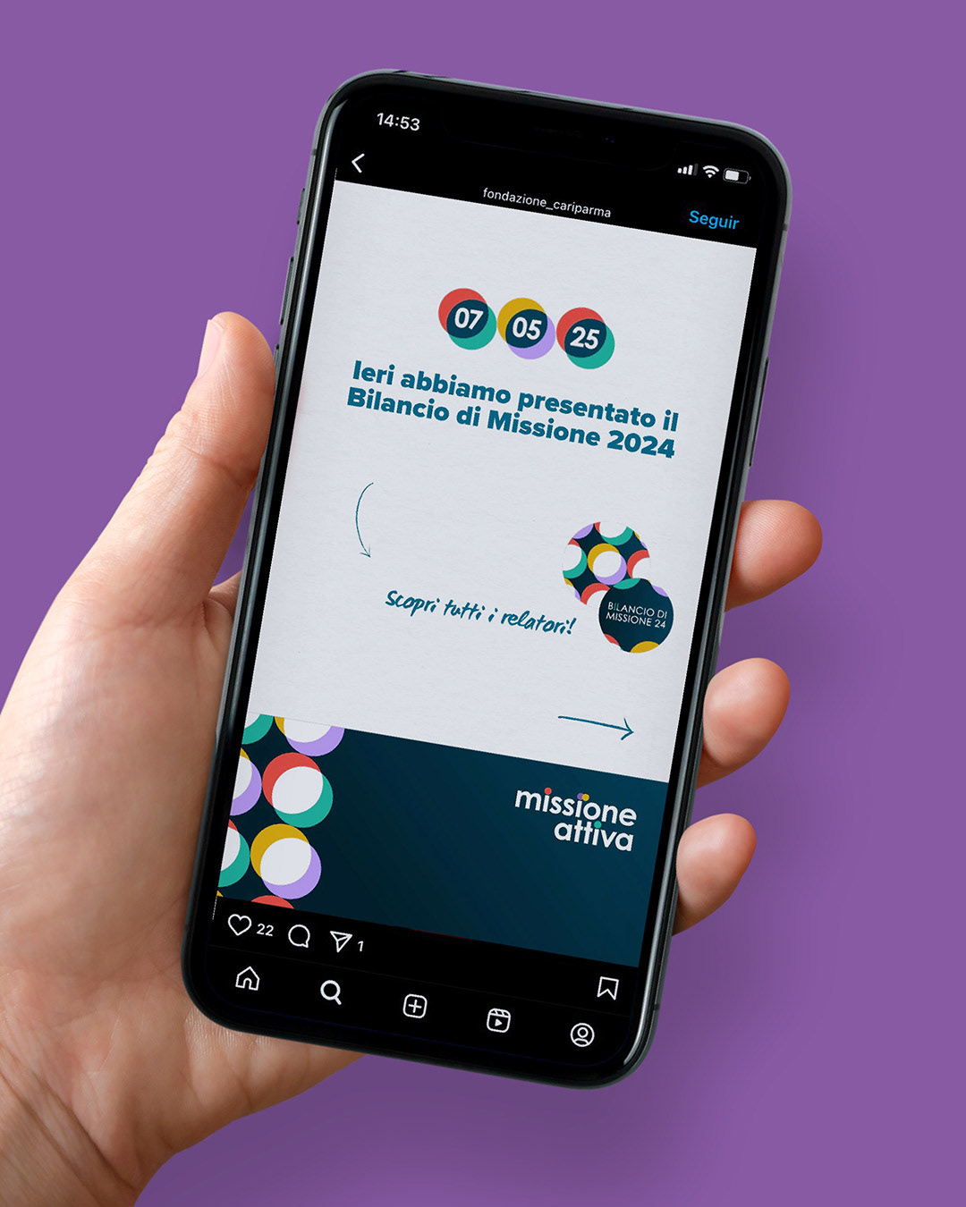
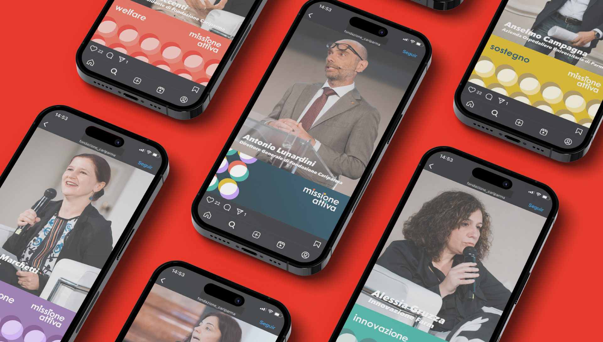
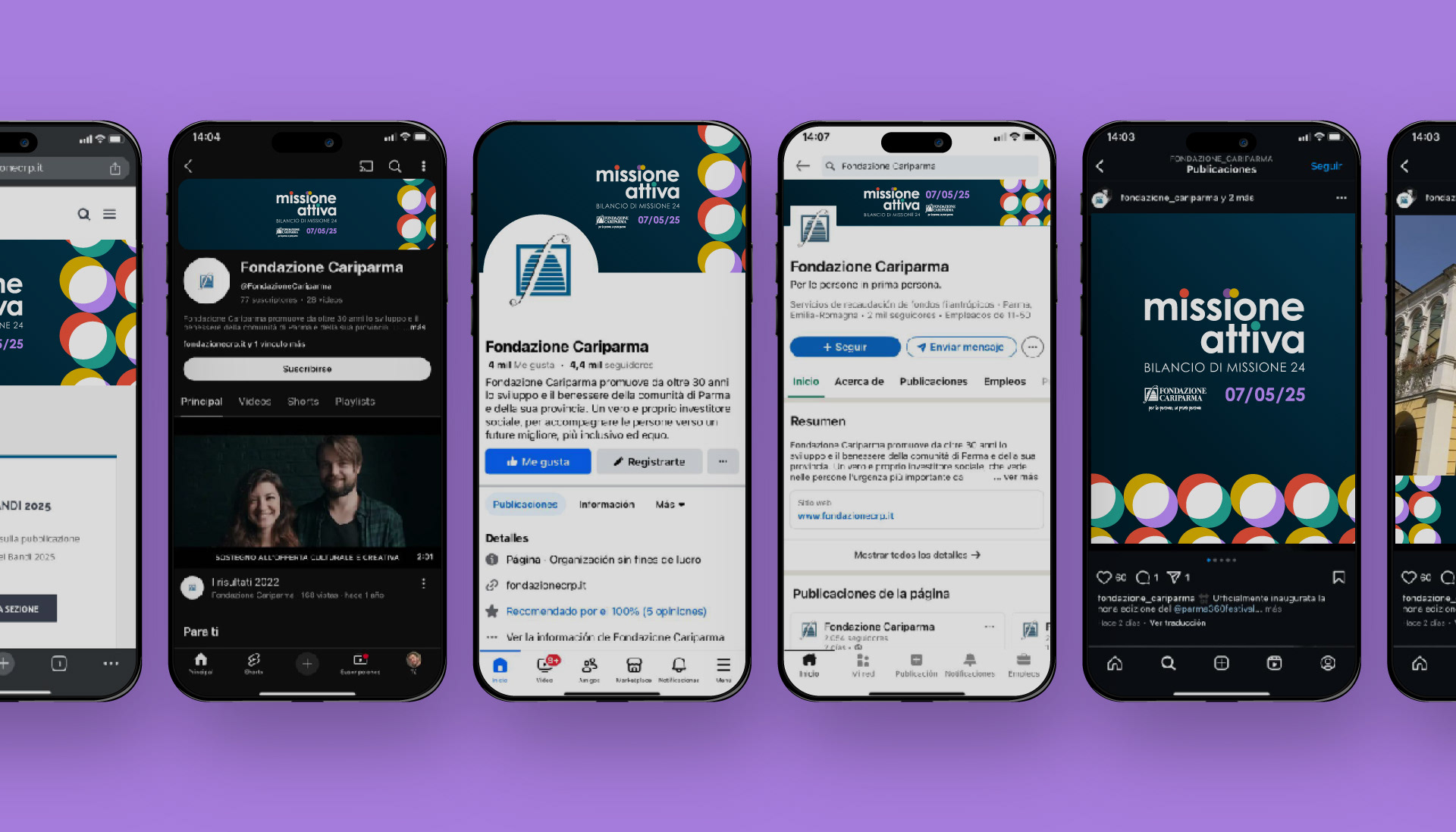
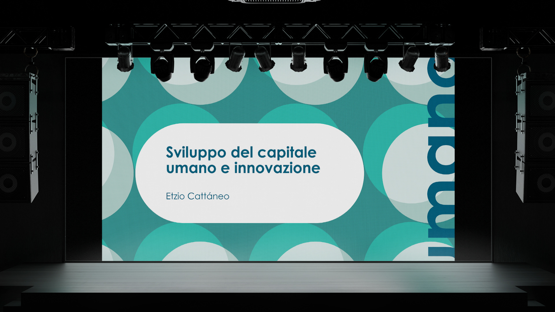
For the 2024 edition of its Bilancio di Missione (Accountability Report), the foundation set out to communicate the impact of its strategic plan clearly and engagingly. The event required a name, visual identity, and audiovisual elements to bring structure, emotion, and cohesion to a 90-minute presentation. The design had to align with the foundation's established visual language and make its four areas of action easy to understand and emotionally resonant for a diverse audience of stakeholders.
The Flopicco Studio Approach
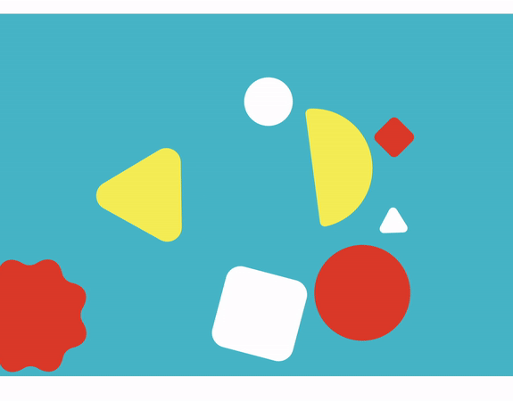
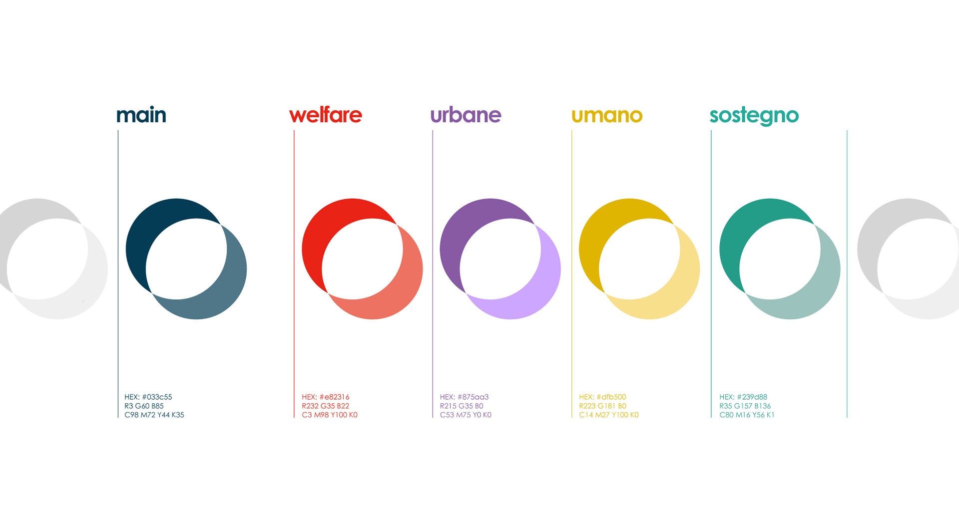
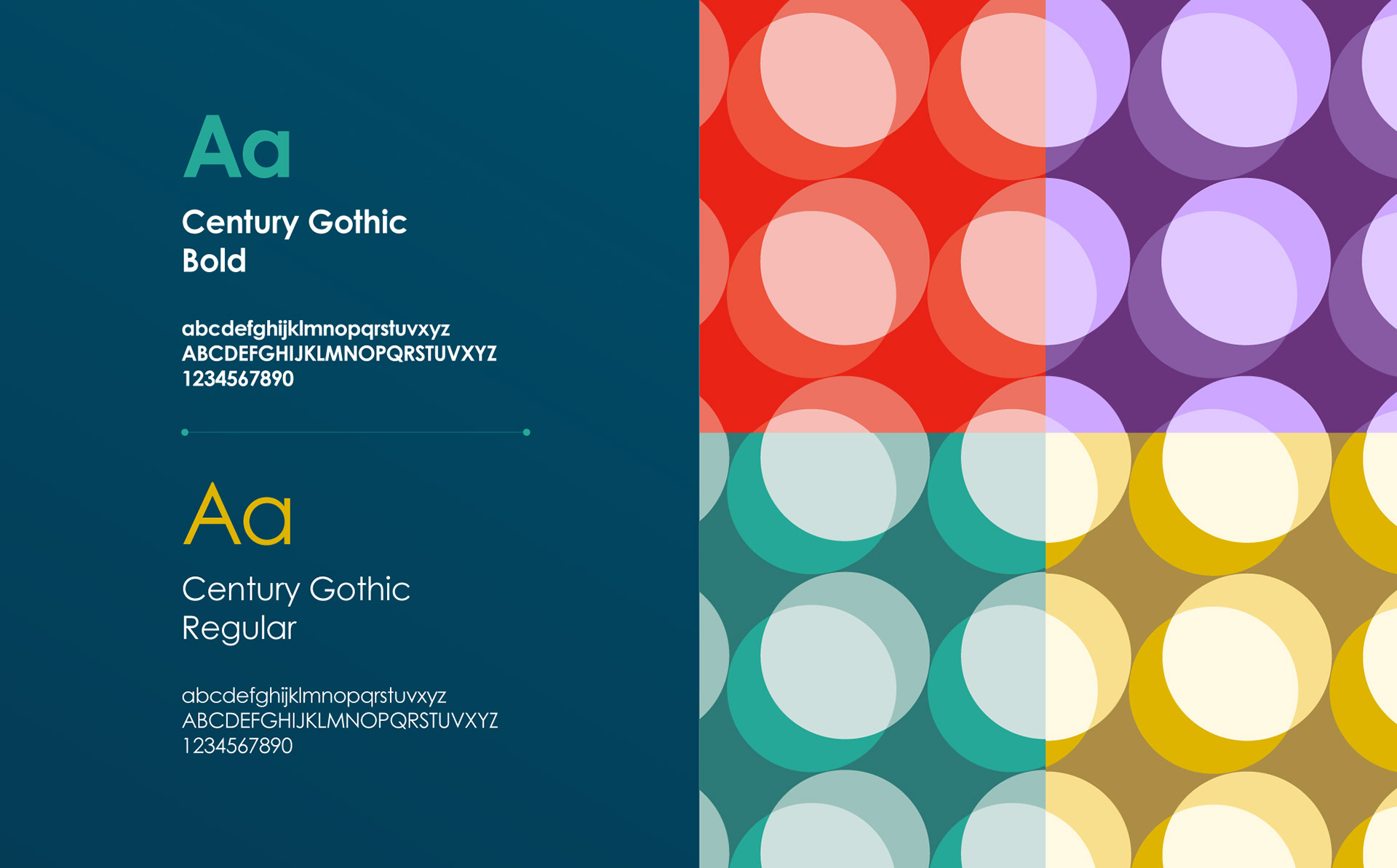
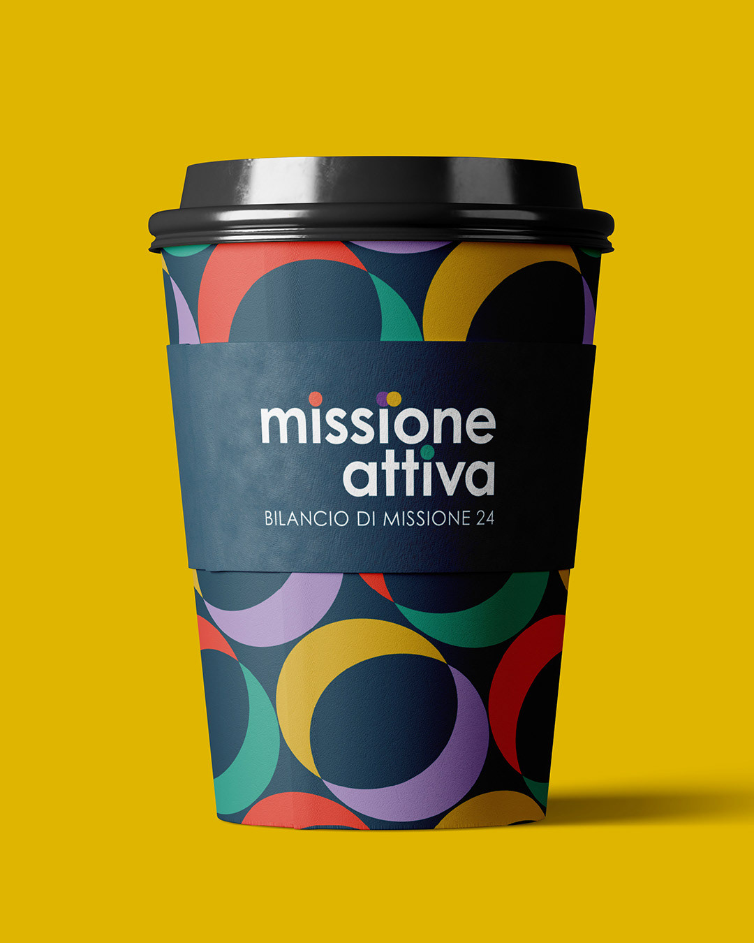
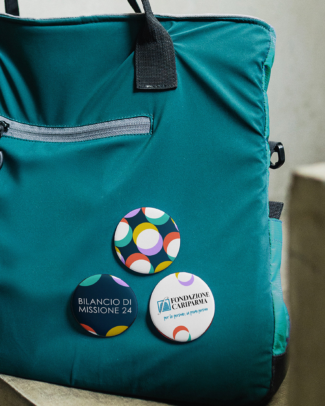
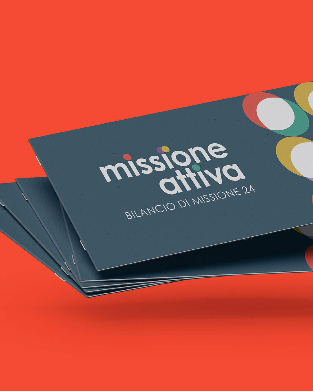
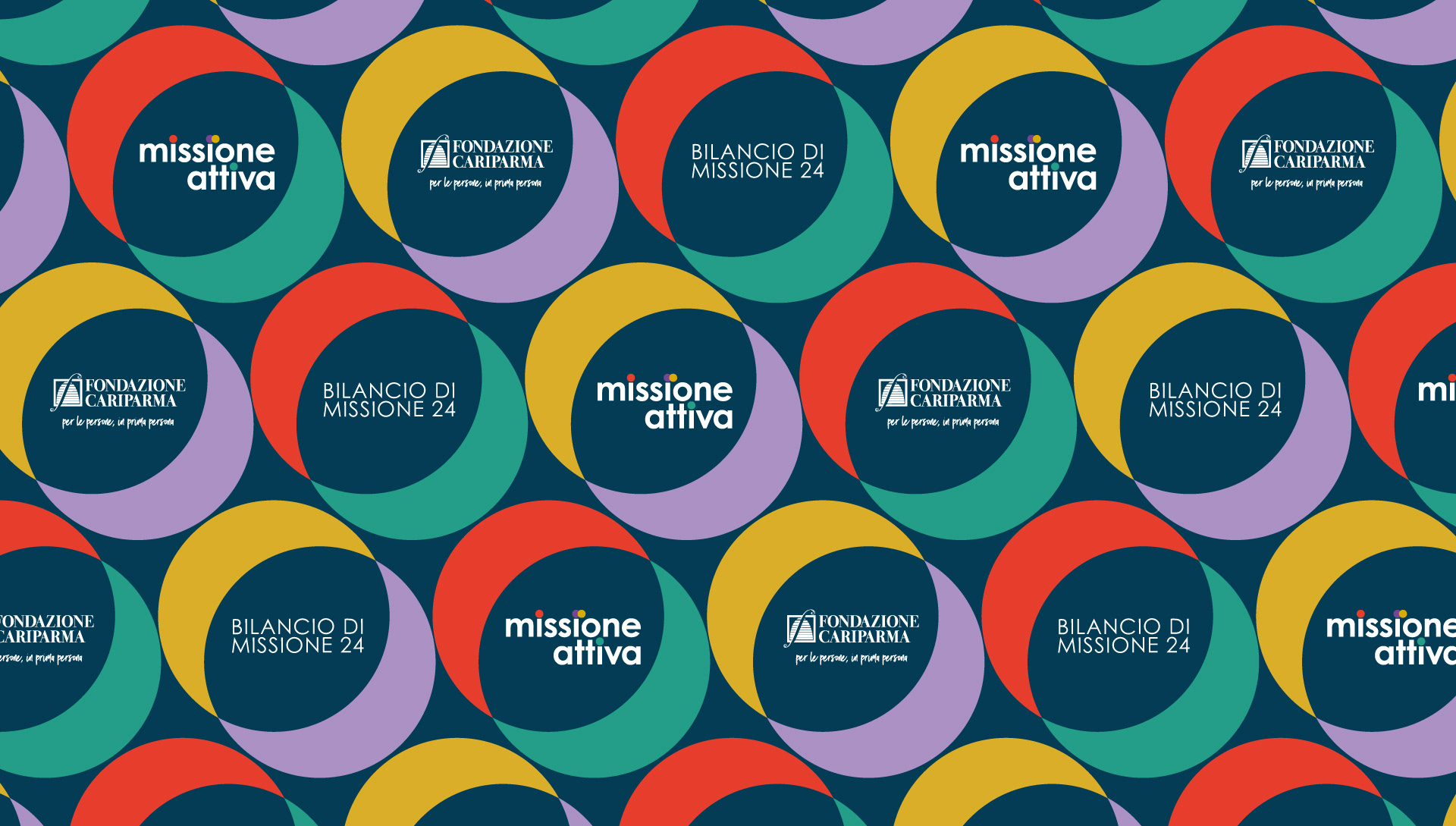
We approached this project as an exercise in visual clarity and narrative connection. Our brand system preserves the foundation's institutional fonts and colors, simplifying its graphical language. We reinterpreted one of the most recognizable elements of their identity, the circle, using it as a visual anchor and a metaphor for collaboration. The four action areas became intersecting, color-coded circles: distinct yet connected. The result conveys impact, synergy, and the shared responsibility of building a better future together.
El cliente
Fondazione Cariparma es una fundación sin ánimo de lucro con origen bancario que se compromete a fomentar una transformación positiva en su comunidad. Su misión se basa en tres objetivos estratégicos: reducir la desigualdad, fortalecer a las personas y las instituciones, y guiar al territorio a través de sus transformaciones. Estas prioridades se materializan a través de cuatro áreas de acción, que van desde el bienestar social hasta el cambio urbano y la innovación, cada una de las cuales cuenta con el apoyo de programas de subvenciones personalizados.
El reto
Para la edición de 2024 de su Bilancio di Missione (rendición de cuentas), la fundación se propuso comunicar el impacto de su plan estratégico de forma clara y atractiva. El evento requería un nombre, una identidad visual y elementos audiovisuales que aportaran estructura, emoción y cohesión a una presentación de 90 minutos. El diseño debía estar en consonancia con el lenguaje visual establecido por la fundación y hacer que sus cuatro áreas de actuación fueran fáciles de entender y resonaran emocionalmente en un público diverso de partes interesadas.
Para la edición de 2024 de su Bilancio di Missione (rendición de cuentas), la fundación se propuso comunicar el impacto de su plan estratégico de forma clara y atractiva. El evento requería un nombre, una identidad visual y elementos audiovisuales que aportaran estructura, emoción y cohesión a una presentación de 90 minutos. El diseño debía estar en consonancia con el lenguaje visual establecido por la fundación y hacer que sus cuatro áreas de actuación fueran fáciles de entender y resonaran emocionalmente en un público diverso de partes interesadas.
El enfoque de Flopicco Studio
Abordamos este proyecto como un ejercicio de claridad visual y conexión narrativa. Nuestro sistema de marca conserva las fuentes y los colores institucionales de la fundación, simplificando su lenguaje gráfico. Reinterpretamos uno de los elementos más reconocibles de su identidad, el círculo, utilizándolo como ancla visual y metáfora de la colaboración. Las cuatro áreas de acción se convirtieron en círculos entrelazados y codificados por colores: distintos pero conectados. El resultado transmite impacto, sinergia y la responsabilidad compartida de construir juntos un futuro mejor.
Abordamos este proyecto como un ejercicio de claridad visual y conexión narrativa. Nuestro sistema de marca conserva las fuentes y los colores institucionales de la fundación, simplificando su lenguaje gráfico. Reinterpretamos uno de los elementos más reconocibles de su identidad, el círculo, utilizándolo como ancla visual y metáfora de la colaboración. Las cuatro áreas de acción se convirtieron en círculos entrelazados y codificados por colores: distintos pero conectados. El resultado transmite impacto, sinergia y la responsabilidad compartida de construir juntos un futuro mejor.
CREDITS
CLIENT
Fondazione Cariparma
CREATIVE DIRECTION, ART DIRECTION
AND GRAPHIC PRODUCTION
Flopicco Studio
Inhouse Team
Florencia Picco, Fernando Vallejos, Natalia Bellagio, Alejandro Guatelli,
Pablo Camino, Martín Polech, Emiliano Agnetti and María Cecilia Ognio.
💜
#GoWithTheFlopicco