B R A Z I L · F L O P I C C O S T U D I O + S B T · 2 0 2 4
+SBT NOVELAS
B R A N D S Y S T E M
T H E C L I E N T
SBT, Sistema Brasileiro de Televisão (SBT, in Portuguese: Sistema Brasileiro de Televisão) is a Brazilian television network founded in 1981. It currently consists of ten thematic channels and is one of the three most watched channels in Brazil.
T H E C H A L L E N G E
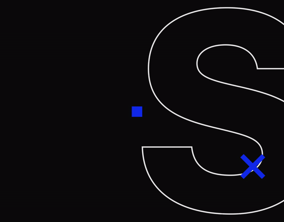
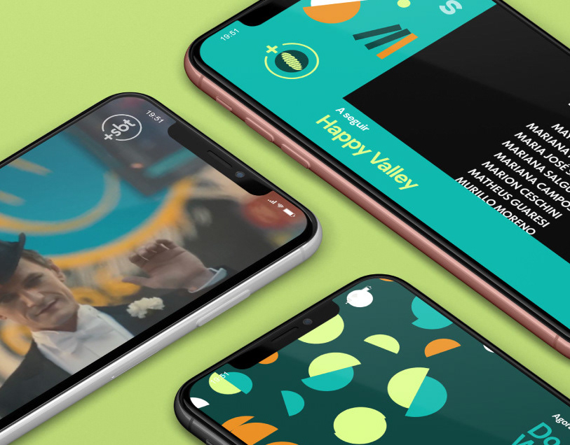
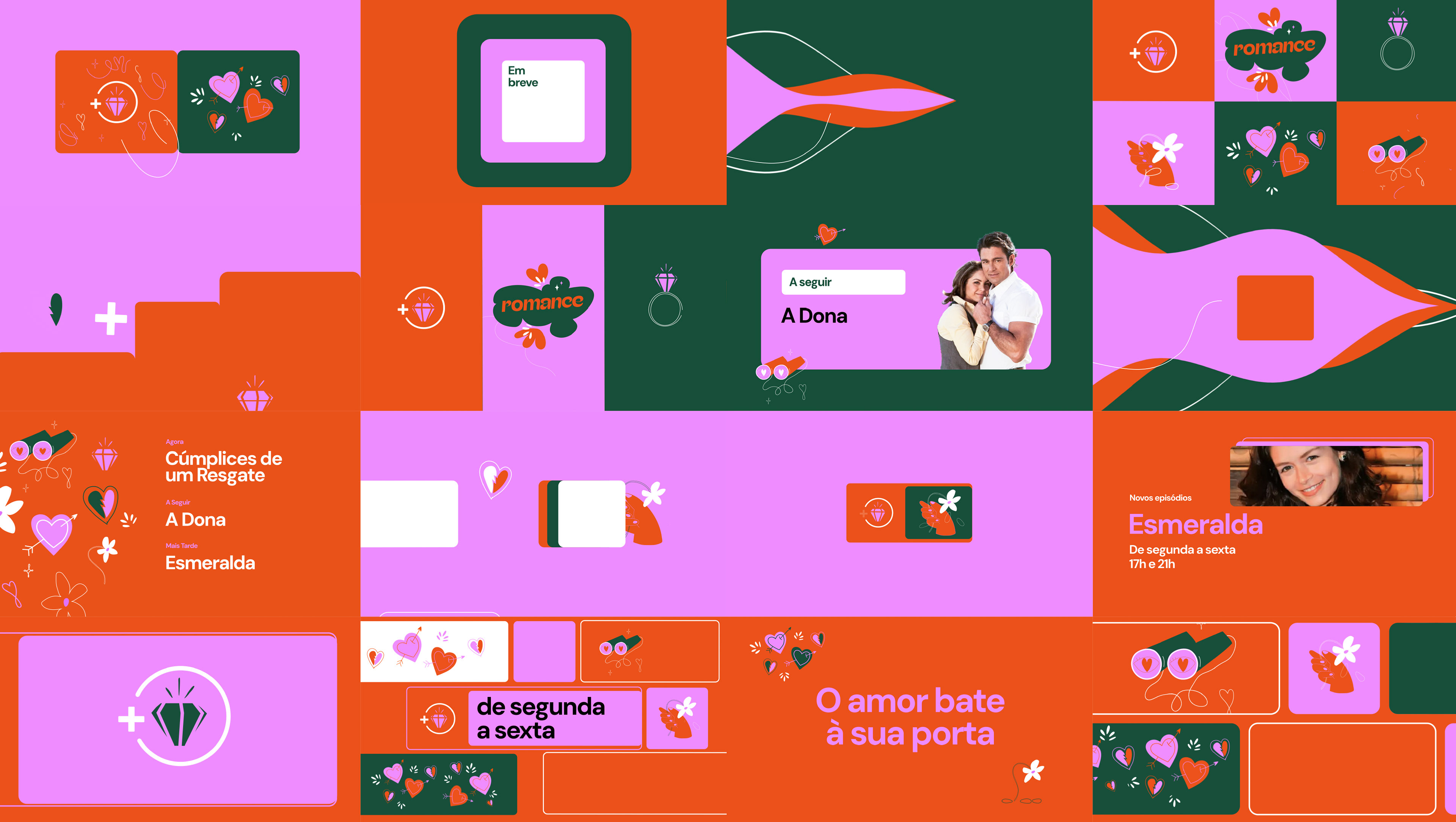
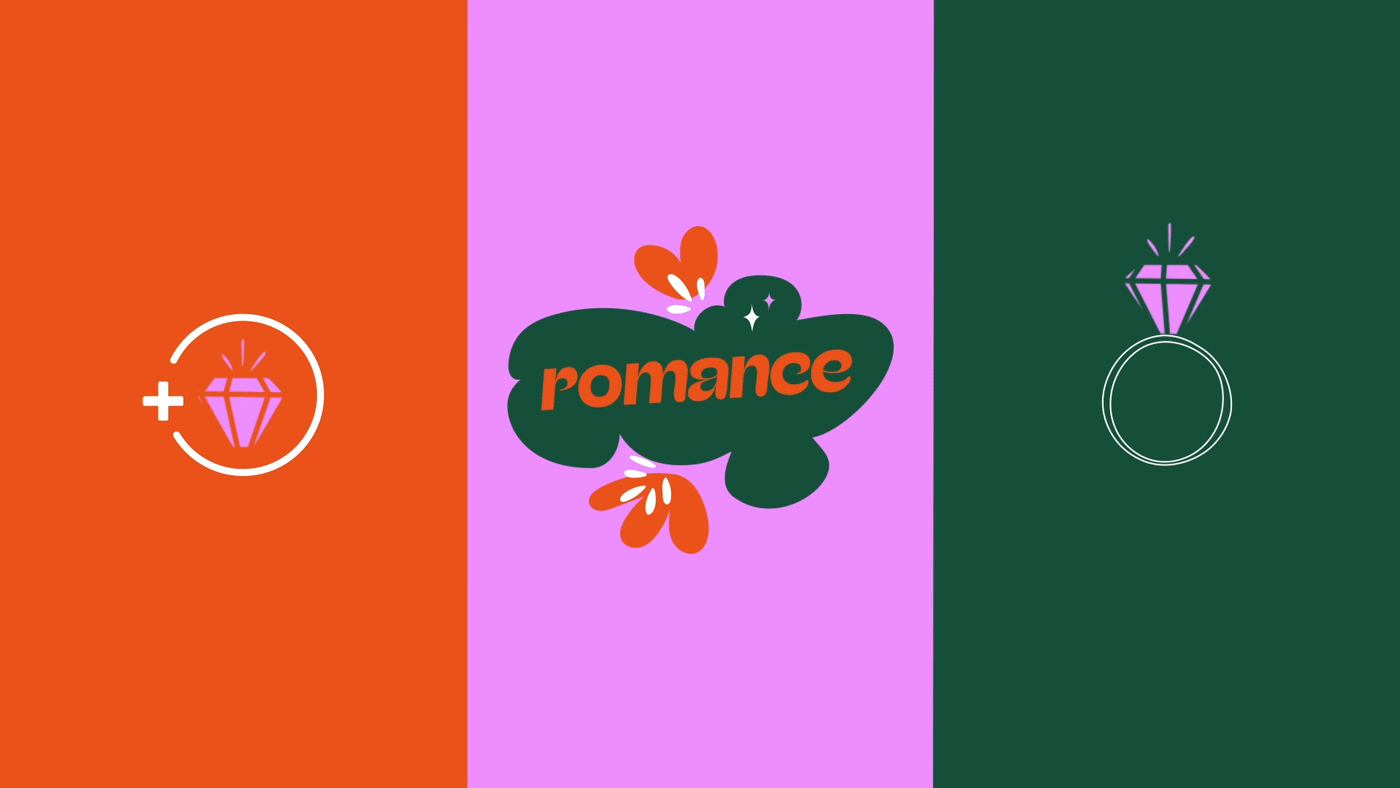
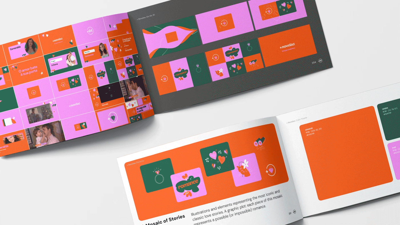
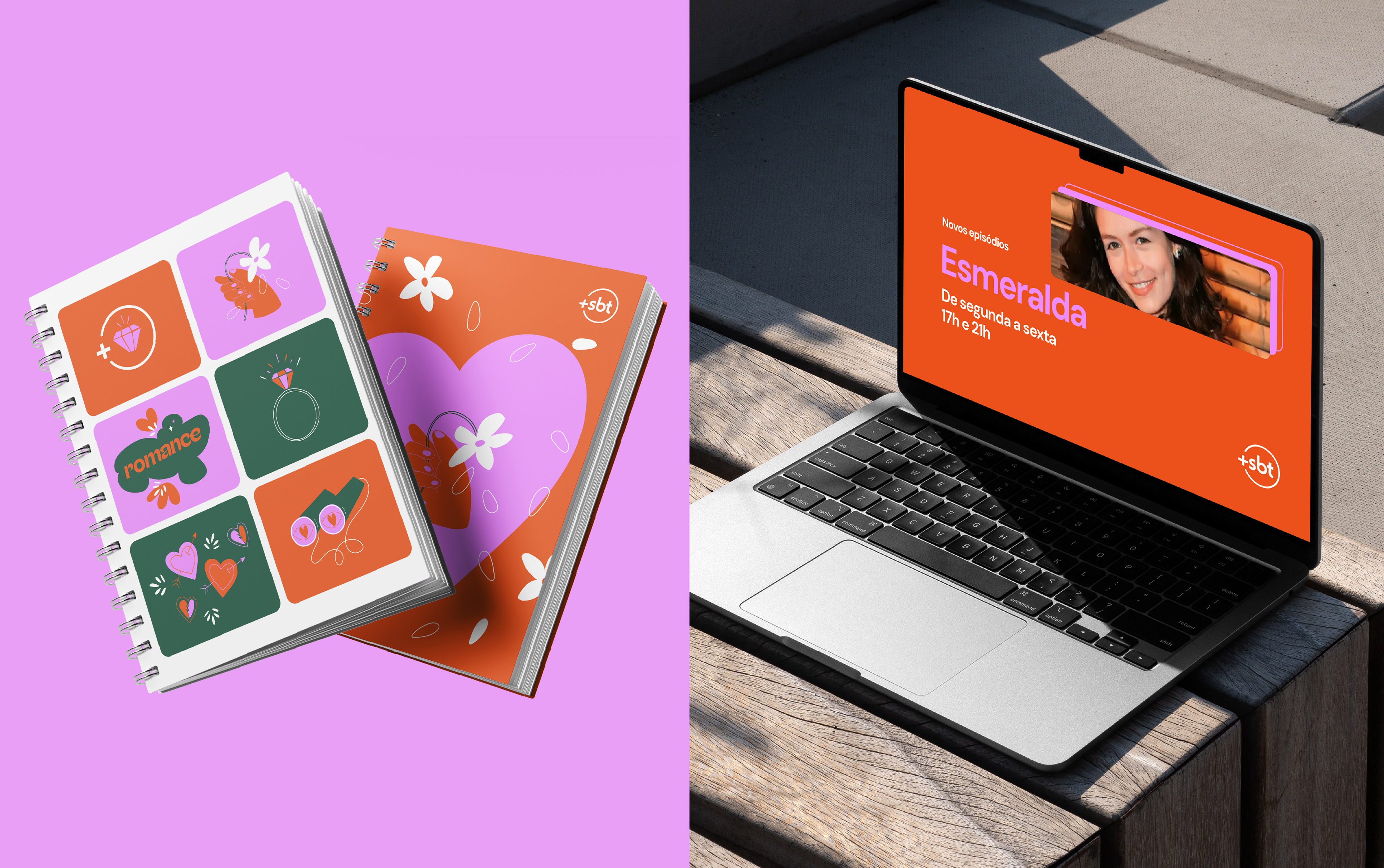
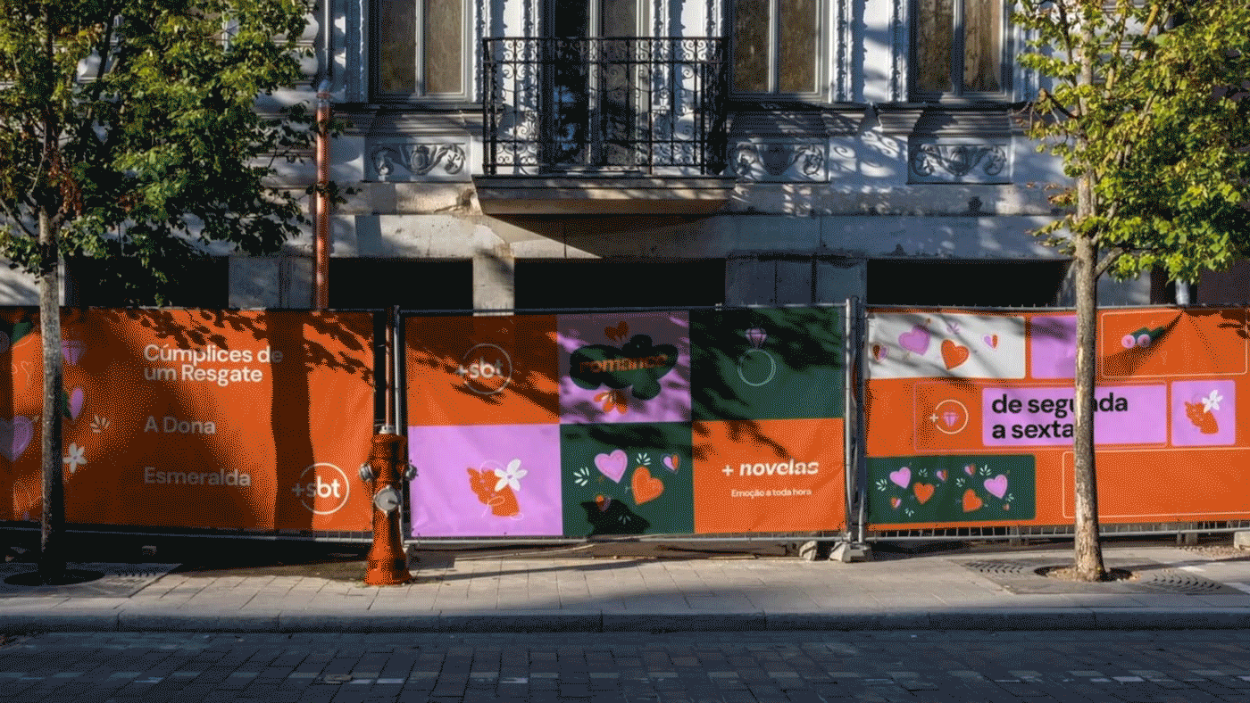
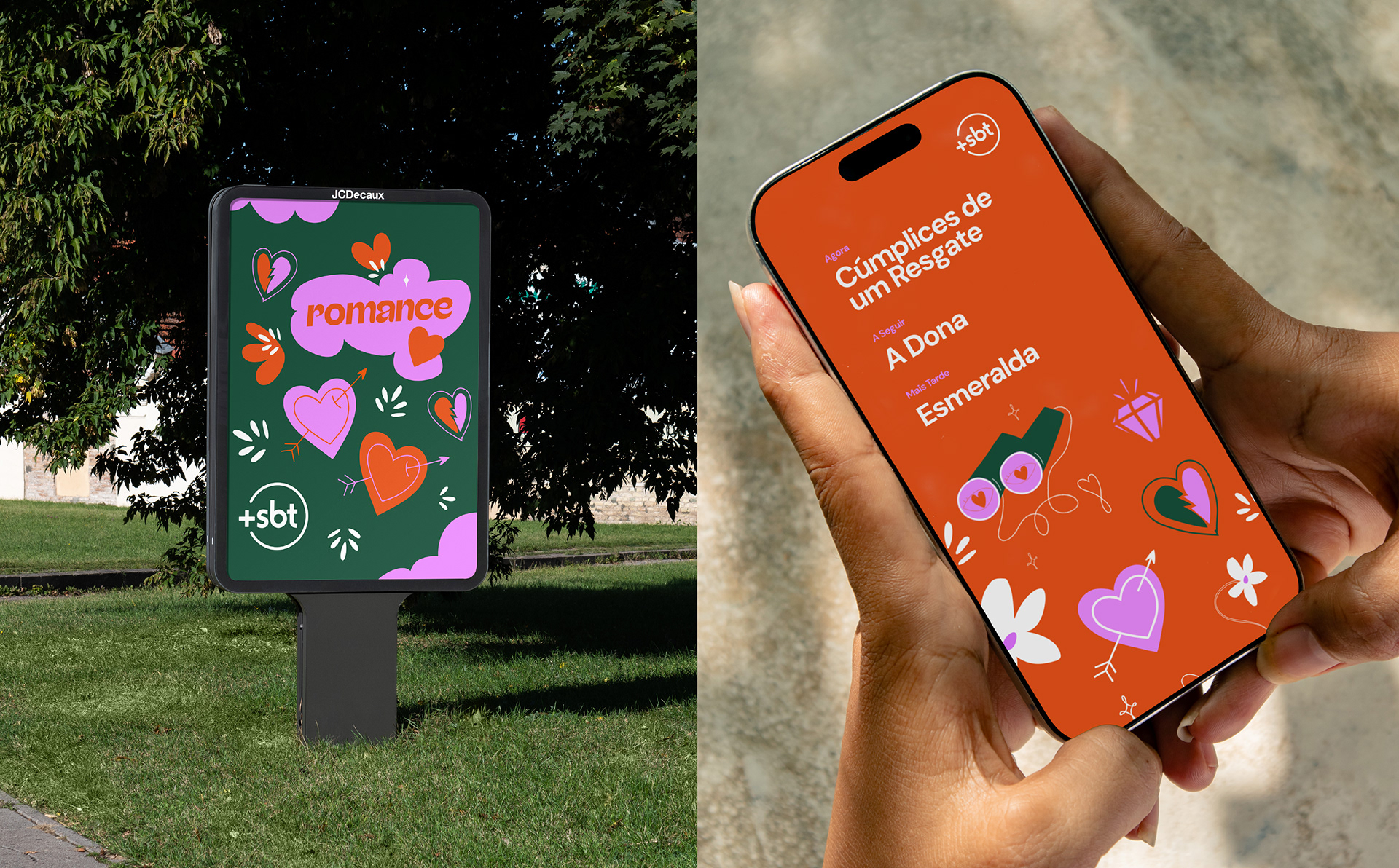
In 2024, SBT decided to innovate further by adding a free streaming platform to its TV offering: Mais SBT (+SBT). Our challenge was to develop a branding system for these 10 fast channels that was structurally harmonious to give a unique overall sense to the ten channels as a whole, but with a look & feel that reflected the identity of each channel. For +SBT Novelas, the challenge was to create a visual identity that could embrace the vast emotional spectrum of the 'telenovela', from timeless love stories to impossible romances, while celebrating this iconic Brazilian storytelling tradition.
T H E F L O P I C C O A P P R O A C H
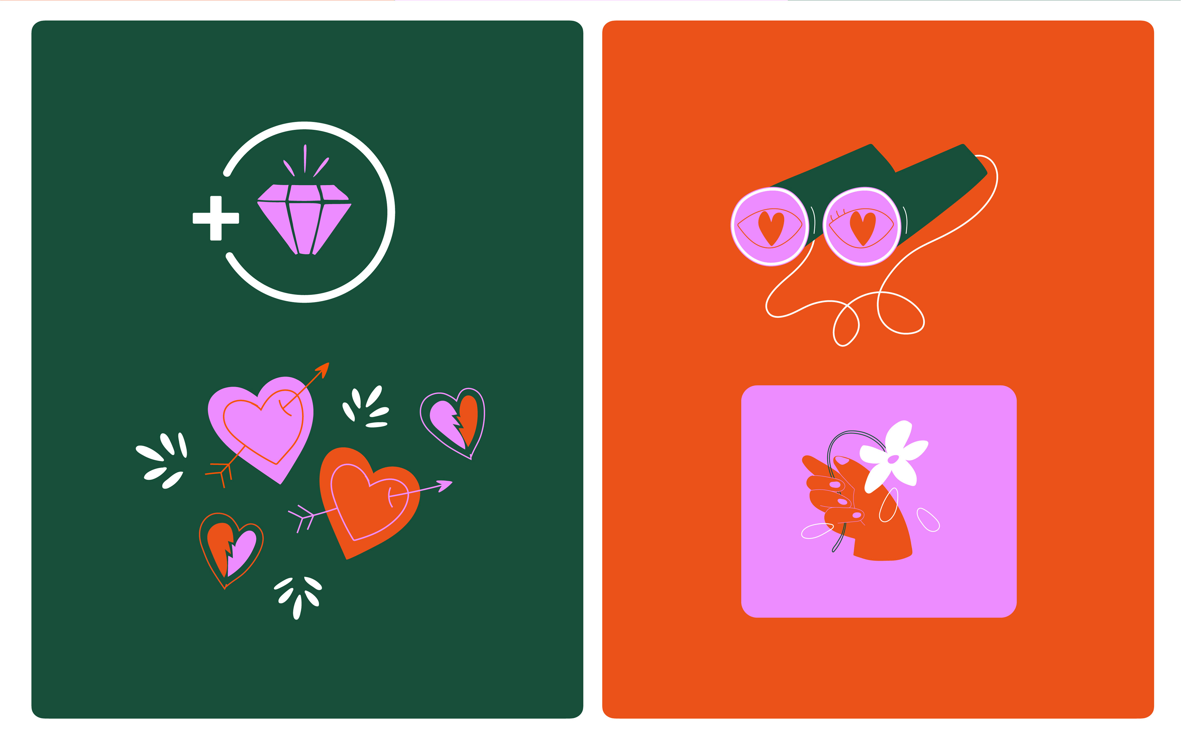
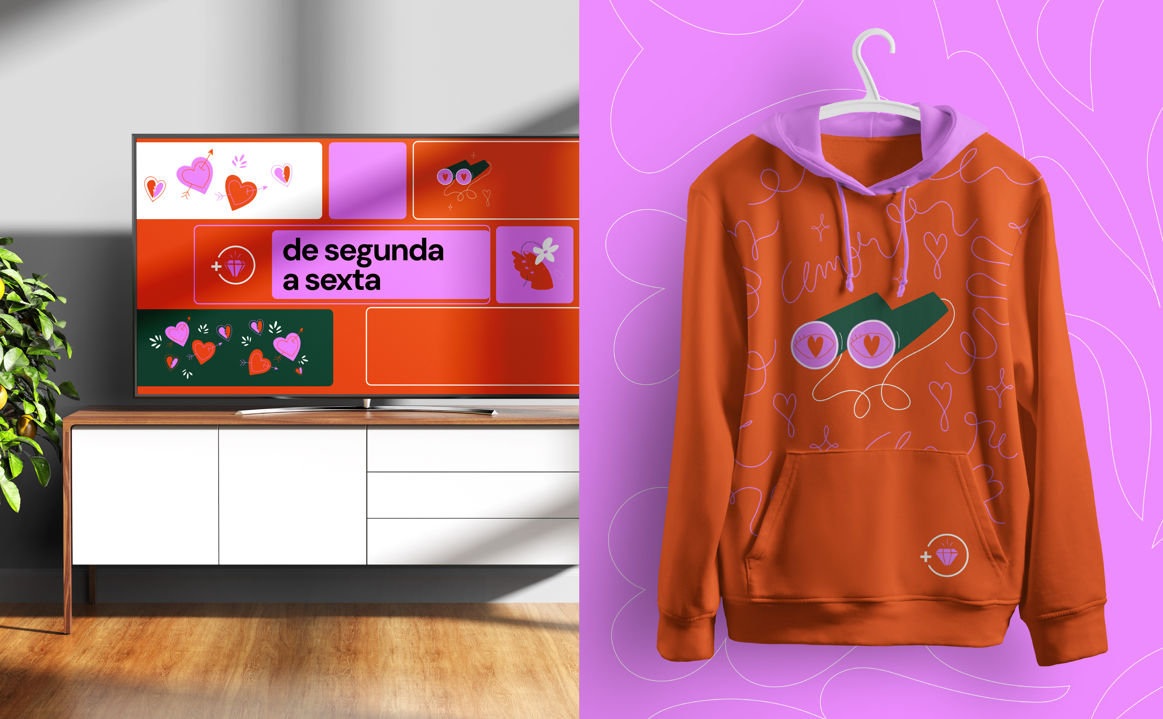
Inspired by the visual language of classic romance stories, we designed a playful set of icons that symbolize fragments of these stories, emotions, and convoluted plots. We worked with a palette of bold, contrasting colors: pink, blood orange, and dark green. These colors speak of passion and opposites attracting. The result is a brand system that celebrates the enduring love stories that keep audiences tuning in night after night.


E L C L I E N T E
SBT, Sistema Brasileiro de Televisão (en portugués: Sistema Brasileño de Televisión) es una cadena de televisión brasileña fundada en 1981. Actualmente consta de diez canales temáticos y es una de las tres cadenas más vistas de Brasil.
SBT, Sistema Brasileiro de Televisão (en portugués: Sistema Brasileño de Televisión) es una cadena de televisión brasileña fundada en 1981. Actualmente consta de diez canales temáticos y es una de las tres cadenas más vistas de Brasil.
E L R E T O
En 2024, SBT decidió innovar aún más añadiendo una plataforma de streaming gratuita a su oferta televisiva: Mais SBT (+SBT). Nuestro reto era desarrollar un sistema de marca para estos 10 canales rápidos que fuera estructuralmente armonioso para dar un sentido global único a los diez canales en su conjunto, pero con un look & feel que reflejara la identidad de cada canal. Para +SBT Novelas, el reto consistía en crear una identidad visual que abarcara el amplio espectro emocional de la telenovela, desde historias de amor atemporales a romances imposibles, al tiempo que se celebraba esta emblemática tradición narrativa de Brasil.
En 2024, SBT decidió innovar aún más añadiendo una plataforma de streaming gratuita a su oferta televisiva: Mais SBT (+SBT). Nuestro reto era desarrollar un sistema de marca para estos 10 canales rápidos que fuera estructuralmente armonioso para dar un sentido global único a los diez canales en su conjunto, pero con un look & feel que reflejara la identidad de cada canal. Para +SBT Novelas, el reto consistía en crear una identidad visual que abarcara el amplio espectro emocional de la telenovela, desde historias de amor atemporales a romances imposibles, al tiempo que se celebraba esta emblemática tradición narrativa de Brasil.
E L E N F O Q U E D E F L O P I C C O S T U D I O
Inspirándonos en el lenguaje visual de las historias románticas clásicas, diseñamos un divertido conjunto de iconos que simbolizan fragmentos de estas historias, emociones y tramas enrevesadas. Trabajamos con una paleta de colores llamativos y contrastantes: rosa, naranja brillante y verde bosque. Estos colores transmiten pasión y la novelesca noción de que los opuestos se atraen. El resultado es un sistema de marca que celebra estas perdurables historias de amor que mantienen al público enganchado día tras día.
CLIENT
Sistema Brasileiro de Televisão (SBT)
CREATIVE DIRECTION, ART DIRECTION
AND GRAPHIC PRODUCTION
Flopicco Studio
Inhouse Team
Florencia Picco, Fernando Vallejos, María Cecilia Ognio, Natalia Bellagio, Alejandro Guatelli, Emiliano Agnetti, Martín Polech, Pablo Camino and Ana Laya.
With the collaboration of
Tercer Espacio
Audio Production, Editing and Equalization
Ignacio Tomé
🖤