U S A · F L O P I C C O S T U D I O + N A T I O N A L G E O G R A P H I C · 2 0 2 3
NATIONAL GEOGRAPHIC
STATIC DESIGN BEST PRACTICES
EDITORIAL DESIGN
The client
National Geographic is a Society founded with the purpose of furthering the knowledge and awareness of our world. They are the world’s leading multimedia destination for the best stories in science, exploration and adventure. Nowadays, National Geographic is owned by The Walt Disney Company.
The challenge
Nat Geo needed a practical, educational, and easy-to-use tool that summarized the basic design principles and graphic resources available for creating new off-air products that meet Nat Geo's brand criteria. Flopicco Studio was tasked with interpreting the brand principles and creating this guide.
The Flopicco Studio Approach
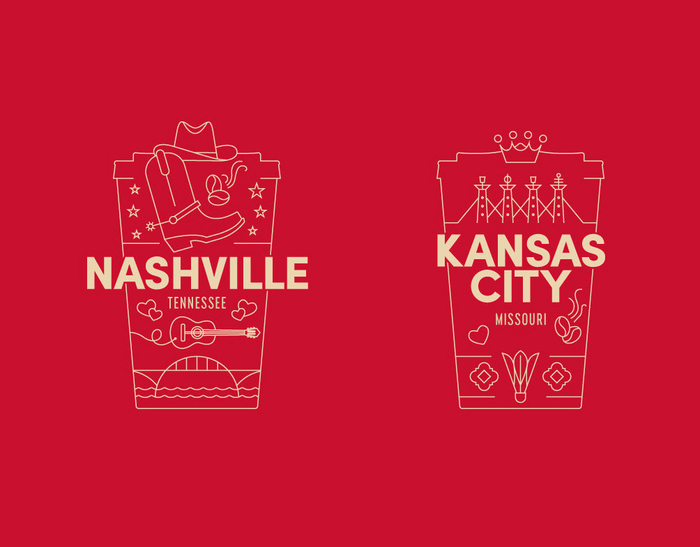
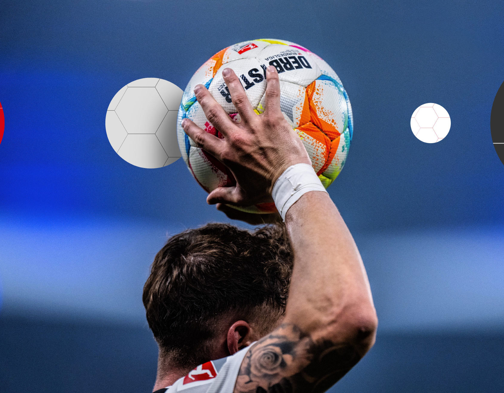
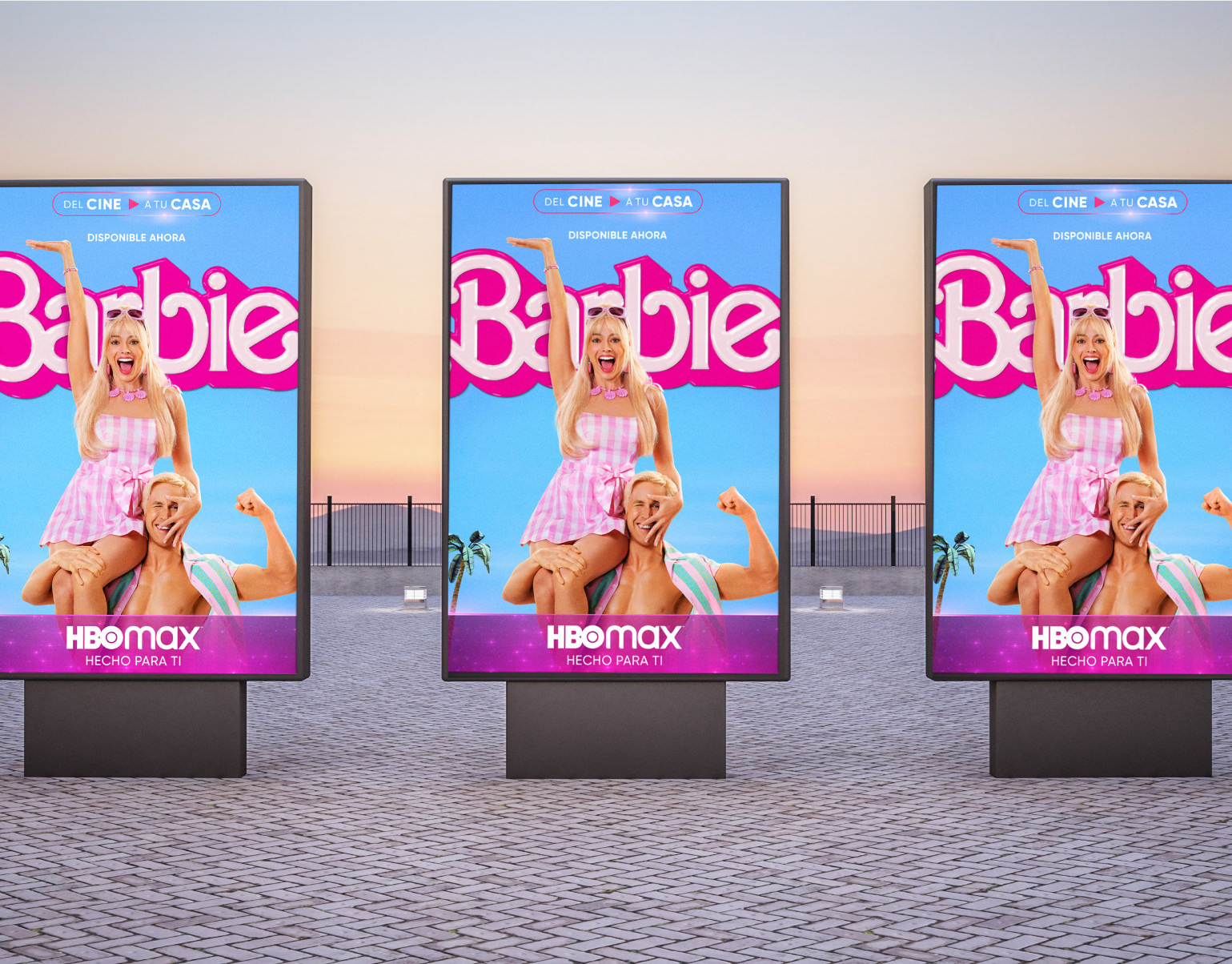
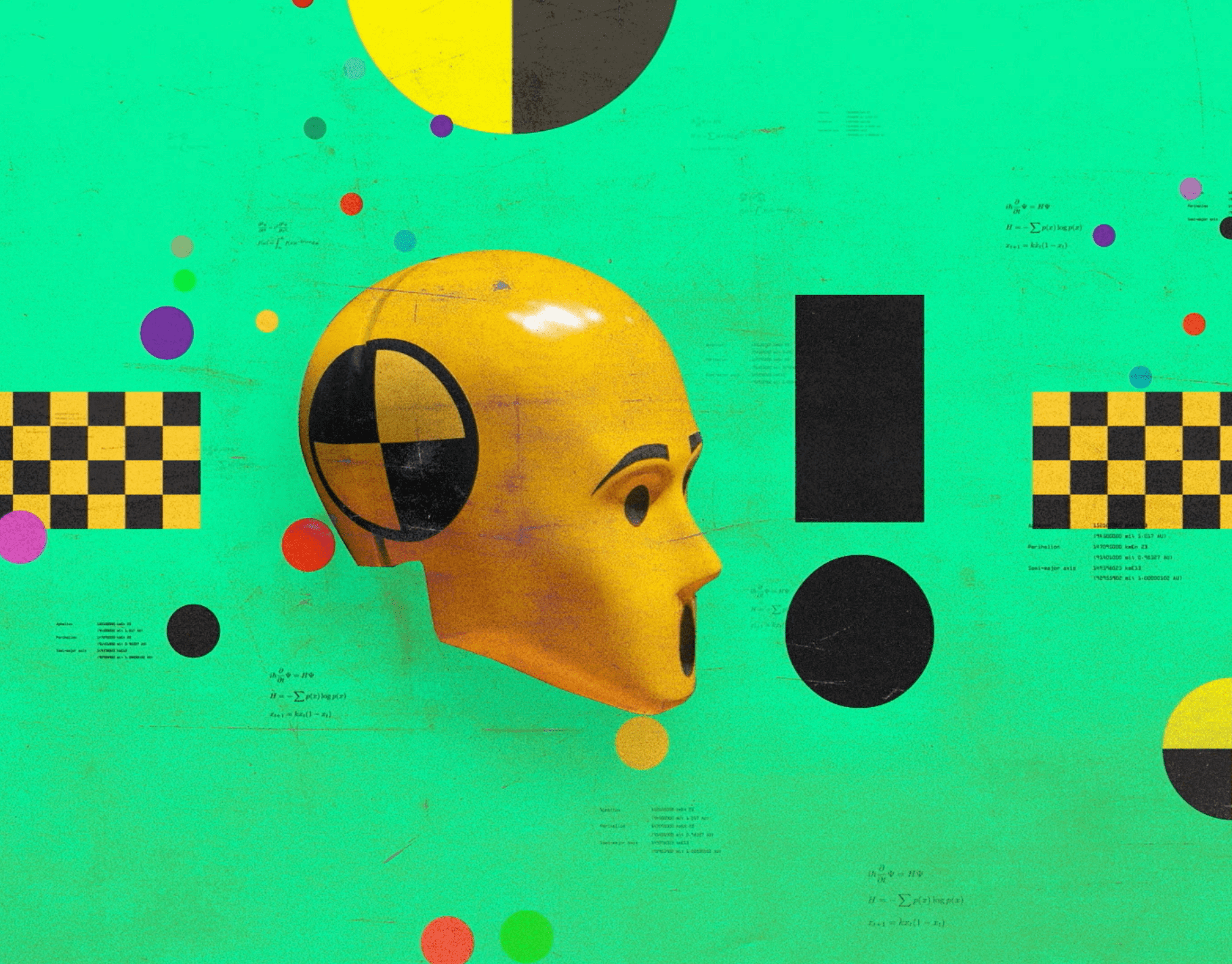
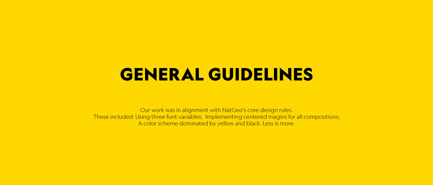
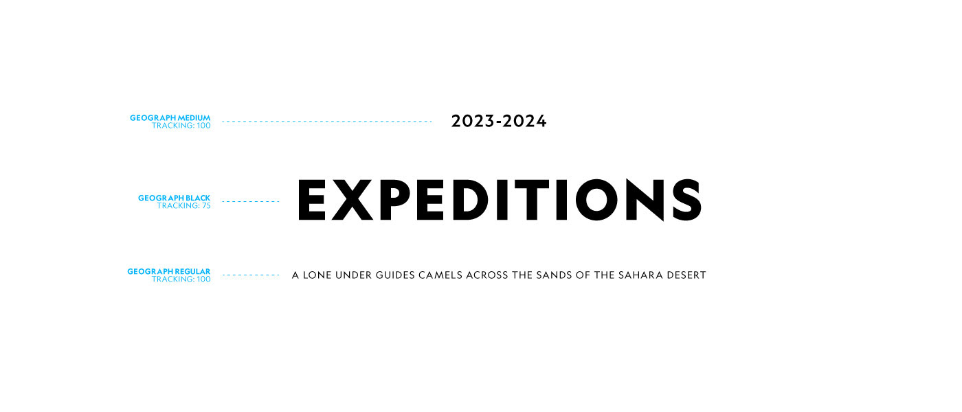
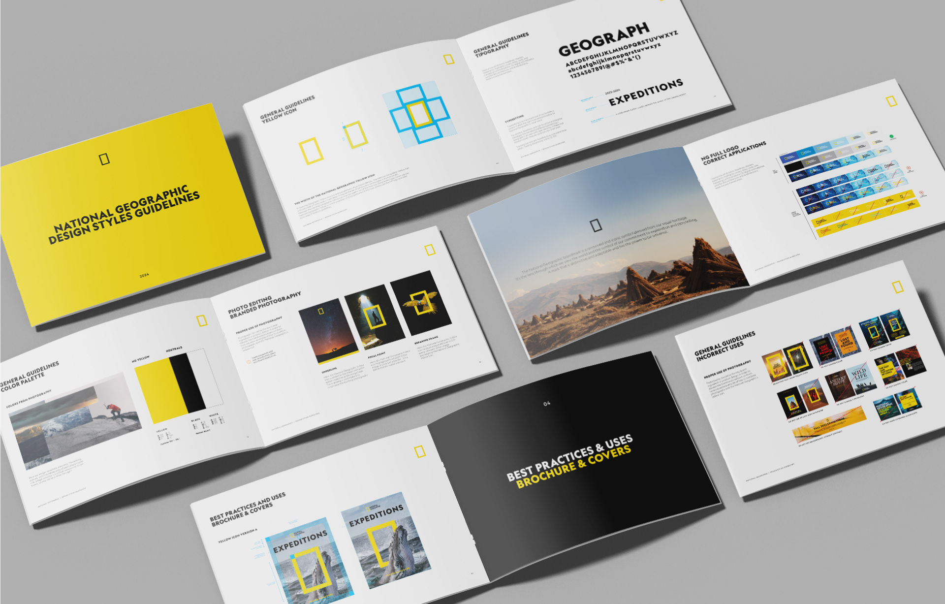
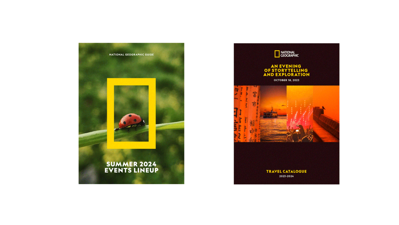
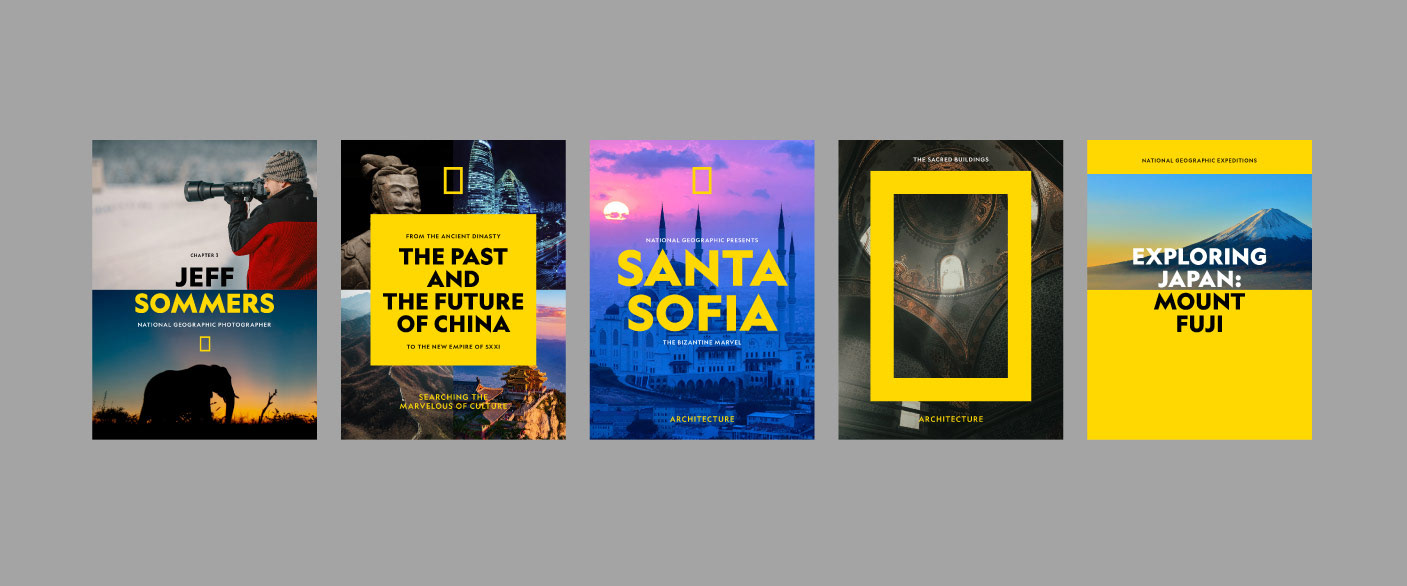
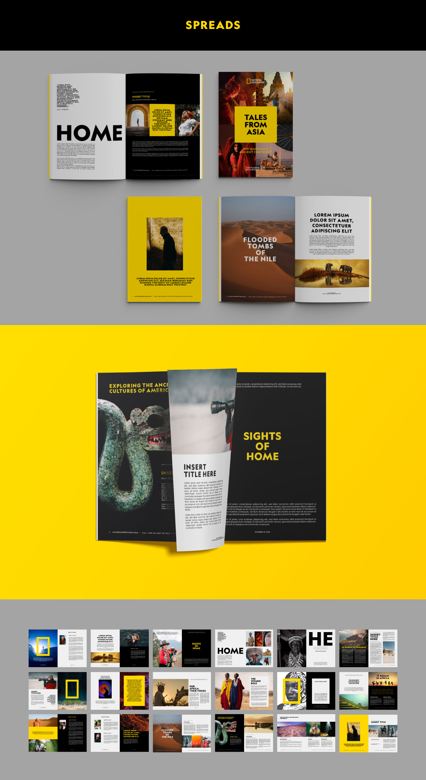
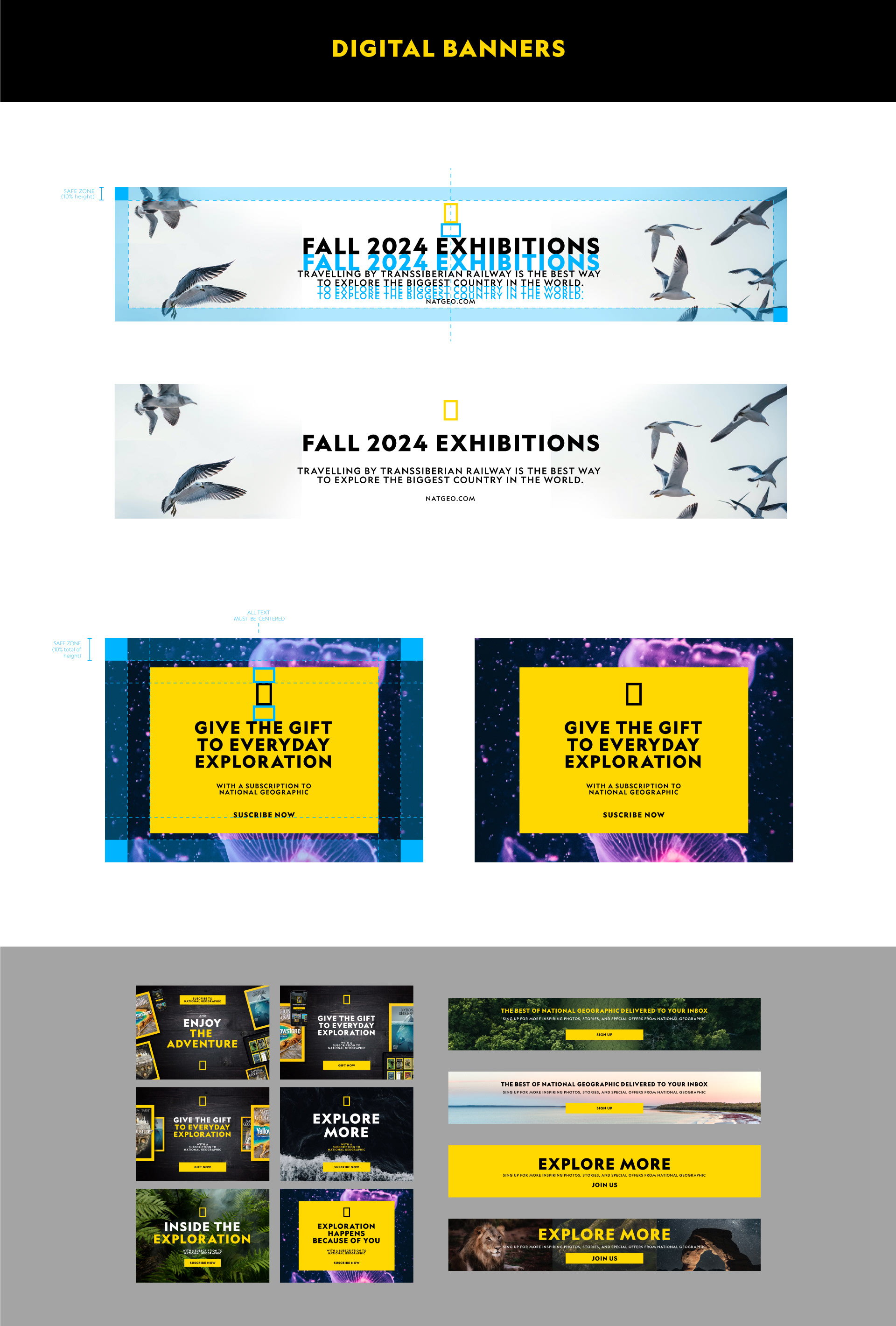
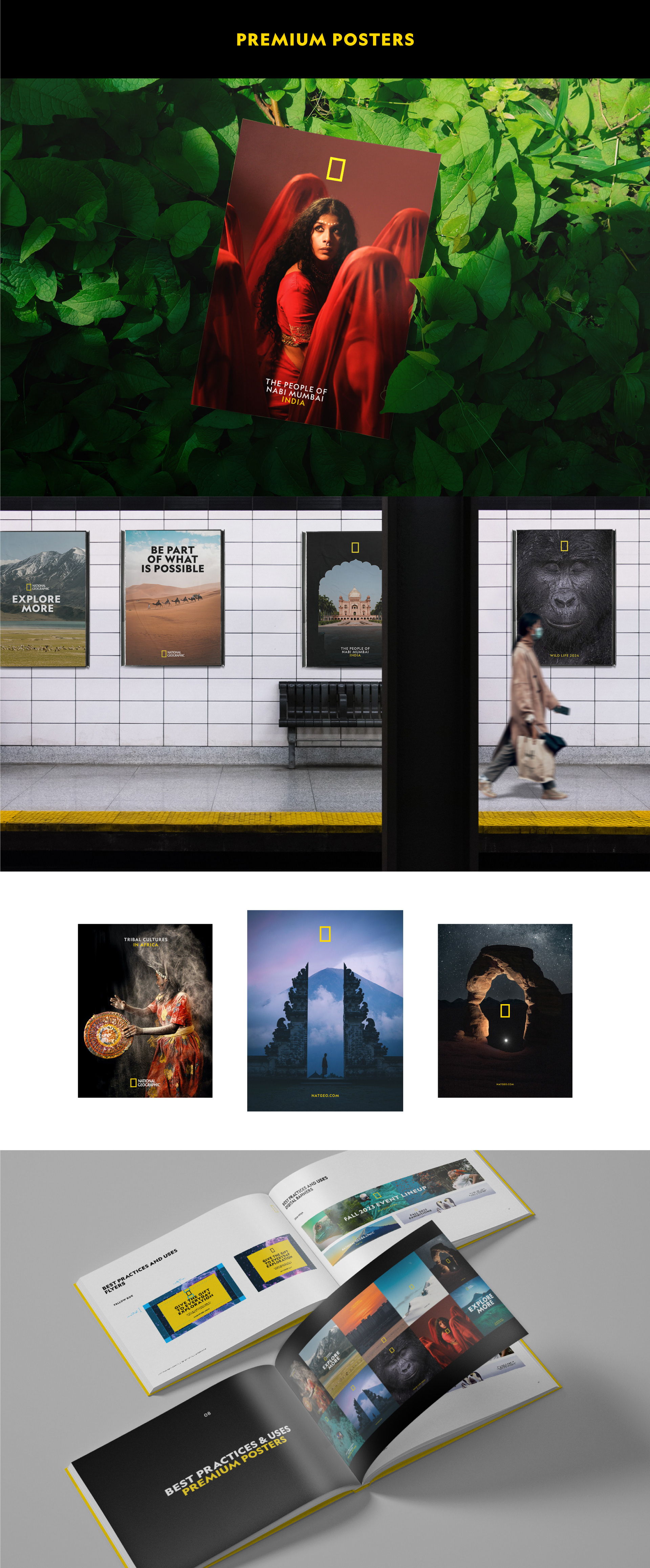
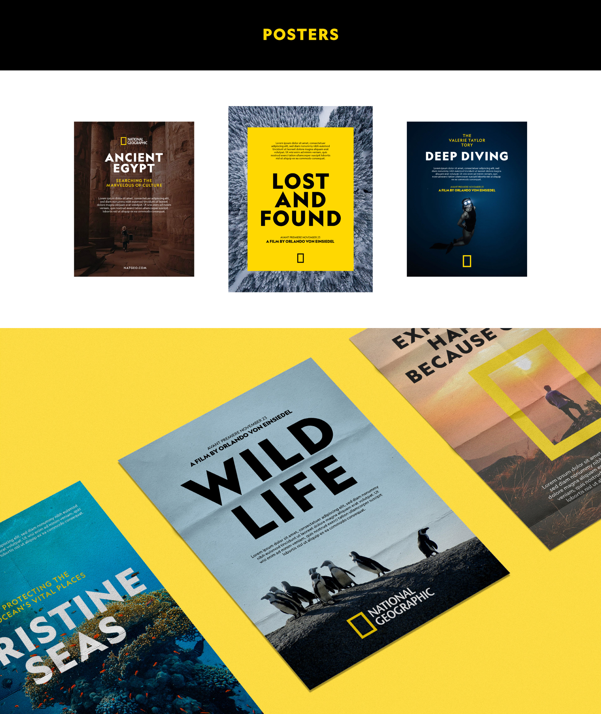
The guide we created for Nat Geo follows its principles by being concise but bold, precise but flexible. It summarizes the brand's design principles, from use of the yellow icon and typography to photographic treatment and layout structure. In addition, we have compiled best uses and examples of clean compositions. Here are a few excerpts from the guide.


El reto
El cliente
National Geographic es una Sociedad fundada con el propósito de promover el conocimiento y la conciencia de nuestro mundo. Son el destino multimedia líder en el mundo para las mejores historias de ciencia, exploración y aventura. Actualmente, National Geographic es propiedad de The Walt Disney Company.
El reto
Nat Geo necesitaba una herramienta práctica, educativa y fácil de usar que resumiera los principios básicos de diseño y los recursos gráficos disponibles para crear nuevos productos off-air que cumplieran los criterios de marca de Nat Geo. Se encargó a Flopicco Studio la interpretación de los principios de la marca y la creación de esta guía.
El enfoque de Flopicco Studio
La guía que creamos para Nat Geo sigue sus principios siendo concisa pero audaz, precisa pero flexible. Resume los principios de diseño de la marca, desde el uso del icono amarillo y la tipografía hasta el tratamiento fotográfico y la estructura de los layouts. Además, hemos recopilado los mejores usos y ejemplos de composiciones limpias. He aquí algunos extractos de la guía.
La guía que creamos para Nat Geo sigue sus principios siendo concisa pero audaz, precisa pero flexible. Resume los principios de diseño de la marca, desde el uso del icono amarillo y la tipografía hasta el tratamiento fotográfico y la estructura de los layouts. Además, hemos recopilado los mejores usos y ejemplos de composiciones limpias. He aquí algunos extractos de la guía.


CREDITS
CLIENT
National Geographic · The Walt Disney Company
CREATIVE DIRECTION, ART DIRECTION
AND GRAPHIC PRODUCTION
Flopicco Studio
Inhouse Team
Florencia Picco, Natalia Bellagio, Alejandro Guatelli, Emiliano Agnetti,
Fernando Vallejos, Pablo Camino, Martín Polech and Ana Laya.
🖤