I T A L Y  ·  F L O P I C C O  S T U D I O  +  W A R N E R  B R O S.  D I S C O V E R Y  ·  2 0 2 4


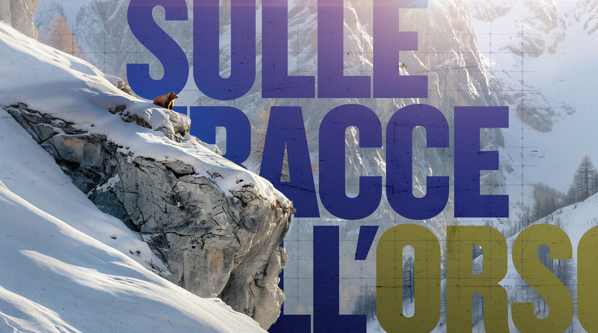
SULLE TRACE DELL'ORSO
MOTION TOOLKIT


The client
DMAX Italia is a thematic network television, owned by Warner Bros. It is the first factual entertainment channel dedicated to the Italian male audience. They promise their audience to experience a number of extremen adventures from their sofa.

The challenge
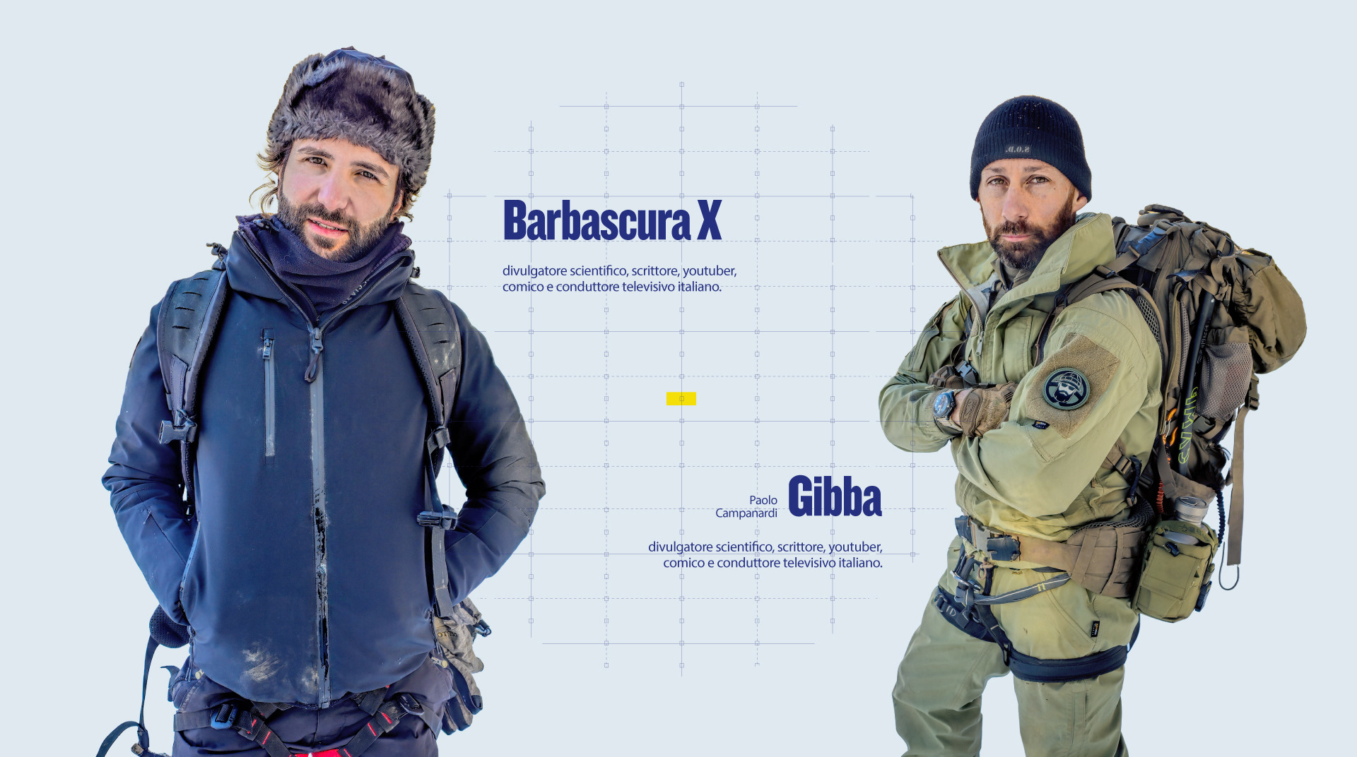
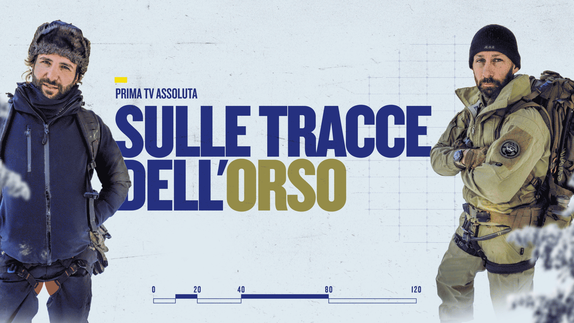
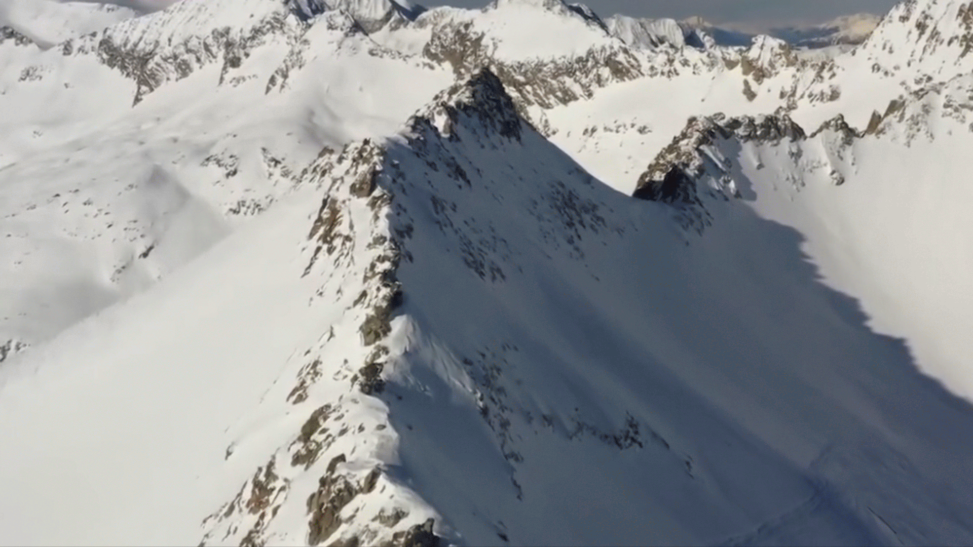
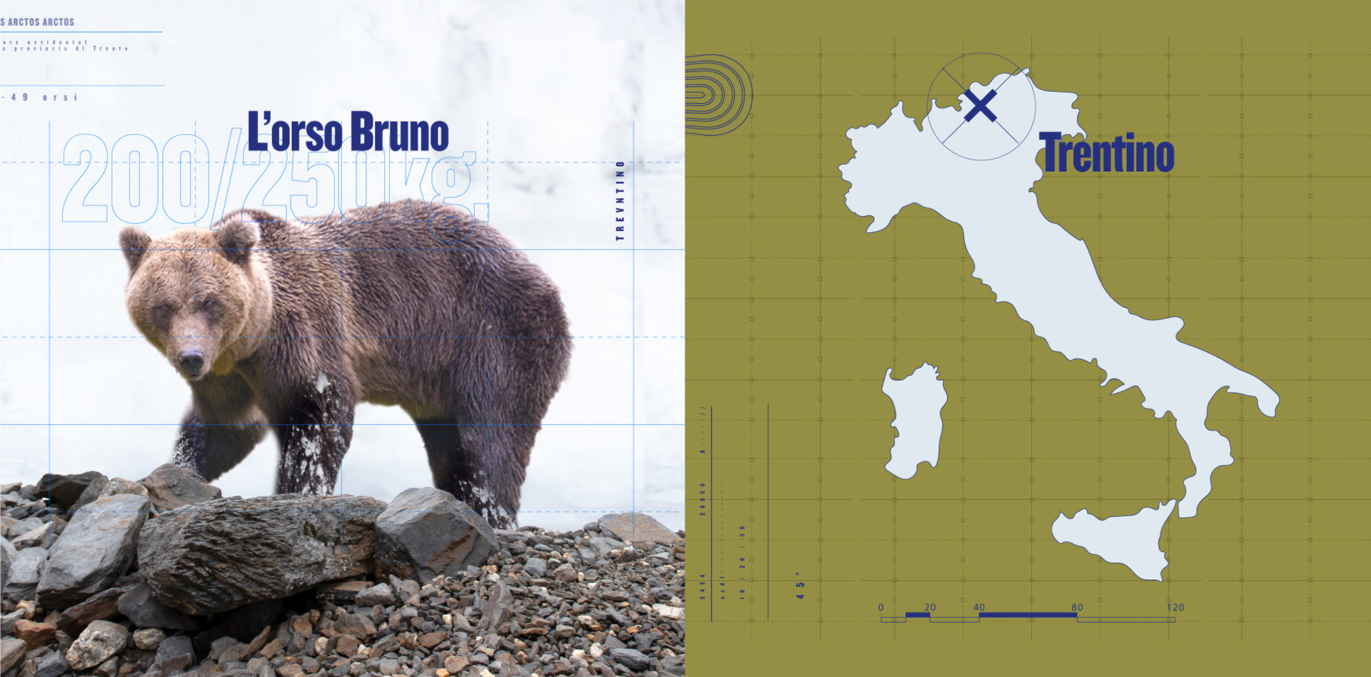
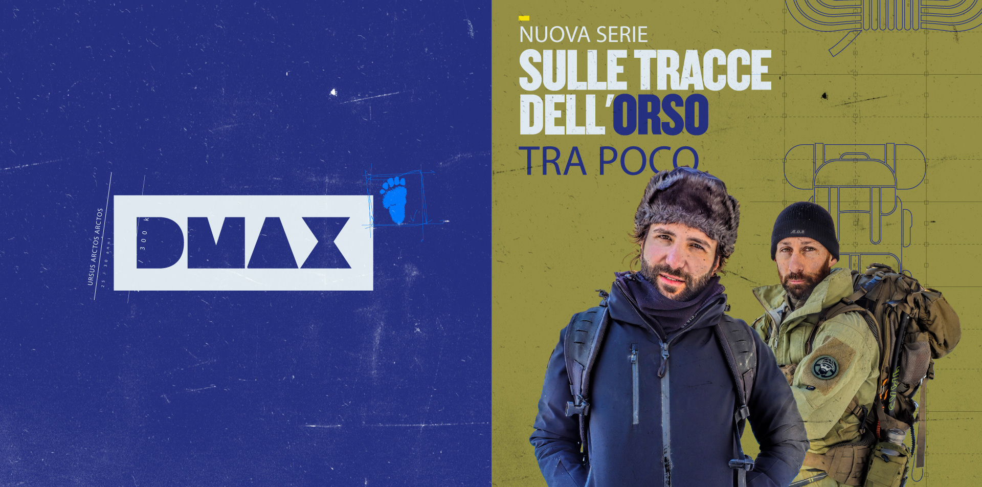
DMAX Italia's commissioned Flopicco Studio a visual identity and a basic motion toolkit for their new show Sulle Trace Dell'Orso (On the Trail of the Bear) the program is hosted by Barbascura X and Gibba who will explore the Trentino forest in the Alps north of Italy.

The Flopicco Studio Approach
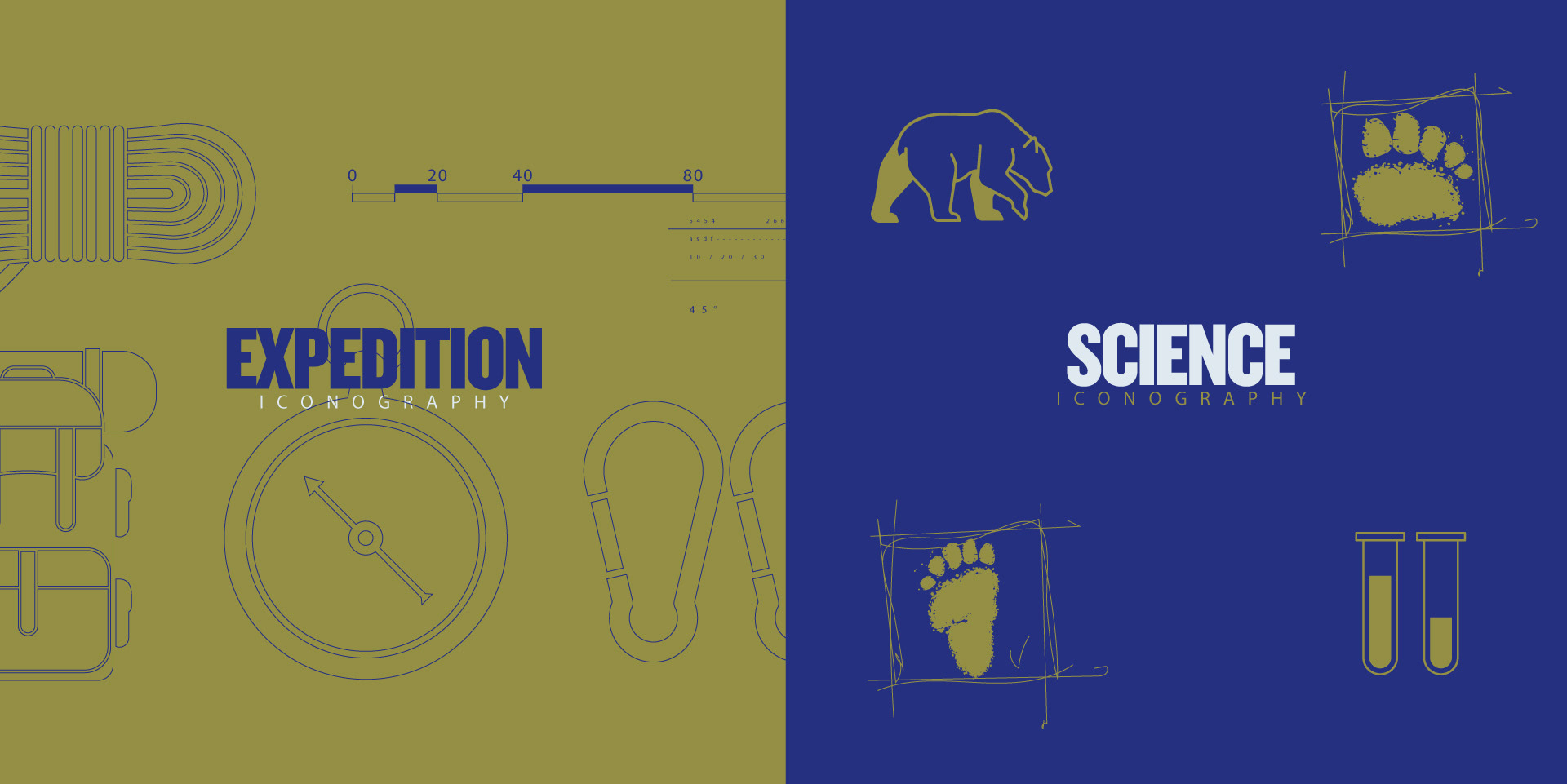
Anchored in the DMAX's basics elements (textures, colors, composition), we looked for a series of visual cues that reveal the character of the show without being too obvious. Among the elements incorporated is a gridded background that references the aesthetics of maps and grids, and a series of icons that infographically reinforce the art of nature exploration.
​​​​​​​​


El cliente
DMAX Italia es una red de televisión propiedad de Warner Bros. Es el primer canal de entretenimiento dedicado a la audiencia masculina italiana. Prometen a su audiencia vivir una serie de aventuras extremas desde su sofá.

El reto
DMAX Italia ha encargado a Flopicco Studio una identidad visual y un juego de herramientas de movimiento básico para su nuevo programa Sulle Trace Dell'Orso (Tras la pista del oso) el programa está presentado por Barbascura X y Gibba que explorarán el bosque de Trentino en los Alpes al norte de Italia.

El enfoque de Flopicco Studio
Anclados en los elementos básicos de la DMAX (texturas, colores, composición), buscamos una serie de pistas visuales que revelaran el carácter del programa sin ser demasiado obvias. Entre los elementos incorporados se encuentra un fondo cuadriculado que hace referencia a la estética de los mapas y las cuadrículas, y una serie de iconos que refuerzan infográficamente el arte de la exploración de la naturaleza.


CREDITS

CLIENT
Chiara Cerutti · DMAX 

CREATIVE DIRECTION, ART DIRECTION
AND GRAPHIC PRODUCTION
Flopicco Studio

Inhouse Team
Florencia Picco, Fernando Vallejos, Natalia Bellagio, Alejandro Guatelli, 
Emiliano Agnetti, Pablo Camino & Martín Polech.


🖤
#GoWithTheFlopicco​​​​​​​​​​​​​​

You may also like

FROM THE CINEMAS TO YOUR HOME BARBIE EDITION
Branding, Motion Graphics
DISNEY CHANNEL EMEA 2022
Art Direction, Branding, Motion Graphics
MEDIASET UPFRONT 2025
Italian media giant Mediaset presented its vision of the future to its employees, partners and stakeholders. We were tasked with giving it a visual, sensory identity in all possible formats.
Branding, Motion Graphics, Set Design
KARTOON CHANNEL BRAND IDENTITY
On Air and Off Air rebranding of Kartoon Channel, the preferred destination for families and kids looking for smart and meaningful fun.
Art Direction, Branding, Graphic Design
SEA THE FUTURE BRAND IDENTITY
Sea the Future is a purpose driven brand that aims to protect and restore our ocean (with a little help from its friends). It is situated at the intersection of ocean conservation related institutions, NGOs and crowdfunding, it is both an ecological and a…
Art Direction, Branding, Graphic Design
CINECANAL STAR WARS
Exciting brand domination exercise to celebrate the premiere of The Rise of Skywalker in Cinecanal.
Motion Graphics, Branding, Visual Effects
SULLE TRACE DEL CRIMINE
Branding, Graphic Design, Editorial Design
+SBT TVZYN STREAMING
TVZYN is SBT’s channel turning four in 2024—with over 3 billion views, 6 million YouTube subscribers, and a massive presence across TikTok and Instagram. Our challenge was to evolve the brand’s image while staying true to its eclectic spirit and wildly engaged audience.
Graphic Design, Branding
+SBT NOVELAS: BRAND SYSTEM
Inspired by the visual language of classic romance stories, we designed a playful set of icons that symbolize fragments of these stories, emotions, and convoluted plots. We worked with a palette of bold, contrasting colors: pink, blood orange, and dark green. These colors speak of passion and opposites attracting. The result is a brand system that celebrates the enduring love stories that keep audiences tuning in night after night.
Branding, Art Direction
TIM HORTONS REFRESHERS MERCH
Our goal was to capture the essence of summer in our visual system while creating useful products for the season. We used a sunny color palette inspired directly by the drinks themselves, with juicy reds, yellows, and greens. We created a graphic language to tie the whole set together that is fresh and evocative. These products are a vacation you can wear.
Graphic Design, Branding
Back to Top