U N I T E D S T A T E S · F L O P I C C O S T U D I O + T I M H O R T O N S · 2 0 2 5
TIM HORTONS REFRESHERS MERCH
LICENCING & MERCHANDISING
The Client
Tim Hortons is Canada's most iconic coffee and donut chains, beloved for its cozy, no-fuss vibe and strong community ties. As part of its U.S. expansion, the brand is investing in local activations to connect with new audiences in a warm and memorable way.
The Challenge
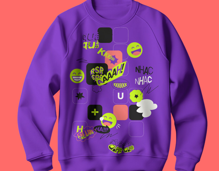
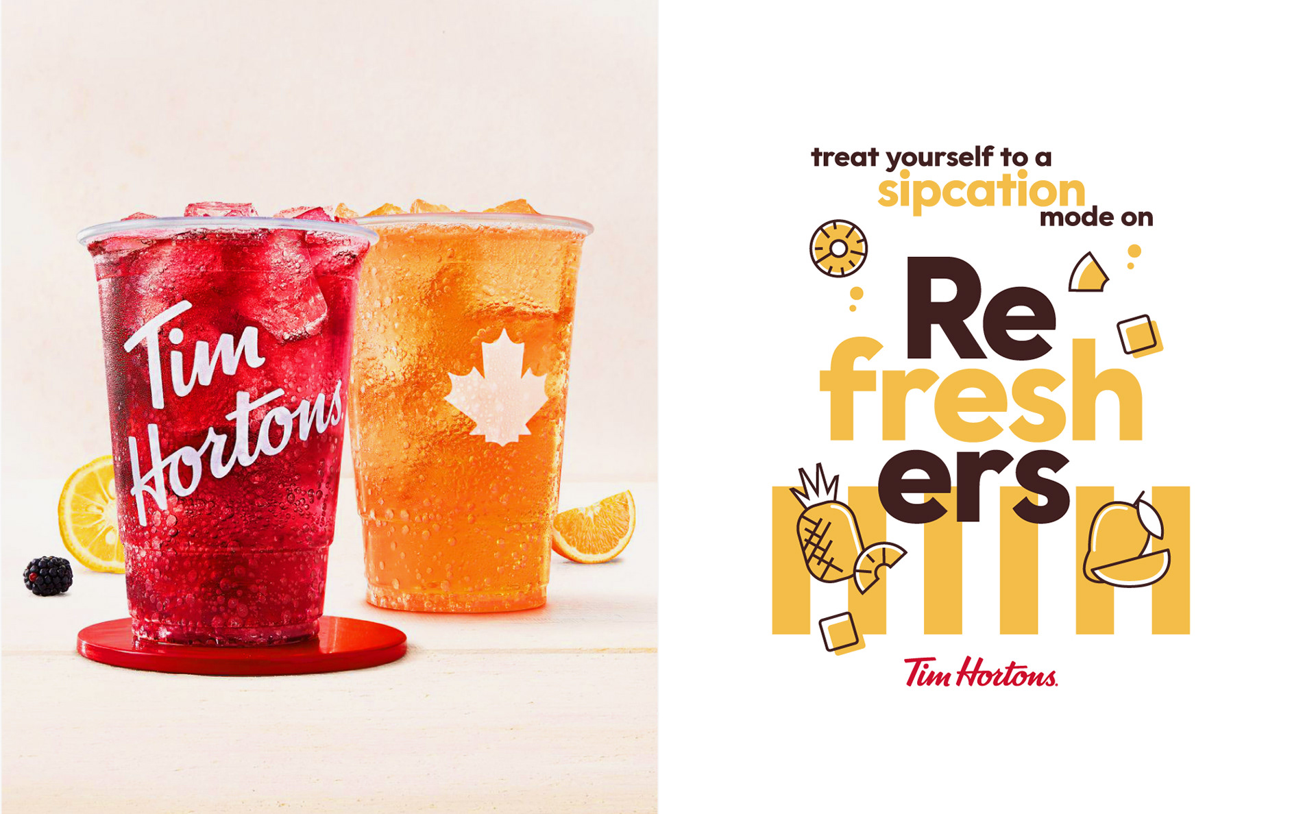
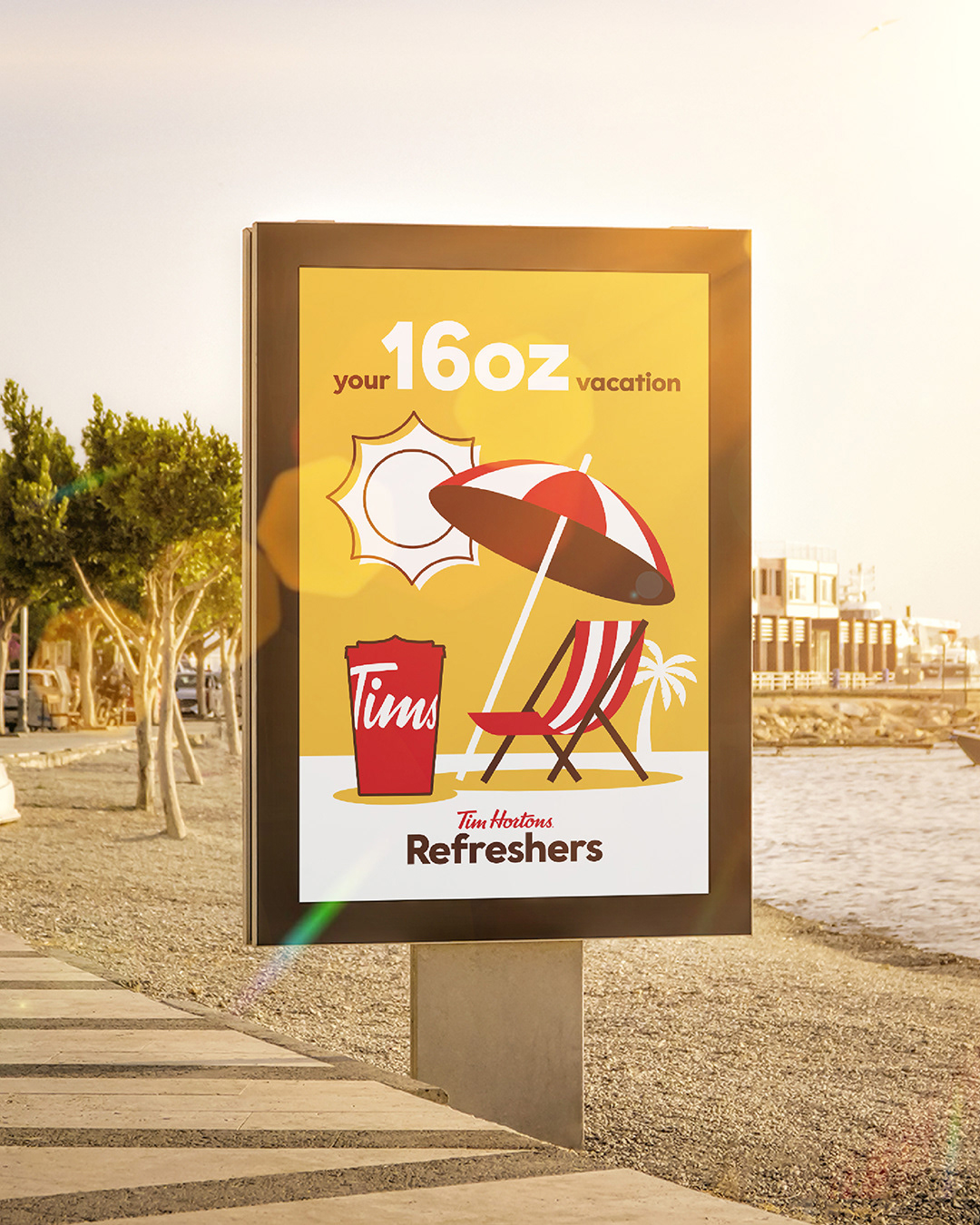
Tim Hortons launched its newest lineup of Refreshers, their iced, fruit-packed drinks "designed to take you beyond the ordinary", and needed some perks to promote the new flavors. Our challenge was to create a visual system that expressed the feeling of summer and the essence of each Refresher, radiating freshness with images of juicy fruits and colorful splashes.
The Flopicco Studio Approach
Our goal was to capture the summer vibres in our visual system while creating useful seasonal merchandise. We used a sunny color palette directly inspired by the drinks themselves, with punchy reds, yellows, and greens, and we created a composition with the illustrated fruits and the iconic Tim Hortons cup that is fresh and inviting. The result is a vibrant, instagrammable, and collectible merch set that feels like a wearable vacation.
Our goal was to capture the summer vibres in our visual system while creating useful seasonal merchandise. We used a sunny color palette directly inspired by the drinks themselves, with punchy reds, yellows, and greens, and we created a composition with the illustrated fruits and the iconic Tim Hortons cup that is fresh and inviting. The result is a vibrant, instagrammable, and collectible merch set that feels like a wearable vacation.


El cliente
Tim Hortons es una de las cadenas de cafeterías y donuts más emblemáticas de Canadá, muy apreciada por su ambiente acogedor y sin pretensiones y por sus fuertes lazos con la comunidad. Como parte de su expansión en Estados Unidos, la marca está invirtiendo en activaciones locales para conectar con nuevos públicos de una manera cálida y memorable.
Tim Hortons es una de las cadenas de cafeterías y donuts más emblemáticas de Canadá, muy apreciada por su ambiente acogedor y sin pretensiones y por sus fuertes lazos con la comunidad. Como parte de su expansión en Estados Unidos, la marca está invirtiendo en activaciones locales para conectar con nuevos públicos de una manera cálida y memorable.
El reto
Tim Hortons lanzó su nueva línea de Refreshers, bebidas heladas frutales «diseñadas para llevarte más allá de lo habitual», y necesitaba una serie de productos para promocionar los nuevos sabores. Nuestro reto era crear un sistema visual que evocara la inconfundible sensación del verano, que irradiara frescura y que expresara la esencia de cada Refresher.
El enfoque de Flopicco Studio
Nuestra meta además de capturar la esencia del verano en nuestro sistema visual era crear productos útiles para la temporada. Utilizamos una paleta de colores soleados inspirada directamente en las propias bebidas, con ramarillos, verdes y rojos jugosos, y creamos una composición con las frutas ilustradas y el icónico vaso Tim Hortons fresca y evocadora. Estos productos son más que perks coleccionables, son unas vacaciones, que se pueden llevar puestas.


CREDITS
CLIENT
Tim Hortons
CREATIVE DIRECTION, ART DIRECTION
AND GRAPHIC PRODUCTION
Flopicco Studio
Inhouse Team
Florencia Picco, Fernando Vallejos, Natalia Bellagio, Alejandro Guatelli,
Pablo Camino, Martín Polech y Emiliano Agnetti.
🥝
#GoWithTheFlopicco