U N I T E D S T A T E S · F L O P I C C O S T U D I O + B U R G E R K I N G · 2 0 2 4
BURGER KING MELTS
LICENCING & MERCHANDISING
The Client
Burger King is an American-based multinational chain of hamburger fast food restaurant Royal Perks is Burger King's loyalty program, it aims to reward BK's customers with perks ranging from in-store rewards to early access to offers and cool merch.
The Challenge
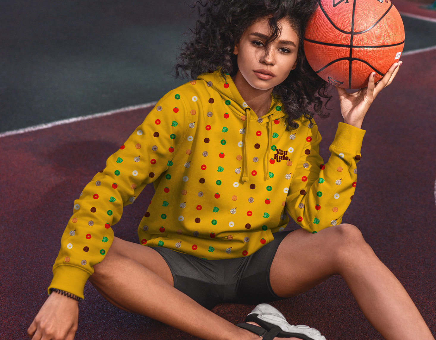
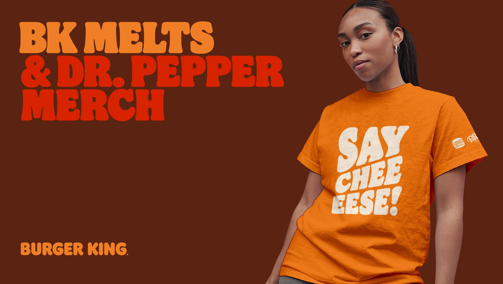
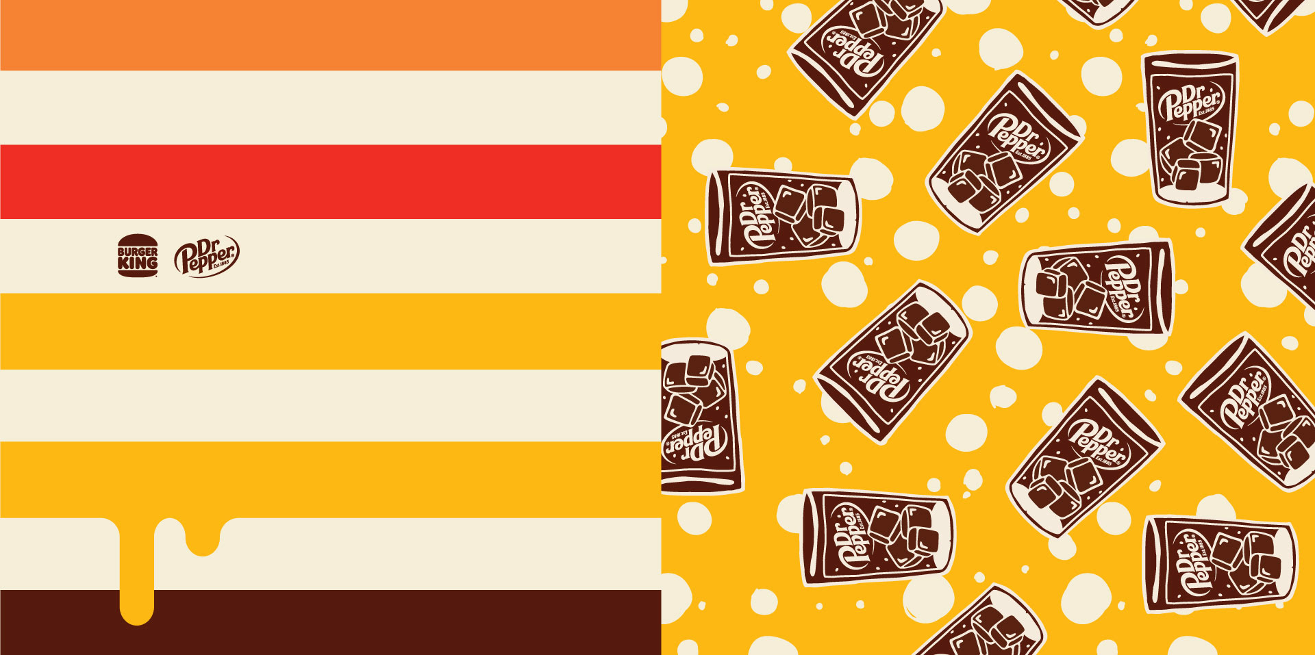
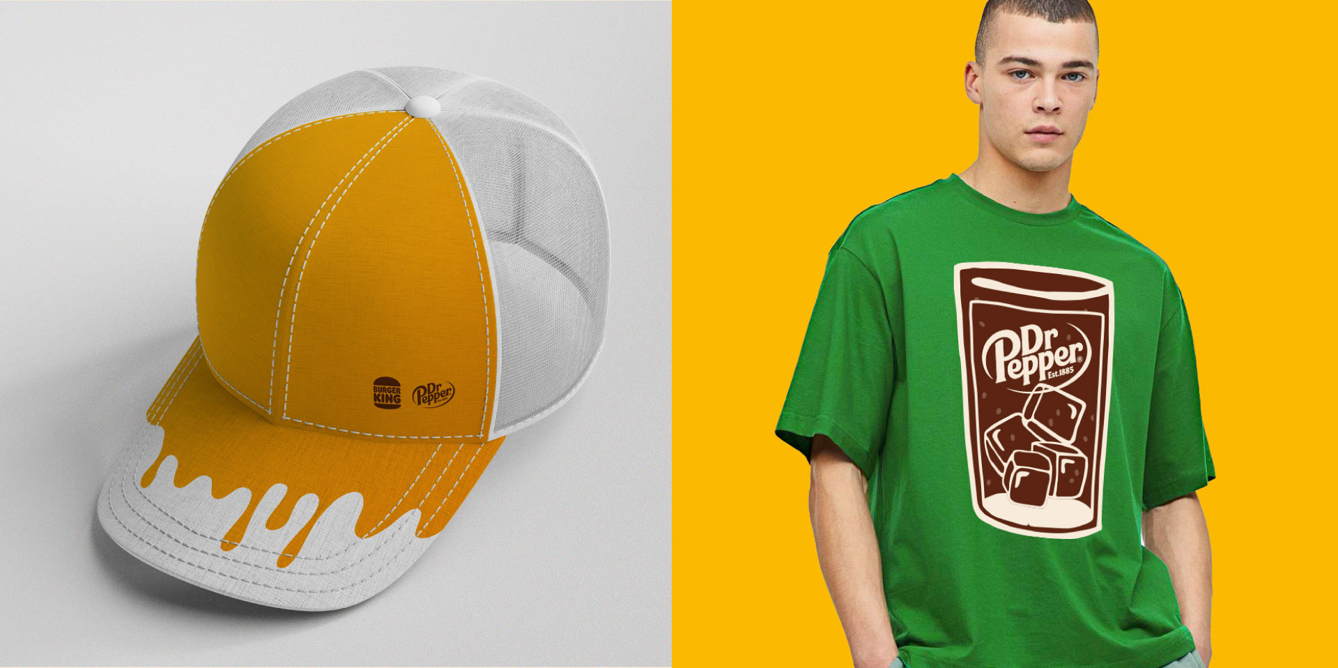
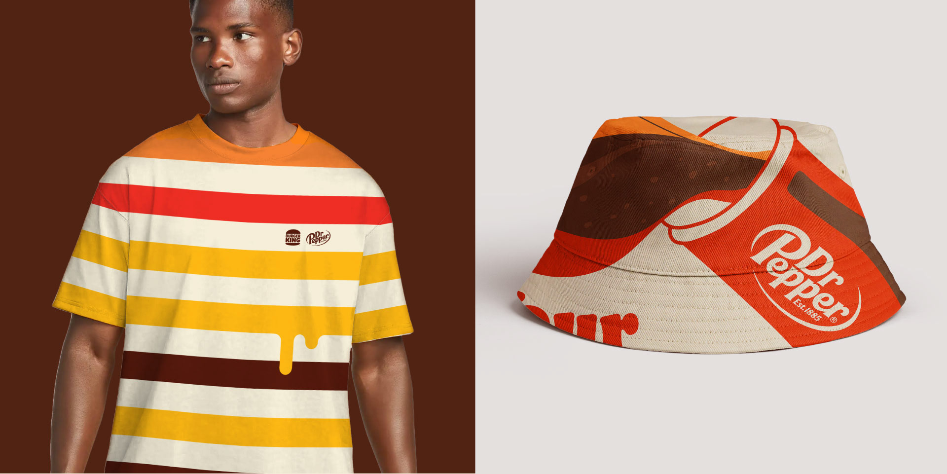
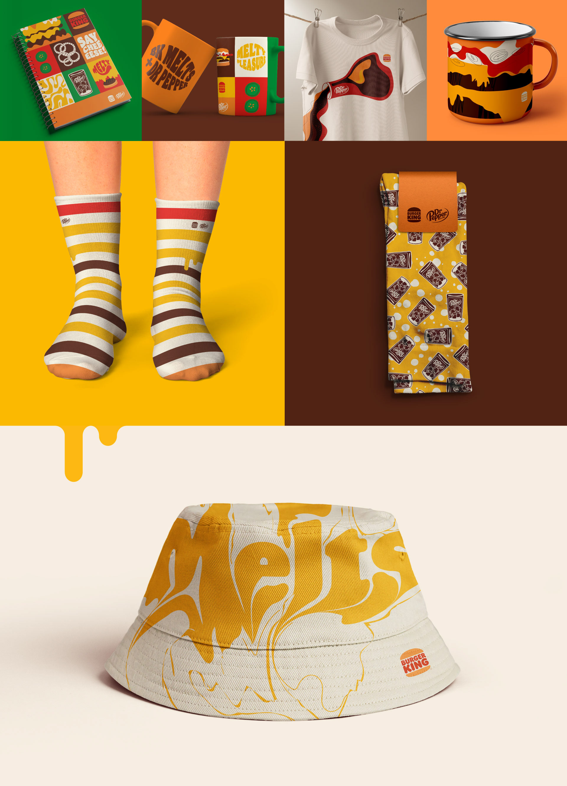
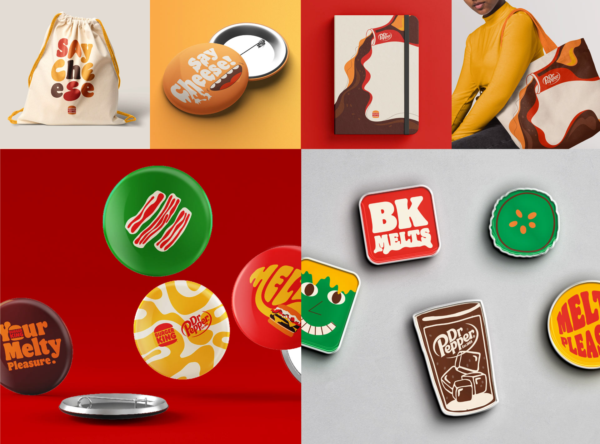
Burger King Melts are iconic sandwiches that feature two slices of toasted bread topped with two flame-grilled Whopper Jr. Patties, American cheese, caramelized onions and Royal Sauce, and they have die-hard fans. As part of the Royal Perks program, Burger King wanted to reward those fans with the merchandise they deserve. That's why they approached Flopicco Studio.
The Flopicco Studio Approach
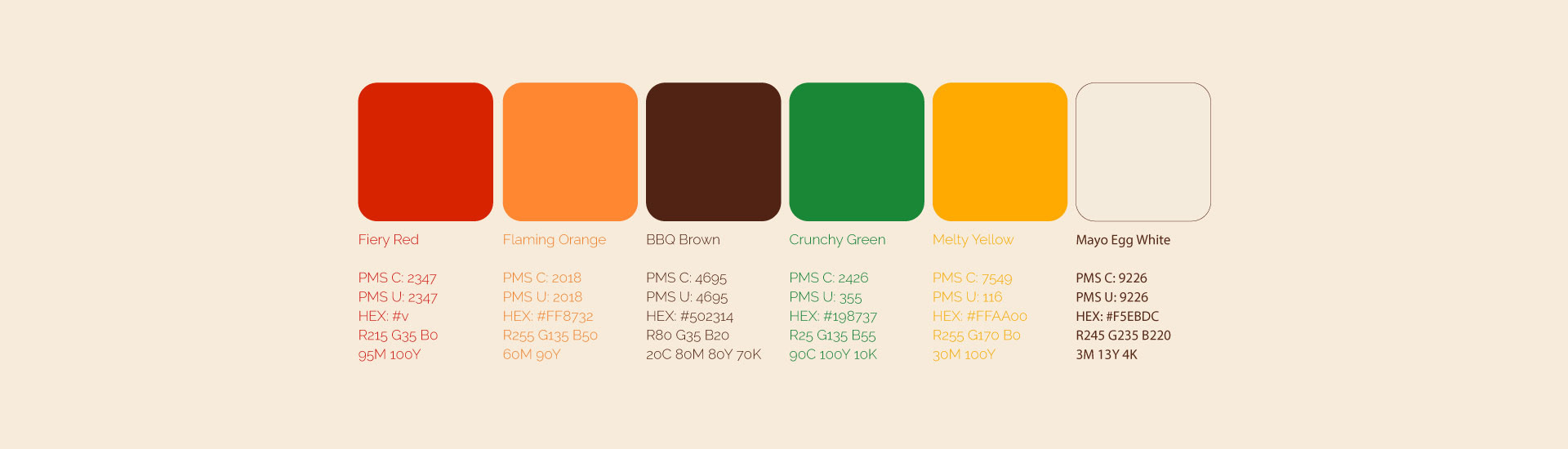
The design of the swag focused on the ingredients and the unique nature of the melted cheese, which was approached both geometrically and typographically. Also, the perfect companion for a melt couldn't be missing: Dr. Pepper, of course.


El cliente
Burger King es una cadena multinacional estadounidense de restaurantes de comida rápida a base de hamburguesas. Royal Perks es el programa de fidelización de Burger King, cuyo objetivo es recompensar a los clientes de BK con ventajas que van desde premios en la tienda hasta acceso anticipado a ofertas y merchandising.
Burger King es una cadena multinacional estadounidense de restaurantes de comida rápida a base de hamburguesas. Royal Perks es el programa de fidelización de Burger King, cuyo objetivo es recompensar a los clientes de BK con ventajas que van desde premios en la tienda hasta acceso anticipado a ofertas y merchandising.
El reto
Los Burger King Melts son sándwiches emblemáticos que llevan dos rebanadas de pan tostado cubiertas con dos hamburguesas Whopper Jr. a la parrilla, queso americano, cebolla caramelizada y salsa Royal, y tienen fans incondicionales. Como parte del programa Royal Perks, Burger King quería recompensar a esos fans con el merchandising que se merecen. Por eso se pusieron en contacto con Flopicco Studio.
El enfoque de Flopicco Studio
El diseño del swag se centró en los ingredientes y la naturaleza única del queso fundido, que se abordó tanto geométrica como tipográficamente. Además, no podía faltar el acompañante perfecto para un fundido: Dr. Pepper, por supuesto.
CREDITS
CLIENT
Burger King
CREATIVE DIRECTION, ART DIRECTION
AND GRAPHIC PRODUCTION
Flopicco Studio
Inhouse Team
Florencia Picco, Fernando Vallejos, Natalia Bellagio, Alejandro Guatelli,
Pablo Camino, Martín Polech y Emiliano Agnetti.
🤎