I T A L Y  ·  D I S C O V E R Y  C H A N N E L  +  F L O P I C C O  ·  2 0 1 6


TOP CHEF
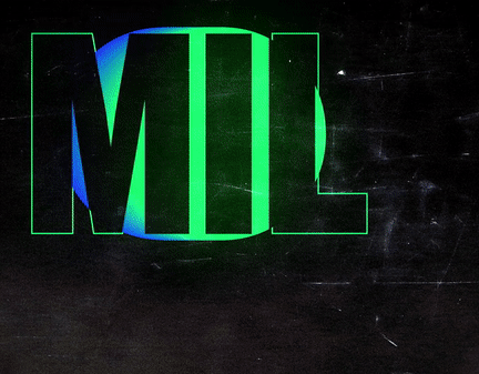
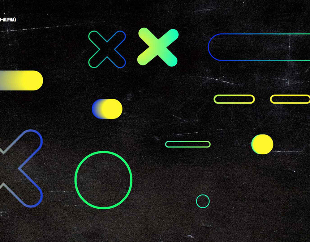
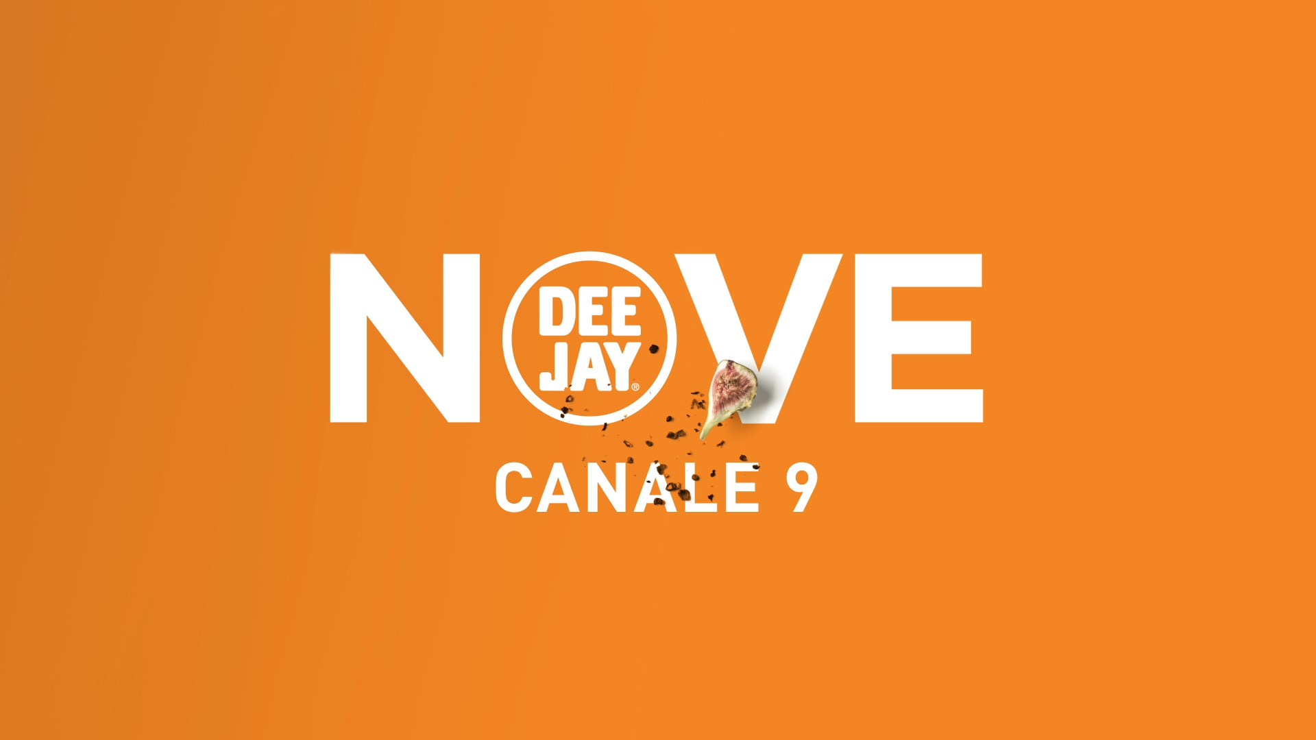
PROMO PACK & IDENTS FOR NOVE


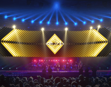
For the acclaimed reality competition series Top Chef, we were given the task of developing the promotional creative package and a set of idents for a countdown leading to the premiere of the show.

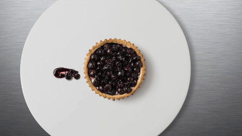
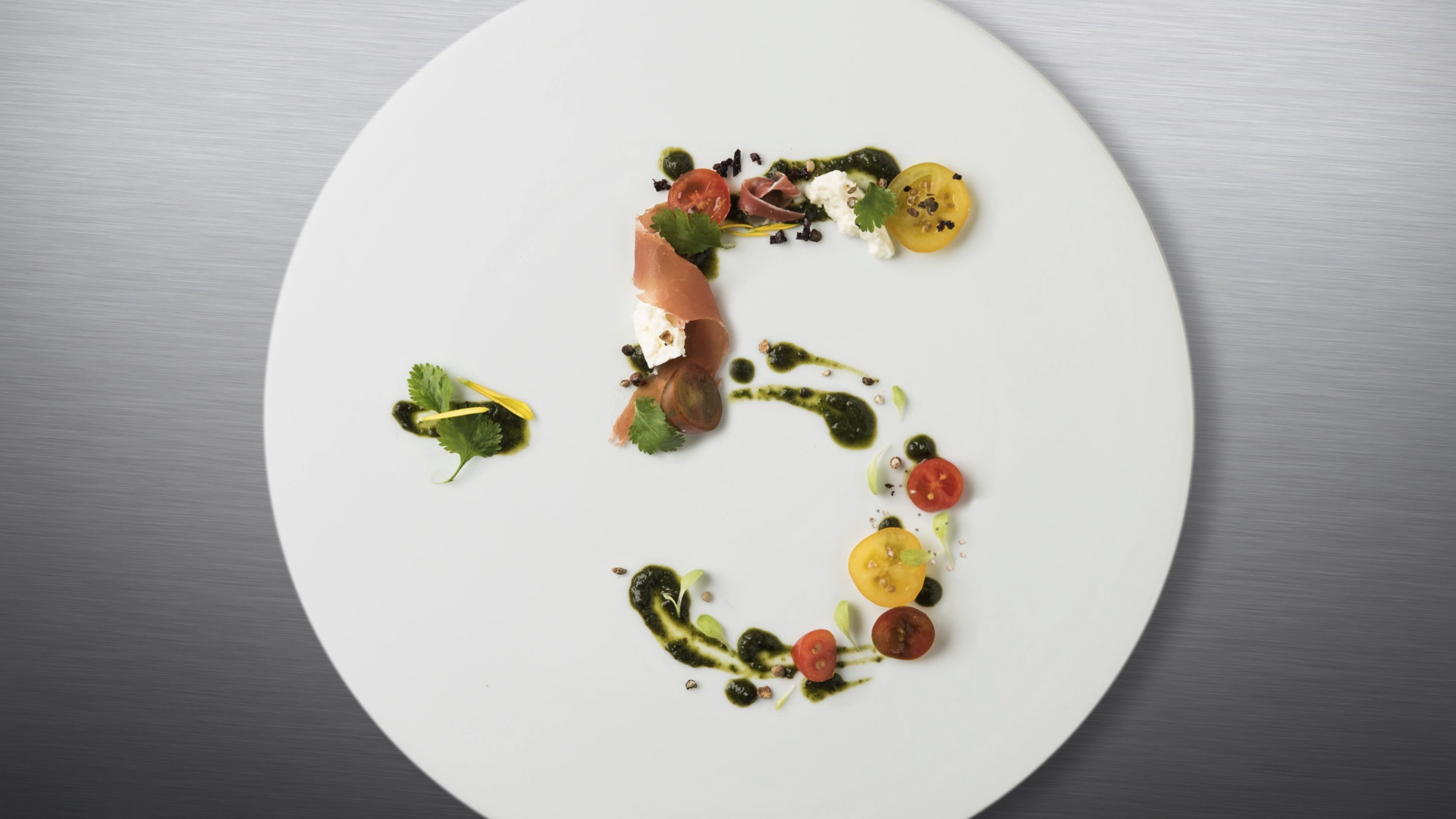
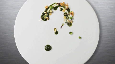
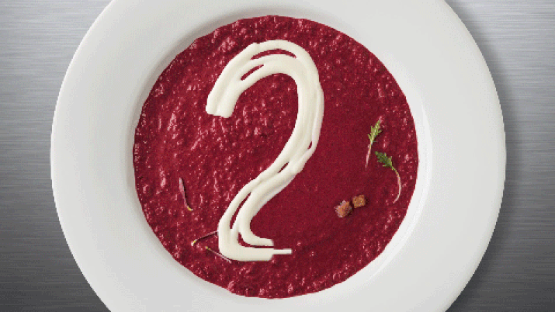
Besides the array of mixed emotions and adrenaline of each episode there's one element that is always highlighted by the judges: high-end plating. Some would say that's one of the key elements that separate a delicious homemade risotto from the one served by a top chef in a Michelin starred restaurant. So, we decided to focus on this and we created a  image with the sophistication, beauty and complexity of food design.

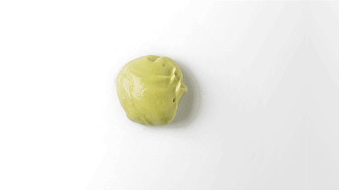
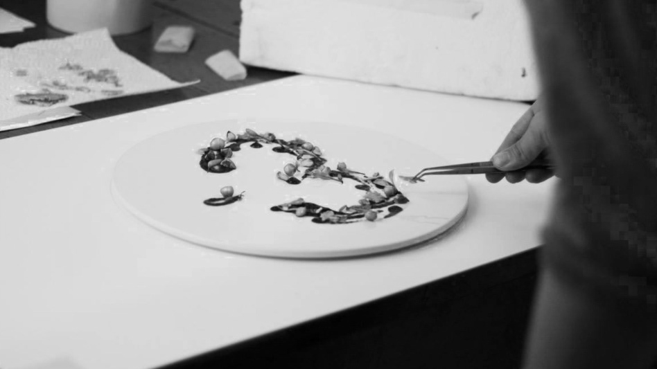
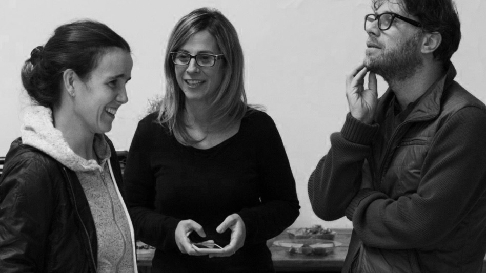
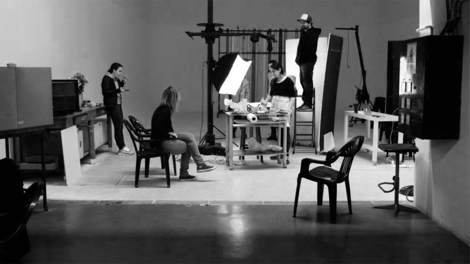
Here you will see a mix of the results and of the process. 

Buon appetito! ​​​​​​​


CREDITS

Client
Giorgio Schwarz, Discovery Italia

Creative Direction, Art Direction and Graphic Production
Flopicco

Inhouse Team
Florencia Picco, Marco Salemi

In collaboration with
Eloisa Iturbe


🖤

You may also like

BURGER KING MELTS SWAG
Burger King Melts swag design focused on the ingredients and the unique nature of the melted cheese, which we approached both geometrically and typographically.
Branding, Fashion Design, Graphic Design
Rai Sport Brand Identity
Branding, Motion Graphics, Art Direction
Plenitude Brand Identity
Graphic Design, Advertising, Branding
+SBT HUMOR STREAMING
For +SBT Humor, we decided to take an iconographic approach to the digital language we use every day: emoticons, reactions, faces that express surprise or approval, short phrases that symbolise laughter. Humour is definitely a universal language, and emoji are its most effective shortcut.
Branding
Flopicco Studio Ten Years Manifesto
Graphic Design, Illustration
BORDER CONTROL ITALIA TOOLKIT
Illustration, Motion Graphics, Graphic Design
TIM HORTONS CITY GRAPHIC SETS
Tim Hortons approached Flopicco Studio to design city-inspired merchandise for its newest locations in Kansas City and Nashville, USA. The aim was to capture the essence of each city through playful illustrations that could be used on postcards, sticker sets and tote bags, turning each item into a unique collectable.
Graphic Design, Illustration, Product Design
MAX: FROM CINEMAS TO MAX
Max is the brand that brings together several entertainment titans: HBO, Warner Bros., Discovery, DC and Wizarding World. Its logo, which has gradually replaced HBO-Max in the different markets where the streaming platform is present, combines the HBO bull's-eye and the Warner Bros. curves in a modern yet timeless design, according to its creators. In the case of Latin America, for the big launch in March 2024, they needed to adapt their popular premiere series "From Cinemax to HBO-Max" to the new design system. That was our challenge.
Branding, Motion Graphics
+SBT POP BRAND SYSTEM
+SBT POP is channel that is an ode to a "pop lifestyle", a casual approach to the simple pleasures we enjoy in our everyday lives: Eating, listening music and having fun watching our favourite shows with our besties.
Graphic Design, Illustration, Branding
DMAX Channel Branding
Motion Graphics, Art Direction, Branding
Back to Top