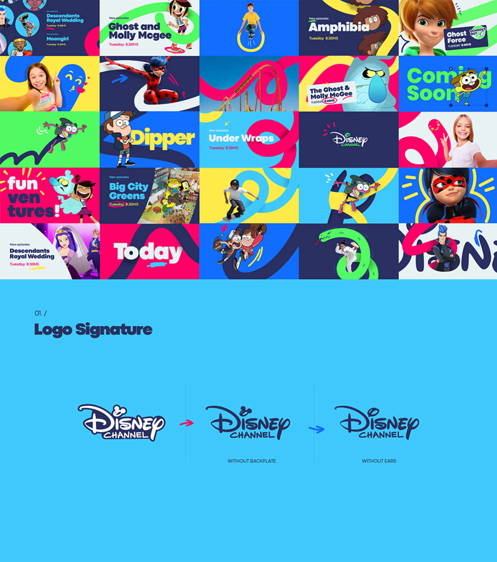
It all started with a signature… the most iconic signature in the world. Its distinctive strokes became our studio's leitmotiv to create this brand new Disney Channel for Europe, Africa and the Middle East regions.
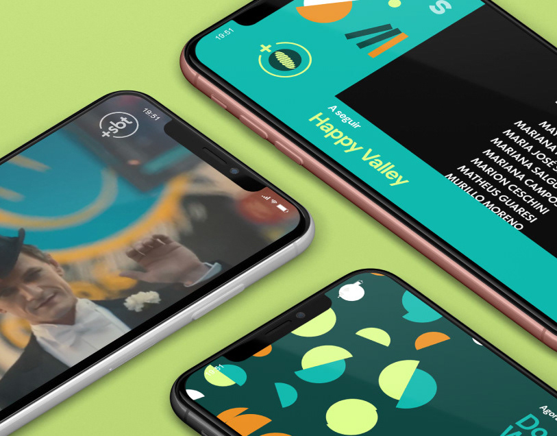
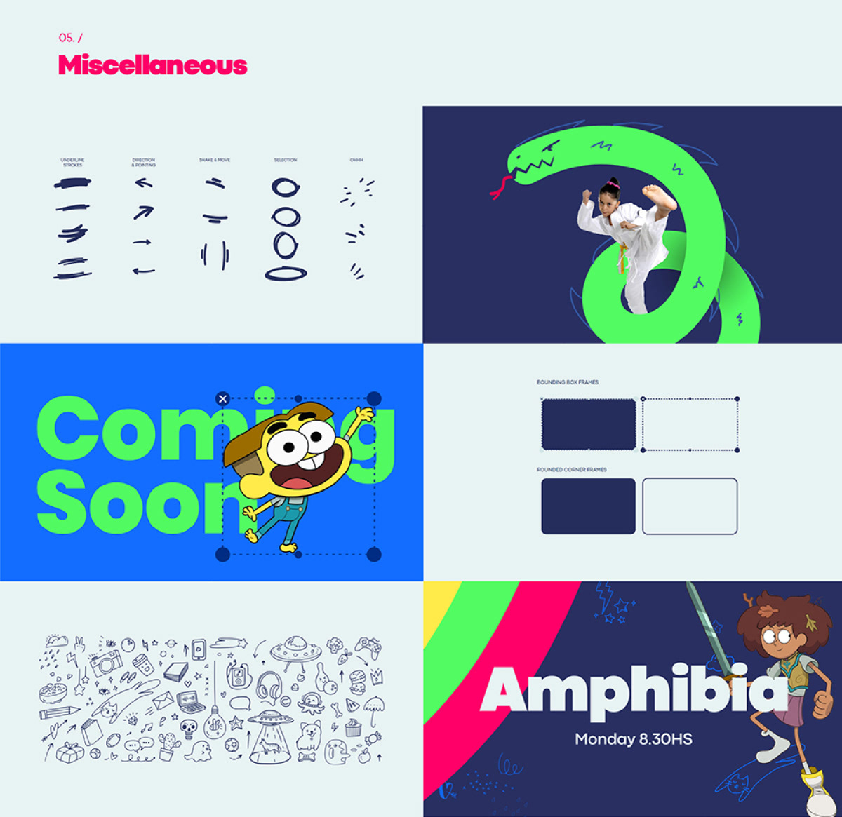
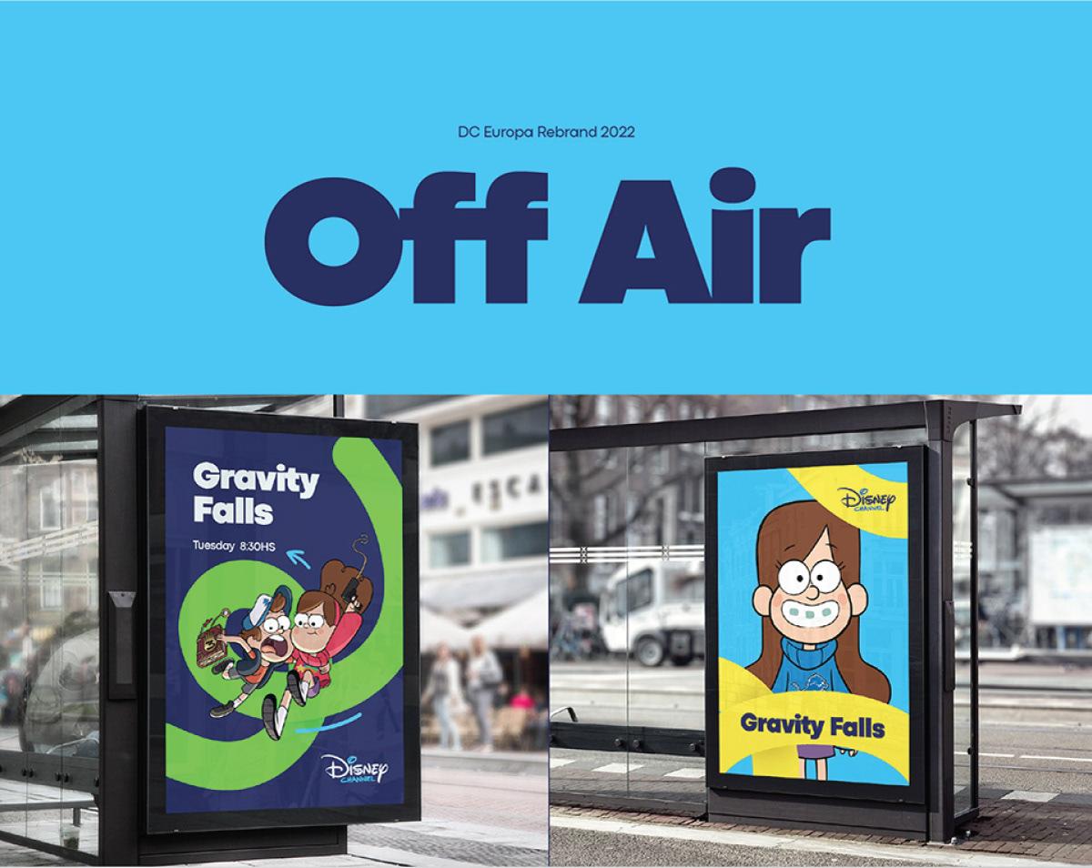
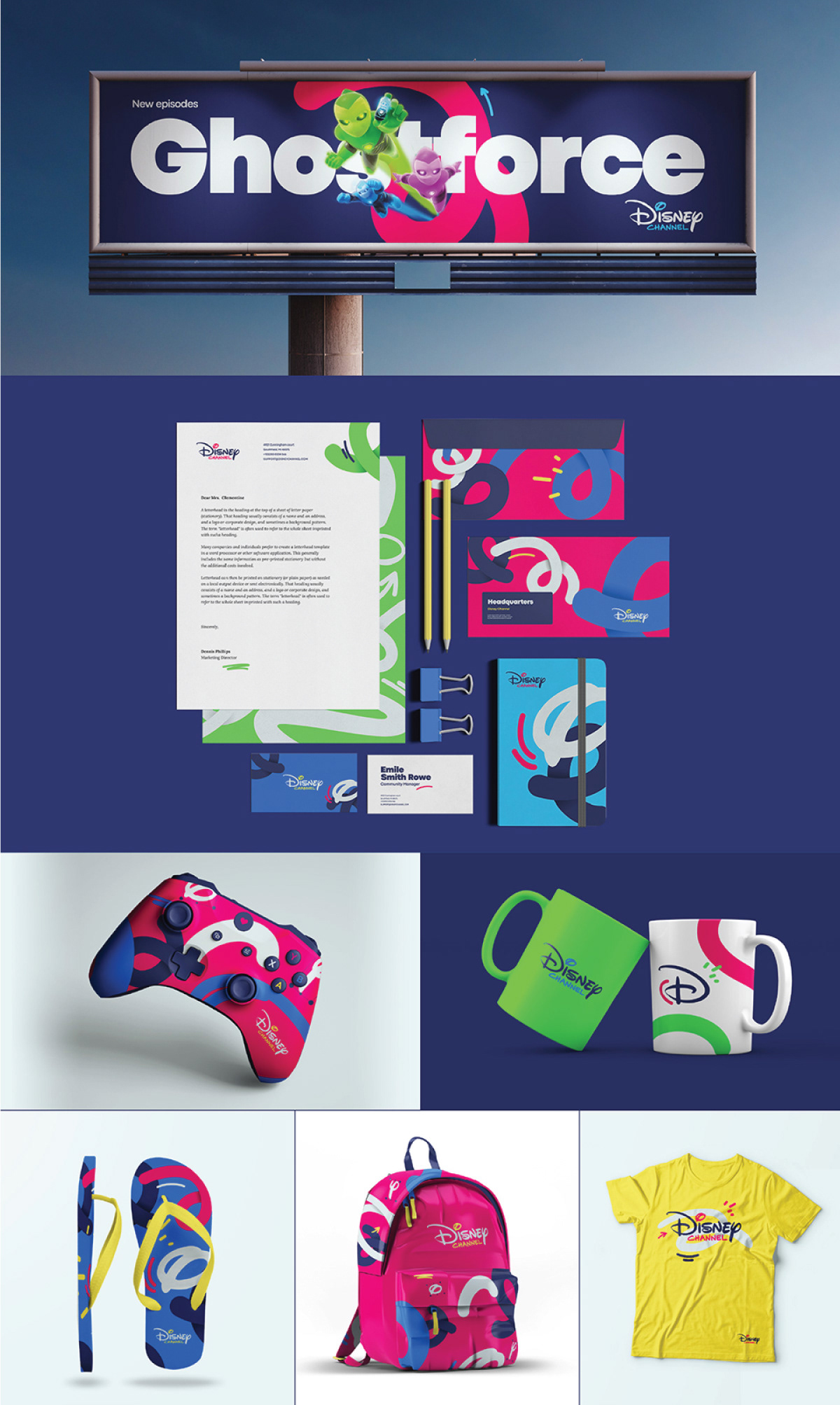
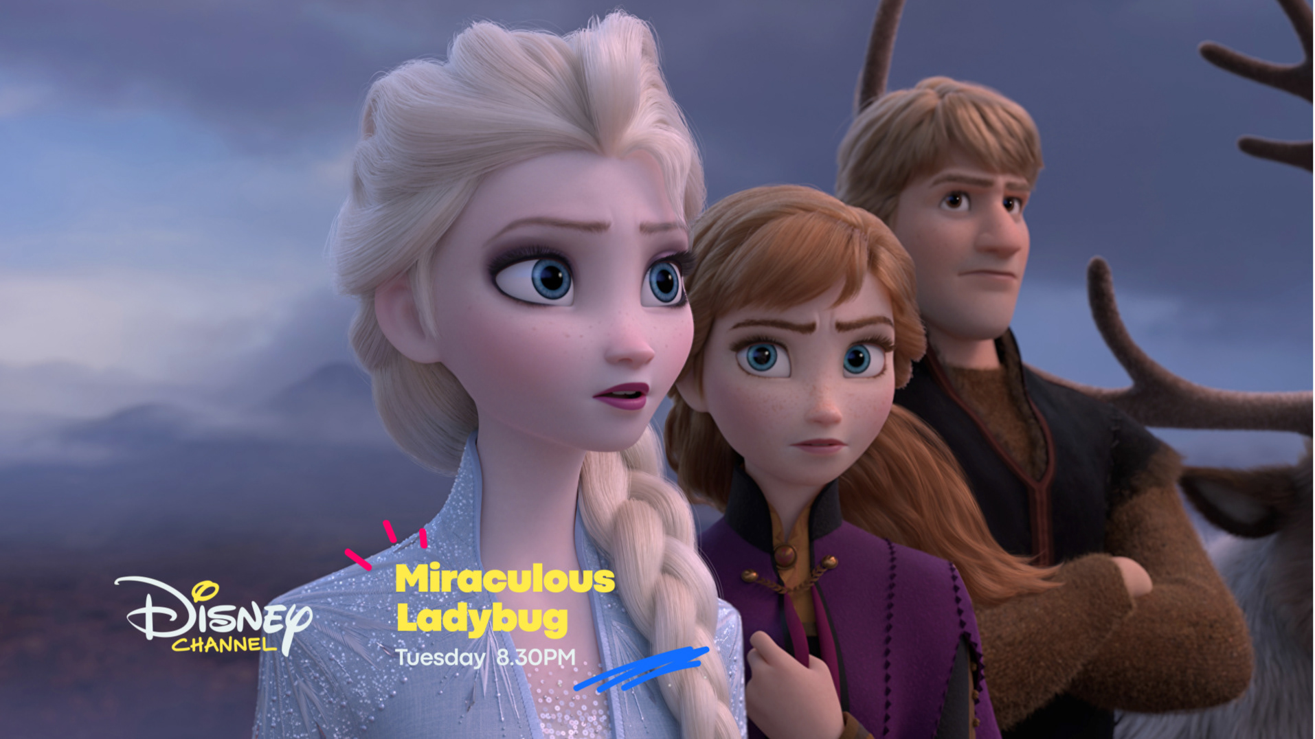
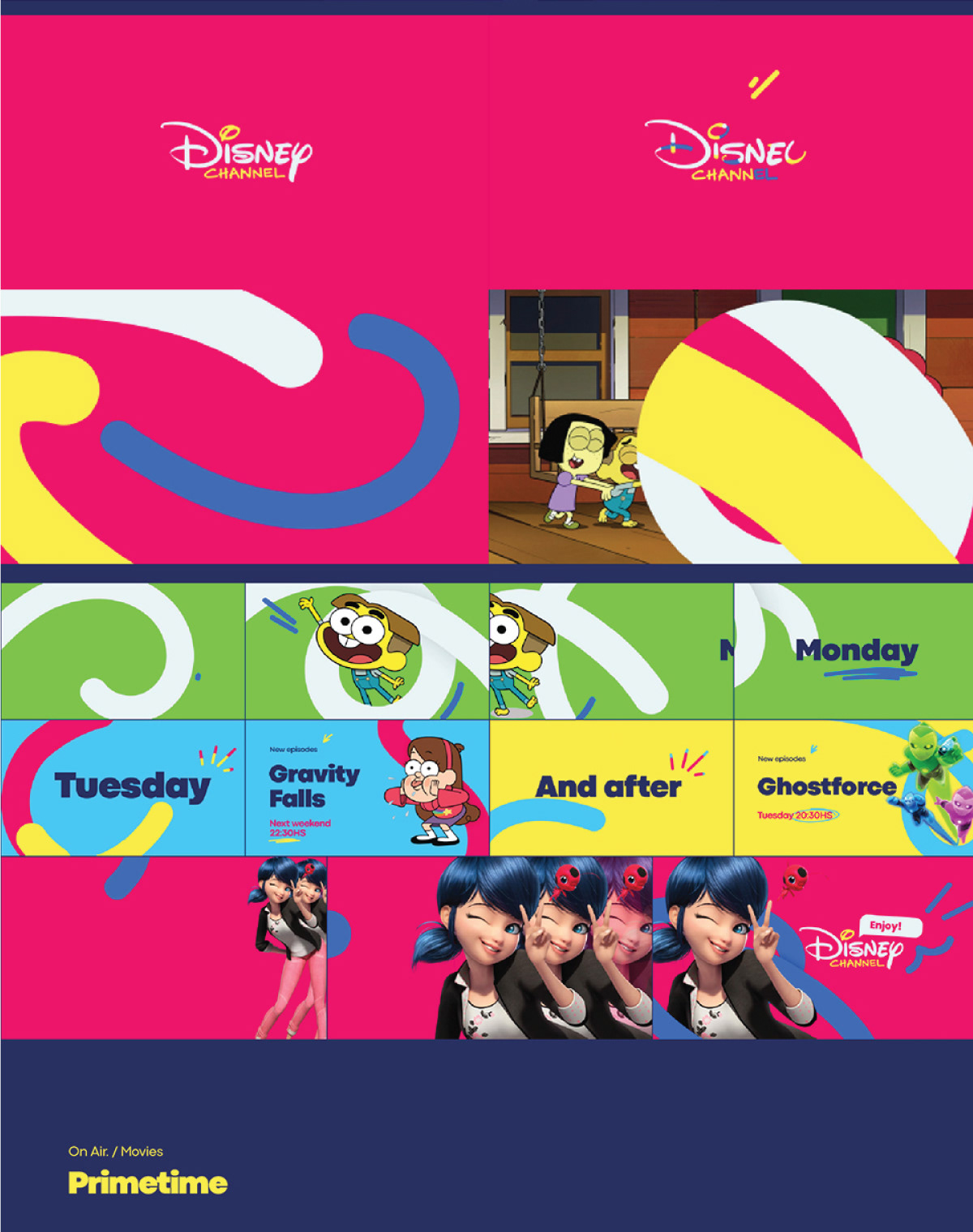
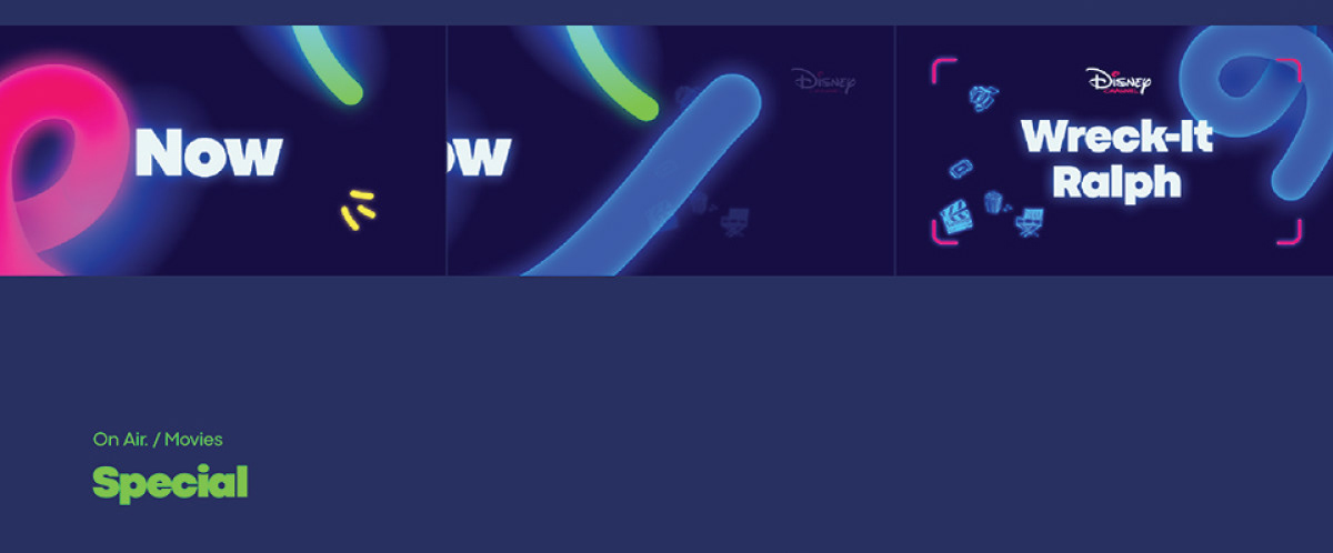
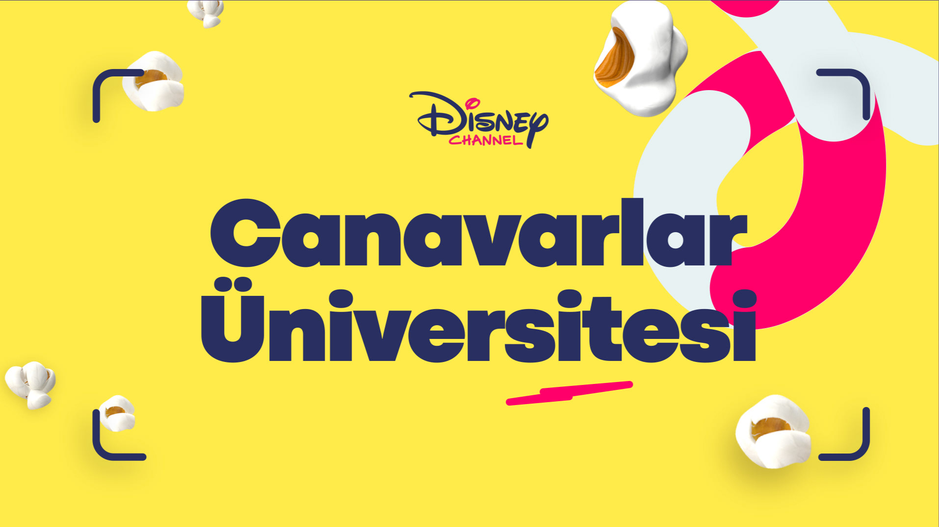
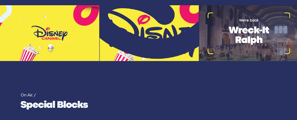
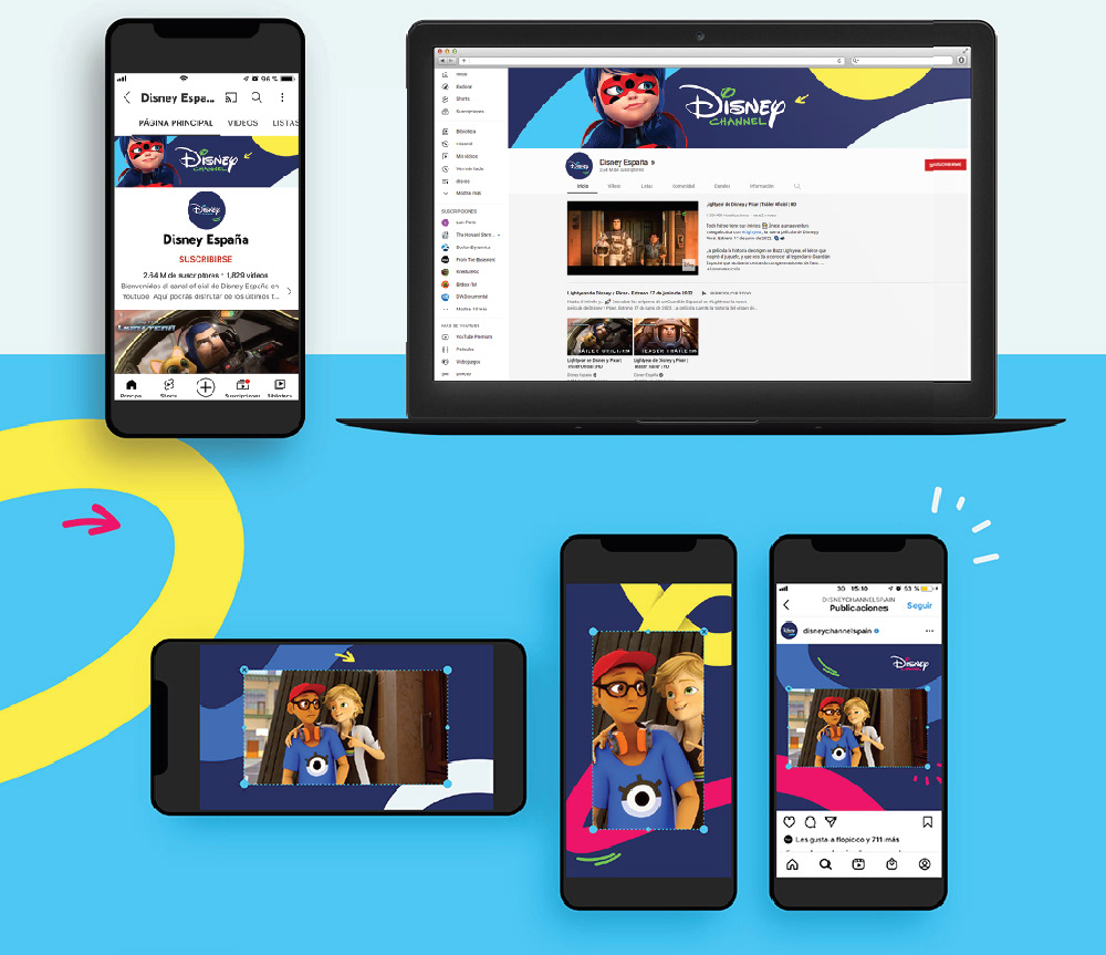
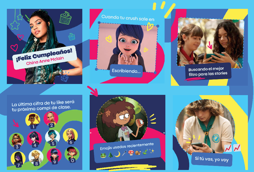
Our studio was is charge of all the On-Air, Off-Air and Digital components of this brand system that aimed to modernize the Disney Channel image, reconnect with its target audience, become more straightforward, gender neutral, within-reach, and make the lesser-known characters famous.
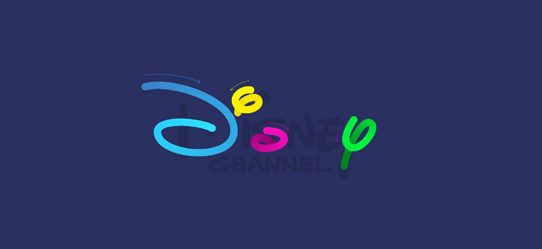
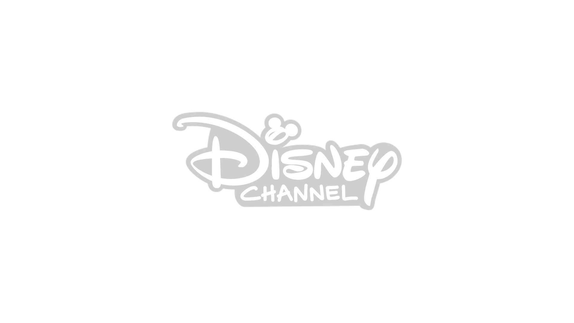
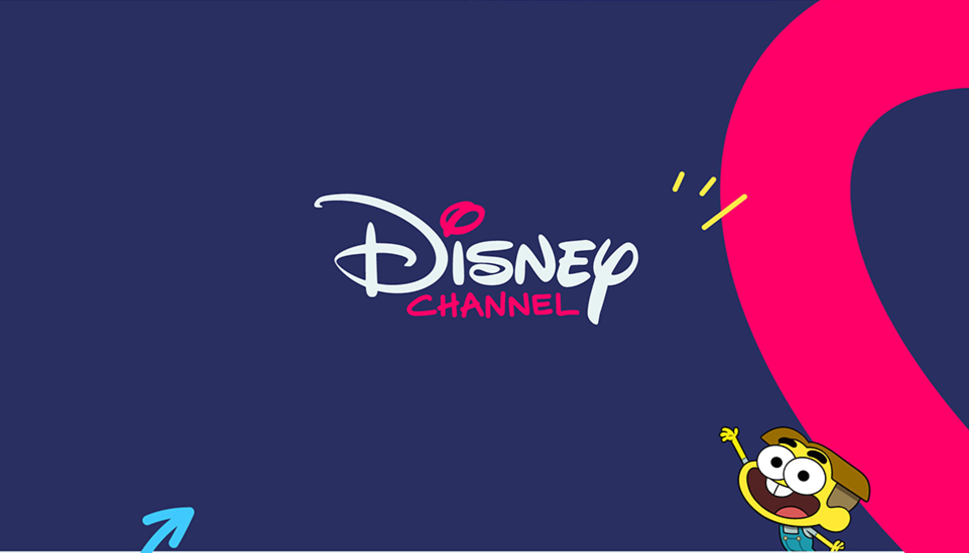
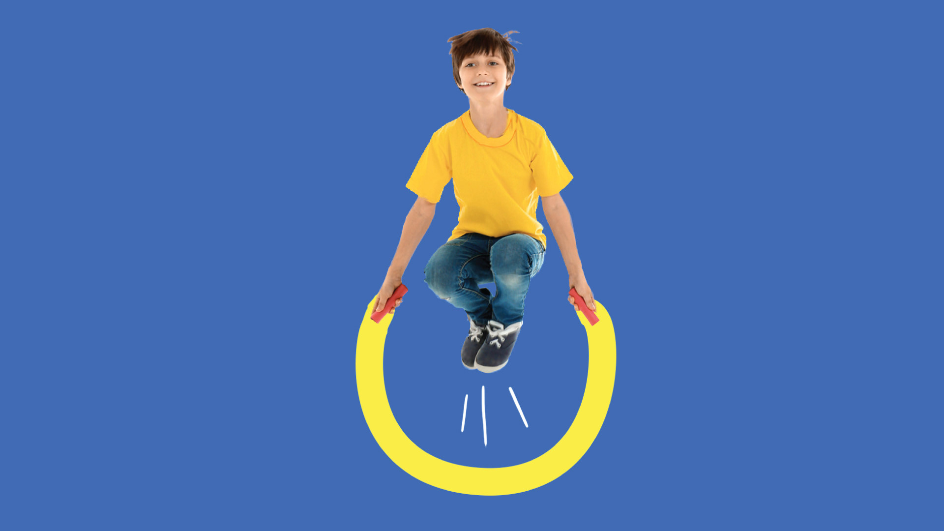
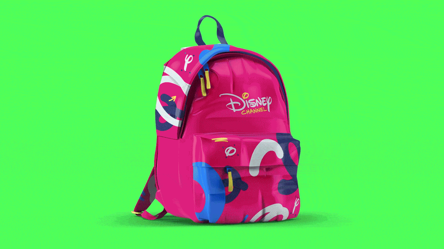
We changed the logo! Yes, it was a sutil change (no ears, no stroke, no black), but it was a step towards the new aspirational target of the channel that belongs to an older age-bracket: 8-14 years old.
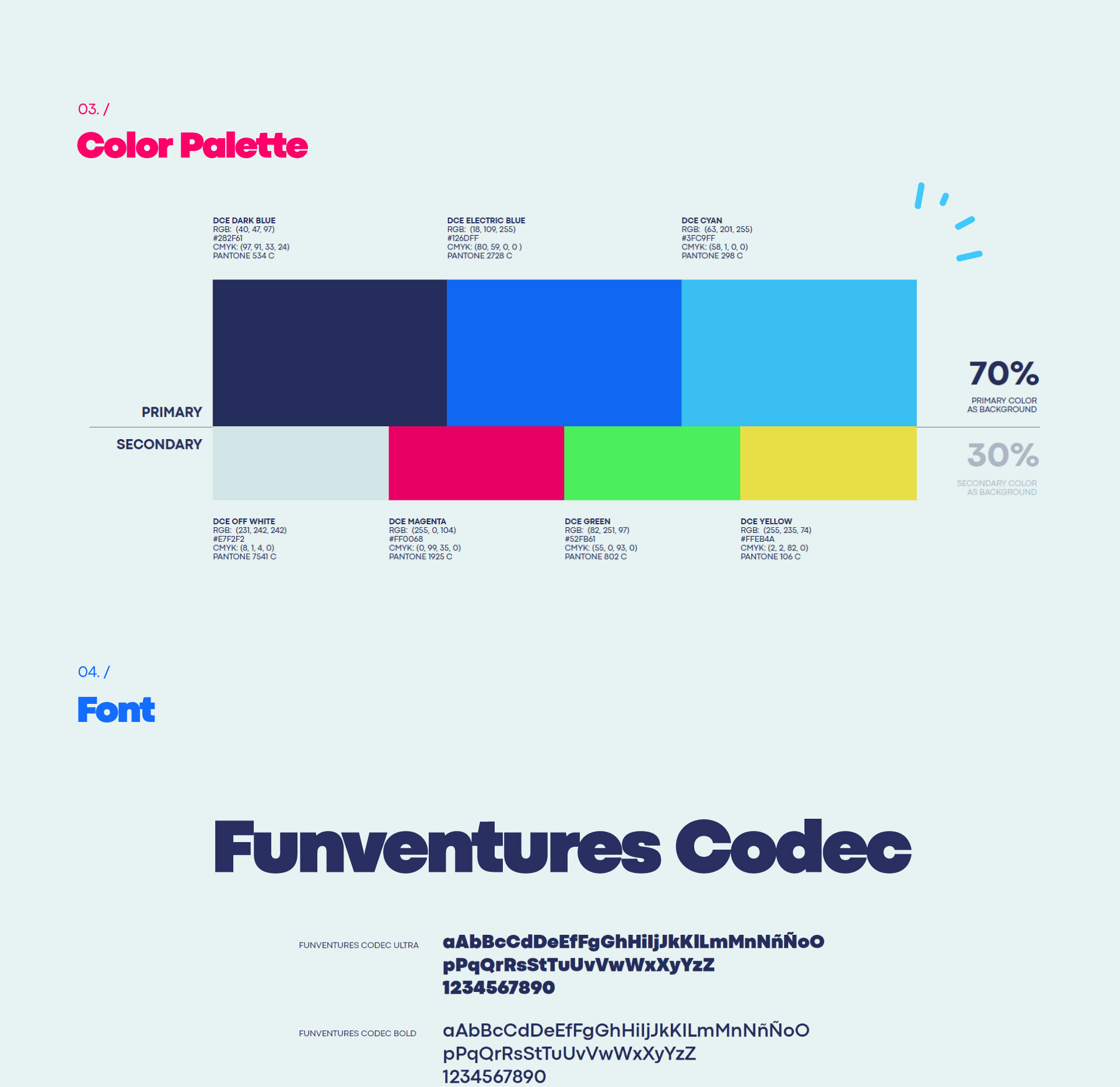
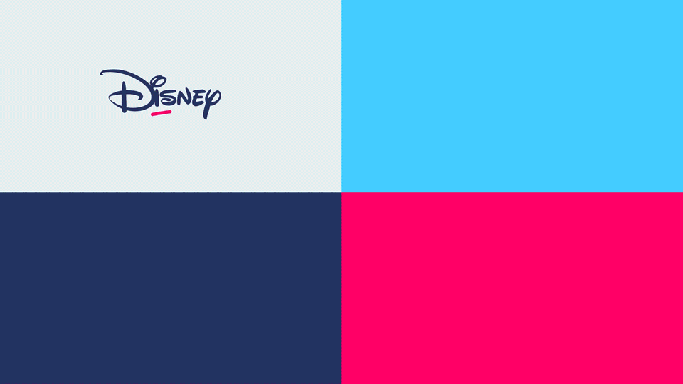
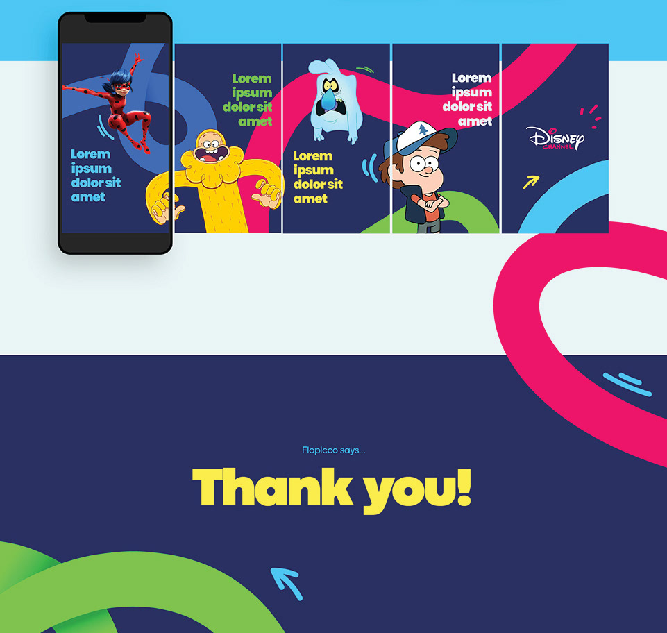
The main blue shades also helps to connect this TV channel with the rest of the Disney+ products. That is why they are the main color of our otherwise vibrant palette.

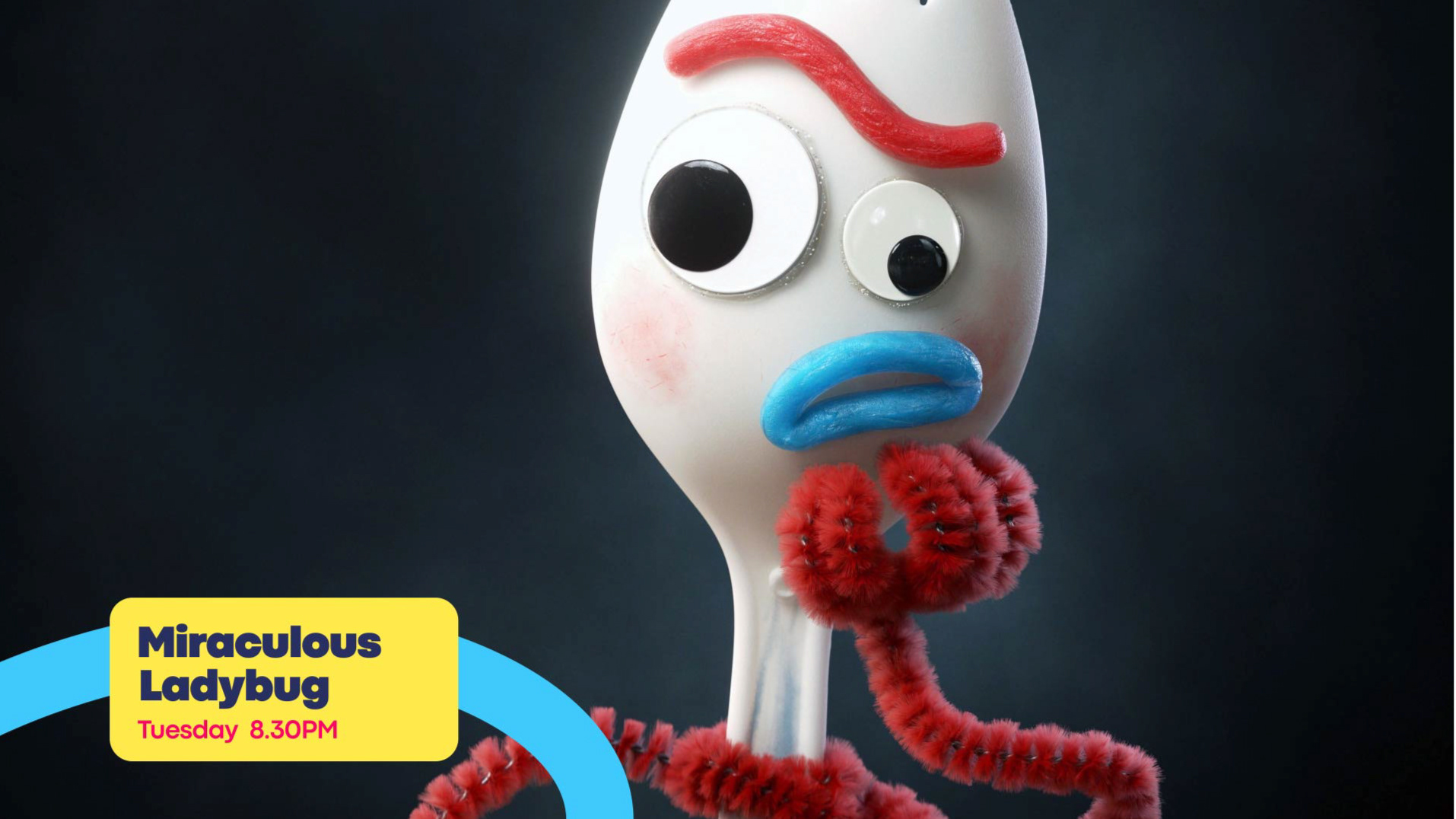
The new Disney Channel is not only a favourite of ours, but it also responds in a creatively and accurately way to the main goals the Disney Channel Spain team had at the beginning of this -fun and adventurous- process: Updating the Disney Channel image, (re)connecting with a new target audience, becoming more bold, gender neutral, within-reach, and making the lesser-known characters famous.


CREDITS
CLIENT
Disney Channel Spain
CREATIVE DIRECTION, ART DIRECTION
AND GRAPHIC PRODUCTION
Flopicco Studio
Inhouse Team
Florencia Picco, Fernando Vallejos, Natalia Bellagio, Pablo Camino,
Alejandro Guatelli, Martín Polech, Daniela Parasporo, Ana Laya
+
Agustín Tognola, Beatrice Carosi, Emiliano Agnetti, Gonzalo Avendaño, Juan Manavella, Leandro Nicolosi, Marcelo Hsu, Matías Pastorini, Pia Rossi, Soledad Basigalup, Tato Herrero & Valentín Stur.
With the collaboration of
Andy Cambiasso
Darvideo
Elia Iandolo
Luca Miranda
Luca Miranda
Luis París
Sebastián Brown
&
Tercer Espacio
TYPOGRAPHY DESIGN
Zetafonts
🖤