E M E A · F L O P I C C O S T U D I O + T H E W A L T D I S N E Y C O M P A N Y · 2 0 2 4
DISNEY CHANNEL BACK TO SCHOOL
THEMATIC BRANDING
T H E C L I E N T
Disney Channel is a children's pay television network owned and operated by The Walt Disney Company Limited, the international division of The Walt Disney Company, serving television markets in Western Europe, the Middle East, North Africa, Sub-Saharan Africa, Greece, Cyprus, the Baltic States and most of the Balkans.
T H E C H A L L E N G E
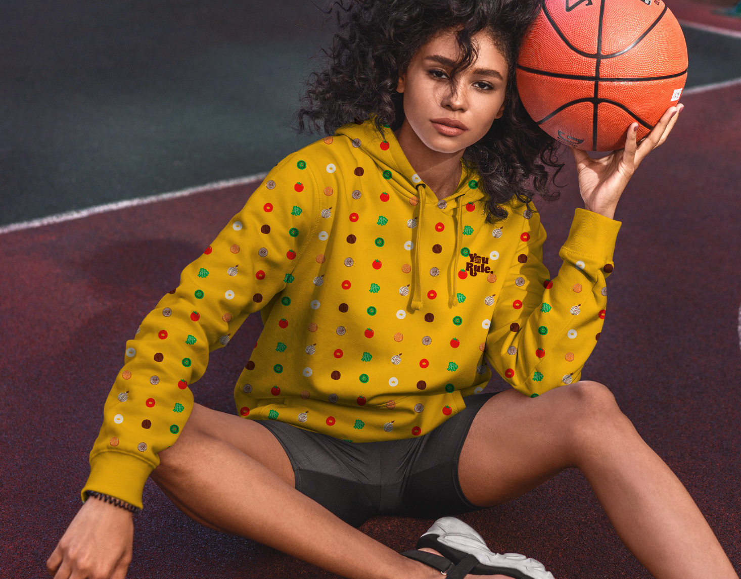
Disney Channel approached Flopicco Studio because they wanted to do something special for Back to School, one of the most iconic moments in children's lives as they return to routine after the summer. The idea was to make this moment, and the programming that accompanies it on the channel, a fun and memorable one.
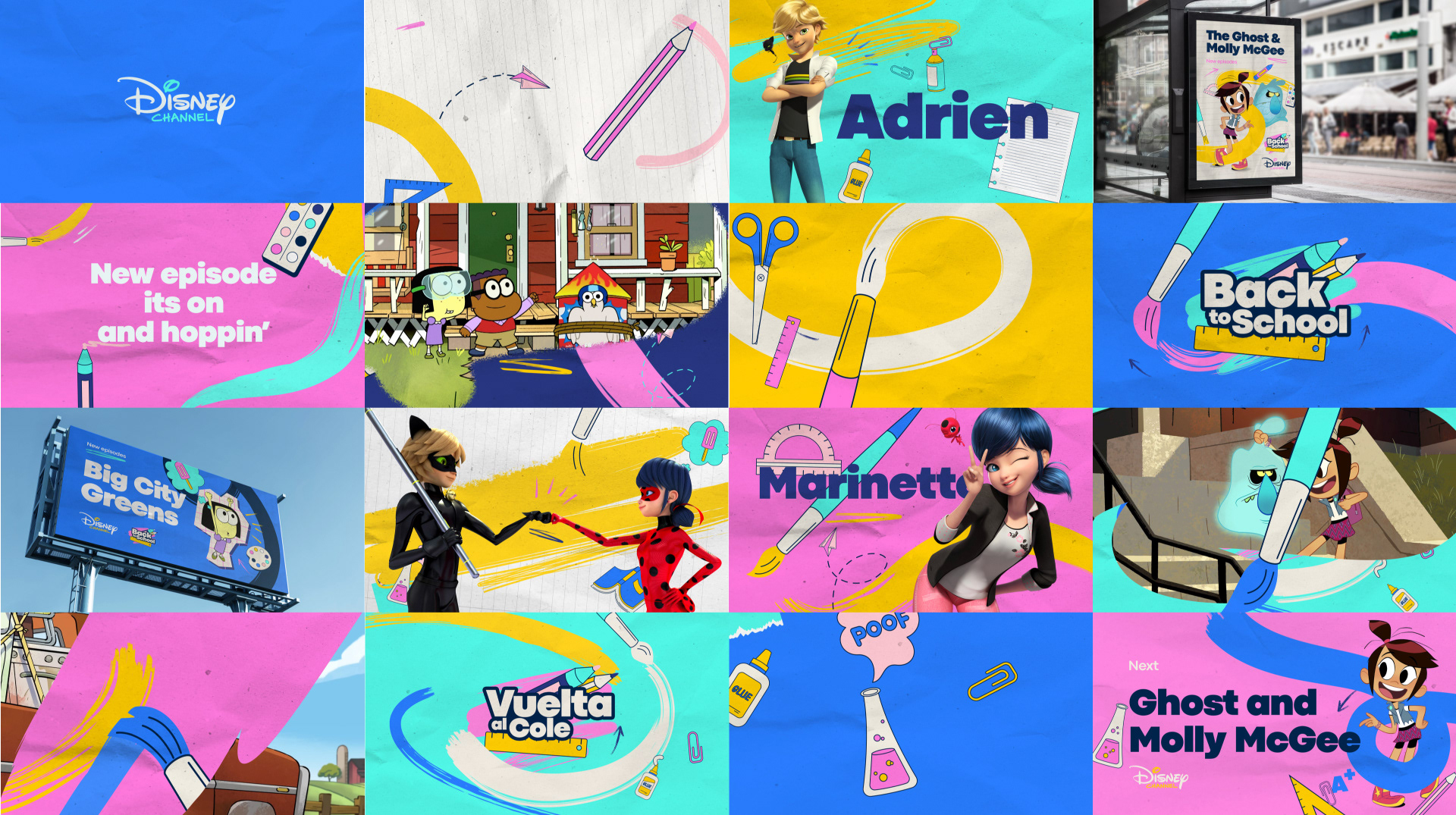
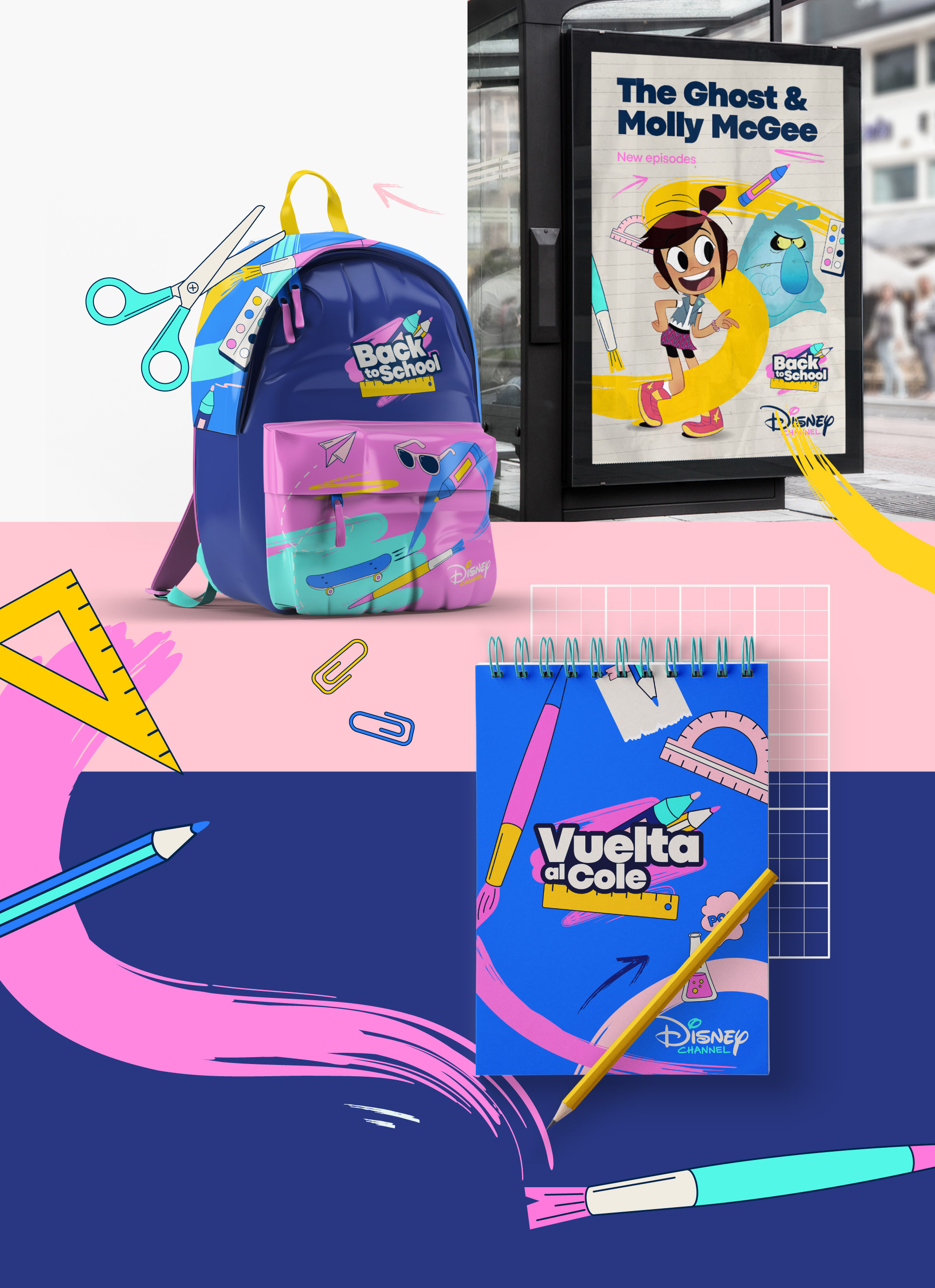
T H E F L O P I C C O S T U D I O A P P R O A C H
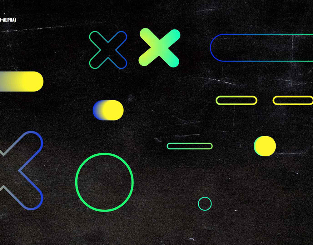
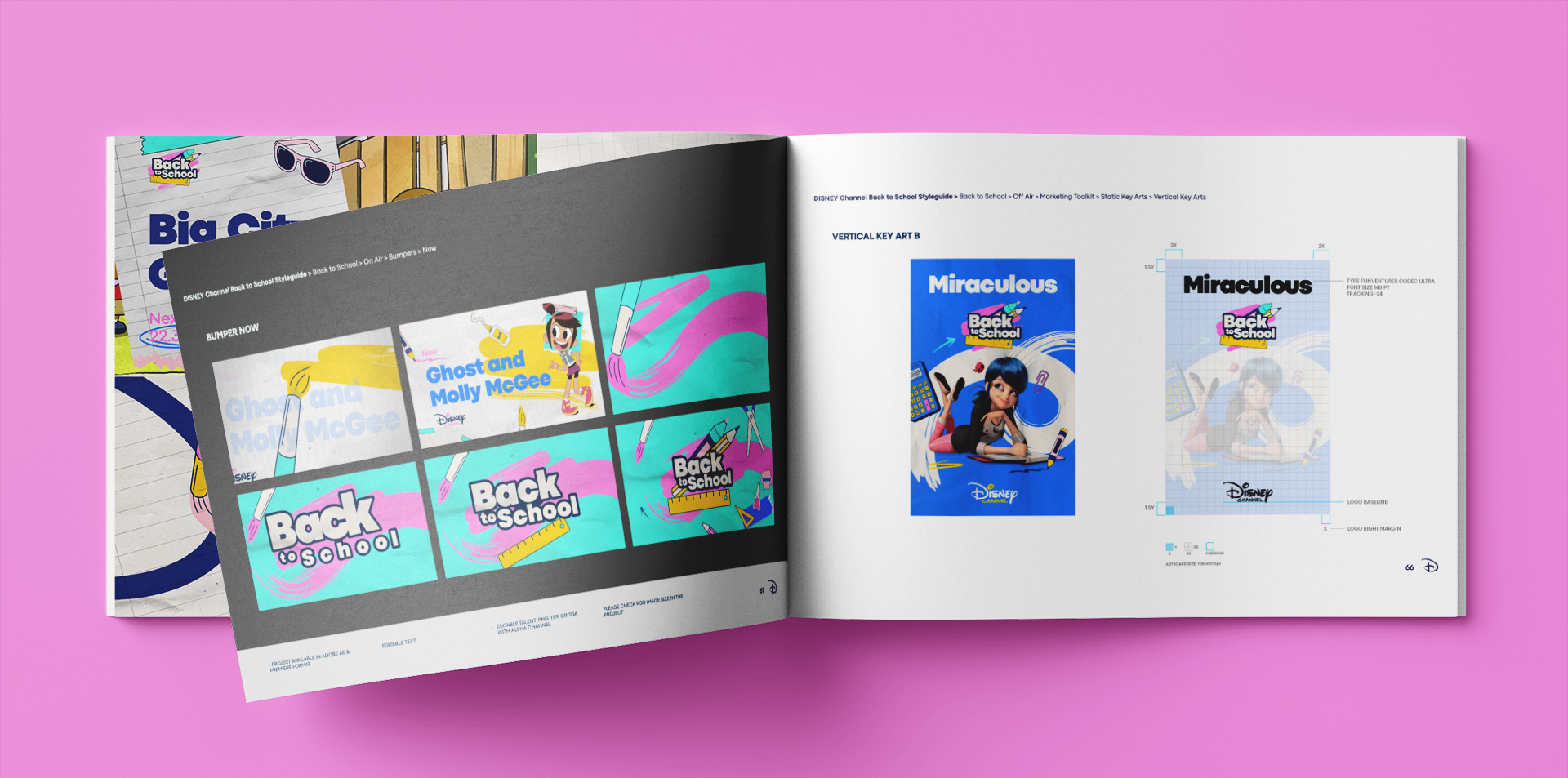
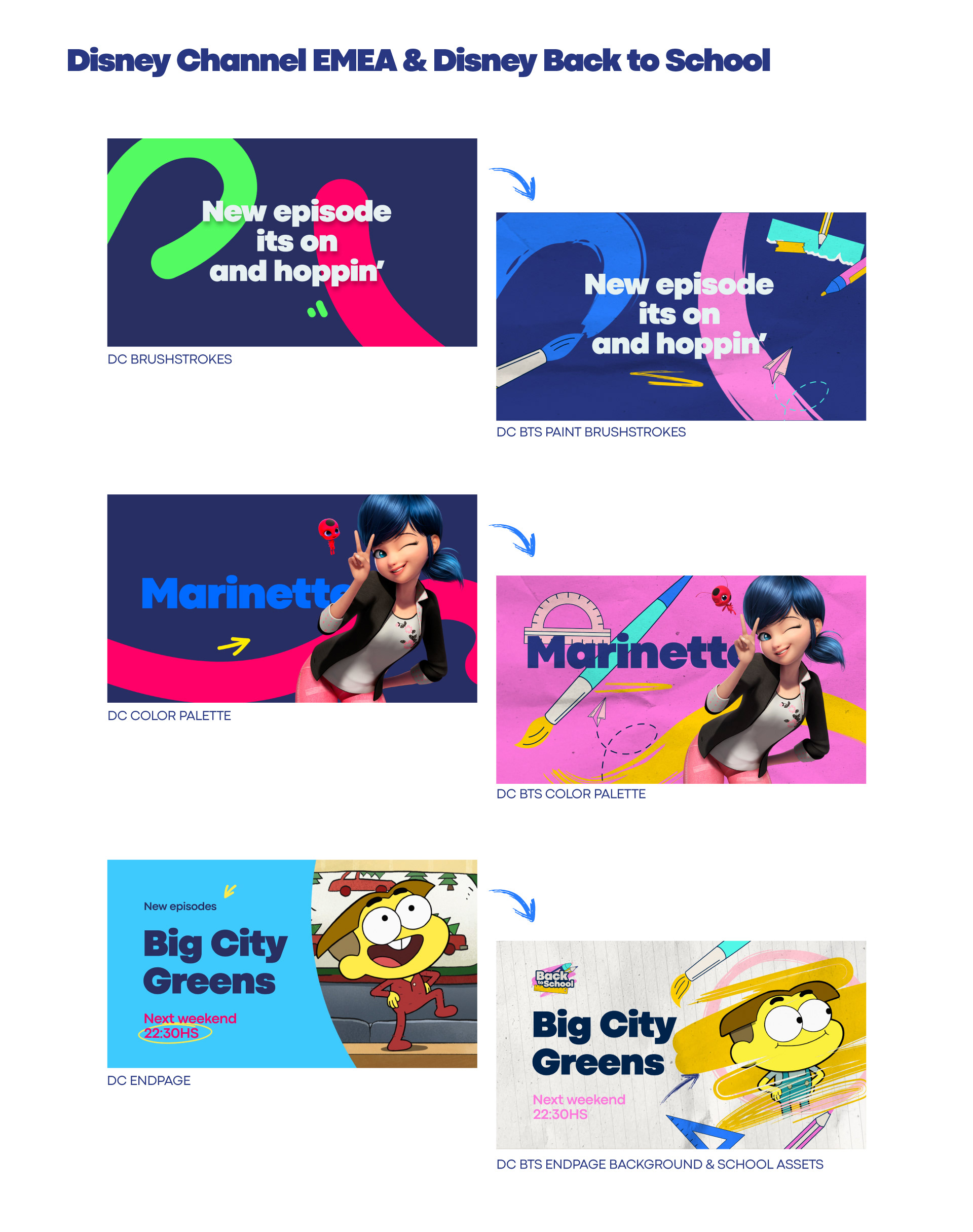
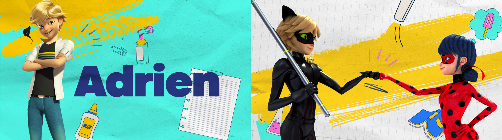
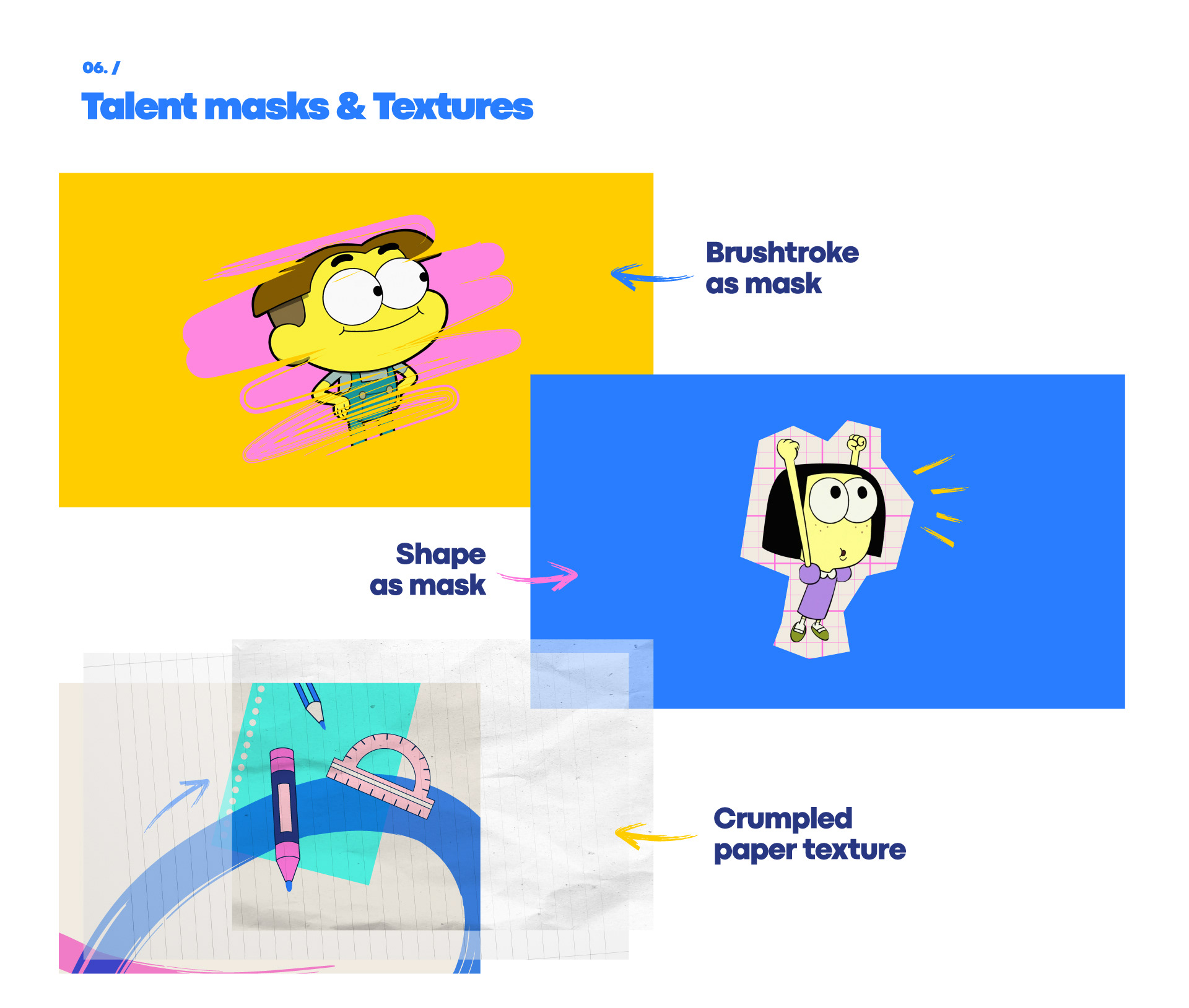
The Disney Channel image, also created by Flopicco Studio, is composed of a series of iconic resources, masks and elements, many of them derived from the distinctive Disney calligraphy, that give the channel a narrative and thematic coherence. For this visual package, we decided to rethink and repurpose some of these iconic identity elements, mixing them with school symbols and textures, and coloring them with a vibrant new palette of neon pastels. It's our beloved Disney Channel, but in a new light and very much ready to go back to school.
The Disney Channel image, also created by Flopicco Studio, is composed of a series of iconic resources, masks and elements, many of them derived from the distinctive Disney calligraphy, that give the channel a narrative and thematic coherence. For this visual package, we decided to rethink and repurpose some of these iconic identity elements, mixing them with school symbols and textures, and coloring them with a vibrant new palette of neon pastels. It's our beloved Disney Channel, but in a new light and very much ready to go back to school.

E L C L I E N T E
Disney Channel es una cadena de televisión infantil de pago propiedad de The Walt Disney Company Limited, la división internacional de The Walt Disney Company, que opera en los mercados televisivos de Europa, Oriente Próximo, el norte de África, el África subsahariana, Grecia, Chipre, los países bálticos y la mayor parte de los Balcanes.
E L R E T O
Disney Channel se puso en contacto con Flopicco Studio porque querían hacer algo especial para la vuelta al cole, uno de los momentos más emblemáticos en la vida de los niños cuando vuelven a la rutina después del verano. La idea era hacer de este momento, y de la programación que lo acompaña en el canal, algo divertido y memorable.
E L E N F O Q U E F L O P I C C O
La imagen de Disney Channel, también creada por Flopicco Studio, se compone de una serie de elementos icónicos, derivados de la caligrafía distintiva de Disney, que dan al canal una coherencia narrativa y temática. Para este paquete visual, decidimos repensar y reutilizar algunos de estos elementos icónicos de identidad, mezclándolos con símbolos y texturas escolares, y coloreándolos con una nueva y vibrante paleta de pasteles neón. Es nuestro querido Disney Channel, pero bajo una nueva luz y muy preparado para la vuelta al cole.


CLIENT
Disney Channel EMEA / The Walt Disney Company
CREATIVE DIRECTION, ART DIRECTION
AND GRAPHIC PRODUCTION
Flopicco Studio
Inhouse Team
Florencia Picco, Fernando Vallejos, Natalia Bellagio, Alejandro Guatelli,
Emiliano Agnetti, Martín Polech and Pablo Camino.
🖤