I T A L Y · F L O P I C C O S T U D I O + E N I G R O U P · 2 0 2 3
VERSALIS
BRAND SYSTEM
The Client
In 2022, Eni, the Italian energy multinational, began a profound process of evolution towards energy transition and decarbonization. A strategy that includes the use of clean energy sources, the development of sustainable mobility alternatives, and innovative products, services and experiences. From this turning point, the Plenitude, Enilive and Versalis brands were born or transformed.
The Challenge
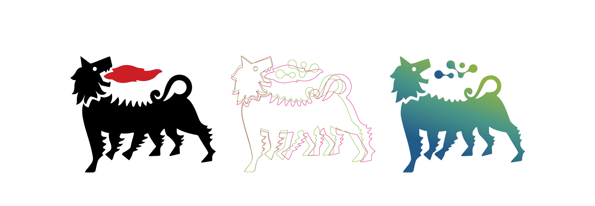
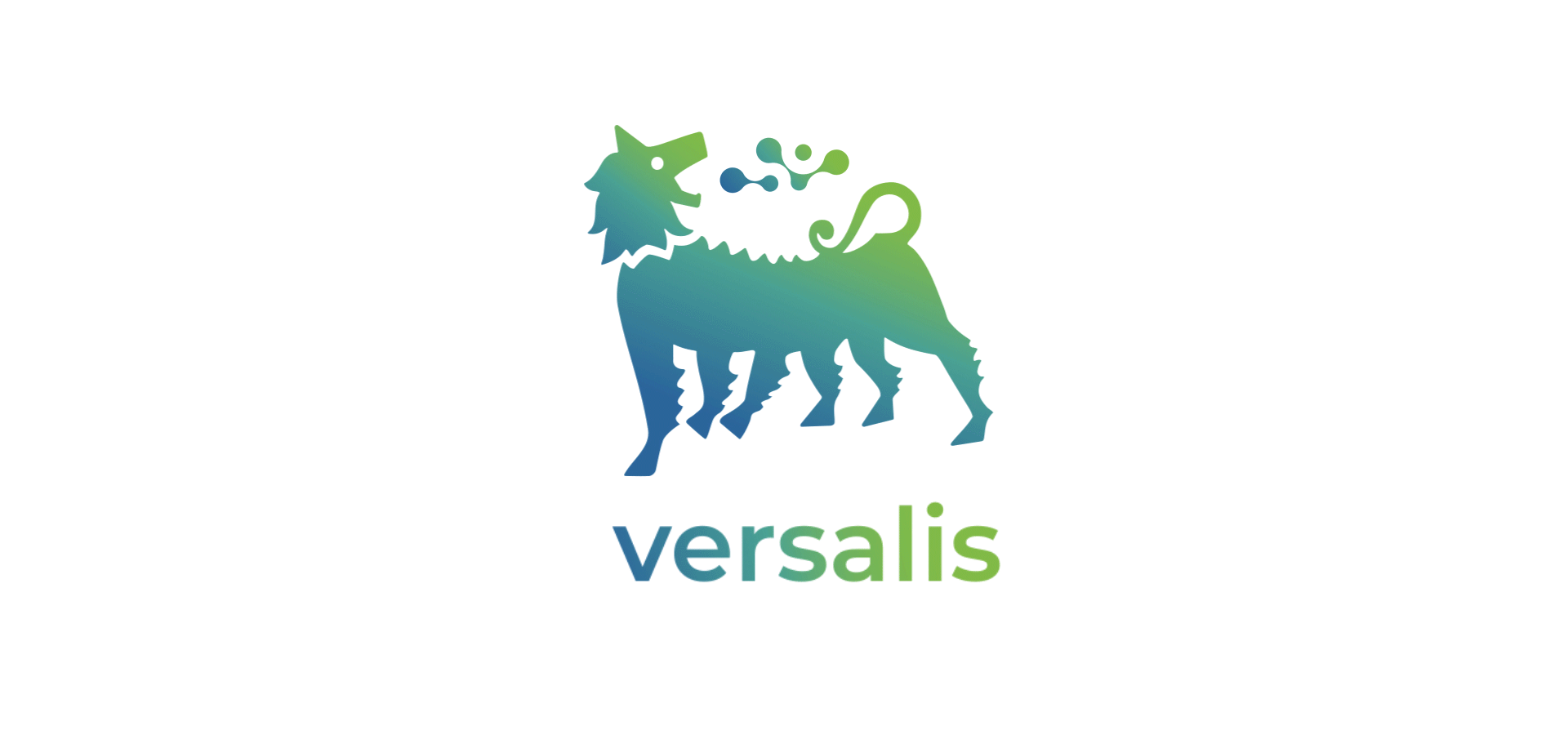
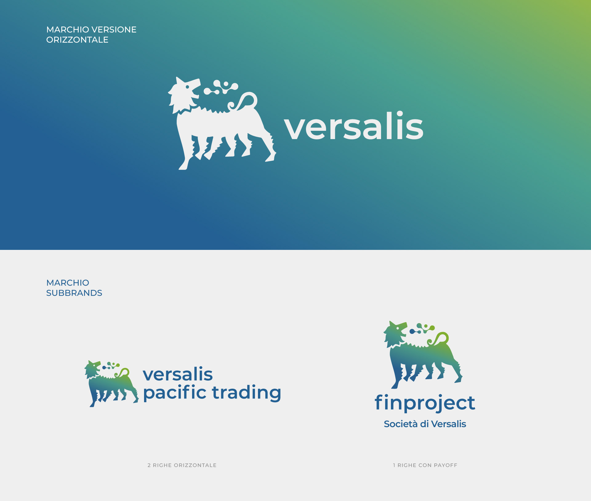
Flopicco Studio was responsible for the Eni branding system and the Plenitude, Enilive and Versalis brands. Versalis is the brand of the group dedicated to the research and development of chemical and biochemical products. Its goal is product innovation and its vectors are sustainability and safety.
The Flopicco Approach
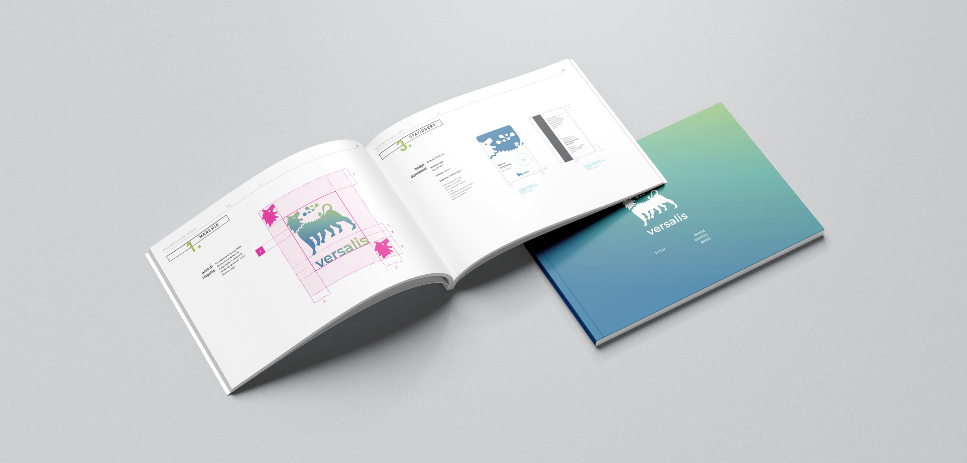
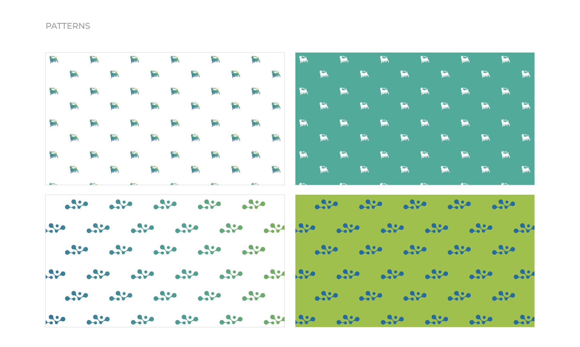
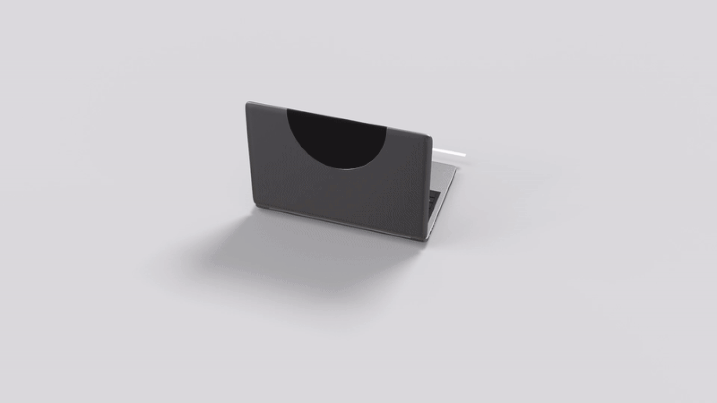
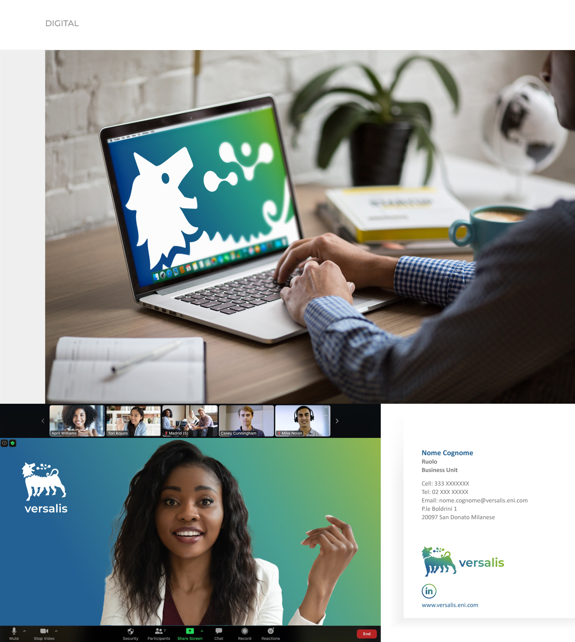
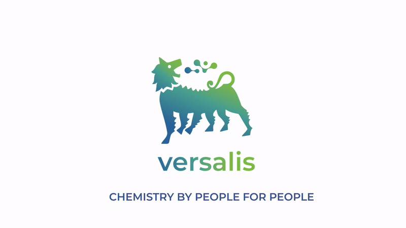
The logo uses the same morphological approach while conveying an independent message, following the main guidelines of the Plenitude brand system (the first of the brands developed). In this case, the six-legged dog remains central and identifiable, but the icon that replaces the flame represents the synthesis of new sustainable compounds. The chosen blue-green gradient is in harmony with the other brands (see Plenitude and Enilive).


El cliente
Eni, la multinacional energética italiana, inició en 2022 un profundo proceso de evolución hacia la transición energética y la descarbonización. Una estrategia que incluye el uso de fuentes de energía limpias, el desarrollo de alternativas de movilidad sostenible y productos, servicios y experiencias innovadoras. A partir de este punto de inflexión, nacieron o se transformaron las marcas Plenitude, Enilive y Versalis.
El reto
Flopicco Studio se encargó del sistema de branding de Eni y de las marcas Plenitude, Enilive y Versalis. Versalis es la marca del grupo dedicada a la investigación y el desarrollo de productos químicos y bioquímicos. Su objetivo es la innovación de productos y sus principales pilares son la sostenibilidad y la seguridad.
El enfoque de Flopicco
El logotipo sigue las directrices clave del sistema de marca Plenitude (la primera de las marcas desarrolladas) utilizando el mismo enfoque morfológico, al tiempo que transmite un mensaje independiente. En este caso, el perro de seis patas sigue siendo central e identificable, pero el icono que sustituye a la llama representa la síntesis de nuevos compuestos sostenibles. Por otra parte, el degradado de azules y verdes elegido armoniza con el resto de marcas (véase Plenitude y Enilive).

.


CREDITS
CLIENT
TBWA \ Italia
CREATIVE DIRECTION, ART DIRECTION
AND GRAPHIC PRODUCTION
Flopicco Studio
Inhouse Team
Florencia Picco, Natalia Bellagio, Alejandro Guatelli, Emiliano Agnetti,
Fernando Vallejos, Pablo Camino & Martín Polech.
🖤