I T A L Y · F L O P I C C O S T U D I O + W A R N E R B R O S. D I S C O V E R Y · 2 0 2 4
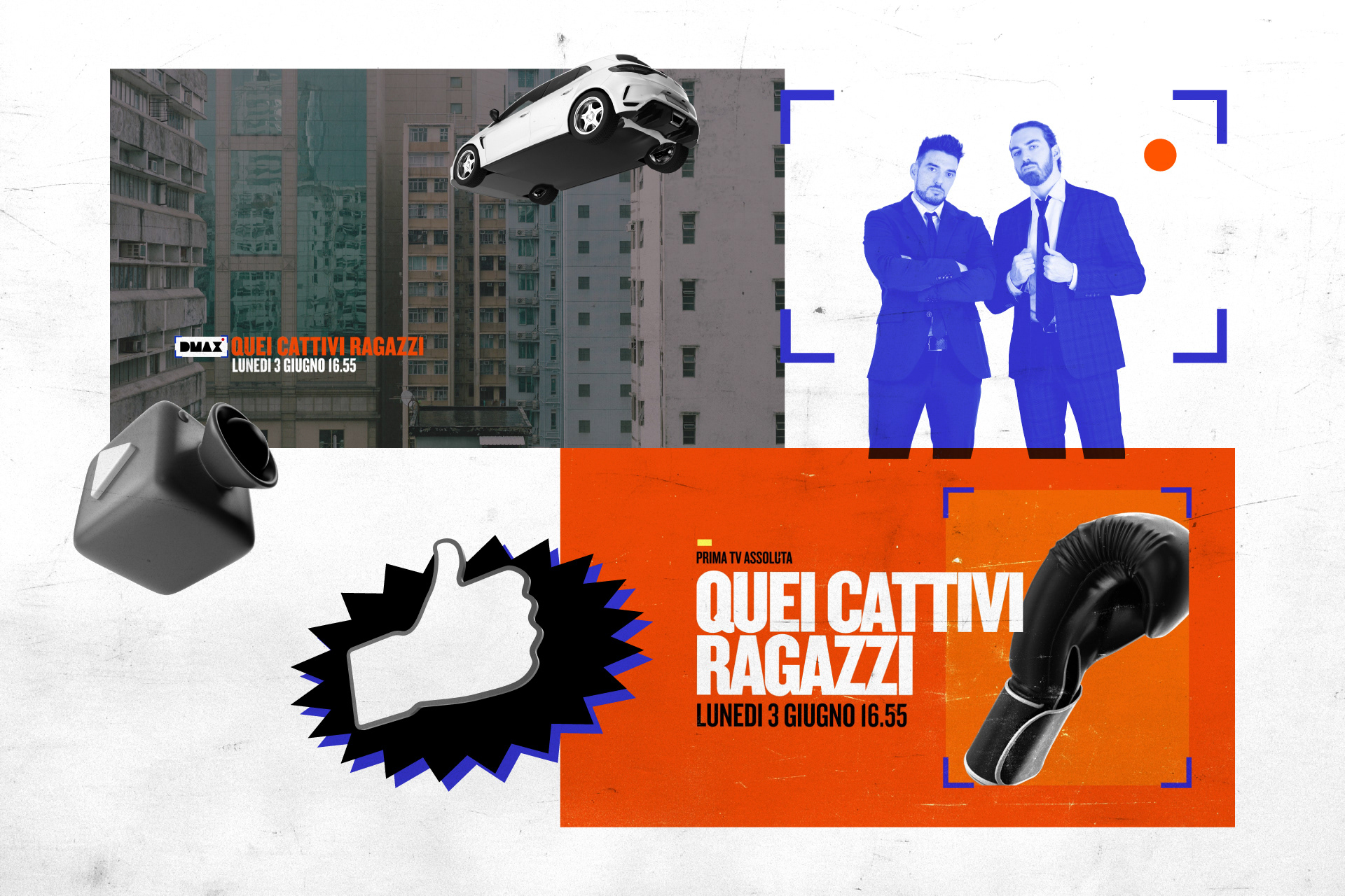
QUEI CATTIVI RAGAZZI
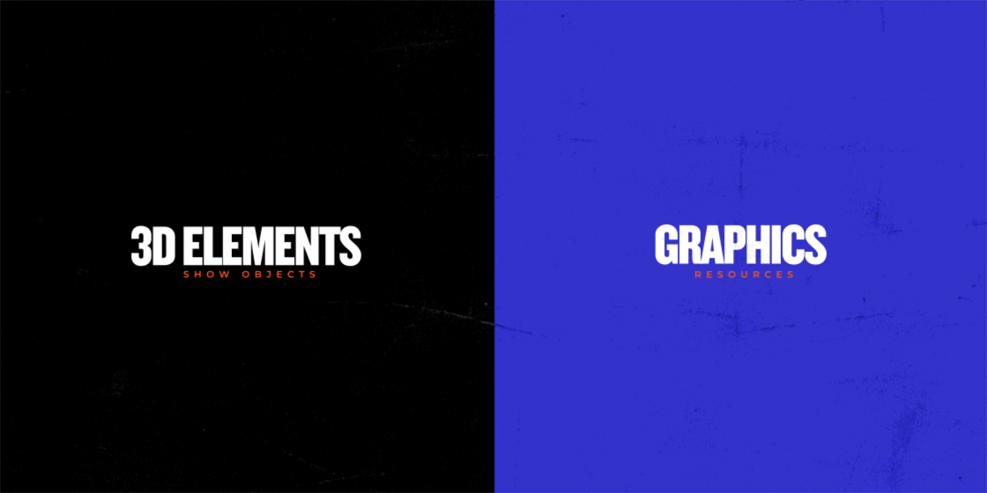
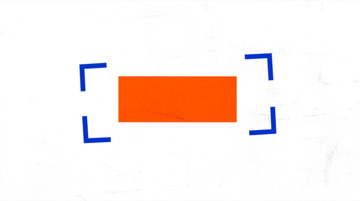
MOTION TOOLKIT
The client
DMAX Italia is a thematic network television, owned by Warner Bros. It is the first factual entertainment channel dedicated to the Italian male audience. They promise their audience to experience a number of extreme adventures from their sofa.
The challenge
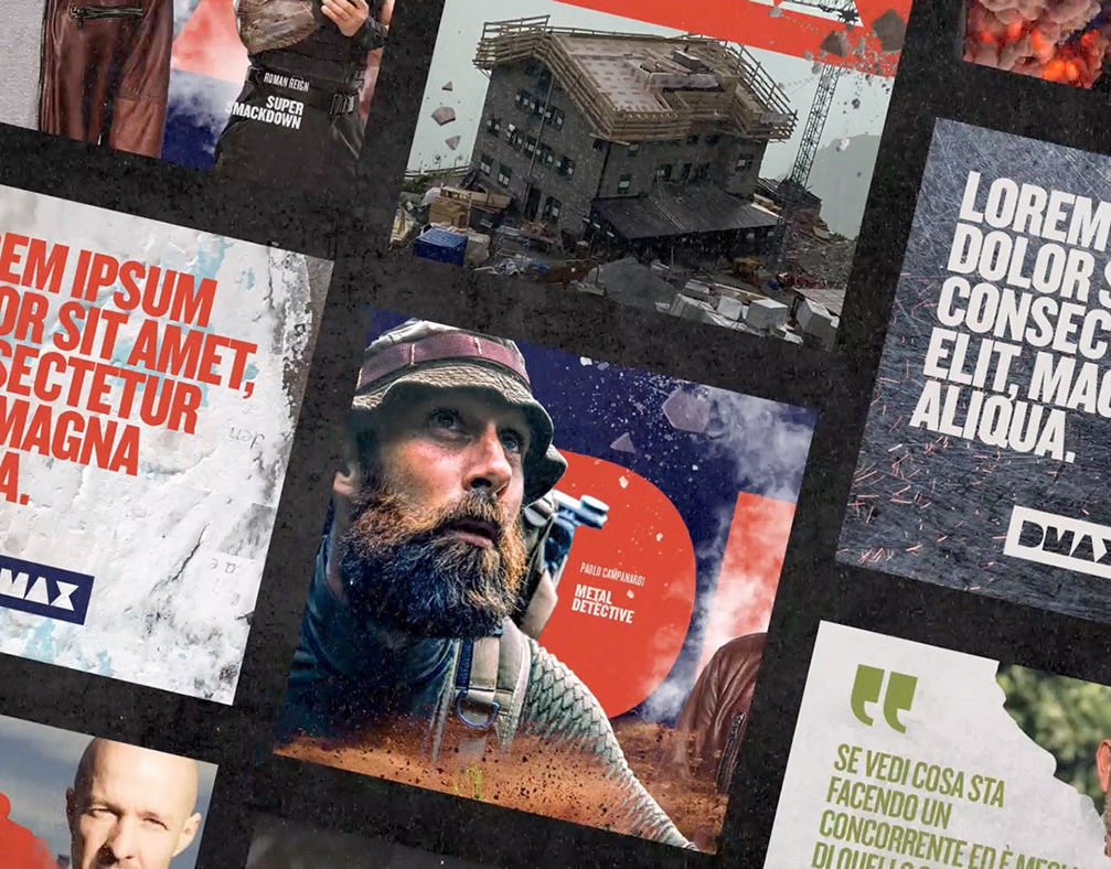
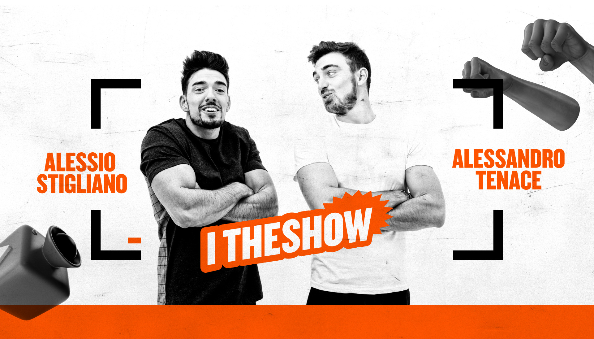
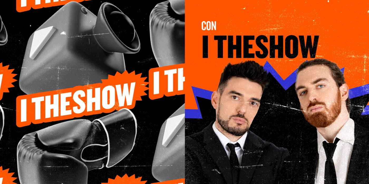
DMAX Italia asked Flopicco Studio to create a visual identity and a basic motion toolkit for their new show Quei Cattivi Ragazzi, an Italian television show in which Alessio Stigliano e Alessandro Tenace take us into the homes of Americans to comment on "bad neighbours" captured by security cameras and show us arguments and accidents that border on the ridiculous.
The Flopicco Studio Approach
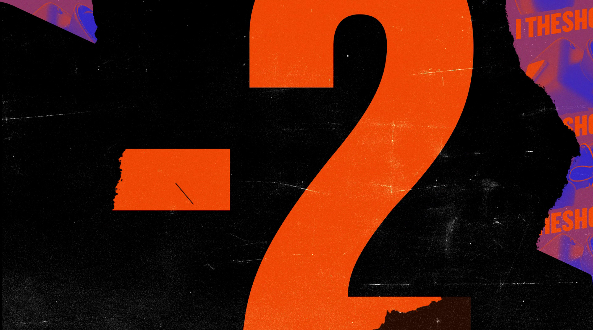
Anchored in the basic elements of DMAX (textures, colors, composition), we looked for a series of visual elements that would enhance the physical comedy nature of the show. We borrowed elements from the comic book world to create impact. Also, the color palette is reminiscent of good old graphic novels, but in vibrant RGB to make it look fresh and up-to-date.

El cliente
DMAX Italia es una red de televisión propiedad de Warner Bros. Es el primer canal de entretenimiento dedicado a la audiencia masculina italiana. Prometen a su audiencia vivir una serie de aventuras extremas desde su sofá.
El reto
DMAX Italia pidió a Flopicco Studio que creara una identidad visual y un conjunto de herramientas básicas de movimiento para su nuevo programa Quei Cattivi Ragazzi, un show en el que Alessio Stigliano y Alessandro Tenace nos llevan a las casas de los estadounidenses, para comentar a sus «malos vecinos» captados por cámaras de seguridad, y mostrarnos discusiones y accidentes que rozan el ridículo.
El enfoque de Flopicco Studio
Anclados en los elementos básicos del DMAX (texturas, colores, composición), buscamos una serie de elementos visuales que realzaran la naturaleza de comedia física del espectáculo. Tomamos prestados elementos del mundo del cómic para crear impacto. Además, la paleta de colores recuerda a las viejas novelas gráficas, pero en RGB vibrante para darle un aspecto fresco y actual.

CREDITS
CLIENT
Chiara Cerutti · DMAX
CREATIVE DIRECTION, ART DIRECTION
AND GRAPHIC PRODUCTION
Flopicco Studio
Inhouse Team
Florencia Picco, Fernando Vallejos, Natalia Bellagio, Alejandro Guatelli,
Emiliano Agnetti, Pablo Camino & Martín Polech.
🖤
#GoWithTheFlopicco