U N I T E D S T A T E S · F L O P I C C O S T U D I O + W A R N E R B R O S D I S C O V E R Y · 2 0 2 3
FROM CINEMAS TO MAX
STREAMING PROMO TOOLKIT
The Client
Max, previously HBO Max, is the streaming platform for everything HBO, including new Max Originals and TV content from the libraries Warner Bros., Discovery Channel, HBO, CNN, Cartoon Network, Adult Swim, Animal Planet, Eurosport and their related brands. It is owned by Warner Bros. Discovery Global Streaming & Interactive Entertainment, a Warner Bros.
The Challenge
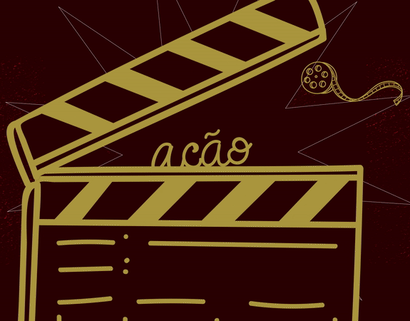
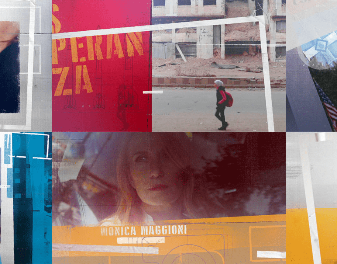
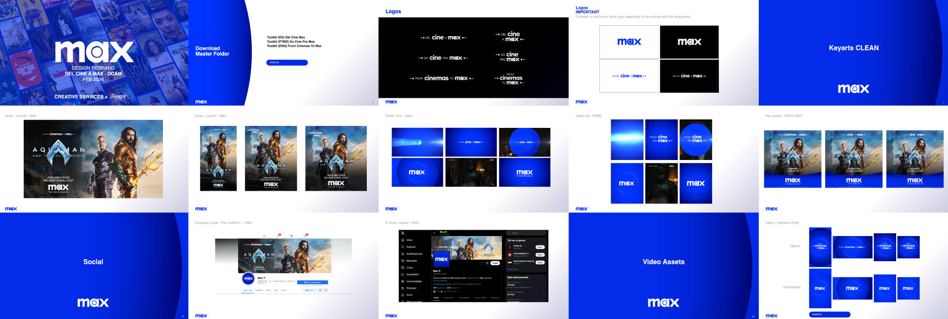
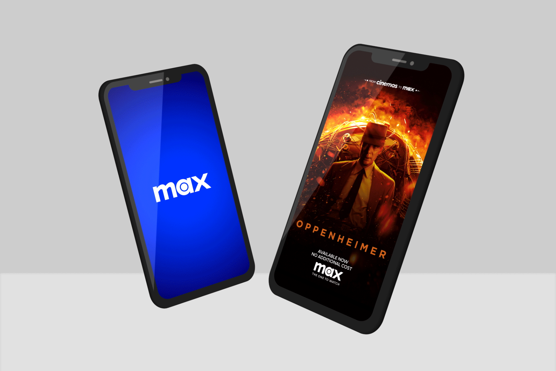
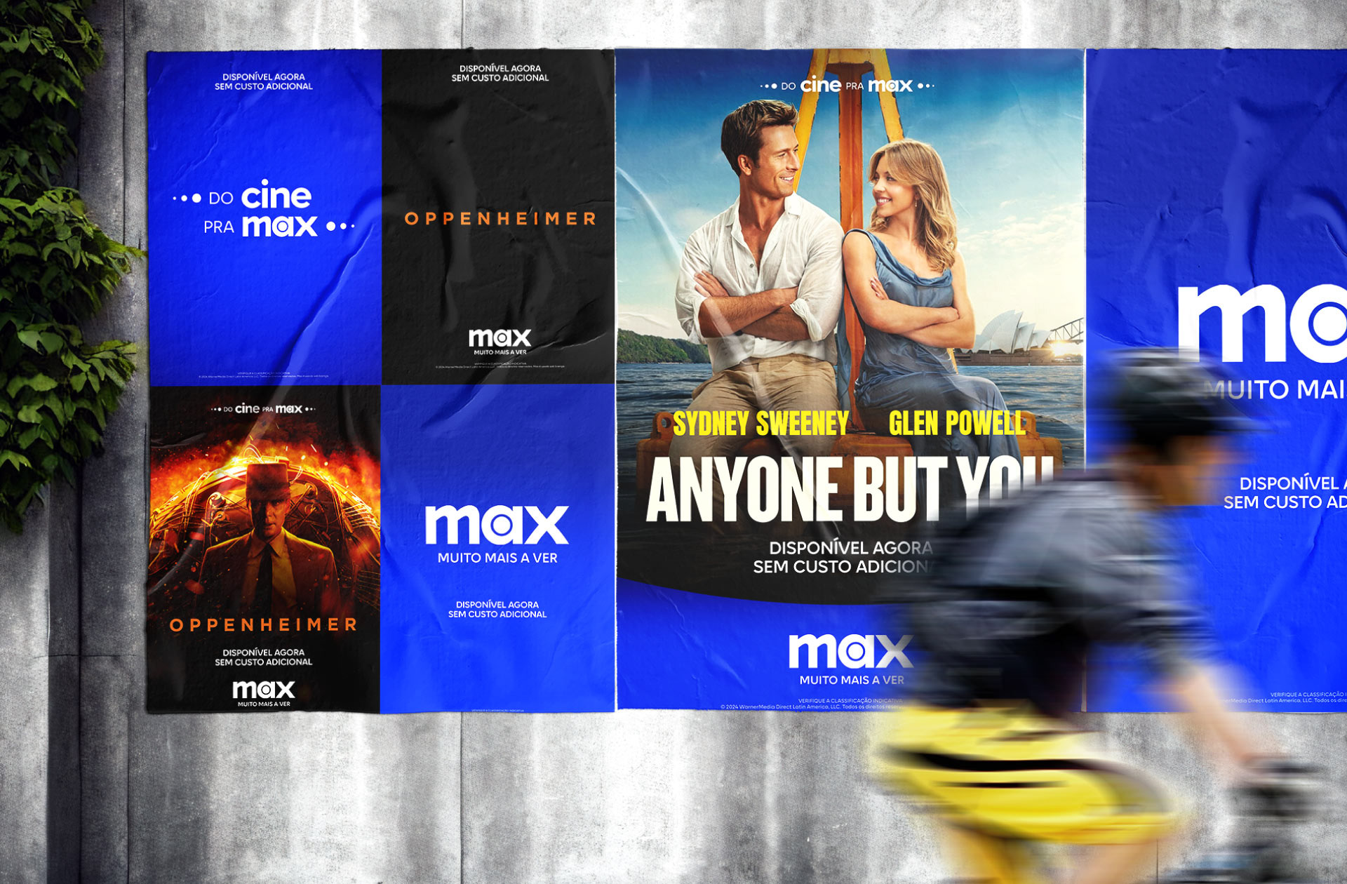
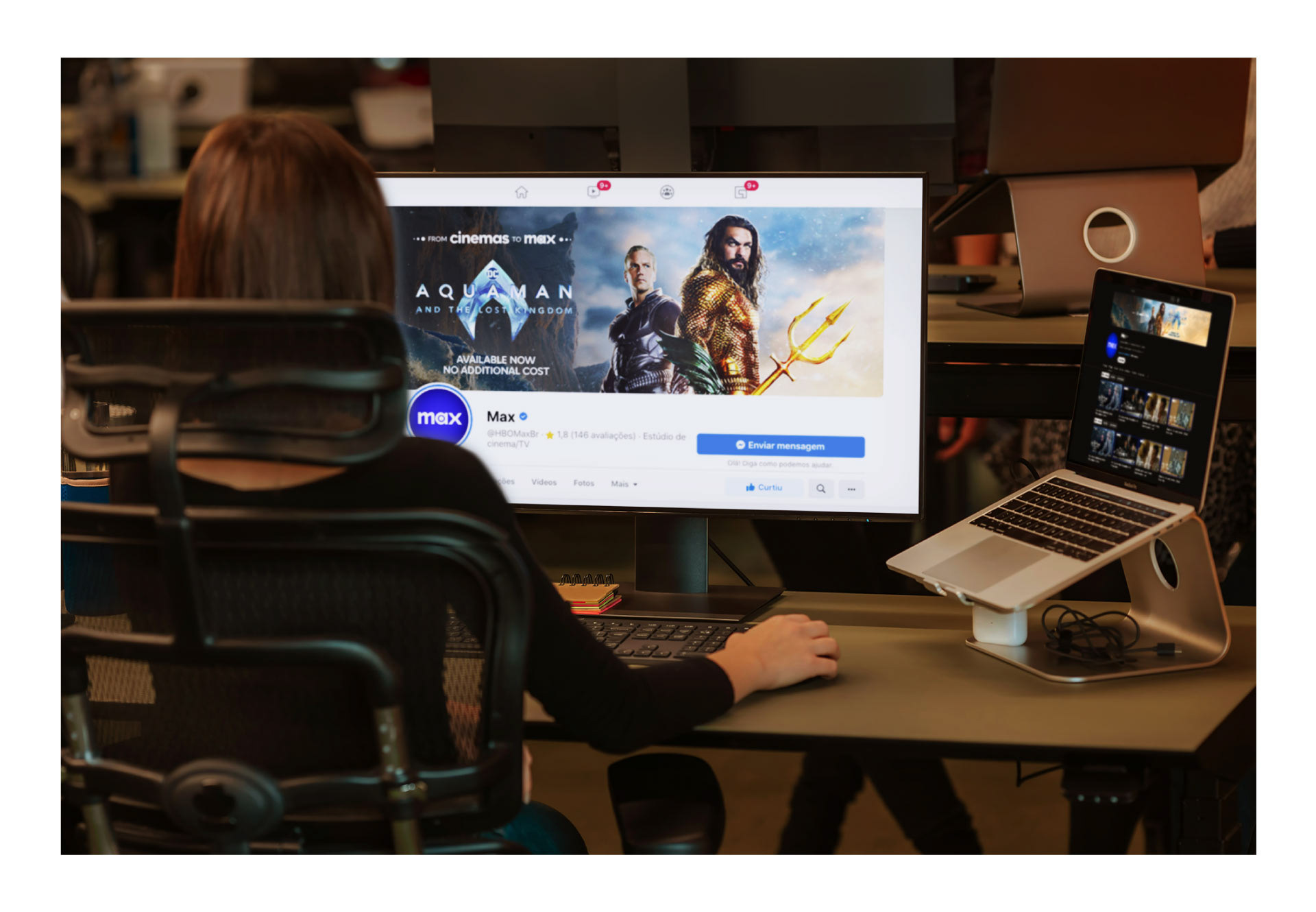
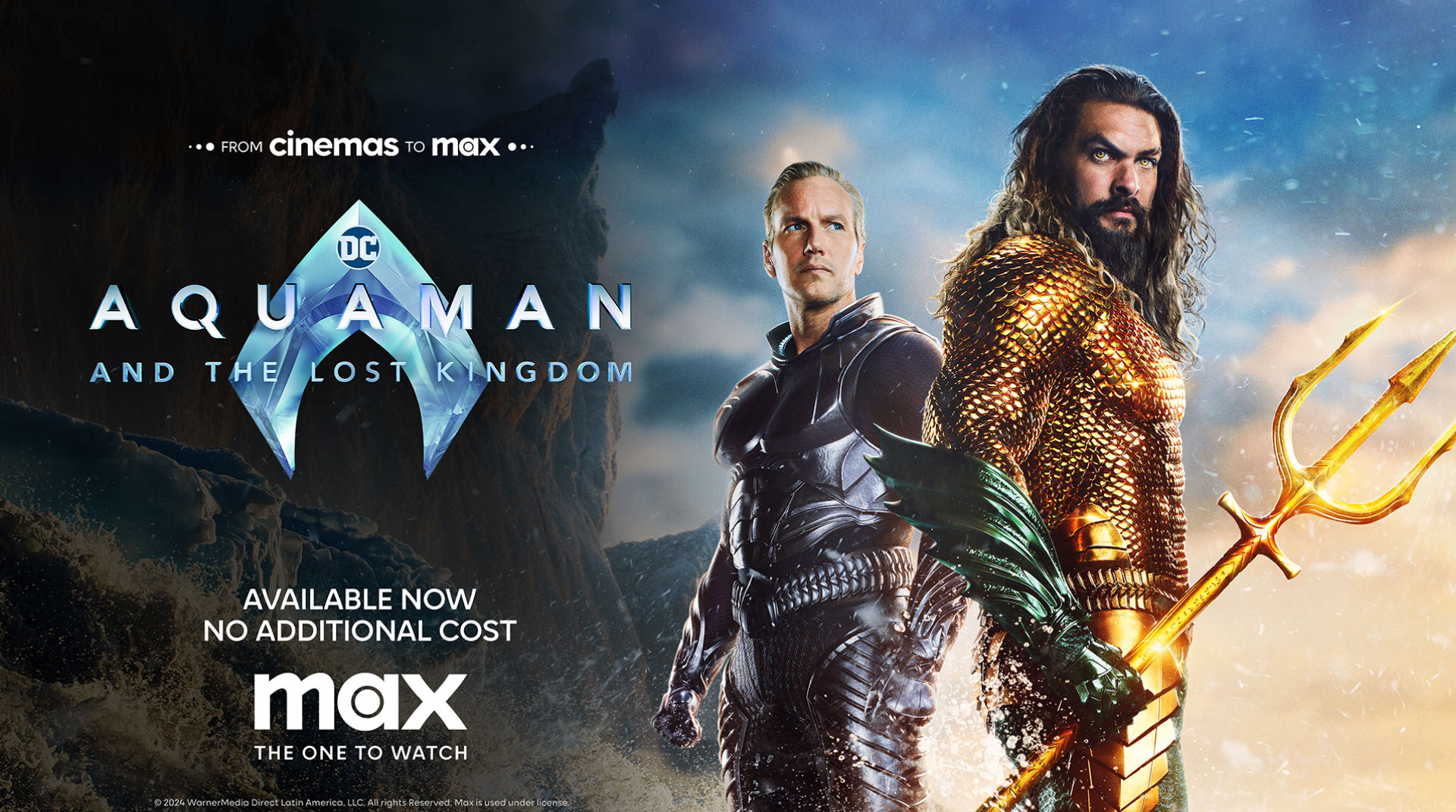
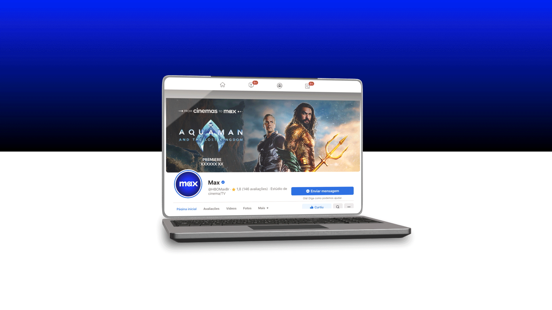
Max is the brand that brings together several entertainment titans: HBO, Warner Bros., Discovery, DC and Wizarding World. Its logo, which has gradually replaced HBO-Max in the different markets where the streaming platform is present, combines the HBO bull's-eye and the Warner Bros. curves in a modern yet timeless design, according to its creators. In the case of Latin America, for the big launch in March 2024, they needed to adapt their popular premiere series "From Cinemas to HBO-Max" to the new design system. That was our challenge.
The Flopicco Approach
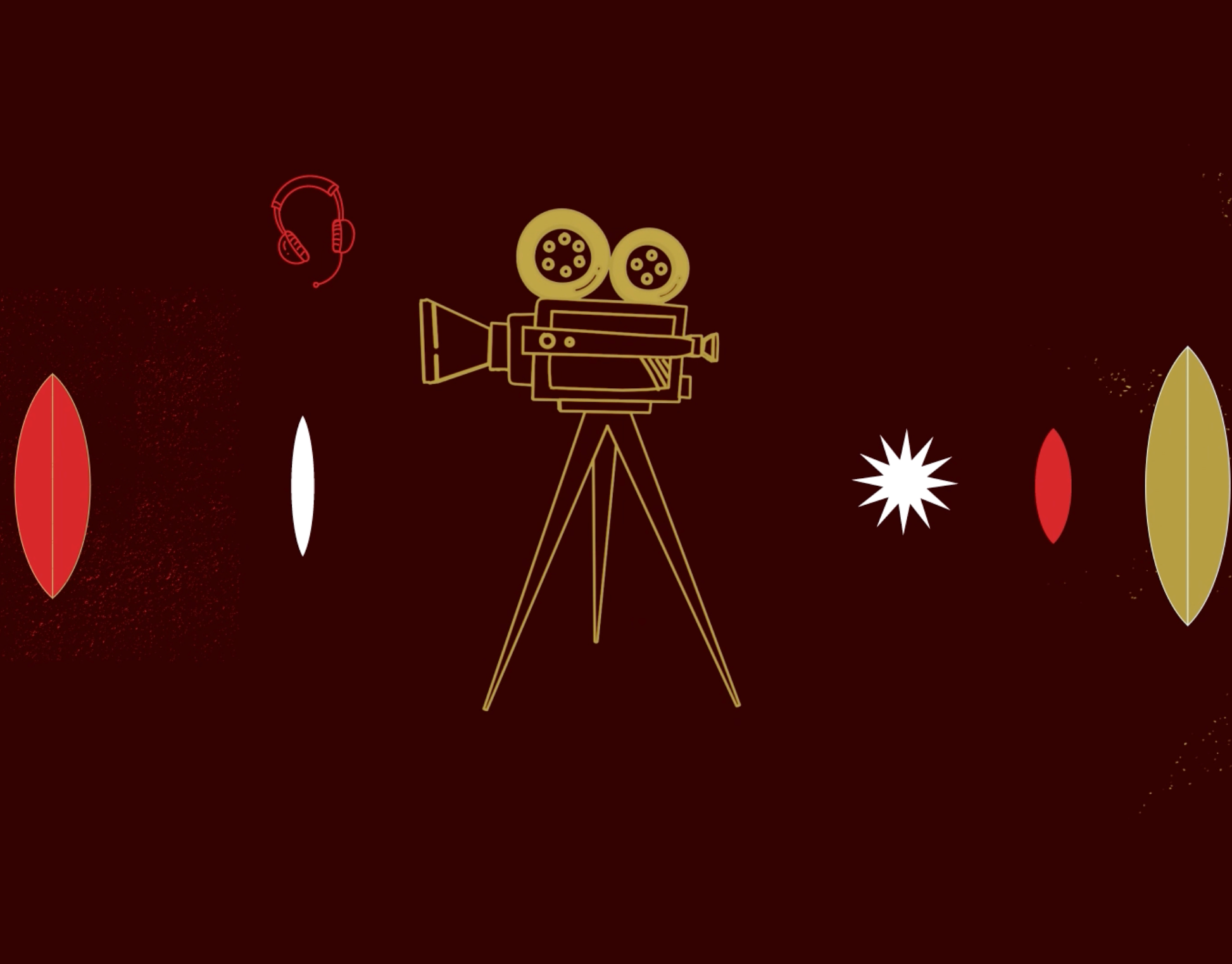
The logo "From Cinemas to Max" takes as its starting point and reference the Max bullseye. It generates a progression in its extremes, as well as the main shapes of the animated graphics. While respecting the basic system's logic, we also created new elements: Logos, animations and key art for on-air, off-air and digital use were included in our toolkit.


El cliente
Max, anteriormente HBO Max, es la plataforma de streaming para todo lo relacionado con HBO, incluidos los nuevos Max Originals y los contenidos televisivos de las bibliotecas Warner Bros., Discovery Channel, HBO, CNN, Cartoon Network, Adult Swim, Animal Planet, Eurosport y sus marcas relacionadas. Es propiedad de Warner Bros. Discovery Global Streaming & Interactive Entertainment, una filial de Warner Bros.
Max, anteriormente HBO Max, es la plataforma de streaming para todo lo relacionado con HBO, incluidos los nuevos Max Originals y los contenidos televisivos de las bibliotecas Warner Bros., Discovery Channel, HBO, CNN, Cartoon Network, Adult Swim, Animal Planet, Eurosport y sus marcas relacionadas. Es propiedad de Warner Bros. Discovery Global Streaming & Interactive Entertainment, una filial de Warner Bros.
El reto
Max es la marca que reúne a varios titanes del entretenimiento: HBO, Warner Bros., Discovery, DC y Wizarding World. Su logotipo, que ha ido sustituyendo a HBO-Max en los diferentes mercados en los que la plataforma de streaming está presente, combina la diana de HBO y las curvas de Warner Bros. en un diseño moderno pero atemporal, según sus creadores. En el caso de Latinoamérica, para el gran lanzamiento de marzo de 2024, necesitaban adaptar su popular serie de estreno "Del cine a HBO-Max" al nuevo sistema de diseño. Ese era nuestro reto.
Max es la marca que reúne a varios titanes del entretenimiento: HBO, Warner Bros., Discovery, DC y Wizarding World. Su logotipo, que ha ido sustituyendo a HBO-Max en los diferentes mercados en los que la plataforma de streaming está presente, combina la diana de HBO y las curvas de Warner Bros. en un diseño moderno pero atemporal, según sus creadores. En el caso de Latinoamérica, para el gran lanzamiento de marzo de 2024, necesitaban adaptar su popular serie de estreno "Del cine a HBO-Max" al nuevo sistema de diseño. Ese era nuestro reto.
El enfoque de Flopicco
El logotipo "Del cine a Max" toma como punto de partida y referencia la diana de Max. Genera una progresión en sus extremos, así como en las formas principales de los gráficos animados. Respetando la lógica básica del sistema, también creamos nuevos elementos: Logos, animaciones y key art para uso on-air, off-air y digital.
El logotipo "Del cine a Max" toma como punto de partida y referencia la diana de Max. Genera una progresión en sus extremos, así como en las formas principales de los gráficos animados. Respetando la lógica básica del sistema, también creamos nuevos elementos: Logos, animaciones y key art para uso on-air, off-air y digital.


CREDITS
CLIENT
Warner Bros. Discovery
CREATIVE DIRECTION, ART DIRECTION
AND GRAPHIC PRODUCTION
Flopicco Studio
Inhouse Team
Florencia Picco, Fernando Vallejos, Natalia Bellagio,
Alejandro Guatelli, Emiliano Agnetti, Pablo Camino and Martín Polech.
🖤