I T A L Y & S P A I N · D M A X + F L O P I C C O · 2 0 1 6
DMAX REBRAND 2016
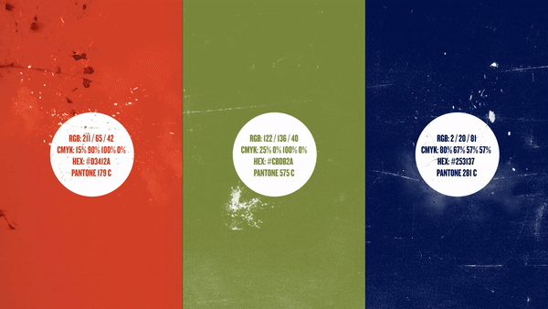
BRAND IDENTITY
The DMAX thematic channel, operated by Discovery Networks, is present in Italian and Spanish territories.
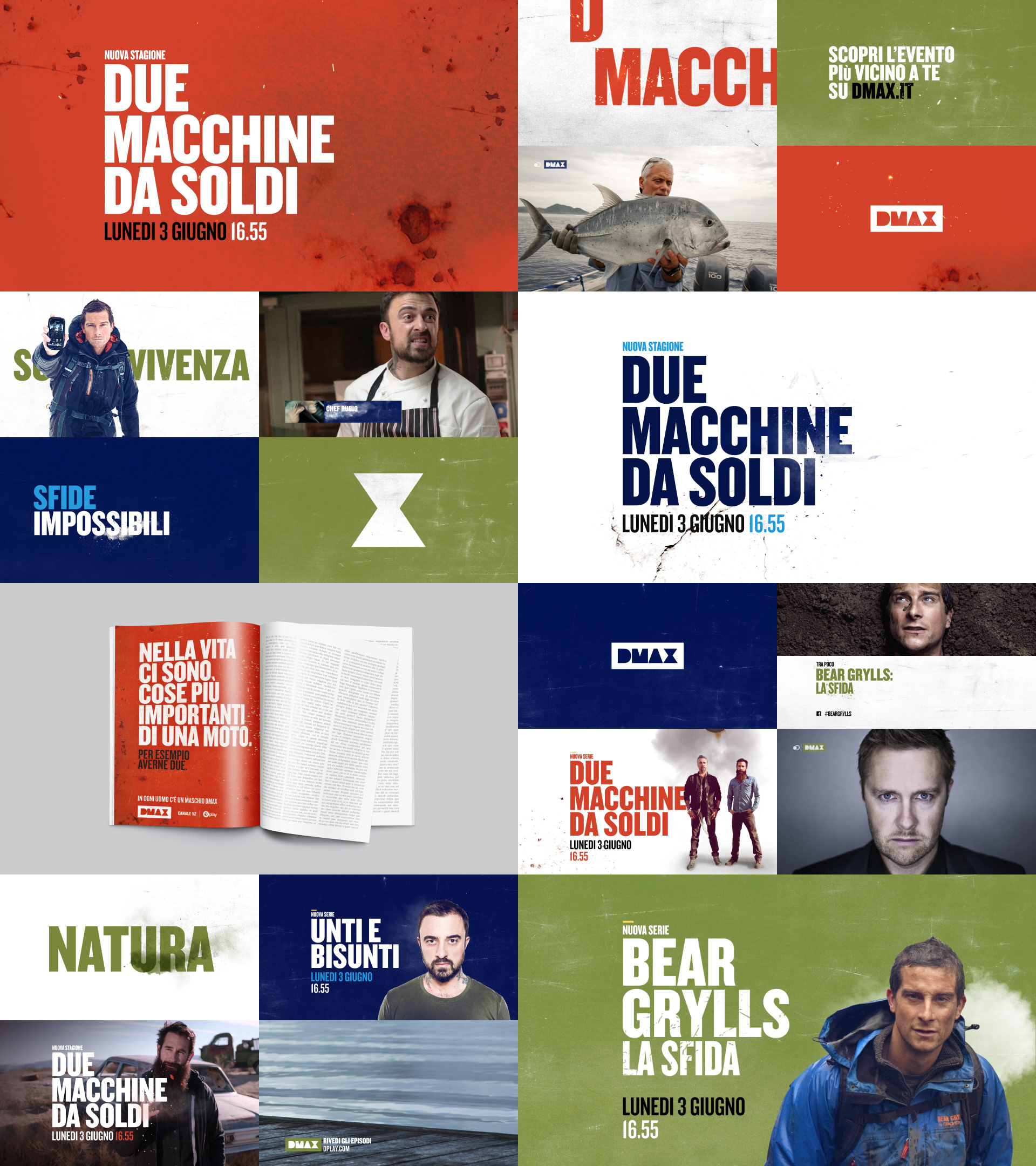
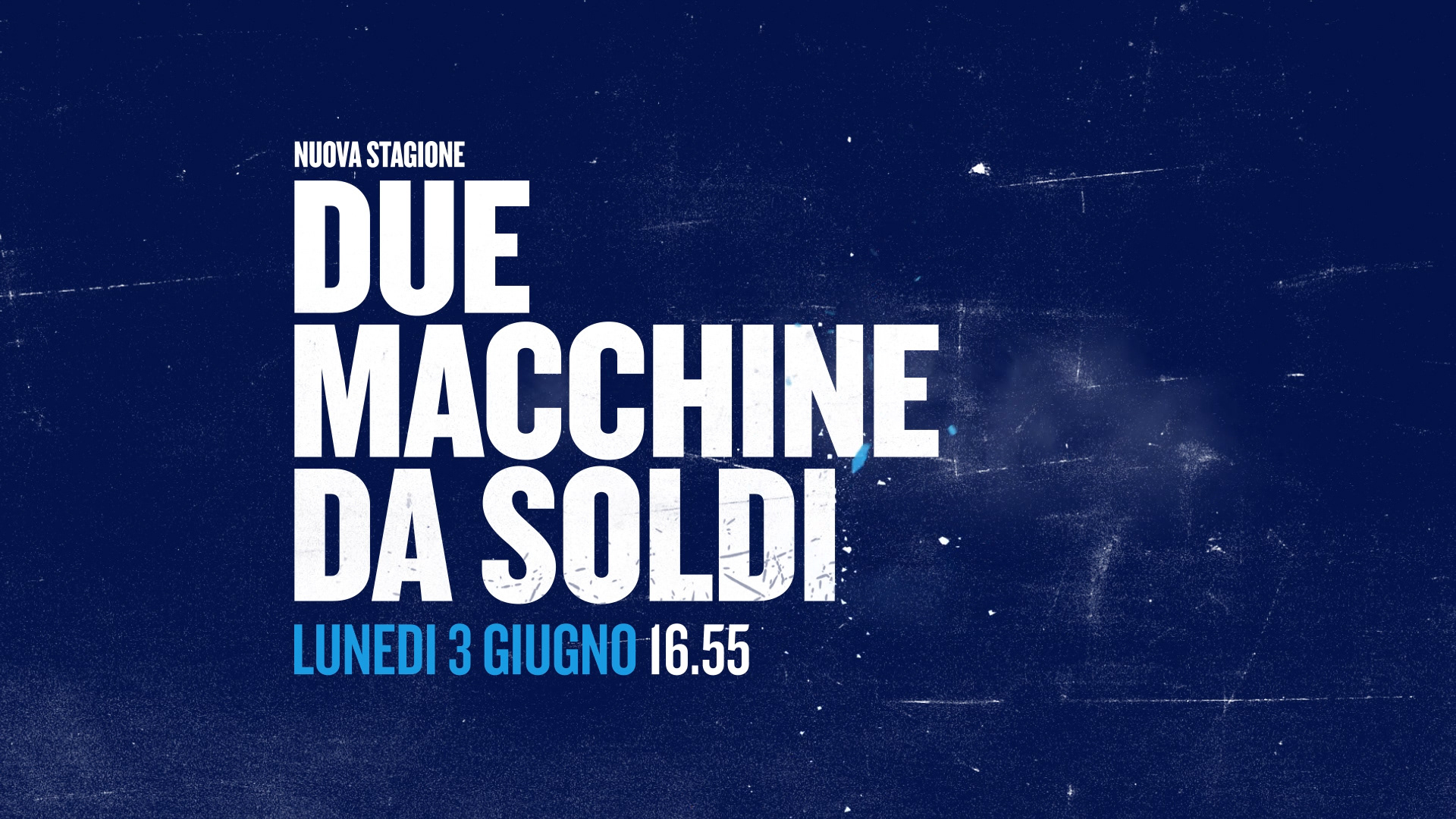
For the 2015-2016 season, the client asked us to refresh all elements of the channel, including continuity pieces and promotional package.
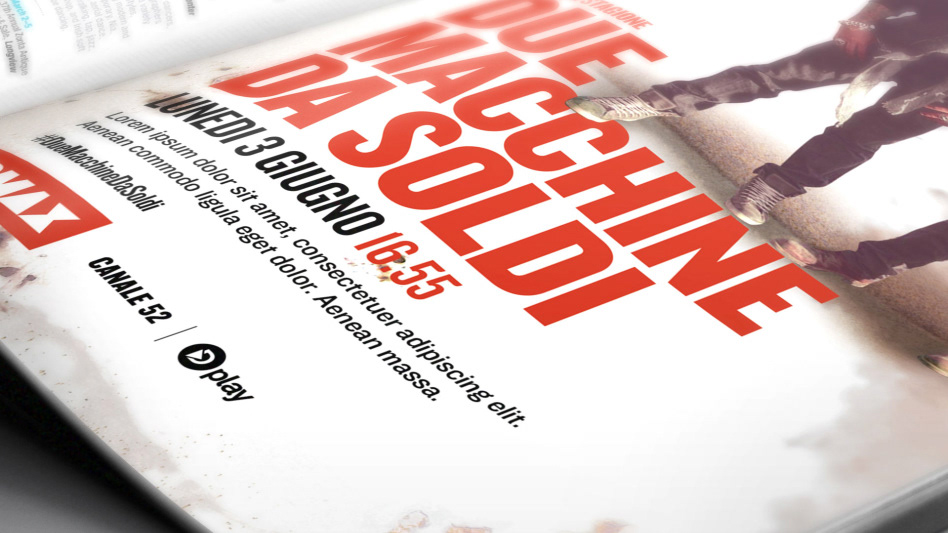
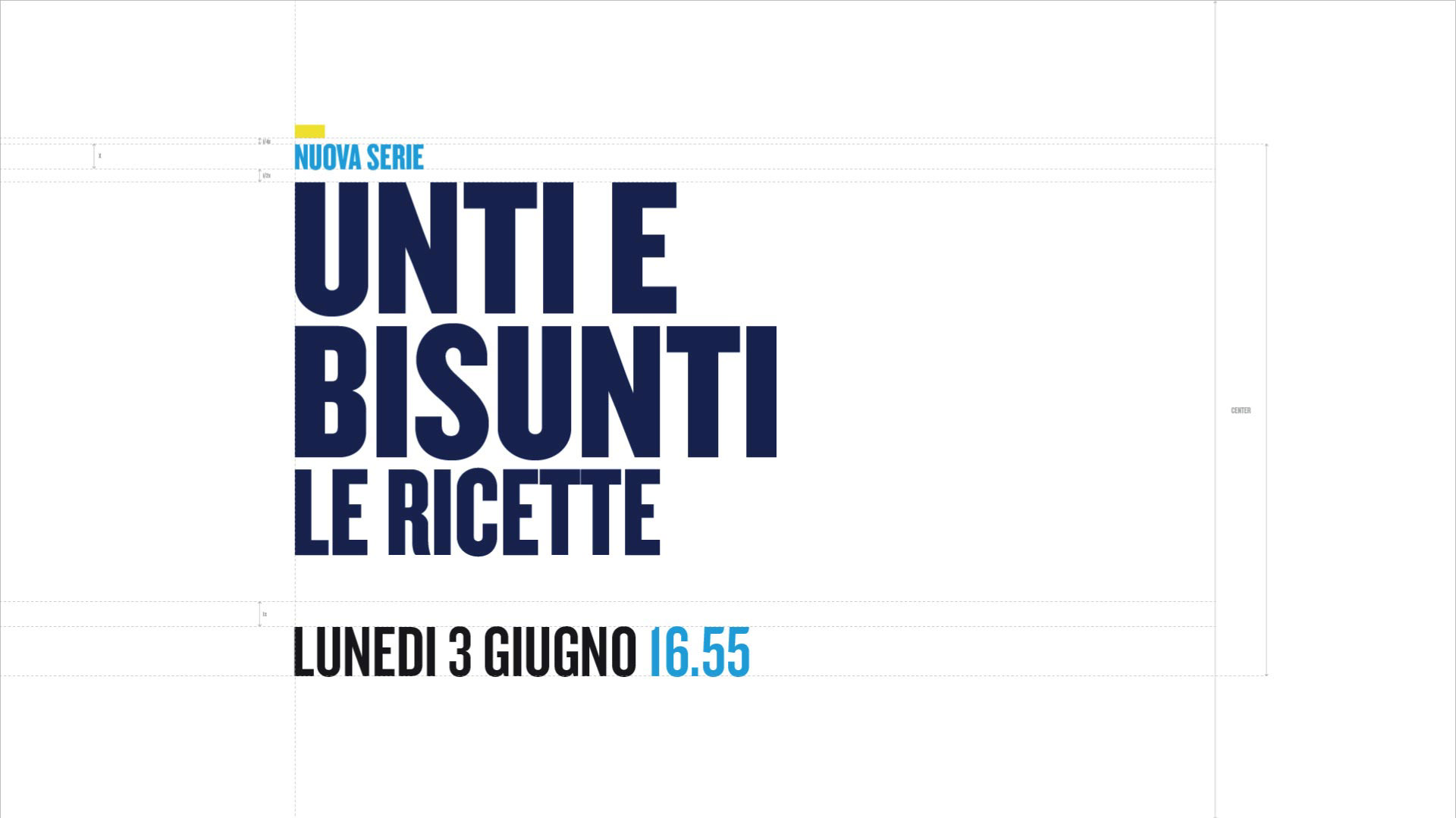
The main objective is to convey the fundamentally playful masculine nature of the channel, graphically representing the main pillars of programming, oriented at light entertainment and always putting “manly” DMAX at the forefront.
Our DMAX man was definitely dynamic. Since as long as he can remember he’s been moving around. He’s not afraid of change, of experimenting, of building, making and specially... breaking things! That’s what it makes him feel alive.
In the image the notion of movement is characterised with visual allusions to actions that the maschio DMAX typically enjoys. Welding, building, painting, waxing-on, and waxing-off (!)
Nothing is static, everything responds to a clear principle of action and reaction. It’s dynamic, but not only that, it is also logical as the main concern of the DMAX man, his desire to explore and to be in constant motion comes from the intellect, from the reason.
One of the things that we like best about DMAX is how versatile it can be. Some would say is weird, we just say is unpredictable, contradictory, sometimes irreverent, definitely smart... all in all, nothing makes the channel more human and down to earth that this unconventionality.
From really complex contents treated with simplicity, to really unpretentious disaster movies produced with high standards. From a delicate and advanced model aircraft, a modern compass or a Swiss army knife to a little yellow rubber duck or a dart game. In our whimsicality we want it all... and have it all.


CREDITS
Client
Chiara Cerutti, Discovery Italia
Chiara Cerutti, Discovery Italia
Creative Direction, Art Direction and Graphic Production
Flopicco
Flopicco
Inhouse team
Florencia Picco, Romina Giarrizzo, Marco Salemi, Lorena Ruiz
Florencia Picco, Romina Giarrizzo, Marco Salemi, Lorena Ruiz
With collaboration of
Inland
Inland
*
Thanks for watching!