I T A L Y · F L O P I C C O S T U D I O + R A I · 2 0 1 7
RAI REBRAND 2017
RAI, short for Radiotelevisione Italiana, is the national public broadcasting company of Italy since 1924 (!) and it is a massive enterprise that includes 13 channels and that as every public broadcaster, visualise television as a public service that not only aims to entertain but also holds the responsibility of informing and educating.
Working on this project was an honour and one of the highlights of our 2016.
What did you have to do?
Everything!
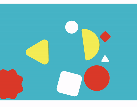
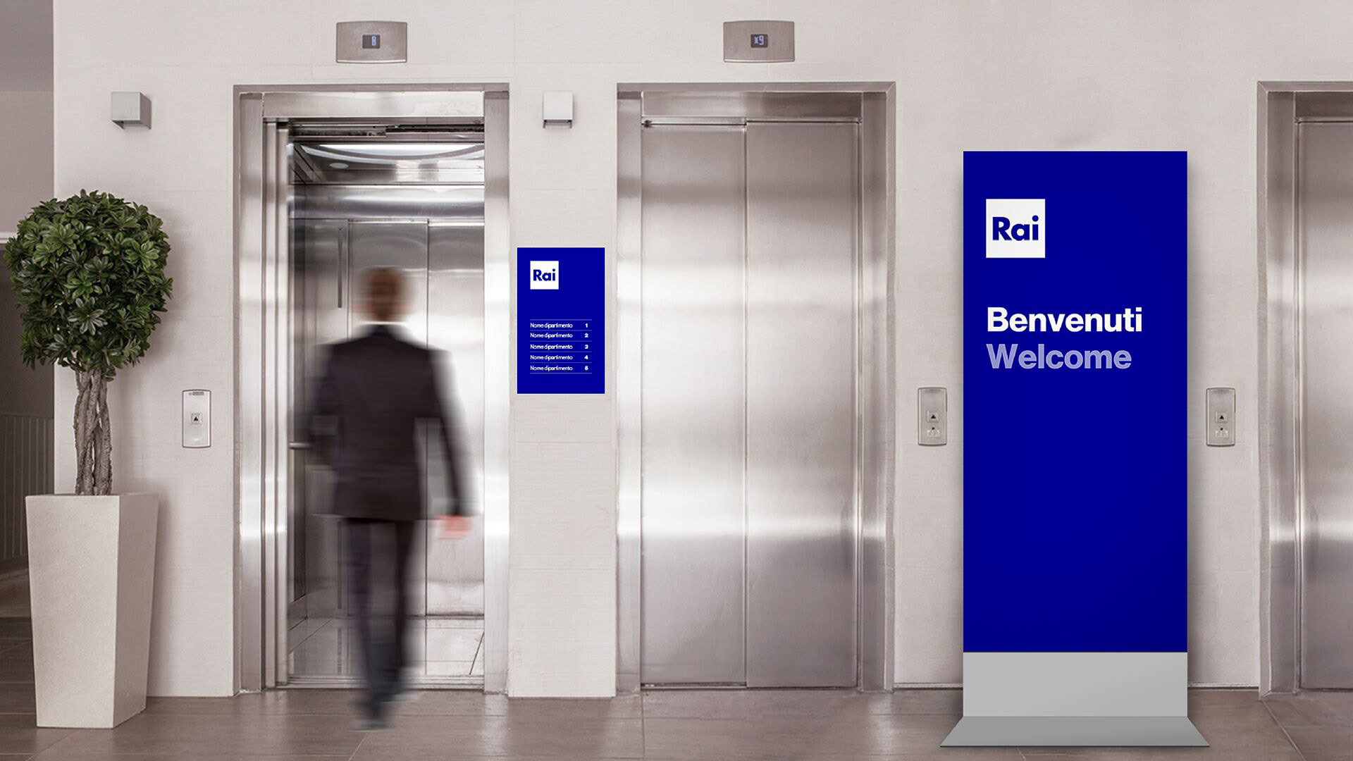
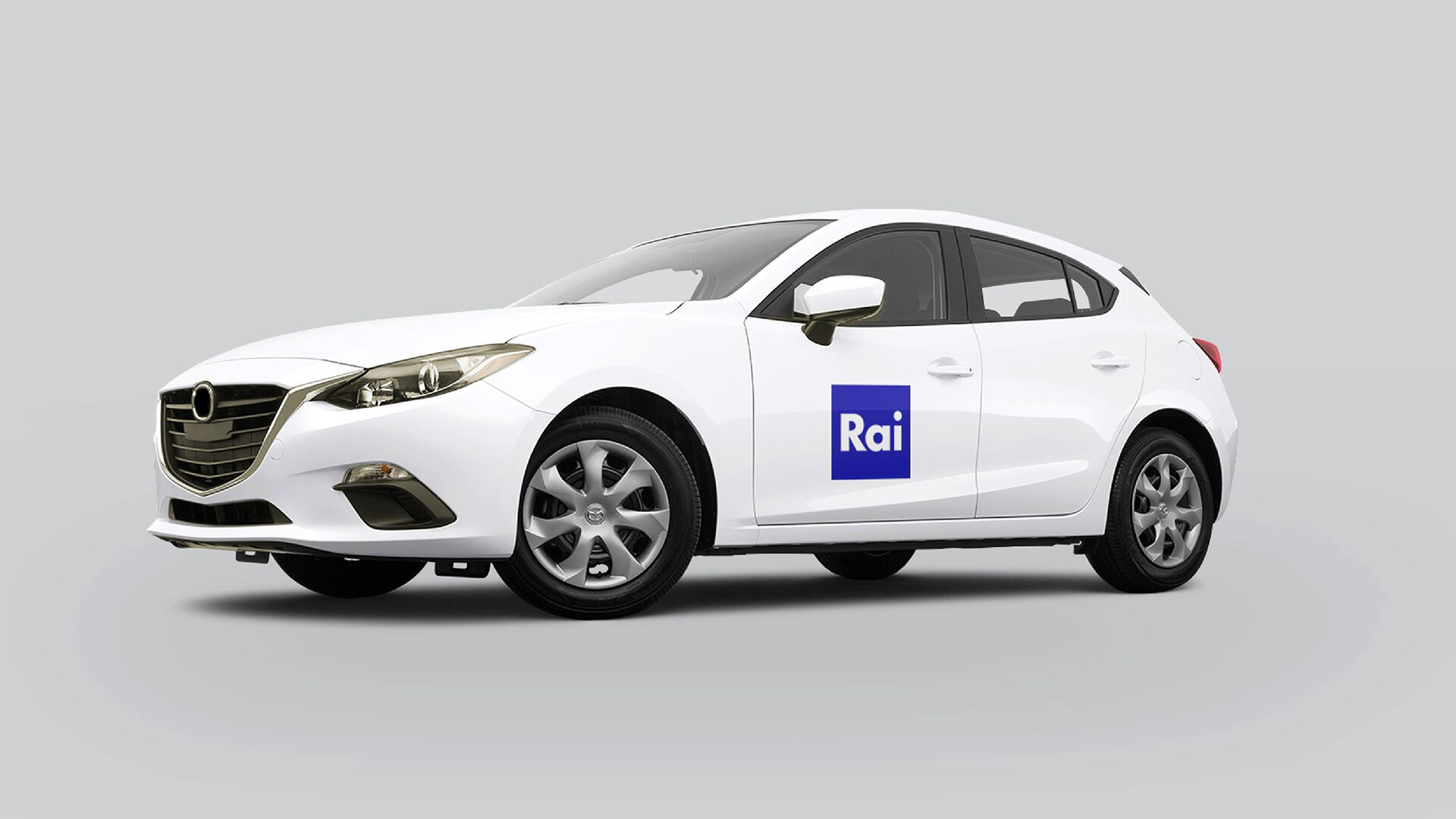
We were commissioned to redesign RAI's brand identity, both on and off-air, and the brand architecture of all its business units, from network logos to corporate design. The goal was to modernise the network’s image, making it flexible and fresh, while keeping the essence of its very recognisable and solid identity.
How did we do it?
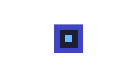
We went back to square one.

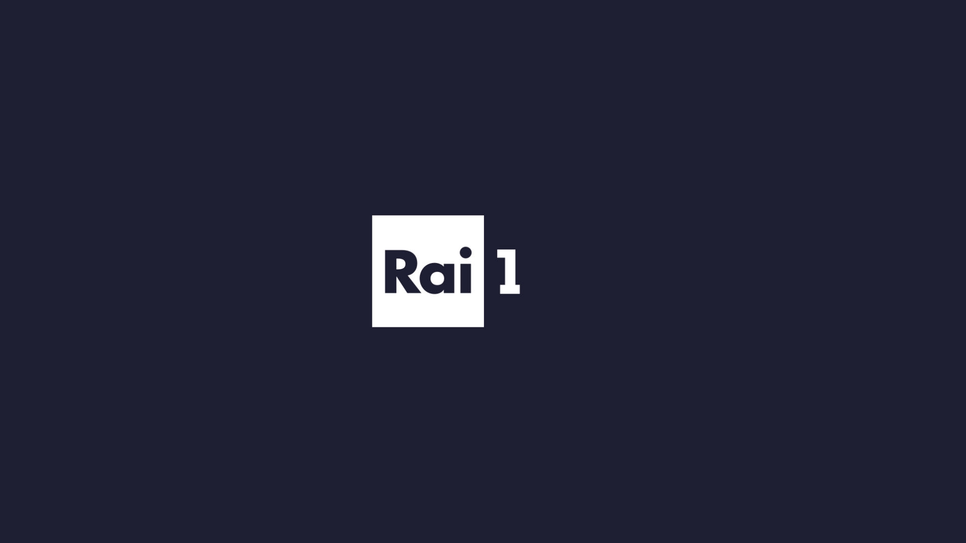
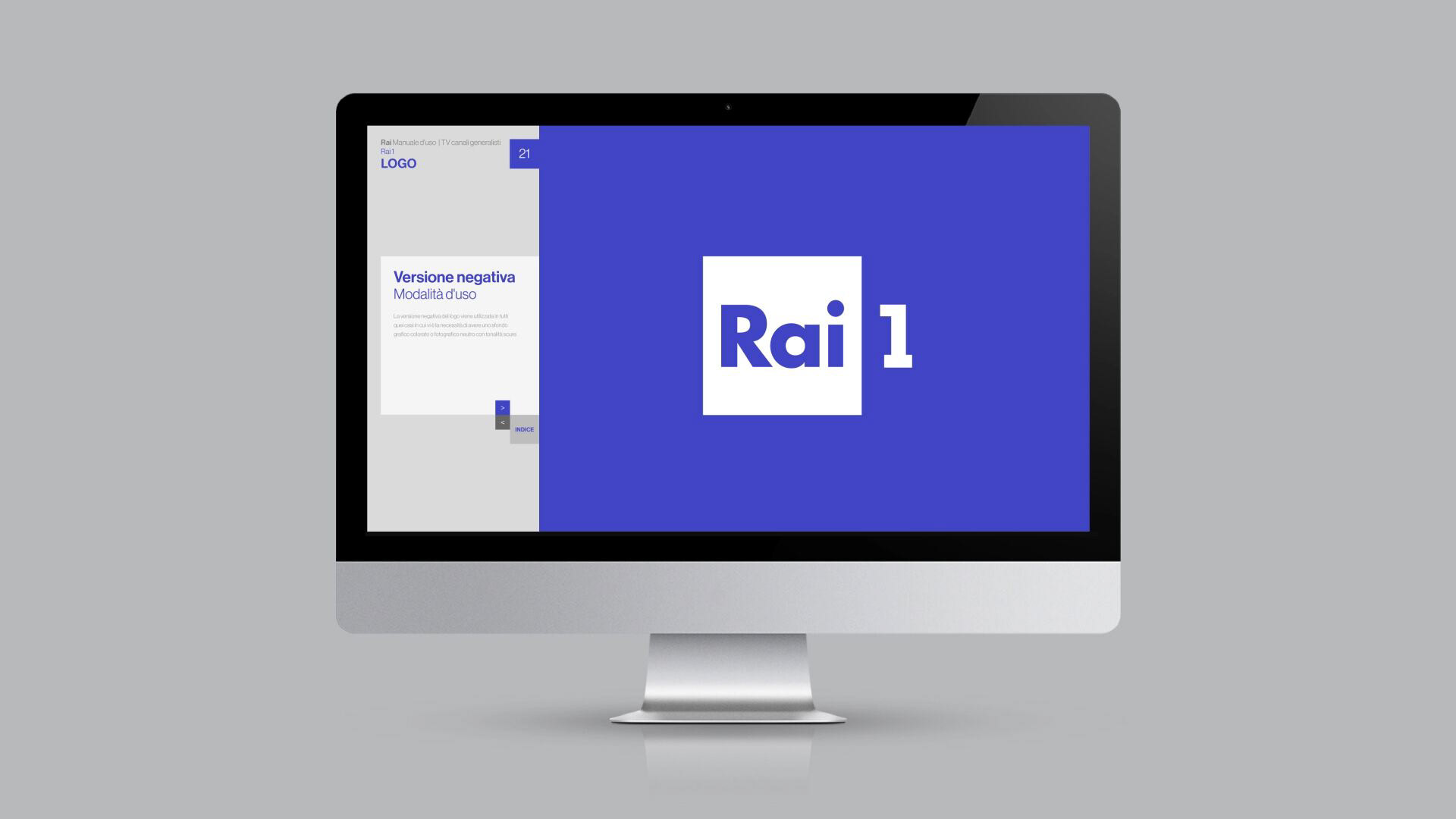
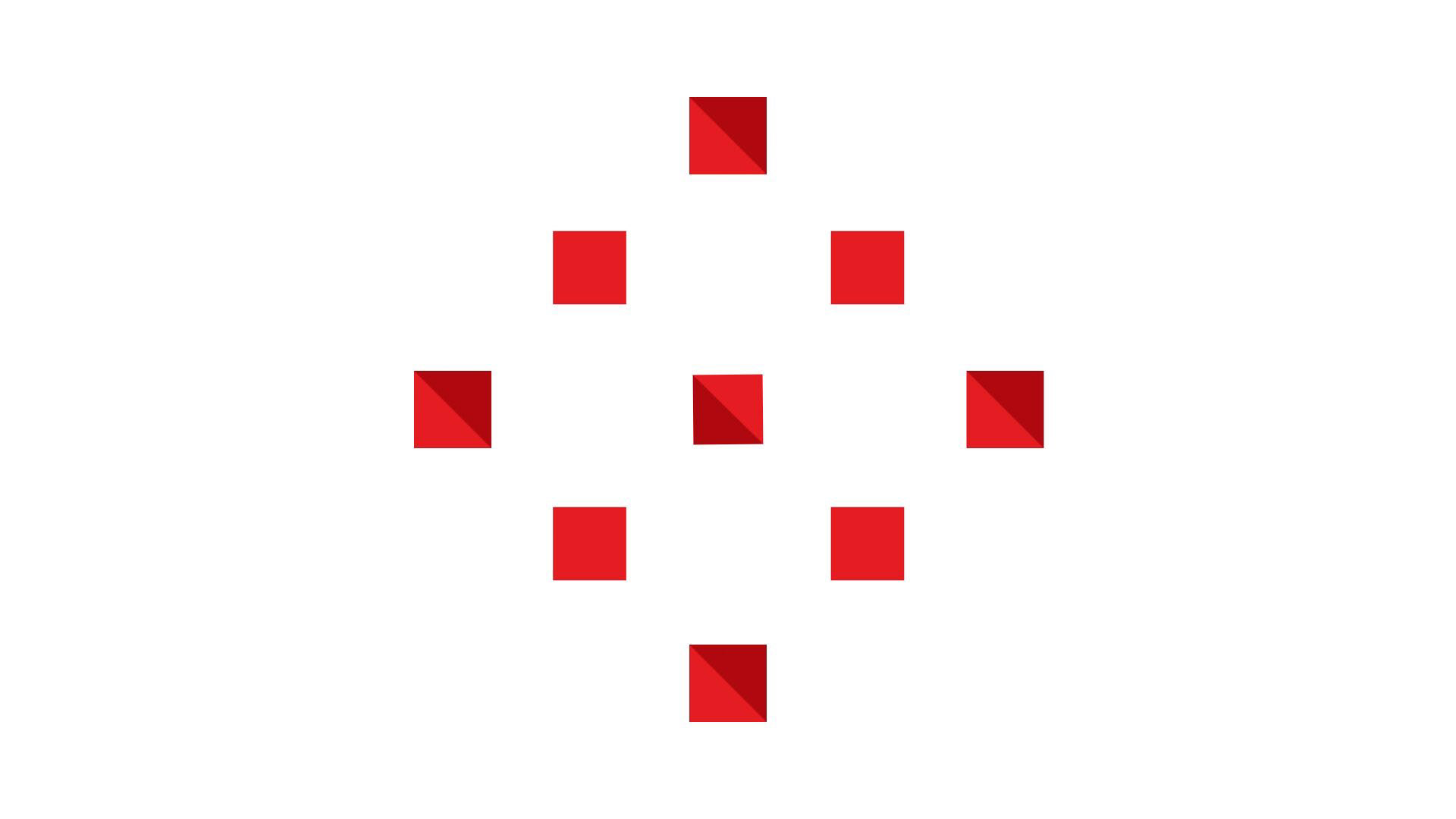
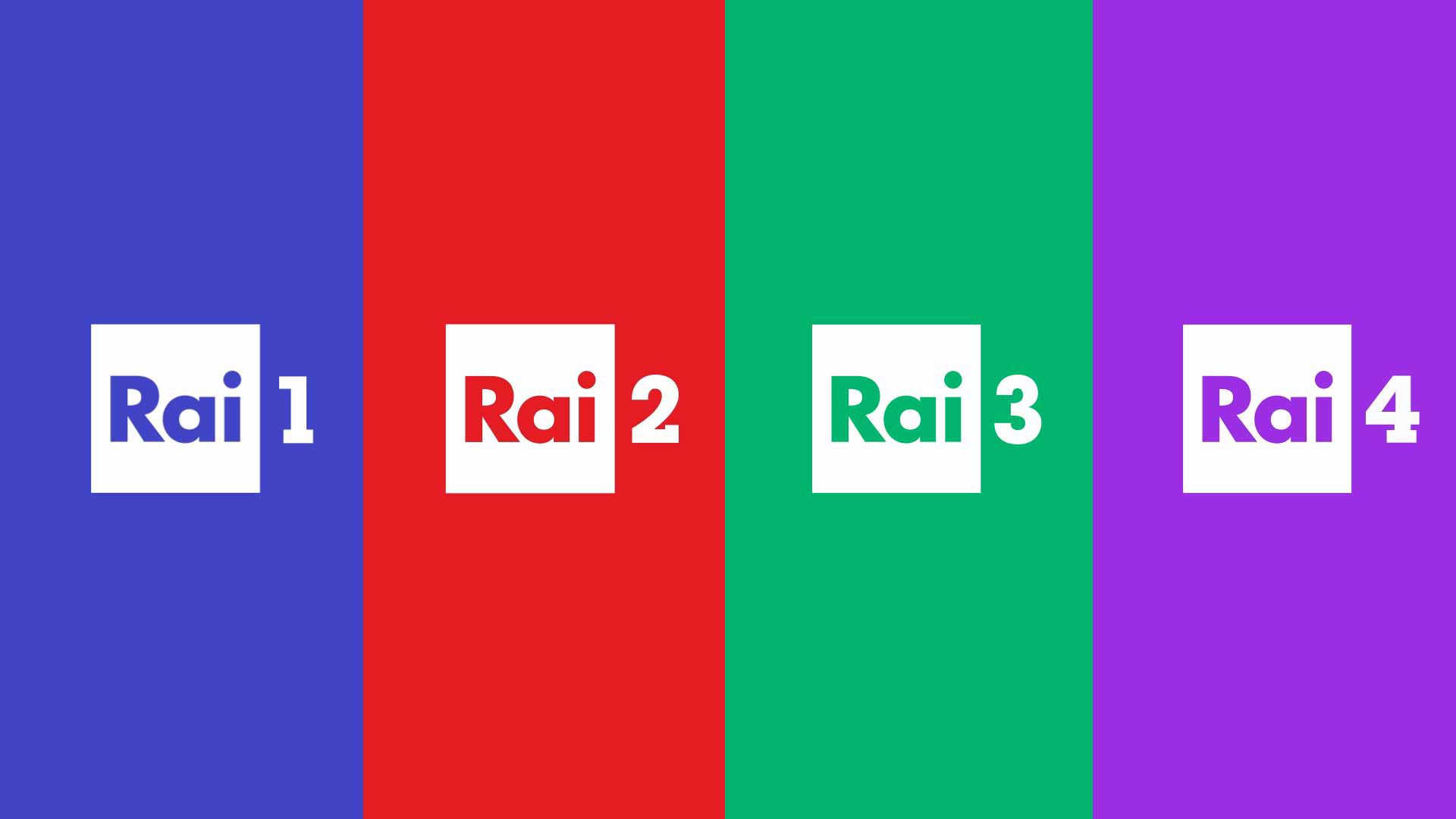
Rai 1
Rai 1 is the beginning of the story and the center of it all as it is the most watched TV channel in Italy.
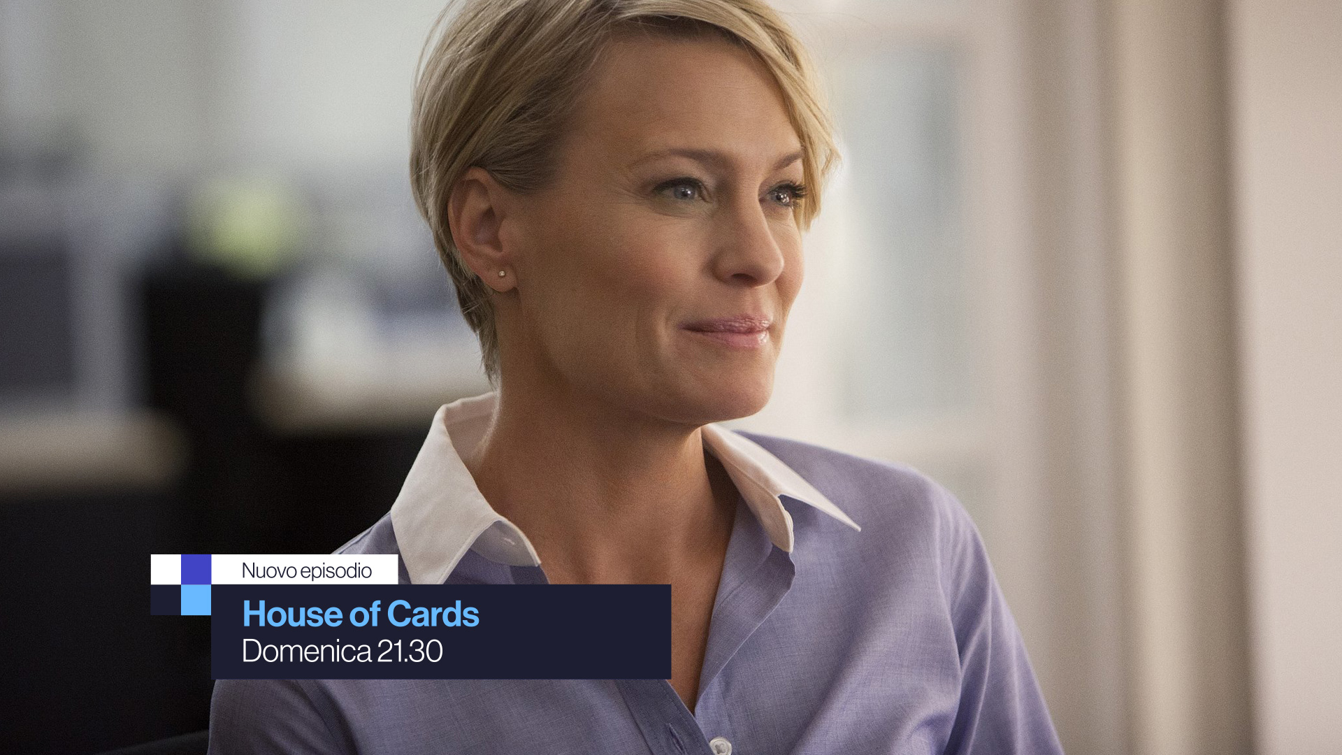
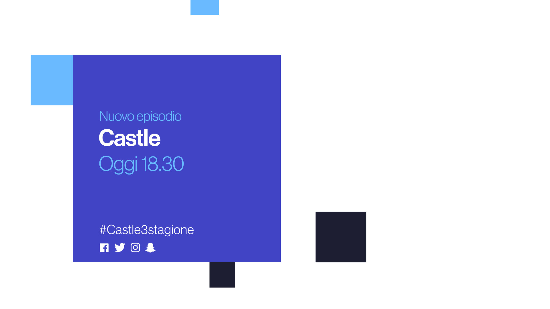
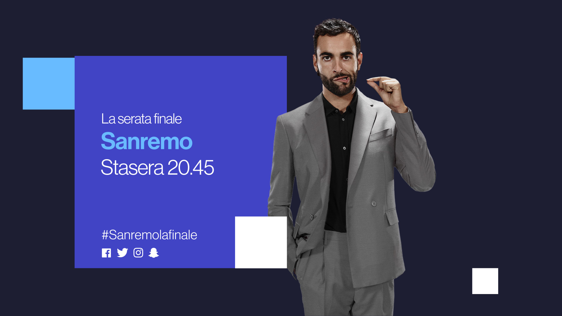
Rai 1 airs a wide mix of shows for a very general audience, from daily news to live sports, movie premieres and soap operas. Aiming for this varied audience we opted for simplicity and straight-forwardness and we decided to keep the animation bidirectional, here our square always moves along the vertical or horizontal axis.
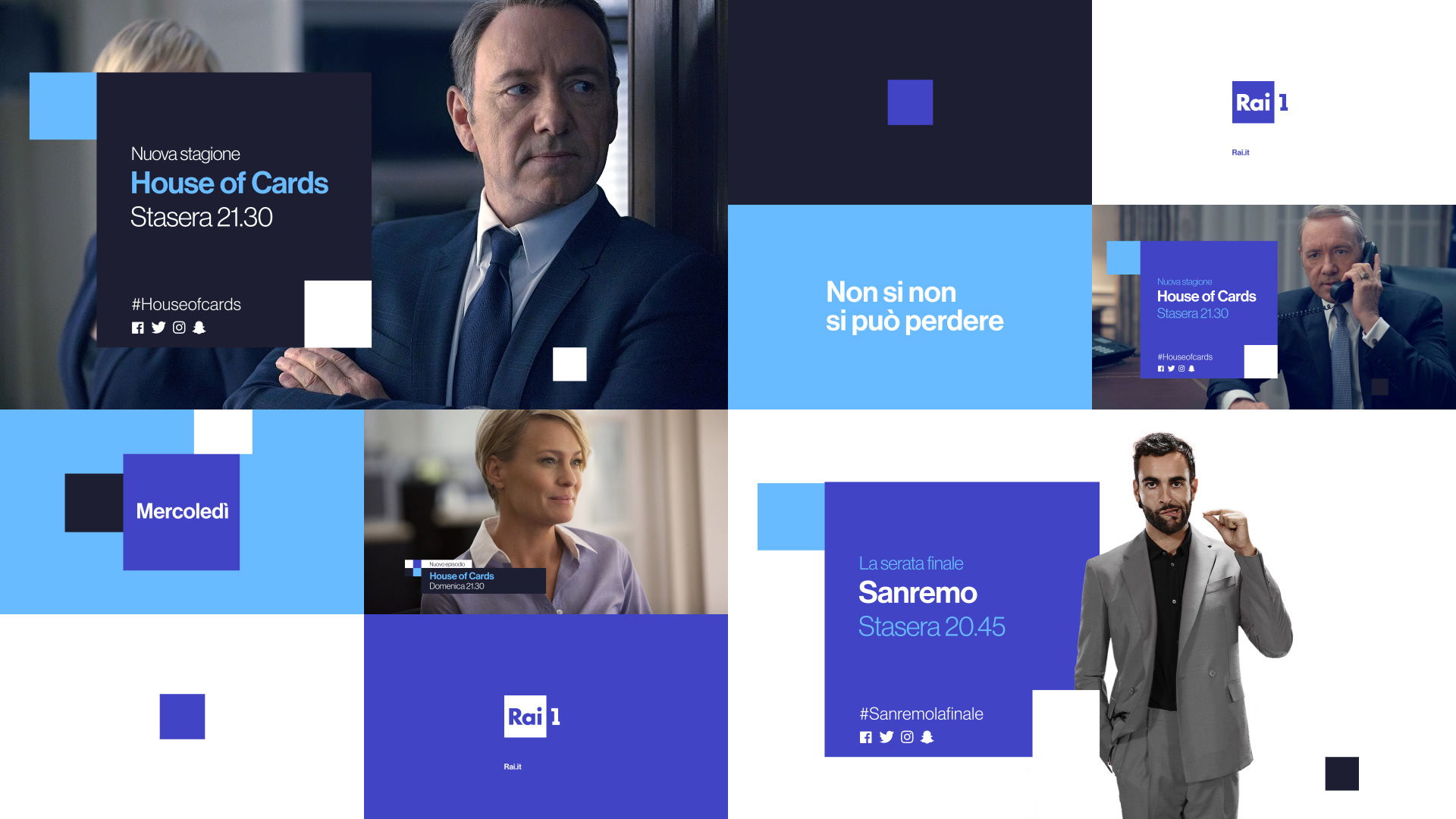

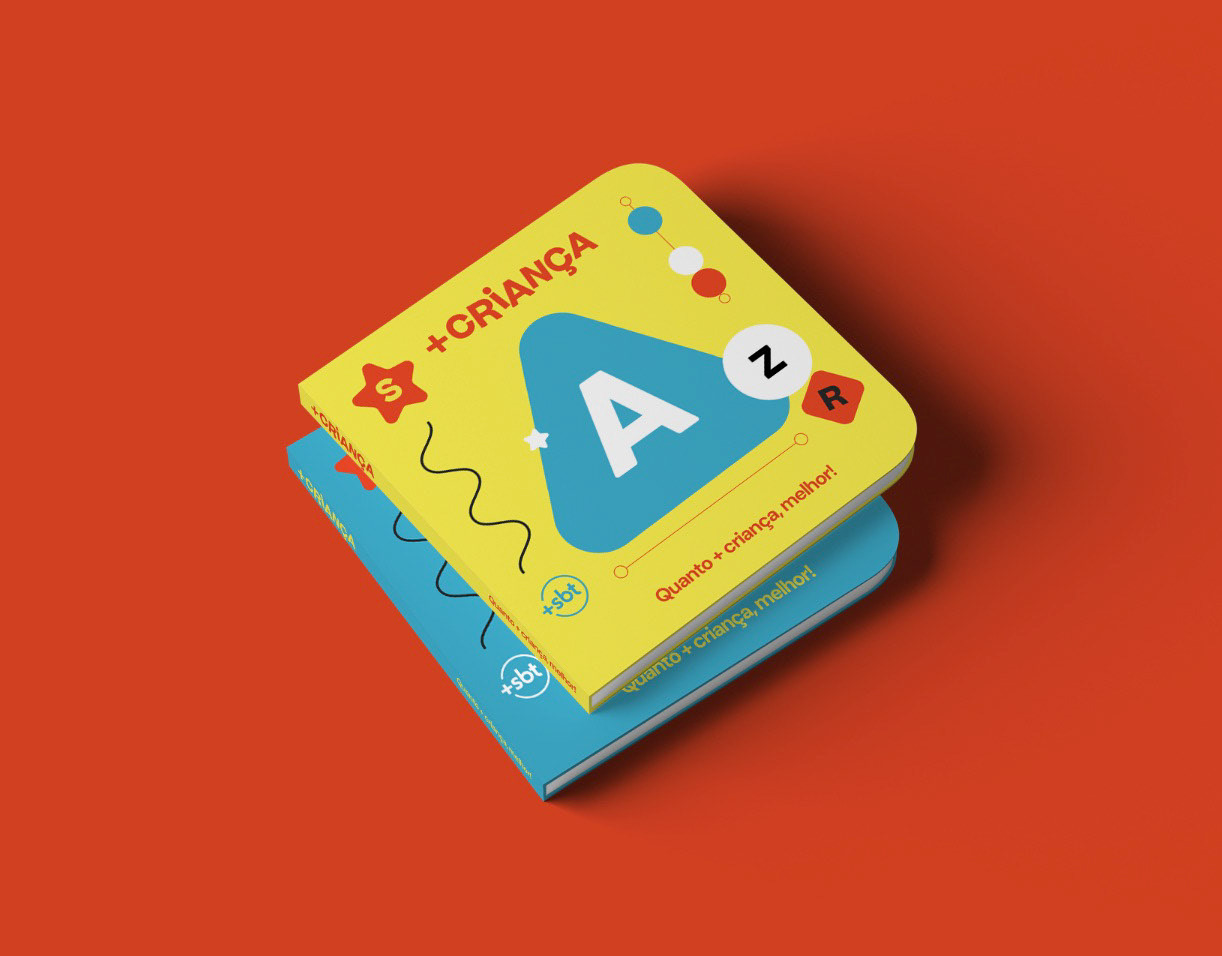
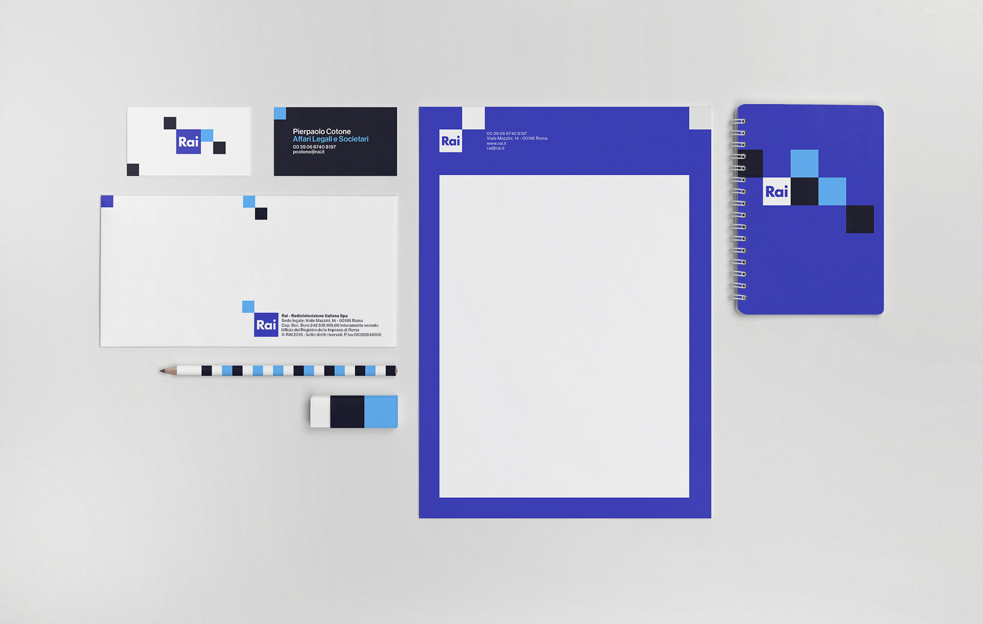
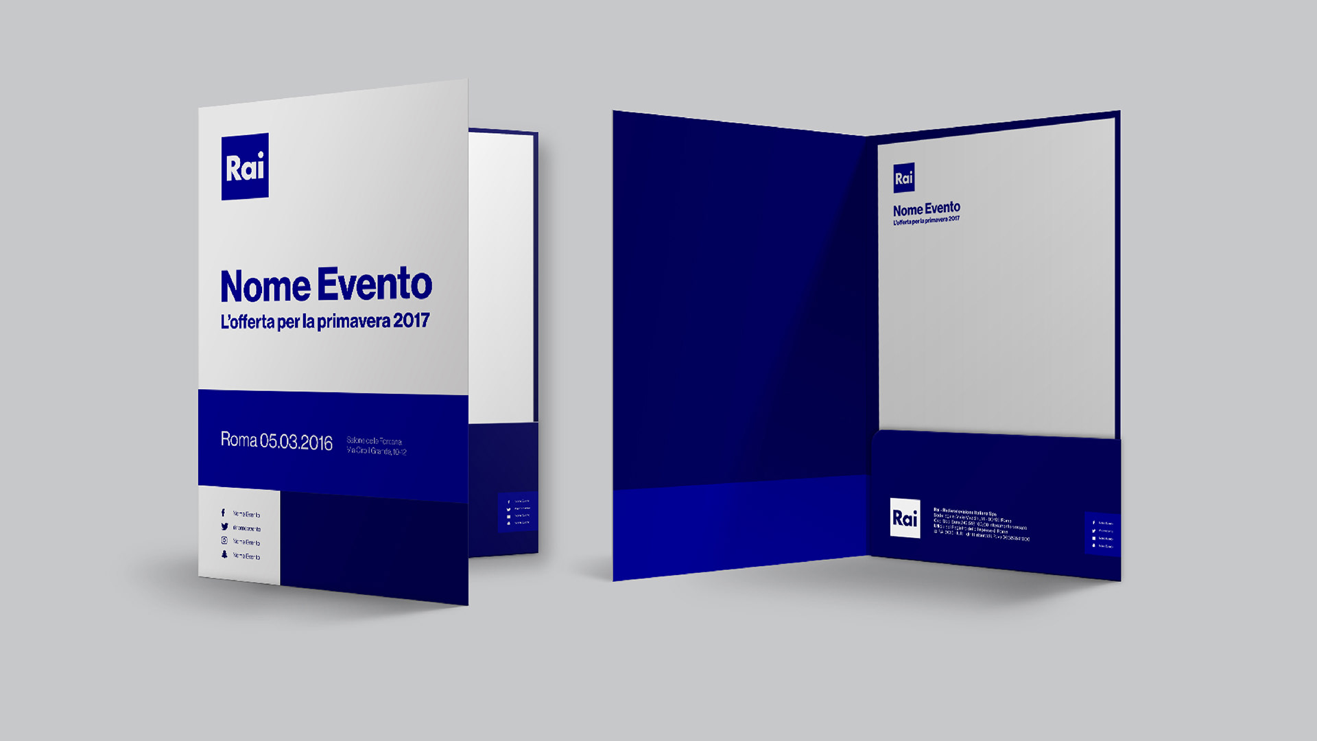
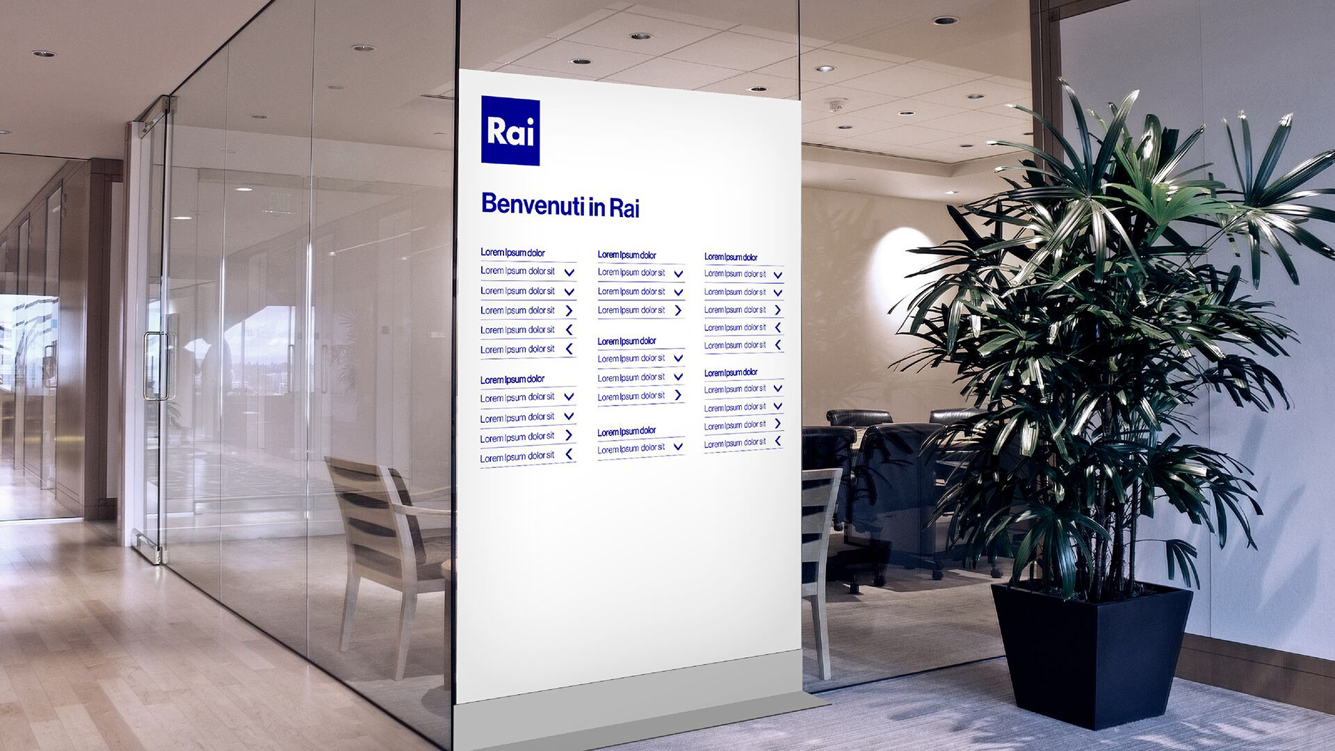
The design narrative and colour palette of Rai 1 was also the chosen one for the Rai Corporation (Il Gruppo RAI) and based on that we designed a little bit of everything.
Magazines.
Stationary.
Office signaling.
...and if they've asked us, we would have done space rockets too!
(Seriously, we would love to make a space rocket).
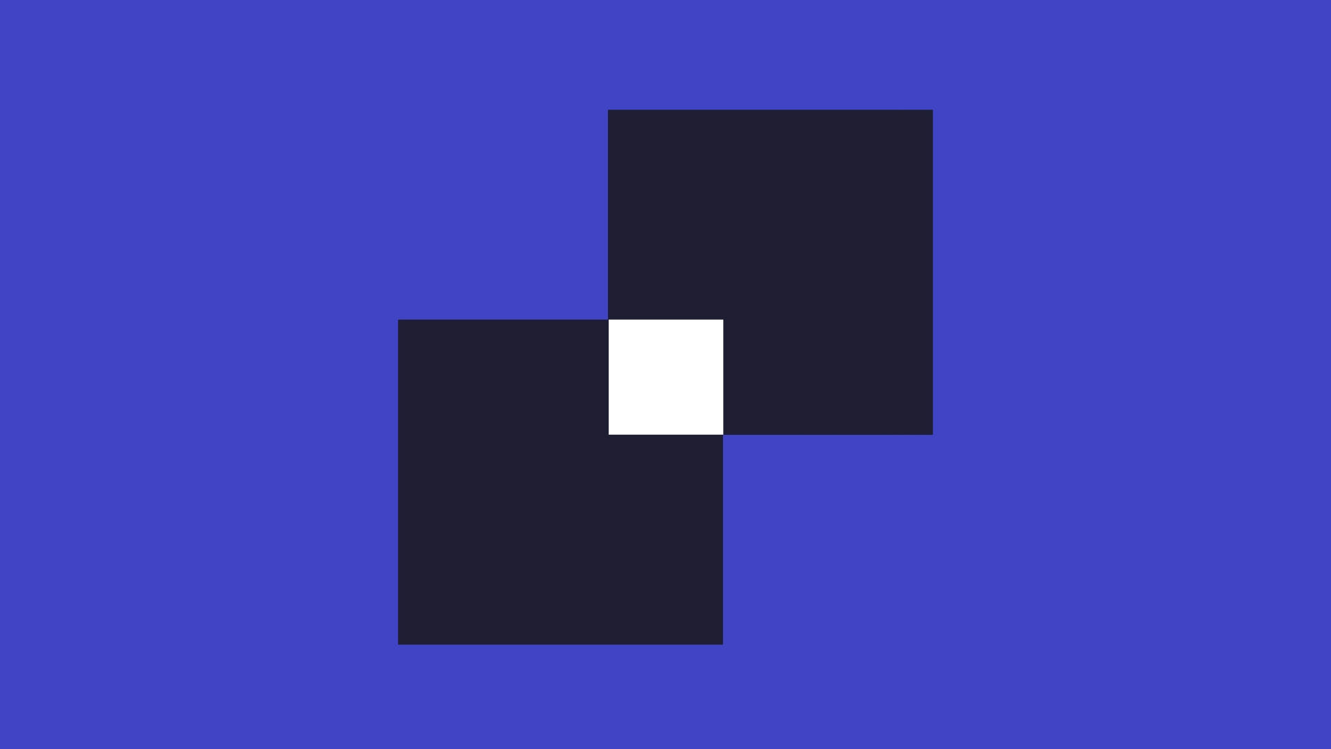
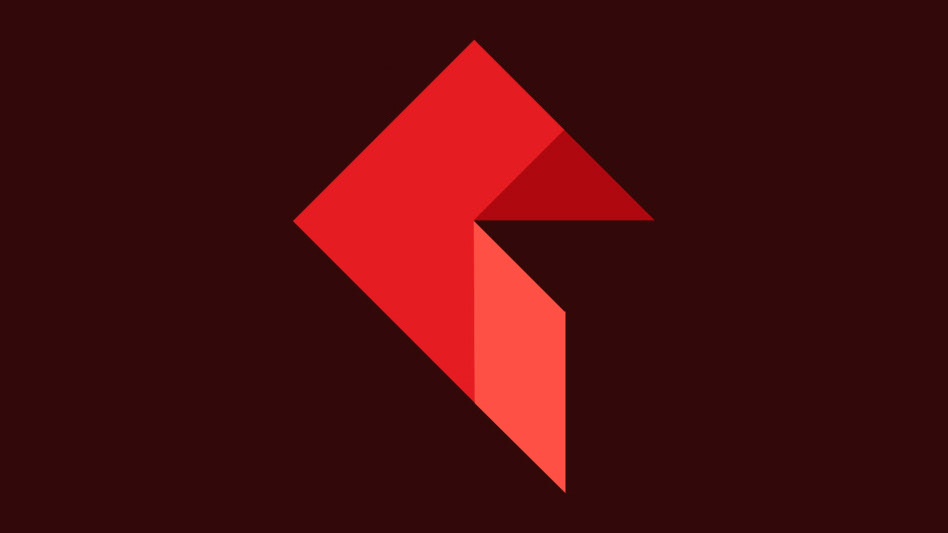
Rai 2
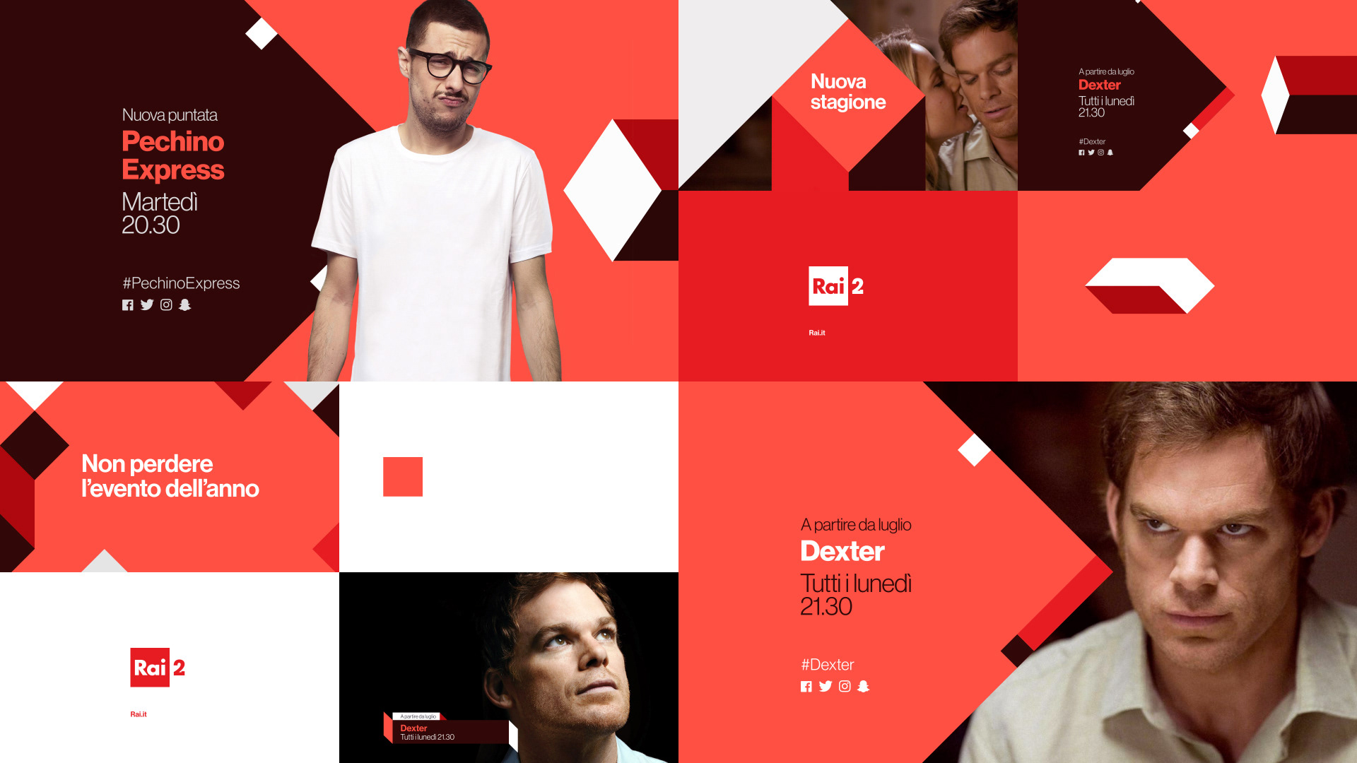
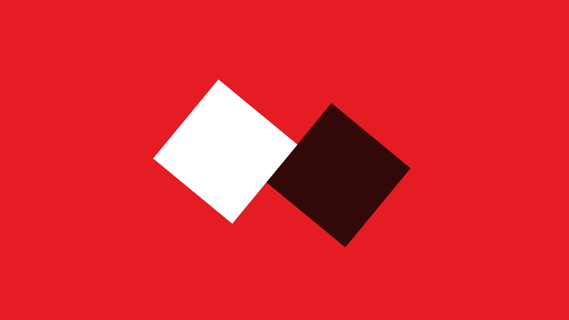
Rai 2 was the first twist we gave to our original square. Rai 2 is indeed a channel with a twist as it offers a variety of current affairs shows approached from the entertainment angle and a nice variety of series and movies.
Graphically we then angled our square and we play with the channel's extra dimension adding a depth to the animation.

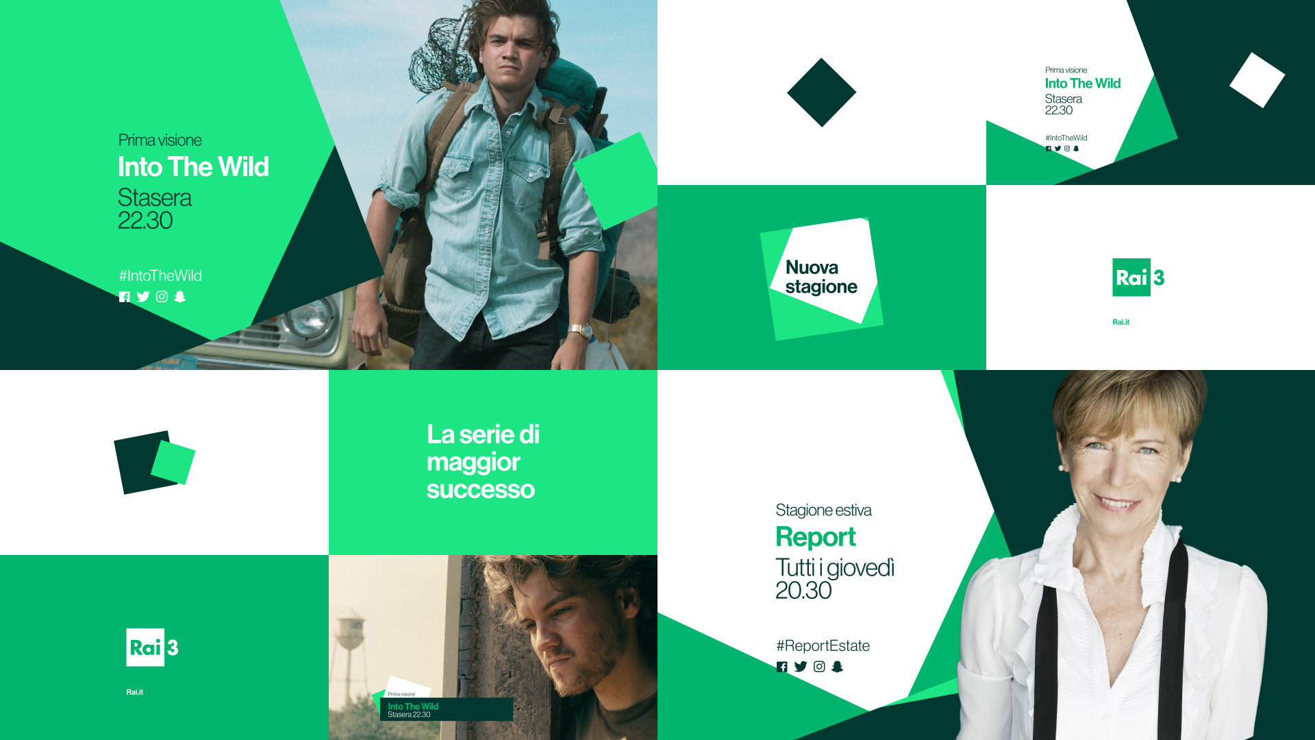
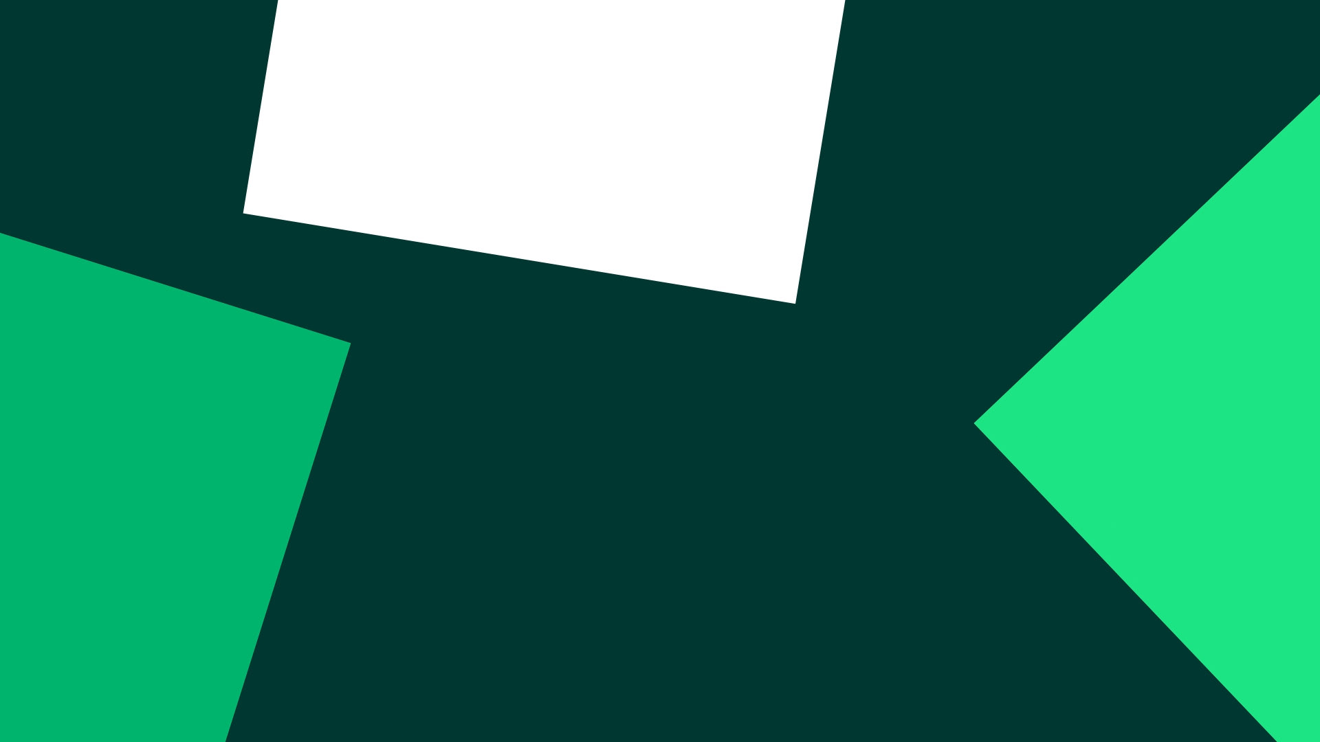
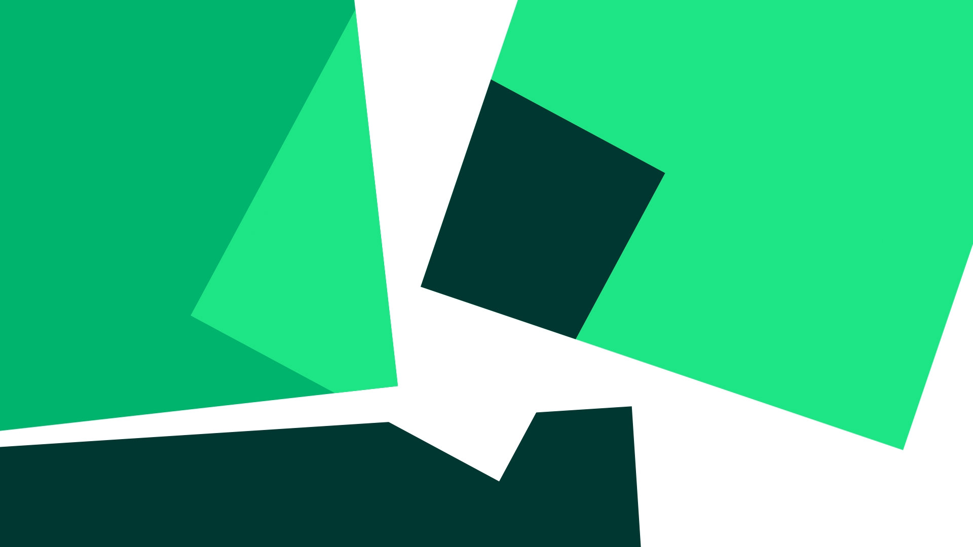
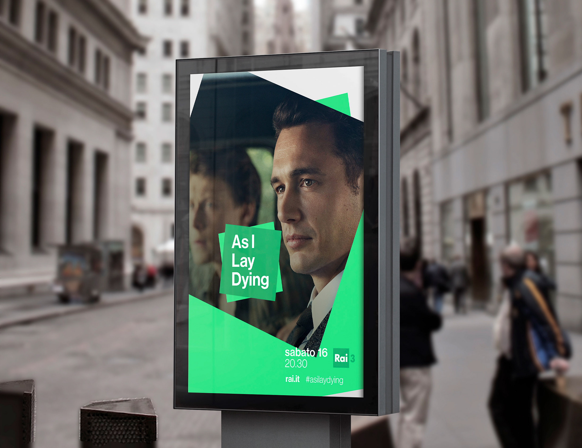
Rai 3
The unscripted nature of many of the programs that are Rai 3 (live shows, travel series, realities, etc) informed our approach to the animation making it as surprising and unpredictable and fun to watch as Rai 3.

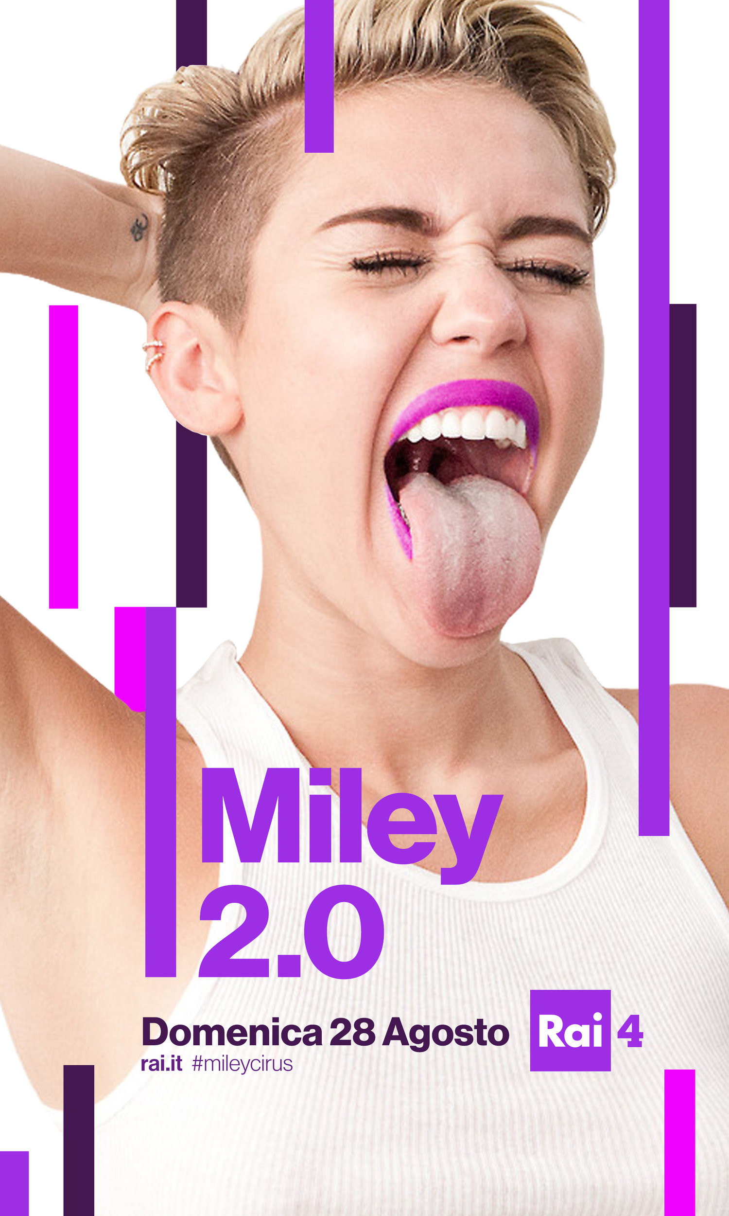
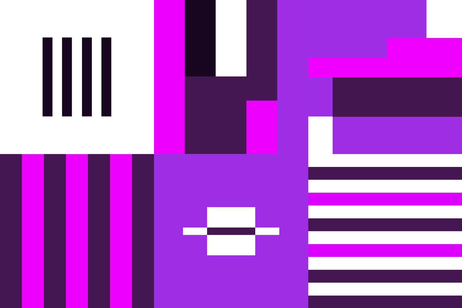
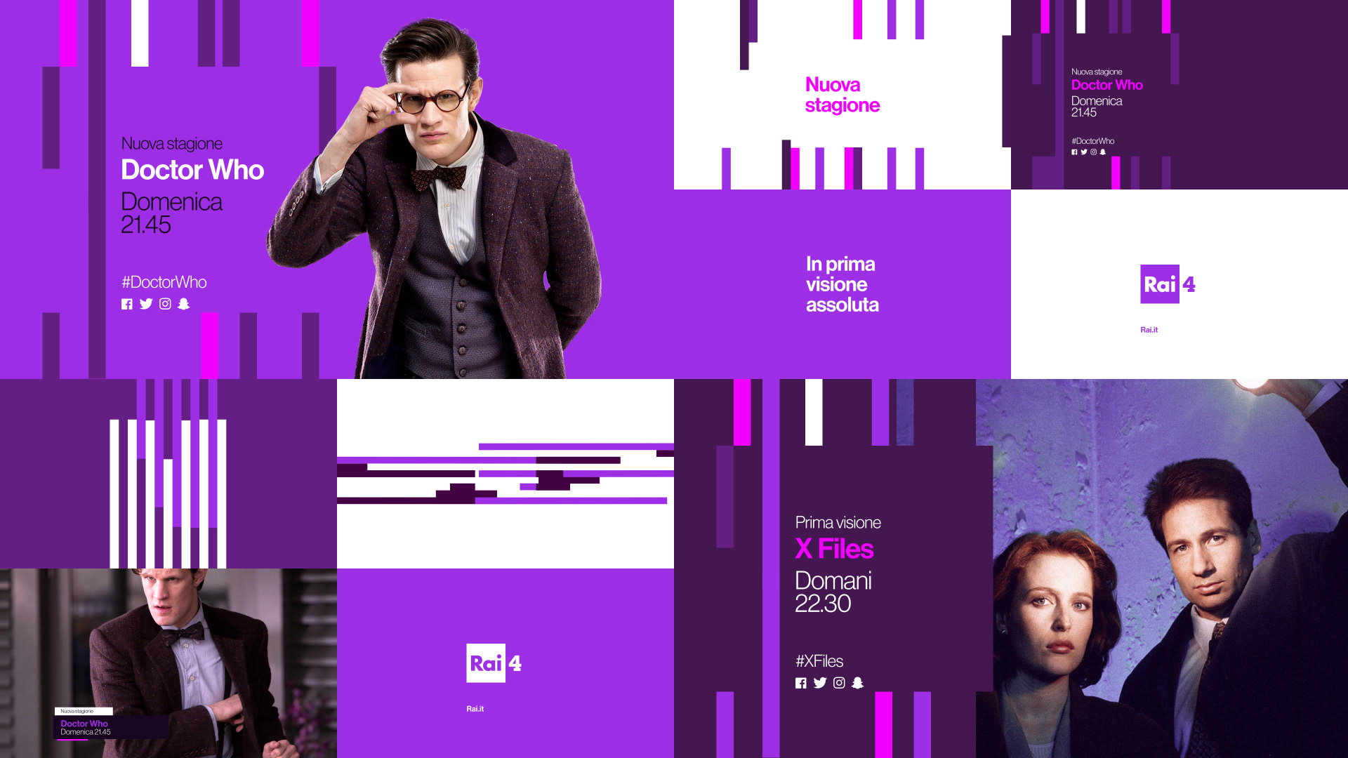
Rai 4
Finally with Rai 4, a channel that is aimed mostly at millennials and GenZs with a programming that includes sci-fi series, fantasy shows, anime, music concerts and other niche content, we opted for deconstructing the square.
The animation makes it disappear and come together in innovative ways, offering new alternatives to understand reality as a fluid concept that is open to interpretation, a premise that resonates quite harmonically with this channel's offer.

As you can see, this rebranding work was as challenging as it was amazing, nd we really really would like to do something like this again really soon. Who's game?
CREDITS
Client
Roberto Bagatti, Rai
Roberto Bagatti, Rai
Creative Direction, Art Direction and Graphic Production
Flopicco
Flopicco
Inhouse team
Florencia Picco, Marco Salemi
Florencia Picco, Marco Salemi
In collaboration with
Eloisa Iturbe and Luis Paris
Eloisa Iturbe and Luis Paris