PLENITUDE BRAND IDENTITY

ENI · ITALIA · 2022


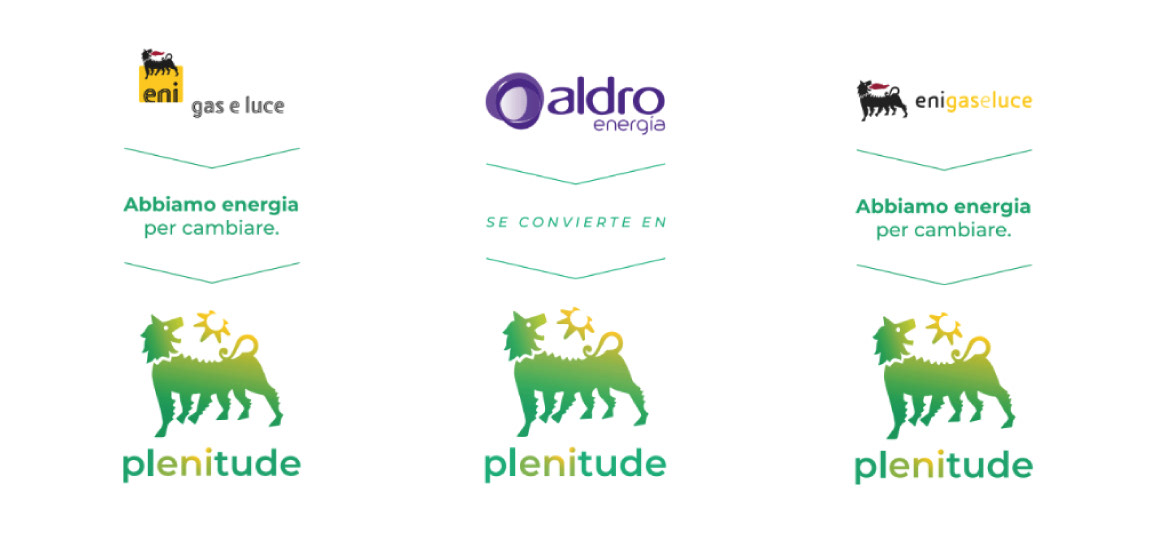
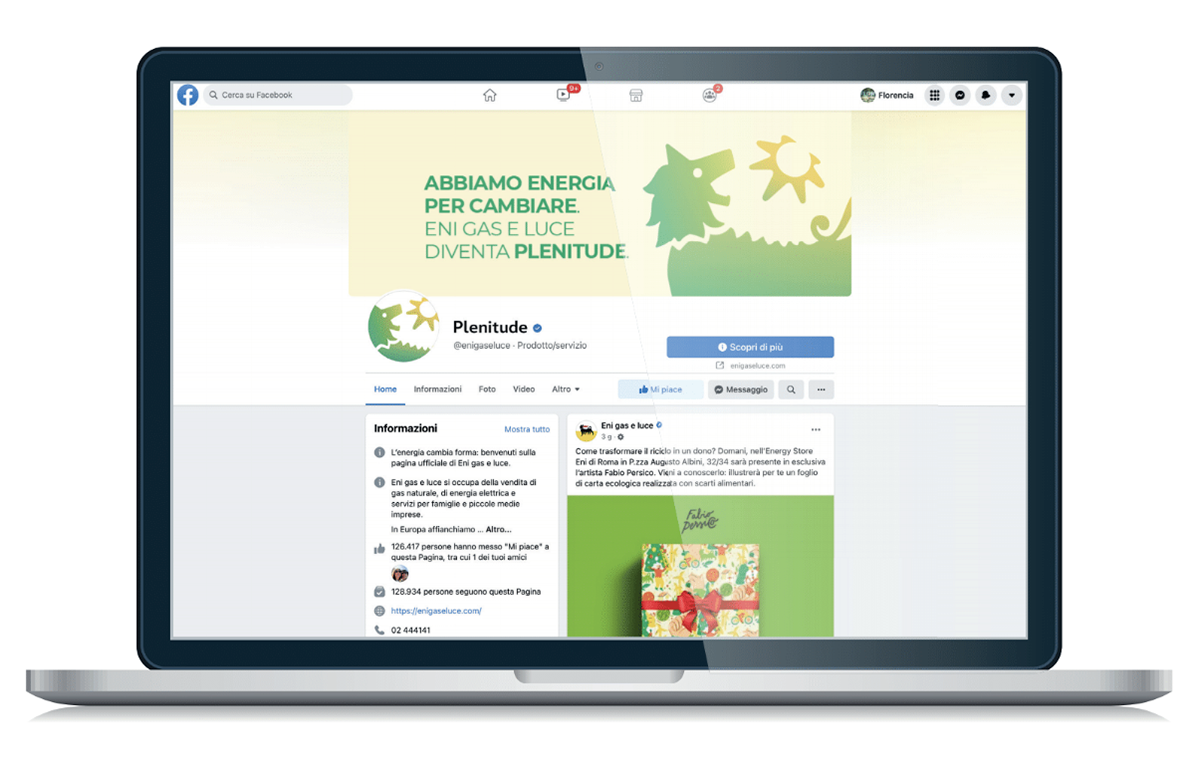
Early this year, the energy company Eni Gas e Luce (Eni Gas and Light) became Plenitude: a name that "reflects the company's history and, at the same time, represents the fullness of a new global vision where energy continues to regenerate itself". Our studio was in charge of transforming the company's logo, and with it, their whole brand vision and system.


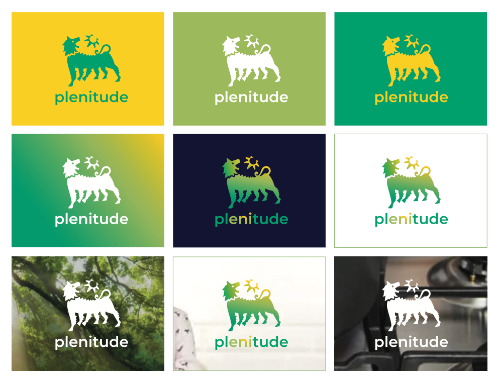
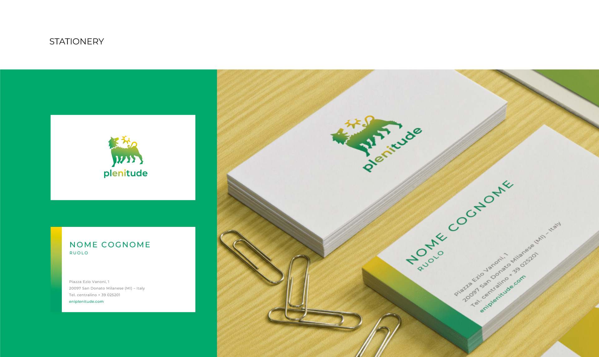
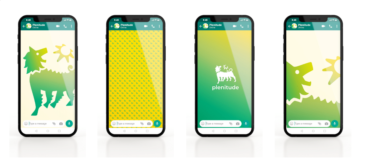
The new Plenitude logo embodies Eni's deep transformation and represents its motto: we have energy to change.

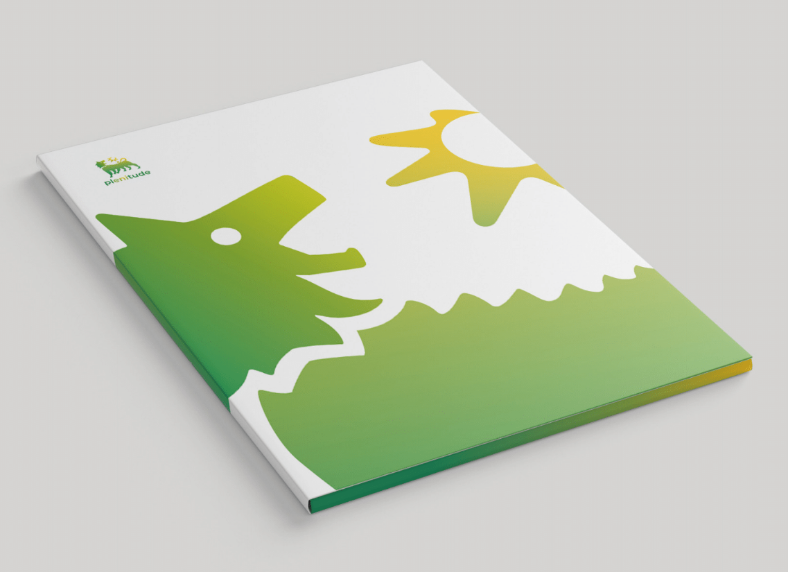
It's transformation not only included changing the colours and exchanging the flame for a sun, but also softening the edges of the mascot and make its face friendlier.​​​​​​​


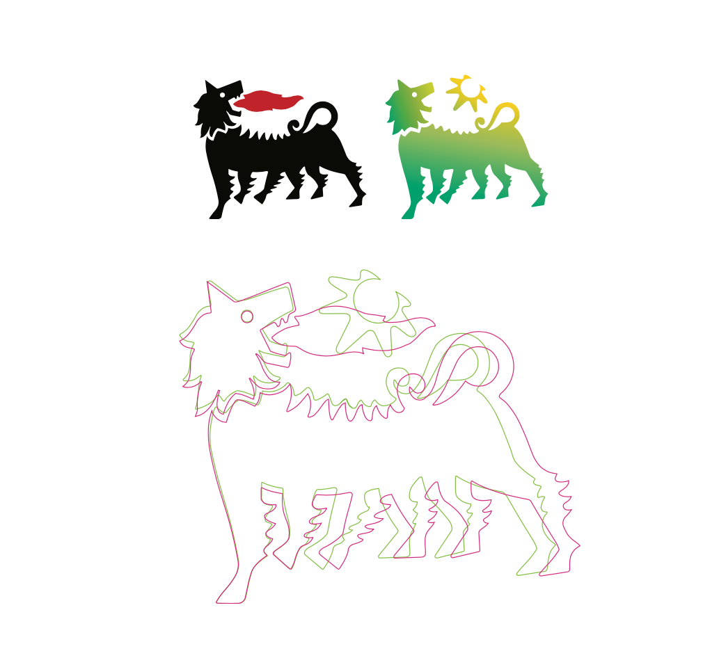
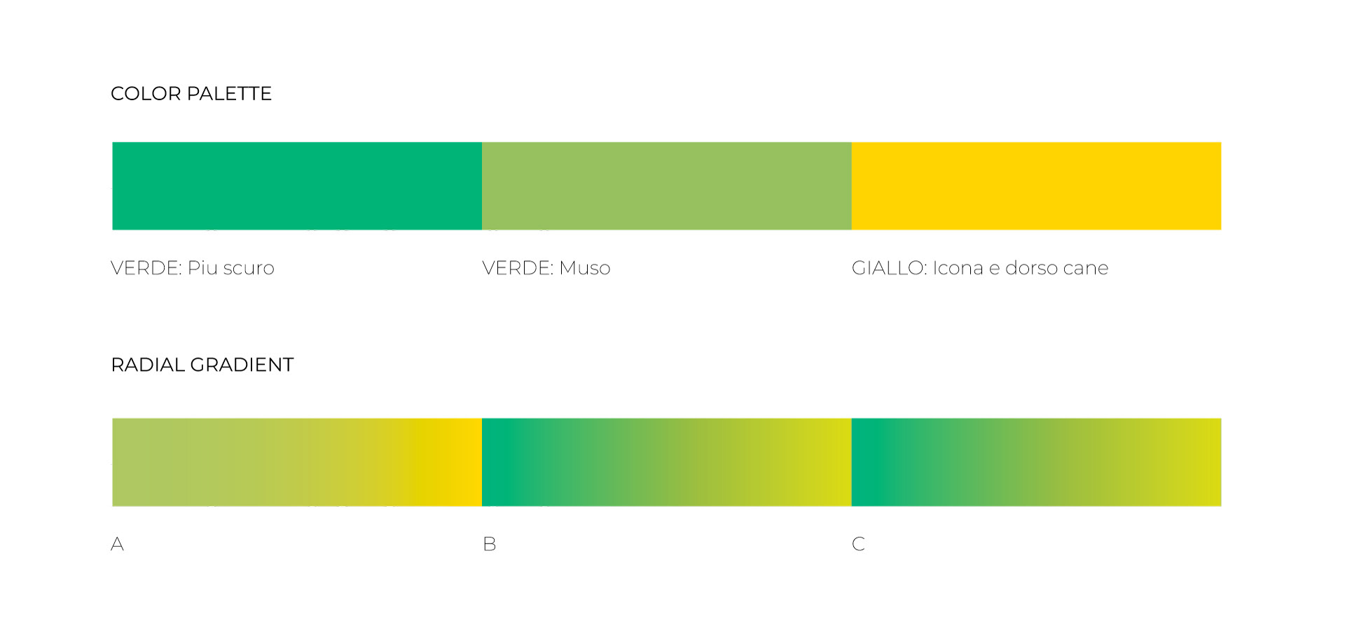
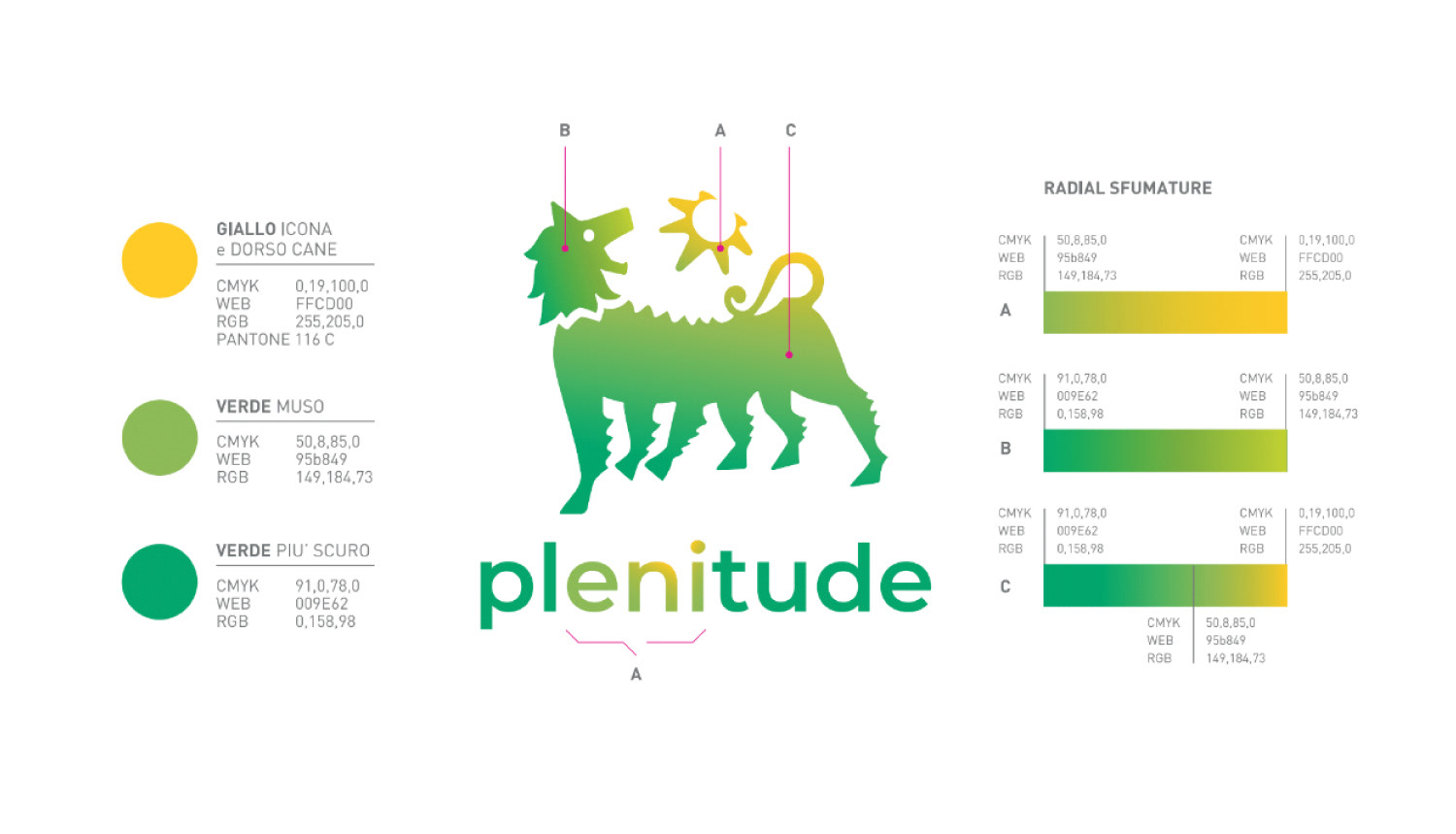
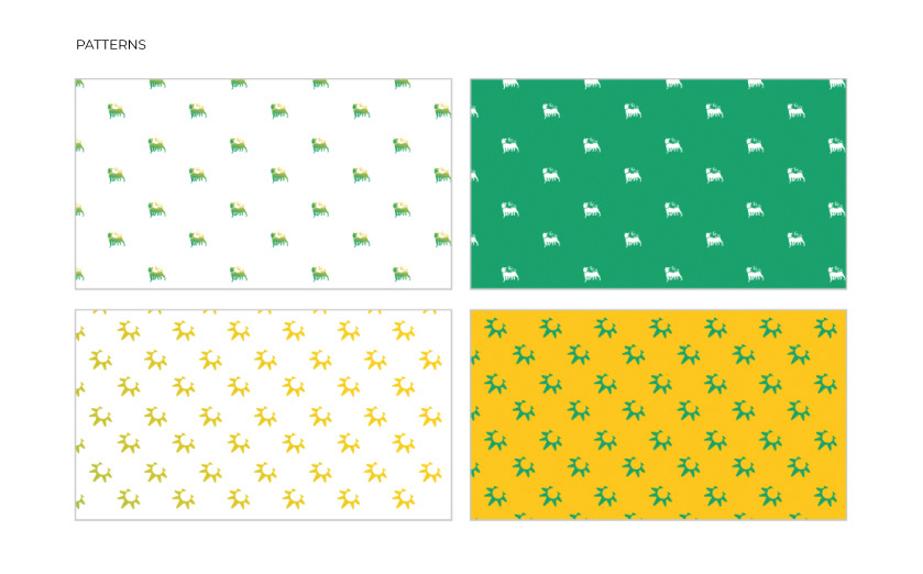
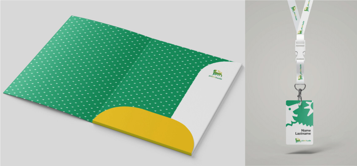
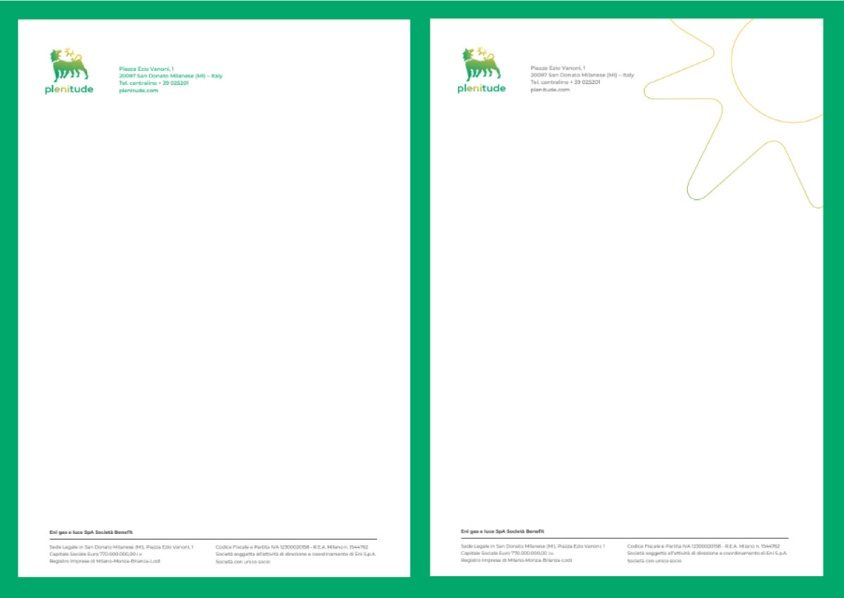
The colour palette, composed basically of green, yellow and different gradients between the two, definitely embody the new brand values and the search for ecological and solar energy sources. The diagonal of the logo's gradient allows to see a shinny sun that brings energy to a greener Earth.


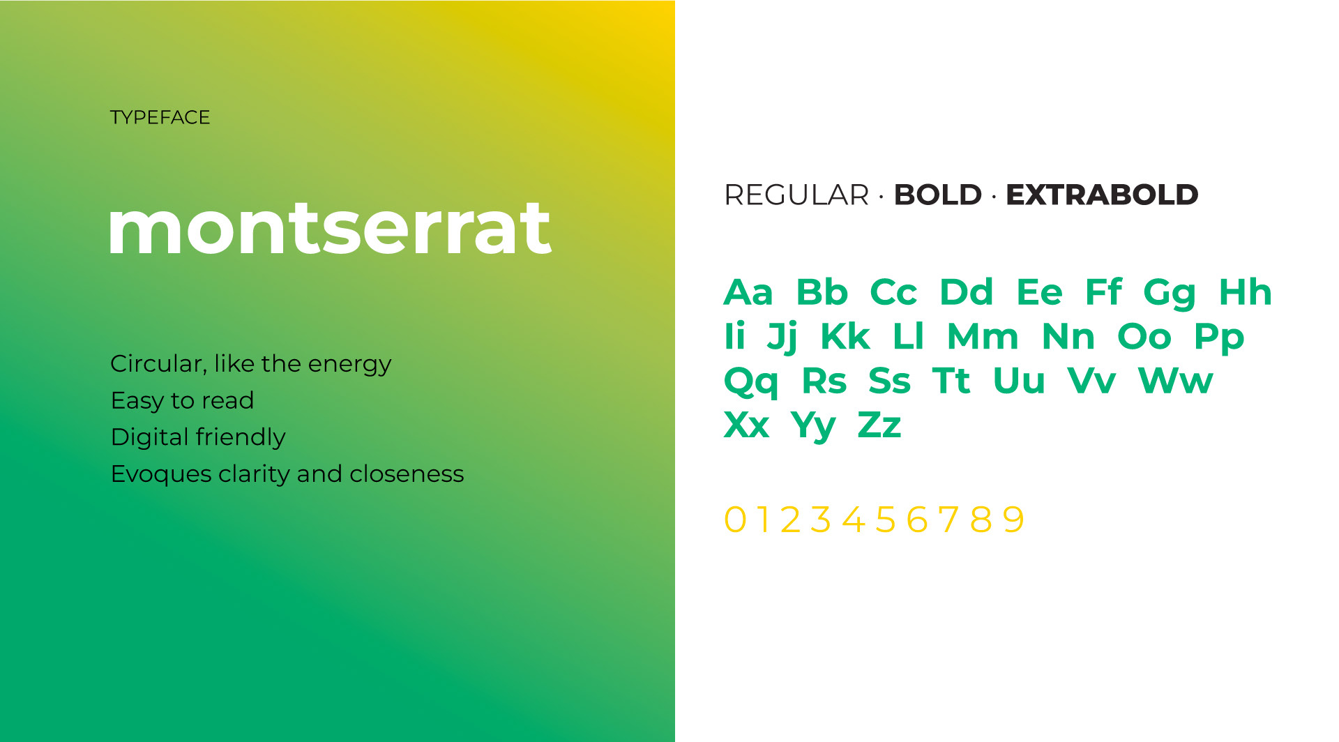
The chosen typeface was Montserrat. Geometric and simple, clean lines, with a circular structure (like energy itself) that facilitates readability and transmits clarity and closeness.

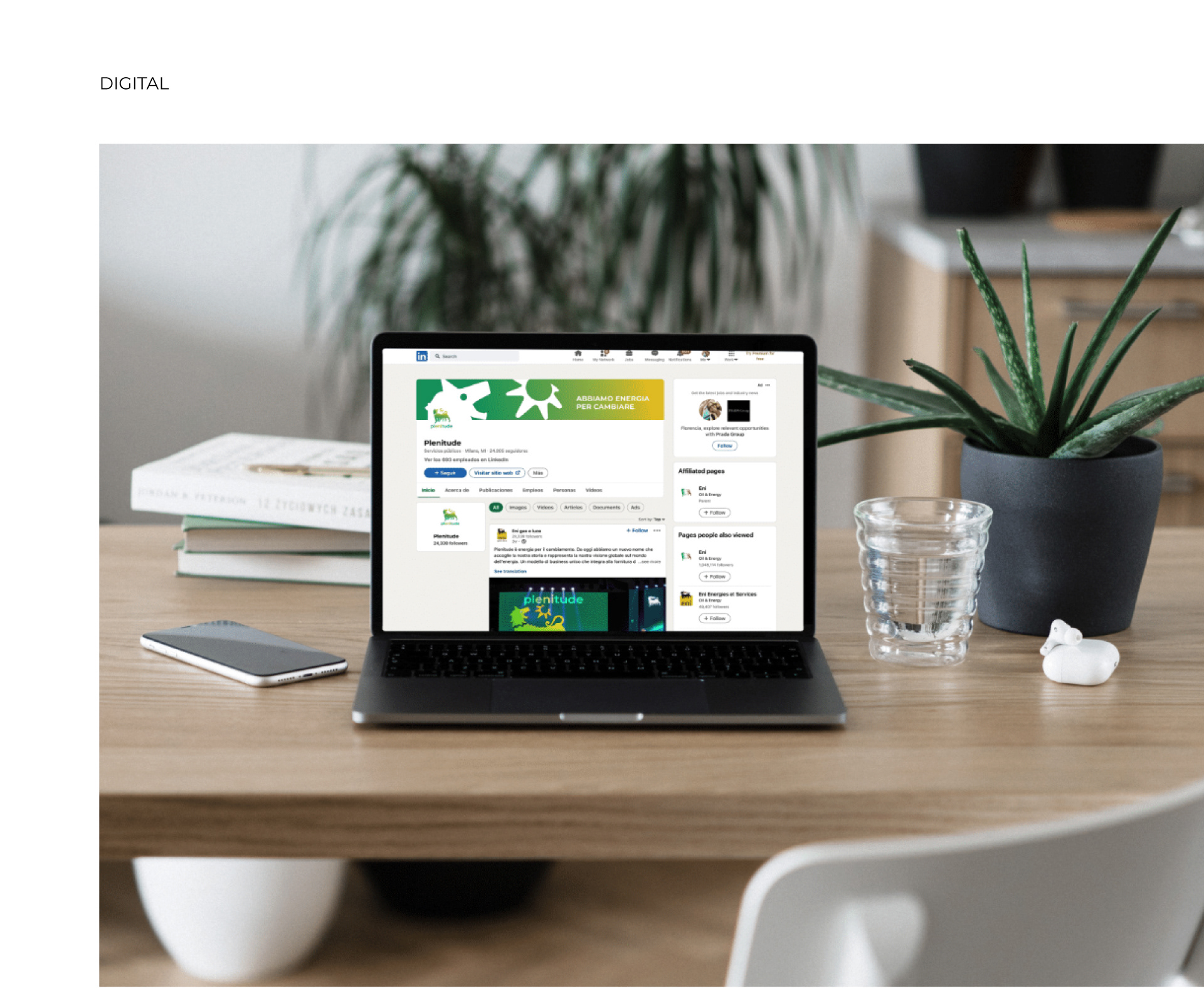
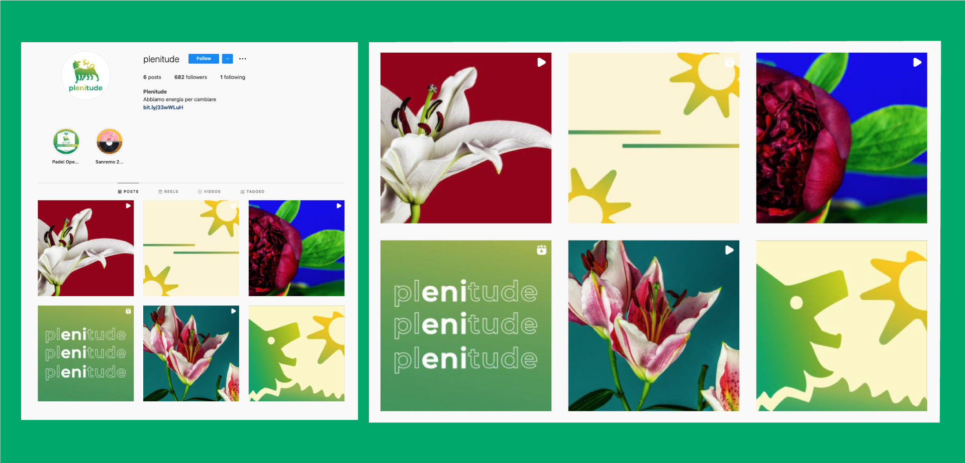
Montserrat is also a very digital-friendly font so it will work well in video, print and social.​​​​​​​


CREDITS


CLIENT
TBWA


CREATIVE DIRECTION, ART DIRECTION
AND GRAPHIC PRODUCTION
Flopicco Studio


Inhouse Team
Florencia Picco, Fernando Vallejos, Natalia Bellagio, Pablo Camino,
Alejandro Guatelli & Martín Polech.


🖤


You may also like

LIKE A STAR
Like a Star is Nove's new talent show hosted by Amadeus, with Elio, Serena Brancale and Rosa Chemical acting as judges. Flopicco Studio was responsible for creating the show's visual identity and the motion toolkit for on-air use. The idea was to combine the look typically associated with talent shows with the glamour of Hollywood and stardom. Contestants will not only act like stars; they will be stars for one night. other and bring this concept to life.
Graphic Design, Branding, Motion Graphics
ARENA SUZUKI '60 '70 '80
Advertising, Motion Graphics, Art Direction
Cine34 BRAND SYSTEM
Simple yet baroque, divine and mundane, essentially Italian, that's Cine34. Our studio was in charge of creating from scratch its brand system.
Graphic Design, Motion Graphics, Art Direction
Flopicco Studio Ten Years Manifesto
Graphic Design, Illustration
BURGER KING's HOW TO TRAIN YOUR DRAGON
The goal was to harmoniously blend the film’s Viking-inspired imagery with Burger King’s bold, iconic aesthetic to create a functional, original and fun merchandise line.
Graphic Design, Illustration
DISNEY CHANNEL EMEA BACK TO SCHOOL
A revamp of the iconic identity elements of the Disney Channel image, with a school theme and a new palette of neon pastels.
Graphic Design, Motion Graphics, Logo Design
LA BIENNALE DI VENEZIA 2021
Illustration, Motion Graphics, Animation
+SBT SAUDADE STREAMING
Branding, Art Direction, Graphic Design
RAI CHANNELS 3D TRANSITION
We created for Rai Channels a colourful 3D system that looked playful but elegant, and that is easily customizable for each channel.
Branding, Motion Graphics, 3D Motion
National Geographic Latam · Branding Refresh
Branding, Motion Graphics, Graphic Design
Back to Top