


U N I T E D S T A T E S · F L O P I C C O S T U D I O + B U R G E R K I N G · 2 0 2 3
'TIS THE CHEESON
LICENSING & MERCH
The Client
Burger King (for those in the back) is an American-based multinational chain of hamburger fast food restaurant Royal Perks is Burger King's loyalty program, it aims to reward BK's customers with perks ranging from in-store rewards to early access to offers and cool merch.
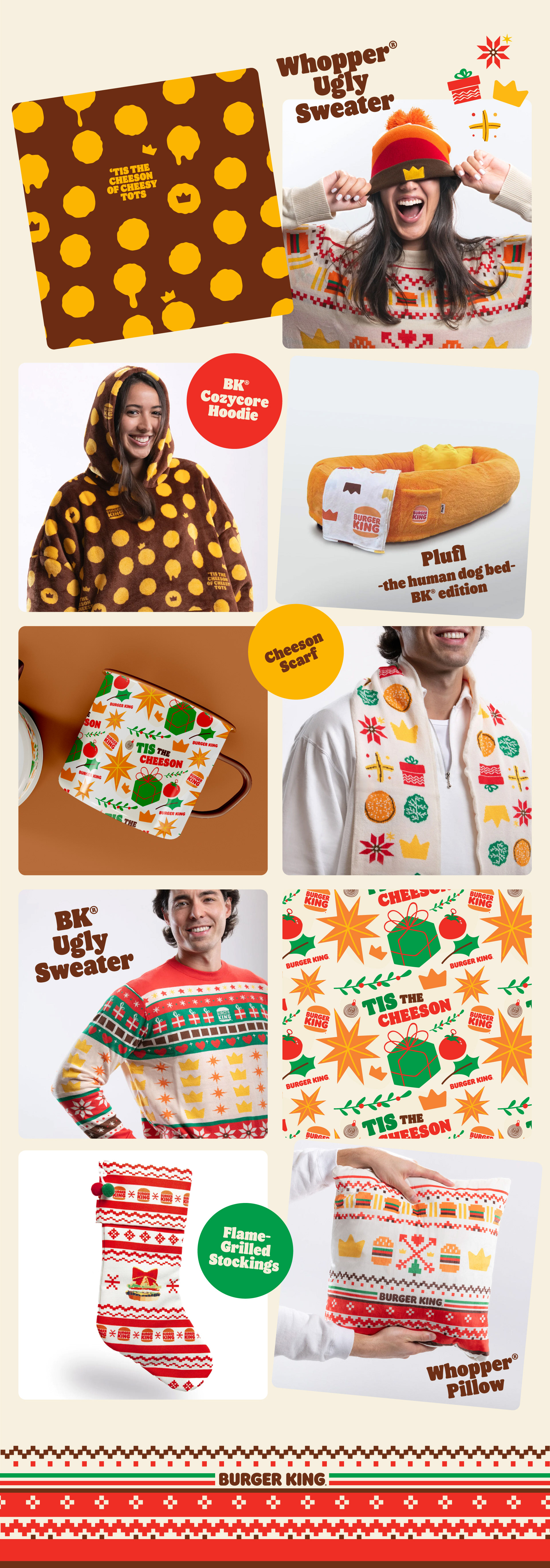
The Challenge
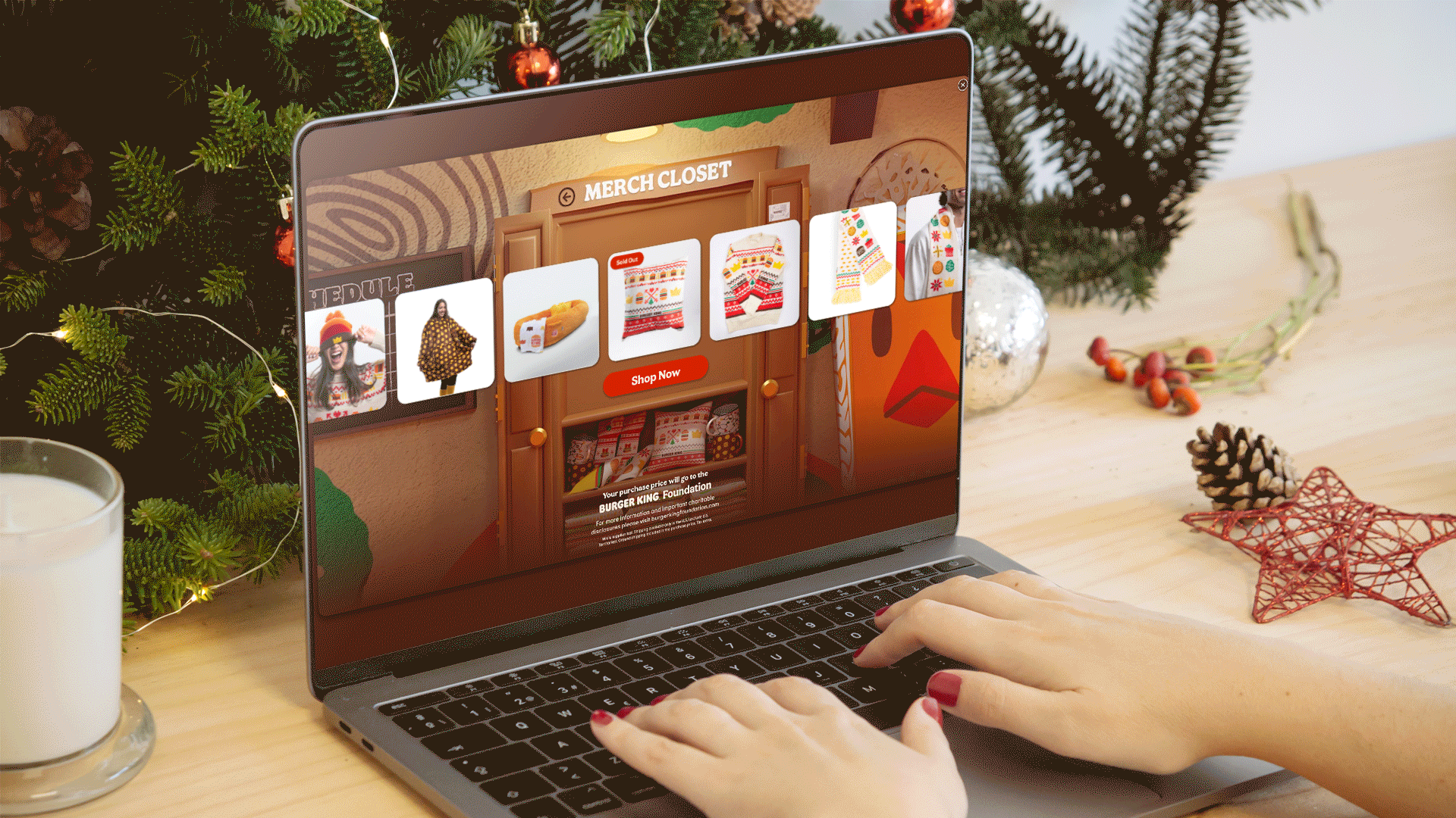
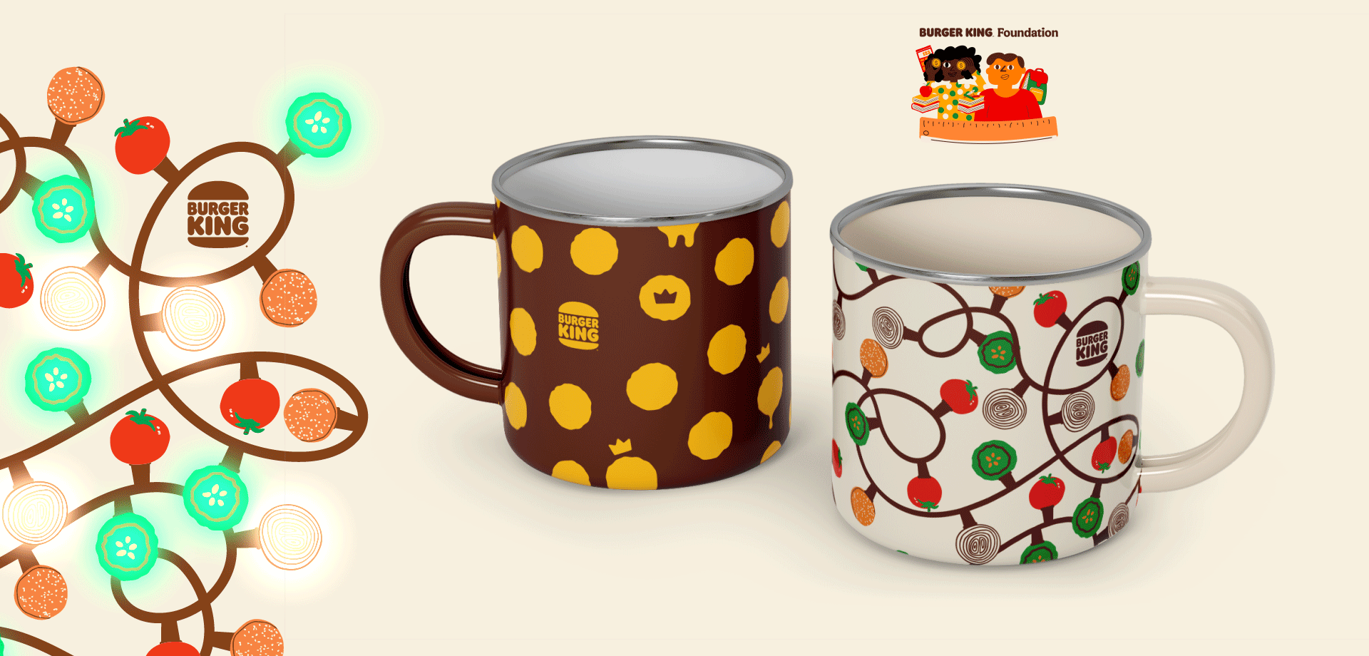
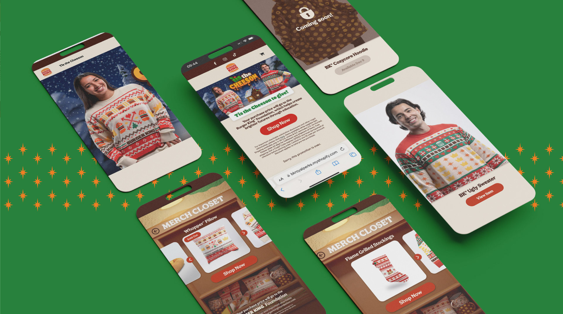
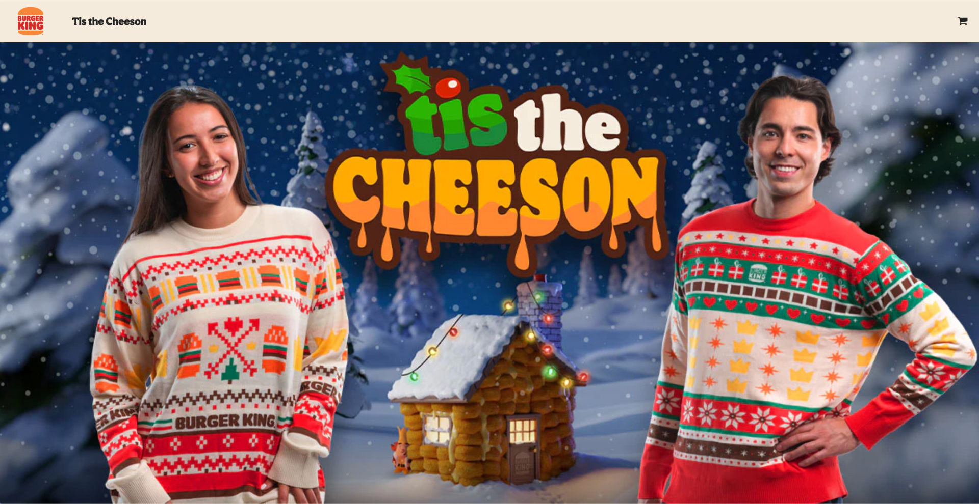
Flopicco Design Studio was commissioned to develop a holiday-themed Royal Perks merchandising collection. As with previous collections, the items had to be fun, unisex and easy to produce. This time we were asked to expand the product range to include the extremely cool Plufl.
The Flopicco Studio Approach
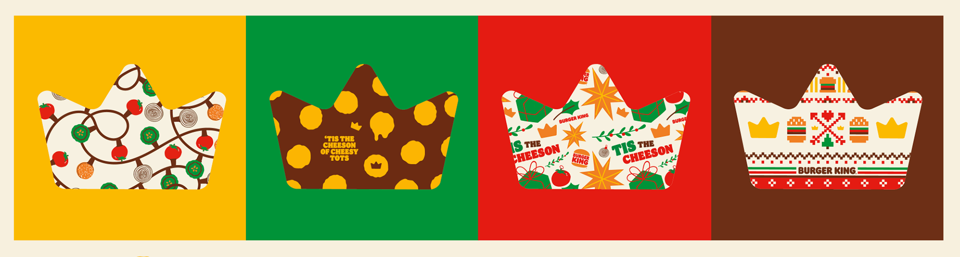
Flopicco Design Studio designed the traditional ugly sweaters and experimented with alternative items. The Burger King logo and crown were transformed into cross stitch or fun patterns perfect for use throughout the merchandise line. We stayed consistent in their institutional color palette, as it was important for the brand to remain recognizable. The campaign lasted throughout the holiday season and, in the end, the gifts were successfully sold out.


El cliente
Burger King es una cadena multinacional estadounidense de restaurantes de comida rápida a base de hamburguesas. Royal Perks es el programa de fidelización de Burger King, cuyo objetivo es recompensar a los clientes de BK con ventajas que van desde premios en la tienda hasta acceso anticipado a ofertas y merchandising.
Burger King es una cadena multinacional estadounidense de restaurantes de comida rápida a base de hamburguesas. Royal Perks es el programa de fidelización de Burger King, cuyo objetivo es recompensar a los clientes de BK con ventajas que van desde premios en la tienda hasta acceso anticipado a ofertas y merchandising.
El reto
Flopicco Design Studio recibió el encargo de desarrollar una colección de merchandising de Royal Perks con temática navideña. Como en colecciones anteriores, los artículos debían ser divertidos, unisex y fáciles de producir. En esta ocasión se nos pidió que ampliáramos la gama de productos para incluir el genial Plufl.
Flopicco Design Studio recibió el encargo de desarrollar una colección de merchandising de Royal Perks con temática navideña. Como en colecciones anteriores, los artículos debían ser divertidos, unisex y fáciles de producir. En esta ocasión se nos pidió que ampliáramos la gama de productos para incluir el genial Plufl.
El enfoque de Flopicco Studio
Flopicco Design Studio diseñó los tradicionales 'ugly sweaters' creando una trama de punto cruzado, y también experimentó con artículos alternativos. El logotipo y la corona de Burger King se transformaron en divertidos estampados perfectos para su uso en toda la línea de productos. Mantuvimos la coherencia con la paleta de colores institucional, ya que era importante que la marca siguiera siendo reconocible. La campaña duró toda la temporada navideña y, al final, exitosamente, los 'perks' se agotaron.
Flopicco Design Studio diseñó los tradicionales 'ugly sweaters' creando una trama de punto cruzado, y también experimentó con artículos alternativos. El logotipo y la corona de Burger King se transformaron en divertidos estampados perfectos para su uso en toda la línea de productos. Mantuvimos la coherencia con la paleta de colores institucional, ya que era importante que la marca siguiera siendo reconocible. La campaña duró toda la temporada navideña y, al final, exitosamente, los 'perks' se agotaron.
CREDITS
CLIENT
Burger King
CREATIVE DIRECTION, ART DIRECTION
AND GRAPHIC PRODUCTION
Flopicco Studio
Inhouse Team
Florencia Picco, Fernando Vallejos, Natalia Bellagio, Alejandro Guatelli,
Pablo Camino, Martín Polech y Emiliano Agnetti.
With the collaboration of
Martín Tibabuzo.
🤎
Legal Disclaimer: All the photos belong to the Burger King Corporation unless specified otherwise.