I T A L Y · F L O P I C C O S T U D I O + R A I · 2 0 2 4
Rai Sport 2024
BRANDING
The Client
Radiotelevisione Italiana, the national broadcasting company of Italy, operates many terrestrial and subscription television channels and radio stations (Rai 1, 2, 3, 4, Rai Culture, Rai Fiction, Rai Sport, Rai Kids, to name some). It is one of the biggest broadcasters in Italy.
The Challenge
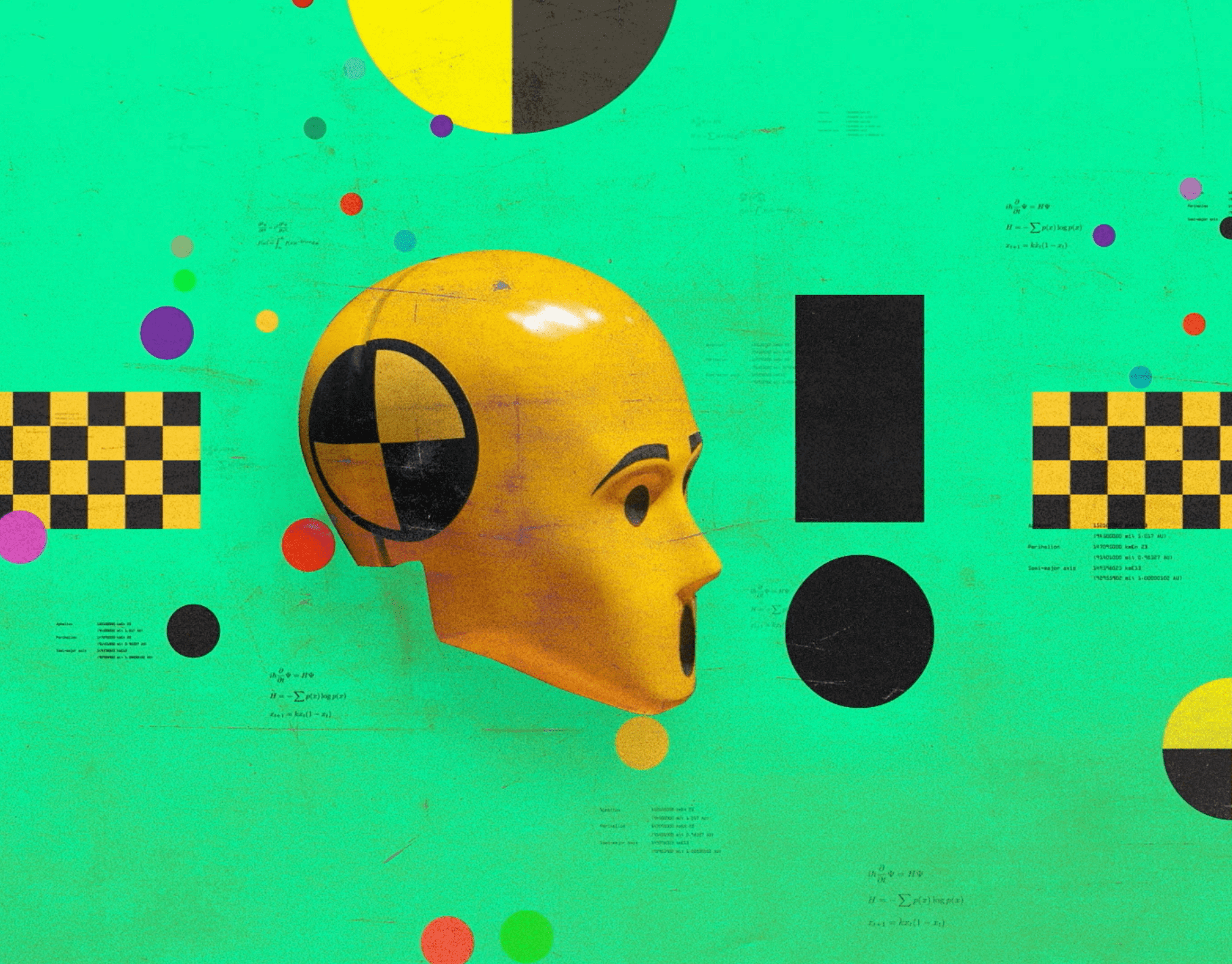
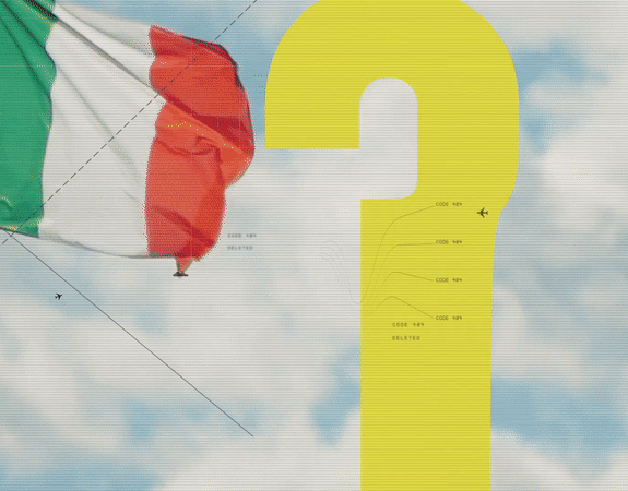
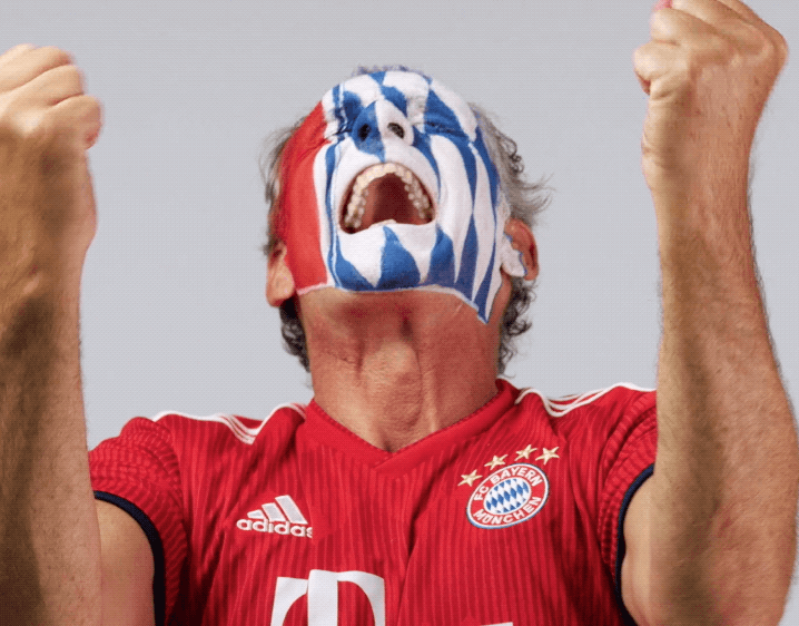
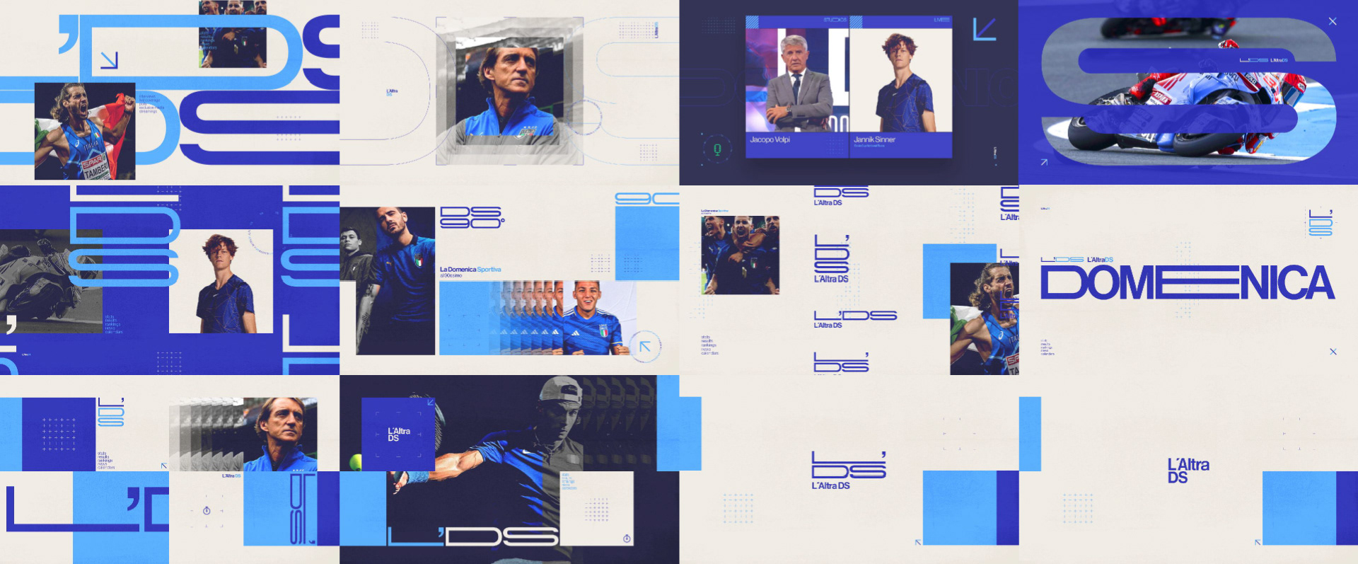
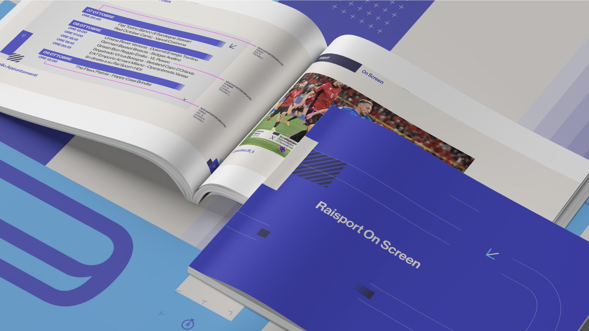
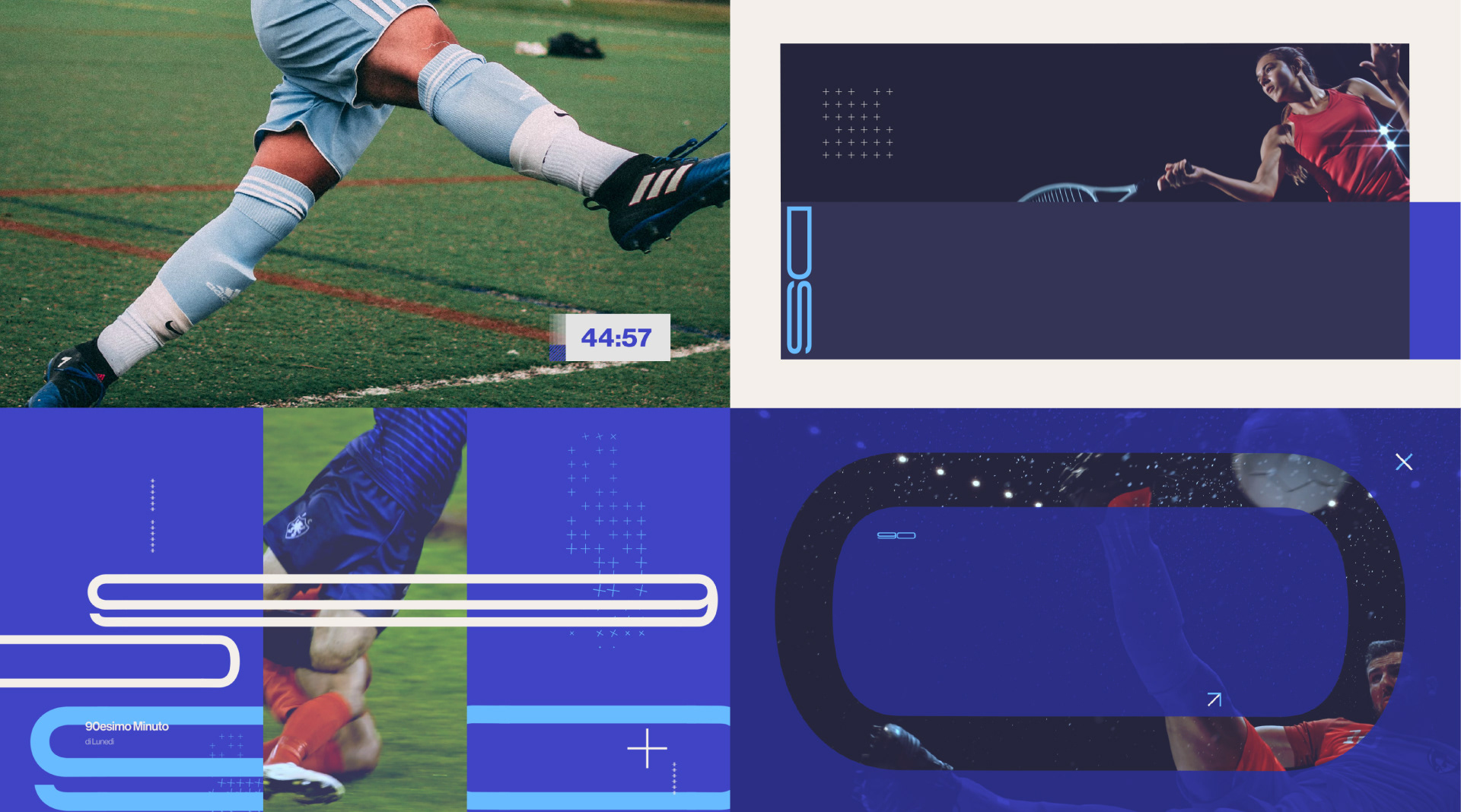
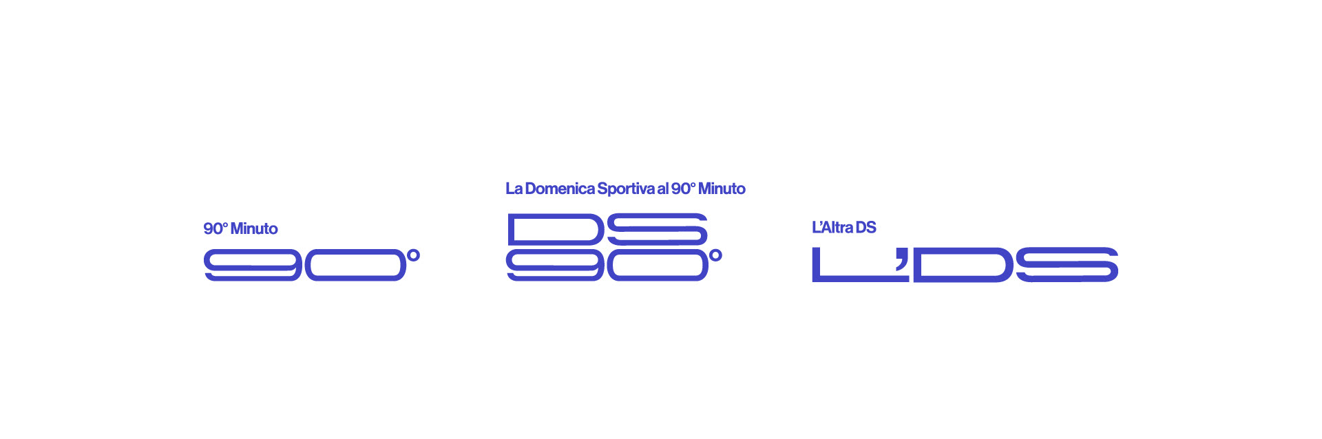
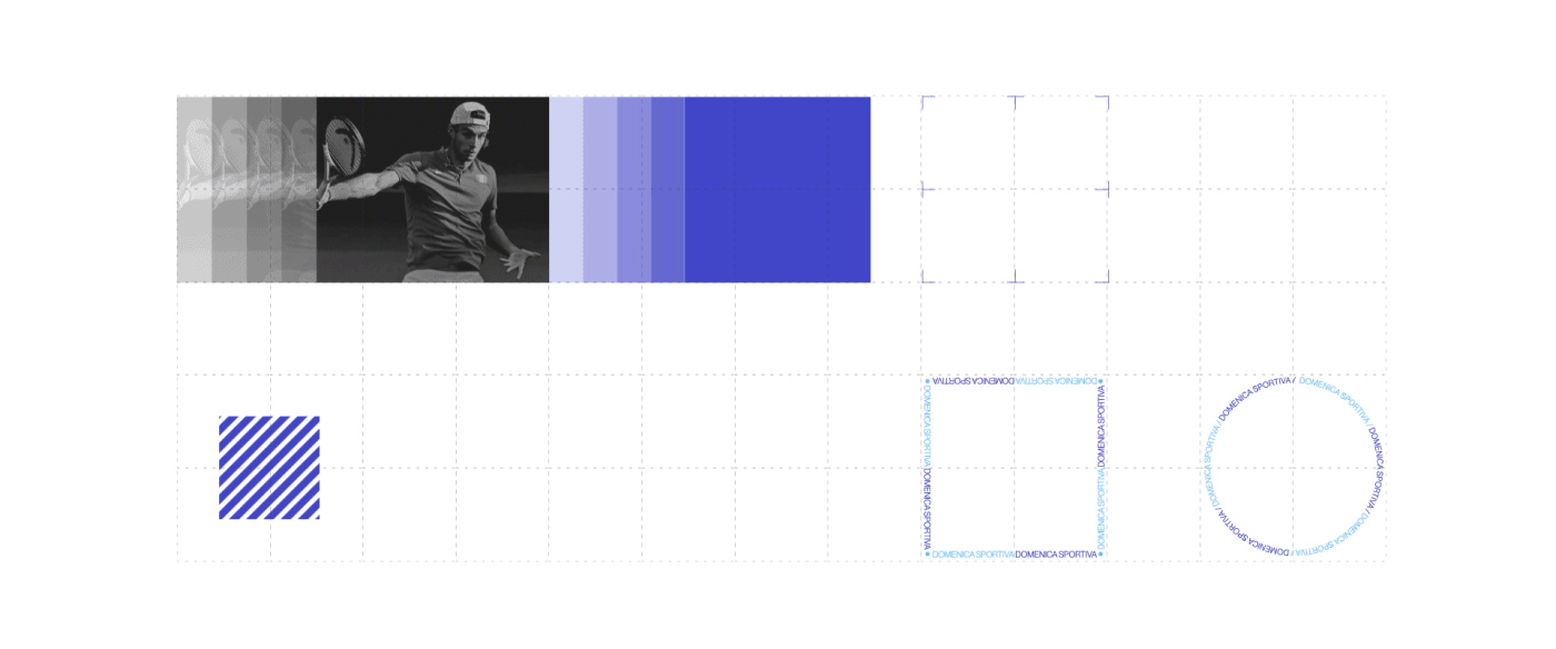
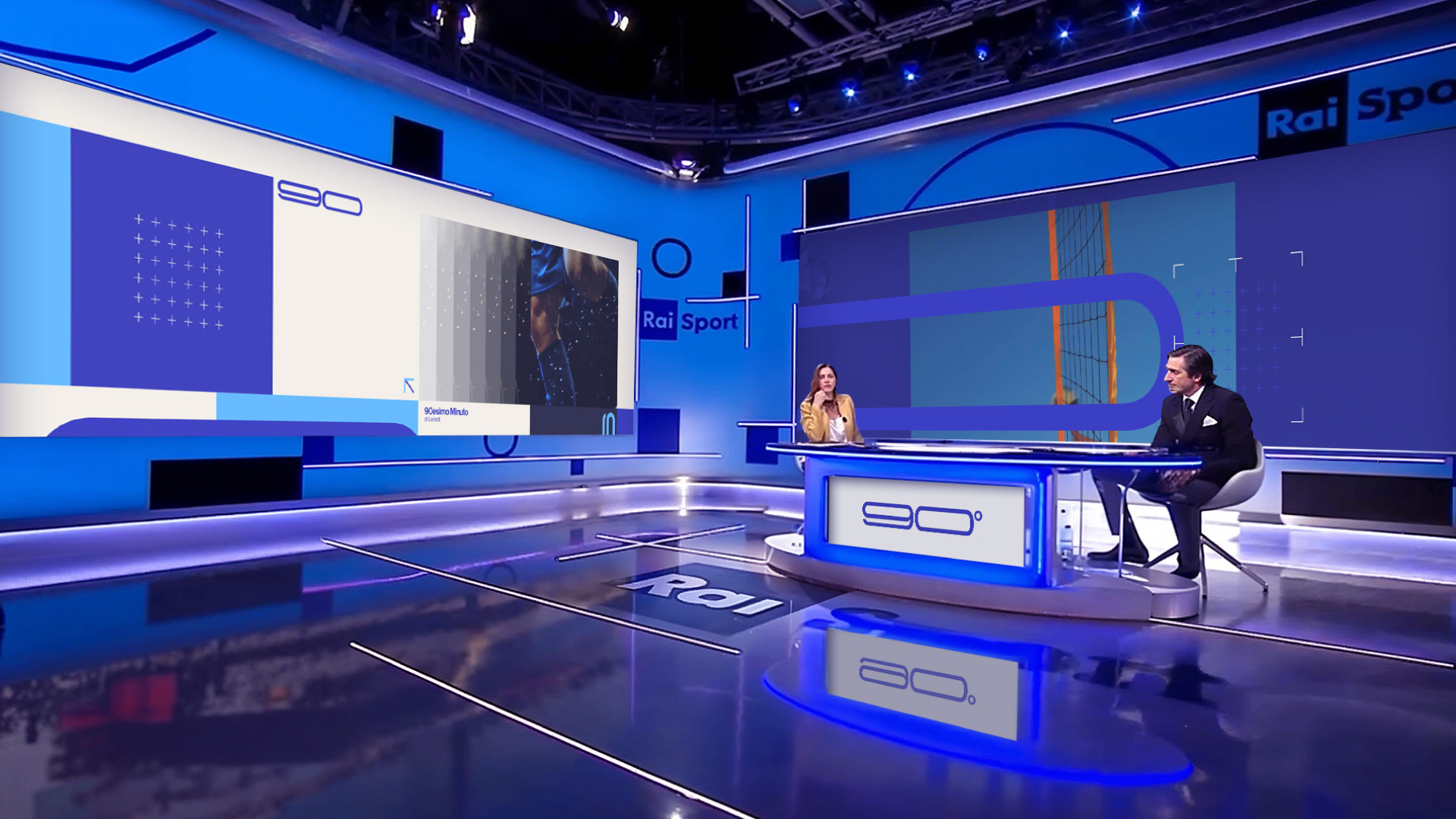
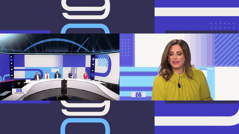
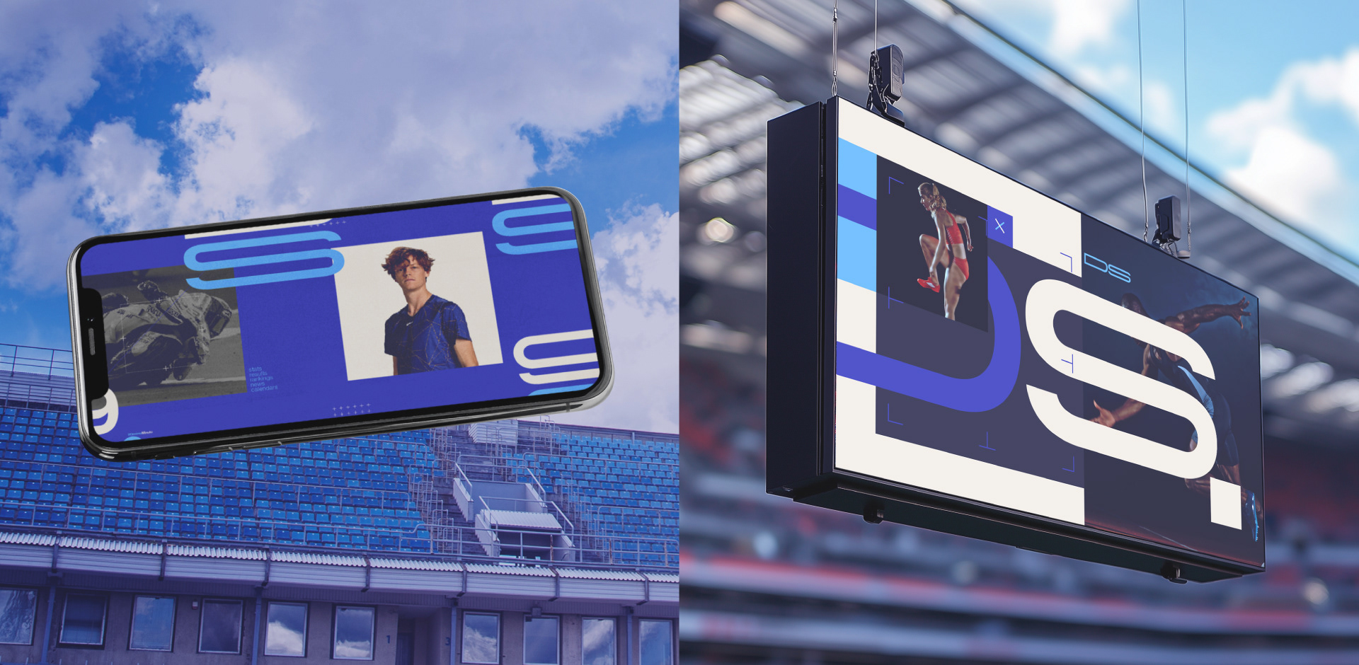
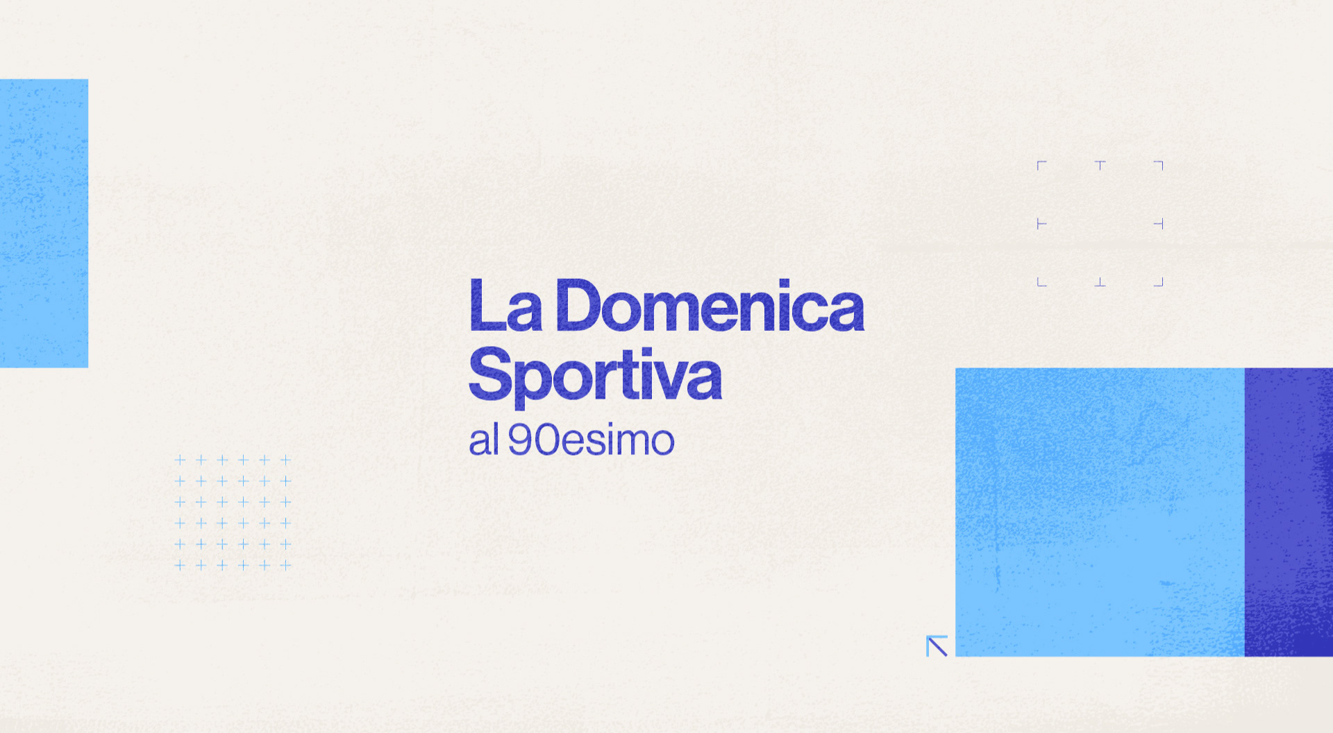
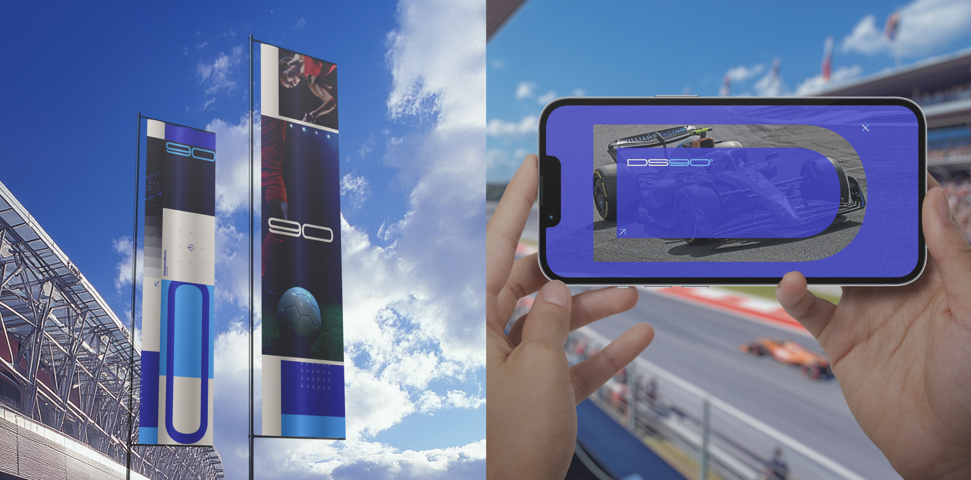
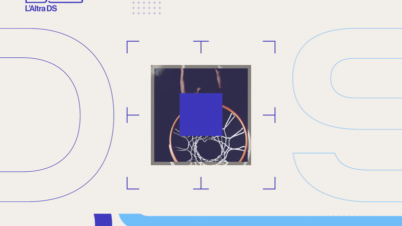
For Rai, sport has a unique personality, dynamic, extreme, and at the same time a reflection of discipline and teamwork. The aim of this project was to reflect this special character. The visual system had to be versatile to work with any sporting discipline, as well as in the coverage of major international events.
The Flopicco Studio Approach
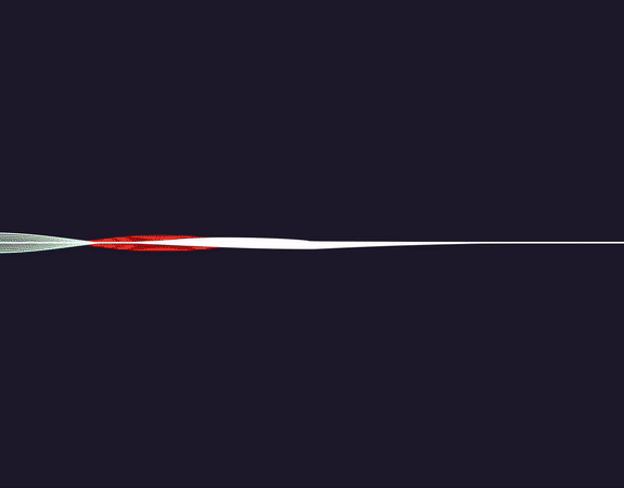
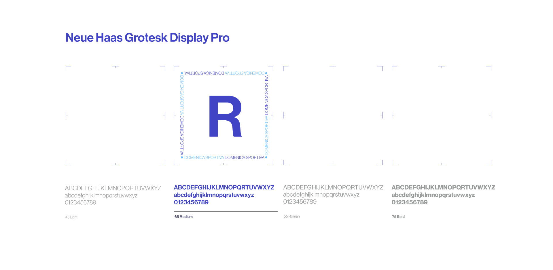
The fast-paced world of sports broadcasting is always looking for newness and cutting-edge innovation, just as athletes are always looking to break new records. The rebranding we ideated and produced for Rai Sports taps into the elasticity and dynamism of sport and mixes it with the disciplined geometric shapes, typography and palette that are quintessentially Rai to create a brand system that is different enough from the Rai channels to stand on its own, but remains in a tight, unmistakable Rai orbit.

El cliente
Radiotelevisione Italiana, la empresa nacional de radiodifusión de Italia, transmite a través de numerosos canales de televisión terrestre y de pago y emisoras de radio (Rai 1, 2, 3, 4, Rai Culture, Rai Fiction, Rai Sport, Rai Kids, por citar algunos). Es uno de los mayores radiodifusores de Italia.
El reto
Para Rai, el deporte tiene una personalidad única, dinámica, extrema, y a la mismo tiempo reflejo de la disciplina y el trabajo en equipo. El objetivo de este proyecto era reflejar ese carácter especial. El sistema visual debía ser versátiles para que funcionara con cualquier disciplina deportiva, así como en la cobertura de grandes eventos internacionales.
El enfoque de Flopicco Studio
El acelerado mundo de las transmisiones deportivas busca siempre la novedad y la innovación, del mismo modo que los atletas buscan batir nuevos récords. El rebranding que ideamos y produjimos para Rai Sports se basó en la elasticidad y el movimiento del deporte, y en las disciplinadas formas geométricas, tipografía y paleta que son la esencia de Rai para crear un sistema lo suficientemente diferente de los canales de Rai como para valerse por sí mismo, pero en una órbita cercana que permite identificarlo como parte de la familia.
CLIENT
Rai
CREATIVE DIRECTION, ART DIRECTION
AND GRAPHIC PRODUCTION
Flopicco Studio
Inhouse Team
Florencia Picco, Fernando Vallejos, Natalia Bellagio, Emiliano Agnetti,
Alejandro Guatelli, Pablo Camino, Martín Polech
🖤
#GoWithTheFlopicco