I T A L Y · F L O P I C C O S T U D I O + R A I · 2 0 2 3
Rai Play Rebranding
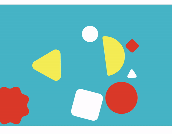
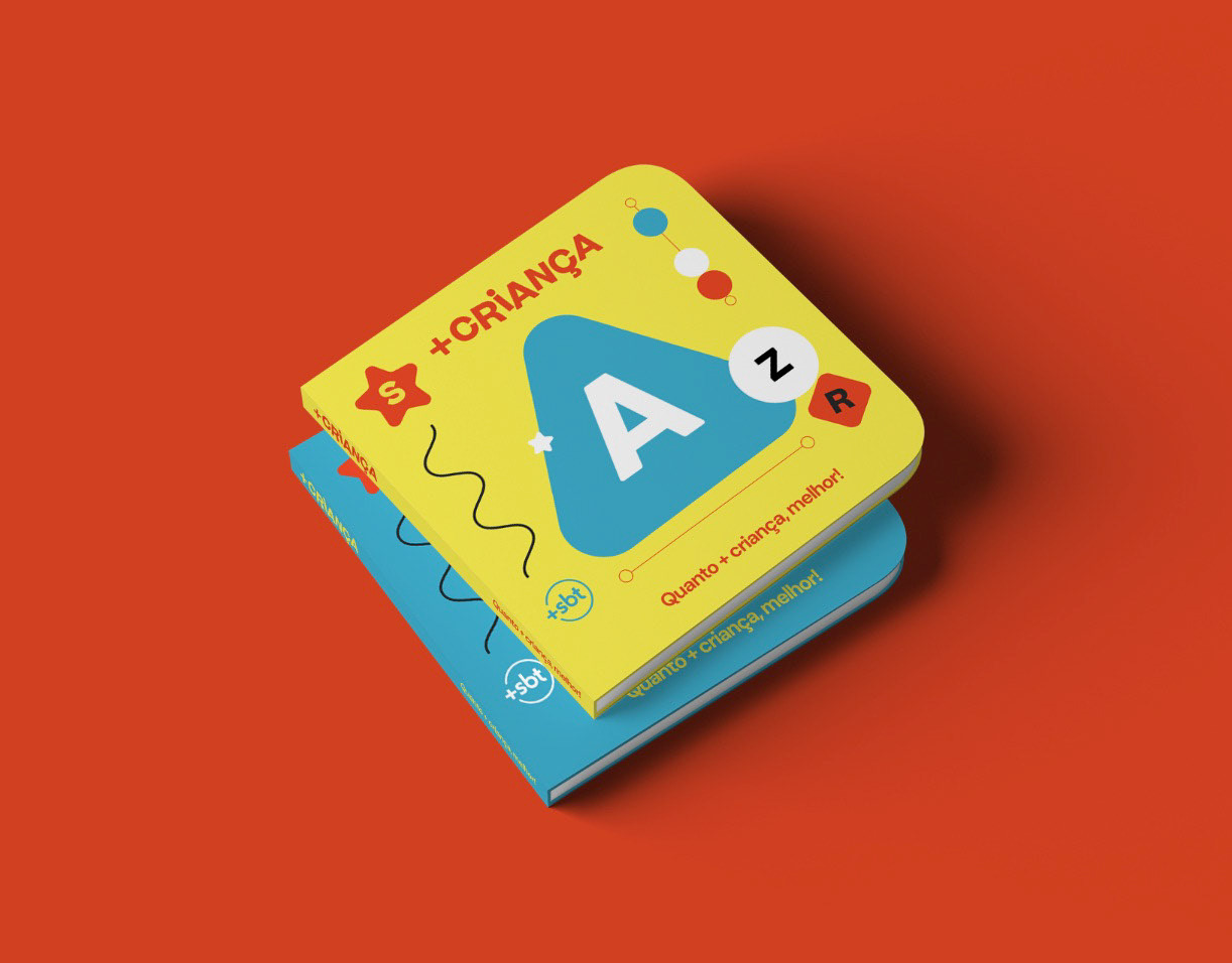
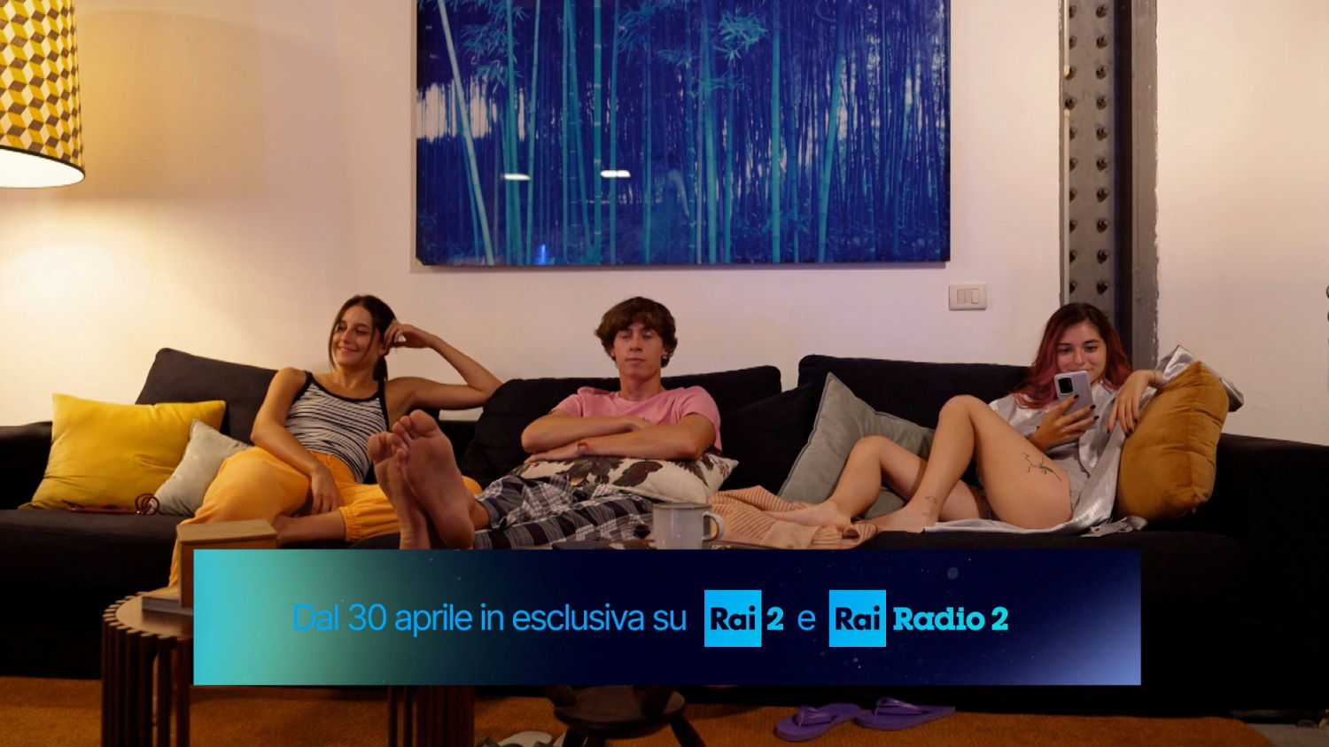
BRAND SYSTEM
The Client
Radiotelevisione Italiana, the national broadcasting company of Italy, operates many terrestrial and subscription television channels and radio stations (Rai 1, 2, 3, 4, Rai Culture, Rai Fiction, Rai Sport, Rai Kids, to name some). It is one of the biggest broadcasters in Italy.
The Challenge
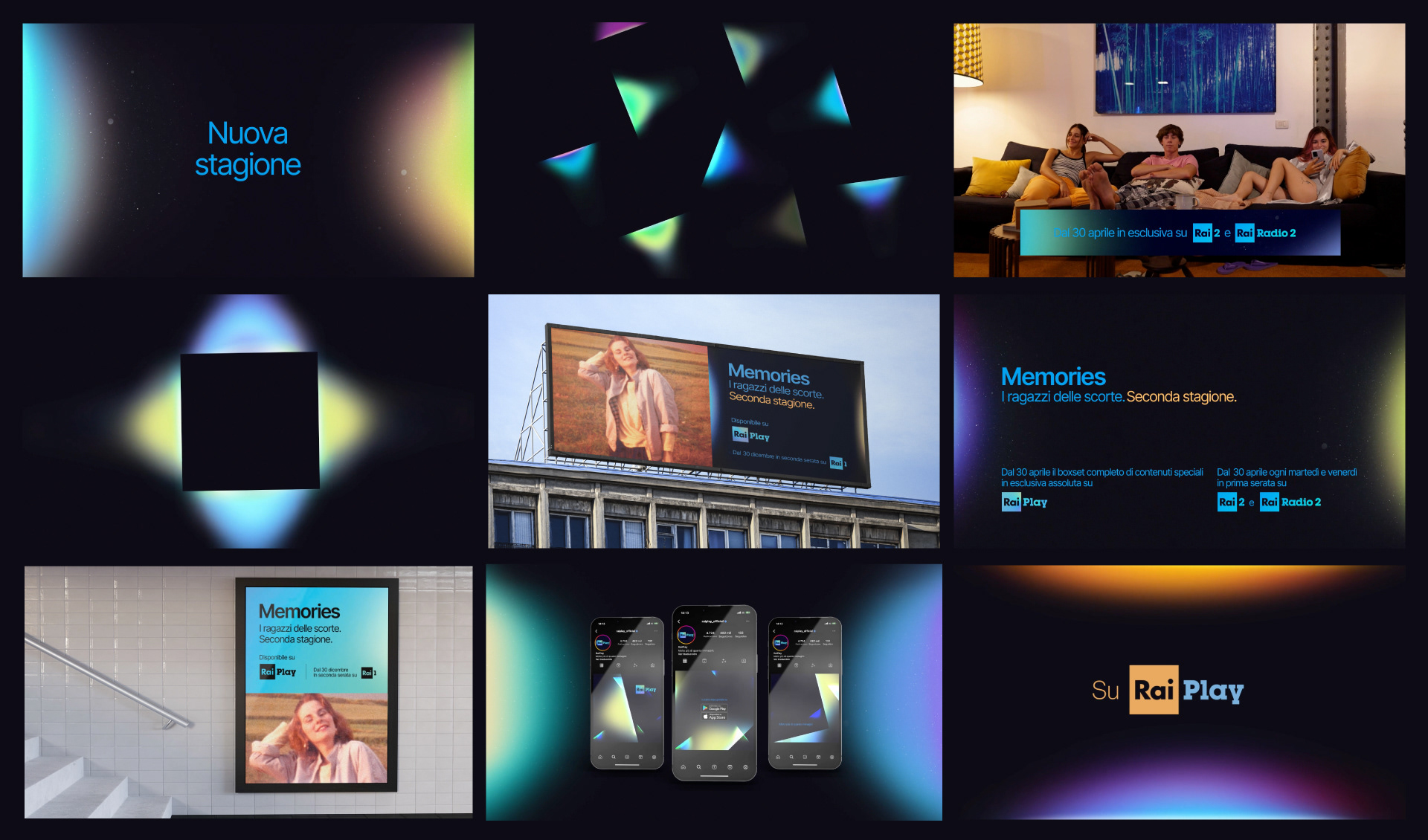
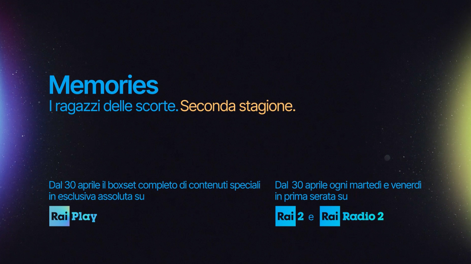
Flopicco Studio was commissioned to rebrand Rai's streaming system: Rai Play. They wanted a visual approach that speak of the legacy and elegance and of modernity and the comfort of streaming from home. A brand that reflected Rai's distinctive attributes with a touch of innovation.
The Flopicco Studio Approach
Playing with lights and textures that evoque both digital and physical supports, right there in the intersection of mediums, languages, supports, color temperatures, that was our focus while ideating, designing and animating this distinctive -yet familiar- brand identity.


El cliente
Radiotelevisione Italiana, la empresa de radiodifusión nacional de Italia, opera muchos canales de televisión terrestres y de suscripción y estaciones de radio (Rai 1, 2, 3, 4, Rai Culture, Rai Fiction, Rai Sport, Rai Kids, por nombrar algunos). Es una de las mayores emisoras de Italia.
El reto
Flopicco Studio estuvo a cargo del rebranding the Rai Play que es el servicio de streaming de Rai. Querían un enfoque visual que balanceara el legado y la elegancia con la modernidad y la comodidad del streaming desde casa. Una marca que reflejara los atributos distintivos de Rai con un toque de innovación.
El enfoque de Flopicco Studio
Jugar con luces y texturas que evocan tanto soportes digitales como físicos, siempre en la intersección de medios, lenguajes, soportes, temperaturas de color, ese fue nuestro foco mientras ideábamos, diseñábamos y animábamos esta distintiva -aunque familiar- identidad de marca.


CREDITS
CLIENT
Rai
CREATIVE DIRECTION, ART DIRECTION
AND GRAPHIC PRODUCTION
Flopicco Studio
Inhouse Team
Florencia Picco, Fernando Vallejos, Natalia Bellagio, Emiliano Agnetti, Alejandro Guatelli,
Pablo Camino, Martín Polech, Soledad Basigalup, Julieta Alessio, Matias Pastorini,
Pia Rossi and Leandro Nicolosi
💜