I T A L Y  ·  F L O P I C C O  S T U D I O  +   D I S C O V E R Y  I T A L Y   ·  2 0 2 2


MOTOR TREND
BRANDING TOOLKIT


Complete Toolkit for the 2022 Brand Refresh of Motor Trend, a channel for all things automotive that is owned by Warner Bros. Discovery Italia and part of the global Motor Trend family.

This toolkit will be added to the current branding of the channel, also ideated and designed by Flopicco Studio. As you will see, the toolkit is a simple and concise array of On-Air, Off-Air and Digital pieces, plus two 3D Animated Idents.


IDENTS

The golden pieces of this brand refresh are the two 3D animated Idents we have ideated and animated. This one is for all the "motor-nerds" that watch the channel (pretty much all the audience). Is called Engineering. 


The second IDENT is specially for the fans of the shows where derelict vintage and classic autos are recovered by the expertise of the hosts. It is called: Recover.
​​​​​​​
CREDITS

CLIENT
DMAX 


CREATIVE DIRECTION, ART DIRECTION
AND GRAPHIC PRODUCTION
Flopicco Studio

Inhouse Team
Florencia Picco, Fernando Vallejos, Natalia Bellagio, Daniela Parasporo, Pablo Camino,
Alejandro Guatelli, Martín Polech, Ana Laya, Soledad Basigalup, Matias Pastorini, Leandro Nicolosi & Sebastian Brown

With the collaboration of
NEO DG

​​​​​​​


🖤

#GoWithTheFlopicco​​​​​​​​​​​​​​

You may also like

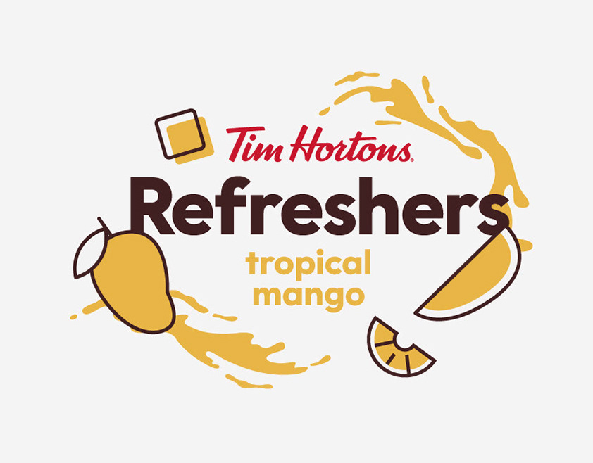
TIM HORTONS REFRESHERS MERCH
Our goal was to capture the essence of summer in our visual system while creating useful products for the season. We used a sunny color palette inspired directly by the drinks themselves, with juicy reds, yellows, and greens. We created a graphic language to tie the whole set together that is fresh and evocative. These products are a vacation you can wear.
Graphic Design, Branding
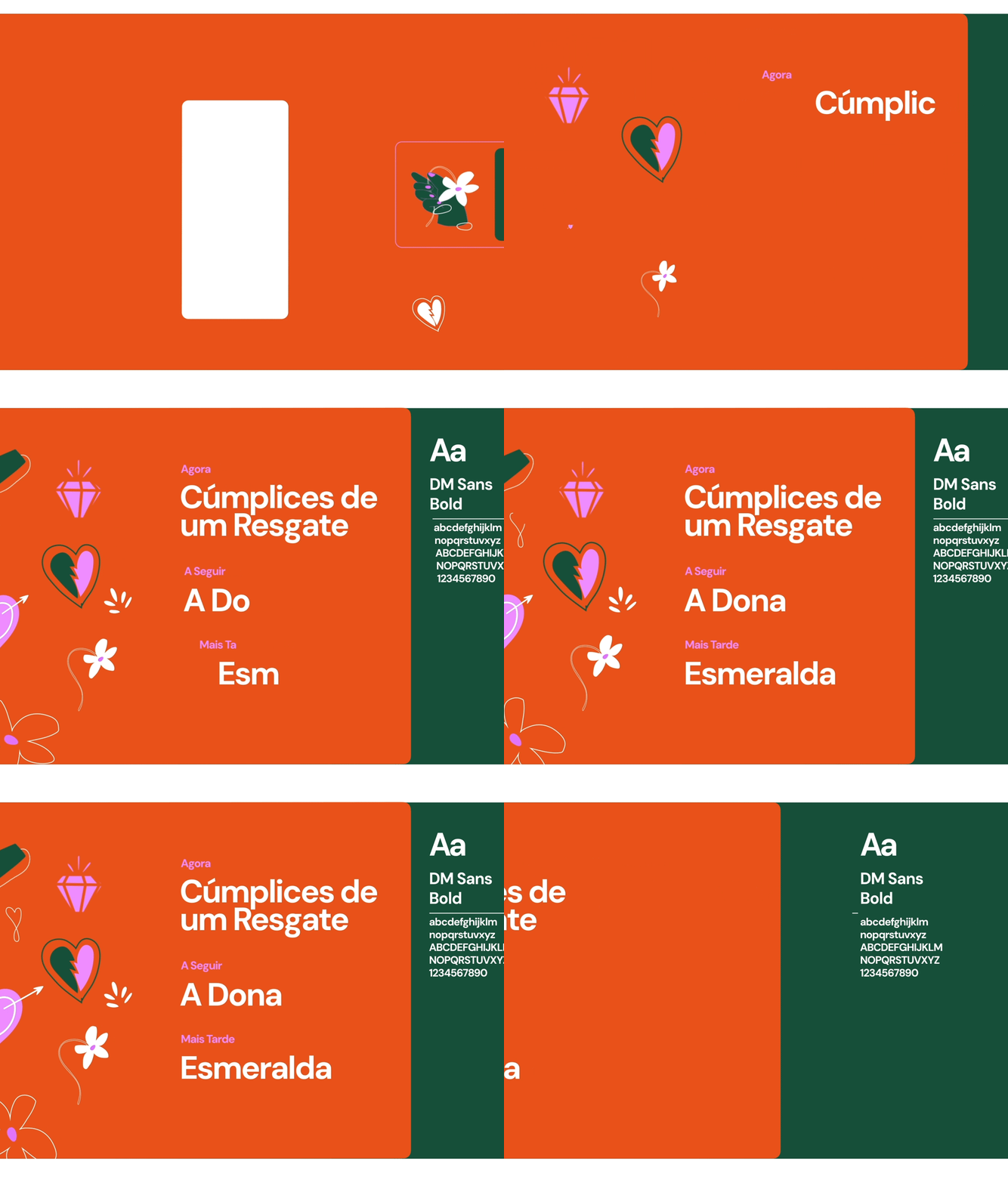
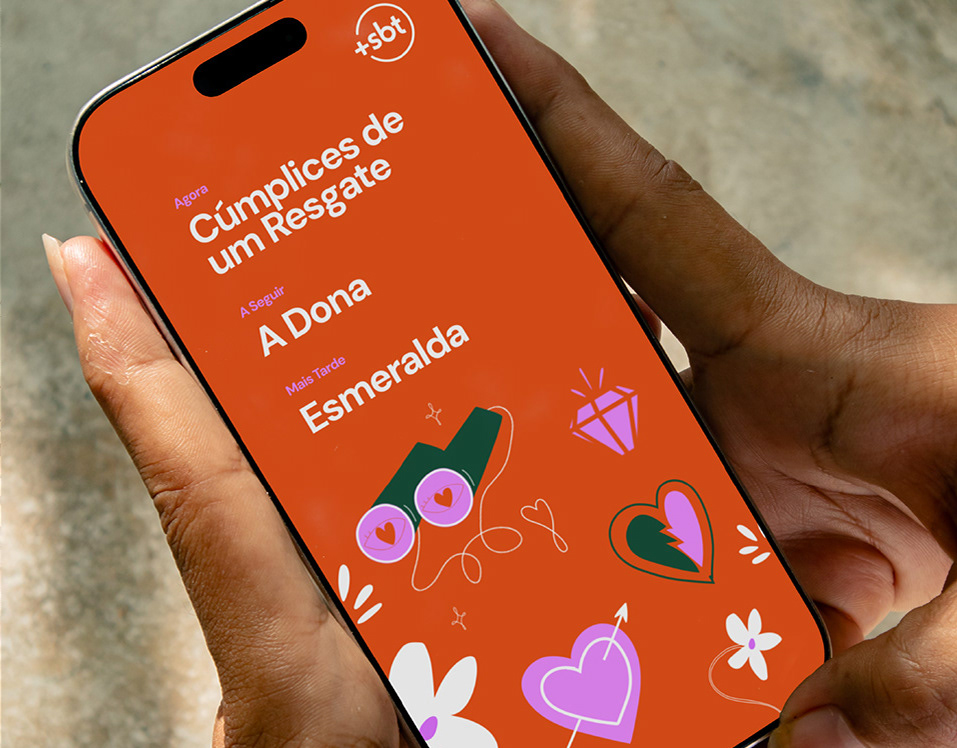
+SBT NOVELAS: BRAND SYSTEM
Inspired by the visual language of classic romance stories, we designed a playful set of icons that symbolize fragments of these stories, emotions, and convoluted plots. We worked with a palette of bold, contrasting colors: pink, blood orange, and dark green. These colors speak of passion and opposites attracting. The result is a brand system that celebrates the enduring love stories that keep audiences tuning in night after night.
Branding, Art Direction
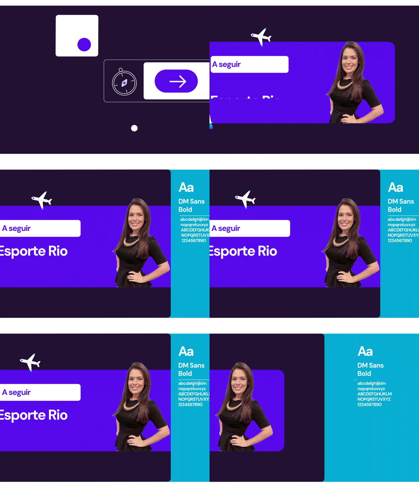
+SBT INFORMAÇAO
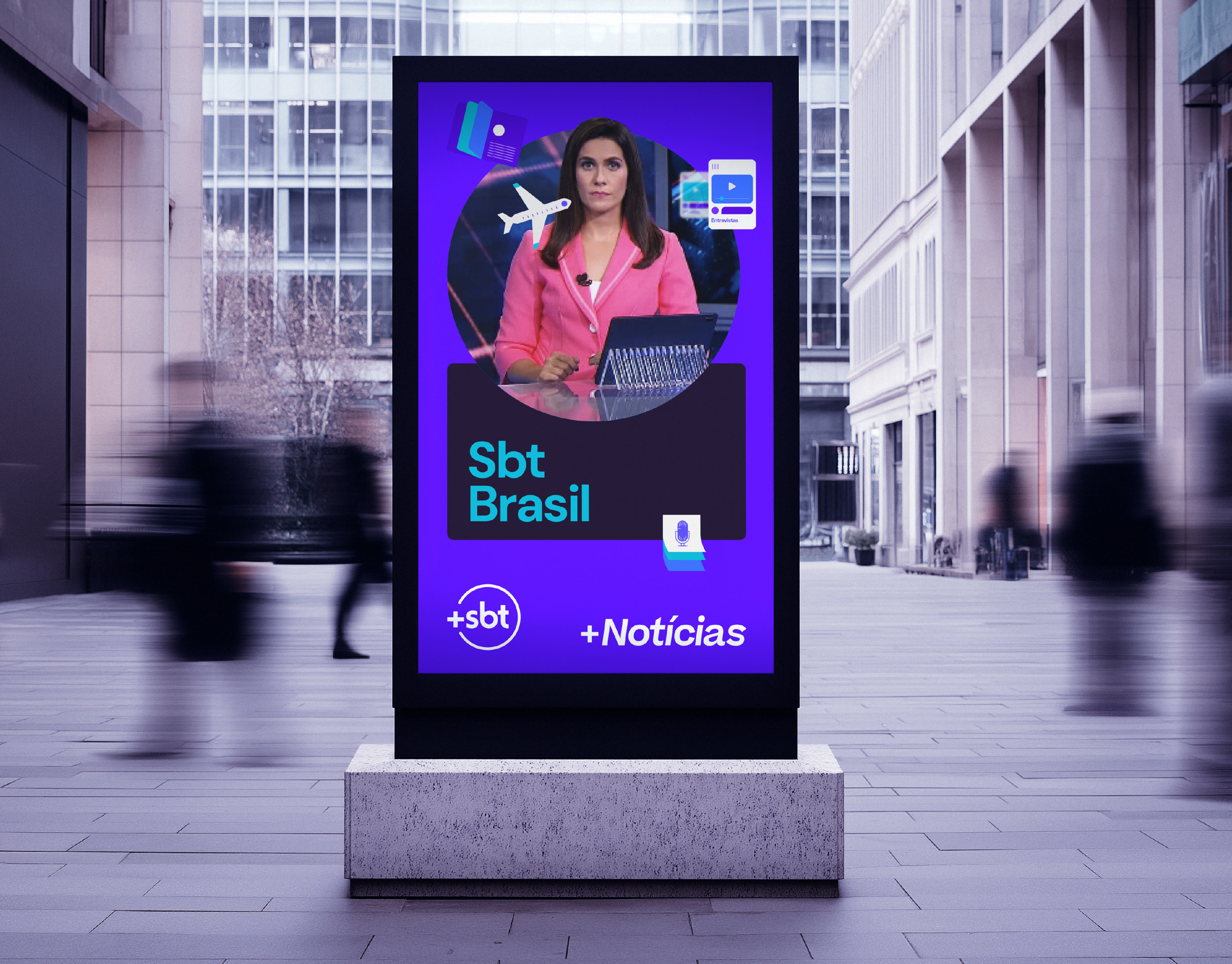
+SBT Informação, a Brazilian news outlet, needed a brand identity that could reflect the breadth of today's news landscape, covering everything from the economy and health to sports, travel, and fashion.
Branding, Graphic Design, Motion Graphics
RAI SANREMO GIOVANI 2023
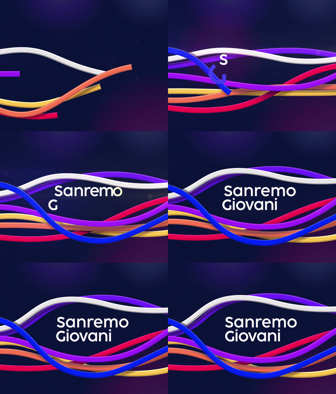
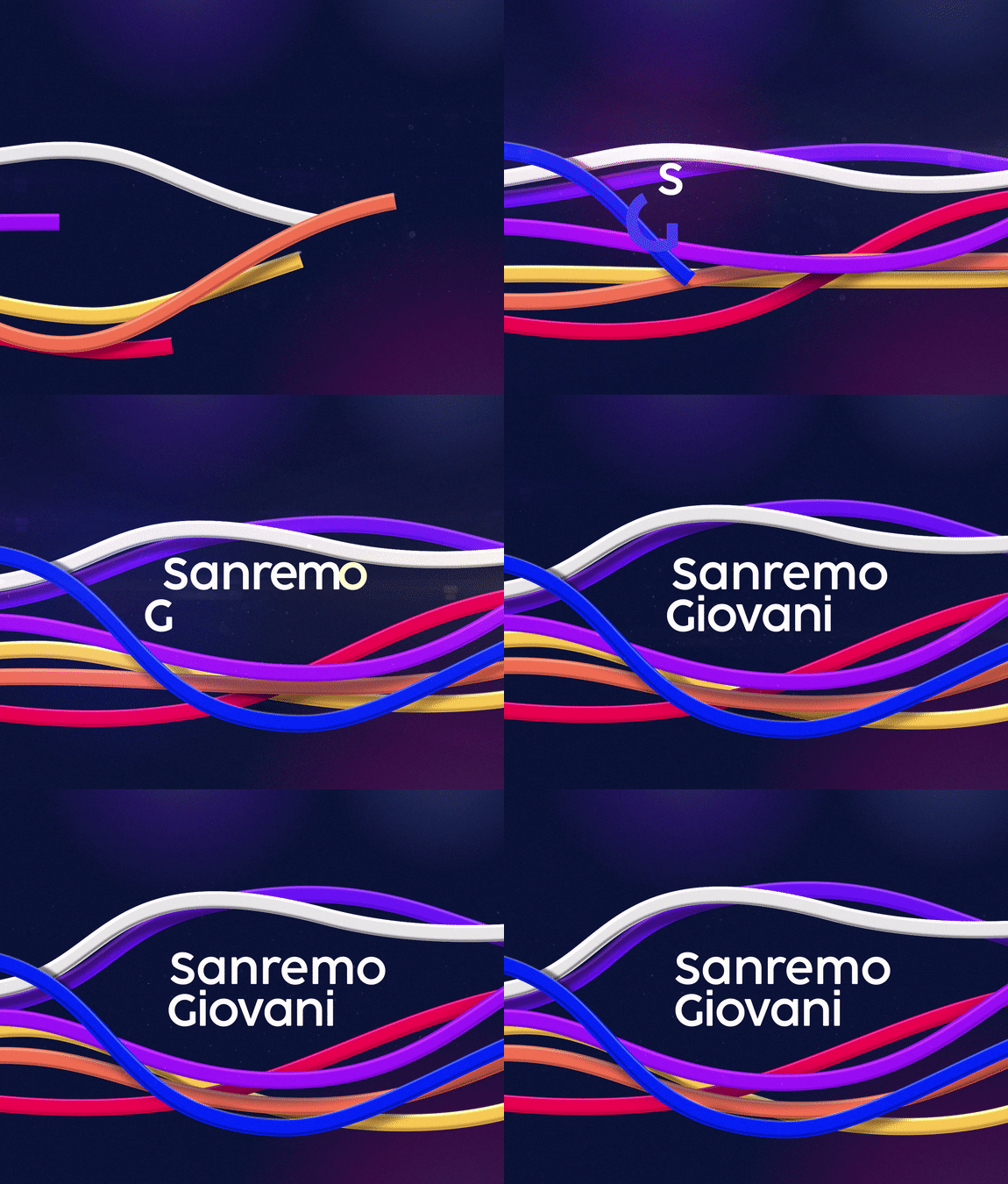
Visual identity and logo design for Sanremo Giovanni 2023.
Branding, Logo Design, Graphic Design
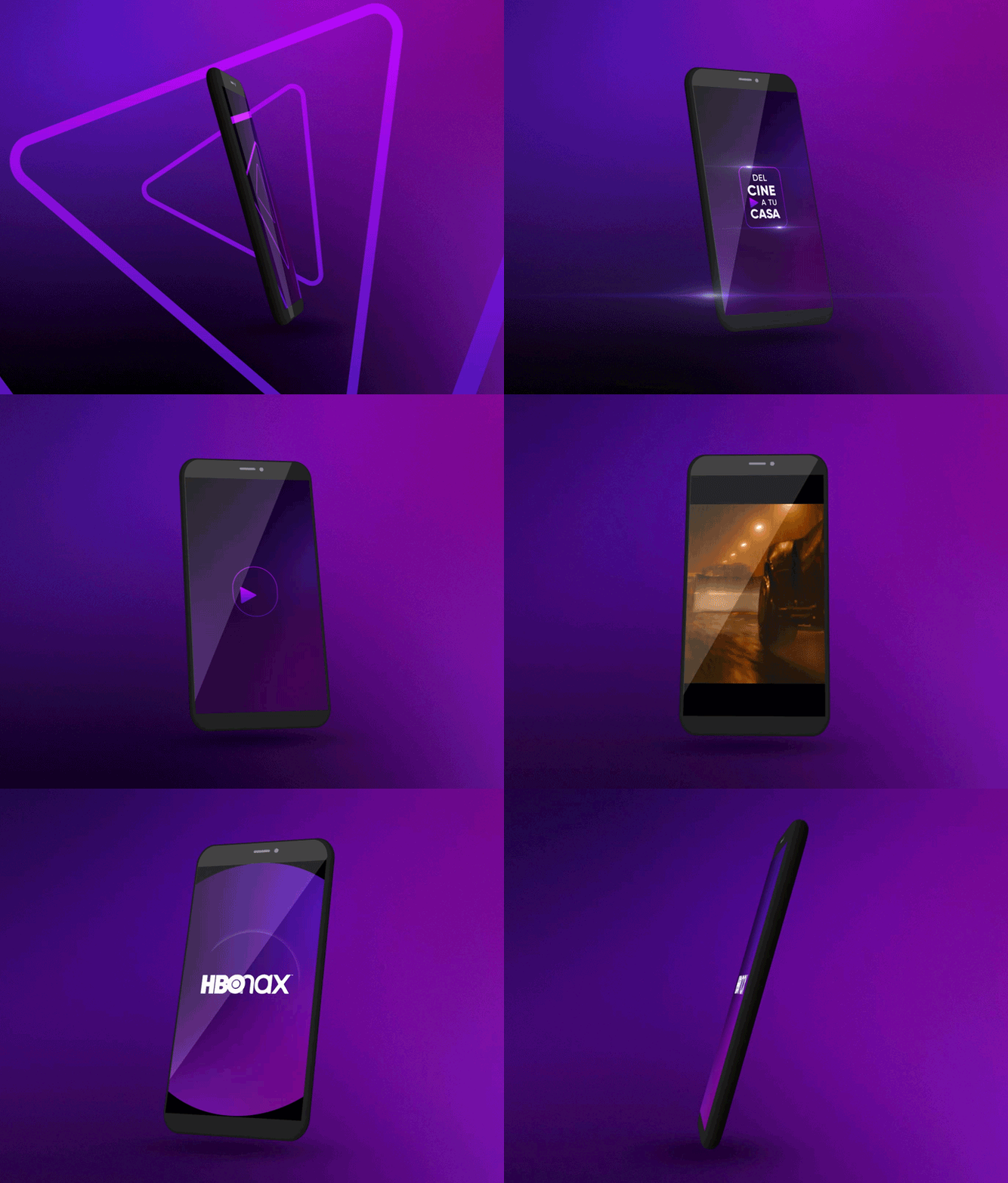
HBO-MAX: DEL CINE A TU CASA
Branding, Graphic Design, Advertising
MOTION DESIGN FOR DMAX IDS
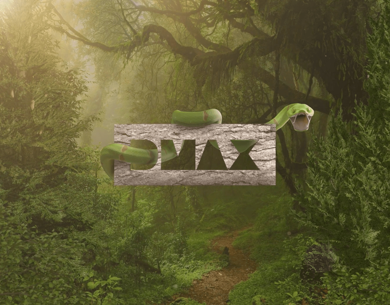
DMAX Italia's commissioned Flopicco Studio a series of seasonal and thematic idents to be aired during 2022 and 2023. Idents that reflected show categories as motor, construction, auction and nature, and also idents for special dates such as Halloween or …
Branding, Motion Graphics
DMAX I DEMONI DELLO SPORT
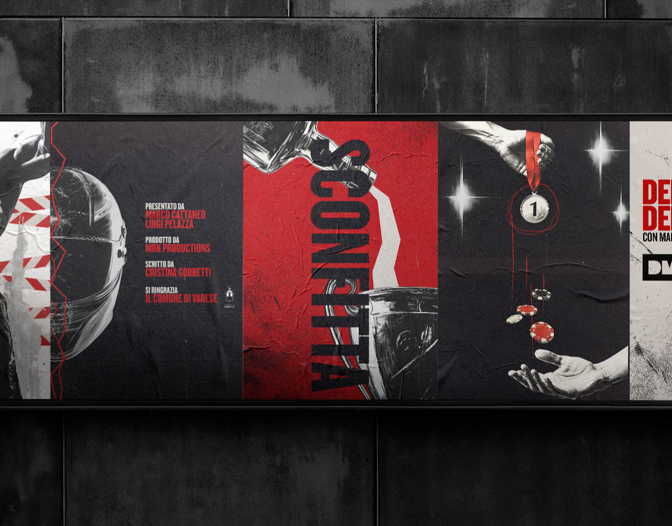
For Demoni dello Sport, Flopicco Studio created an identity that blends tabloid aesthetics with noir influences, highlighting the duality of fame and failure. To amplify the emotional weight of the series, a dramatic red was introduced into the black and white palette, creating a visual tension that reflects the complex reality of these fallen icons.
Graphic Design, Motion Graphics
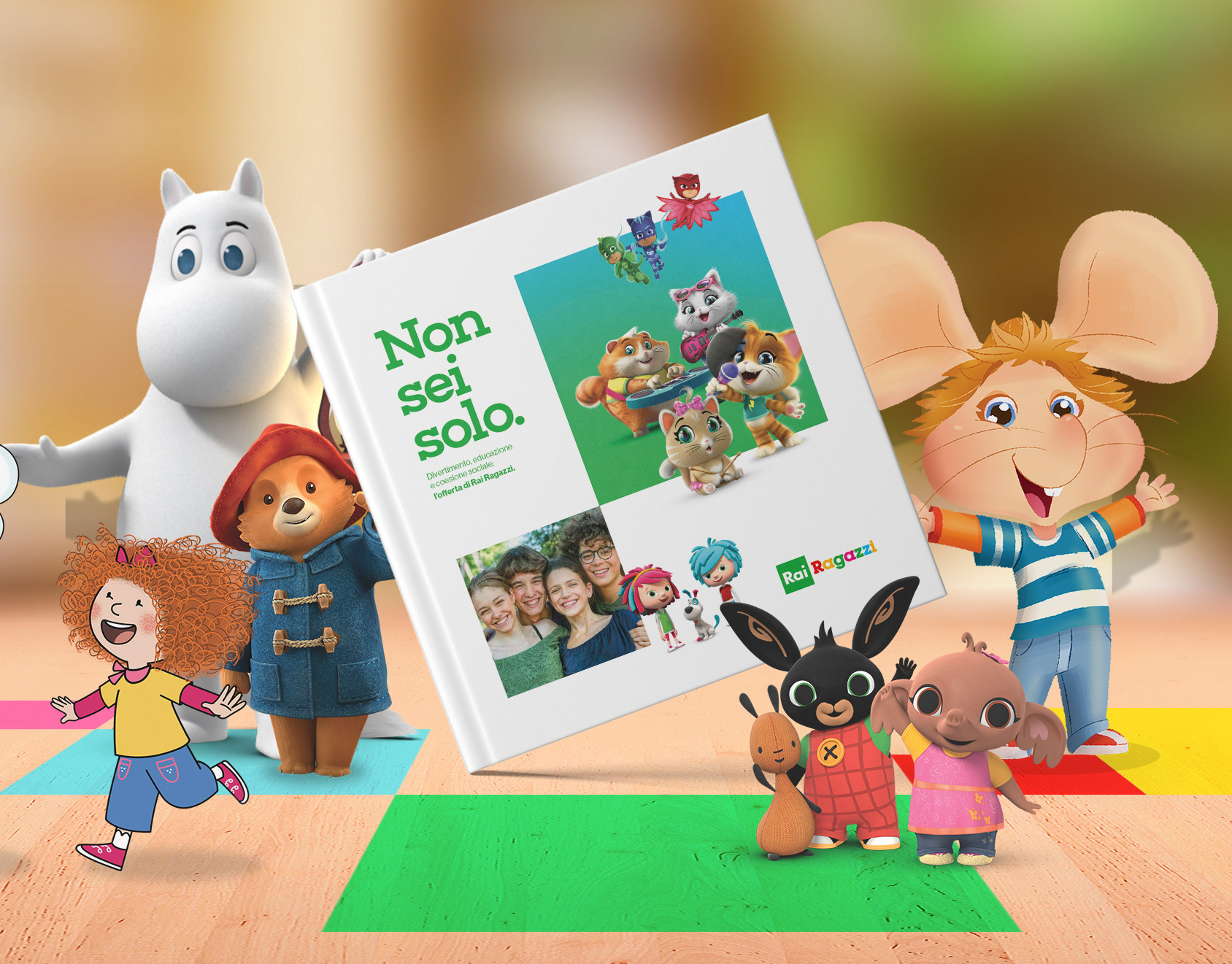
RAI RAGAZZI BOOKLET
Graphic Design, Editorial Design, Branding
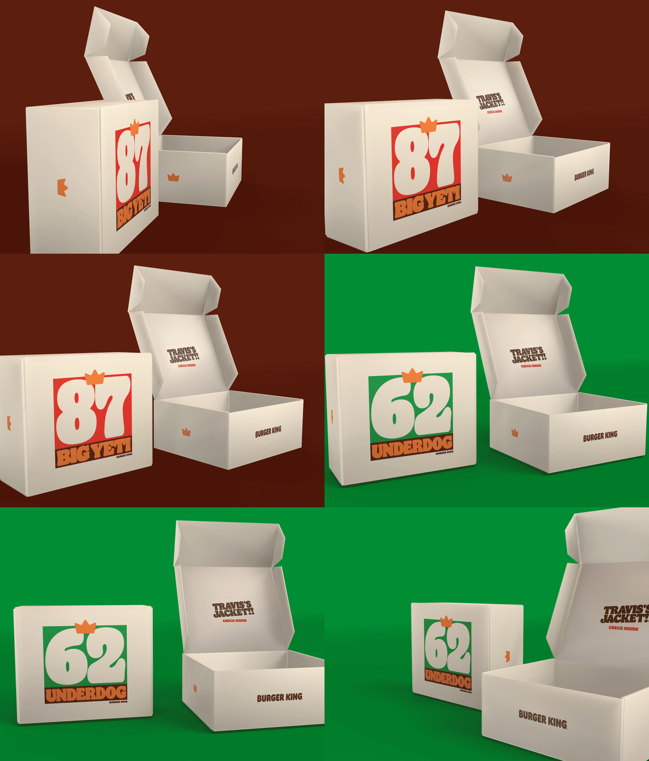
TRAVIS AND JASON KELCE X BURGER KING
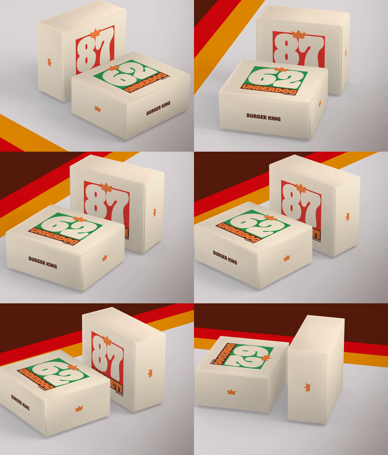
Our commission was simple but very fun, as the Kelce brothers are known not only for being two of the best NFL players but also massive Burger King fans, the company decided to design some cool perks for them.
Graphic Design, Illustration, Packaging
Flopicco Studio Ten Years Manifesto
Graphic Design, Illustration
↑Back to Top