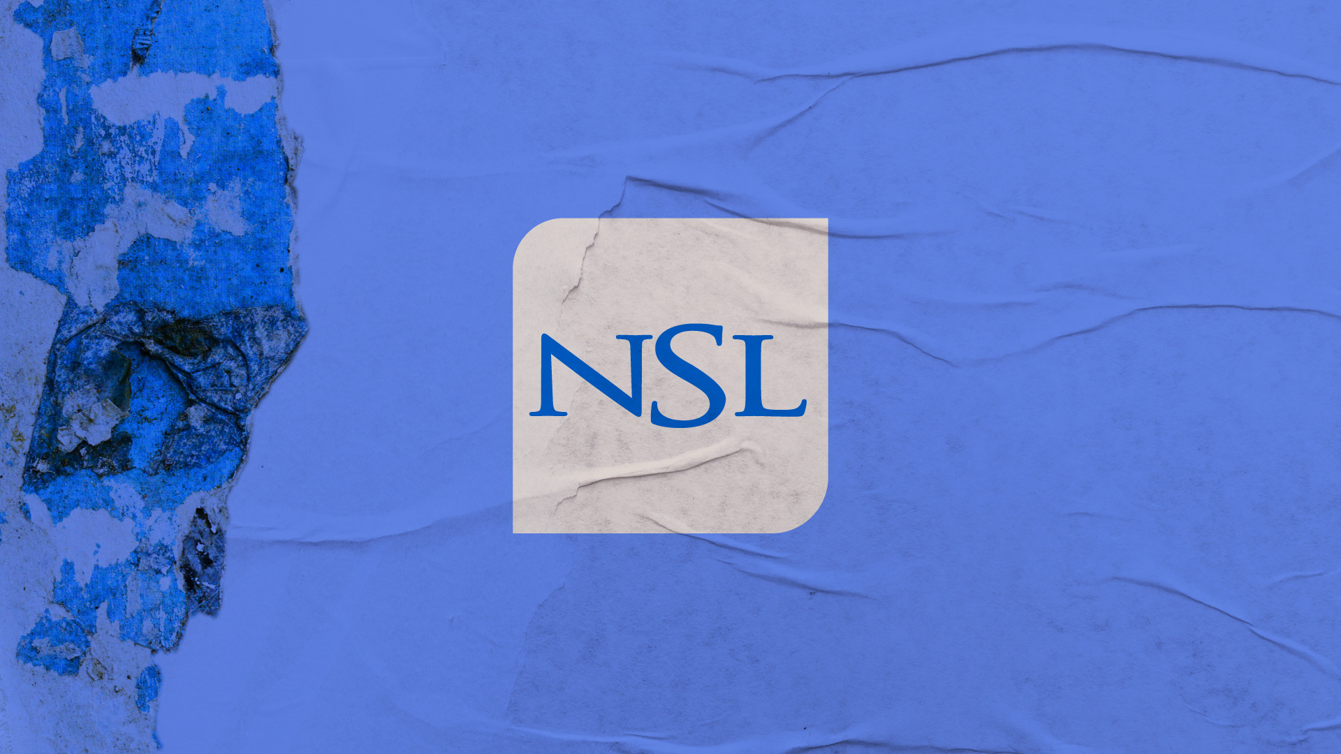
NSL CHANNEL BRANDING


N S L +  I T A L Y · 2 0 1 8


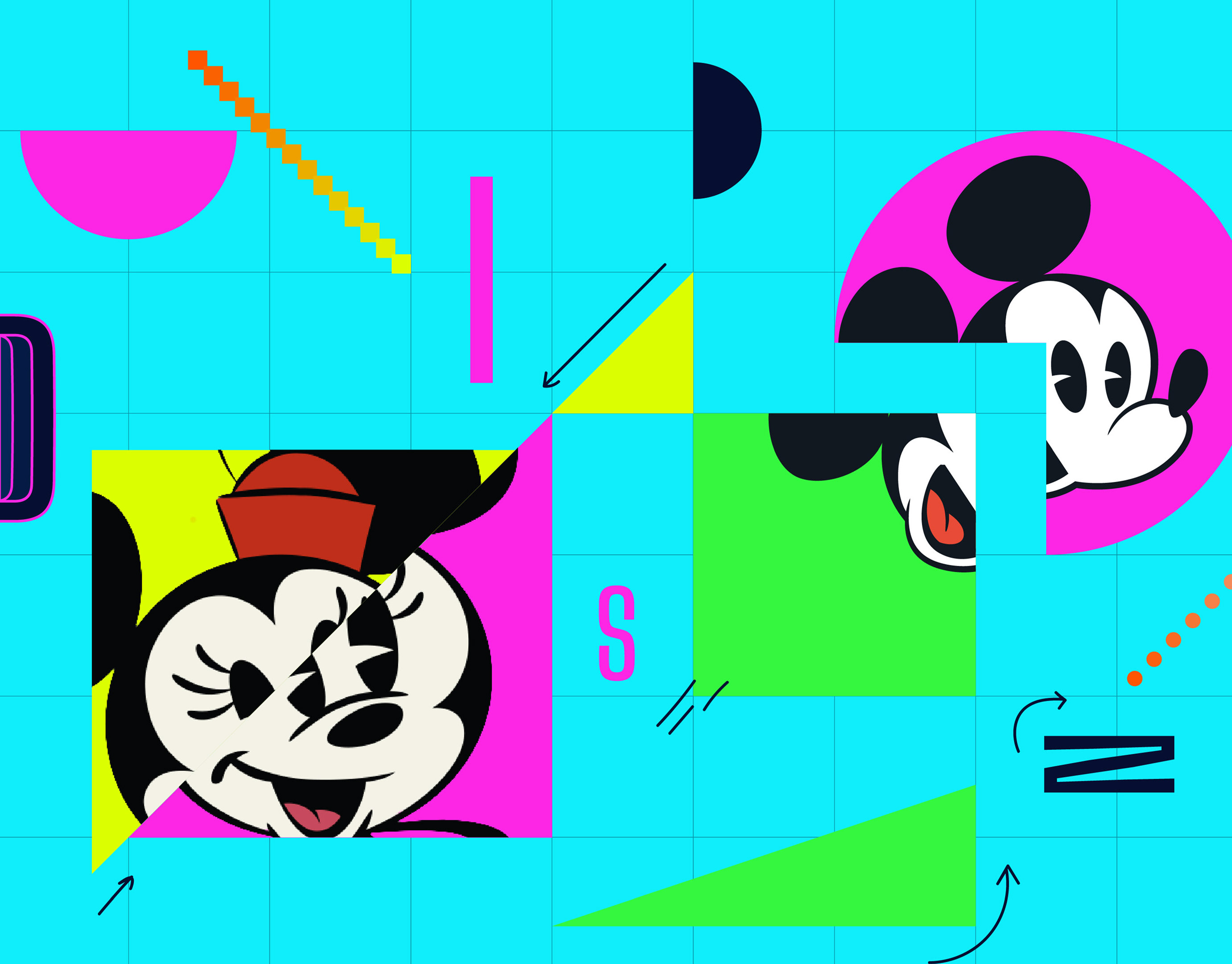
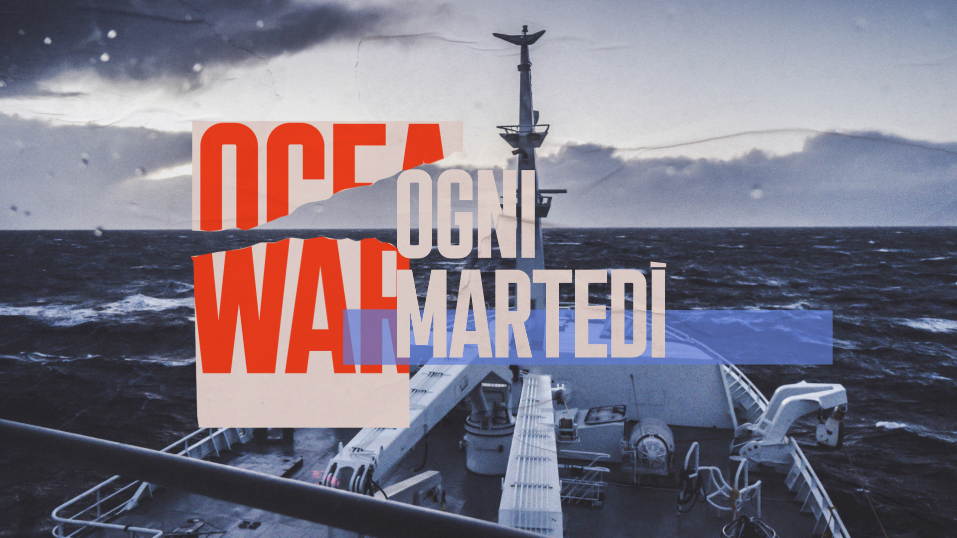
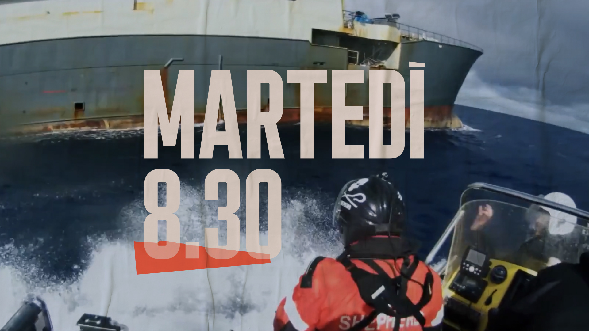
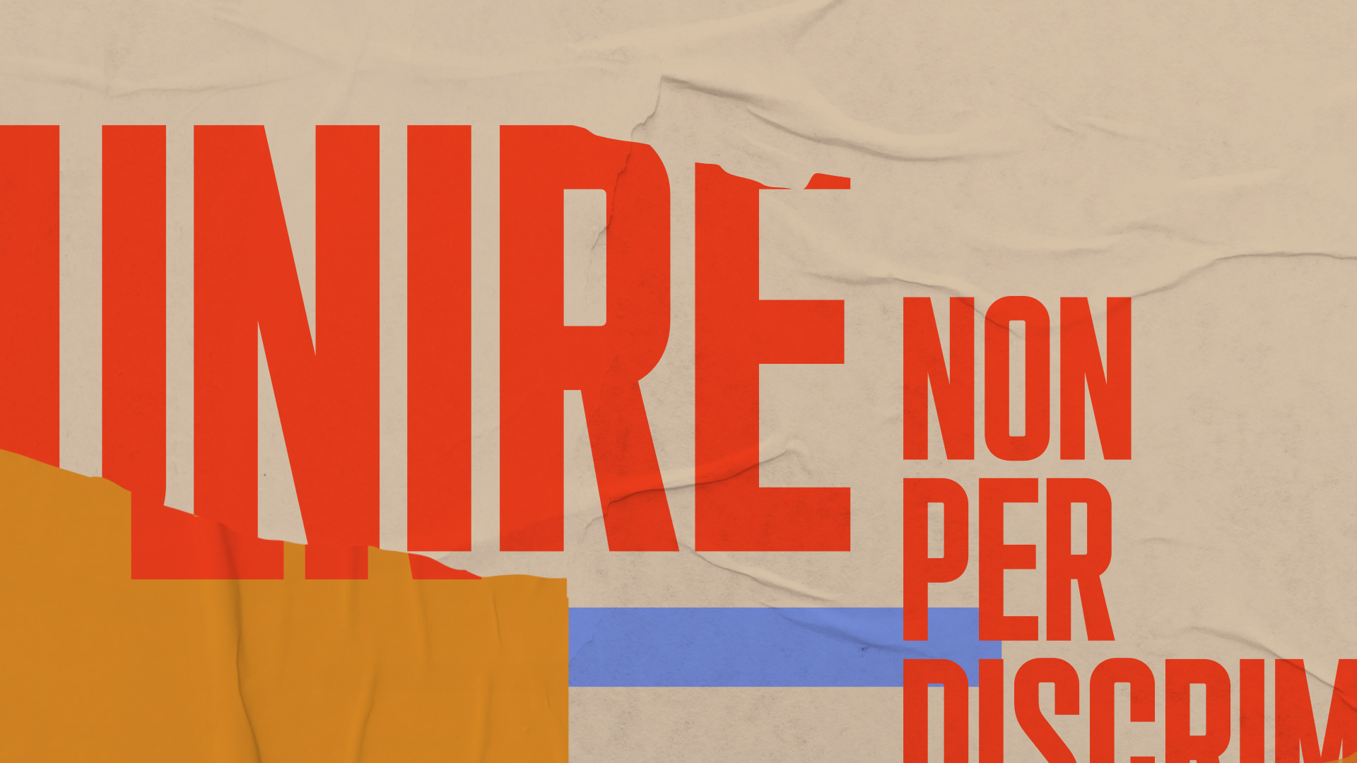
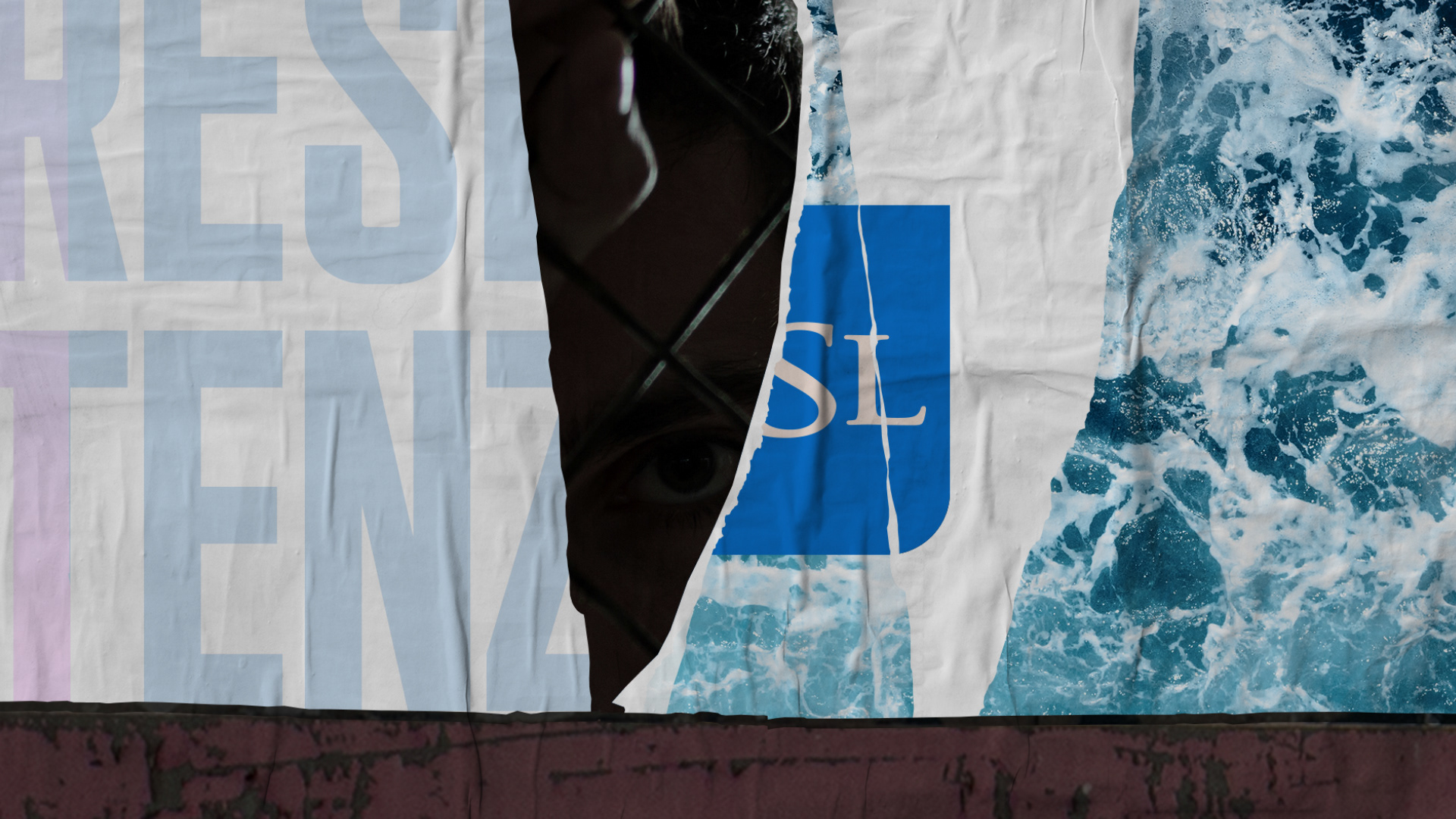
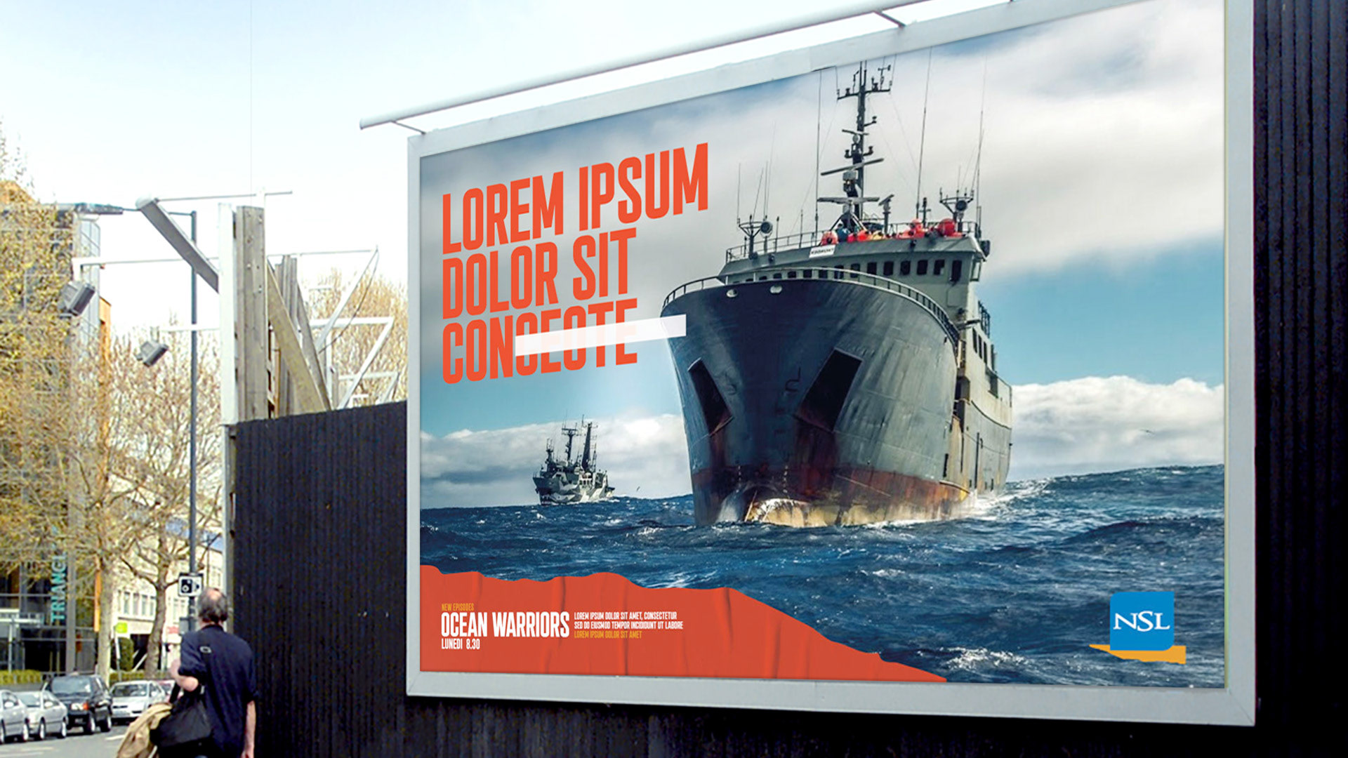
NSL (Noi Siamo La Resistencia), is definitely a very unique audiovisual proposal, an original mix of visual radio, TV series, documentaries, visual radio and live shows that brings forward a critical look to our modern lives.​​​​​​​

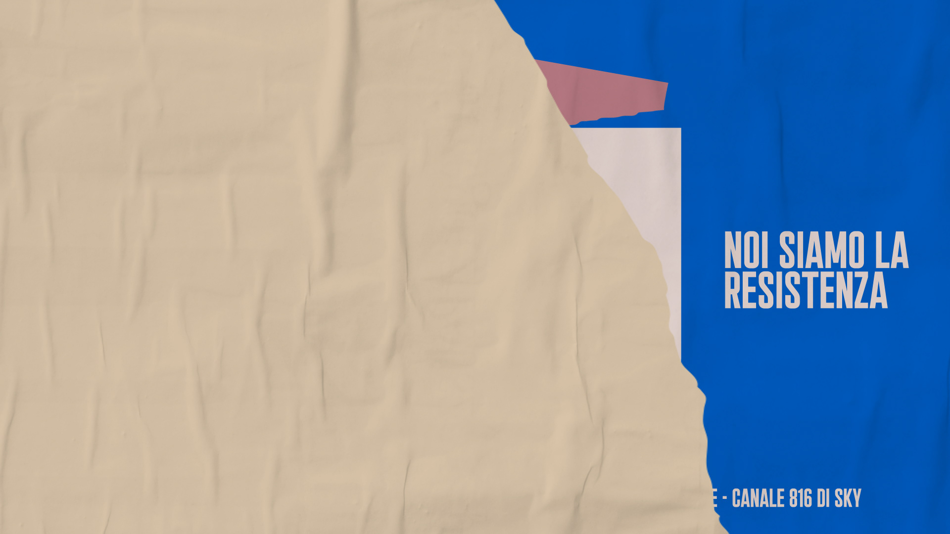
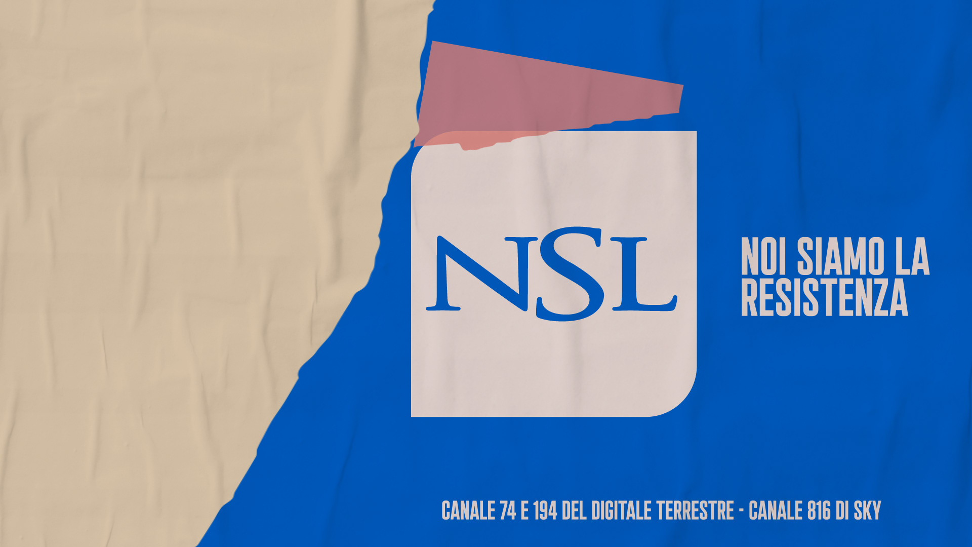
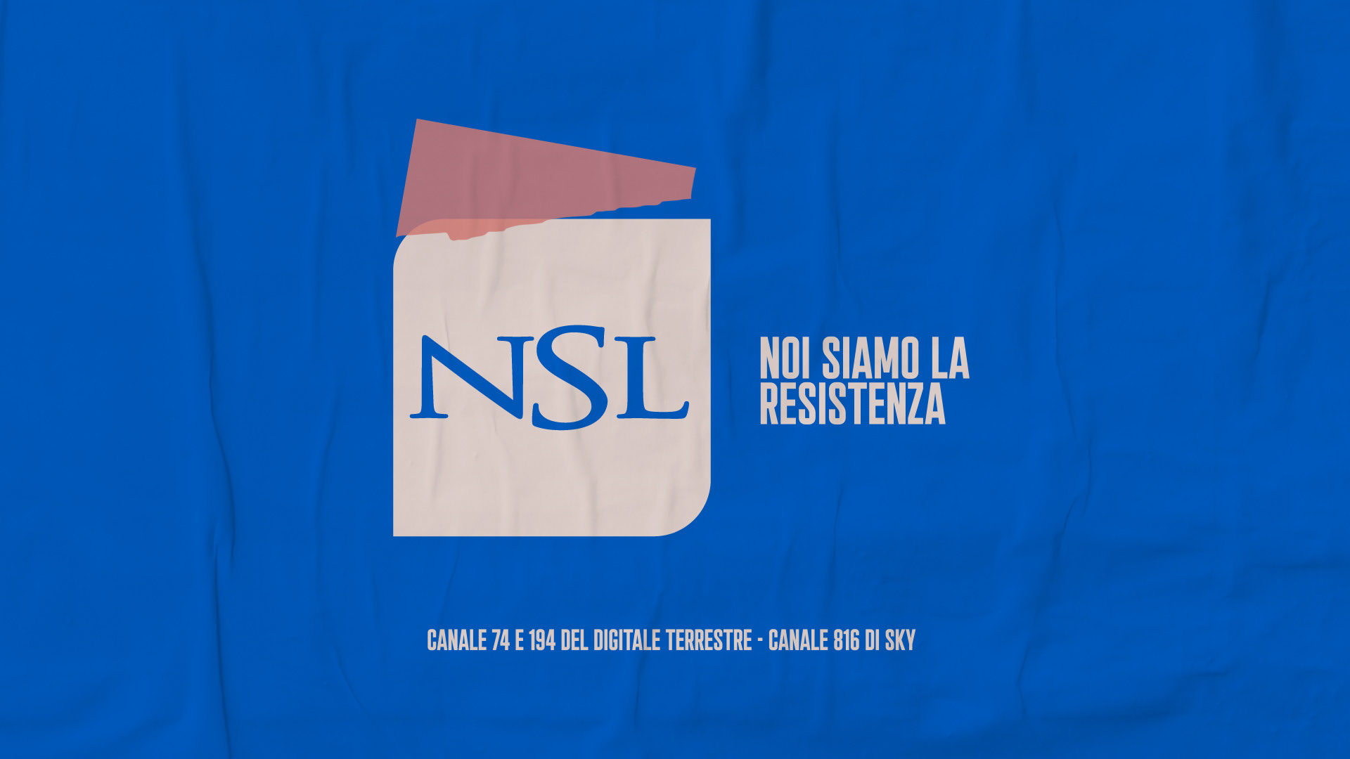
Noi Siamo La Resistencia means "we are the resistance", a very strong stand that we wanted to bring to life visually in an authentic way. 


​​​​​​​

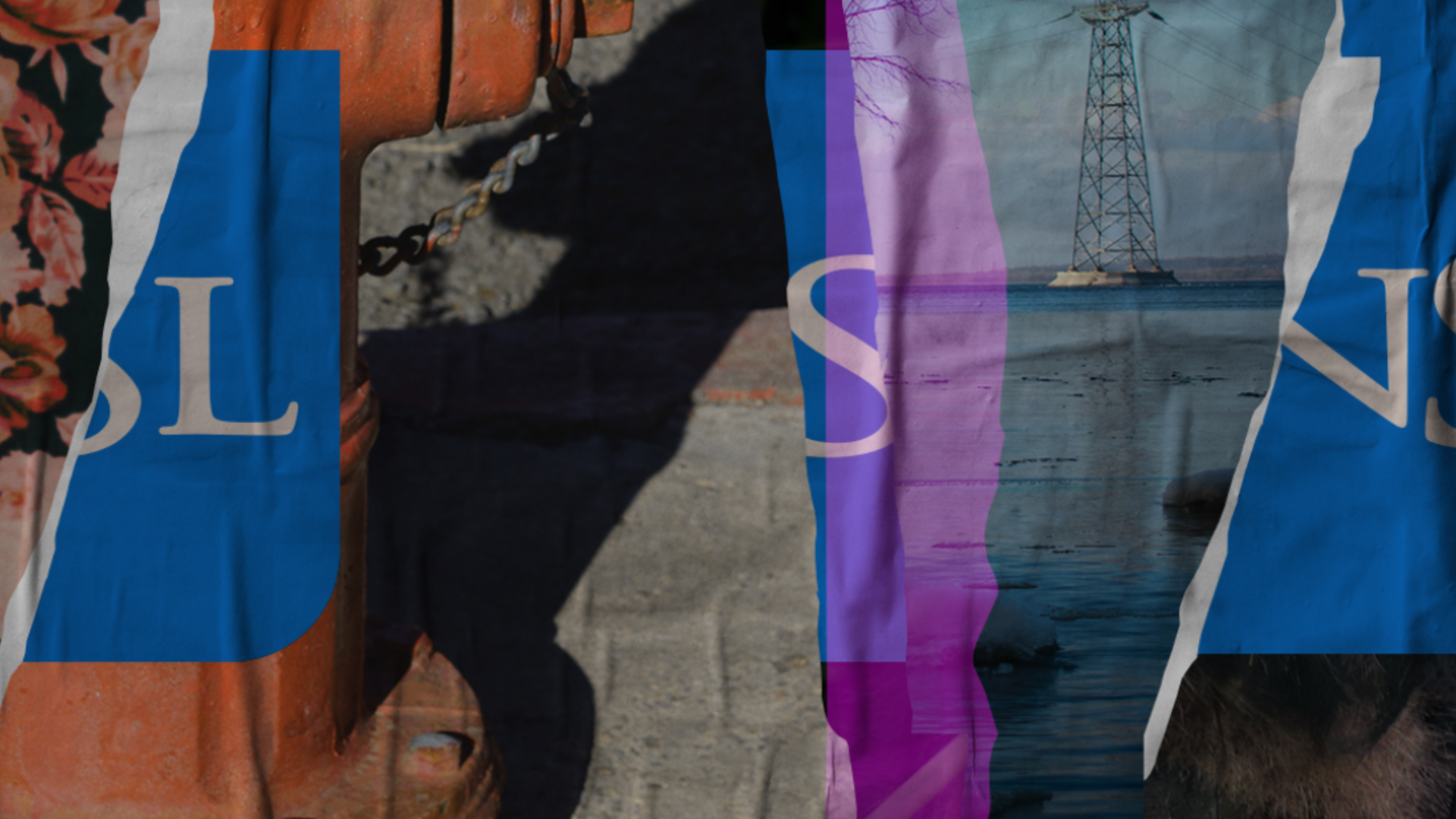
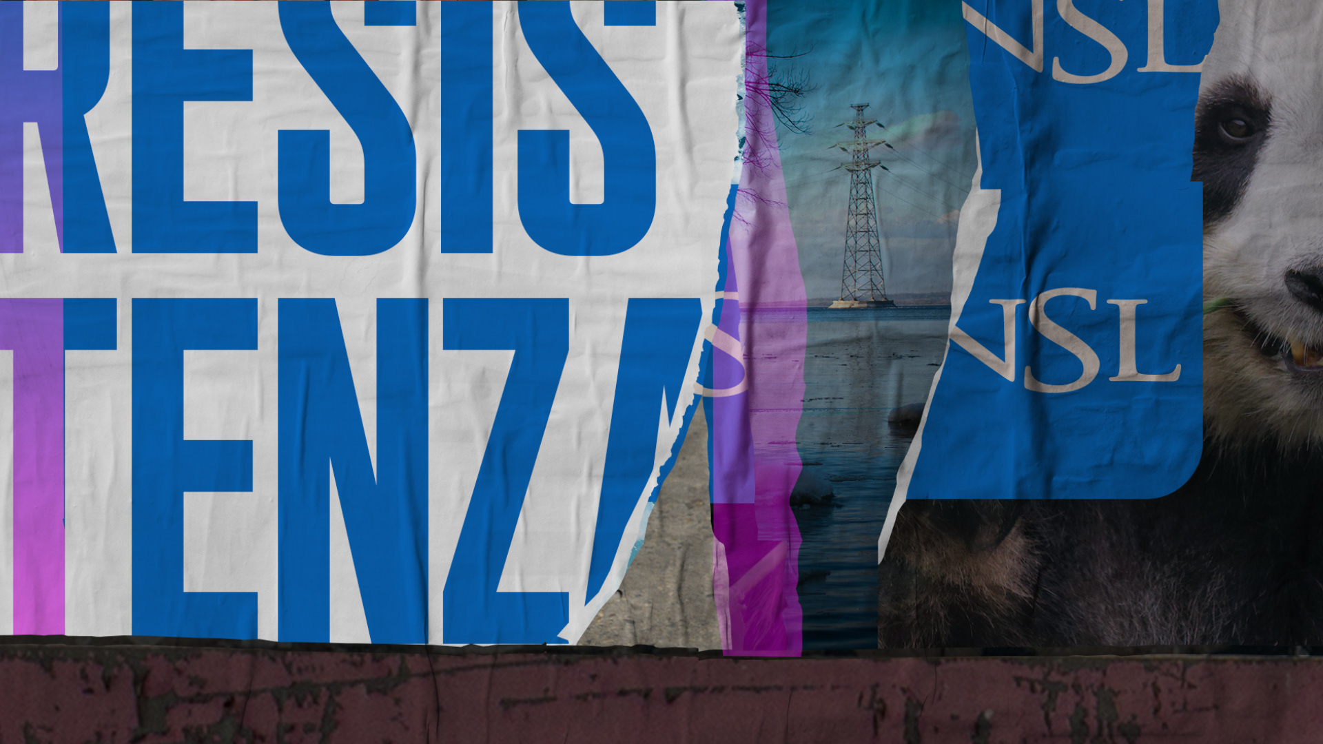
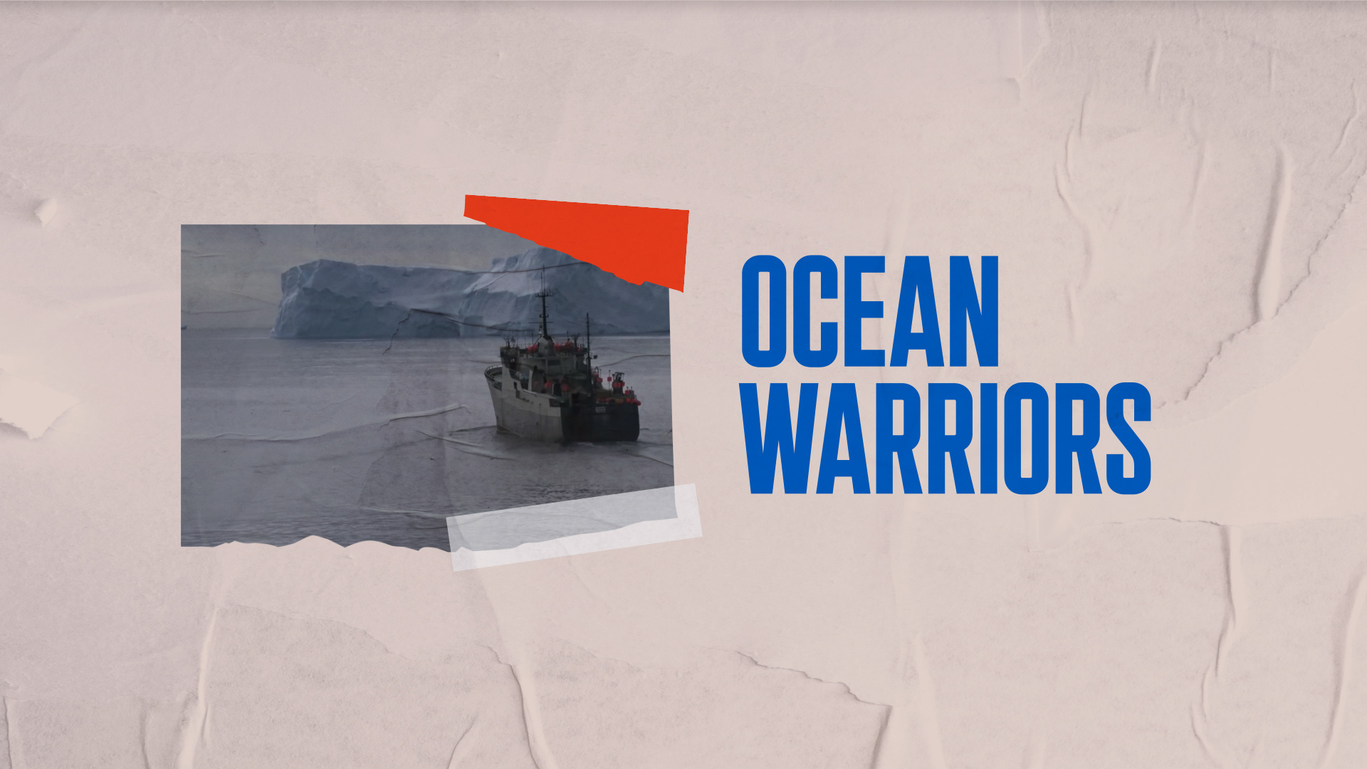
Flopicco working alongside the prestigious Milan-based company Clonwerk created the branding for this channel focusing on highlighting the voice of the broadcaster that is everything but shy as it pushes forward the mission of promoting a positive impact in the world. 


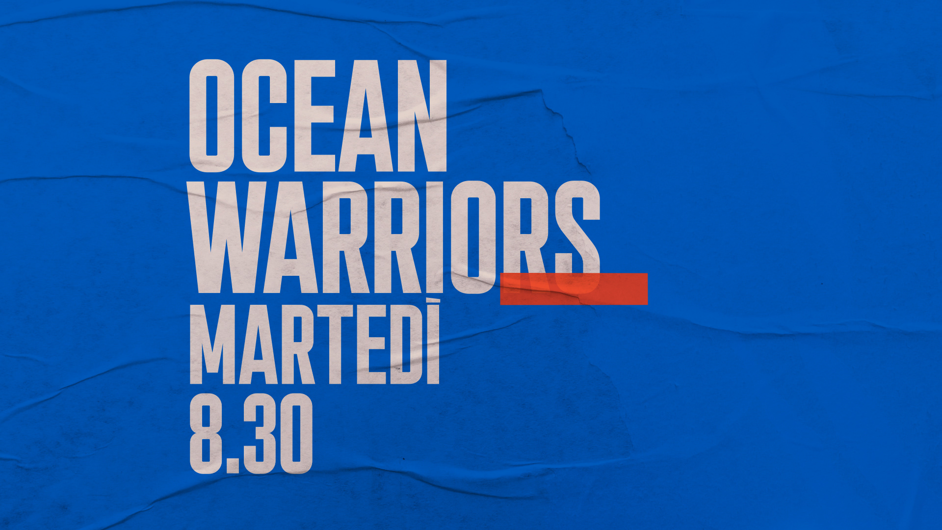
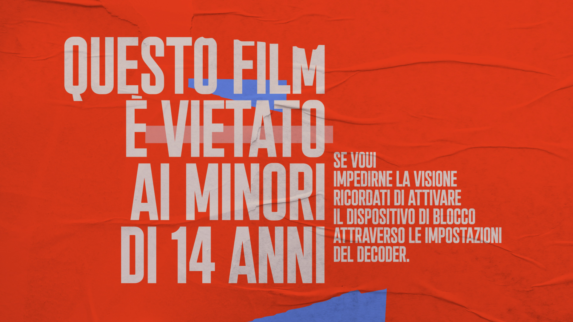
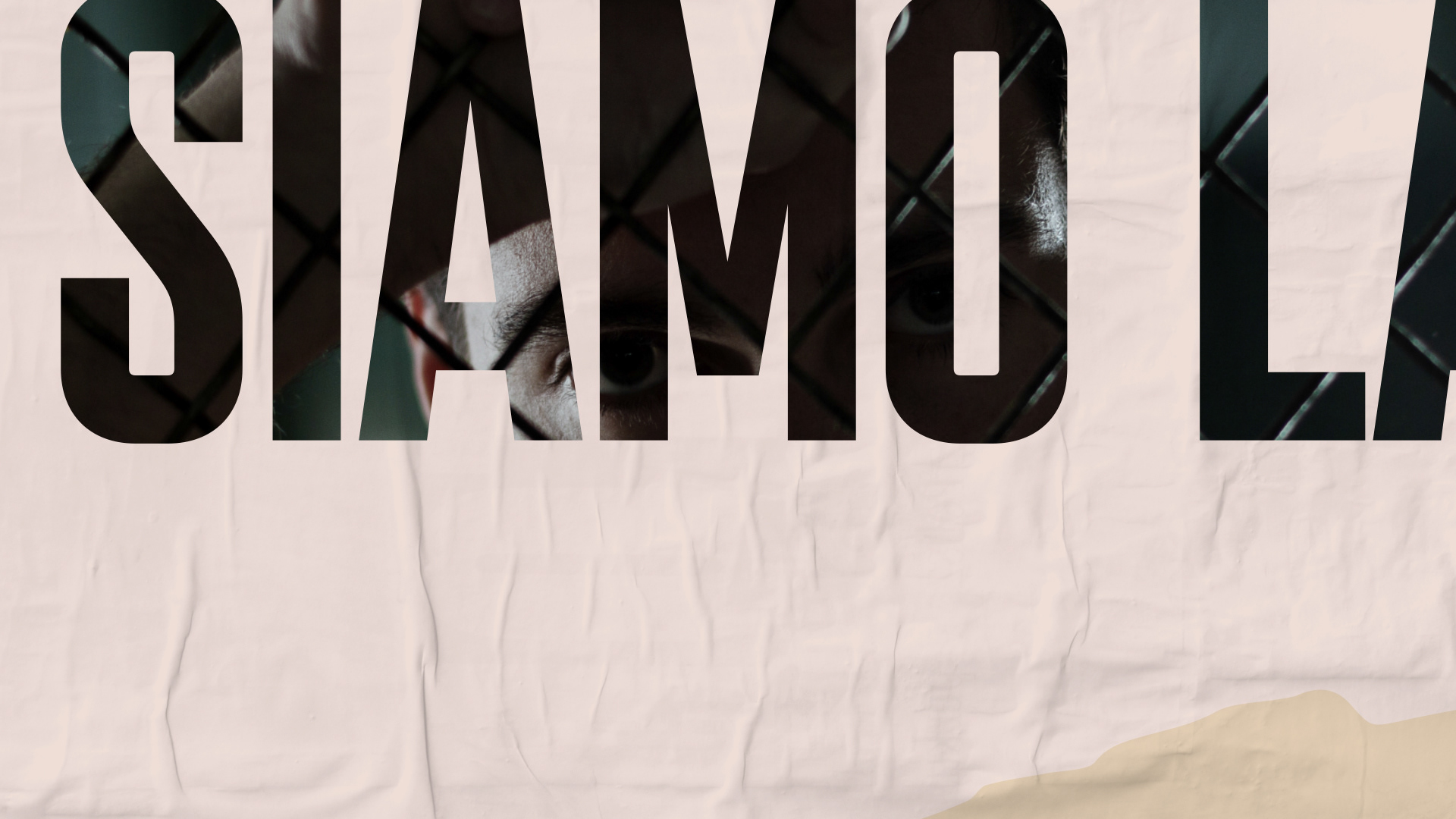
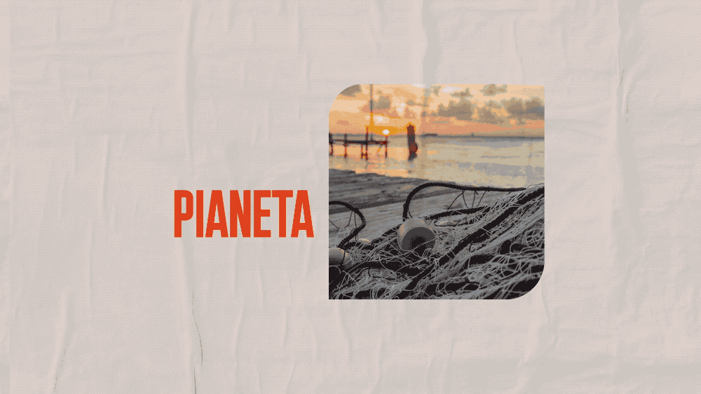
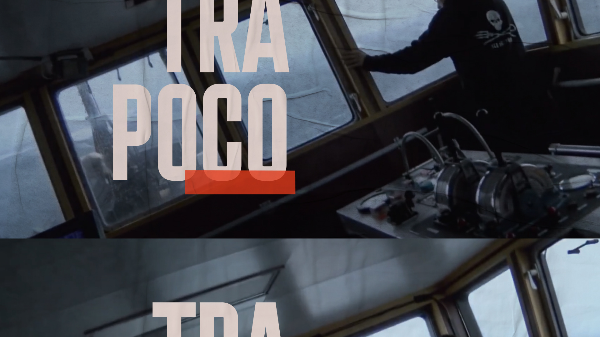
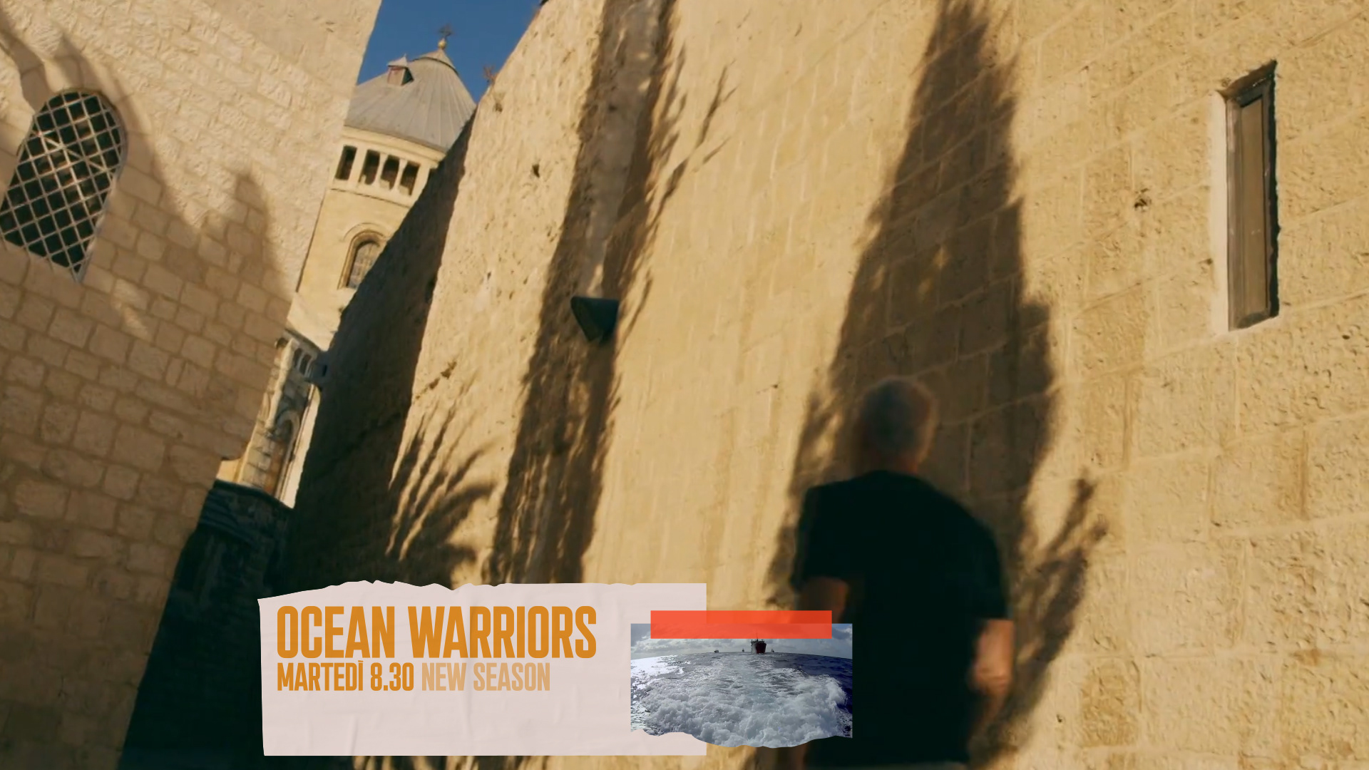
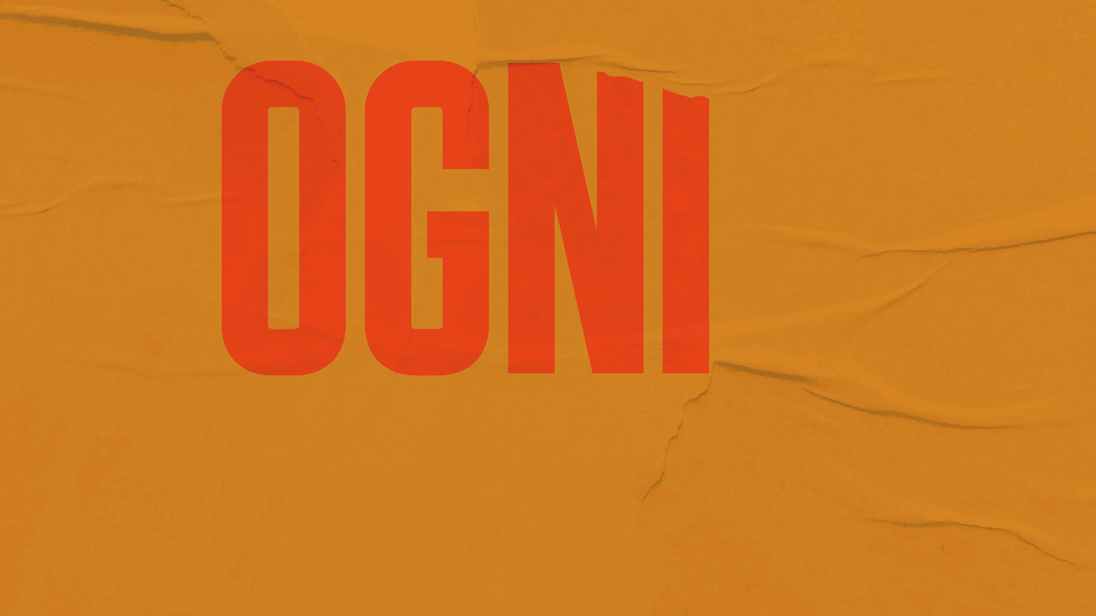
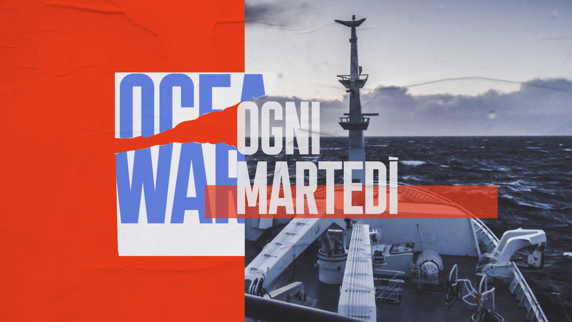
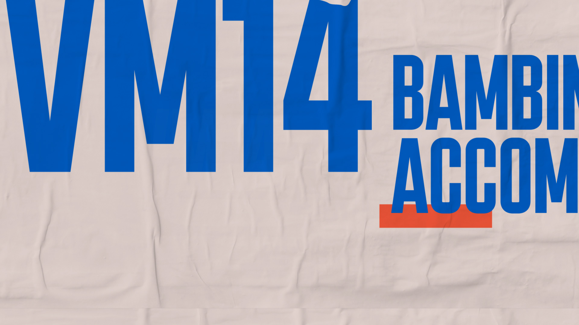
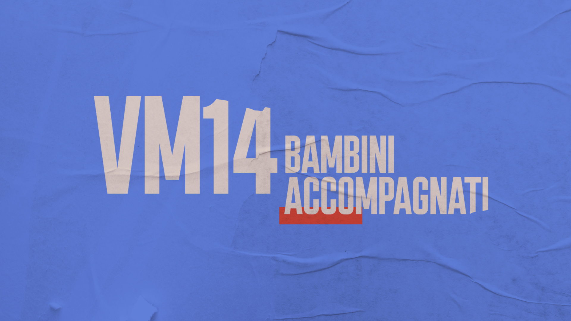
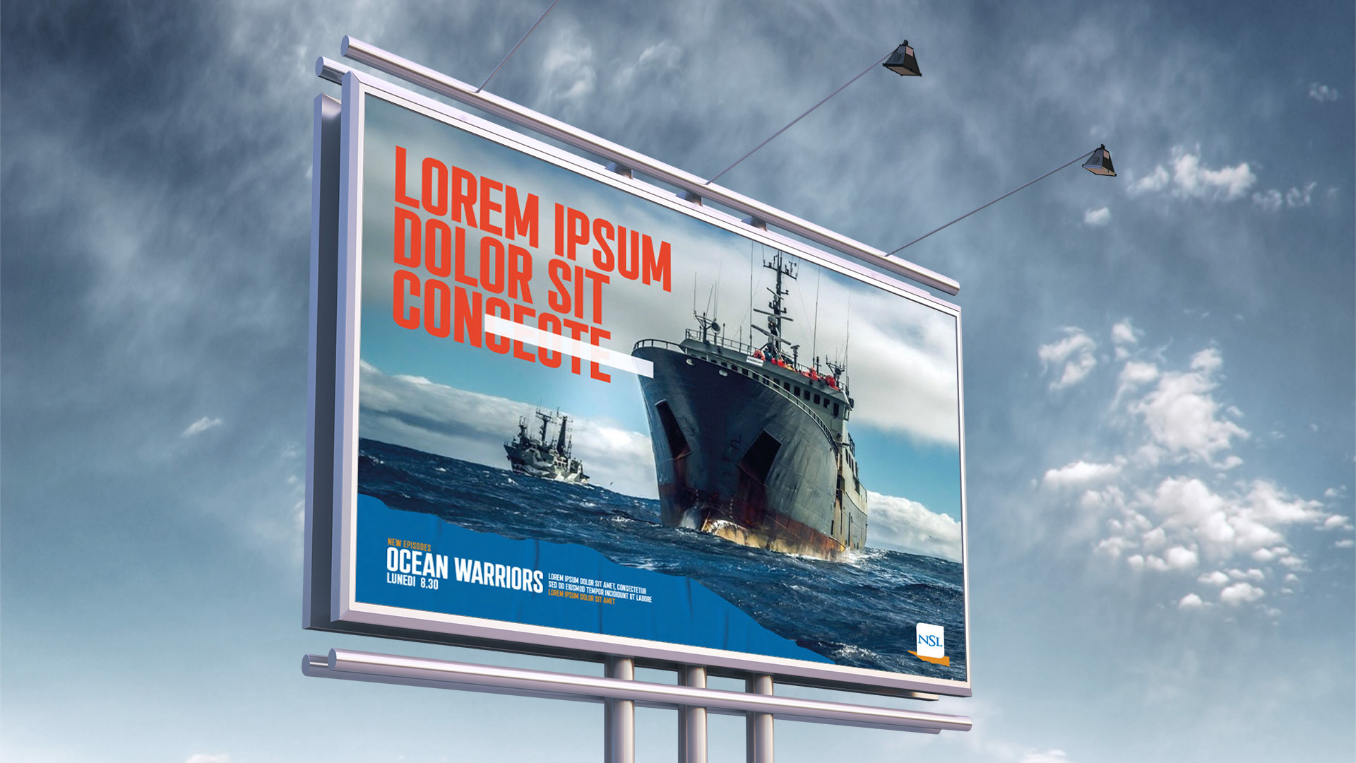
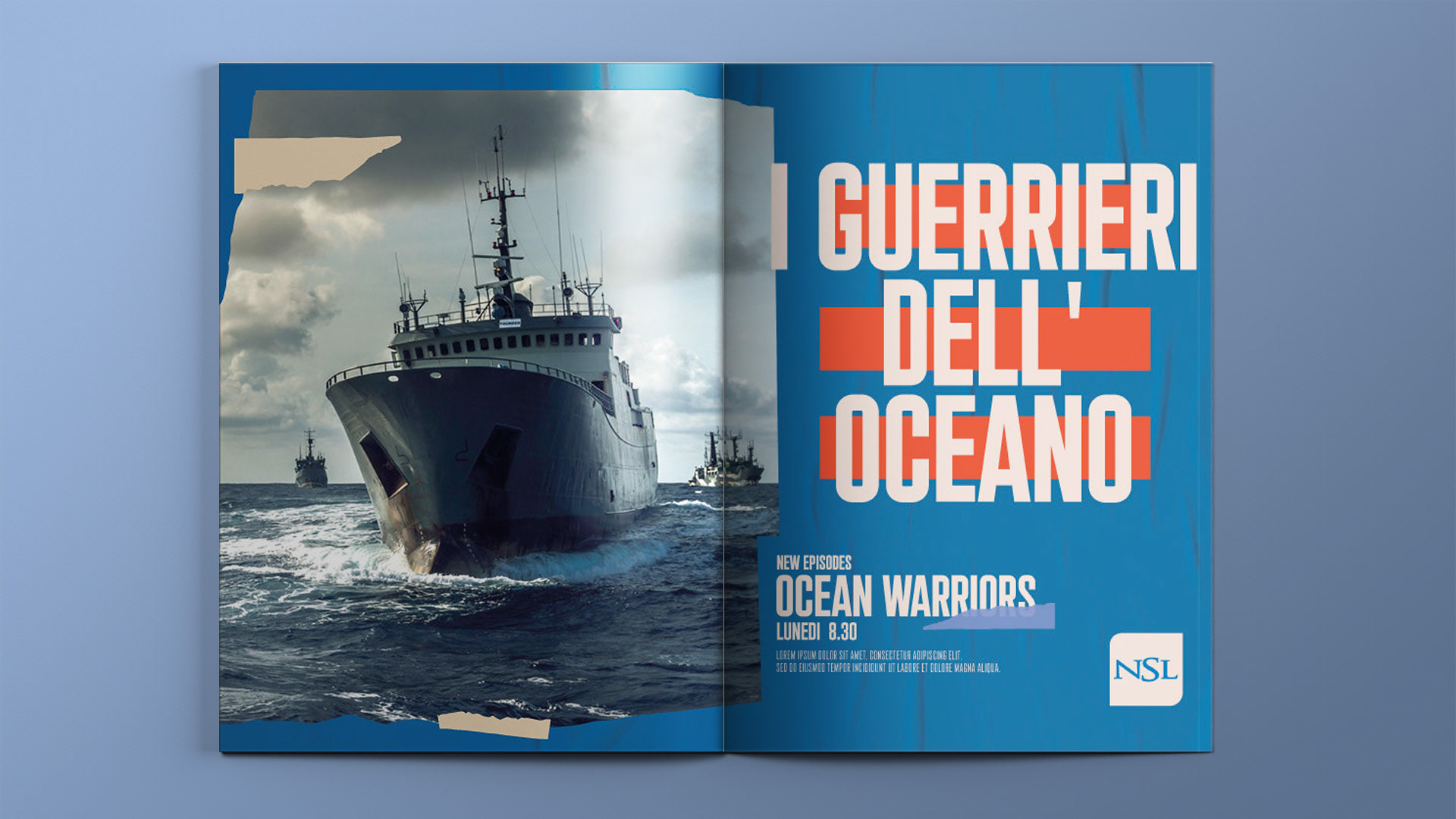
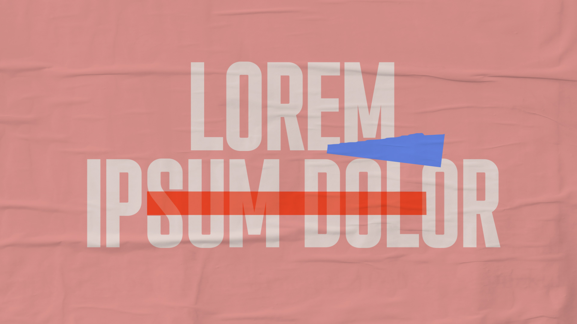
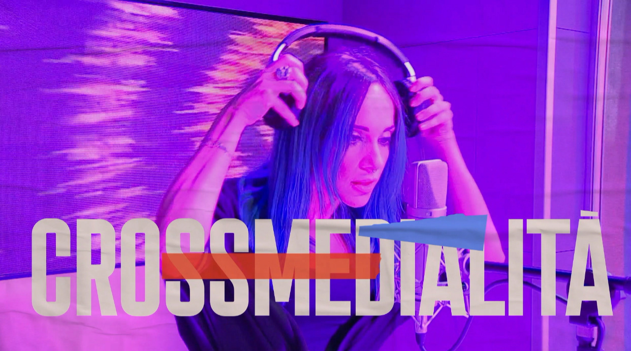
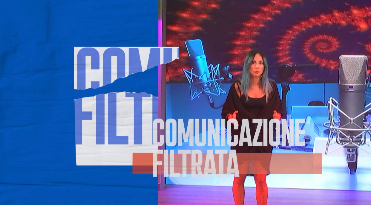
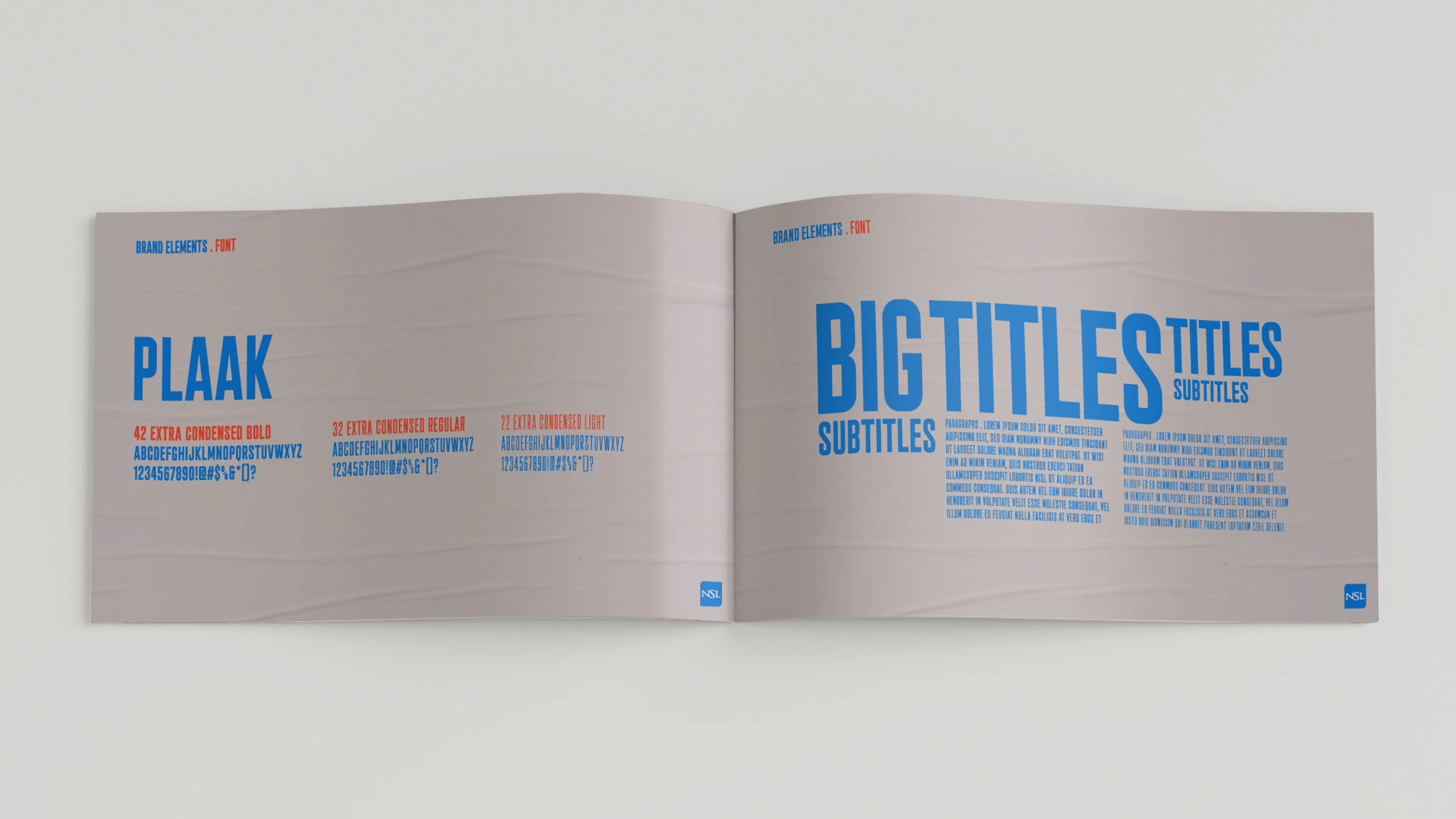
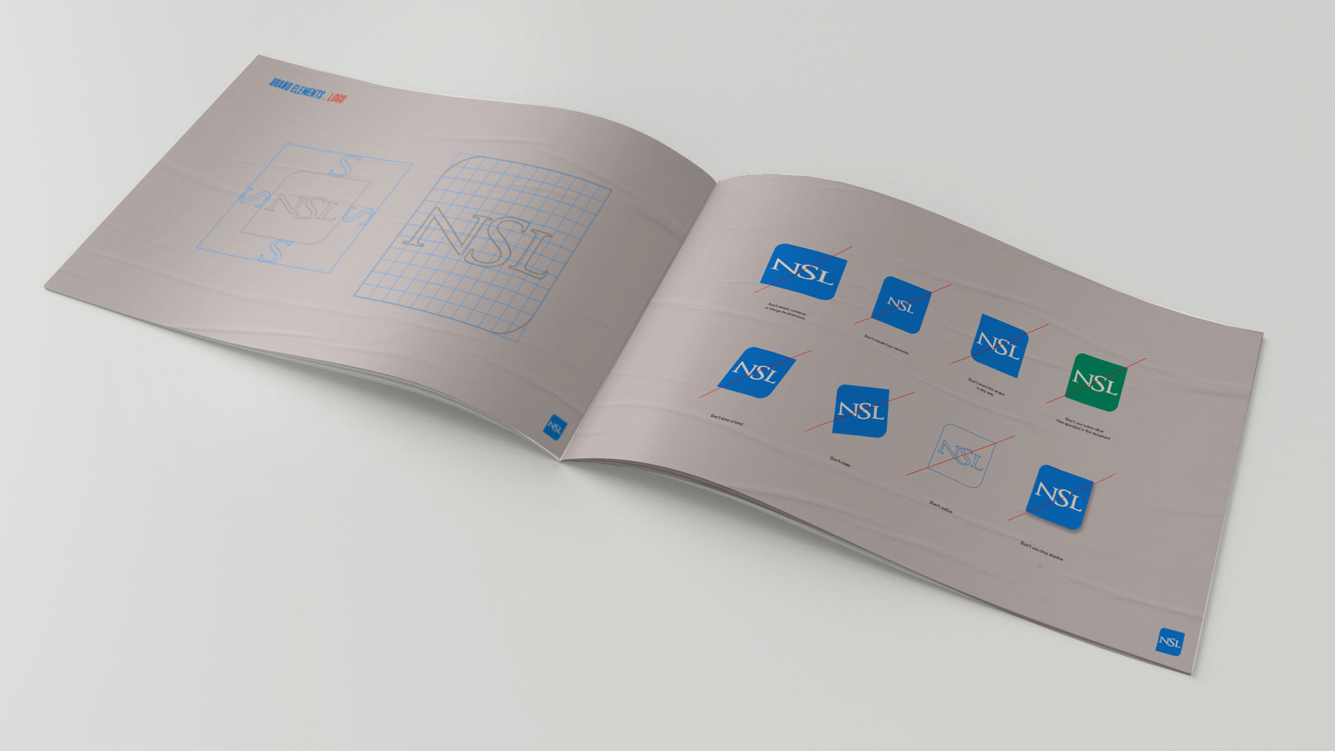
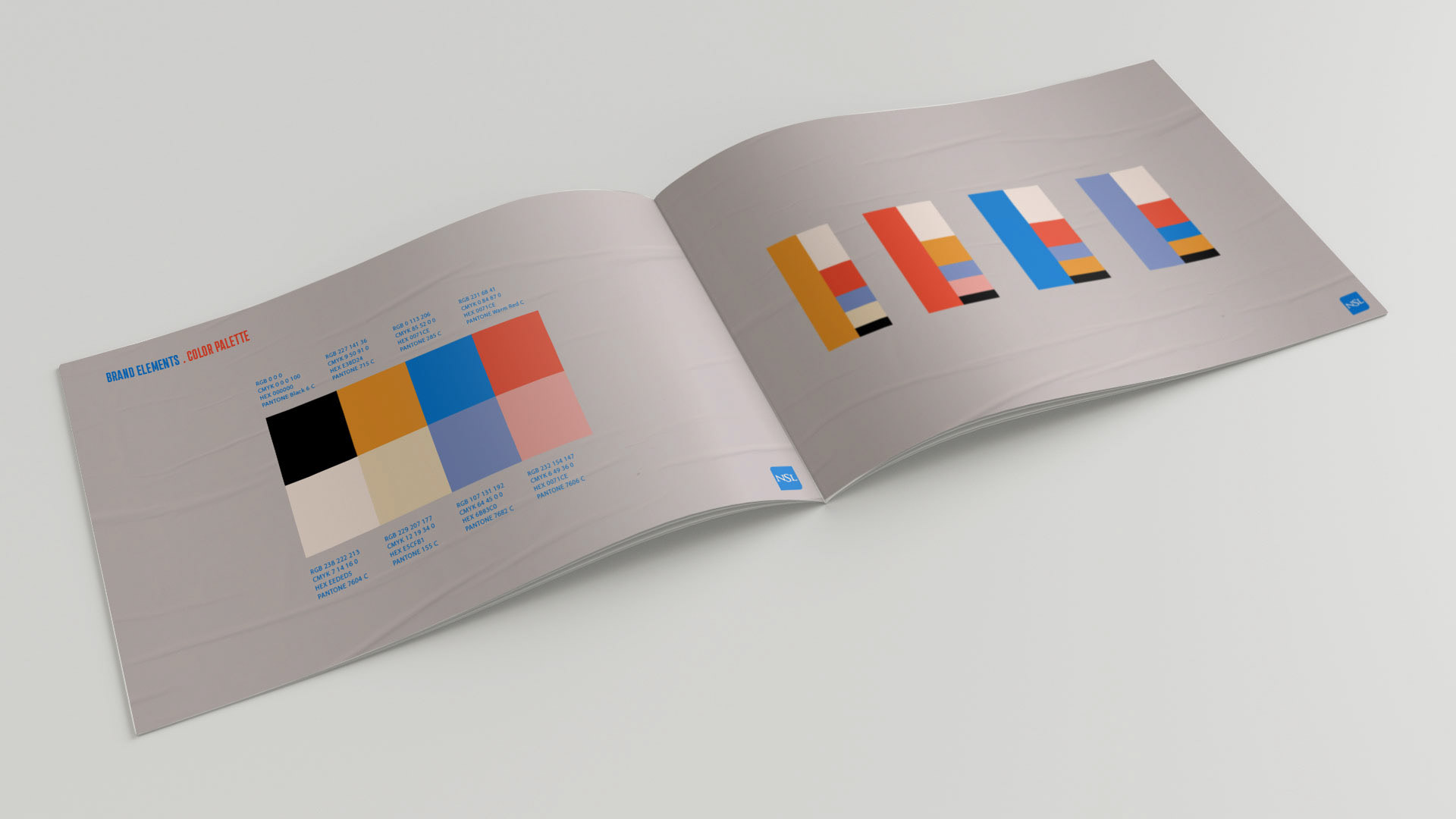
The package we created holds their grassroots essence but in an urban way; it is colourful, strong, bold, loud, and it revolves around an evolving collage of ideas and points of views about relevant issues from the environmental challenges to personal relationships. 


CREDITS

Client
Axel Sainvoisin, Michela Dinardo, CLONWERK

Creative Direction, Art Direction and Graphic Production
Flopicco

Inhouse team
Florencia Picco, Fernando Vallejos, Natalia Español, Pablo Camino, 
Martin Polech and Alejandro Guatelli

*

Thanks for watching!
.

You may also like

SETTESTORIE
Branding, Motion Graphics, Art Direction
DMAX I DEMONI DELLO SPORT
For Demoni dello Sport, Flopicco Studio created an identity that blends tabloid aesthetics with noir influences, highlighting the duality of fame and failure. To amplify the emotional weight of the series, a dramatic red was introduced into the black and white palette, creating a visual tension that reflects the complex reality of these fallen icons.
Graphic Design, Motion Graphics
+SBT HUMOR STREAMING
For +SBT Humor, we decided to take an iconographic approach to the digital language we use every day: emoticons, reactions, faces that express surprise or approval, short phrases that symbolise laughter. Humour is definitely a universal language, and emoji are its most effective shortcut.
Branding
DMAX OPERAZIONE N.A.S.
DMAX Italia's commissioned Flopicco Studio a visual identity and a basic motion toolkit for their new show Operazione N.A.S., an Italian TV program produced by Hangar for Discovery Italia, dedicated to the operations of the Carabinieri Corps' Anti-Sanitation and Health Unit.
Graphic Design, Branding, Art Direction
RAI PLAY BRAND SYSTEM
Playing with lights and textures that evoque both digital and physical supports, right there in the intersection of mediums, languages, supports, color temperatures, that was our focus while creating this distinctive -yet familiar- brand identity for Rai Play, Rai's streaming service.
Graphic Design, Branding, Art Direction
Nat Geo's Planet Possible
A space designed to inform, inspire and empower all of us to live more lightly and responsibly on the planet. 
Graphic Design, Branding, Motion Graphics
FESTIVAL DI SANREMO 2023
Lodo design, key arts and logo animation for Sanremo 2023, the most important music festival of Italy.
Graphic Design, Branding, Art Direction
BURGER KING's HOW TO TRAIN YOUR DRAGON
The goal was to harmoniously blend the film’s Viking-inspired imagery with Burger King’s bold, iconic aesthetic to create a functional, original and fun merchandise line.
Graphic Design, Illustration
Cine34 BRAND SYSTEM
Simple yet baroque, divine and mundane, essentially Italian, that's Cine34. Our studio was in charge of creating from scratch its brand system.
Graphic Design, Motion Graphics, Art Direction
HBO Go · A Universe of DC
Art Direction, Branding, Motion Graphics
Back to Top