B R A Z I L · F L O P I C C O S T U D I O + S B T · 2 0 2 4
+SBT Crianças
BRAND SYSTEM
T H E C L I E N T
SBT, Sistema Brasileiro de Televisão (SBT, in Portuguese: Sistema Brasileiro de Televisão) is a Brazilian television network founded in 1981. It currently consists of ten thematic channels and is one of the three most watched channels in Brazil.
T H E C H A L L E N G E
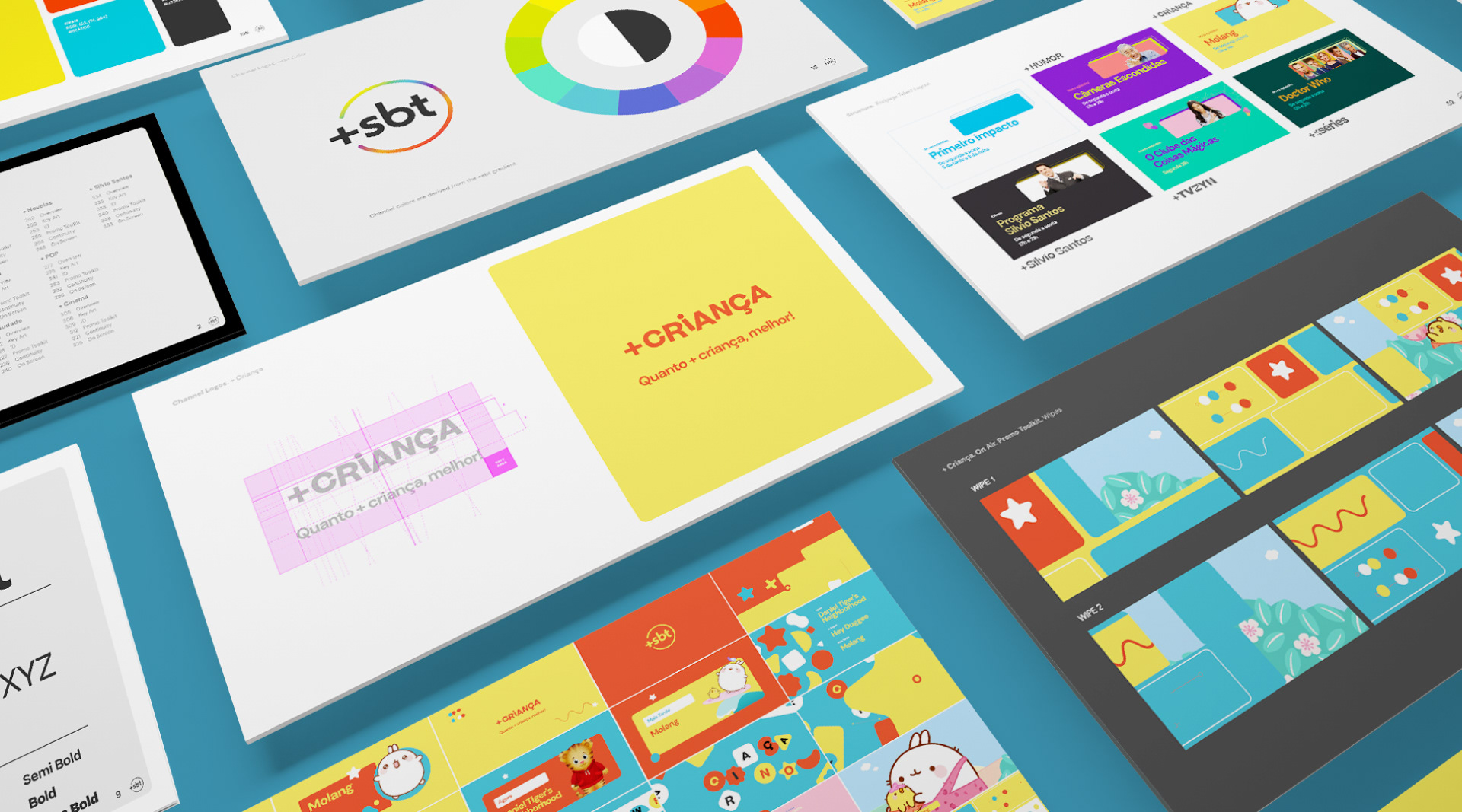
In 2024, SBT decided to innovate further by adding a free streaming platform to its TV offering: Mais SBT (+SBT). Our challenge was to develop a branding system for these 10 fast channels that was structurally harmonious to give a unique overall sense to the ten channels as a whole, but with a look & feel that reflected the identity of each channel.
T H E F L O P I C C O S T U D I O A P P R O A C H
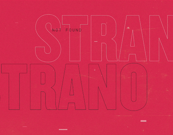
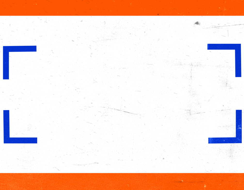
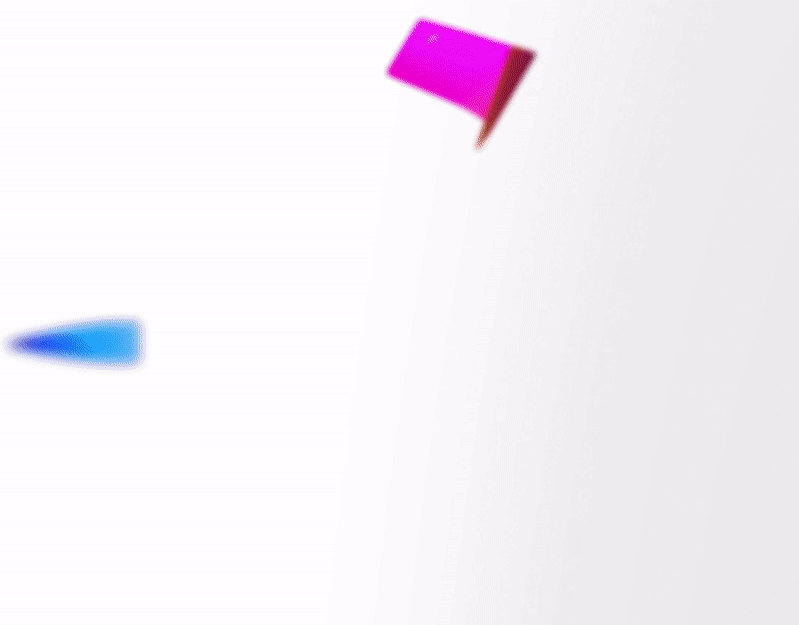
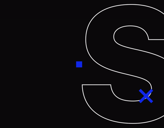
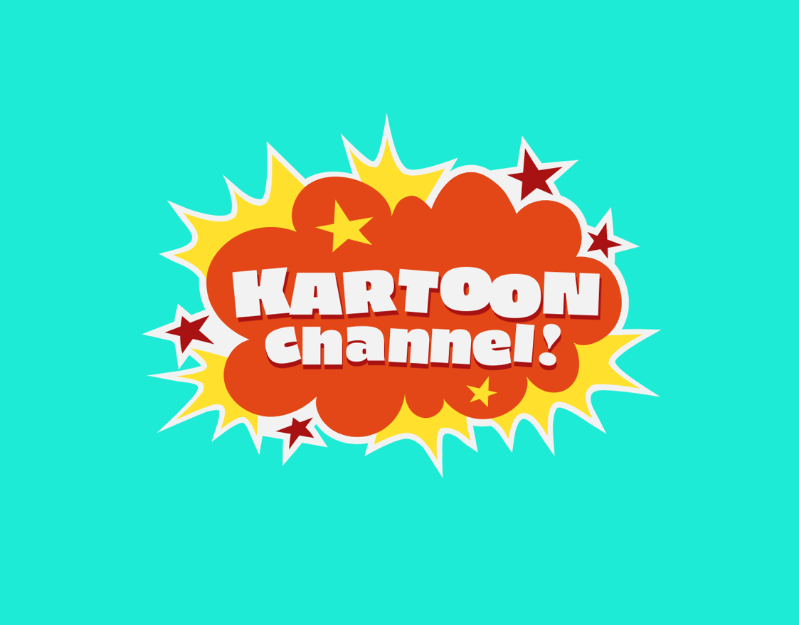
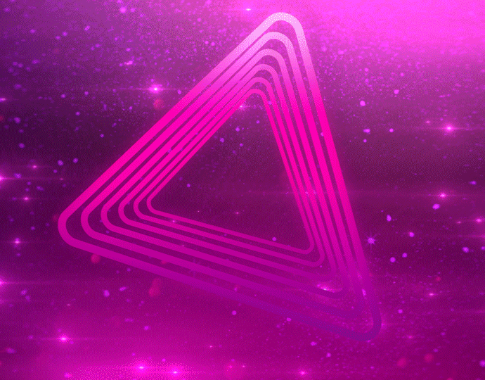
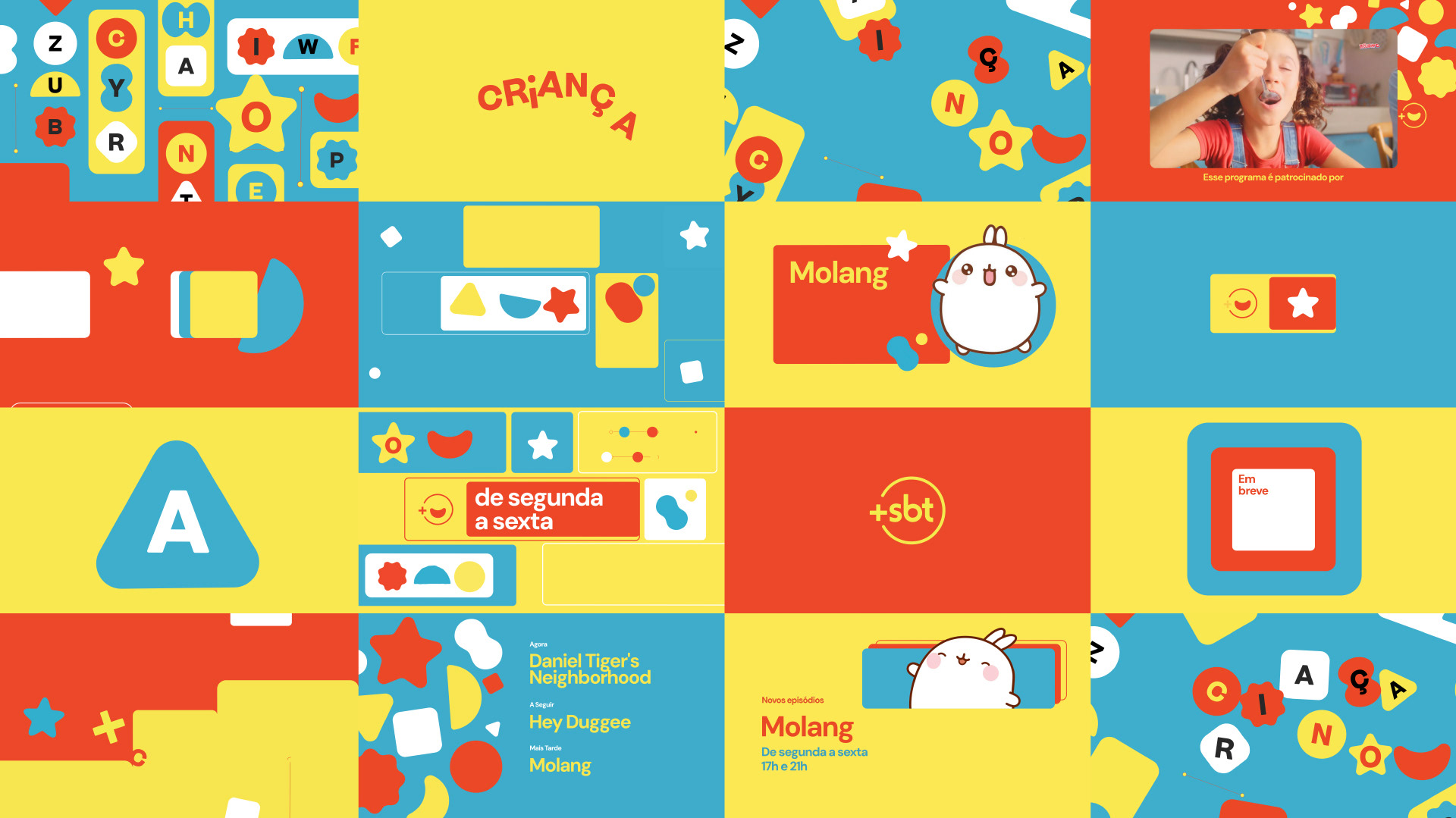
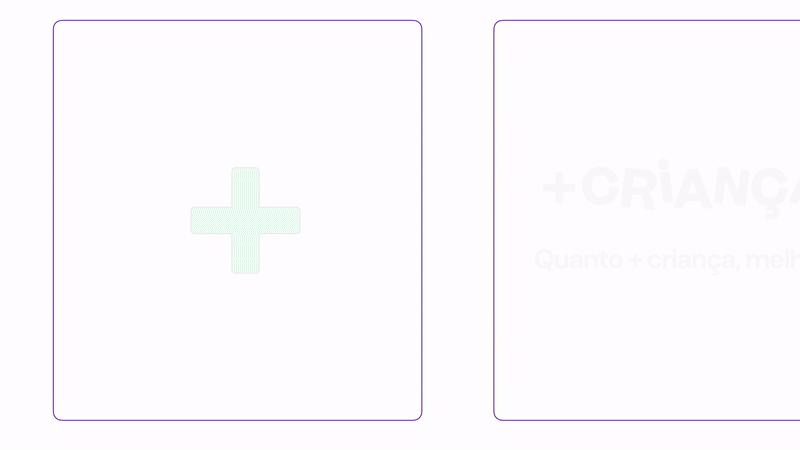
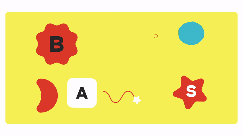
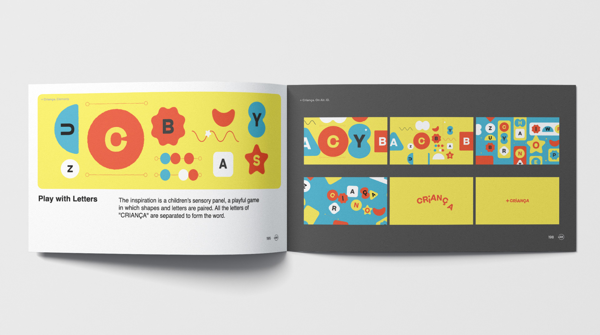
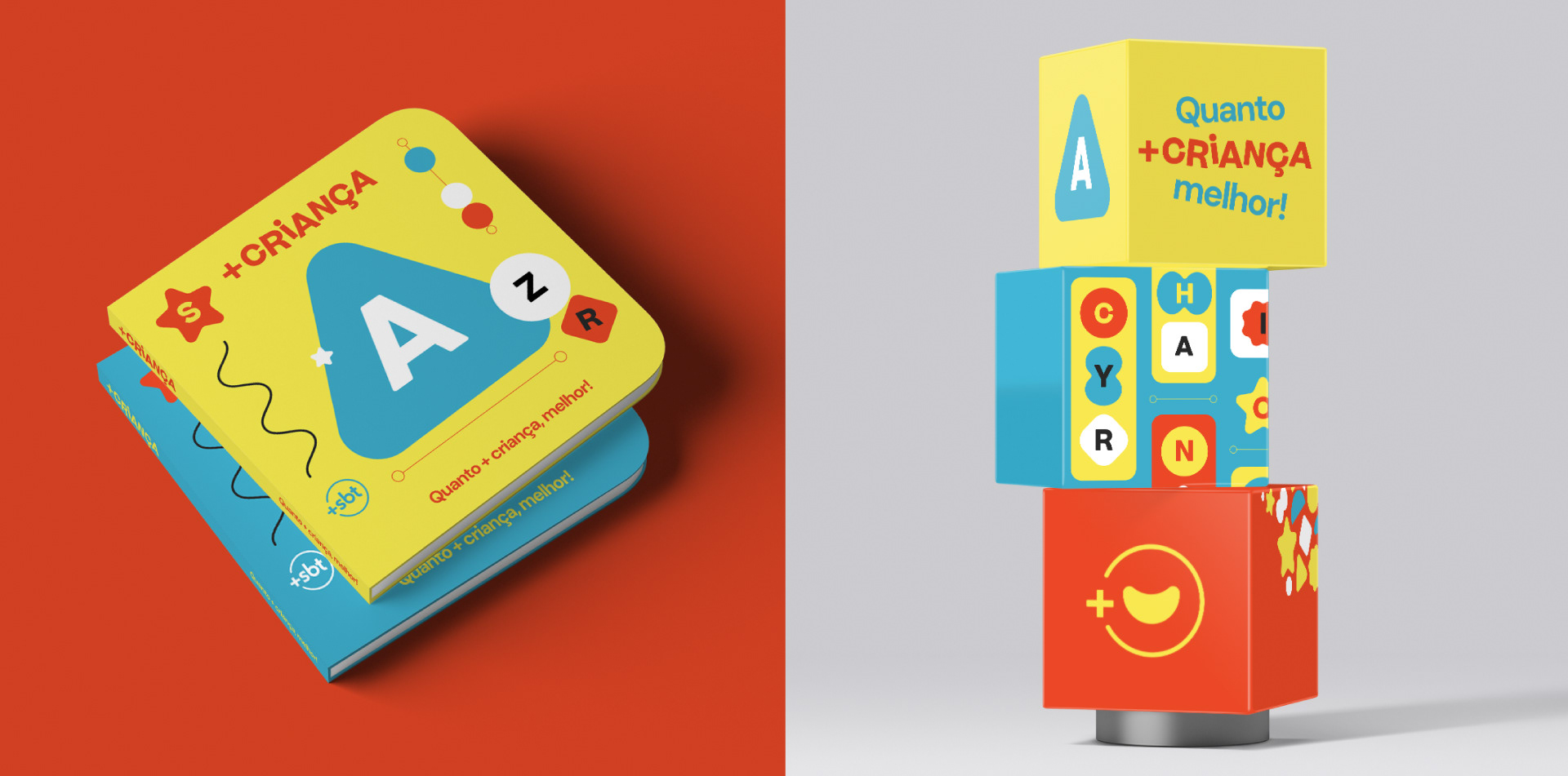
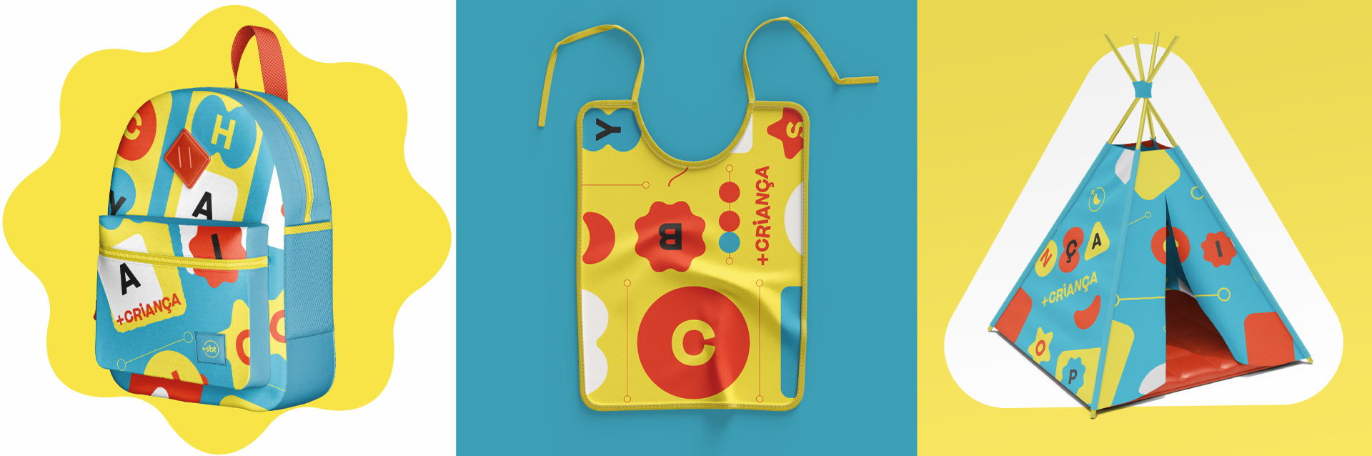
Starting with the current SBT logo, we created a system made up of three basic elements: a replicable modular base, a series of exclusive icons for each channel, and a single typeface family with enough variables to capture the spirit of each channel's theme. This is the image that corresponds to Crianças, which is +SBT's feed dedicated to younger children and to families in general. It's a channel with a bright primary color palette. It's playful, bouncy and fun to match and support the carefully curated programming.


E L C L I E N T E
SBT, Sistema Brasileiro de Televisão (en portugués: Sistema Brasileño de Televisión) es una cadena de televisión brasileña fundada en 1981. Actualmente consta de diez canales temáticos y es una de las tres cadenas más vistas de Brasil.
SBT, Sistema Brasileiro de Televisão (en portugués: Sistema Brasileño de Televisión) es una cadena de televisión brasileña fundada en 1981. Actualmente consta de diez canales temáticos y es una de las tres cadenas más vistas de Brasil.
E L R E T O
En 2024, SBT decidió innovar aún más añadiendo una plataforma de streaming gratuita a su oferta televisiva: Mais SBT (+SBT). Nuestro reto era desarrollar un sistema de marca para estos 10 canales rápidos que fuera estructuralmente armonioso para dar un sentido global único a los diez canales en su conjunto, pero con un look & feel que reflejara la identidad de cada canal.
En 2024, SBT decidió innovar aún más añadiendo una plataforma de streaming gratuita a su oferta televisiva: Mais SBT (+SBT). Nuestro reto era desarrollar un sistema de marca para estos 10 canales rápidos que fuera estructuralmente armonioso para dar un sentido global único a los diez canales en su conjunto, pero con un look & feel que reflejara la identidad de cada canal.
E L E N F O Q U E D E F L O P I C C O S T U D I O
Partiendo del logotipo actual de SBT, creamos un sistema compuesto por tres elementos básicos: una base modular replicable, una serie de iconos exclusivos para cada canal y una única familia tipográfica con suficientes variables para captar el espíritu del tema de cada canal. Esta es la imagen que corresponde a Crianças, el feed de +SBT dedicado a los más pequeños y a las familias en general. Es un canal con una paleta de colores primarios brillantes. Es juguetona, alegre y divertida para combinar y apoyar la cuidada programación.
Partiendo del logotipo actual de SBT, creamos un sistema compuesto por tres elementos básicos: una base modular replicable, una serie de iconos exclusivos para cada canal y una única familia tipográfica con suficientes variables para captar el espíritu del tema de cada canal. Esta es la imagen que corresponde a Crianças, el feed de +SBT dedicado a los más pequeños y a las familias en general. Es un canal con una paleta de colores primarios brillantes. Es juguetona, alegre y divertida para combinar y apoyar la cuidada programación.


CLIENT
Sistema Brasileiro de Televisão (SBT)
CREATIVE DIRECTION, ART DIRECTION
AND GRAPHIC PRODUCTION
Flopicco Studio
Inhouse Team
Florencia Picco, Fernando Vallejos, Natalia Bellagio, Alejandro Guatelli,
Emiliano Agnetti, Martín Polech and Pablo Camino.
With the collaboration of
Tercer Espacio
Audio Production, Editing & Equalization
Ignacio Tomé
🖤