B R A Z I L · F L O P I C C O S T U D I O + S B T · 2 0 2 4
+SBT SAUDADE
BRAND SYSTEM
T H E C L I E N T
SBT, Sistema Brasileiro de Televisão (SBT, in Portuguese: Sistema Brasileiro de Televisão) is a Brazilian television network founded in 1981. It currently consists of ten thematic channels and is one of the three most watched channels in Brazil.
T H E C H A L L E N G E
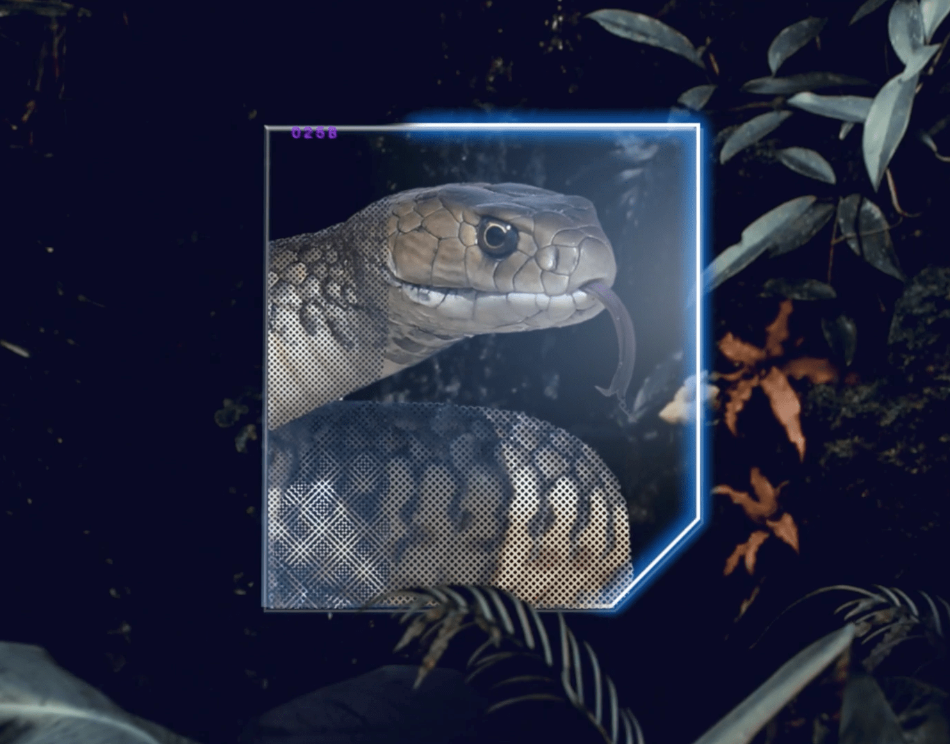
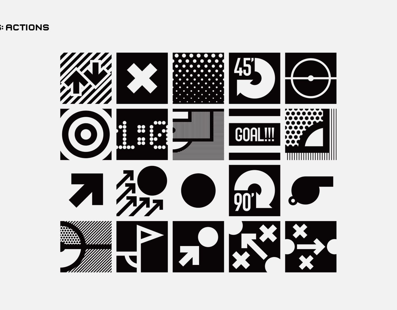
In 2024, SBT decided to innovate further by adding a free streaming platform to its TV offering: Mais SBT (+SBT). Our challenge was to develop a branding system for these 10 fast channels that was structurally harmonious to give a unique overall sense to the ten channels as a whole, but with a look & feel that reflected the identity of each channel.
T H E F L O P I C C O S T U D I O A P P R O A C H
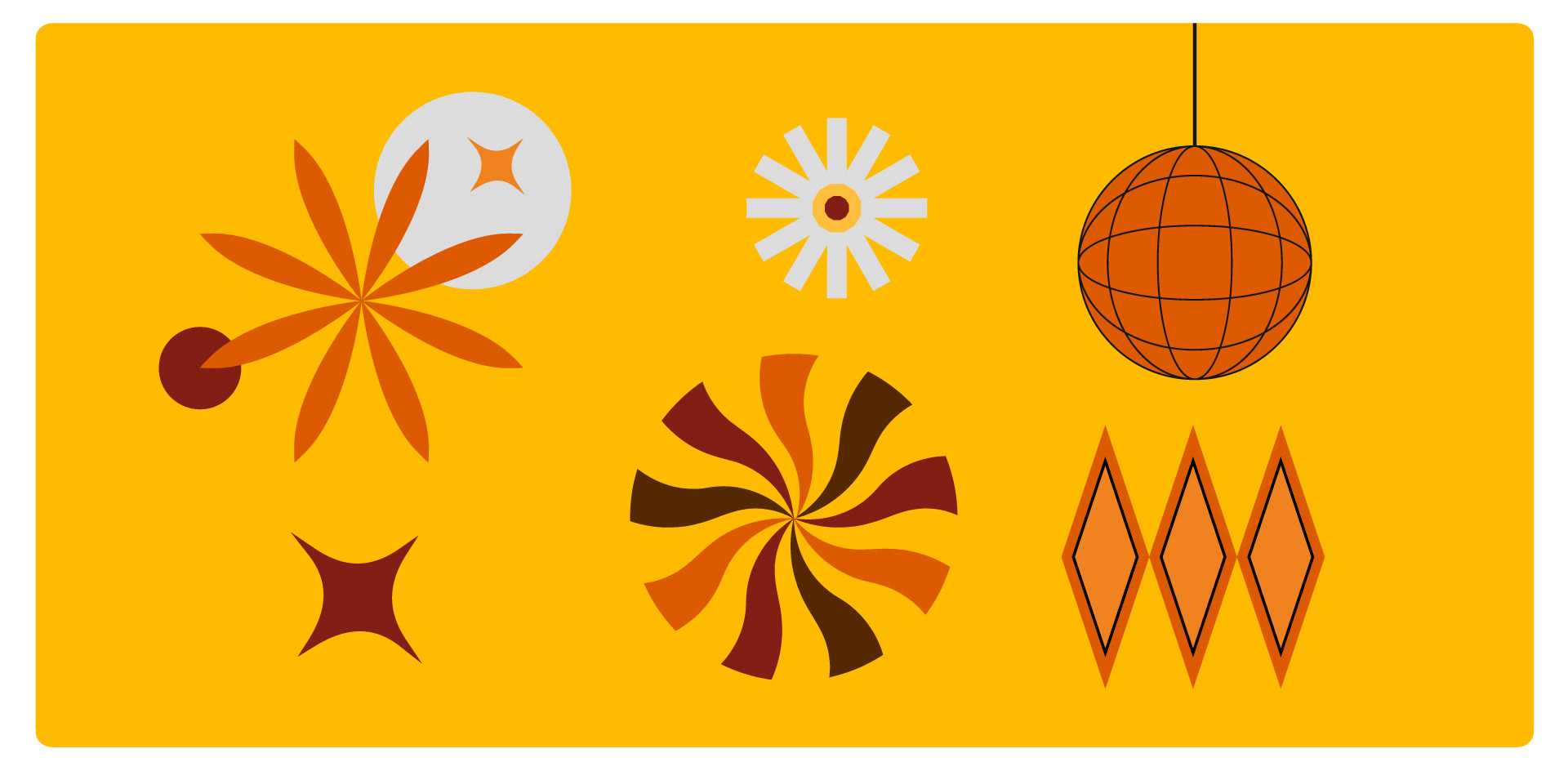
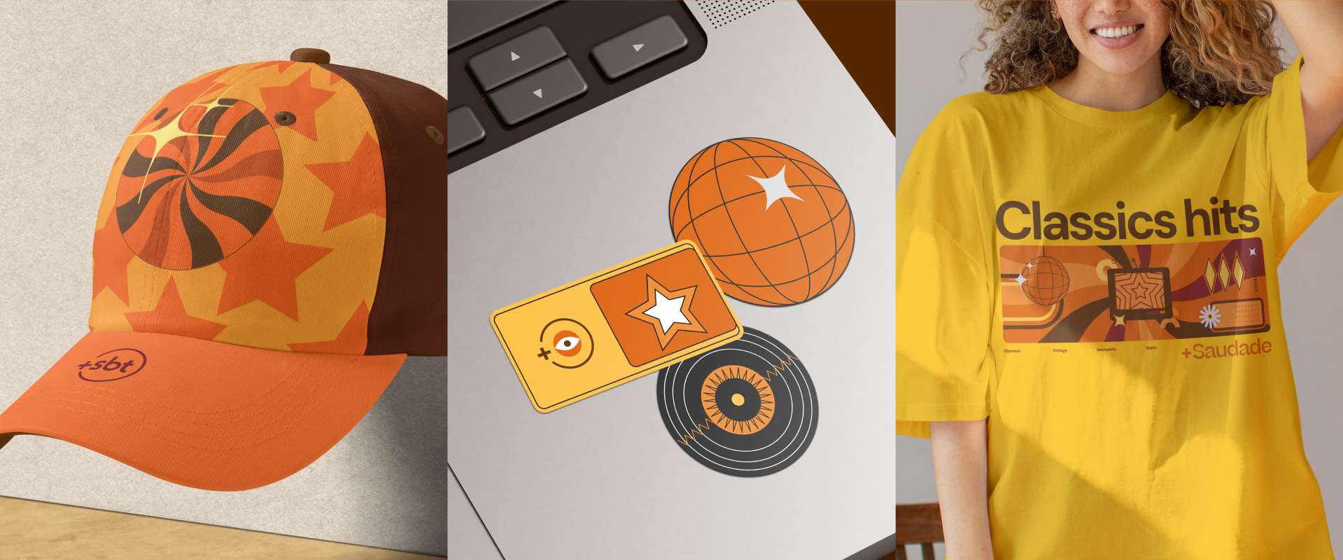
For SBT Saudade, we tapped into the emotional power of nostalgia, creating an identity that captures the visual allure of Brazilian pop culture from the '60s and '70s. Our goal was to celebrate the era's distinctive graphic style.
The design system features a cozy, familiar color palette of earthy browns, sun-warmed oranges, and mustard yellows. The iconography references cultural touchstones from that time period. The result is a warm, joyful memory made modern.


E L C L I E N T E
SBT, Sistema Brasileiro de Televisão (en portugués: Sistema Brasileño de Televisión) es una cadena de televisión brasileña fundada en 1981. Actualmente consta de diez canales temáticos y es una de las tres cadenas más vistas de Brasil.
SBT, Sistema Brasileiro de Televisão (en portugués: Sistema Brasileño de Televisión) es una cadena de televisión brasileña fundada en 1981. Actualmente consta de diez canales temáticos y es una de las tres cadenas más vistas de Brasil.
E L R E T O
En 2024, SBT decidió innovar aún más añadiendo una plataforma de streaming gratuita a su oferta televisiva: Mais SBT (+SBT). Nuestro reto era desarrollar un sistema de marca para estos 10 canales rápidos que fuera estructuralmente armonioso para dar un sentido global único a los diez canales en su conjunto, pero con un look & feel que reflejara la identidad de cada canal.
En 2024, SBT decidió innovar aún más añadiendo una plataforma de streaming gratuita a su oferta televisiva: Mais SBT (+SBT). Nuestro reto era desarrollar un sistema de marca para estos 10 canales rápidos que fuera estructuralmente armonioso para dar un sentido global único a los diez canales en su conjunto, pero con un look & feel que reflejara la identidad de cada canal.
E L E N F O Q U E D E F L O P I C C O S T U D I O
Para SBT Saudade, aprovechamos el poder emocional de la nostalgia y creamos una identidad que captura el encanto visual de la cultura pop brasileña de los años 60 y 70. Nuestro objetivo era celebrar el estilo gráfico distintivo de esa época.
El sistema de diseño presenta una paleta de colores acogedores y familiares, con marrones terrosos, naranjas cálidos y amarillos mostaza. La iconografía hace referencia a elementos culturales emblemáticos de ese periodo. El resultado es un recuerdo cálido y alegre con un toque moderno.


CLIENT
Sistema Brasileiro de Televisão (SBT)
CREATIVE DIRECTION, ART DIRECTION
AND GRAPHIC PRODUCTION
Flopicco Studio
Inhouse Team
Florencia Picco, Fernando Vallejos, Natalia Bellagio, Alejandro Guatelli,
Emiliano Agnetti, Martín Polech and Pablo Camino.
With the collaboration of
Tercer Espacio
Audio Production, Editing & Equalization
Ignacio Tomé
🖤
#GoWithTheFlopicco